从用户体验的角度聊任天堂的《动物之森:口袋营地》
从用户体验的角度聊任天堂的《动物之森:口袋营地》
原文作者: Chris Cobb 译者:Megan Shieh
本文涵盖了任天堂最新模拟经营类手游《动物之森:口袋营地》的核心系统、盈利模式、整体游戏体验,以及我们需要反思的一些问题。
入门教程
本作的入门教程大约会花费掉玩家20分钟左右的时间,其中包含了与NPC的大量对话。该教程采用了一种双重教学的方法,先是提供教学图像,然后要求玩家在一个锁定的用户界面中一步一步地完成每个指令。一开始的时候,我并不明白为什么开发者会这样设计,但是经过反思后我得出了这样一个结论:以不同的方式来重复呈现相同的教学内容,可能可以帮助玩家更好地记住这些知识。
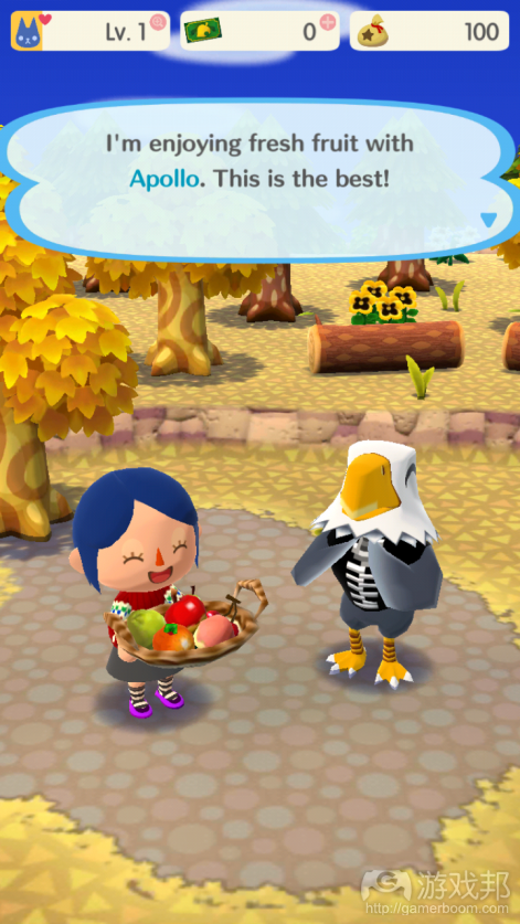
尽管《动物之森》系列的背景故事一向都不是很丰富,但是对于这么一个系列而言,《动物之森:口袋营地》的内容还是显得太过单调了。在游戏中,玩家化身成为一个营地的管理者,但是除了给住在营地上的动物送“礼物”之外,对玩家似乎就没有什么其他实质性的需求了。我并不是说每款游戏都非得有个宏大的背景故事,即便只是最基本的“帮助你爷爷复兴他的农场”也已经足够给玩家提供游玩的动力了,但是本作在这方面似乎还有待改善。
提问:考虑到手游的会话长度一般都保持在5分钟左右,有什么办法能够将长达20分钟的强制新手教程替换掉?在移动游戏中,背景故事真的有那么重要吗?
游戏的核心回路
这款游戏的核心回路是去不同的地方收集食物和物品,包括树上的水果、沙滩上的贝壳、河里的鱼,等等。有些物品能够在几分钟内迅速生成,比如鱼和虫子;而有些物品则需要等待几个小时,比如水果。这些物品可以用来为玩家的营地制作道具和家具,也可以作为礼物送给NPC,从而提升它们对你的好感度。当然,玩家也可以选择花真钱来加快物品的生成速度。
这款游戏里的主要元素很少。大多数物品都可以通过简单的单击屏幕来收集,而抓鱼或者抓虫子的活动则需要通过简短的等待,在鱼或虫子出现的时候点击屏幕就可以把它们收入囊中了。
虽然人们对“游戏”的定义还没有争论出个所以然来,但是本作中很少会出现解决问题、做决策、意料之外的结果等其他游戏中常有的机制。有的只是意料之中的、点击一个按钮就能装饰一个小空间的机制。
提问:如果一款游戏的主要机制是手工制作和装饰,那么什么样的社交功能可以让游戏体验变得更加互动化,而且还能提供一种超越自我满足感的回报?
到处都是计时器
本作的核心回路是围绕着不断增长的计时器而构建的。玩家可以通过一个手工制作系统来订制新的家具,那些不愿意等上5个小时的玩家可以花真钱来加快家具的出货速度。这是最早也是最致命的手游盈利手法之一。在游戏的早期阶段,物品的构建非常快速;但是随着时间的推移,构建这些物品所需的时间变得越来越长,玩家的游戏体验也随之变得越来越差。
从表面上看,玩家花真钱购买加速以后似乎就可以回到像早期阶段那样的速度,但是这么说其实是错误的,因为一旦玩家消费了以后,他们就将立即面对新的、耗时更长、更昂贵的计时器。
要求玩家逐步投入更多的时间来到达下一关卡,这种做法从最早的数字RPG开始就一直都是主流。然而重要的是,这些传统游戏只是要求玩家投入更多的游玩时间来取得进阶。在一个活动上加入计时器,然后在旁边放置一个购买按钮,这并不是一个友好的做法。
从表面上看,这些能源系统似乎是为了阻止玩家沉迷游戏而设计的。然而,它们的设计往往都起到了相反的作用——玩家不得不频繁地启动应用程序,只是为了查看计时器到时了没有。在等待的同时,游戏会一直用引诱你花真钱去加速。某些物品只需2-3分钟就可以重新补充,这就意味着即使是在等待长达几小时的计时器时,玩家也还是可以一直和游戏互动。这一适得其反的设计意味着,玩家永远都无法摆脱游戏的需求。
提问:除了随着时间的推移而降低游戏体验的质量,还有什么其他方法可以促进消费?在会话长度较短的手机游戏中,我们该如何利用传统的游戏体验?这些商业惯例是游戏生存的必要条件,还是有其他更值得尊重的方式能够让我们在移动环境中建立一款可持续产品?
任务系统
任务系统分为两种。一种是限时任务,必须在规定时间内完成。另一种是固定任务,这些任务会一直展示在任务列表上,直到你完成为止。
限时任务是一种额外的参与机制,每当引入新的限时任务时,都会促使玩家回来玩。此外,为了让玩家在到时之前完成任务,游戏会鼓励玩家花真钱。
而固定任务则是确保玩家不会无事可做,不过翻看一张永无止境的任务列表可能会让人感觉有些喘不过气来。目前还不清楚这个任务列表会不会为玩家指引方向,但是我猜测为了给玩家提供合适的任务,列表的排序方式应该是根据玩家的等级来设计的。
提问:除了千篇一律的收集物品任务之外,还有什么其他更具吸引力的任务系统?如何能够将故事与任务系统结合到一起,从而提供一个更加出色的游戏体验?传统的模拟经营类游戏中有哪些特性可以引入到像《动物之森》这样的手游中来?
各种各样的围墙
一个特别讨人厌的特性是在教程结束后立即出现的。我想去一个叫采石场的地方,游戏建议我要么花真钱,要么就招募5个朋友来帮助我解锁这个地点。这类“朋友墙”一直是沮丧的根源,也是游戏《Candy Crush》中的一个显著特性。这类特性促使你在社交软件上给你的朋友发送垃圾邮件,邀请他们来玩这款游戏。这种乏味的社交参与方案是一种掩饰不佳的工具,将玩家变成了游戏的销售代理。我更喜欢的是那种高度吸引人的社交体验,比如和朋友一起完成某项任务,或是一个能够为现有玩家和被邀请的朋友都提供满足感的交互性社交系统。
玩家在访问不同的地点时,会遇到随机的真实玩家角色。系统会提示玩家去添加这些人作好友,并且提供“Kudos”作为添加好友的奖励。也不知道这些Kudos是干啥的,我送出了十几个,也收到了十几个,可是好像并没有对游戏体验产生明显的影响。本作的开发者错过了有效利用这一特性的机会,他们本可以用这个Kudos来积极推动玩家去添加很多好友、参观别人家的营地的。
提问:在邀请或被邀请的时候,什么样的社交系统才能产生真正的效应,并且让双方都感到愉快?什么样的合作元素可以驱动玩家们去参观对方的基地?
推送和通知
我们都知道,大量的注意力捕捉机制(比如推送通知、横幅)有时真的很烦人。然而,《动物之森:口袋营地》的游戏界面中充满了各种各样的推送和通知。比如说,两个不咋地的物品正在限时抢购,结果界面上就有一个亮红色的蝴蝶结盖过了物品制作的图标,而且根本没有办法把它去掉或者忽略它的存在。再比如说,游戏界面的左上角有一个一直推送优惠通知的滑动窗口,时常会分散玩家的视觉注意力。根据游戏内通知的数量,我想《动物之森:口袋营地》遵循的是典型的频繁推送通知的做法,从而促使玩家使用该应用程序。
提问: 你认为游戏中本就应该包含大量的通知和提醒,还是它们的“打扰”会让玩家感到厌烦?我们该如何开发出一个可以给游戏体验增加价值的推送系统?从长远的角度来看,这些过于活跃的通知系统将会促进还是阻碍玩家参与?
用户界面
用户界面总体感觉很好,尽管有少数令人沮丧的交互,我认为其中的某些部分将会随着用户参与频率的增加而变得非常烦人。任天堂以其高质量的优化和无缝的交互体验而闻名,可惜的是,他们在这款游戏中并没有发挥出该有的水平。下面让我们来看看我在用户界面方面都遇到了哪些问题。
屏幕间的切换和进出会话模式的速度都很慢。我在睡前启动了一个长达几个小时的计时器,然后单单是在各个地点间切换,做基本回路,就花了我30分钟的时间。其中很大一部分时间都是在等待屏幕加载、服务器刷新和镜头转换。这是让我对这款游戏失去兴趣的主要原因之一,这种浪费时间的设计问题也阻碍了游戏中其他环节的顺畅运行,导致整个游戏的玩家体验很差。
虽然长达20分钟的故事教程还是蛮厉害的,但是《动物之森:口袋营地》在内容的引入方面却没有做到既保持玩家兴趣又防止信息超载。尽管有很长的入门教程,但是在看到新的抽象工艺品(比如essence)的时候,我仍然感到不知所措,因为没有任何解释,它就这样莫名其妙地出现了。此外,重要的信息,比如在哪里才能找到所需的工艺材料,我花了一个多小时才找到。有些工艺材料(比如essence)从来都没解释过是用来干什么的,但是它们抽象的外观又让我感到困惑。这些毛病都可以通过成本较低的迭代来解决。
玩家可以通过访问NPC,和它们交互来获得礼物,然而UI不会告诉你有这个功能,除非你经过一系列缓慢的聊天对话,否则你根本无法知道这个功能的存在。这就迫使玩家去参与许多没用的交互,而且因为加载非常缓慢,所以需要花费很长的时间。这种做法实在是不咋地,因为它拉长了会话的长度,但是却没有提供任何价值。移动游戏的交互反应应该是快速的,并且提供一个紧凑的、令人满意的参与回路。
游戏中还有其他一些乏味或令人沮丧的用户体验元素,我会简要地列举出来:我想要收集的物品摆放在非常不显眼的位置,玩了几个小时以后才无意间被我找到。NPC的话实在是太多了,而且“与NPC的对话”和“家具清单”之间的切换也是慢到吐血,每次都至少需要点击屏幕5次。规划营地的UI总体上是不错的,但是在移动家具和边缘区域方面有几个小问题。用来分隔营地空间的墙壁太宽,占用的空间太大,无法使用。
总结
当我开始写这篇文章的时候,并没有打算要对任天堂的最新手游提出批评。几年前任天堂宣布打算投资手游的时候,我还非常高兴。我本以为任天堂能够成为移动游戏领域的救世主,可是现在的我对这一信念却越来越不抱幻想了。相反的,他们采用了普遍的、已经存在的、不友好的手法。
本文由游戏邦编译,转载请注明来源,或咨询微信zhengjintiao
A look at the core systems of Nintendo’s latest mobile game, including core systems, monetization, and overall experience, as well as thoughts on alternative approaches.
About me: I’ve been developing games for almost a decade at PopCap Games and Riot Games as a systems and platform engineer for various R&D teams. Opinions are my own, comments and feedback and are greatly appreciated, or reach out on twitter @cccobb.
Tutorial
Players can expect to spend around 20 minutes going through a heavily scripted tutorial. The tutorial uses a dual approach by providing instructional images, then requiring the player to go through each instruction step by step with a locked UI. I was confused by this at first, but upon reflection I concluded that presenting the instructions twice, in two different ways, may help players retain the lessons better.
The ‘why’ of the game feels thin, even for a game whose core franchise never provided a strong story. In AC:PC, you are the director of a campground, but other than giving ‘gifts’ of assorted items to the animals staying in your camp, there doesn’t appear to be any real needs you are addressing. It’s not as though gamers need a grand narrative, just the simple premise of restoring your grandfather’s rundown farm is enough explanation to motivate players in Harvest Moon.
Questions: Considering mobile play sessions are frequently 5 minutes or less, what alternatives are there for a mandatory 20 minute tutorial? Is narrative important in mobile games?
Core Game Loop
The core game loop involves visiting various locations to collect food and items, including fruit from trees, shells on the beach, fish from the river, etc. Some items replenish quickly, within a couple of minutes (fish and bugs for example), while fruit takes several hours to replenish. These items can be used to craft props and furniture for the player’s campground, and used as gifts to fill up the friendship meter of various NPCs. Players are offered the chance to spend real money to speed things along.
AC:PC offers very little gameplay. Most items can be collected simply by clicking, while catching bugs or fish involves a lightweight timing activity that includes tapping the screen when a prompt appears. While debates on what constitutes a game are not productive, this game provides little problem solving, decision making, uncertain outcomes, or other common constructs present in most games. The result is a deterministic button clicking activity with the ability to decorate a small space.
Questions: Is it okay for a game to be more of an activity than a traditional game? If the game is about crafting and decorating, what social features could make this experience more interactive and provide a payoff beyond self-satisfaction?
Timers, timers, timers
The core game loop revolves around timers of increasing length. You can order new furniture to be made through a crafting system, and players who don’t feel like waiting for 5 hours to build a new cabinet can spend real money to speed things up. This is one of the earliest and most pernicious approaches to mobile game monetization. Early in the game, items are built quickly, and over time the player experience degrades as the delay between each crafted item gets longer. The promise that monetizing will restore the game to its earlier, responsive glory is a false promise– as soon as the player has made their purchase they will be immediately confronted by new, longer, more expensive timers. Requiring players to invest progressively more time to reach the next level has been a staple since the earliest digital RPGs. Importantly however, these traditional games only required additional play time to progress. Slapping a timer on an activity and putting a purchase button next to it is not a friendly practice.
At face value it may seem that energy systems are designed to prevent players from binging. Unfortunately these systems are typically designed to do the opposite, prompting the compulsive behavior of frequently launch the app just to check whether one of the very long timers has expired. While waiting, the game persistently dangles the carrot of speeding things up through microtransactions. In AC:PC some items replenish within 2-3 minutes, meaning you can interact with the game perpetually even while waiting on the multi-hour timers. This worst-of-both-worlds design means that players are never free from the demands of the game.
Questions: What alternatives are there to a game experience designed to degrade the quality of the experience over time in order to prompt purchases? How can we leverage traditional game experiences in a mobile environment where game sessions are shorter? Are these business practices required for games to survive, or are there more respectful ways to build a sustainable product in the mobile environment?
Quests
The quest system is split into Timed Goals that must be completed before they expire, and Stretch goals that are persistent and seemingly never-ending.
Timed Goals are an additional engagement mechanism, prompting players to come back every time new timed goals are introduced (at launch, Timed goals expire every 12 hours). In addition, players are encouraged to monetize in order to complete quests before they expire.
An infinite list of stretch goals ensures that players always have something to do, though scrolling through a never-ending list of potential activities is overwhelming. It’s not clear whether the list provides direction for new players, though I suspect the order of the list is designed to provide goals appropriate to the player’s level.
Questions: What are examples of more compelling quest systems than a bland to-do list that involves picking up various items? How could narrative contribute to a more fulfilling experience? What features of simulation games could be introduced that would fit into a mobile experience like Animal Crossing?
Pay walls, friend walls, and social (oh my)!
An especially unwelcome feature was presented immediately after the tutorial ended. Trying to visit a location known as the Quarry, I was prompted to either spend money or else recruit 5 friends to help me unlock the location. These ‘friend walls’ have always been a source of frustration, and were a notable feature in the game Candy Crush. These features prompt you to spam your friends on social media and invite them to play. This kind of bland social engagement scheme is an ill-disguised tool that employs players as sales agents for the game. I would much prefer a highly engaging social experience, such as cooperative quests or a truly interactive social systems that offers a satisfying experience for both the current player and the friend being solicited to play.
Players meet random real life player characters as they visit various locations. The player is prompted to add these players as friends, and offers the chance to give the player ‘Kudos’. What these Kudos do is unclear, after giving and receiving at least a dozen of them, there was no noticeable impact on the play experience. This is a missed opportunity to give players a real reason to add friends and visit other player’s campsites.
Questions: What social systems might generate real network effects that leave both parties feel good about inviting and joining the game? What cooperative elements could be introduced to give players a compelling reason to visit each other’s sites?
Badges and alerts
We generally understand the dangers and frustrations of push notifications and similar attention grabbing mechanisms, and unfortunately the AC:PC interface is chock full of badges and alerts within the game. For example two unappealing craft items were available for a limited time, leaving a bright red ribbon overlaid on the crafting icon with no way to dismiss or ignore it. There is also a sliding window of sales alerts in the top left that is omnipresent and visually distracting.
I always disable phone notifications so I can’t speak to these, though based on the amount of in-game alerts, I imagine AC:PC follows typical practices of frequent notifications prompting players to engage with the app.
Questions: Should games include a large number of in-game notifications and prompts, or do they overwhelm players? How can we develop notification systems that act as a value add to engagement, rather than participate in the frustrating effort at constantly grabbing player attention? Do these overactive notification systems help or hinder long term engagement?
User Interface
The user interface overall is implemented well, though there are a handful of frustrating interactions, some of which I expect will become truly onerous with extensive engagement. Nintendo has a stellar reputation for extremely high polish and seamless interaction and it’s unfortunate that their usual level of polish isn’t present in this mobile experience. Here is a shotgun list of various UI features that I had trouble with.
The transition time between screens and transitioning in and out of the dialogue mode is extremely slow. After trying to log in and kick off the big, multi-hour timers before bed, I spent 30 excruciating minutes simply trying to travel to each location and do the basic loop. The vast majority of my time was spent waiting for screens to load, server refreshes, and camera transitions. This is the single largest aspect that deters me from remaining even a casual player, and counteracts many of the other design decisions oriented toward the mobile format.
While the 20 minute scripted tutorial was fairly robust, AC:PC still doesn’t hit the sweet spot for introducing content at a consistent rate that maintains interest while preventing information overload. Despite the long tutorial, I still felt overwhelmed when new abstract crafting items such as ‘essence’ was introduced without explanation. In addition, important information like where to find desired crafting materials took me more than an hour to find (located in a popup in the world map UI). Some crafting material (such as essence) were never explained, but their abstract representation caused me confusion. These nitpicks could be addressed through relatively low-cost iterative improvements.
Players can interact with visiting NPCs to receive gifts, however there is no UI to let you know this is available without going through a sluggish chat dialogue to find out. This forces players to engage in many useless interactions that take a considerable amount of time due to the slow transitions. This combination is unfortunate because it increases session length by adding frustration and no additional value. Mobile games especially should strive to be responsive and provide a tight, satisfying engagement loop.
There were a handful of other tedious or frustrating user experience elements that I’ll list but not go into detail on: Checking where desired items can be collected is in an unintuitive location that I stumbled across after a few hours of play. Switching between the list of furniture needed by an NPC and the crafting dialogue is ridiculously slow, requiring half a dozen clicks with transitions between each. The UI for organizing the campsite is good overall, but there are a couple small bugs related to moving furniture on the edge of the area. The walls used to separate space in your campground are too wide and take up too much space to be usable.
Conclusions
I did not set out to be so critical of Nintendo’s latest mobile installment when I started to write this piece. When Nintendo announced their intention to invest in mobile several years back, I was elated. Sadly I’m becoming increasingly disillusioned in my belief that Nintendo will be the savior of the mobile games space. Instead, they have conformed to existing, unfriendly patterns established by dominant players in the space. Nintendo’s choice to conform to these practices seems to be a response to their experience with Mario Run, which despite massive download numbers was not a financial success. I believe Nintendo learned the wrong lesson on Mario Run. I chose not to unlock the full purchase not because of the $9 price point, but because the core experience wasn’t compelling.
I would love to see games that offer an experience closer to the Nintendo 3DS, with adjustments to game design oriented around shorter play sessions, while preserving strong narrative and satisfying, interactive gameplay. Here are two alternative approaches I hope Nintendo will consider as they seek out a sustainable presence in the mobile space.
Using Mario Run as an example, instead of offering the full game unlock for $9, Nintendo could have offered the same content broken into five $2 chunks. I would have been very comfortable unlocking the next set of levels to see whether they offered more interesting gameplay then the free trial levels. Breaking up the unlockable content into more digestible chunks, with a discount for unlocking the full bundle, is an approach that accounts for consumer expectation oriented around microtransactions, without unfriendly mechanisms such as monetized impatience and friend walls.
Alternatively, Nintendo should try to release a full scope 3DS game at the full price of $40. While the common wisdom says players will rarely unlock content listed at a higher price point on mobile, seeing a full priced title on the app store shifts the comparison from free-to-play mobile games to premium video games. If Nintendo is able to deliver on that promise of a premium gaming experience on my phone, I expect players will respond better than they did to a compromised, kind-of-but-not-really, $10 Mario game. (Source: gamasutra.com)


 闽公网安备35020302001549号