


《Archmage Rises》的独立图像创造过程
作者:Thomas Henshell
在艺术鉴赏领域,我是个新人。几年前,阅读了John Milton的《失乐园》对我来说是个巨大的转折点。从那时起,我对于艺术以及作品背后的艺术家的欣赏不断提升。我的书架上甚至还摆放着Peter Max的限量版的画作。
我是幻想艺术以及20世纪80年代源自TSR的任何游戏艺术的忠实粉丝。那是一些关于布面油画的内容—-对于我来说这能提升作品的质量。我并不是在抱怨数字绘画的完美,只是我更喜欢画笔所带来的“手绘”感。
《Archmage Rises》是写给桌面角色扮演游戏的一封情书。其美术风格是面向现代领域的80年代TSR。

lordsothscharge(from gamedev)
我没钱去雇佣像Larry Elmore,Todd Lockwood或Keith Parkinson等人。所以为了招来一些美术师,我浏览了Deviant Art(游戏邦注:是一个展示与分享各类艺术创作的大型国际性社群网站)上无数幻想艺术的作品集。并联系了其中的许多作者。我选择了其中的3个人。而Rogier van de Beek的风格是我迄今为止最喜欢的。
所以本周我们将探寻Rogier如何创造自由独立游戏图像的幕后故事。
Rogier van de Beek:
不管是出于概念,游戏美术或推广目的,你都需要一些人去创造图像内容。视觉呈现是设定情绪或传达故事的最简单方式,因为人们都很注重视觉效果。
尽管《Archmage Rises》侧重故事叙述,但它仍需要美术去设定游戏的基调和氛围。这便是我加入的原因。我叫Rogier Van de Beek,一名来自荷兰自由的概念美术师兼插画师。在过去7个月时间里我一直与Thomas共同致力于《Archmage Rises》,我不得不说这真的是一次突破性的的尝试。让我们深入了解其种的一幅图,即“法师的教室”。
首先,每位美术师都有其独特的工作方式。就像他们所说的那样,条条大路通罗马。所以第一个教训便是选择让你舒心的道路。
这幅图的目标是创造一个能让法师传授他们的知识的教室。他们是一些有才能但却不够强大或特别的人。这在角色创造过程是个关键点。这个房间的所有人是那些很了解魔法并能够教授孩子们他们的基础知识的人。
我所采取的第一步便是与Thomas讨论图像理念。也许他脑子里有一些特别的想法,如特定的椅子类型,或挂在墙上的怪物头盖骨之类。而在其它时候,这只是图像必须唤醒的一种特定情感。之后我让他提供给我一些参考图像。让客户提供参考资料能够避免猜测并让我能够更有自信地执行任务。
Thomas Henshell:
需要不断地寻找参考图像!作为一名程序员,设计师和作者,除了“我希望它足够吸引人”外,我并不清楚自己想要什么。这个方向是否足够?所以寻找参考图像能够帮我将理念压缩到一些更加稳定的内容—-即我们都能够理解且讨论的内容。所以我会花大量时间去寻找适当的参考对象。
Rogier:
在最初的讨论后,我浏览了Thomas所提供的以及我自己找到的参考图像。我正在寻找一种方式让我们能够在一张图上传达所有重要的理念。而现在便是时候开始绘制草图了!
我开始研究如何绘制图像。摄像机角度非常重要。我并不是在创造一列对象,我只是想象着如果自己站在一个场所将会看到什么。然后我便转向使用最有趣的方式在图像中呈现所有的元素。就像老师的大椅子。巨大的书桌。有魔法的员工以及书架。总之一切都应该让人觉得是真正的教室一样。
在绘制了一些草图并研究了理念后,我最终获得了一些可使用的内容。是时候转向平板电脑并将图像数字化了,然后将其发给Thomas并看看他的想法。
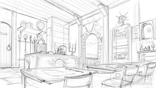
classroom1(from gamedev)
Thomas:
对于我来说这是最激动也是最让人害怕的一部分。看到我所设想或编写对话的游戏场景突然生动地呈现在我眼前真的很让人激动。在这一阶段,我会不断查看是否有Rogier的邮件以明确他的工作进度。
这同样也是让人害怕的一个阶段,因为如果草图的方向是错的,这便意味着自己未能有效传达观点。错误的草图意味着我们需要花费许多时间去寻找更棒的参考图像,编写更多文件并进行更多次的会议。而如果我认可了草图,那么所有人都会很开心的。
最后,作为一名非美术人员,我有时候并不清楚如何评价一副草图。草图中的门是关着的,但那却是最后一扇门。书架最上方的怪物的头不如最后的大。草图就像是故事的第一幕和第二幕。而第三幕会如何发展是取决于我的想象,并且我的第三幕可能与Rogier的不同。大部分情况我都会认可草图。而如果我们对图像拥有不同的看法,那么这种情况通常会出现在下一个阶段。
Rogier:
当Thomas批准了草图,我便开始将其绘制出来。有时候情况并不容乐观。因为可能本来作为草图很棒的内容在真正绘制的时候情况并不是很理想。你的脑子里有一副画,你感受到了这幅画最终将会很棒。但在其真正完成前,绘制的第一步骤却是很糟糕的体验!特别是当你开始审查你的草图并发现自己犯了许多错误时。
因为各种原因我使用了参考。大多数情况下我是为了材料或光线使用它们。当我不知道某些内容在“现实世界”的特定照明设置下是怎样时,我便会找出类似的图片进行研究。
绘制的开始阶段可能很有趣也可能很痛苦,会让你怀疑自己以及你要创造的理念。过程是不同的,但我发现从大到小最有效。我会先草拟出形状,并详细勾勒出一些形状,让它们区分开来以明确整体价值。然后我再进行一些较小的内容。我尝试着马上明确整体的图像;基于这种方式你能够拥有更高的“控制”程度,并能够掌握图像的最终发展,视角以及最后的构成。
在这种情况下,我可能会喜欢最初的图像。我有信心自己能够将其变成一副让人满意的图像。
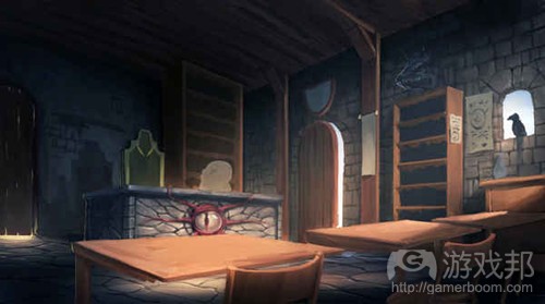
classroom2(from gamedev)
Thomas:
这是一个关键阶段。现在我知道图像是怎样的。当然了,我们还漏掉了许多细节,如氛围,灯光和颜色等等。也许我不知道第三幕的结局,但我可以看出它的要旨。
Rogier:
随着最初的颜色获得认可,我们便确定了许多内容。现在是时候致力于细节了,即我所谓的“渲染”—-我是亲手执行这一工作。
在这一部分中,你可以暂时关闭大脑而只是专注于绘画便可。可以说这是非常轻松的一部分。
在致力于一个项目的时候我一般不会有休息时间。但这却是个大错误。而现在我领悟到了只有休息才能加快工作进度。在离开一阵子后重新回到工作中能够让我更清楚地看到自己正在做什么。这是我花费好几个小时一直着眼于同一张图时领悟不到的。我会让自己休息一会以避免出现“噢不,我到底做了什么?!”,或者更糟糕的是收到来自客户的修订要求。
因为这是关于独立开发,所以如果时间和预算安排都很紧凑的话我们便会很棘手。我们最好能够将三天的工作量安排到四天时间里。特别是美术工作更是急不来!
这里有一个具有帮助的窍门:翻转你的画布从而让你能够从一些新的视角去审视图像。当你翻转图像时,你的大脑也会进行新的思考,这能够帮助你更好地找出问题所在。
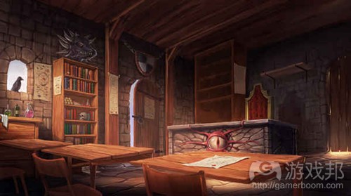
classroom3(from gamedev)
同时,缩小图像,以避免图像的氛围/感觉与细节不符。缩小图像能够帮助我们更轻松地明确重点,也就是“更多细节”。这能够强化绘画的整体。
另一方面,我希望观众在着眼于图像时能够拥有一些关注内容。当他们专注于其中时,便能够发现一开始未注意到的细节。这让图像更具有吸引力。然而保留氛围和构成也很重要。图像可以伴随着灯光和气氛,并保留细节,从而达到最优平衡。
现在是时候将最终作品发给Thomas并再次寻求反馈。只是为了最后校订而添加许多细节到一个绘画元素中真的会浪费了所有人的时间。

classroom4(from gamedev)
Thomas:
在这一阶段,我很清楚图像的最后发展。这时候我可能会要求对方做出较小的校订,但我们也通过了一些较大的校订内容。我很高兴看到图像的诞生,并告诉Rogier继续完善。因为我太过兴奋了,所以我几乎每一天都在问他是否完成了图像。
Rogier:
当我获得反馈和认可后,我进入了最后的细节阶段。
我继续添加完善各种细节并添加一些氛围,同时我还减小了一些暗色区域的饱和度。这将让整体画面更平和,并让我能够控制观众的视线点。
然后我将其发给Thomas进行最后审核。
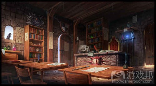
classroom5(from gamedev)
不管怎样我真的很高兴能够看到最后的图像。它真的很详细,但却一点都不会让人觉得无聊。当你压缩图像时,其中的组成内容仍然能够清晰地呈现出来—-这也是一个加分点。当近距离看它时,你不会有任何内容是“未渲染的”想法;你可以清楚地看到所有事物!
Thomas:
我可以一整天都凝视着这张图像!
Rogier:
我迫不及待地想看到完整的游戏了。
Thomas:
多谢你Rogier!
(本文为游戏邦/gamerboom.com编译,拒绝任何不保留版权的转功,如需转载请联系:游戏邦)
Inside the Indie Art Process of Archmage Rises
By Thomas Henshell
I’m relatively new to art appreciation. A big turning point for me was a few years back when I read John Milton’s Paradise Lost. Since then, my appreciation for art and the artists behind the work has continued to grow. I even have some Peter Max limited edition prints hanging on my walls.
I’m a huge fan of fantasy art and pretty much any game art coming out of TSR in the 1980s. There is something about the oil on canvas, seeing the stroke of the brush—which for me sort of elevates the work. I’m not complaining about the perfection found in digital painting—just that I like the “handmade” quality brush strokes bring.
Archmage Rises is a love letter to tabletop role-playing games. The art style is ’80s TSR for the modern area.
I can’t afford to hire Larry Elmore, Todd Lockwood, or Keith Parkinson. So to recruit artists, I went through hundreds of fantasy art portfolios on Deviant Art. Of those, I contacted many. Of those, I worked with three. Rogier van de Beek’s style was (by far) my favorite.
So this week, we’re going behind the scenes with Rogier on how he does freelance indie game art. Take it away, Rogier!
Rogier van de Beek:
Whether for concepts, game art, or promotional purposes, you’re going to need someone to create the art. Visual representation is the easiest way to set a mood or tell a story after all, since human beings are highly visual.
Although Archmage Rises is heavy on storytelling, art is still needed to set the tone or mood. This is where I come in. My name is Rogier van de Beek, a freelance concept artist and illustrator from the Netherlands. I’ve worked with Thomas for the past seven months on Archmage Rises, and I have to say that it’s been a total blast. But enough talk: Let’s take a deep dive into the piece, “The Mage Classroom.”
First off, every artist out there has a unique own way of working. As they say, there is more than one road that leads to Rome. So the first lesson is to follow the one you are most comfortable with!
The goal for this image was to create a classroom where a mage teacher imparts his or her knowledge. Someone who is talented, but not overly powerful or special. It is a pivotal point in the character creation process. The room is owned by someone who knows a lot about magic and teaches the children their foundational knowledge.
The first step is always to discuss the image idea with Thomas. Maybe he has something specific in mind like a certain type of chair, or monster skull on the wall. Other times, it’s just a certain emotion the image must evoke. I then ask him to provide me with several reference images. Having the client provide reference material eliminates a lot of guesswork and makes me feel more confident about the task.
Thomas Henshell:
Finding reference images takes forever! As a programmer, designer and writer, I don’t really know what I want other than “I want it to be awesome!” Isn’t that enough direction? ![]() Finding reference images helps me narrow down the ideas into something more concrete—something that both of us can understand, point at, and discuss. So I definitely see the value of spending hours finding the right references.
Finding reference images helps me narrow down the ideas into something more concrete—something that both of us can understand, point at, and discuss. So I definitely see the value of spending hours finding the right references.
Rogier:
After the initial discussion, I look through the provided references but also find my own. I’m looking for a way to capture all the important ideas in a single image. Then it’s time to start sketching!
I start by exploring the composition of the image. Camera angle is super important, for example. I don’t create a list of objects or anything, I just imagine what I would see if I was standing (or sitting) in that location. Then I move into what would be the most interesting way to display all the elements in the image. Like the large chair of the teacher. The giant desk. The magical staffs and the bookshelves. It needs to feel like a real classroom.
After doing some sketchbook work and exploring the idea, I finally have something I can use. It’s time to switch to the tablet in order to be able to sketch it up digitally—and then send it off to Thomas and find out what he thinks.
Thomas:
This is the most exciting and scary part for me. It’s exciting to see a game scene I’ve only thought about or written some dialogue for suddenly come to life right before my eyes. At this stage, I pounce on any email coming from Rogier so that I can see what he’s done.
It is also scary because if the sketch is completely wrong, it means I haven’t done a good job of communicating the vision of what is needed. A wrong sketch means lots of time has to be spent finding better reference images, writing more documentation, and having more meetings. So everyone is happier if I just approve the sketch.
Finally, as a non-artist, I sometimes have a hard time knowing how to evaluate a sketch. The door in the sketch isn’t open, but it is in the final. The monster head on top of the bookshelf isn’t as large as it is in the final. A sketch is like Act 1 and 2 of a story. Its up to my imagination what Act 3 will look like, and my Act 3 may be different from Rogier’s. I usually will approve a sketch without changes. If we have totally different visions for the picture, it will show up at the next milestone.
Rogier:
When Thomas approves the sketch, it’s time to start painting it up. Sometimes this can be very intimidating! What looks great as a sketch may not look great as a painting… You have the lines, you have a picture in your head, you have a feeling this picture will be really cool when it’s done. But until it’s done, the first steps of painting it up will be horrible! Especially when you start going over your sketch and finding all the mistakes you made. Yikes!
I use references for many different reasons. Most of the time, I use them for materials or lighting. When I don’t know how something will look in a certain lighting setup in the “real world,” I try to find a picture of it so I can see how it really looks.
The beginning of a painting can be a lot of fun or be absolute hell and make you doubt everything about yourself and the idea you have set up to create. ![]() The process varies, but I find it’s always best to start big and go small. I ‘block in’ the shapes, detail a bit of the shapes, and make them more distinguished to get the overall values in place. Then I go smaller and smaller… I try to work out all of the picture at once; this way, you have a higher degree of “control,” understanding where the picture is going to end up, the POV (point of view), and final composition.
The process varies, but I find it’s always best to start big and go small. I ‘block in’ the shapes, detail a bit of the shapes, and make them more distinguished to get the overall values in place. Then I go smaller and smaller… I try to work out all of the picture at once; this way, you have a higher degree of “control,” understanding where the picture is going to end up, the POV (point of view), and final composition.
In this case, I happen to like the initial illustration. It wasn’t too long before I had some nice values and mood in the picture. I was confident that I could take it all the way through to a satisfying conclusion.
Thomas:
This is a pivotal stage. Now I understand what the picture will look like. Sure . . . a lot of detail is missing—but the mood, lighting, and palette are all there. I may not know how Act 3 ends, but I can see the gist of it!
Rogier:
With the first general colors in and approved, pretty much everything is set up. Now is the time for detail work, which I call “rendering” even though I’m doing it by hand ![]()
This is the part where you sort of shut off your brain and just paint away hour after hour. The relaxing part of the job, finally!
I used to not take any breaks while working on a project. That was a (big) mistake. I now understand that taking a break actually speeds things up. Leaving and returning allows me to clearly see what I am actually painting. Surprisingly so, spending hours looking at the same image makes it harder to see. I take a break to avoid the feeling of ‘Oh no, what have I done?!’ – or worse, getting a bunch of revisions from the client.
Since this is all about indie development, it can get tricky because timelines are tight and budgets are tighter. It is better to spread three days’ work over four actual days and do some other little things in between, than to power through. A work of art cannot be rushed!
Here’s a helpful tip: Flip your canvas a lot so that you get a fresh view of your image. When you flip (mirror) your image, it sort of refreshes it in your brain—which helps when looking for mistakes.
Also, zoom out a lot to avoid tuning the mood/feel of the image out with too much detail. Sometimes images can be so detailed that they end up looking dead. Zooming out makes it easier to figure out where the focal point should be, which equals “more detail.” This greatly enhances the overall composition of the painting.
On the other hand, I want viewers to have something to see wherever they look in the image. As they focus in, they discover details they hadn’t noticed at first. This makes the image more engaging to look at. However, preserving the mood and composition is essential. Play with light and atmosphere, and keep detail in check to create a nice balance.
Then it’s time to send the finished work to Thomas again for feedback. It wastes everyone’s time to put lots of detail into an element of the painting only to have it moved or removed due to late revisions.
Thomas:
At this stage, it’s clear to me how the picture will end up. Small revisions may be asked at this point, but we’re way past any big revisions. I generally am very excited to see it coming to life and tell him just to keep going. Due to my excitement, I pretty much bug him every day to see if he is done yet ![]()
Rogier:
Once I get feedback and approval, I go into the final detail phase.
I continue with the detailing and then add some atmosphere while desaturating some of the darker areas. This will tie the whole piece together and give me more control on where I want the viewer to look.
Then I send it off (hopefully!) for final approval.
Overall, I’m pleased with how the image turned out. The fact that it’s detailed but never gets boring to look at is something I’m really proud of. When you size it down, the values and composition still work really well—which is also a plus. When up close, nothing feels “un-rendered’; you can always tell what you’re looking at!
Thomas:
I could stare at it all day.
Rogier:
I hope this art walkthrough was helpful! Can’t wait to play the finished game.
Thomas:
Thanks, Rogier!
SDG
(source:gamedev)

")
")
")
")


 闽公网安备35020302001549号