阐述游戏关卡设计中的色彩理论
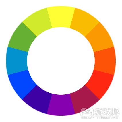
首先让我们看看普遍意义上的色彩理论:维基百科解释了色环如何建立了12种重要的颜色。其中3种是原色,3种是次色(混合了3原色),6种是第三色(由在原色和次色合成的)。3原色组成了一个三角色(红黄蓝)。次色(绿、紫、橙)则直接介于原色之间,它们也组成了一个倒三角色。第三色介于原色和次色,将提供暗色。这一点很重要,因为它关系到人们如何看待色彩组合。
色觉
相邻的颜色很容易整合,直接交叉的颜色则对比鲜明,而1/3融合的色彩则更有特点。这意味着如果选择了黄色,那么略带黄色的颜色——绿色、淡橙、蓝色、红色和紫色如果使用得当,都能够相互搭配。关键在于如果选择了黄绿色来搭配黄色,那么使用蓝色就会显得很扎眼,因为蓝色并不能与黄绿色相搭配。
色彩选择决定着图像的一切,包括观者所产生的感觉,所看的位置,所注意到的重点(因为他们最先或最后看到该点)。
这是一个使用补色方案来达到理想的视觉吸引力效果的例子。色彩相互整合,你可以看到每种颜色与其他颜色的一致性。那么你所关注的就是图像中的名称、标志和内容。
这是相同瓶子的另一种包装,其调色盘总体被转换,其本身没有任何一种颜色发生变化。这些颜色的组合证明一个可靠的调色盘正是可靠图像的关键。
这种包装正是大家应该避免的做法:其中随机挑选的颜色胡乱地拼凑在一起组成了一个混乱的画面。人们的眼睛会因此错误地关注其中内容,有些内容淡入了背景,而副标题居然比名称还要显眼。
第一张图给人轻松的感觉,但最后一图却并没有呈现良好感觉。要令色彩的使用超越色彩帮助画面呈现良好感觉的范畴。
色彩的影响
色彩并不仅仅决定了物体的视觉效果。视力是人类的主要感官,无论人们看到什么都会对其产生超越图像本身的影响。每种颜色都带有与之相关的感觉和意义。这里我们以红色为例。
它是热情 、浪漫、危险 、温暖或血腥的象征。
如果要问红色所代表的意义或感觉,这应该是个相当标准的列表。选择颜色的深浅,以及它在图像中的使用方式,可以产生意义或感觉,但这里也存在上述提到的一些先入为主的偏见。人们都认为红色光线代表停止,绿色代表运行,闪光代表忙碌。当如果在创造一种场景时忽略了色彩在生活中的运用,那么观者就会误解自己本应该看到或感觉到的内容。每种颜色都有自己的内在意义,使用这种意义可让关卡设计师在自己的作品中创造出氛围。
例如,在《半条命2》中,淡蓝色光在组合城堡中创造了一种冷酷感。温暖的黄色光在Black Mesa East创造了令人舒适的感觉。《半条命2》的这种做法值得所有关卡设计师借鉴。
这一过程始于挑选场景的基调。这种预设的基调可能影响纹理和光色的选择。例如在一个令人毛骨悚然的沼泽场景中。黑色是一为神秘和具有威胁性的色彩,所以能采用暗色相及低亮度值。绿色则用于藻类和沼泽水。其中还需要一个小屋,所以看看色环中的1/3橙色与绿色的混合,并以一个暗色相得到褐色。这是一个对应该基调的完美强调色。裸色的木头是小屋的理想选择。此时图像就有了关键色,材料和感觉 ,通过让纹理和亮度与关键色理论兼容,场景基调就会不言自明。
新人们的一个普遍错误就在于饱和度。世界上几乎每件东西都不是单一色彩,呈现白色是因为其中一个波长穿梭得更顺利。因此,理论上黄色的灯光应该是加入一点点黄色的白色灯光。除非你故意要创造一种过度饱和感,否则就要切记这一点!
关注点
关注点就是设计师想让玩家去看的地方。它可能是一个干扰性事物,还是一个谜题,出口,甚至是下一个敌人,总之它就是玩家应该注意查看的地方。虽然创造关注点已经超越本文范畴(游戏邦注:色彩理论仅讨论亮度和颜色)但我们确实可以通过增加音频、动作、形状、光照或色彩来达成这一目标。使用色彩和亮度来创造关注点的最简单方法就是强调和对比,例如暗室中的灯光,一列红色交通锥中的一个蓝色交通锥。正如上文所述,强调和对比能够很好地运用于场景,所以通常并不难植入关注点。关键是要在正确的时机选择正确的物体。
回到上文中沼泽小屋的例子,小屋应该成为一个关注点。由于该图像调色盘以暗色为主,所以让小屋突出的最佳方法就是使用亮光。为小屋增加亮光,它就几乎立即成了一个完美的关注点,在强烈亮度对比下的强调色。玩家会注意到小屋并朝它前进。因为它很惹眼和突出。
关于糟糕的关注点的例子就是红砖小巷。砖头建筑并列两边,屋顶上有一块够不着的区域,它正是敌人的所在来源。增加绿色的大型垃圾桶,以及灰色的门,这幕场景就算完工了。红与绿,这也是一组对比色,垃圾桶与整个场景相兼容。但在试玩这个场景时就会发现问题。玩家够不着屋顶,但玩家会注意到垃圾桶,因为它是一个对比鲜明的元素。玩家就试图跳到垃圾桶,因为他们认为这可以帮助自己跳上屋顶。但玩家并没注意到门,因为它是一个自然色,它并非对比色或强调色。
这正是色彩与亮度的关注点问题。如果在制作场景时稍有不慎,就有可能让玩家关注了错误的事物。(本文为游戏邦/gamerboom.com编译,拒绝任何不保留版权的转载,如需转载请联系:游戏邦)
Color Theory in Level Design
First a bit on color theory in a general practice: Wikipedia explains how the color wheel is set up to show 12 important colors. 3 are primary, 3 are secondary (mixing the primary colors) and 6 tertiary colors (created by mixing primary and secondary colors). The primary colors form a triangle, (Yellow, Blue and Red). The secondary colors (Green, Purple and Orange are directly in between the primary colors). These also form an upside down triangle. The tertiary colors are in between the primary and secondary colors and will provide the shades of colors.
This is important because of how people perceive color combinations.
Color Perception
Colors found next to each other blend well, colors directly across contrast each other, and colors 1/3 the way round help accent. This means if yellow were chosen then the colors yellowy-green, pale orange, blue, red, and purple can all work with it if used properly. The key comes from the fact that if yellowy-green is chosen to work with the yellow then using blue becomes tricky as blue doesn’t work cleanly with yellowy-green.
The colors picked define everything about an image. What the viewers feel, where they look, what belongs there, and what they notice the most because they saw it first or last.
Original Packaging
This is a solid example of using complimentary colors to work to a nice visually appealing goal. The colors work together and you can see each color fitting in with the rest. The thing your attention is drawn to are the focus of the image such as the name, slogan, and properties.
Semi decent Packaging
This is another approach to the same bottle, the color palette in its entirety has been shifted, no individual color changed on its own, all colors changed the same amount. It all still fits together proving that an established palette is the key to a solid image.
Horrible Packaging
This packaging demonstrates what not to do: colors have been taken randomly from everywhere thrown together to make a mess of what can be a good image. The viewers’ eyes focus on the wrong things, and some properties fade into the background while the subtitle becomes more noticeable than the name.
The first images were easy to look at but the last image was one that did not feel right at all. Taking the colors used as more than colors helps an image feel better to the viewer.
Effect of Color
A color does more than simply define how objects look. Sight is the primary human sense, whatever anyone see affects them deeply and carries more effect than just that of an image. Each color has feelings and meanings attached to it. Take red for example.
A color of passion, of romance, of danger, of warmth, of blood.
When asked to list what red means or feels this is a pretty standard list. What shade is picked and how it is used in the image can give any feeling or any meaning, but there’s
preconceptions to deal with like the ones above. Everyone knows a red light means stop, green means working, blinking means busy. When creating a scene if how each color is used in life is ignored, the viewers will misinterpret what they’re supposed to see and feel. Every color has an inbuilt meaning and using that meaning is what allows level designers to create an atmosphere in their creations. For example in Half Life 2 pale blue lights to create a cold feeling in the combine citadel. Warm yellow lights to create a comfortable feeling inside the Black Mesa East. Half Life 2 uses this as a practice and every level designer can as well.
The process starts by picking the mood of the area. The mood intended should affect what textures are picked and what lighting colors are used. For example a creepy swamp scene. Black is a very mysterious and threatening color so go with darker shades and low brightness values. Greens for algae and swampy water are expected as this is a swamp so include those into the palette. A hut is needed for this, so checking the color wheel orange is 1/3 round from green and a dark shade gives the color brown. This gives a perfect accent color that fits the mood.
Using the brown a wood becomes a good choice for the hut. Now there are key colors, materials and a feeling, by sticking to textures and light that work with the theory of the key colors and moods the scene will make itself.
A nearly ubiquitous rookie mistake is saturation. Most everything in the world isn’t a specific color, it’s white where one of its wavelengths comes through better. As such, a yellow lamp in theory should be a white lamp with a little bit of yellow added in. Unless you explicitly want to create over-saturation, keep this in mind!
The only thing still missing is a point of focus.
Point of Focus
The point of focus is simply what the designer wants the player to be looking at. Whether its a distraction, the piece of a puzzle, the way out, or even the next enemy its where the player should be looking and going. While creating a true point of focus is beyond this article it can be done by any means including sound, motion, shape, light or color. As this is a color theory article only light and color shall be discussed. The simplest way to give a point focus with color and light is accents and contrasts, a bright light in a dark room, a blue traffic cone in a line of red ones. As stated before contrasts and accents can work well in a scene so its often not hard to include a point of focus. The key becomes making it the right object at the right time.
Going back to the example of the swamp with the hut, the hut shall be made a point of focus. As the palette will be mostly dark colors and light the best way to make the hut stand out is to use bright light. Add a bright light to the hut and it becomes almost instantly a perfect point of focus, an accented color under contrasting brightness. The player will notice the hut and move towards it. Because it’s noticeable, it stands out.
However for a bad point of focus move to a red brick alleyway. Brick buildings lining both sides, there’s an area on the roofs that’s out of reach its intended use is where the enemies come from. Adding in a green dumpster and a greyish door the scene is finished. Red and green, contrasting colors, the dumpster fits in the scene. Upon playtesting the scene comes the problem.
The player can’t get up to the roofs, but the player will notice the dumpster as it’s a contrast element. The player tries jumping around on the dumpster for 5 minutes because they think that’s how they’re supposed to get to the roof. The player hasn’t noticed the door because its only a neutral color, it does not contrast or accent.
This is the problem with point of focus in color and light. The wrong thing can be made to seem important if a scene is made carelessly. (source:developer)
下一篇:电子游戏是否该尽量提供更多角色






 闽公网安备35020302001549号