分享独立工作室的游戏易用性测试方法(2)
作者:Maria Sifnioti
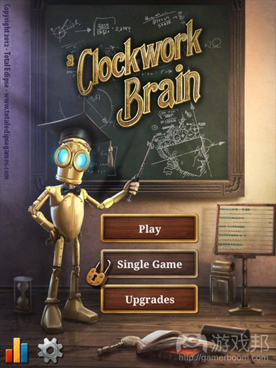
本文是详述iOS游戏《A Clockwork Brain》易用性测试设计及开展过程的第2部分内容。
研究、设计及开展易用性测试从始至终耗费1个月时间。在此之前,我们在设计正式易用性测试方面都没有任何经验。我自己在问卷设计和简化实验方面有些许经验,这主要源自我们之前的大学研究工作。
第一部分的文章内容主要解释我们的硬件和软件选择,详述设计成本。而本文则主要查看游戏本身及解释易用性测试过程。
本文中,我们将讨论下述话题:
* 了解你的游戏。
* 你希望邀请什么类型的玩家,我们如何招募他们。
* 找出测试内容。
* 设计首个易用性情境。
* 在测试过程中利用iGEQ问卷和开放式问题。
让我们开始吧!
了解你的游戏
我们起初不知道要如何着手。阅读相关文章几天之后,我们发现:
* 众多有用的网页易用性信息。
* 众多关于游戏易用性的学术文章。在我们看来,这些内容大多都过于学术性,无法立即进行实际应用。存在某些例外情况,详见下文。
* 有许多出自工作室之手的、清楚阐释游戏易用性的事后分析(游戏邦注:或是将其外包给易用性测试公司)。
我们发现,解决下述关键问题有助于后期设计工作。
游戏距离完工还有多久?
我们决定在Beta阶段前进行数个月的测试,这样多数插图和机制到时候就已完成。我们没有理由不在较早阶段进行易用性测试。事实上,我们觉得这有利于解决各种设计之间的分歧。你需要弄清完工阶段,因为你手头的内容就是你的测试目标。
通过仔细规划,你可以在不同制作阶段安排一个以上的易用性项目。
谁是你的玩家?
了解潜在玩家意味着你将清楚得安排哪些玩家测试你的游戏,是吧?是的,这是我在易用性文章中读到的大多数内容,但我并未将其看作是真理。我觉得你还应该邀请若干反派玩家,如果你希望游戏有更广覆盖面的话。
《A Clockwork Brain》是款针对大多数玩家的益智游戏系列。对于我们来说,控制装置要能够快速把握,即便玩家没有阅读指南(许多玩家都没有阅读指南),玩家要能够快速把握进展情况。因为这是款iOS游戏,我们的目标玩家是持有这类设备、会下载我们游戏的群体。但我们也将从未用过触屏手机的用户纳入在内。我们还邀请喜欢硬核游戏、不喜欢在自己的触屏手机上玩游戏的用户。
你通过未玩过这类游戏或未玩过游戏的用户获取的反馈信息非常有价值,会令你大开眼界。
你应邀请多少玩家?
Nielsen表示,邀请5名用户参加易用性试验是最佳选择。融入越多玩家,我们从中把握的东西越少。若你安排10-12名人员,最好将他们划分到2个连续的易用性试验中:进行首个试验,修复内容,进而第二个试验,测试你所修复的内容。其他人则建议在各试验中安排8-10名用户。总之,你手头要安排额外人员,尤其是:
* 各模拟易用性试验至少安排1名人员
在你将易用性设计呈现给有价值的玩家之前,你应先进行测试。模拟试验将证实,你预计的时间安排颇为合理,过程没有漏洞,所有内容进展顺利。显然,你不能借助参与易用性试验设计的人员。若你的模拟试验按计划完成,你的用户也是游戏的潜在用户,你将会在着手之前获得宝贵的反馈信息。我们的模拟试验就是这样——我们当天获得的多数反馈信息和我们在正式运行阶段获得的信息大同小异。
* 安排适当人员,以防有些用户最后没有出现
有人也许会取消约定——这不应影响你的试验。你应安排若干供你调遣的用户。在我们的两个易用性试验中,我们在首个试验中安排5位玩家,在第二个试验中安排6位玩家,还有2名人员配合各模拟运行环节。这里我们要强调的是,5名玩家是个合理数字,如果你不想要区分玩家。例如,如果你想要测试成年人&儿童的行为,那么你就需要在各试验中安排两组人员,1组是儿童,1组是成年人。关于此方案,Nielsen建议:
— 若测试两组用户,那么各类型各3-4名用户
— 若测试3组或更多用户,那么各类型安排3名用户(你总是希望有至少3位用户,以确保能够囊括小组中的多元化行为)。
如何招募玩家?
我们通过Facebook和Twitter平台发动call for Beta Testers计划,从中招募玩家,在此我们安排有兴趣的人士填写调查表。
最好是提前计划,融入同时也能够帮你挑选未来项目测试玩家的问题。你需要知道年龄和性别之类的典型信息,还有玩家能够接触到什么技术,他们玩游戏的频率,基于什么设备。这样你还能够扩宽潜在测试者的覆盖面;完成我们调查问卷的用户只有40%来自希腊。最后,这能够让你在玩家到达现场前,了解他们的信息——这样玩家就不会花费宝贵时间完成用户信息问卷,相反,会着眼于关键内容:游戏。
顺便提一下,务必给予玩家奖励,提供刺激因素。我们的每位易用性测试参与者都会得到我们的2份游戏及2张闪亮的游戏海报。
我们想要测试什么?
这是个很难回答的问题,需进行严肃思考和计划,因为这会定义易用性试验本身的结构。在《A Clockwork Brain》中,我们发现尽可能准确描述游戏非常有帮助,然后从此着手。总之,它的特点是:
* 具有蒸汽朋克外观和感觉的免费下载脑力训练游戏。
* 平台:植入应用内部消费的iOS。
* 奖励玩家的代币机制。
* 11个迷你游戏测试各种技能(如逻辑和算法):4个免费,6个通过虚拟交易购买,1个通过代币解锁。
* 各迷你游戏有单击控制装置。
* 玩家需要在1分钟里给出尽可能多的正确答案。若他们表现突出,关卡就会变得越发困难。若他们回答错误,任务就会变得更加简单。
* 两种体验模式:Challenge(连续4个迷你游戏)和Single Game(随意体验任何游戏)。二者都以Token作为奖励,将分数提交至本地&全球排行榜。
仅是通过这么做,我们意识到,自己希望测试两种不同的游戏元素:
1. 迷你游戏本身。各迷你游戏机制是否按计划运行?个人指令是否足够清晰?玩家喜欢或者不喜欢迷你游戏?
2. 我们对于此“仅下载应用”体验的落实情况如何?游戏在初期关键时刻的运行情况如何?
这些元素取决于第一印象,是相互抵触的关系。初次体验游戏的玩家不会立即访问到所有游戏内容,或Single Game模式。另一方面,玩过所有迷你游戏的玩家不是测试“游戏初体验”的最佳人选。我们需要至少2个截然不同的易用性试验,由两组不同的全新玩家完成。
第一个试验:测试迷你游戏
这一试验主要着眼于各迷你游戏的易用性和可玩性。我们首先是给各玩家设定若干任务:
1. 玩家需要体验各迷你游戏3次:这能够确保玩家清楚把握机制,能让我们获悉他们从完全的新手到新手的表现情况。例如,是否存在这样的机制:他们似乎到第3次试验才把握,但我们希望他们能够立即把握?
2. 玩家需要完成各迷你游戏的问卷调查:完成迷你游戏后,玩家需要进行评估其对迷你游戏第一印象的问卷调查。
3. 我们应和玩家进行最后讨论:试验结束后,就他们的总体体验展开沟通。
各任务/要求对于试验的设计有深远影响。
迷你游戏的顺序
由于游戏基于认知技能,因此我觉得,若玩家需要体验各迷你游戏3次,完成11种迷你游戏,他们将非常疲惫。我们需要确保,玩家不会因心力交瘁而给迷你游戏消极评价。为保持平衡关系,我们根据参与者调整各个游戏的体验顺序。我们的内容包括:
* 4个核心游戏(免费游戏,可供所有玩家体验,较高优先级,良好第一印象最重要)。
* 3个各包含2个游戏的包裹(付费游戏,付费体验,中等优先级)。
* 随后解锁的奖励游戏(通过Token激活,低优先级)。
这里需要强调的是,在试验中,所有游戏都平等呈现给玩家。我们不会透露游戏类型,以防影响玩家的看法。当玩家出现在Singe Game Mode时,他们需要体验迷你游戏。
事实上,游戏给各个玩家安排不同的体验顺序。为在Singe Game Mode中快速转变游戏顺序,我们举行游戏内部的开发者座谈会,这让我们能够在试验之间快速做出类似变更。我们还植入快速“保存/导出”玩家数据功能,这让我们能够快速将各玩家的具体分数保存于数据库文件中。最后,为了帮助玩家简化体验,我们隐藏若干菜单选项,这不是这一试验的必要内容(游戏邦注:如Upgrades版块和Challenge模式)。
设计问卷调查
各迷你游戏的问卷调查需保持简短,方便玩家完成内容,其中原因显而易见。我们想要知道玩家是否享受其中,是否面临足够挑战,他们是否沉浸于游戏之中,他们是否喜欢游戏的视觉效果。最后,我们想要通过玩家获悉若干易用性信息:他们是否清楚关卡何时改变?当玩家做出正确回答时,游戏是否清晰显示?反馈信息是否足够?
问卷调查由两部组成。第一部分是iGEQ版本(FUGA的游戏体验问卷调查)。iGEQ是包含42个问题的游戏体验问卷调查的简称。各问题着重于不同因素,如技能,感觉和想象沉浸性,流动性,紧张感,挑战和消极/积极影响。
我们根据FUGA的指令将GEQ翻译成希腊语,然后将iGEQ调整成迷你iGEQ。我们没有设置14个问题,给各个因素各2个问题,相反我们设置7个问题;各因素各1个问题。关于调查方面,这不是相当准确,因为针对同个因素设置更多问题能够进一步强化结果。但在所有iGEQ记录中,玩家鲜少完成内容超过3次。就我们而言,玩家需要完成11个问题,因为1个迷你游戏有1个问题。因此,我们针对各因素选择最具代表性的问题。
最后讨论内容
关于此,最重要的是,让玩家谈论和表达他们对游戏的感觉。这也让我们有机会就在试验中所发现的问题进行发问。我们给予这部分内容极大灵活性,除设定若干具体问题外,如玩家是否有最喜欢/最不喜欢的迷你游戏。回过头看,没有提问玩家的固定问题列表不是可取模式。有时,问题的提问具有引导性。此外,我们试验过程的一个推进因素是,故意提及之前玩家在游戏中的表现,进而影响讨论结果。在第二个易用性试验中,我们仔细设定所想要提问的问题,在讨论过程中将内容打印出来。
总结
这是文章的结尾部分;我希望你觉得内容颇为有趣。本文中,我谈及我们的具体游戏内容,如何确定测试内容,如何招募玩家,以及如何着眼于迷你游戏设计易用性试验。(本文为游戏邦/gamerboom.com编译,拒绝任何不保留版权的转载,如需转载请联系:游戏邦)
Game Usability Testing for Indies: It’s Easier than you Might Think! (Part 2)
by Maria Sifnioti
This is the second in a three-part series of articles detailing how we designed and deployed usability testing for our latest iOS game, A Clockwork Brain.
The research, design, and deployment of usability testing took one month from start to finish. Prior to this, none of us had any experience with designing formal usability testing. I, myself, have had some experience in questionnaire design and facilitation of experiments, based on previous work in university research.
The first article explained our choice of hardware and software and detailed the set-up costs. This article examines the game itself and explains its usability testing procedure.
The following topics will be discussed:
* Knowing your game.
* What kind of players we wanted to invite and how we recruited them.
* Discovering what to test.
* Designing the first (of the two) usability scenarios.
* Using the iGEQ questionnaire and open-ended questions, during testing.
Let’s begin!
Know your game
We had no idea how to proceed in the beginning. After reading articles for days, we discovered:
* A ton of information on web usability that could be helpful.
* A lot of academic articles on games usability. Most of them were found to be too academic-oriented and with no immediate practical application in our case. Some exceptions did exist, which are referenced below.
* A handful of post-mortems with clear how-to’s on games usability by games studios themselves (or contracted usability companies).
We found that answering the following key questions proved very helpful with the subsequent design.
How far is your game from completion?
We decided to test a couple of months before Beta, so most artwork and mechanics were completed by then. There is no reason why one should not do a usability test at a much earlier stage. In fact we think this would be very beneficial in resolving disputes between different designs. You need to know the stage of completion simply because what you have is what you can test.
With careful planning you could organise more than one usability sessions at different stages of your production.
Who are your players?
Knowing your prospective players means knowing whom you should invite to play-test your game, right? Well, that is what I read in most usability articles but I do not take it as gospel. I think you should also invite some anti-players if you want your game to have a very broad reach.
A Clockwork Brain is a series of puzzle games that target pretty much everyone. It is imperative for us that the controls can be quickly understood and, even if someone does not read tutorials (many people don’t), she should quickly grasp what’s going on. Because it’s an iOS game, our targeted players should be ones that own such devices and thus would be also likely to download our game. However, we also brought in people who had never used a touchphone in their lives. We also invited people who we knew love hardcore games and dislike playing games on their touchphones.
The feedback you get from people who have no experience with your game’s genre, or with games in general, could be extremely helpful and a real eye-opener.
How many players should you invite?
Nielsen suggests that 5 users is the best number for a usability session. As one adds more and more users, he learns less and less. If you have 10-12 users, it is much better to split them in two consecutive usability sessions: do the first, fix stuff, do the second and test what you fixed. Others suggest 8-10 users per session. In any case, consider that you must have some extra users handy and in particular:
* At least one for each mock usability session(s)
Before you unleash the usability design onto your worth-their-weight-in-gold players, you should test it. The mock session will verify that the timings you have estimated are correct, the procedure has no holes, and that everything runs smoothly. Obviously don’t use someone who has worked in designing the usability session. If your mock session goes according to plan and your user is also a prospective user of your game, you will have valuable feedback before you even begin. That’s what happened with our mock sessions – most of the feedback we got on that day we also got on the official runs.
* People to invite in case of no show
Someone might cancel – this should not affect your session. You should have a list of people you can invite in their place. For our two usability sessions we had 5 players in the first, 6 in the second and two more for each mock run. We should stress here that 5 players is a good number if you don’t want to differentiate between the players. For example, if you wanted to test the behaviour of adults vs. the behaviour of children then you would need two groups for each session, one with children and one with adults. For this scenario, Nielsen suggests:
* 3-4 users from each category if testing two groups of users.
* 3 users from each category if testing three or more groups of users (you always want at least 3 users to ensure that you have covered the diversity of behaviour within the group).
How will you recruit your players?
We recruited players through a call for Beta Testers through Facebook and Twitter, where we tasked interested persons to complete a survey.
It’s best to plan forward and include questions that will help you select players for future projects, as well. You need to know typical things like age and gender, but also what access to technology a player has, how often he/she plays games and on which devices. This way you can also broaden your reach of possible testers; just 40% of those who completed our survey were located in Greece. Lastly, this allows you to have each player’s demographic info before he/she arrives at the session – so the player won’t spend precious time completing demographic questionnaires, and will instead focus on what matters: the game.
By the way, make sure that you reward the players, give them an incentive. In our case, each usability participant was rewarded with two of our games plus two shiny game posters.
What do you want to test?
This is a very hard question to answer and requires serious thought and planning because it will define the structure of the usability session itself. For A Clockwork Brain, we found it helpful to describe the game as concisely as possible and start from there. You can read the description here. In summary, it identifies:
* Free to download Brain-training game with a Steampunk look and feel.
* Platform: iOS with in-app purchases.
* A Token system that rewards players as they play.
* Eleven mini-games testing various skills (such as logic and arithmetic): 4 free, 6 bought through in-app purchases and one unlocked with Tokens.
* One-tap control for every mini-game.
* The players have to give as many correct answers as possible within a minute. If they do well, the levels become harder. If they answer wrongly the tasks become easier.
* Two modes of play: Challenge (4 mini-games in a row) and Single Game (play any game you want). Both give Tokens as rewards and submit scores to local & global Leaderboards.
Just by doing this we realised that we wanted to test two different aspects of the game:
1. The mini-games themselves. Does each mini-game mechanic work as planned? Are the individual instructions clear? Do players like, or dislike, the mini-game?
2. How well have we implemented the ‘just downloaded the app’ experience? How does the game flow in those first crucial minutes?
These aspects depend on first impressions and are conflicting with each other. A player, playing for the first time, would have no immediate access to all the games, or the Single Game mode. On the other hand, a person who has played all the mini-games and has had experience with the game would not be a good candidate for testing the ‘first experience with the game’. We needed at least two, differently designed, usability sessions with two different, fresh, sets of players.
1st Session: Testing the Mini-Games
This session focuses on the usability and playability of each mini-game. The first thing we did was to set some tasks for each player:
1. The player has to play each mini-game three times: This would ensure that players would have (hopefully) understood the mechanics and would also allow us to see how they perform from total novices to just novices. For example, is there a game mechanic that they seem to understand later, in the third session, that we’d want them to understand immediately?
2. The player has to complete a questionnaire for each mini-game: Immediately after playing the mini-game, the player should complete a questionnaire that evaluates their first impressions of the mini-game.
3. We should have a closing discussion with the player: Once the session is over, have a discussion about their overall experience.
Each task/requirement had further implications on designing the session.
Mini-games order
Because the games are based on cognitive skills, we thought they could be tiring for the player if he’s asked to play each mini-game 3 times and has 11 games to play. We had to ensure that the player will not rate a mini-game negatively because he is somehow mentally tired. In order to be balanced, the order with which games are played changes for each participant. We have:
* Four core games (free games, playable by all, high priority, good first impressions matter the most).
* Three packs of two games each (premium games, playable by those who purchase, medium priority).
* One bonus game that unlocks much later (activated with Tokens, low priority).
It should be stressed that during the session all games are presented as equal to the player. Any categorisation of the games is not revealed, in case that it might somehow affect the player’s perception. The player is simply asked to play the mini-games as they appear in Singe Game Mode.
In reality, each player is assigned a different play order. To quickly switch the game order in Singe Game Mode we implemented an in-game developer’s panel that allowed us to make changes like this rapidly between sessions. We also implemented a quick ‘save/export’ player data feature, which allowed us to quickly save each player’s detailed scores in a database file. Lastly, to make the experience easier for the player, we hid some menu options that were not required for this session, such as the Upgrades section and Challenge modes.
Designing the questionnaire
For obvious reasons, the questionnaire for each mini-game had to be short and easy for the player to complete. We wanted to know if the player was having fun, if she had enough of a challenge, whether she was immersed with the game, if she liked the visuals. Lastly, we wanted to get information from the players on specific usability areas: Did they understand when the level changed? When they answered correctly, did the game make it clear enough? Was the feedback sufficient?
The questionnaire consists of two parts. The first part is a version of iGEQ (the in-Game Experience Questionnaire by FUGA). The iGEQ is a shorter version of the 42-question-long Game Experience Questionnaire. Each question gives weight to different factors, such as competence, sensory and imaginative immersion, flow, tension, challenge and negative/ positive affect.
We translated the GEQ in Greek as per FUGA’s instructions and then adapted the iGEQ to a mini-iGEQ. Instead of 14 questions, two per factor, we used 7; one for each factor. Research-wise, this is not extremely accurate as more questions for the same factor will give greater strength to the results. However, in all documented uses of the iGEQ, the players rarely completed it more than 3 times. In our case, the player had to complete 11 of those, as we needed one for each mini-game. As a result, we chose the most representative questions for each factor (in their Greek equivalent) and used those.
Here’s the full GEQ questionnaire translated in Greek along with the questions chosen for iGEQ and mini-iGEQ. Additionally we provide a sample of the resulting questionnaire in English and Greek, for one of the mini-games.
Closing Discussion
A big part of this was letting the players talk and express their feelings regarding the game. It was also an opportunity for us to ask questions on issues we observed during the session. We left that part pretty much unscripted, apart from having a few set questions such as whether they had any favourite/least favourite mini-games. In retrospect, not having a fixed list of questions to ask the player was not a good approach. Sometimes, questions were asked in a leading way. Additionally, one of our facilitators perhaps inadvertently influenced the discussion by referring to previous players’ performances in the game. For the second usability session we carefully created all the general questions we wanted to ask and had a printout during the discussion.
Conclusion
This marks the end of the second usability article; I hope you’ve found it interesting. In this article I have explained what our game is, how we decided which parts of it we wanted to test, how the players were recruited and how we designed the usability session focusing on the mini-games. The final part will examine the second usability session. We’ll also discuss the lessons we took away from the whole experience and, of course, present some results and design choices that we made due to the usability sessions.(Source:gamasutra)
下一篇:电子游戏的叙事潜能或超越其他媒体


