强大的用户界面可以增强玩家的游戏体验
作者:Brice Morrison
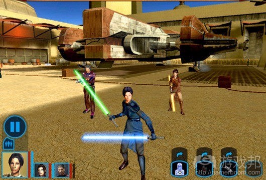
用户界面(游戏邦注:下文简称UI)是游戏设计中的重要组成部分,但这块创新之地常常被人所忽视。遵循设计惯例非常简单,比如得分位于上方,当前装备的武器和生命值状态放在角落等等。这种结果显得过时,有时会充满整个屏幕,让玩家觉得他们正在使用字处理软件而不是进入某个虚拟世界。
但是UI应当成为游戏中需要设计师投入大量精力的领域。这是玩家理解游戏以及同游戏互动的方法。想象下,游戏中的劣质UI就像是设计精巧的汽车上有个劣质的方向盘,或者是某本著作中有着难以辨认的字迹。尽管这些缺点不会影响到汽车的马力或者书本中的角色发展,但是它们仍然会极大地提升或者损害到用户的最终体验。
因而,设计师应当关注UI,对其的重视应当等同于游戏设计中的其他层面。UI中的每个部分是否都能够为游戏尝试传达的核心体验提供支持呢?如果不是的话,那么为何要在UI中使用这个部分?如何改善这个部分?
游戏设计:环境内置UI
可应用平台:动作游戏
可应用体验:游戏希望能让玩家沉浸其中
《死亡空间》系列游戏有着强大的UI设计。在《死亡空间》和近期发布的《死亡空间2》中,Visceral团队利用了某个不被人重视的功能,并将其整合到用户体验中。
不隐藏在菜单之后
《死亡空间》的核心体验是让玩家不断感到受到威胁,从未感到安全,让玩家总处在焦躁不安和危险的境地中。因而,游戏就需要强效的沉浸感,这样玩家玩家就会遗忘他们正处在游戏中,认为自己正处在一艘荒废的宇宙飞船上。设计不佳的UI或者“点击这里!”之类的做法都可能摧毁开发团队耗时数个月才营造出的环境。因而,《死亡空间》的UI努力以某些不同的方法来表达部分环境。
教程介绍。在《死亡空间2》开场时,玩家看到的首个UI场景就让人感到发狂。在很近的距离之外,有个战友刚刚被杀死,更多的怪物和敌人不断从四处冒出来。
对设计师而言,那种可能摧毁整个场景的UI设计较为简单,因而极具诱惑力。但是《死亡空间》的主要UI形式更好地融入到环境中。UI以主角Isaac Clarke服装上附着的全息图的方式弹出,随房间中其他灯光的频率闪烁。而且,UI并没有同行动脱离,它跟着Isaac移动,从未离开过游戏世界。
生命值和弹药。贯穿《死亡空间》系列的另一个优秀UI设置范例便是现已闻名的背部UI,Isaac的生命值、弹药和其他常见UI道具都不设置在屏幕的角落中,而是显示在角色的背部。
他的背部某些部分亮度较高,可以从蓝色变成红色,Isaac的背部会给玩家传达所有他们需要知道的信息,同时仍然让玩家保持沉浸在游戏黑暗且充满死亡气息的世界中。
如此设计的结果是,既可以告诉玩家他们需要采取的做法,又不会公开地提醒玩家他们只是在玩游戏而已。
门和可互动物品。《死亡空间》的环境中布满了其他形式的UI,提示玩家需要采取何种做法来互动。但是,UI还是遵循了团队设定的设计原则:融入环境,不打扰玩家体验但是要传达所需的信息。
当Isaac走向不同的门、武器或道具时,UI显示全息图,明确地告诉玩家需要怎么做。当靠近门时,蓝色的图像会出现在门上,询问玩家是否愿意打开。游戏的科幻环境让玩家很容易相信这就是Isaac看到的情形,再次保持玩家沉浸在《死亡空间》的恐怖环境中。
吸引力和理解
强大的UI设计很难获得。尽管这并非最适合实验新颖设计的部分,但是如果实现可以保持游戏对玩家的吸引力,让他们理解游戏,这是优秀用户界面的两个关键点。(本文为游戏邦/gamerboom.com编译,拒绝任何不保留版权的转载,如需转载请联系:游戏邦)
Terrifying Immersion: Dead Space’s Masterful UI
Brice Morrison
User Interface is an important part of game design that is often overlooked as a place for innovation. It’s very easy to just follow the usual conventions – points go on the top, currently equipped weapon and life stats go in the corners, and so on. The result feels outdated and clunky, sometimes filling up the screen and making the player feel like they’re using a word processor instead of entering a virtual world.
But UI deserves to be an area of games that receives great effort from designers. It is the way that the player interacts with and understands the game. Imagine a well-designed car that had a poor steering wheel or a well-written book that had an illegible font. While these may not be as exciting as the car’s horsepower or the book’s character development, they still can greatly enhance or detract from the user’s finaly experience.
Thus, great care needs to be given to UI, and it should be held up to the same scrutiny as other designs in the game. Does each part of this UI support the core experience that the game is trying to convey? If not, why is it here? How can it be made better?
Game Design: In-Environment UI
Applicable Platforms: Action Titles
Applicable Experiences: Games seeking strong player immersion
Dead Space is a franchise that shines as a great example of strong UI design. In both Dead Space and the recent Dead Space 2, the team at Visceral made exquisite work of a feature that is normally thrown by the wayside, and made it integral to the experience.
No Hiding Behind a Menu
Dead Space’s core experience is for the player to constantly feel threatened, to never feel safe, and always be on edge and in danger. Thus, a strong sense of immersion was needed so that the player forgot that they were in a game and instead felt like they were on a derelict spaceship. A clunky UI or “Click here!” would threaten to ruin the environment that the rest of the development team had sunk months into. Thus, Dead Space’s UI strives to feel like part of the environment in a few different ways.
Tutorial Instructions. In the beginning of Dead Space 2, the first piece of helpful UI that the player sees is in the midst of mass hysteria. A comrade was just killed at close range, and more monsters and enemies are appearing all over.
It would have been tempting for the designers to ruin this scene by sticking a sloppy pop up in front of the screen, overlaid on top of the action. But Dead Space’s main UI format prefers to immerse itself better than that. The UI pops up as a hologram attached to main character Isaac Clarke’s suit, flickering just as all the other lights in the room do. And the UI isn’t disembodied from the action, it moves along with Isaac, never leaving the world of the game.
Health and Ammo. Another great example of good UI placement throughout the Dead Space series is the now-famous back UI, where Isaac’s health, ammo, and other common UI items are found not on some corner of the screen, but on his back.
By lighting up parts of his suit, shifting from cool blue to danger red, Isaac’s back gives the player all the information they need while still keeping them sucked into the game’s dark and deadly world.
The result is a great piece of UI that both tells the player what they need to do without being so overt that it reminds them they’re just playing a game. By staying quiet, getting the message across, and blending in with the action, the UI doesn’t so much as provide a spare breath to the player as the experience a heart-pumping opening sequence.
Doors and Interactables. Other forms of UI appear all over the environments in Dead Space, providing clues as to what they player needs to go in order to interact. However, the UI again follows the same design guidelines that the team set for themselves: be part of the environment, don’t be intrusive, but get the point across.
When Isaac walks up to different doors, weapons, or items, then the UI appears as a hologram, clearly telling the player what needs to be done. When nearing a door, a blue image appears on top of the door, asking the player if they would like to open it. The sci-fi environment makes it easy to believe that this is exactly what Isaac is seeing, again keeping the player inside the scary reality of Dead Space.
Engagement and Understanding
Strong UI design is hard to come by. While it isn’t often the most exciting part of a game to experiment with new designs, doing so can pay big dividends for keeping players engaged, helping them understand your game, the two keys to a great user interface.
Readers, feel free to comment below: are there any other recent titles you’ve noticed that have done great work with innovative UI designs? (Source: The Game Prodigy)
上一篇:分享制作优秀手机应用的6大技巧


 闽公网安备35020302001549号