如何将网站的易用性设计运用于游戏
作者:Anamaria Todor
Steve Krug所著《Don’t Make Me Think》一书早在2000年就问世了,然而它仍然被视为网站易用性设计的最好教程之一。我在2006年时第一次阅读那本书,自那以后,我就把它当作设计易用性的最好资料。那本书的副标题是“用常识设计网站的易用性”(“A Common Sense Approach to Web Usability”)。
如果你没还读过那本书,你真该读一读。至少在你知道我如何运用它的方法设计游戏之后。在本文中,我会介绍该书的几个最重要的章节,并解释如何利用其中的指标。
第一章:不要让我思考!
这是Steve Krug的第一条易用性法则。意味着如果你看到一个网页,如在线商店,你应该能快速浏览页面。如果你需要思考你看到的是什么,那就说明这个网站让你疑惑自己在看什么。如果网站的易用性良好,访问者将不经思考就知道自己在寻找什么。
Krug指出当设计网页时,为了达到完美的易用性,必须做几点分析。通常来说就是,最终结果应该一目了然,按钮就该有按钮的样子,链接看起来就像链接。
游戏也是一样的。观察玩家与游戏的互动方式,从他们按下的按钮开始。那些按钮像按钮吗?你可能会想,按钮应该体现游戏的主题,但能不能在保留一般按钮的特征同时仍然传达主题信息?
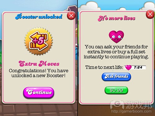
(尽管与普通的按钮相比,《Candy Crush Saga》的按钮就像糖果一样充满光泽,但仍然看得出来是按钮。)
另外再考虑一下你放进游戏的文本。越少越好,所以你应该把现在的文本量压缩掉50%。如果你能做到,那就继续压缩剩下的50%。
实用指标:与UI元素的互动率
为了保持UI简单,你可以建立一个追踪用户与UI互动活动的指标。记录玩家在什么时候接触了屏幕上的什么地方,据此你可以制作一个2D UI热点地图,显示用户如何使用UI,以及帮助你找出多余的UI元素。在触屏设备上,这还可以用于发现玩家是否难以按下按钮(表明UI元素太小或太挤)。
你还可以追踪玩家看到游戏主界面时按下某个按钮所花的时间。你从中可以知道游戏是否容易进入。如果用户花了很长时间在你认为很容易理解的东西上,那么也许你应该进一步简化界面了。
第二章:我们如何使用网站?
Krug认为人们并不是使用网站,而是“浏览网站”。人们打开网站后,第一眼看到什么就先看什么。如果发现不是自己要找的东西,他们就会继续看下一样东西,直到找到想看的内容。
人们并不会花时间考虑网站设计者的设想。在这个追求速度的时代,忙碌的人们只想开门见山。换成游戏,可以认为玩家想尽快玩到有趣的部分。
玩家在游戏中的“初体验”非常重要。如果玩家在玩了游戏一分钟以后还没有找到乐趣,他们就会退出游戏,把目标转向其他游戏。
在你的游戏中,你必须尽快“开门见山”,但还要记住,你也不能一次性把所有东西摆在玩家面前,让他们不知所措。玩家会学习你的游戏,即使你只能一点一点地教他们。一份条理清楚而有趣的指南能帮你达到目的。教你的玩家新东西,但要以有趣而简单的方式。另外,尽量不要使用文本。
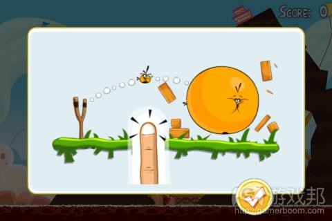
(《愤怒的小鸟》从来不用文本来教玩家玩游戏。)
实用指标:游戏教程
玩家(游戏邦注:特别是手机游戏玩家)非常不能容忍笨拙的和冗长的教程。他们安装游戏是为了玩,不是为了被教育。通常来说,你应该制作一份简短的教程,但这个工作的困难程度远远超过大多数开发者的想象。有时候,开发者们会忽略教程,直到游戏发布的最后一刻或游戏品质因此而下降的时候。建立检查玩家对教程反应的指标,不仅有利于你现在的游戏,而且有利于你以后做的游戏,因为你可以重复利用收集到的反馈。
建立衡量玩家执行教程各步骤所需时间的指标。据此,你可以知道哪一步是最困难的,以及完成所有教程所需的时间。这些资料可以拿来与相同玩家的登录情况作比较,看看游戏是否能吸引他们反复游戏。如果玩家甚至没有完成教程,那就说明教程设计失败,而那些数据将告诉你是什么原因导致玩家放弃。你还可以根据这些数据重新设计教程,把重点放在简化和缩短教程上。
第三章:减少干扰
在这章,Steve Krug讨论的是画面层次、利用约定俗成如可视区域、使交互元素更加显眼以及尽量减少干扰元素。重点是,给用户提供所有有用的信息,并且使他们能不费力地接收所有信息。
Krug建议我们本着常识做设计,使用普遍的UI设计。我认为这个建议也适用于游戏。HUD游戏包含大量关于游戏资源的信息和按钮,很容易使玩家不知从何入手。
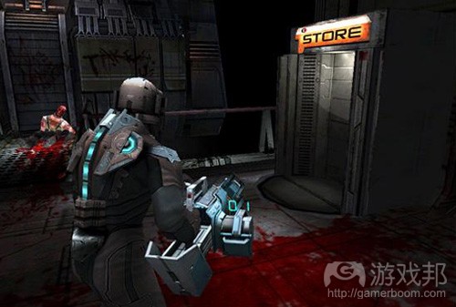
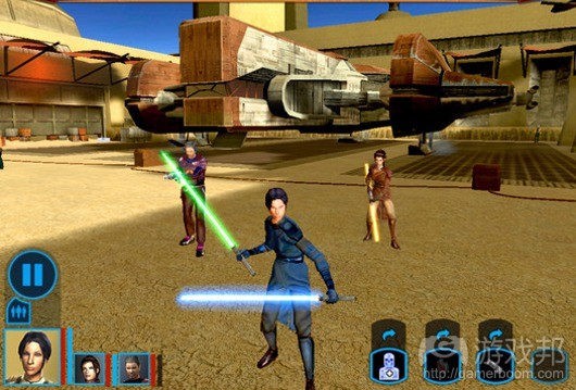
(《死亡空间》系列把简单的HUD与角色的装备融为一体,不会干扰玩家,这是值得欣赏的设计。)
第六章:导航
Krug认为第一次进入网站的人总是会在导航上遇到麻烦,但用户第二次访问时就很清楚在哪里找他们想到的东西了。
浏览网站可能是一件沉闷的事,如果所有导航元素散落在页面的各处。最好的组织结构是把所有导航元素放在页面顶部;把标题显示在顶部便于用户及时了解当前页面是什么。
Krug的导航原则也适用于游戏。大多数免费游戏都有一个向玩家出售服装、建筑等虚拟道具的商店。玩家应该能够从一个购物区跳到另一个,轻松地在层级之间切换。
(《Farmville》的商店具有清楚的分类。)
实用指标:界面导航模式和任务成功率
如果玩家在导航游戏上遇到困难,他们会很气愤,甚至直接离开游戏。设计导航是一件艰难的任务,设计师往往落入“我会用的,所有人都会用”的陷阱中。在开发过程中尽量多测试是一个好办法。但终端用户才是判断标准。
游戏的复杂度直接决定了游戏是否需要简化导航。复杂的游戏也有更复杂的导航。所以多界面的复杂游戏最需要追踪用户如何使用界面。为了记录用户的导航模式,你可以收集玩家进入哪个界面和停留了多久的数据。据此,你可以知道玩家如何使用不同的界面以及如何在它们之间切换。这样,设计师就可以确定哪一个页面使用最频繁和使用顺序。设计师可以根据这些资料,决定是否有必要移除某些元素或使界面之间切换得更加顺畅。
这些指标还可能用来确定用户是否进入某个界面后什么事也不做。那意味着用户没有找到他需要的信息或活动,从而说明了UI设计应该调整。
第八章:为什么大多数团队成员会争论易用性,以及如何避免这种情况?
Krug指出,公司的不同部门对他们的网站的看法非常不同,他们非常希望他们的修改意见能被采纳。每个人都有不同的关注点。例如,商务部门的人更加注重与收益产生有关的内容,而设计师则把注意力放在制作吸引人的视觉画面上。
谁说的才是重点?这是无所谓对与错的问题。网站访问者也各不相同——有些人喜欢视觉上的享受,有些人只要最低限度的视觉设计就满足了。重点是,要通过测试发现哪一种设计方案最能吸引网站的目标市场。
这也适用于游戏。在开发时,每一款游戏都应该用真实玩家进行严格的测试,这样团队中的争论和分歧就能被第三方的意见缓和。
第九章:10美分的易用性测试
Krug指出,易用性测试对一般公司来说并不是有趣的事,所以他们大多不怎么做。原因通常是,要么没有时间,要么没有设备,要么不知道怎么分析测试结果。
Krug提出一个低成本、高效率的用户测试方案,如下:
1、测试三四名用户即可,不需要多达8人或以上。
2、从你的小区、朋友以及朋友的朋友中寻找测试参与者。
3、用办公室或会议室当作测试间。只需环境安静即可。
4、决定测试目的,在设计过程中坚持开展测试。
5、测试完毕后立即向团队公布结果。
在游戏中,如果能让你的游戏的目标受众来参与测试就最好了。寻找游戏的目标市场,并找到目标玩家。记住,在开发时要尽早组织测试,以便通过测试提早发现最基本的问题。通常你会发现许多明显的问题。
第十章:易用性是社会公德
Krug指出,如果网站用户第一次进入你网站就能找到他们想要的东西,他们就会对你的网站充满好感。每出现一次错误,用户对网站的好感度就会下降一点,直到他们决定退出你的网站。
以下是Krug提出的影响用户好感度的常见原因,也适用于游戏:
1、玩家正在寻找的信息被隐藏
2、玩家不按你的方式做事就被惩罚
3、询问你其实并不需要的信息
4、骚扰或欺骗玩家
5、使用太多嘈杂的特效
6、游戏品质看起来太业余
以下是能增加好感度的方法:
1、知道玩家在寻找什么,并使之容易被发现
2、向玩家显示他们正在寻找的东西
3、保存步骤;例如,在教程中,如果玩家决定暂时离开游戏,你要确保当他们重回游戏时不必从头开始。
4、在你的游戏中多花点心思
5、玩家容易从错误中恢复过来
6、使用图片或分段,使文本阅读更舒服
在游戏中,你应该努力让玩家时时刻刻都感到舒服。你应该注意的一件事是,玩家什么时候关闭游戏?你必须让玩家觉得暂时离开游戏是件无害的事。
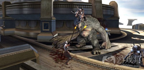
(《战神2》是一款好游戏,但玩家退出时并不感到舒服,因为自动保存只适用于当前游戏环节,实际保存点还很遥远。这么设计是失误还是故意?)
书中的内容当然比本文丰富得多。你最好能找时间阅读一下原著。(本文为游戏邦/gamerboom.com编译,拒绝任何不保留版权的转载,如需转载请联系:游戏邦)
Don’t make me think – Applied to game design
by Anamaria Todor
Steve Krug’s book Don’t Make Me Think came out in 2000, yet it is still regarded as one of the best website usability books around. It’s been the best resource for me in usability since I read it for the first time in 2006. The book is subtitled “A Common Sense Approach to Web Usability.”
If you haven’t read the book yet, you should. At least right after you’ve read my thoughts on how to apply the approaches to game design. I will tackle some of the most important chapters in the book and point out how to apply them. Here goes!
Chapter 1. Don’t make me think!
This is Krug’s first law of usability. It means that if you are given a web page, like an online store, you’ll quickly browse the page. If you need to think about what you are seeing, you are using the site in a way in which you question what you are seeing. If the site has good usability, the person won’t need to think and can immediately spot what they’re looking for.
Krug points out that when designing a page, there are several compromises that need to be done to achieve the perfect usability. Usually the end result is the obvious result. Buttons should look like buttons and links should look like links.
The same applies to games. Look at the way the player interacts with your game, start off with the buttons you have in the game. Do they look like buttons? You might think that they need to fit the theme of the game, but can they look even more like regular buttons and still feel like they belong?
Although glossier than your average button, Candy Crush Saga’s buttons still look like, well, buttons
Also think about the text you are putting into the game. Less is better, so try to reduce your text by 50%. If you manage to do that, go and reduce another 50%.
Useful metric: interaction rate with UI elements
To keep the UI simple, you can set up a metric that tracks the user’s interactions with the user interface. Track where the user touches the screen and when so you can make a 2D user interaction heat map on every game screen. This will show you how the users navigate the UI, and can help you strip the interface of any redundant elements. On touch devices this can also be used to see if the users have trouble interacting with the buttons, which would indicate that the UI is too small or too crammed.
You could also track how long it takes the player to press a button, once they are presented with the main game scene. That will give you an indication of accesibility. If the users spend a long time on something you thought was simple and easy to understand, then maybe your interaction flow needs to be simplified even further.
Chapter 2. How do we really use the web?
Krug believes that people are not using web sites, they are “browsing through” them. People go to a website and they just pick what they first see. If that doesn’t please the eye, then they’ll pass on to the next thing, until the right thing is found.
People don’t use time to assess what the designer of a site had in mind. People are busy and want to cut the chase as quickly as possible. In games, this would translate into getting the player to the fun parts as soon as possible.
In the case of games, the first time user experience counts a lot. If people don’t enjoy the game in under one minute of playing, they will quit and go spend their time on something else.
In your game, you need to “cut the chase” as soon as possible, but just keep in mind that you shouldn’t overwhelm your players either. People will learn your game, even if you teach it in small pieces. A well organized and enjoyable tutorial will help with this. Teach your players new things, but do it with lots of fun and simple interfaces. Also, avoid text where possible.
Angry Birds never uses text to educate its players
Useful metric: first time flow
Players (and especially mobile game players) have very little tolerance to clumsy and lengthy tutorials. They install a game to play, not to be schooled. Generally, you’d want a short and easy tutorial, but that is a more difficult challenge than most developers realize. The tutorial is sometimes overlooked until the very last moment before launch and suffers in quality because of that. Setting up metrics to examine how players respond to the tutorial is beneficial for the current game and any other games you might make in the future, as you can reuse the collected feedback.
Set up a metric that measures how long the player takes on each step of the tutorial. This will give you an indication of what steps are the most complicated, as well as a total completion time. The data could then be compared to retention data from the same player to see if you have successfully incentivised him or her to play the game. If the players do not even finish the tutorial, then the tutorial’s design has failed and the data will show you exactly where the player gave up. You can then use that data to redesign the tutorial with focus on shortening and simplifying it.
Chapter 3: Billboard Design 101
Here Steve Krug goes into visual hierarchies, taking advantage of known conventions, like visual areas, making interactive stuff seem obvious and how to minimize noise. The point is to give the user all the useful information, in such a way that the user can actually read all of it with ease.
Krug wants us to keep design on a common sense level and use very general user interface design. I think it should apply to games as well. A HUD game that has lots of information on game resources, with lots of buttons, can easily create a mess for the player to navigate through.
Among other things, the Dead Space series was appreciated for the minimalist HUD placed on the character’s suit. It did not intrude in any way.
Chapter 6: Navigation
Krug believes that navigation on a site will always be hard for a first-timer, but once the users return, the path is much smoother and they already know where to look for things.
Navigating on a website can feel tedious if all the navigation elements are scattered all around the page. Having all the navigation on the top is a good start for organizing things. It’s also a good practice to keep the user up to date on what the current page is with a title displayed on top.
Krug’s navigation principles apply well to games. Most free to play games have a virtual item shop where you can buy clothes for your character or buildings for your city. As a player, you should be able to navigate from one shopping area to another and move up and down the hierarchy with ease.
Farmville has a breezy shop with self-explanatory categories
Useful metric: Interface navigation patterns & task success ratio
If the player has problems navigating the game, they will become irritated and might stop playing altogether. Designing something to be easy to navigate is a challenge and designers often fall into the “what works for me, works for everyone” trap. Having as many eyes as possible on the game during development is a good start. But the end user is the real judge and metrics can help you find out what the end user thinks.
The need for easy navigation is directly influenced by the game’s complexity. A complex game makes navigation harder. So using metrics to track for interface navigations is most relevant in complicated games with multiple screens. To track the user navigation patterns, you can set up metrics that collect data from what screens the user go to and from how long they stay there. This will show how the players use the different screens and switch between them. The designer can thus tell what screens are used the most and in what sequence. Based on that, the designer can decide if it is necessary to make navigation smoother between sections or to move elements around.
Such metrics can also be used to determine if a user accesses a section without taking any actions. That indicates that the user can’t find the information or action that he was looking for, and that might mean that the UI design should be revised.
Chapter 8: Why most team members have arguments about usability and how to avoid them
Krug highlights how different departments of a company view their website, and how they’d want their message to go through. Everyone wants to focus on different aspects. For example, the business people want to drive the focus directly to the revenue-generating content, whereas the designers would want to focus their creation efforts on something visually appealing.
Nobody is right and nobody is wrong in what should be picked as the focus. Website visitors are all different from each other – some need visually attractive content while others can go with minimal visual appeal. It is all about testing and seeing which design fits best for the site’s intended market .
This applies to games as well. Each game should be rigorously tested with actual users while still under development, so that opinions and arguments inside the team can be tempered by a third opinion.
Chapter 9: Usability tests for 10 cents
Krug points out that usability testing isn’t that interesting for companies in general, and most of them don’t do any. Usually the reasons are that people either don’t have time, don’t have the facilities to run the tests or just wouldn’t know how to interpret the tests.
Krug’s methodology for running a cheap but effective user testing session goes as follows:
Test with three or four people rather than 8 or more
Almost anyone will work so try to grab a few people from around your building, friends of your friends etc.
Use any office or meeting room for the test. All you need is a quiet place.
Decide what you are going to show and run tests continuously throughout the design process
Tell the results to your team immediately after the tests
In games, it is beneficial to get play testers who will be your actual playing audience. Look at the target market for your game and bring the right people. Remember to test early on in the development, to grab the low hanging fruit from the findings of the tests. Usually you will spot lots of obvious problems.
Chapter 10: Usability as common courtesy
Krug talks about how all users of a website have goodwill and optimism to find what they’re looking for when they first arrive on your site. With each virtual bump, the optimism gets drained away and at some point the user leaves the site.
Here is Krug’s list of common things that negatively impact user goodwill, translated to game design.
Hiding the information that people are looking for
Punishing players for not doing things your way
Asking for information that you don’t really need
Annoying and jiving the players
Putting too much ‘sizzle’ (i.e. Flash intro) in the way
Game looks amateurish
And here are some ways to create positive goodwill.
Knowing what your players are looking for and making it easy to find
Showing your players what they are looking for
Saving steps; for example, in the tutorial, if the player decides to leave and return later, ensure that they won’t need to start it all over again when they return.
Putting effort into your game
Making it easy to recover from errors
Make texts comfortable to look at by using images and breezy paragraph styles
In games, try to make the player feel comfortable at all times. One important thing that you need to look into is when does the player close the game? You need to build you game in a way that enables the player to feel comfortable in putting the game down for a while.
God of War II was a great game, but players were not comfortable quitting it because autosave only worked for current game sessions and actual save points were miles apart. Blunder or intentional game design decision?
That’s about it. There is of course a lot more in the book. You should definitely read it yourself at some point. (source:gameanalytics)
上一篇:开发者初级教程:制作等距游戏世界







 闽公网安备35020302001549号