解析策略游戏的“微观、广泛、宏观”控制层面
作者:Josh Bycer
《Brutal Legend》真是一款让我爱恨交加的游戏。我喜欢游戏中的故事,美术设计等内容,但是我却很讨厌游戏中的战斗阶段。对于未玩过这款游戏的人来说,他们会认为这就是一般的即时策略战斗;明确规定玩家操纵着哪些角色在战场上进行战斗。而当我坐在游戏前思考着如何作战时,我突然想到有关于控制方式与策略游戏之间的关系。
当提到电子游戏的“控制方式”时,你可能马上会想到响应性或者不同按钮的作用。但是对于策略游戏设计师来说,他们则需要考虑各个层面的控制内容。在本篇文章中我们将从“微观”,“广泛”和“宏观”三个层面的控制进行分析。
微观层面的控制特指个人对于某些单位的命令或者对于一小部分单位的命令。例如在《星际争霸2》中让你的圣堂武士使用“psionic storm”。微观命令是资深RTS玩家的一大特长,他们能在个体单位命令与快速准确传输多种指令之间灵活转变。举个例子来说吧,在《星际争霸2》中的一场战斗中,操纵普罗托斯(游戏邦注:《星际争霸》中的神族)的玩家将从自己的军队中挑选出多个圣堂武士;然后朝着更广泛的领域施放多个psionic storms,并彻底摧毁敌军。
在回合制策略(TBS)游戏中玩家不需要过多担忧这种层面的控制。因为玩家在游戏中的所有时间都是用来制定决策,而这种层面的控制不需要他们进行太深入的思考。唯一较复杂的决策只是关于判断使用何种特殊技能(如果适用的话)。
广泛层面的控制是指命令一场战斗中的多个单位或者同时衡量所有有价值的信息。这就是为何控制组和热键对于RTS玩家如此重要的原因。带有现实世界中侧翼攻击理念的游戏便要求玩家能够同时对多组单位下达命令,快速调遣它们投入战斗。
在TBS游戏中,这种层面的控制适合于多单位战斗中,如《文明5》中的两个军队的战斗。因为都未曾带给玩家制定决策的紧迫感,所以微观层面和广泛层面控制在回合制游戏的差别并不大。
而宏观层面控制则主要关于一些重大决策的内容,并且需要优秀的UI设计。这一层面的控制是包含战斗中所有主要的决策,并需要玩家进行更深刻的思考。在广泛层面中玩家只需要关注于一个屏幕上的单位,但是在这里,玩家需要面对的是整个游戏地图。平衡多个群组,进行基地建造,研究并制造单位等都是玩家在这个层面必须思考的内容。而因为宏观层面的重要性,设计师就更需要重视UI的设计,并且这也是决定一款策略游戏成败的关键因素。
而这种层面的控制在TBS游戏中与在RTS游戏中有所不同。就像在4X战略游戏中,这个层面的控制主要是关于玩家如何面对游戏中的多个城市和系统。如果说广泛层面的控制是关于如何赢取战役,那么宏观层面的控制则是关于如何赢取战争。
对于RTS游戏来说,平衡微观层面与宏观层面的控制便是一大挑战。就像我在《星际争霸2》中发现的一大问题是,玩家在微观层面上所使用的控制技能同样也能够用于宏观层面上。即游戏统一了玩家应该如何在热键中设置单位制造结构并且明确了集结点等内容。
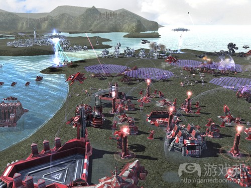
《最高指挥官2》是少数几款能够有效平衡三大控制层面的游戏。当玩家能够切换到战略视图时,游戏允许他们看到整个游戏地图并对军队发号施令。然后放大画面让玩家有条理地指挥战斗。而《Sins of the Solar Empire》是另外一款拥有优秀UI设计的游戏。与《最高指挥官2》一样,玩家可以在这款游戏中随时放大或缩小游戏地图,并且也能够缩放画面而对整个太阳系统发号施令。
最后,让我们再次回到《Brutal Legend》,并将其根据这三个层面的控制方式对号入座。从中我也发现了我在游戏战斗中所遇到的问题。让我们先分析《Brutal Legend》做得最好的层面:广泛层面。玩家能够使用方向键对附近所有的军队下达命令,这是一种快速有效的方法,让玩家也能够专注于其它任务。
但是如果是从微观层面来看,问题就出现了。游戏中设置了两种传达个体命令的方法,从地面上或者从空中。如果是在地面下令,玩家就必须先按压一个按钮,然后跑到一个单位跟前点亮它,并最终使用方向键下达命令。如此看来这是一个非常繁琐的控制系统,玩家根本不想在战斗过程中只是因选中一个单位并下达命令而停止军队战斗。
从空中选择单位则属于宏观层面中的内容,但是这正是《Brutal Legend》这款游戏最让我崩溃的地方。本来玩家在空中飞行时就很难看清楚地面上的单位了,游戏中不仅未设置迷你地图功能,而且唯一能够帮助玩家看清单位战斗的是一个只能呈现战斗大致方向的弹出窗口。
《Brutal Legend》之所以会出现这一宏观层面问题,主要是因为其设计师将开放世界游戏中缺乏HUD元素的UI照搬到这款游戏中。玩家只能通过单位募集屏幕上看到自己拥有多少单位以及目前所拥有的资源等内容。因为这些都属于重要信息,本该呈现在主屏幕上;但是在这款游戏中,即使是在次屏幕中,我们也很难找到我们目前所拥有的单位信息。
很多次当我在游戏中与一组敌人抗击时,我必须转回单位部署中了解我的军队的状况,因为游戏并未给予任何提示。
实际上,任何宏观层面都需要一个优秀的UI,从而让玩家能够快速了解战斗模式并快速做出决策。很难想象在《星际争霸2》中玩家不能一眼看到自己的单位计数器或资源信息会是怎样的一种情况。所以如果换成我在制作《Brutal Legend》,我会让玩家在空中飞行时能够看到代表敌人的图标以及地理位置,并与之进行互动。同样我也会在游戏主屏幕中呈现出玩家当前所拥有的单位和资源数。
让我们再次回到RTS游戏,例如《Sacrifice》——这同样也是一款强调第三人称控制模式的游戏。游戏中具有优秀的UI设计,并且也提供给玩家获取胜利所需要的所有信息。《Brutal Legend》为视觉美感而牺牲了游戏玩法,所以不幸地成为了众设计师的前车之鉴。事实上,很多时候我们需要为游戏玩法而让美术设计妥协,特别当游戏要求玩家制定关系游戏发展的重要决策时。
(本文为游戏邦/gamerboom.com编译,拒绝任何不保留版权的转载,如需转载请联系:游戏邦)
The Three Layers of Control in Strategy Games.
by Josh Bycer
Recently there has been major news surrounding Double Fine and the kick starter funding success. I know that several people (including me,) took it as an excuse to replay the various games from the studio. First up on my list was Brutal Legend which I have a love-hate relationship with. I loved the story, art design and writing, but just hated the stage battles. The stage battles for those who didn’t play it, were Real Time Strategy styled battles. With the defining feature that you control someone on the field at all times. As I sat there thinking about my issues with it, a thought occurred to me about control, and what it has to do with strategy titles.
When you think of the term “control” with video games, thoughts like responsiveness or how well the buttons are laid out come to mind. With strategy games however, there are several layers of control that the designer has to get right. For this post we’re going to define them as: “micro”, “wide” and “macro”.
The micro layer deals specifically with individual commands for units or an order for a small number of units. For example: telling your templar in Starcraft 2 to use psionic storm. Micro commands are one of the hallmarks of expert RTS players, who can quickly shift between individual units to deliver multiple commands quickly and accurately. As an example of an expert use, I remember watching a pro Starcraft 2 match where the Protoss player picked out multiple templar from his army. Then launched several psionic storms across a wide area completely covering the enemy army and decimated them.
Turn based games don’t have too much to deal with at this level of control. Since players have all the time in the world to make their decisions. Controls at this layer don’t require as much thought as other ones. The most complex action here would be deciding what special skills (if applicable) to use.
The wide layer is made up of commanding multiple units for a battle, or to put it in perspective, dealing with a screen’s worth of information at a time. This is where using control groups and keyboard hot-keys are important for RTS players. Games that deal with the real world concept of flanking require the player to be able to command multiple squads of units on screen quickly to set up maneuvers.
For TBS games, this is the layer for fighting a multi-unit battle, such as two armies going at it in Civilization 5. For TBS games, there isn’t as much of a difference between the micro layer and the wide layer, due to the lack of urgency with making decisions.
The macro layer is both the biggest in terms of decisions and where a good UI design is needed most. Here, the layer encompassing all major decisions dealing with the match and where high level thinking comes into play. In the wide layer you were just focusing on one screen of units, at macro it’s the entire map. Balancing multiple groups, base building, research and unit production are all elements at this layer. Because of the importance of the macro layer, this is where UI design is focused on, and where strategy games are praised and criticized the most.
For TBS games, this layer is different compared to RTS games. For 4X strategy games, this is the layer that deals with all the multiple cities and systems of the game. If the wide layer was about winning the battle, the macro layer is about winning the war. There is so much we can talk about in terms of UI design at this layer but that would be too much to go into for this post.
The challenge when it comes to RTS games is balancing control between the micro and macro layers. One of the problems that I had with Starcraft 2 was how the same skills of control at the micro layer were also needed for the macro layer. With how the player had to set unit productions structures at hotkeys and making sure that rally points and such were set up.
Supreme Commander 2 was one of the few titles that did a decent job of balancing the three layers. As the player could switch to strategic view, allowing them to see the entire map and command their troops from there. Then zoom in to command armies in battle without missing a step. Another game that had a great UI was Sins of the Solar Empire. Like Supreme Commander 2 the player could zoom in and out at anytime, while issuing commands to solar systems while zoomed all the way out.
Finally with all that said, we can talk a little about where Brutal Legend fits in on this. Using the three layers as a guide I can see where my problems with the battles come from. Let’s start with where BL succeeds: at the wide layer. The player can use the directional pad to issue commands to all nearby troops, it’s quick, efficient and allows the player to focus on other tasks.
At the micro layer is where the problems start. There are two ways to issue individual orders: on the ground and in air. On the ground you have to hold a button down then run over to a unit to highlight them, and then use the directional pad to issue an order. The system is clunky and in the heat of combat you can’t really stop your army from fighting to pick out a unit for a specific command.
Selecting units from the air is part of the macro layer and where BL just falls apart for me. While the player is flying in the air it’s incredibly hard to see your units on the ground (at least for me on a SD TV.) There is no mini-map functionality and the only way to see if your units are fighting is a popup showing the general direction of the conflict.
The problems with BL’s macro layer stem from the designers using the same HUD-less UI for the battles as they did for the open world gameplay. You can only see how many units you have and your current resource total by bringing up the unit recruitment screen. This kind of information should always be displayed on the main screen due to its importance. Even from the secondary screen, you can’t quickly see how many of each unit type you currently have.
There were plenty of times where I was fighting a group of enemies to then switch back to the unit deployment to find that the majority of my army was gone, without any warnings from the game. Trying to organize your army at this layer is also a pain due to how rallying works. To set up a rally point you have to play a guitar solo (the game’s version of spells) to create a flag. You can only summon the flag while on the ground, forcing you out of the macro layer to make macro layer plans.
The simple fact is that a good UI is required for the macro layer, as the player needs to know quickly the shape of the battle to make decisions. Imagine playing Starcraft 2 without being able to see your unit counter or resources at a glance. What I would have done for BL, was while the player is flying around, they could see and interact with icons that represent enemy and friendly positions. Also I would put on the main screen the current unit counter and resources.
If we go back to the RTS game: Sacrifice, which also featured a third person control scheme. It still had a UI designed to give the player all the information they need to win. Brutal Legend is unfortunately a case where gameplay was put aside in favor of art direction and has an important lesson for designers. Sometimes you have to sacrifice art direction for gameplay, especially when the player has to make informed decisions that affect the game.(source:GAMASUTRA)
上一篇:解析游戏趣味元素之身份和故事


 闽公网安备35020302001549号