关于优化手机应用图标的6点建议
作者:Zoya Street
手机应用的图标和盒装游戏的封面设计一样重要。就像身处实体店的货架中一样,用户会浏览应用商店,寻找能够吸引自己眼球的产品。开发者不要让自己的应用淹入在众多应用图标中。下面是若干热门iOS应用的图标设计特点:
1. 呈现游戏物体
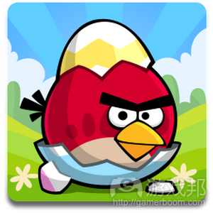
多数触屏游戏都很像是玩具。它们都很容易理解,因为它们锁定单个互动物件。产品图标应清楚呈现玩家将操作的物体。《愤怒的小鸟》图标并没有呈现弹弓,而是突出小鸟。
在Mobile Games Forum上,Fishlabs的Michael Schade谈到,他希望公司《Volkswagen》游戏的标志是汽车形象,但Volkswagen坚持采用公司的图标。他认为汽车图像更能够有效帮助他们取得成功。
2. 呈现用户操作内容
这仅次于突出物件,但形象呈现玩法操作所起的作用也非常显著。《割绳子》图标的内容是“沿此处剪开”标记(游戏邦注:剪刀加虚线),但呈现更隐秘的线索也可行。《水果忍者》图标所呈现的就是运动中的模糊刀片,而《愤怒的小鸟》则是通过漫画背景效果示意推进意义。
3. 跳出框框
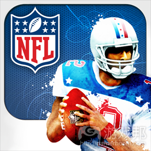
这是突出运动元素的另一有效漫画效果策略。首先,你需要设定框框。这些通常呈白色或银色,这样它们就不会干扰我们的视觉效果。然后你会希望物体能够延伸到框框之外。《NFL Flick quarterback》图标所呈现的是,足球员倚在框框之外。《水果忍者》的飞溅果汁刚好落在框框上。《愤怒的小鸟》图标中的云彩既是框框,又是背景。
4. 指向玩家
和著名的“I need YOU”海报一样,许多热门应用图标直接指向观众。《Monopoly》图标中的招牌角色将手伸出框框之外,直接指向玩家。《Words with Friends》字母方块出现在框框之外,边缘指向玩家。和采用此效果的图标相反,很多图标看起来颇为单调和静态,几乎难以从背景中区分出来。
5. 采用基本色
对很多游戏来说,这点必不可少,例外情况是:游戏旨在呈现粗糙外观,例如,《Hatchi》或《Stickman cliff diving》,这些游戏主要采用白色和灰色。重点是,图标应采用明亮色彩,或完全不融入色彩;热门应用图标的色彩一般都不多。
6. 不要体现名称
游戏名称已标记于图标旁,所以你完全无需将其体现在图标中(游戏邦注:除非游戏已经非常出名)。例如《侠盗猎车手》就可以体现名称,但其他作品则就不适合这么做。
(本文为游戏邦/gamerboom.com编译,拒绝任何不保留版权的转载,如需转载请联系:游戏邦)
Is your logo losing you customers? 6 ways to improve it
The logo for your mobile app is as important as the cover design for a boxed game. Just like a shelf in a physical store, your customers browse the app store, waiting for something to stand out and grab their attention. Don’t get lost in the sea of icons. Here are some key design features of top logos from the iOS app charts:
1. Show the object of play
The majority of touch-screen games are like toys. They are easy to understand because they centre on one object of interaction. Your logo should clearly show the object that users will play with. The Angry Birds logo doesn’t show the slingshot, it shows the bird.
At the Mobile Games Forum, Michael Schade from Fishlabs mentioned that he wanted the logo for their Volkswagen games to be an image of the car, but Volkswagen insisted on using their company logo. He was pretty sure that an image of the car would have further boosted their success.
2. Represent what users will do
This is secondary to showing the object, but it does help if you can graphically symbolise the action of play. Cut the rope features a ‘cut here’ sign with scissors and a dotted line, but more subtle cues also work. Fruit Ninja shows the blurry shape of a blade in motion, while Angry Birds uses a comic-book background effect to imply propulsion.
3. Jump outside the frame
This is another great comic-book trick to emphasise movement. First, you need to include a frame. These are usually white or silver, so as not to get in the way visually. Then, you want to make the object extend beyond it. The logo for NFL Flick quarterback shows the footballer leaning outside the frame. The juice splatters on Fruit Ninja appear to have landed right on the frame itself. The clouds in the Angry Birds logo are a frame and a background at the same time.
4. Point toward the player
Just like the famous ‘I need YOU’ poster, many top app logos point straight at the viewer. Monopoly shows the mascot gesturing out towards you, his hand outside of the frame. Words with Friends has letter tiles flying out, the edge pointing towards the customer. In contrast to logos that use this effect, many others look flat and motionless, causing them to fade into the background.
5. Use primary colours
This is a must for the majority of games, with notable exceptions: if your game is meant to look charmingly primitive, like Hatchi or Stickman cliff diving, use plain white or grey. The point is to either go for bright, strong colours or no colour at all; there are very few pastels in the top apps charts.
6. Don’t use the name
The name of your game is already written next to the logo, so you have no good reason to include it in the logo, unless your game is already famous. Grand Theft Auto? Fine. Anything else? Probably not.(Source:gamesbrief)





 闽公网安备35020302001549号