提升免费游戏登陆页用户转化率的9个技巧
作者:Anthony Doctolero
曾有客户征询改善登陆页转化率的建议,他们的条幅广告的点击量很高,但注册数量却达不到期望值。现在,可供玩家选择的免费游戏很多,所以游戏营销人员需要有效地将游戏的基本价值主张传达给访客,这对能否将访问者转变为游戏玩家至关重要。以下是10个对创造高登陆页转化率有所帮助的优化技巧:
1、制作专用登陆页
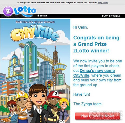
我们不推荐将用户导向主页,因为主页上可能有许多其他信息,还可能有许多不同的游戏。用户会感到困惑,于是很有可能后退到上个页面或者直接关闭页面。制作专用登陆页,这样就能保证条幅广告和着陆页两者信息的一致性,有助于将用户转变为玩家。
2、限制页面上的链接数量
数数你的登陆页上有多少个外链,不要忘了将顶部导航和脚注链接,计算链接的总数量。如果这个数字大于5的话,那么就相当于你给用户提供了过多离开页面的选择。诚然,你可能需要在页面中添加服务协议、隐私政策和最终用户许可协议(游戏邦注:简称“EULA”)的链接,但是完成注册的链接才是登陆页中最重要的。据我们的经验来看,链接数量不超过5个的登陆页会有较好的表现。睿智的营销人员甚至会移除顶部导航、底部导航和指向主页的链接。如果有某些特别重要的信息必须添加链接,可以考虑制作成以弹窗方式显示信息,这样玩家无需离开页面就可以获得额外的信息。
3、插入具有吸引力的图片或视频
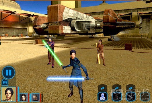
你手下肯定有富有才华的美术人员,他们花费无数个小时来制作游戏角色和布景,可以在登陆页中用上这些图片。关键在于,要向玩家呈现真实的屏幕截图或游戏视频。玩家希望能够看到真实的游戏玩法,因为这样他们就可以知道在游戏中可以获得何种体验。此外,如果你选择在登陆页中插入视频,可以设置在页面加载时自动播放视频。
4、限制表格栏目的数量
表格栏目数量会直接影响到转化率。我们曾经见过填写栏目多达15-20个的表格。当然,邮箱和密码是必要栏目。除此之外,你应当认真考虑是否确实需要玩家在登陆页上填写用户名、密码确认、昵称、验证码、年龄、生日、安全问题和安全问题答案等内容。我们的数据显示,只需填写最基本信息的登陆页转化率是繁杂登陆页的两倍。当然,上述数据中可能导致游戏产生虚假账户。但是,你应该可以找到既让用户可以轻松注册又能够减少虚假账户的折中方法。
5、号召玩家采取行动
提交表格按键上所使用的词是很重要的。富有号召力的词语有助于让你将访问用户转变为玩家。相对于“提交”或“马上下载”等词语,使用“免费体验”或“马上开始玩游戏”之类的词语更有可能吸引用户。
6、确保banner和页面美术风格相一致
这虽然只是一个小细节,但是我们依然会惊奇地发现,许多banner图片与登陆页图片并不一致。两者的不一致会让玩家感到困惑,他们成为游戏玩家的可能性就会降低。
7、添加来源可靠的评论
用户不希望将自己的时间浪费在乏味的游戏上。如果你可以将某些著名媒体对游戏的评论呈现在登陆页上,就相当于在向玩家暗示游戏的趣味性。单纯引用评论还不够,还需要注明评论者或评论来源,必要时可添加该网站的logo。
8、将关键元素显示在页面前列
将关键元素(游戏邦注:包括图片、试玩视频、注册表格和行动号召按键)显示在页面前列,这一直是很有效的做法。如果你将这些元素放置在页面底部,玩家很可能看不到。将关键元素显示于页面上方并进行精心布置,可以促使用户了解游戏和注册账户。
9、关键元素和字体的大小
如果要让登陆页获得较高的转化率,那么其中内容的大小和尺寸也是很重要的。注册表格、提交按键和关键信息的尺寸要大。你只有几秒的时间来吸引用户,所以需要在登陆页上突出显示关键元素。这样就不会让用户在看到页面时觉得心烦意乱,有助于提升转化率。
游戏邦注:本文发稿于2011年11月28日,所涉时间、事件和数据均以此为准。(本文为游戏邦/gamerboom.com编译,拒绝任何不保留版权的转载,如需转载请联系:游戏邦)
Learn Ten Techniques to Creating High-Converting Landing Pages for Free-to-Play MMO Games
Anthony Doctolero
Last week, one of our clients asked us for some suggestions to improve their landing page conversion. Their banners received lots of clicks, but the amount of registrations fell short of expectations. Since we are in a unique position of being able to see performance data on hundreds of landing pages in the free-to-play MMO game space, we decided to offer the client some recommendations at optimizing their game landing page.
With so many free-to-play game options for players to choose from these days, it is crucial that game marketers be effective at communicating their game’s basic value proposition in order to convert visitors into players. In no particular order, here are ten landing page optimization tips for creating high-converting landing pages.
Create a dedicated landing page
Sending users to your homepage is not recommended. This is because your homepage has lots of general information and possibly lots of different games. You will confuse the user and they are likely to hit the back button or click out of the page. Creating a dedicated landing page allows you to keep the messaging from banner to landing page consistent and keeps the focus on converting the user to a player.
Limit the number of links on the page
Quick, count how many actual outbound links there are on your landing page. Don’t forget to include all the top navigation, footer links, count everything. If that number is more than 5, you’re giving the user too many additional ways to leave your page. Sure you’ll probably need to provide links to your Terms of Service, Privacy Policy and End User License Agreement (EULA), but the most important link should be a button that completes the registration. The better converting landing pages we see have 5 or less links on the page. Savvy marketers even go so far as removing the top navigation, footer navigation, and even the link to the homepage on the logo as well. For those, that feel it is a must to include some links, consider making the information pop-up so the user doesn’t have to leave the page to get the additional information.
Insert strong imagery/video
You have talented artists who’ve spent countless hours on the characters and scenery of the game, so use those images to good use. The key is to provide actual screenshots or video of the game. Players today want to see actual game play as it gives them an idea of what’s to come if they decide to invest their time in the game. Additionally, if you have video, make it auto-play when the page loads.
Limit number of form fields
The number of form fields directly impacts the conversion percentage. We’ve seen some LONG forms with as many as 15-20 fields to fill out. Of course there are going to be required fields such as email and password, but beyond that consider if you truly need username, re-confirm password, nickname, a captcha, age, date of birth, security question, security question answer, etc. We’ve seen as high as double digit percentage increase in conversions when the landing page fields are culled down to just the basics. We’re not saying this won’t increase the number of bogus accounts, but clearly there is a happy compromise between making it easy for users to sign up and keeping your database clean.
Clear call-to-action
The actual wording you use on the button used to submit the form on the page is important. This call-to-action for the user can take them from on the fence to a user so choose action-oriented phrases. You’re more likely to convert a user with “Play for Free” or “Start Playing Now” as opposed to the often used “Submit” or “Download Now.”
Make sure banners match the landing page art
This is a subtle thing, but you’d be surprised how many times we see banner imagery that doesn’t match the landing page imagery. Not having them match creates confusion for the user and they are less likely to convert to a player in your game.
Add reviews from credible sources
Users don’t want to waste time on boring games. You lend credibility to your game if you are able to garner some good press mentions from notable sources. It’s not enough to have just the quote itself, be sure to include the person/source and possibly a logo of the website.
Keep things high
It’s always best to keep all the key elements (imagery, video trailer, form fields, call-to-action button) above the fold of the page. If you bury these elements near the bottom, there is a high chance they won’t get seen. Keeping all elements high and neatly organized toward the top of the page keeps users focused on the task at hand—learning about the game and signing up.
Size does matter
When it comes to high-converting landing pages, size does matter. Keep the submit button, form fields, and key messaging big. Again, you only have seconds to pique the interest of the user so make it easy from a visual standpoint by giving the key elements more visual weight on the page. This keeps the user from getting distracted and in the end increases conversions.
If you’d like a free assessment of your game landing page, join Game Advertising Online. (Source: Gamasutra)


 闽公网安备35020302001549号