


面向不同设备规格去缩放你的手机游戏
作者:Martin Drapeau
我刚刚发行了自己的第二款手机游戏《Miam Boom!》。就像我的第一款游戏那样,我是在JavaScript进行编写并使用Cocoon.io将其发行于iOS和Android上。我再一次使用了Backbone Game Engine。不过这一次我对游戏在不同屏幕规格上的呈现品质进行了一些完善。你会发现我的游戏使用了图像精灵。而改变它们的尺寸导致图像出现了模糊问题,这是我在《Ludo’s Quest》中未能解决的问题。而这一次我决定去征服它!
许多设备许多屏幕规格
手机设备拥有各种格式。就像我的iPad Mini的像素为768×1024,我的iPhone 6像素为750×1334,我的Nexus 7像素则为1080×1920。所以我必须基于这些不同的像素去调整精灵。在《Ludo’s Quest》中,游戏是基于横屏模式,我使用了viewport meta标签将其宽度锁定在1024像素。
<meta name=”viewport” content=”width=1024, user-scalable=no”/>
这样的设置在我的iPad mini上具有很好的效果。但是在其它设备上调整尺寸将会让图像变得模糊。
对此的解决方法便是不能强行改变视图的宽度,反而应该使用真正的设备实体宽度并基于分辨率去加载缩放精灵。这一视图应该这样设置:
<meta name=”viewport” content=”user-scalable=no”/>
需要注意的是:网上有很多人提到宽度==设备宽度。如此的话你的视图宽度将变成设备的CSS宽度而不是实体宽度。就像对于iPhone 6,你将可能得到375*667像素而不是750×1334像素。而这绝非你想看到的。
创造精灵尺寸
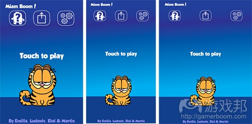
你需要基于多种分辨率去创造精灵表。就像在《Miam Boom!》中我用怪兽(游戏邦注:即游戏主角)作为基本标准。在基于最低分辨率且没有retina的iPhone 3,像素为180,这是480像素的设备高度的1/4。而随着分辨率的增加,图像将按比例缩放2倍,3倍或4倍。以下便是游戏中的一个怪兽角色The Cat在不同设备中缩放后的样子。
MiamBoomSpriteSizes(from gamasutra)
你会注意到The Cat在特定屏幕上有时候会变得更小。虽然这并不要紧,但却会引起GUI和游戏玩法的副作用。我将按照视图的宽度和高度比例去创造游戏的回应和位置元素。例如按键将在左,中,右之间进行调整。标签将被固定在上下方。而怪兽将始终待在下方。如此不管高度和纵横比有什么不同都不会受影响了。
矢量图像
使用矢量图像是关键。在《Ludo’s Quest》我将矢量图像与基于像素的图像结合在一起。按比例放大非矢量图像将导致图表变得模糊。这便是我所吸取的一大经验教训。所以这一次我将只使用矢量图像。现在我已经精通AI了。
我使用了Adobe Illustrator定义了我的精灵表并将图像输出到适当的比例因子。举个例子来说吧,以下便是主要的游戏精灵表:
spritesheet(from gamasutra)
面向每个比例因子,精灵表拥有4中不同版本:
artifacts.png (990×360) scale=1x
artifacts2.png (1980×720) scale=2x
artifacts3.png (2970×1080) scale=3x
artifacts4.png (3960×1440) scale=4x
这里的窍门便是基于设备的屏幕规格加载合适的缩放图像。
动态载入
在《Ludo’s Quest》中我预先将所有图像载入HTML文件中:
<body>
<img id=”gui” src=”img/gui.png” style=”display:none;” />
<img id=”artifacts” src=”img/artifacts.png” style=”display:none;” />
…
而在《Miam Boom!》中我便不会再这么做了。基于运行时间我决定使用比例因子去加载适当的精灵。我使用了JavaScript去加载它们。Backbone Game Engine也拥有这种功能:
function loadImage(url, callback) {
var img = document.createElement(“img”);
img.src = url;
if (callback) {
img.onreadystatechange = callback;
img.onload = callback;
}
}
Backbone.spriteSheet拥有一个imageUrl性能可以动态加载图像。
需要注意的是:在iOS上,图像的加载速度很快。相比之下在Android就慢多了。为了避免出现一个没有任何图像的画面,你必须等待所有图像都完全加载好。而Backbone.spriteSheetCollection拥有event allSpawnImg能够处理这一问题。
在我加载图像前我需要基于设备的实际像素大小去决定加载的图像规格。
var screenWidth = Math.max(window.screen.width * window.devicePixelRatio, window.innerWidth);
var factor = screenHeight >= 960 ? 2 : 1;
if (screenHeight >= 960*2) factor = 3;
if (screenHeight >= 960*2.5) factor = 4;
然后我会调整图像的URLs去加载适当的规格:
imgUrl.replace(“.png”, factor + “.png”);
适应游戏玩法
因为在不同设备上屏幕规格和纵横比也是不同的,所以我必须确保游戏玩法能够适应所有不同的情况。再一次地我调整了我的heuristics。此外,对于像素中的测量距离,我也需要衡量速度。
性能考量
一开始我认为加载更大的图像会影响性能。我同时也也会纠结内存。毕竟按2倍比例缩放图像将占据4倍的内存。如此按4倍比例缩放的话便会占据16倍的内存。
幸运的是这并不是特别严重的问题。因为全新的iPad和iPhone
都拥有足够的处理能力和内存去处理额外的像素。甚至连我那基于1080分辨率的Nexus 7也具有很强大的性能。
结论
对于结果我非常满意,《Miam Boom》在任何设备上都看起来不错。这便是它超越《Ludo’s Quest》的地方。而我也将把这一切运用于我的下一款游戏中,希望这对你们来说也会有帮助。
(本文为游戏邦/gamerboom.com编译,拒绝任何不保留版权的转发,如需转载请联系:游戏邦)
Scaling your Mobile Game to Any Device Size
by Martin Drapeau
I just launched on my second mobile game called Miam Boom! Like my first, I wrote it in Javascript and used Cocoon.io to release it to iOS and Android. Again I used Backbone Game Engine. This time however, I made a few improvements to the quality of the game across screen sizes. You see, my games use image sprites. Resizing them dynamically causes blurriness. You lose the crispiness of the images. This is an issue I failed to properly address in Ludo’s Quest. This time around, I was determined to solve this issue.
Many devices, many screen sizes
Mobile devices come in many formats. My iPad Mini has 768×1024 physical pixels. My iPhone 6 has 750×1334 pixels. My Nexus 7 has 1080×1920 pixels. Sprites therefore have to be scaled accordingly. In Ludo’s Quest, the game was in landscape mode and I locked the width to 1024 pixels using the viewport meta tag.
<meta name=”viewport” content=”width=1024, user-scalable=no”/>
On my iPad mini this looked great. However on other devices, the dynamic resize made things look blurry.
The solution is not to force the width of the viewport, but use the actual physical width of the device, and to load pre-scaled sprites depending on the resolution. The viewport should be set this way:
<meta name=”viewport” content=”user-scalable=no”/>
Note: Many people on the Web mention to set width=device-width. This will set the width of your viewport to the CSS width of the device?—?not the physical width. For an iPhone 6, you’ll get 375*667 pixels instead of 750×1334 pixels. That’s not what you want.
Establishing sprite sizes
Remains the need to define the sprite sheets at multiple resolutions. In Miam Boom! I used the monsters (main characters) as the baseline. At the minimum resolution of an iPhone 3 without retina, it is 180 pixels, one fourth of the device height of 480 pixels. As the resolution increases, graphics are scaled by 2x, 3x or 4x. Here’s what The Cat, one of the monsters in the game, looks like on various devices properly scaled.
You will notice The Cat is sometimes smaller on certain screens. That’s okay but comes with side effects for the GUI and game play. I had to make my game responsive and position elements proportionally to the width and height of the viewport. For example, buttons are left, center and right justified. Labels are anchored to the top and bottom. The monster is always anchored relative to the bottom. These strategies work regardless of the height or aspect ratios.
Vector graphics
The key is to use vector graphics. With Ludo’s Quest I combined vector with pixel-based graphics. Scaling up non-vector graphics always results in blurry images. Lesson learned. This time around I used vector graphics exclusively. I have now mastered AI.
I defined my sprite sheets using Adobe Illustrator and exported images to the proper scaling factor. For example, this is the main game sprite sheet.
The spritesheet has 4 different versions, for each scaling factor:
artifacts.png (990×360) scale=1x
artifacts2.png (1980×720) scale=2x
artifacts3.png (2970×1080) scale=3x
artifacts4.png (3960×1440) scale=4x
The trick is to load the properly scaled images depending on the device screen size.
Dynamic loading
In Ludo’s Quest I pre-loaded all graphics directly in the HTML file this way:
<body>
<img id=”gui” src=”img/gui.png” style=”display:none;” />
<img id=”artifacts” src=”img/artifacts.png” style=”display:none;” />
…
In Miam Boom! I could no longer do that. At runtime, I determine the scaling factor to load the proper sprites. I load them dynamically using Javascript. Backbone Game Engine has this little function to do so:
function loadImage(url, callback) {
var img = document.createElement(“img”);
img.src = url;
if (callback) {
img.onreadystatechange = callback;
img.onload = callback;
}
}
Backbone.SpriteSheet has an imageUrl property to dynamically load images. It uses this function so you don’t have to worry about it.
Note: On iOS, images get loaded really fast. On Android however it seems a lot slower. To avoid showing a screen without images, it is important to wait for all images to have been loaded. Backbone.SpriteSheetCollection has event allSpawnImg to handle that.
Before I load images, I need to determine the size of images to be loaded depending on the pysical pixel size of the device.
var screenWidth = Math.max(window.screen.width * window.devicePixelRatio, window.innerWidth);
var factor = screenHeight >= 960 ? 2 : 1;
if (screenHeight >= 960*2) factor = 3;
if (screenHeight >= 960*2.5) factor = 4;
Image urls are then modified to load the proper size:
imgUrl.replace(“.png”, factor + “.png”);
Adapting gameplay
Since screen size and aspect ratios differ from device to device, I had to ensure the gameplay was adaptable to all situations. Again, I modified my heuristics to anchor to the top and sides. Furthermore, as the game measures distance in pixels, I needed to scale velocity and acceleration as well.
Performance considerations
At first I thought loading much bigger images would impact performance. I also wondered about memory consumption. After all, an image scaled at 2x takes 4 times the amount of memory. Scaled at 4x is 16 times.
Fortunately, that does not seem to be the case. It seems there is enough processing power and memory on newer iPads and iPhones to handle the extra pixels. Even my Nexus 7 with a resolution of 1080p was performing well. I was pleasantly surprised.
Conclusion
I’m very happy with the outcome. Miam Boom! looks crisp on any device. This is a major improvement over Ludo’s Quest. What I’ve learned and applied here will serve me for my next game for sure. I invite you to check it out for yourself.(source:Gamasutra)

")
")
")
")


 闽公网安备35020302001549号