游戏设计课程之精心制作游戏组件(18)
作者:Ian Schreiber
我们的课程即将进入尾声。现在,你已经制作了一款游戏。你已经将游戏测试了数次,测试目标包括趣味性、平衡性和可用性。你拥有许多需要组合起来的东西。到目前为止,你要做的就是完成整个设计项目。(请点击此处阅读本系列第1、第2、第3、第4、第5、第6、第7、第8、第9、第10、第11、第12、第13、第14、第16、第17课程内容)
原因
有些人可能会产生疑问,为什么要将更高质量成分组装至游戏中呢?游戏的主要内容是机制,游戏棋子只是机制的呈现方式而已。因而,所有内容的质量应当是相同的。撇开UI问题不谈,为何不只是将以前使用过的原型称为最终项目呢?
对上述问题,我的回应如下:
首先,如果棋子算是规则的呈现形式的话,作为设计师的你也应当给予同样的重视,这样游戏的外在美才能够与其机制的内在美相符。
其次,你应当为自己的游戏感到自豪。就设计而言,棋子同规则一样重要。棋子告诉玩家的内容是,游戏设计师觉得游戏有着足够好的质量,所以应当拥有高质量的成分。打个比方,如果你是个厨师,你正在制作一个花生黄油三明治,或许食客并不介意在纸盘子上享用,但是如果你想让顾客有更好感觉的话,找个质量较好的盘子来盛装是个不错的做法。
再次,如果你计划最终将你的游戏商业化和出售,那么成分的质量是顾客首先看到的东西。许多欧洲游戏在包装盒正面印上亮丽的游戏成分,以此来作为卖点。他们在向玩家暗示:“如果你购买了这款游戏,你就可以得到这些成分。”即便你不打算出售自己正在制作的这款游戏,那么熟悉这个过程对将来的项目也是个重要的实践。
最后,应当记住的是,游戏体验设计师的能力。如果你忽略了某项每个玩家都将看到的东西,他们会对你产生何种想法呢?是否暗示着你对自己的项目并没有足够的关心,不愿意投入更多的精力?是否意味着你并不以自己的作品为傲?是否意味着你缺乏信心?如果你计划将这款游戏(游戏邦注:或其他游戏)添加到你的职业设计简历中,应当明白它会让雇主产生何种想法。你或许会为工作面试打扮梳理,同样,你也应当在游戏发布之前对其装扮一番。
反向美学
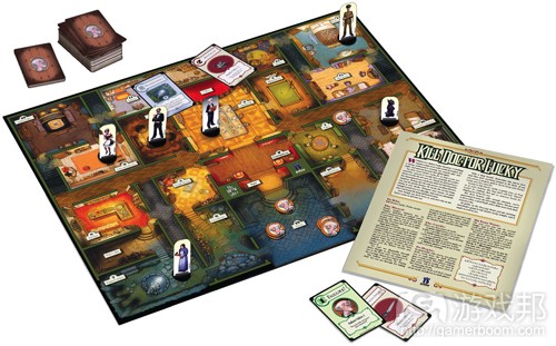
有些人可能会进一步辩解。有些商业游戏特地制作较差的机制承载方式。《Kill Doctor Lucky》(游戏邦注:原版游戏发行商的其他游戏与其情况相似)的首个印刷产品中,有只有单色且纸张很薄的卡片,只有简单的文字,毫无艺术感科研。游戏甚至没有棋子或骰子等最常见的成分,游戏装在薄薄的纸质信封中出售,规则就印在袋子上,没有单独打印出来的用户手册。在数字领域,《Kingdom of Loathing》这款在线浏览器游戏的游戏艺术简单而且劣质。看起来开发商好似根本没有在这方面努力过,但是他们的游戏依然拥有数量可观的玩家。为何我们在自己的游戏中不能仿效他们的做法呢?
我想要强调的是,这些游戏事实上拥有很高的制作价值。每款游戏都持续性地提供视觉美学,而且游戏所产生的强大冲击力与制作者和游戏机制的价值一致。
在《Kill Doctor Lucky》的案例中,James Ernest表示正是那些不必要的成分使游戏变得过于昂贵。如果你拥有的其他游戏中已经有骰子的话,为什么还要在这款游戏中花钱买呢?诚然,所用的卡片确实很容易坏,但是如果你不小心弄坏它们的话,可以出去再买一付游戏。游戏的价格比你在星巴克喝的摩卡拿铁还便宜。
《Kill Doctor Lucky》是款模仿其他产品的游戏。作为模仿产品,开发商故意选择了低质量的艺术风格,这样才能与其他注重视觉艺术细节的同类产品形成鲜明对比。
因而,如果在你制作的游戏中,低质量的游戏成分可以发挥作用,那么可以选择这种方式。但是即便是这种情况下,每种成分的质量和外观的制作也是需要投入精力的设计决定。将来你可能会发现,降低成分的质量比制作游戏高质量成分所需的技能更多。
游戏组件的制作技巧
卡片印制:
1、以厚卡片纸为材料,而不是标准的打印用纸。
2、如果你不选择彩印的话,至少可以考虑将内容印制在有底色的卡片上,选择一个与游戏其他内容相配的颜色。
3、确保卡片在印出后能够让玩家识别。有时,卡片印制出的效果不及电脑屏幕上的显示效果。
4、在打印程序中使用圆角矩形来印制你的卡片,然后自己用剪刀细心地裁剪。或者,如果你有切角器的话(游戏邦注:通常打印店里有),可以节省你许多时间。圆角卡片拿起来更加方便。
5、如果可以的话,将卡片过塑。这会让你的卡片不易损坏而且防水,但这样做需要一定的成本。有个较为廉价的方法,有些商店提供喷涂塑料外层的服务,这种方法可以让你的卡片手感类似于过塑过的游戏卡片。在喷涂时要注意,不可让卡片表面变得凹凸不平。
6、如果可以实现的话,在卡片双面都印上内容。应当注意的是,背面与正面是相反的,背面左侧的内容与正面右侧的内容相同。
棋盘印制:
1、不要将棋盘印在卡纸上。这与多数你见过的游戏棋盘相比显得较为易损。用纸板或泡沫芯曾来印制棋盘。
2、如果你必须将纸板裁切到特定大小,先在一个角上预先测试裁剪。有些工具的裁剪会让棋盘的边缘显得很糟糕,应当特别注意。
3、将整个棋盘印制在单独一张纸上需要很高的成本。可以选择的成本较低的方法是,将整个大棋盘分解成数个标准印制尺寸的小棋盘,然后将它们拼接起来。
4、要想制作可折叠的棋盘,将两个小的棋盘放在一起,然后用带子连接起来,在连接处留下空隙。这样当棋盘摊开时,玩家不会看到带子。
特色骰子制作:
1、印制在胶粘标签上,将它们切成所需大小,然后将它们贴在普通骰子的各个面上。
2、在骰子每个面的末端留一点空间(游戏邦注:也就是说,所裁剪的胶粘标签要比骰子每个面的尺寸小)。会可以避免小部分纸张在每个面的边缘重叠。
3、如果使用的是标准骰子(游戏邦注:底色为白色,上面使用黑色凹点),即便你贴上标签,黑点可能也会透视出来。如果出现这种情况,先在骰子面上放上1到2层得空白粘性标签,然后再黏上所需的标签。这样做可以减轻或杜绝透视效果。
4、如果你有更高要求的话,有些游戏制造商会出售只带有凹点的空白骰子。这些骰子是最理想的材料,因为你可以直接将标签黏上,无需担心标签会因重复使用而脱落。但是,这样的材料寻找起来较为困难。
棋子的涂色:
1、如果你拥有大量未上色的木质棋子(游戏邦注:比如正方体棋子或类似象棋中卒子的棋子),而且需要用颜色来区分,最简单得方法就是在碗中装上清水并加入些许染料,将棋子浸泡其中,然后风干。我建议将这个步骤分为两个阶段。首先,用某个棋子来测试所有的染料,看看染色之后的效果。有些颜色可能会比较接近,或者你需要通过控制浸泡时间来调整颜色的浓淡程度,最好先进行测试,以免毁掉所有的棋子。然后,在你得出制作方法之后,将所有剩下的棋子进行处理。
2、你也可以用画笔来为木质棋子上色,但是这要消耗更多的时间,而且是个乏味单调的工作。
3、如果你使用的是塑料棋子,那么最简单的方法是咨询供应商,看看他们是否已经制作出不同颜色的棋子。自己为塑料棋子上色并不是件简单的事情。如果你只能自行寻找方式来区分各个塑料棋子,那么可以考虑使用不同颜色的带子,将其黏在棋子上,这比自己为塑料棋子上色要简单。
4、如果你使用的是金属棋子而且需要涂色,那么油漆可能是你最好的选择。出售小型金属制品的商店可能也同样会出售油漆和其他涂料。应当注意的是,这种方法较为昂贵而且需要耗费时间,但是如果你会使用金属棋子的话,相比成本已经不算是个问题。
规则的印制:
1、规则成就游戏,因此别忘了这个最重要的方面。至少要将规则印制在质量较高的纸上。
2、根据你所设计的游戏,考虑是否有必要将规则“主题化”。比如,有关火车的游戏规则可以像火车时刻表那样布局。有关运营餐厅的游戏的规则可以用塑料的餐厅菜单来装饰。有关收集经典艺术作品的游戏,可以在规则的页面中加上某些艺术作品。
3、确保规则印制所使用的字体可以让玩家清楚阅读。不要使用过于卡通画的字体,标题可以使用这种方法,但是规则的正文最好不要使用这个方法。记住,玩家能够轻松阅读才是最重要的。
4、多次确认规则内容中没有拼写、语法和语义错误。或许你之前已经做过这项工作,但是最好再重复检查,花这个时间是值得的。
所有的内容都属于设计决定
如果你只是将大量随便的成分拼装起来,这也算是你自己做出的决定。如果你亲自修理自己后院中的树木,这也算是决定。简单地说,你对游戏所做的所有事情都是你自己的决定,你作为设计师应当要对其负责。
那么,大胆地做决定吧,但是务必要谨慎。考虑每个成分是否符合整体视觉效果和玩法体验的策略美学。
游戏邦注:本文发稿于2009年8月27日,所涉时间、事件和数据均以此为准。(本文为游戏邦/gamerboom.com编译,拒绝任何不保留版权的转载,如需转载请联系:游戏邦)
Level 18: The Final Iteration
Ian Schreiber
We are nearing the end of this adventure, so if you are still here, you deserve some congratulations.
At this point you have created a game. You have playtested your game multiple times, with multiple purposes (from fun to balance to usability). You have a list of materials that you need to assemble, and a list of things you must do to assemble them. All that is left in the Design Project is to complete it.
Readings / Viewings
None.
On Craftsmanship
One might wonder, why bother with assembling high-quality components for a game? The game is all about the mechanics, after all, and the game pieces are just a physical manifestation of the mechanics. Therefore, any pieces should be as good as any other. UI issues aside, why not just use the prototype you’ve been using and call that the final project… handwritten cards and all?
I have several responses to this.
First, if the pieces are a physical representation of the rules, you as the designer should give them the same care, so that the outer beauty of the game matches the inner beauty of the mechanics.
Second, you should take pride in your game. The physical pieces are as much a design statement as the rules. What the pieces say to a player is that the game designer felt that their game was high enough quality to deserve high-quality components. To use an analogy, if you are a chef and you’re making a simple peanut-butter sandwich, maybe you don’t mind eating off a flimsy paper plate; but if you’ve put together an elaborate nine-course gourmet dinner, find some better-quality plates to serve it on.
Third, if you plan to eventually commercialize and sell your game, the quality of the components is one of the first things a prospective customer will see. Many Eurogames actually print a nice picture of the game components on the back of the box as a selling point. They are in essence saying, “if you buy this game, you will get these fine components.” Even if you aren’t planning on selling the game you’re making right now, going through that process is good practice for future projects.
Lastly, keep in mind that your game represents you as a designer. If you ignore the one thing that every player is going to see, what does that say about you? Does it suggest that you don’t care about your projects enough to put in some extra effort? Does it mean you don’t take pride in your own work? Does it mean you lack confidence? If you are planning to use this game (or another one) as part of your professional design portfolio, think about how it will appear to prospective schools or employers. For the same reason that you might dress up for a job interview, dress your game up before you release it.
An Anti-Craftsmanship Aesthetic
You might press this even further. Some commercial games were made with intentionally poor production values. The first printing of Kill Doctor Lucky (and the rest of the games from the original publisher) had cards printed in one color on flimsy paper with just simple text and no art. The game didn’t even include common components like pawns or dice, and it was sold in a thin paper envelope with the rules printed right on the bag – there wasn’t even a separate printed manual. In the digital realm, Kingdom of Loathing is an online browser game that uses badly-drawn stick figures for all of the game art. It’s as if these people aren’t even trying, and yet their games see many players. Why not just do that with your own game?
I would argue that these games actually have very high production values. Each offers a consistent visual aesthetic and a strong impact that is consistent with the values of the creator and the game mechanics.
In the case of Kill Doctor Lucky, the whole point of the entire line of games, in fact James Ernest’s mission statement, was that games were getting too expensive because they included all these extraneous components. Why bother paying an extra dollar for two dice when you’ve probably got dozens of dice lying around from other games you own? And sure, the cards are flimsy… but if you accidentally ruin them, oh well, go out and buy the game again. The game cost you less than that mocha latte you had at Starbucks this morning.
With Kingdom of Loathing, the game is a parody of similar games. As a parody, the intentionally low-quality art style is a deliberate choice, standing in contrast to the focus on detailed visuals in other games. And any time that didn’t go into drawing stick figures went into the writing of the game, which is (frankly) of higher quality than many of the visually stunning games out there.
So, if you have a game where “low” production values make sense – maybe you’re making a game about living in a trailer park, or a game about magpies where the object is to build a nest out of the shiniest junk, or something – then by all means, craft your game accordingly. But even in this case (or I should say, especially in this case), make the quality and appearance of each component a deliberate design decision. You’ll find that it may take more skill to pull this off in a way that looks genuine than it would to just make a game with standard high-quality components.
Quick Tips
For printing cards:
Print on heavy card stock, not standard printer paper.
If you’re not printing in color, consider at least printing on colored card stock, choosing a color that matches the rest of your game.
Make sure the cards are readable when printed. Sometimes they don’t print out exactly as they look on a computer screen.
Use rounded rectangles to mark your cards in a print program, and then carefully cut them out on your own with scissors. Or, if you have a corner-cutter (available at most craft/hobby stores), use that and save yourself a lot of work. Rounded corners are gentler to hold; square corners can poke you uncomfortably.
If you want to get really fancy, get the cards laminated (this means cutting the corners of the lamination instead of the card itself). This will make the card virtually indestructible and waterproof, although it can be expensive. As a less expensive alternative, some hobby stores sell spray-on plastic coating that will give your cards a similar feel to standard plastic-coated playing cards. Take care to apply the spray evenly so that your cards don’t have lumps or irregularities.
Print cards double-sided if you can, with a standard card back. Note that the back is a mirror image of the front, so things that print on the left side of the back of the sheet will be printing over the right side of the front. Also, be very careful about double-sided printing, as even a minor offset on one side may make the entire sheet unusable. Try to get the two sides lined up exactly.
For printing a board:
Don’t just print on card stock alone. It feels flimsier than most game boards you’re used to. Try mounting it on flat cardboard, poster board, or foam core.
If you have to cut cardboard or foam core to a specific size, try a test cut in a corner first. Some tools will not cut cleanly, but instead will leave the entire edge torn and jagged and ugly.
Getting a large board printed on a single sheet of paper is expensive. Getting it printed on a vinyl banner is even more expensive. One low-cost alternative is to break up a large board on several standard sheets, then mount them on a firm backing. If you want to get fancier, instead of printing on normal paper, print on a full-sheet adhesive label. Then, you can just peel off the sheet and stick it on somewhere without having to worry about glue… but be careful when sticking it so that there are no creases.
To make a foldable board, put two smaller boards near each other and tape them together with clear tape (such as mailing tape). Leave a little bit of space between them where there is just tape (this is where it will fold). Once you mount the actual game board on top, you might not even notice the tape.
For making custom dice:
Print on adhesive labels, cut them to size, and stick them over the faces of existing dice.
Leave a little room at the end of each dice face (in other words, cut the adhesive labels a little smaller than the actual dimensions of the dice). This will avoid having little bits of paper sticking out around the edges.
For standard dice (white background, black recessed dots), the black dots may show through even after you put a label over them. If this is the case, put an extra layer or two of blank adhesive label over the face first, before applying the final label on the outside. This will reduce or eliminate the visual effect.
If you really want to get fancy, there are some game manufacturers that sell blank dice with recessed sides. These are ideal, because you can put adhesive stickers on them and not worry about the stickers rubbing off through repeated use. These can be hard to find, though.
Coloring your pieces:
If you have a lot of blank wooden pieces (such as cubes or pawns) that you want to differentiate by color, the easiest way is to fill a bowl with water and a little bit of food dye, then soak the pieces and let them dry. I suggest doing this in two stages. First, do a test on a single piece per color, to see what they’ll look like (some colors may not show up as well as others, or you may find you need to soak them for more or less time; better to find this out before you ruin your entire stock of pieces). Then, once you have something that works, repeat for all of the rest of the pieces at once.
You can also paint wooden pieces by hand, but it is far more time-consuming and tedious and the paint is a bit more expensive.
If you have plastic pieces, the easiest thing to do is check your supplier to see if they naturally come in different colors already. Doing this by hand is not easy. If you find you must differentiate plastic pieces by hand, consider using small adhesive bands or dots instead of trying to color the plastic itself.
If you have metal pieces and need to color them, paint is probably your best option. The same hobby stores that sell metal miniatures will probably also sell paints and other materials for you to paint them. Note that this can get very expensive and time-consuming, but if you’re using metal parts you were probably not concerned about cost in the first place.
For printing your rules:
The rules are the game, so don’t neglect these! Print on good-quality paper at the very least.
Consider if it is appropriate to “theme” your rules according to your game. For example, a game about trains might have rules laid out like a train schedule. A game about running a restaurant might have rules that are inserted into a plastic-shielded restaurant menu. A game about collecting classical artwork might have some art pieces displayed in the pages of the rules.
Make sure the font of the rules is readable. Don’t get too cute with custom fonts – doing this for headings is fine, but for the main text of the rules, remember that your players actually need to read them.
And for the love of all that is holy, double- and triple-check your rules for spelling, grammar, and clarity of writing. You did this before, but do it again – this time it counts.
Also check your written rules to make sure they are correct. You’ve likely made a lot of changes to the mechanics of the game over the course of the project, and the last thing you’d want is to accidentally print out an old copy of the rules before you made several key changes!
Everything is a Design Decision
If you just throw together a bunch of random components, that is a decision you made. If you hand-carved each component out of the branches of a tree in your backyard, that is also a deliberate decision. In short, everything you do for your game is a decision that you, as the designer, are responsible for.
So, make your decisions… but make them with both eyes open. Consider each component and how it fits into the overall visual and tactile aesthetic of the play experience.
Now, get out there and build the final version of your game. (Source: Game Design Concepts)
下一篇:跨平台工具能否终结手机平台大战?


 闽公网安备35020302001549号