


颜色是游戏设计中最有用的工具之一
作者:Herman Tulleken
如果想要了解颜色,我们需要涉及多个学科,包括:物理,生物,心理,艺术,还有设计。这是帮助美术师创造氛围,游戏设计师突显功能,市场营销者做计划的有效工具。在本文中我们将进一步着眼于游戏中的颜色,即关于它的功能,技术如何完善颜色的呈现,以及我们的生物学如何影响人们对颜色的感知。
颜色在游戏中的功能
色觉的主要功能便是让我们更轻松地识别事物,的确,在游戏中使用颜色便能够反应出这一功能。我们之所以在游戏中呈现出红色的苹果是因为在现实生活中苹果就是红色的,如此我们便能更清楚地在游戏中识别它们。但是颜色在游戏中还有许多其它的功能,就像在艺术,设计和电影中那样。
情感
颜色是唤醒情感的一种有效方法。
以下便是基于不同颜色的同个场景。我们可以看出每张图都具有不同的氛围。
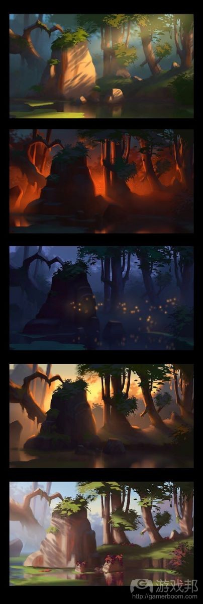
mood(from gamasutra)
颜色分级是设计师常用于调整游戏颜色的一种方法,通常是以改变氛围为目的。
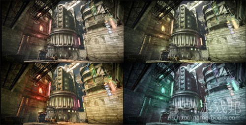
MDB_Grading(from gamasutra)
有时候颜色的改变也能够用于降低情感的影响。例如为了看起来不那么暴力,有些游戏会将血的颜色变成绿色。
品牌和流行趋势
在游戏品牌中颜色扮演着一个很重要的角色,即能够更有效地突显游戏:例如《传送门》使用了蓝色和橙色,《镜之边缘》使用了亮红色,《超级食肉男孩》使用了肉红色,《超级玛丽兄弟》使用了紫蓝色,而《迈阿密热线》使用了桃粉色。
colors(from gamasutra)
除了突显游戏外,颜色也能够帮助游戏传达其目标用户群体:例如亮红色更常用于休闲游戏中,而更细致的颜色则更常用于硬核游戏中。
游戏中关于颜色的选择经常会受到当下流行趋势的影响。以下便是来自4个不同年份的最受欢迎的颜色案例,期间的跨度达到了30多年。

game_colors_over_the_years(from gamasutra)
我们可以看到2012年的主导颜色变成了蓝色和棕色/橙色。Xaphan认为活力元素的减少(游戏邦注:游戏更倾向于单色)能够进一步推动现实性,并带动阴影和氛围光线的使用。有许多游戏便故意使用低饱和度和较淡的颜色去追求现实感。
视觉层次
游戏场景的元素构成了重要性的自然层次结构。例如先是玩家,然后是敌人,然后是互动对象,再然后是背景元素。颜色能够更清楚地突显这样的层次。在像绘画和电影等视觉作品中,这一原则能够引导观看者将注意力放在真正重要的内容上。而在互动作品中,这一原则更加重要,因为它能够帮助玩家判断自己该做什么:该去哪,该攻击谁,以及该收集什么内容。
价值,饱和度和色彩都能够用于区分重要元素。
进程
颜色能够提供给玩家一种进程感:即关于时间或空间的改变感。就像在《Journey》中,氛围的改变会伴随着颜色的改变而改变。

journey_colors(from gamasutra)
在《几何冲刺》中,背景是基于彩虹顺序,而这么设定的另一个目的便是让游戏关卡看起来更加不同。
机制
有些游戏是为了一些新机制而使用颜色。
《Exit Palette》是一款带有混合颜色机制的益智游戏。它是通过绘制带有不同颜色的对象去表示每个关卡的出口。不同颜色能够提供给对象不同的属性(如让它们向上飞翔),并且通过混合适当的颜色,你可以提供给对象解决谜题的适当属性。
而在游戏《Hue》中,玩家需要改变世界的颜色从而让特定的对象消失。
《僵尸末日》拥有一个染色机制,即玩家可以使用浆果去制作染料给衣服染色。通过以不同比例去混合浆果,玩家便能获得不同的颜色。
dayz-dyeing-color-mechanics-on-current(from gamasutra)
有些游戏利用了不同颜色去区分它们的机制。《The color! 》是一款需要你在网格中寻找不同颜色的方形,并且游戏会逐渐呈现出更多方形和更接近的颜色。《Specimen》则让你从一个与背景颜色相同的黑色培养皿中识别出一些斑点。
《Blendoku》让你以梯度的顺序在一个纵横交错的网格中排列色卡。《Huedoku》的游戏理念也是相同的,但它只是在正常网格中进行。这些游戏与《Online Color Challenge》非常相似,即通过让你按照一定顺序去排列4组色卡而给予分数。
《Brandseen》是一款依赖于颜色记忆(或品牌认知)的游戏:玩家需要根据记忆去匹配一些流行品牌的颜色,并根据自己的表现获得分数奖励。
标记和标示
游戏中的颜色经常用于识别不同元素并提醒玩家某些元素的性能。
标示
颜色标示(也就是符号)经常用于区分游戏元素,如区别不同玩家,游戏角色和游戏领域。
我们总是很容易标记颜色符号,或者很容易将其区别于其它标示以及场景中的中性色。标示经常用于像《Kill Zone》等对抗游戏以及像《国家的崛起》这样的区域争夺游戏。
标记
标记经常用于向玩家传达元素的属性(如一种道具或一段地形)。一种道具或一段区域的颜色能够告诉玩家它们是否能够与之互动或者能否使用它。
在《Mirrors Edge》的奔跑模式中,能够帮助玩家向前的对象会以红色进行标注。
在即将问世的游戏《Witness》中,特殊的区域会以不同颜色进行标注去突显它们的重要性。
《传送门2》的传送光圈将创造一个用推的蓝色传送门以及一个用拉的橙色传送门。
在《加勒比海盗Online》中,颜色是用于划分不同的药剂原料。
内容变量
颜色变量是创造游戏内容的一种廉价方式。
在带有抽象图像的游戏中,关卡总是很像,所以游戏深度很容易被降低。所以这类型游戏总是会通过改变关卡间的背景色去突显关卡,并让玩家更清楚地感受到游戏的变量和深度。《Splice》便是一个典型的例子。
像《Tiny Wings》和《Blowfish Rescue》等游戏便使用了算式去创造无数配色方案。
颜色改变同样也可以用于获得更多内容。转变调色板便是一种增加敌人和游戏道具的方法。今天,改变颜色仍然是增加内容的有效方法。当颜色是作为一种表示时,这种技巧总是很实用。

gems(from gamasutra)
技术
因为游戏刚打开时是呈现出一个带有白色和绿色图像的黑色页面,呈现于设备上的颜色范围也突然变大了。这会让游戏看起来更加现实。
《Galaxian》(1978年)是第一款使用RGB颜色的游戏。在那以前游戏中的颜色都是通过玻璃纸和硬纸板背景所创造出来的。
注:似乎在第一看颜色游戏上我们搞错了!在这之前已经诞生了不少颜色游戏。虽然很难说清楚,但《Wimbledon》(1974年?)和《Color Gotcha(1973年)都是最早出现的颜色游戏,而《Galaxian》可能是第一款使用了多色精灵的游戏。在《 What Was The First “True” Color Arcade Video Game?》中,Keith Smiths便提到了一些最早使用颜色的游戏。
所以以下段落便是为了纠正之前的错误。
一些突出了超过256种颜色的早前设备包括带有482种(或512种)颜色的PC Engine(1987年)以及带有4096种颜色(或65536种)的Neo Geo(1990年)。在1994年,Play Station更是创造了1670万种颜色的新基准。
一台设备(如印刷机,电视或LCD屏幕)的颜色饱和度是该设备能够“再生”的颜色空间的一部分。大多数显示设备都使用了三种主要颜色去渲染一个场景:红色,绿色和蓝色。这三种颜色的结合让一台设备能够使用在这三种颜色所包围的三角形区域内的任何颜色。
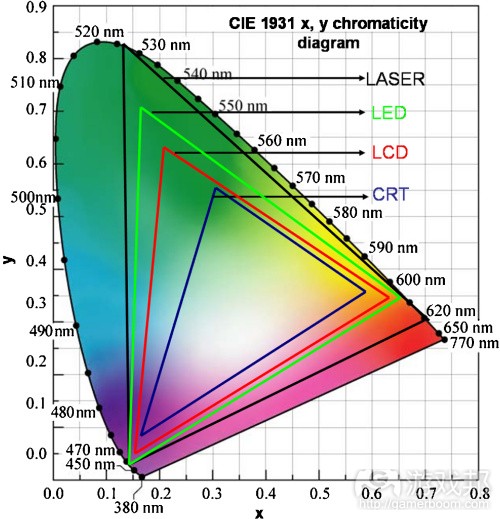
getImage(from gamasutra)
技术的进步让设备拥有越来越大的颜色范围,因此也让游戏能够呈现出越来越多的颜色。能够重现整个有形的颜色空间的设备是我们还未能实现的一个目标;但如今的设备越来越接近这一目标了。有些放映机使用了更多主要颜色去增加颜色范围;例如Brilliant Color放映机。激光录像放映机便使用了三种激光去创造更广的颜色范围并且能够用于今天的显示设备上(这是大多数人类能够看到的90%的颜色),这是因为激光能够创造真正的单色基元。
增加可感知颜色数量的老技术
在过去,色彩转换被用于增加8位体和16位体颜色游戏中的图像内容,并且能够减少创造多个2D精灵的紧张任务。增加游戏角色和道具变量的一种简单方法便是重新使用同样的精灵,但却使用不同的调色板。
色彩转换同时也用于增加可行颜色数量的不同游戏场景中。在3D渲染和完整的32位体颜色游戏出现前,色彩循环用于创造水,火以及其它游戏环境效果的动画中,如《S.P.Y. Special Project Y.》。色彩循环使用的是一个平面图形以及一个带有256种颜色的调色板。通过在调色板上进行颜色的循环所创造的视觉效果(或动画)能够呈现出像素在移动的错觉感。
抖动显示便是通过交叉不同颜色的像素去增加颜色的数量的一种技巧。例如为了获得了一个黄绿色,我们便可以使用绿色和黄色像素的检查板模式。
颜色生物学
我们大脑所感知的颜色其实是物体所反射的光线并反射在我们眼睛的视网膜上。然而不同颜色拥有着不同的生物效果,并且不是所有人看到的颜色都是一样的。这点将会影响玩家在许多游戏中的体验。
关于生物效果的一个例子是,我们如何看待红色。视网膜后面的红光将推动眼睛中的水晶体变得更凸。因此我们在看到红色区域时会觉得它更超前。这也解释了为什么红色更能得到关注并且出现在像《镜之源》这样的游戏,或者说这解释了为什么当暖色系与冷色系放在一起时前者会让人觉得更靠前。
游戏中的色盲
色盲或者色弱都是指看颜色或感知颜色的区别方面的障碍。
在男人中,色盲的比例是1/20,女人则是1/200。最常见的色盲类型是红绿色盲,即会导致人们分不清红色和绿色。
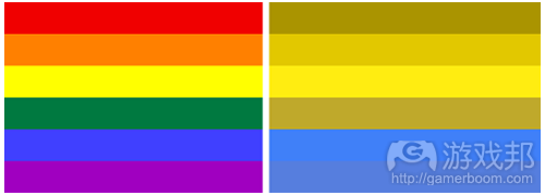
color blind red green(from gamasutra)
尽管大多数游戏都不会特别去迎合色盲玩家,但是也有许多游戏开始在设计过程中考虑色盲这一问题了,即通过提供给这类型玩家除颜色以外的视觉线索(游戏邦注:如形状,文本,模式等等)。
在第一人称射击游戏中有一个常见的问题,即用于区分不同团队的红绿色指示器。对此的常见解决方法(如在《使命召唤:黑色行动》中那样)是用蓝色和橙色指示器进行替代。Tretarch甚至拥有一位色盲首席游戏测试员。
不可能的颜色
不可能的颜色是指那些因为视网膜功能而在生物学上不可能同时被人们所看到的颜色。不可能的颜色并不是颜色的结合,更准确的说应该是彼此相近的颜色,如一个颜色看起来像是“红绿色”或“黄蓝色”。
红光能够刺激人类视网膜的视锥细胞从而让我们看到红色,而绿光会抑制视锥细胞从而让我们看到绿色。尽管大多数颜色都会从神经元中诱导出这些效果的混合体,而红光和绿光也会相互抵消,这便意味着我们不能在同一个地方同时看到它们。这种情况也会发生在黄蓝色上。
人们已经做了许多实验区证实我们的确能够看到不可能的颜色。这些实验便包括使用眼球跟踪器或通过练习而让视锥细胞感到疲劳。最近刚问世的Oculus Rift便被用于像《Diatomic Number》等游戏中去捕捉不可能的颜色。
(本文为游戏邦/gamerboom.com编译,拒绝任何不保留版权的转发,如需转载请联系:游戏邦)
Color in games: An in-depth look at one of game design’s most useful tools
by Herman Tulleken
Knowledge about color spans across several disciplines: physics, biology, psychology, art, and design. It is a useful tool for the artist to create emotion, for the game designer to emphasize function, and for the marketer to set apart. In this article we look at color in games – its function, how technology has improved color display, and how our biology affect the perception of color.
The Function of Color in Games
The primary function of color vision is to make it easier to identify objects, and indeed, the use of color in games reflect this. We make apples red in games because they are also red in the real world, and so we can recognize them easier in the game. But color has many other functions in games, as it does in art, design, and film. This section describe some of those.
Emotion
Color is a powerful way to evoke emotion.
The following is an example of essentially the same scene, with different colors. Each has a distinct mood.
Color grading is a popular method used (adapted from film) to adjust the colors of games in one sweep; usually with the purpose of changing the mood. Here is an example of an image rendered with different color gradings:
Sometimes, a color change can also be useful to reduce emotional impact. For example, to look less violent, some games color their blood green to pass certification requirements (such as those in Germany).
Branding and Fashion
Color plays an important role in the branding of games and making them instantly recognizable: the blue and orange of Portal, the bright red of Mirror’s Edge, the meaty red of Super Meat Boy, the purply blue from Super Mario Bros, the hot pink of Hotline Miami.
In addition to making games recognizable, color can also help convey its intended audience: for example, brighter colors are used more in casual games, while more nuanced colors are used in core games.
The choice of colors in games are often influenced by the fashion of the time. Below are samples of colors from the most popular of four different years, spanning three decades.
The year 2012 shows clear shift toward dominant blues and browns/oranges. Xaphan attributes the reduction of vibrancy (making games more homogenous and monochrome) to the pushing of realism and the use of shadows and atmospheric lighting. Many other games have purposefully used desaturation and tinting to achieve realism.
Visual Hierarchy
The elements of a game scene forms a natural hierarchy of importance. For example, the player, followed by enemies, followed by interactive objects, followed by background elements. Color can help make this hierarchy visually clear. In visual works, such as painting and film, this principle is used to guide the viewer’s visual focus to what is important. In interactive works, this is even more important, because it helps the player figure out what to do: where to go, who to attack, what to pick up.
Value, saturation and hue can all be used to distinguish important elements.
Check out this guide for game developers on visual hierarchy.
Progression
Color can help give the player a sense of progression: a feeling of change of time or space. In Journey, for example, the change in mood goes hand-in-hand with change in color.
In Geometry Dash the backgrounds are in rainbow order, and it serves an additional purpose of making the game levels more distinct (this idea is discussed further under the section Content Variation below).
Mechanics
Some games exploit colors for new mechanics.
Exit Palette is a puzzle game with a color mixing mechanic. The goal is to get to the exit of each level by painting objects with different colors. Different colors give objects different properties (such as making them fly upwards), and by mixing the right color you can give objects the particular property needed to solve the puzzle.
Hue is a game where the player has to shift the hue of the world to make certain objects disappear.
The game DayZ has a color dye mechanic, where cloth can be dyed with dyes made from berries in the primary colors. By mixing berries in different ratios, secondary and tertiary colors can be obtained.
Some games make use of the difficulties in distinguishing colors for their mechanics. The color! is a game that asks you to find the square on a grid that is a different color, progressively showing more squares and closer colors. Specimen asks you to identify from a few blobs in a black petri dish the one that has the same color as the background.
Blendoku asks you to arrange a number of color swatches in gradient order in a crossword-style grid. Huedoku is the same idea, but in a grid. These games are similar to the Online Color Challenge which scores your ability to arrange four sets of color swatches in gradient order.
Brandseen is a game that relies on color memory (or brand recognition): players are asked to match the colors of popular brands by memory, and are given a score on how well they do it.
Signifiers and Identifiers
Colors in games are used to identify different elements and alert the player to properties of elements.
Identifiers
Color identifiers (also known as glyphs) are used to group and separate game elements, such as differentiating players, in game characters and in game areas.
A color glyph should be easy to label or mutually exclusive from other identifiers and neutral colors in the scene. Identifiers are commonly used in versus games like Kill Zone and territorial combat such as Rise of Nations.
Signifiers
Signifiers are used to communicate properties of an element (such as an item or a section of terrain) to the player. The color of an item or area communicates whether or not it can be interacted with and how it can be used.
In Mirrors Edge’s runner mode, objects that can help you progress are highlighted in red.
In the upcoming game Witness, special areas will be graded differently to mark their significance.
The excursion funnel in Portal 2 creates a blue portal for objects to be pushed through and an orange portal for objects to be pulled through.
Color is used to categorize different potion ingredients in the Pirates of the Caribbean Online (and many other games) depending on what they are made from.
Content Variation
Color variation is a cheap way to increase the content of the game.
In games with abstract art, levels have a tendency to look very similar, and it is easy for the depth of the game to be undervalued as a result. Changing the background color between levels is used to make levels more distinct visually, and give the player a better sense of the variety and depth in the game. Splice is one game that does this.
Some games, such as Tiny Wings and Blowfish Rescue, uses algorithms to generate endless color schemes. Here is an article that explains some basic techniques of generating palettes procedurally.
We have also built a Unity plugin, Colors to do this:
Color changes can also be used to get more content. Palette swapping (explained below) was a popular way to increase enemies and game items when space was still an issue. Today, changing colors is still a popular way to increase content. This technique is often used when the color also serves as a identifier.
Technology
Since the introduction of games on black screens with white and green graphics, the range of color displayed on devices has increased dramatically. This has allowed games to look more and more realistic.
Galaxian (1978) was the first game to use RGB colors. Up until then the only colors seen in games were produced using cellophane sheets and cardboard backgrounds.
Edit: It seems we were mistaken about the first color game! There were quite a few color games before this time. The exact history is a bit murky, but Wimbledon (1974?) and Color Gotcha (1973) are candidates. Galaxian may have been the first game that used multicolored sprites. In What Was The First “True” Color Arcade Video Game? Keith Smiths look at some of the first games that used color. (Thanks for Nicholas Ralabate who shared the link in the comments).
Edit The following paragraph was rewritten to fix some inacuracies. (Thanks to Mikie Simons for pointing those out.)
Some early devices that featured more than 256 colors were the PC Engine (1987) with 482 simultaneous colors (of a possible 512) and the Neo Geo (1990) with 4096 simultaneous colors (of a possible 65536. In 1994 Play Station set a new benchmark with 16.7 million colors.
Colour Lovers have a nice infogrpahic of the history of color in video games; a piece of it is shown below:
http://www.colourlovers.com/blog/2011/11/03/the-colorful-history-of-video-games-infographic-2
The color gamut of a device (such as a printer, television or LCD screen) is the portion of the color space that can be reproduced by that device. Most display devices render a scene using the three primary colors, red, green, and blue. The combination of these three colors allows one to display any color that is within the triangular region bounded by those three colors.
Advancements in technology have allowed devices to have larger and larger color gamuts, thus allowing games to display more and more color. A device that is able to reproduce the entire visible color space is an unrealized goal; but devices are getting closer. Some projectors uses more primary colors to increase the color gamut; for example, the Brilliant Color projector. The laser video projector uses 3 lasers to produce the broadest gamut available in practical display equipment today (about 90% of colors most humans can see), derived from the fact that lasers produce truly monochromatic primaries.
Old Techniques to Increase the Number of Perceptual Colors
Pallete swapping was used to increase art content in 8-bit and 16-bit color games, and to reduce the intense task of creating multiple 2D sprites. A simple method of increasing the variety of game characters and items is to reuse the same sprite, but use a different color palette.
Palette swapping was also used between different scenes in the game to increase the number of colors available. Before 3D rendering and full 32-bit true color games, palette cycling was used to animate water, fire and other environmental effects in games such as S.P.Y. Special Project Y. Color cycling involved using a single flat image and a 256 color palette (which was all video cards could render at the time). Visual effects (or animations) were produced by cycling between the colors of the palette, giving the illusion that pixels are moving.
Dithering is a technique used to increase the apparent number of colors by interleaving pixels of different colors. For example, to get a yellow-green, a checker board pattern of green and yellow pixels could be used. You can see the dithering in the screenshot from Aladdin below in the dunes and clouds.
Color Biology
Color is perceived by the brain as a result of light rays reflecting off objects and hitting the retina of the eye. However, different colors can have different biological effects and not all people see color the same. This can affect the player experience in many games.
One example of biological effects is how we see red. Red light focuses behind the retina which forces the lens to grow more convex to pull it forward. Therefore, we perceive that red areas are moving forward. This may explain why red captures attention and is exploited in games such as Mirror’s Edge, or why warm colors give the impression of advancing when put next to cool colors.
Color Blindness in Games
Color blindness, or color vision deficiency, is the inability or decreased ability to see color, or perceive color differences, under normal lighting conditions.
Color blindness affects about one in 20 men, and one in 200 women. The most common type of color blindness is Red-Green color blindness, which results in a difficulty in discriminating red and green hue. The below image shows colors seen with normal vision (left) and colors seen with Red-Green color deficiency.
Although the majority of games don’t cater for color blind players, many are beginning to consider color blindness in the design process, by providing visual cues (shapes, text, patterns) other than color.
A common problem in first person shooter games are red and green indicators, which are used to distinguish opposing teams. A popular solution (implemented in Call of Duty: Black Ops) is to provide blue and orange indicators as an alternative. Treyarch went as far as having a color blind lead game tester.
This article gives some examples of what it is like to play games when you are color blind.
Impossible Colors
Impossible colors (or forbidden colors) are colors that, due to the functionality of the retina, are biologically impossible to be seen simultaneously. Impossible colors are not a mix of colors, but rather a hue that is similar to both, such as a hue that looks “redgreen” or “yellowblue”.
Red light stimulates cone cells in the retina allowing us to see red, while green light inhibits cone cells causing us to see green. While most colors induce a mixture of effects from these neurons, red and green light cancel each other out, meaning we cannot perceive to see them from the same place. The equivalent happens for blue and yellow.
A number of experiments have been done to prove that impossible colors can indeed be seen. These experiments include using an eye tracker device or performing exercises to cause the cone cells to become fatigued. More recently the Oculus Rift has been used for games such as Diatomic Number to see impossible colors.(source:gamasutra)

")
")
")
")


 闽公网安备35020302001549号