举例阐述优秀游戏设计工具的必备特点
作者:Aleksander Adamkiewicz
自从《Pong》(游戏邦注:《Pong》是一款非常耐玩的益智过关游戏,跟弹珠台差不多)诞生后,进入游戏设计和开发领域的门槛就大大降低了,当然,这个门槛还没低到让大部分人都能参与开发过程。在本文中,我想指出当前游戏设计工具的大问题,并提出改进建议。希望读者能从中受益。
游戏设计工具,如Construct、Game Maker、Unity与Garage Band、Music Maker、iMovie这类工具相比,其易用性的区别是什么?
将这些工具相比较并非不公平,尽管它们之间的用途是不同的,但其设计目的都是让业余人士或爱好者在不具备深厚的专业知识的条件下,能够制作自己的东西。使用者要克服的第一个困难是学会使用相应的工具,无论他是从事什么创造活动。
最简单的活动当然是那种不需要任何复杂的工具,或完全不需要工具就能完成的。
例如,足球就是一项低门槛的运动。踢足球只需要知道如何使用自己的身体碰球和基本的规则。当然,要踢得好不止是这样,但确实是低门槛,只要你能控制自己的身体碰球,你就具备踢足球的素质了(年龄大约是5岁)。
电子游戏设计当然更复杂。游戏设计可以画成金字塔的结构图,其中包括许多不同的活动,如图像、界面、软件和声音设计等等。这种结构本身就让游戏设计成为业余者的难题,因为要制作一款电子游戏,仅凭一人之力很难将这些所有成分合为一体。最难的就是软件开发方面,也就是将东西“放进”电子设备(可能是PC、主机或智能手机)的部分。
可视化表现
最直观的应用设计和真正的可视化表现之间的一个重大区别。虽然所有新界面第一眼看上去都很吓人,但是设计界面的技巧就是不止要容易使用,还要直观、容易学习和理解。苹果数年来不断研究界面的易用性和优化界面设计,效果显著。
像Garage Band这类工具,乍一看界面很“幼稚”,但事实上这是一个非常精心巧妙的设计。没有太多色彩丰富的按钮,但结构清晰,让人觉得直观、方便使用。另外,通过程序的启动界面,用户可以知道这个工具最重要和最常用的方面。
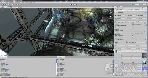
以上三张截图的区别在于界面和各个工具展示其功能的方式。在Garage Band中,用户立即就能看到最实用的元素,在使用这个工具的整个过程中,这些元素最常用(游戏邦注:例如,加载样本、预览样本、调整音量和音高、将样本放入轨道、转换样本)。
相反地,Game Maker什么也没有,所有功能都要通过资源检查器获取,而这个资源检查器则隐藏在工作内部。此外,有些隐藏层级是不可见的(对象、空间、分镜、背景等)。Unity3D存在同样的错误,尽管它的展示方式对使用其他3D程序(Blender、Cinema4D)的用户来说,会更熟悉一点儿。
理想的游戏设计工具应该有一个可视化的展示,不只是各个部分的功能,还有其之间的内在关联和层级关系。当下的工具非常注重体现出代码友好型环境。这些工具的UI和界面对变量、功能和属性的展示做得很合理,但缺少游戏逻辑的反馈和以上功能的可视化表现。
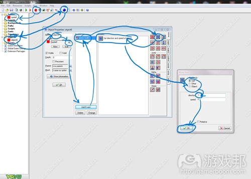
(例如,在Game Maker中创建一个对象,添加行为(如果有向左的箭头出现,就向左移),你必须遵守这些“简单”的步骤。注意,我跳过了创建分镜,即其他3个窗口/步骤。)
问题是,这个界面并没告诉我们在我们所使用的工具环境中,哪里是分镜、对象、事件和动作。对于任何一个对游戏设计略有了解的人来说,分镜是最容易认出来的,但“对象”呢?“行为”呢?“动作”呢?对象能做什么?分镜或者只有对象可以有动作吗?空间可以有事件吗?
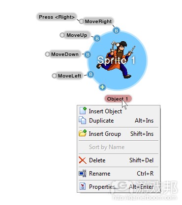
我不想详谈如何“修正”这些UI设计问题,但是如果在分镜或其他东西上存在一个“从……创建对象”的指令,或者有一个你可以互动的分镜的可视化展示(大约类似Blender/Maya中的节点系统),这3个步骤就可以跳过了。
我列举以上例子是为了说明,在之后会变成代码的可视化展示中要包含尽量多的信息。就我使用Game Maker的短短时间内,我能收集到的对象行为如分镜的容器,可以有若干由事件触发行为(动作)。Game Maker不知出于什么原因,设置了一个很不直观的层级,事件居然是动作的上层对象,我猜那是因为事件可以有多个动作/行为。在上例中,这个层级是颠倒的,如果说这种颠倒可能会“更好”,但那毕竟只是可视化的例子。
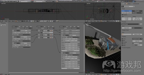
在Blender游戏引擎中,有类似的系统,在3D视图中没有可视化反馈。
(Blender“逻辑砖块”的节点系统在截图的左边。但UI的其他部分非常不直观,但逻辑砖块却是对的。)
灵活性、必要的深度和复杂性
以我的经验,在最好的工具和程序中,功能应该具有各种层次的深度。
例如,After Effects的第一层功能就让用户非常容易理解和学习。程序中有轨道,用户把东西放在轨道上,添加效果然后转换。一旦用户更深入地学习其功能和脚本语言,可能性和自动化的大门就打开了。自动同步时间偏差和背景音乐的跳格剪接?没问题。让动画后的角色对转换事件响应?也行。
最妙之处在于,所有事情也可以手动完成,不需要一行代码,只是效率没那么高。再说Garage Band,它提供了足够“简单的”行为/动作,可以用不同方式组合再创造一些复杂的东西。现在的入门级设计工具不具备这种自然而然就会产生的复杂性。如果你想制作一款复杂的游戏(你应该把“复杂”读作“有趣”),你必须研究代码,即使在你的头脑中,游戏的“逻辑”可能是很简单的。我们需要更有逻辑性的工具来创造表层的复杂性,而不必受脚本语言和代码的困扰。
与此类似的, 游戏设计和开发工具应该为复杂性提供足够“预制的”元素,同时允许用户通过添加代码和脚本的方式增加复杂性。Blender,虽然有最直观的逻辑界面,却很不幸地没有给常用游戏功能(例如,任何鼠标控制的功能应该有现成的脚本语言)提供“预制的”解决方案。Game Maker 在这方面表现还好些,肯定比Construct和Unity好,但是,仍然过分简化了。我可能说错了,因为我只花了很短的时间在Game Maker上,但就我所知,这个程序中没有什么功能可以赋予我称之为“感应器”的东西,这个东西不需要脚本就可以检查其他功能的变量(属性)(BGE的办法是,拖放链接属性到感应器)。
现在,我们再说说Unity,它有个特点确实很吸引人。
这里我要谈的是它的集成素材库,这东西你使用一次以后就再以少不了了。设置了一个专门收集素材和元素的地方真是天才之举。这个功能让工具的灵活性几近无限。对于BGE,要找到预制的素材或脚本是很令人痛苦的,因为这个程序开放源代码,不同质量和功能的资源遍及网络。建立一个社区对外拓展这个工具和一个素材库是个明智之举。
预制的素材
一个没有素材的工具,就算它的界面和功能再强大也不值一提。
样本混合的处理工具,如Sony ACID就很好,除了它没有循环,所以对于新手,它的用法比带样本和循环的Garage Band还难。
游戏设计工具必须带有免费素材。这未必是指将素材整合进程序中,Unity的素材库证明,关键是有一个简单而直观的方式从素材库中获取素材,让用户不必浪费时间网上搜索。
对我来说,用若干图像素材给一个游戏创意快速制作一个原型不难,但对其他人来说,未必如此。类似地,对某些人而言,想出一个脚本/声音循环可能很简单,但对于我,即使是最基本的制作技能,要学会也是很困难,很费时间的。
有时候,重新发明工具可能具有启发意义,但也常常起到阻碍作用。
总结
使UI、工具以及处理过程更直观会使所有人受益,清楚而直观的工作流程会提高效率,无论用户是资深还是业余。更直观的工具不会降低游戏设计难度,也不会让开发工具“不够专业”,只会让有人觉得工具本身更好了。从长远看,使工具的简单易用也会有利于行业发展。
制作游戏并不一定就像每次都重新发明工具,也没有必要发明新的惯例或技术,而只需要将一些旧概念组合起来创造新的、有趣的东西。
如果我们想把游戏设计视为爱好,我们未来的工具必须达到以上要求。它们应该更加灵活,同时让我们有能力从基本的逻辑相互作用中创造必要的复杂性。
我看到的问题是,当前设计工具是由开发者给开发者制作的。
我又想到了一个例子,Blender的UI结构良好,因为那是“从专业人士到专业人士”问题的典型例子。Blender的UI非常高率,一旦你不再拿头撞墙、开始理解这个程序的UI和功能是如何联系在一起,以及程序内在的“逻辑”是怎样的,你就会发现它的界面简单易懂、好用到极致。
我确实不会在Blender以外的程序中建模,因为我已经对它用顺手了,但其他程序我不敢保证。我花了无数个小时才掌握这个程序,因为它的UI太差了(最初用的是Blender 2.1,2.5的好多了。)
Blender这个程序很奇怪,很难学会,一旦学会,就非常容易使用,但要精通又比学会更困难。
我觉得现在的游戏设计工具都非常类似。(本文为游戏邦/gamerboom.com编译,拒绝任何不保留版权的转载,如需转载请联系:游戏邦)
Building Better Tools For Game Design
by Aleksander Adamkiewicz
The barrier of entry for game design and development has been significantly lowered since the days of Pong, but it’s still not low enough for most people to participate in the process. In this article I try to point out the largest problems with todays game design tools and offer suggestions how to create cleaner and more intuitive tools with benefit for everyone. (focused on entry-level design tools)
So what distinguishes the accessibility of tools like Construct, Game Maker or Unity compared to tools like Garage Band, Music Maker or iMovie for example?
It’s not unfair to compare these tools, even though they have different uses and do different things, but they are designed to allow amateurs or hobbyists to create something without extensive knowledge in the subject. The first hurdle any user has to take is getting to grips with the tool they want to use, and it doesn’t matter which activity we are talking about here.
The most intuitive activities of course being the ones that do not require any sophisticated tools, or any tools at all.
Football (soccer, for the yanks) might be a good example, the entry-barrier to play football is low. Playing football requires only the knowledge of how to use your body to kick the ball and a rudimentary understanding of the rules. Of course there’s more to it than just that, but it has a reasonably low barrier of entry, as soon as you can control your body to kick a ball, you are good to go (around 5 years of age).
Videog-game design is of course more complicated, it’s an umbrella-term that unifies under it many different activities like graphics, interface, software or sound design (etc.). That in itself makes it a problem as a hobbyist activity, it’s hard to create a video game because it’s hard to unite all these aspects into one person. The most rare aspect is on the software developer side, the one that makes things “go” inside an electronic device (be it a PC, a console or a smartphone).
Visual (re)Presentation
One major difference is the intuitive minimalist design of the application and the visual representation of what you are actually doing. While all new interfaces are daunting at first, the trick is to design an interface that is not only easy to use, but also easy to learn and understand from just looking at it. Apple has polished their interface-design over years of studying usability and it shows.
Tools like Garage Band have a first-time interface that might seem “infantile” at first, but is in actuality a masterfully crafted piece of interface design. It’s not so much the colorful, friendly buttons but rather a clear structure to the application that makes it intuitive and pleasant to use, as well as a start-up configuration of the application that shows the most important and frequently used aspects of the tool.
The start-up screen of Garage Band, with sample-project.
The start-up screen of Game Maker, no project loaded (it doesn’t matter, it looks the same with a project loaded).
Unity3D start-up screen with loaded sample project.
The difference between these screenshots is the interface and how each tool represents the functions its supposed to perform. Garage Band shows us the most useful elements right away, you will be constantly using these elements throughout your work with the tool (loading samples, previewing samples, adjusting volume and pitch, putting samples into tracks, transforming samples).
Game Maker in contrast gives us nothing, all functions are accessed through property-inspectors hidden inside the tool. Furthermore there are hidden hierarchies that are never visually represented (objects, rooms, sprites, backgrounds, etc.). Unity3D makes the same mistakes, although presenting it in a slightly more familiar fashion for users of other 3D programs (Blender, Cinema4D).
An optimal tool for game design would have a visual representation not only of what the parts do, but also how they interconnect and how the hierarchy works. Current tools are very concerned in presenting a coder-friendly environment. Their UIs and interfaces display variables, functions and properties reasonably well but lack any sort of feedback of game-logic and visual representation of said functions.
For example, to create an object and add a behavior (here: move left, if left arrow is pressed) in Game Maker, you have to follow these ‘easy’ steps. Note that I skipped showing how to create an empty sprite, which is another 3 windows/steps.
The problem is that the interface doesn’t really tell us what a sprite, object, event, or action is in the context of the tool we are using. Sprite would be the easiest to identify for anyone that ever heard anything about game design, but what is an “object”? A “behavior”? An “action?” What can objects do? Can actions be assigned to sprites or only objects? Can rooms have events?
I will not go into detail how to “fix” this instance of UI design, but already 3 steps could be skipped if there was a “make object from…” context command for sprites/etc., or a visual representation of the sprite that you can interact with (maybe similar to a node-system in Blender/Maya).
Example of a visual representation with contextual elements, it’s not perfect, but you get my drift.
I made the above example to illustrate containing a maximum of information in a visual representation of what later will become code. As far as I could gather in my rather short time with Game Maker, objects behave like containers for sprites and can have several behaviors (actions) that are triggered by events. Game Maker for some unknown reason has set an unintuitive hierarchy where events are parents to actions, I’m guessing thats because an event can have multiple actions/behaviors. In my above example this hierarchy is reversed, if thats “better” is debatable, but it’s just a visual example after all.
A similar system, without the visual feedback of being in the 3D view, is present in the Blender Game Engine.
Blenders “Logic Bricks” node-system displayed on the left hand side of the screenshot. Ironically, the rest of Blenders UI is horribly unintuitive (yet very flexible if you take the time to learn it), but they got the logic-bricks right.
Flexibility, Emergent Depth And Complexity
In my experience the best tools and programs feature variable layers of depth to their functionality.
As an example After Effects has a first layer of functionality that is easy to understand and learn. You have tracks, you put things on the tracks, apply effects and transform them. Once you get deeper into the functionality and discover scripting a whole new world of possibilities and automation opens up. Automatically synchronize time-warps and jump-cuts with background music? No problem. Make animated characters react to transformation-events? Done. etc.
The beauty is, all those things are achievable “by hand” as well, without one single line of code, it’s just less efficient. This goes back to tools like Garage Band offering enough “simple” behaviors/actions that can be combined in many different ways to create something of complexity. Current entry-level design tools don’t provide this emergent complexity. If you want a complex game (read, an interesting game), you will need to go into the coding side of things, even though in your head the “logic” of the game might be simple. We need more logic-tools to create this emergent complexity without being bothered with scripting and calling on code.
Similarly game design and development tools should aim at providing enough ‘premade’ elements for complexity, while allowing for increased complexity by adding to the tool through code and scripting. Blender, while having the most intuitive logic-interface unfortunately gives little to no “premade” solutions for common game functions (any mouse-control needs to be scripted for example). Game Maker is better in this department, certainly better than Construct and Unity, yet it’s still too simplistic. Now I might be wrong because I only spent a short amount of time with Game Maker, but as far as I know there is no function to assign what I would call a “sensor” to an object that would check for other function-variables (properties) without scripting (BGE does it with drag and drop to link properties to sensors).
Now lets get back to Unity for a second because it has one feature that is really appealing.
I’m talking about the integrated asset store here, it’s one of these features you can’t go without if you once experienced it. Having one central place to collect assets and elements was a stroke of genius. This functionality gives the tool almost infinite flexibility. For BGE its a pain to find premade assets or scripts for example, thats because the program is open-source and resources are dispersed all over the internet with varying degrees of quality and function. Having the community expand the tool publicly, building a library of assets, was a very clever move.
Premade Assets
The best tool with the greatest interface and functions is still nothing without assets.
A sample-mixing studio like Sony ACID is a great tool, except it doesn’t come with loops, so it’s usability for first-time users already is worse than Garage Band that comes with samples and loops.
Game design tools need to come with free assets. This doesn’t necessarily mean integrated into the program, the Unity asset-store proves that, what is important is that there is a simple and intuitive way to access assets from the program in a central place, without going on a hour-long hunt on the internet.
It’s simple for me to create a few graphics assets quickly to prototype a game-idea, for others, not so much. Similarly it can be easy for someone to come up with a script/sound loop but for me it would be hard and time-consuming to create or learn even the basic skills to produce it.
Reinventing the wheel might sometimes be educational, but it gets in the way equally as often.
Summary
Making the UI and visualization of our tools and processes better will benefit everyone, a clean and intuitive work-flow will increase efficiency for veterans and amateurs alike. Creating more intuitive tools will not “dumb down” game-design and it will not make dev-tools “less professional”, it will simply make them better for everyone. Removing the layer of arcane sorcery involved can only benefit the industry in the long run.
Creating games doesn’t have to be about reinventing the wheel every time, it doesn’t have to invent new conventions or technology, all it has to do is create ways to put old and tried concepts together to create something new and interesting.
If we want game design to be viewed as a hobby, our future tools will need to reflect this. They should give us the ability to create emergent complexity from basic logic-interactions as well as providing us with flexibility for the more ambitious amongst us.
I see the problem being that current design tools are made by developers for developers.
The example again springs to mind of how Blenders UI is structured, because that is a prime case of the “from professionals for professionals” problem. Blenders UI is amazingly efficient at what it does, once you stop hitting your head against the wall and start understanding how the UI and functions in the program are linked and how the programs internal “logic” works, the interface becomes transparent and the usability goes through the roof.
I honestly can’t model in any other program than Blender anymore because of how smooth the experience is, but that was not always the case. I spent countless hours trying to reign in the program and get it to do what I wanted because the UI was just that bad (I started with Blender 2.1, its -much- better now with 2.5).
Blender is in that really weird place where it’s hard to learn, easy to use once you learned it, but even harder to master than to learn.
I feel that current game design tools are in a very similar place.(source:gamasutra)


