应用开发者不再遵循苹果iOS设计惯例
作者:Erica Ogg
随着iOS应用商店的五年诞生日临近,我们目睹的最大转变是,应用开发者们开始在设计上自行其道。有些富有远见的设计师已经放弃传统的苹果界面风格,转向更加简洁设计。
笔者近日与一些资深iOS设计师谈论其最喜爱的iOS应用后,明确了一件事:他们并不喜欢传统的苹果应用。在苹果自己的平台上,有些最受欢迎的和最美观的应用最近都放弃了iOS的纹理、阴影和3D特效,转向更加平面、干净和简洁的设计风格。但这种设计新主张并不是一种离经叛道,反而有望成为iOS设计的未来。奇怪的是,苹果自己却还没赶上这股潮流。
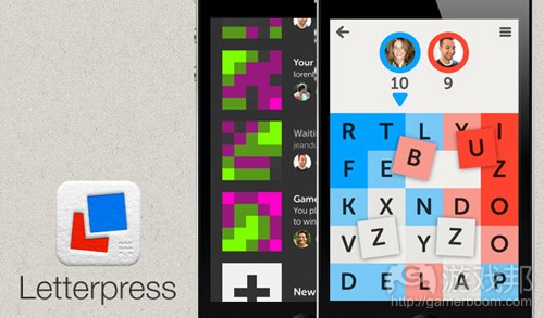
例如,iOS游戏《Letterpress》和任务清单应用Clear就像从另一个星球空降到iOS上似的。Clear的开发团队有意避开传统的iOS用户界面,而选择以平面几何图形搭配鲜明的色彩为主题。除了苹果,开发者们还从其他应用和资源中汲取灵感,包括苹果竞争对手微软的Metro风格。这是Clear联合开发者之一Phill Ryu在最近采访中所透露的情况。
虽然Ryu非常尊重苹果那种仿真同形物(游戏邦注:同形物是一种物品的装饰或设计模仿另一种由不同材料或技术制成的物品,例如,一个陶壶用人造的铆钉作为装饰,使人想到它是金属制作的)的设计风格,但华而不实的点缀物并不合适他的应用类型。
他表示:“我们认为应用的功能是帮助人们完成工作,所以界面应该百分之百地专注于这些功能,而不能被其他东西干扰,我们的做法就是尽量将无关紧要的碎片减到最少。”
与此同时,一支更大的谷歌开发团队凭借它的修订版邮件、地图、搜索和YouTube应用博得苹果用户的喝彩。应用的外观与iOS的应用保持连贯性,但没有采用苹果的菜单风格和UI特效,如卷页效果。开发团队的目的是开发具有“谷歌风格”的iOS应用。
iOS的新纪元
我们看到了iOS历史上的设计转折点。自从2008年中旬iOS应用商店开放以来,苹果的设计风格就一直影响着第三方应用工发者。通过iOS SDK和在全球开发者大会上确立的最佳基准,苹果的设计团队就确立自己的设计基调,并使之成为iOS应用和用户界面设计的风格标准。
正如我们看到的,现在这种影响受限了。有些设计师很直接地表示对老套的苹果外观感到厌倦。一定程度上,这种改变可以认为是苹果并不华丽的转身——乔布斯最重要最不朽的遗产之一就是他的设计眼光。原版Mac直观的桌面风格,世界最薄的笔记本MacBook Air和iPhone软件的基本元素既招致无数模仿,也赢得无数敬意。
设计师们开始在苹果手机平台上自主设计,这是iOS历史上的重大变化——但也可能是不可避免的。有些从事iOS应用的开发者在这几五年的时间里始终坚持自主风格。我们看到用户界面和设计语言更具多样性,这种现象可以归咎于平台的成熟、用户的体验和70万个应用品牌的激烈竞争。
突出特色
因为iOS商店的规模太大,各个开发公司自然必须想办法在激烈的竞争中占上风。像谷歌这样的公司,这意味着突出品牌特色。
Snapguide应用开发者Daniel Raffel表示:“应用能够扩展自己的品牌,突出特点,是因为现在要在手机上制作相当复杂的应用是有可能的。公司必须突出自己和他们的品牌。”这么做的难点在于“需要大量工作”。并非所有应用制作团队或公司都有相应的时间、资源或技术来定制应用的小工具或重写应用的某个完整部分。
那就解释了为什么能成功革新iOS设计风格、且技术和实力都强大的团队并不多。
老手也创新
Loren Brichter是Tweetie和《Letterpress》的制作者,他试图给自己的应用建立与其他99%的应用都不同的标准。他没有被设计时尚所吸引,他只是给自己的拼字游戏设计一种非常简单的外观,因为他认为相比于更流行更复杂的设计,这种简约的风格更适合iPhone的图像引擎。他认为:“简单的平面图像更适应当前的硬件。”
虽然Brichter的经验丰富,被认为是目前最优秀的苹果平台开发者之一,但他也努力创新自己的iOS设计。Clear开发者Ryu将苹果的基本设计原则比喻成作家的写作风格:“就像现代语言学会的写作风格指南和要求,对初学者来说是有重大的指导意义的,因为初学者最害怕犯错。但是,当新手成长为作家,开始形成自己的风格,要为不同故事放宽原则时,通过现代语言学会的指南就会抑制他的写作潜能了。”
同形物主义
你可以说,这么多年来,苹果将亿万手机用户吸引到它的iOS设备上来,与在它的软件上坚持不懈地运用同形物设计不无关系。Ryu指出,正是这种风格让“2岁到90岁的技术恐惧者”乃至所有人都对使用iPhone或iPad感到舒服。
在设计界,有人呼吁跳出这种设计框架,不是因为它的“俗气”或老套,而是考虑到现在的一般用户。以软盘为例,对从来没有使用过软盘的年轻人来说,这种东西不能让他们想到“存储”。Raffel解释道:“因为我们有这么多数字原住民并不知道这种东西指什么,所以过去的设计时尚不一定适合当下的情况。”
但平板电脑显然不是千禧一代所独有的专利。许多人仍然需要苹果的基本设计要素作为“训练的轮子”。当然,有些人也可能不再需要它们了。“但考虑到智能手机市场的成长方式,我认为默认包含训练的轮子还是有道理的。”
iOS设计的未来
导致人们对iOS的这些同形物风格的偏爱,乔布斯起了很大作用。他喜欢装订的皮革、螺旋线装笔记本和撕裂的纸页。但正如之前报道所说的,那些处于工业设计领袖Jony Ive圈子里的人想摆脱那种设计,一场关乎未来设计理念的战争已经打响。
既然Ive负责所有苹果界面,我们可以很肯定地说,他会按自己的方式开创iOS设计的新纪元。但这个过程可能不会发展得太激进或太迅速。如果该公司遵循它发布的年度工作计划,那便意味着苹果的下一次重大变革或一般程度的iOS设计转变不会在6个月内发生。
这是一份承诺,保持苹果平台的灵活性及其第三方开发者们对平台的忠实度,使他们努力为这个平台创造最新鲜最前沿的应用。但这也是一个奇怪的转变——苹果开发者不但受到微软和其他设计师的启发,而且连苹果自身也丧失了对iOS平台的主要影响力和先锋地位。(本文为游戏邦/gamerboom.com编译,拒绝任何不保留版权的转载,如需转载请联系:游戏邦)
Mobile designers no longer see Apple on the forefront of iOS design
By Erica Ogg
As the iOS App Store nears the half-decade mark, one of the biggest changes we’re witnessing is how app developers are beginning to go their own way in terms of design. Some of the most forward-thinking designers are bucking Apple’s traditional look for cleaner, simpler interfaces.
Talk to a respected iOS app designer these days about their favorite iOS apps and something becomes clear: they don’t look like traditional Apple apps. Some of the best-received and most beautiful apps on Apple’s own platform lately are abandoning iOS’s textures, shadowing and 3D effects in favor of flatter, cleaner, often less cluttered designs. But rather than an aberration, this new look is likely the future of iOS design. And oddly enough, Apple’s probably going to be one of the last to catch up to the trend.
The iOS game Letterpress and to-do list app Clear, for example, look like they’ve parachuted onto iOS from another planet. The team behind Clear very intentionally steered away from a traditional iOS user interface — instead choosing a theme that is very flat and geometric with vivid colors. Besides Apple, its creators also drew on inspiration from other apps and sources, including rival Microsoft’s Metro style, Phill Ryu, one of the three co-creators behind Clear, told me in a recent interview.
Letterpress
While Ryu has great respect for Apple’s skeuomorphic design style that leans heavily on real-world metaphors, extra bells and whistles weren’t appropriate for his category of app.
“We felt as an app to help you get stuff done, the interface should 100 percent focus on those things and nothing else, so it was an exercise in keeping the number of puzzle pieces minimal,” he said.
A much larger team at Google, meanwhile, has been wowing Apple users with its revamped Mail, Maps, Search and YouTube apps. The look is coherent across its iOS apps, while at the same time abandoning Apple’s menu styles and UI touches like page curls. This came about after the company started devoting teams to developing apps for iOS that retained their “Googliness.”
A new era for iOS
Clear
We’re witnessing a turning point for design in the iOS era. From the time Apple opened the iOS App Store in mid-2008, it has been the main influence on third-party app makers. Through the iOS SDK as well as benchmarking best practices for developers at its WWDC conference, Apple’s design teams set the tone and made it arbiter of taste for design and user interfaces on iOS.
As we’ve seen, there’s now a limit to that influence. Some designers are just flat-out sick of the same old Apple look. Depending on how you look at it, this change could be considered an embarrassing turn for Apple: One of Steve Jobs’ most important and enduring legacies is his eye for design. The intuitive desktop metaphor of the original Macintosh, the ultraslim packaging of the MacBook Air, and the basics of iPhone software have inspired untold numbers of copycats and homages.
That designers are beginning to go their own way on Apple’s mobile platform is a sea change in the iOS era — but it may also be inevitable. Some of the app makers now working on iOS have been at it for nearly half a decade. The diversity we’re seeing in user interfaces and design language can be attributed to the platform’s maturity, users’ experience, as well as the need for brands to stand out among the more than 700,000 other apps Apple offers.
Trying not to fit in
Because of the size of the iOS store, companies naturally look for ways for to stand out from the crowd. For companies like Google, that means distinctive branding.
“[Apps] extending their brands are looking different because it’s now possible to build really complex apps on mobile,” said Daniel Raffel, who created the Snapguide app. “People need to distinguish themselves and their brands.” The downside is “it just takes a lot of work.” And not every app-making team or company has the time, resources or know-how to spend time on customized widgets or rewriting whole parts of apps.
That explains why there are just a few really skilled or resource-rich teams that are doing meaningfully different iOS design successfully.
Experienced designers can take creative license
Loren Brichter, the creator of Tweetie and Letterpress, tries to apply a different standard to his app than roughly 99 percent of others. He’s not drawn to design fads; he just gave his word game a very simple look because he believes that kind of design is what works most smoothly with the iPhone’s graphics engine, as compared to more popular, complex designs. “Flat, simple shapes lend themselves naturally to [the] current hardware,” he told me.
But Brichter is vastly experienced and regarded as one of the best developers working on Apple’s platform today. Ryu, who helped build Clear, compared Apple’s basic design principles to style guidelines for writers: “It’s like MLA writing style guides and stuff, it’s a great guide for beginning writers when you are most worried about making mistakes. But then you grow as a writer and start developing your own style, and bending the rules to suit various stories, and the MLA rules start holding you back from potential greatness.”
The case for skeuomorphism
You can argue what’s drawn hundreds of millions of mobile users to iOS devices over the years is Apple’s reliance on skeuomorphic design in its software. It’s what let everyone from “2-year-olds to 90-year-old technophobes” feel instantly comfortable interacting with an iPhone or iPad, Ryu pointed out.
Apple’s Find My Friends exemplifies its taste for skeuomorphic details like stitched leather
There are some in the design community who advocate thinking beyond this style, not because it’s “tacky” or old, but because of who the average user is now. Floppy disks, for example, don’t mean “save” to young people who have never used a floppy disk in their life. “Because we have so many people who are digital natives that don’t know the thing being referenced, it’s probably not an appropriate design fad going forward,” said Raffel.
But tablets are obviously not exclusively the province of educated Millennials. Plenty of people still need Apple’s basic design cues, which can act as “training wheels,” Ryu said. Sure, some people may not need them anymore. “But the way the smartphone market is still growing, I would posit it still makes sense to include training wheels by default.”
The future of iOS design
Jobs was the driving force behind the preference for those skeuomorphic details in iOS. He loved the stitched leather and spiral notebooks and torn pages. But as has been previously reported, a war over the future of that philosophy has erupted as those in industrial design head Jony Ive’s circle wanted to move on from that look.
Now that Ive is in charge of all of Apple’s interfaces, it’s a good bet he will get his way and a new era of iOS design will emerge in Cupertino. But it’s probably not going to be radical and it’s probably going to happen slowly. If the company sticks to its yearly release schedule that means that the next chance for Apple to exact any big or even medium-sized iOS design changes won’t come for more than six months.
It’s a testament to the flexibility of Apple’s platform and the dedication of its third-party developers to work hard to create the most innovative and forward-thinking apps for its platform. But it’s certainly a strange turning of the tables — not only that Microsoft and other designers are inspiring Apple developers, but that Apple itself is no longer the main influencer of what is considered cutting edge design on its own platform.(source:gigaom)








 闽公网安备35020302001549号