论述游戏界面设计的10点原则
作者:Lewis
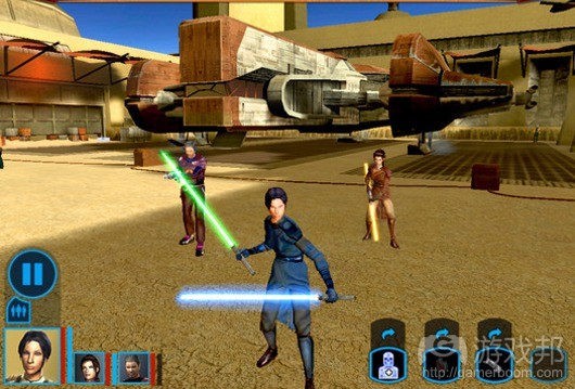
所有游戏都有界面,无论是点击按键、移动操纵杆,还是控制纸牌和棋子。糟糕界面会摧毁一款游戏;若你常玩电子游戏,定有遇到这种沮丧情况:游戏使你难以向其传递自己的期望操作,这就是界面设计失败。
在AAA游戏领域,通常会有1-2个设计师专门负责游戏界面。虽然学习游戏设计的人士不会将自己的所有时间都投入到界面设计中,但这依然是相当重要的话题。
Jakob Nielsen是运用商业网站方面是专家,已投身其中许多年。Nielsen的许多关于制作易用网站的文章也同样适用于设计杰出游戏作品。
Nielsen总结出网页用户界面设计的10大普遍法则。下面我将简要陈述若干涉及游戏设计的内容。
“系统状态的可见性”。用户应能够查看游戏,知晓其中进展情况。他们应能够看到操作产生的结果(游戏邦注:通常要能够即时呈现)。
“机制易于目标用户的理解”。游戏应该采用用户能够理解的词汇和概念。我们知道,你不会要求5岁儿童完成复杂数学题目,或把握“流行词汇”。但所有目标用户都自己的特点,游戏需要做出相应调整。此外,信息应该以富有逻辑的方式呈现。
“用户控制和自由”。若用户在运用界面时犯错(游戏邦注:这不是源自游戏漏洞,而是游戏操作失误),给予他们弥补的机会。电子游戏应让玩家享有取消和重做选择。
“一致性和标准化”。遵循平台惯例。用户总是有自己的期望操作方式,如果你以相反方式设置内容,就会阻碍他们从中收获乐趣。这里最好以标准方式进行操作。
“防范失误”。合理设计游戏,避免用户犯下操作失误。虽然失误反馈有助于优化设计,但避免失误的设计显然更可取。
“辨识而非记忆内容”。不要要求用户记忆或追踪游戏信息,这些工作应由游戏完成。若操作指示无法立即被玩家看到,需确保其易于玩家发现。
“运用的灵活性和高效性”。允许熟练玩家采用捷径,例如控制器上的定位钥匙和操纵杆。不要期望新用户会操作模糊指令。
“美观和简约设计”。不要提供不相关的信息。若一个操作能够完成任务,不要设置两个操作。
“帮助用户辨识、判断和修复失误”。若玩家操作失误,准确描述问题,提供相应解决方案。
“帮助和文档信息”。设计理想的游戏不会要求玩家学习任何规则,但这执行起来极为困难。帮助和文档内容应便于玩家搜索。(本文为游戏邦/gamerboom.com编译,拒绝任何不保留版权的转载,如需转载请联系:游戏邦)
The Interface
by Lewis
All games have an interface, whether it’s pressing a button or moving a joystick, or manipulating cards and pieces. A poor interface can ruin a game; if you’ve played many video games you’ve surely been frustrated when the game made it hard for you to tell it what you wanted to do, a failure of the interface. We’d all like to just think what we want the game to do, and have it act accordingly, but that remains an aim for the Matrix/Star Trek holodeck future.
For a AAA game there might be a designer or two who only work on the game interface. People who are learning to design games cannot devote all their time to interface but it is still important topic.
Jakob Nielsen is the guru of usability for commercial Web sites, and has been for many, many years. (His partner is Don Norman, who wrote “The Design of Everyday Things”, a classic book which I recommend you read.) Much of what Nielsen writes about making easy-to-use Web sites also applies very closely to designing good games. Every few weeks he publishes a new article. I strongly recommend that anyone who wants to be a good game designer read his material. You can begin with http://www.useit.com/alertbox/design-diversity-process.html
Nielsen identifies ten general principles–rules of thumb–for Web user interface design. I’ll try to summarize these in relation to games.
“Visibility of system status”. Users should be able to look at the game and know what’s going on (as far as they ought to know, of course–information about the opposition may be hidden). When they do something they should be able to see the result, usually immediately.
“Match between system and the real world”. The game should use words, phrases, and concepts easily understood by the user. We know that you shouldn’t ask five-year-olds to do complex math or understand “big words”. But every target audience has its characteristics that the game needs to accommodate. Furthermore, information should be presented in a logical order.
“User control and freedom”. Give users a way to bail out when they make a mistake in using interface–not a game mistake but a game manipulation mistake. Allow undo and redo in video games.
“Consistency and standards”. Follow platform conventions. People expect things to work a certain way, and if you do it another way that may interfere with their enjoyment of the game. This is one place where doing it the standard way is almost always a good thing.
“Error prevention”. Design games so that users are unlikely to make mistakes. Good error messages are important but design that avoids mistakes is better.
“Recognition rather than recall”. Don’t make the user memorize things or keep track of things, let the game do it. Instructions should be easy to find if they’re not visible.
“Flexibility and efficiency of use”. Allow expert users to install shortcuts, such as remapping keys and joysticks on a controller. Don’t expect the new user to use obscure commands.
“Aesthetic and minimalist design”. Don’t provide irrelevant information. Don’t require two actions where one action will do.
“Help users recognize, diagnose, and recover from errors”. When a user does something wrong, describe exactly what the problem is and suggest a solution
“Help and documentation”. The ideal game does not require the user to learn any rules, but this is rarely practical. Help and documentation (such as rules for tabletop games) should be easy to search.(Source:pulsiphergamedesign)


 闽公网安备35020302001549号