开发者分享游戏新手教程及UI设计教训
作者:Guy Bar-ner
数月之前,我们Beta测试了自己的语言学习冒险游戏《Immersia’s intro to French》。以下图表就是我们发布游戏Beta版本首月到第二个月的关键粘性状态:完成关卡1(约20分钟)的用户比例,完成关卡2(约40分钟)的用户比例,以及完成整款游戏的用户比例(超过1小时)。
这些数据实际上有误。在头几个月中,我们有许多朋友以较高的粘性体验游戏,所以实际数据应该更糟糕(这正是为何首月的最初流量和注册率更高的原因)。从我们所搜集的数据来看,实际上没有任何一位“外部玩家”能够接近于完成整款游戏。
我们为此准备了4个月时间。就这样一个小型独立团队夜以继日地奔赴这个目标。我们怀着激动紧张的心情,为游戏的发布开始倒计时5!4!3!2!1!…… 发布了!大家开始举杯欢庆,相互拥抱。之后开始收到电子邮件:“我不懂怎么操作!”“噢,我看不到按钮在哪里。”“它看起来很好,但我玩了3分钟就退出了。”这里我们并不讨论一些技术故障问题,关键是用户根本就不理解我们在做什么!但这也太简单了……他们是白痴吗?
当然不是。他们只是不像你过去数月一样同游戏接触如此频繁。我们知道自己推出了一款很棒的游戏,但人们似乎就是不买帐。我们在自己能够找到的所有设备上测试了游戏,检查了障碍人们玩游戏的漏洞和故障,但却一无所获。以下就是我们从中所汲取的教训:
教训1:与玩家交流(注意如何同他们对话)
我们开始询问周围的人的想法,但他们并不是很清楚要说什么。但只有当我们将游戏拿给完全陌生的人时,我们才能得到真正的结果。这里有个建议就是,不要为他们示意如何操作——你要看看他们如何自己处理。除此之外,不要坐得太靠近他们并盯着他们看——这会让他们感觉紧张和不自在,没有人可以在被“测试”的状态下自然地玩游戏。关键在于坐在他们旁边,但却好像你在忙其他的事情,而事实上你确实是在测试他们如何玩游戏。只有当我们开始这样做时,才能获得真正而有益的反馈。
教训2:你的UI不应该太复杂。
玩家遇到的首个问题就是我们教程的设置问题。因为担心教程会过于无聊,我们插入了自己认为有趣的文字关双语,但这样却取得了适得其反的效果。例如:
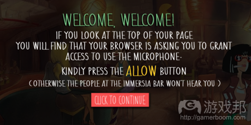
因为我们的游戏是基于浏览器运行,并且需要结合语音辨识能力,我们就需要用户授权浏览器访问麦克风。我们希望这会有趣而令人愉快,所以这就是它最初的样子:
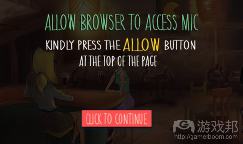
这真是个糟糕的想法。我们的文字过于冗长和复杂了。我们知道这个页面的作用,但他们并不知道。所以我们进行了调整,只保留必要的内容。以下就是调整后的样子:
更简单,更清晰,也较不繁琐。这还只是其中一例。我们在三四个不同的地方也这么做了。其影响甚至为惊人。另一个更简短的教训就是:小写字母比大写字母更受欢迎。看看以下对比图就知道了:
后者的字母更明显,你也不需要费劲去想它的内容。
这两个调整甚为重要,但他们与第三个相比还是小巫见大巫了:
教训3:用你的UI而非文字来解释。
《Immersia’s intro to French》是一款关于学习法语的游戏,以下就是其运行方式:
1.当我们给你一个英语句子时,你得将它翻译成法语。
2.为了实现这一操作,你得点击一个单词并查看它的翻译结果。
3.在你知道该怎么说之后,就要点击一个录音图标,大声说出该句子,并再次点击令其停止。
4.如果说正确了,你就继续玩游戏。如果错了,你就得再检查和尝试一次。
如下图所示:
这里有一些你可能会注意到的东西。
第一,麦克风图标是一个主要功能,但很小,离相关文本位置也很远,它的颜色也并不突出。
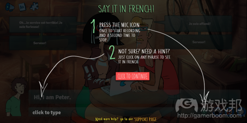
第二,屏幕上没有任何提示你点击,说出句子,并再次点击的标志。因为操作需求并不明确,所以我们又添加了以下指引画面:
我们之前相当确信这里的调整已经一清二楚,玩家明白哪个操作先,哪个操作后了!
但事实并非如此,一切都颠倒了,箭头令人困惑——并且文本太多了!所以我们测试了一些选项,这就是我们所得的结果:
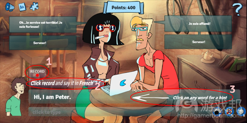
这种调整看似微小,但影响却不容小觑:
1.我们用一个标注着“RECORD”的图标替换了麦克风图标,把它做得更大,并移到其相关的文本旁边。
2.我们有一个明确的行动召唤:“点击录音并用法语说出来”。我们用斜体字将其清晰地标注出来。
3.帮忙提示只会在用户得空四处看看并了解自己身在何处的8秒之后出现。
我们抛弃了“帮助画面”中的“文字”和“箭头”,并再次测试。这次我们还是找自己身边的人(目前为止我们还是在同朋友的朋友,以及随机陌生人交流)。其反应却几乎是令人意外,他们并没有为新设计而惊吧。他们也没有用充满崇拜的眼光看着我们。他们只是理解了应该怎么做,清楚每一步的操作。我们发布了新版本,并等待大家再次反馈。最终,大家都理解了游戏玩法。
最后总结:
1.这里最重要的经验,可能也是我们唯一做对的一件事就是——Beta测试。当我们首次发布时,我们的跳出率几乎达到90%。如果我们当时就将其向成百上千玩家推广,其后果不堪设想。200人就足以获得足够的初始测试结果。
2.我在此提供的插图就是最终结果,但这并不代表我们很轻松就搞定了。我们所做的每一次调整都是团队集体讨论的结果,执行调整和测试至少需要6-7人。
3.我们尝试过弹出窗口、教程视频、叙事内容等操作,结果发现最佳解决方案通常就是最简单的。(本文为游戏邦/gamerboom.com编译,拒绝任何不保留版权的转载,如需转载请联系:游戏邦)
Practical Tutorial and UI Lessons We Learned From Our Game
by Guy Bar-ner
The following blog post, unless otherwise noted, was written by a member of Gamasutra’s community.
The thoughts and opinions expressed are those of the writer and not Gamasutra or its parent company.
A couple of months ago we Beta tested our language learning adventure game, “Immersia’s intro to French”. Here’s the improvement we had in the key engagement stats form the first month after launching our game Beta to the second: % of people who finished level 1 (about 20 minutes of play), level 2 (40 minutes) and % of people who finished the game (just over 1 hour of play)
Month1:
These stats actually lie. During the first months, many of our friends played the game with high engagement, so the real numbers were actually even worse (this is alo why initial traffic and registration rates was higher during the first month). From what we gathered, practically none of the “outside players” got anywhere near finishing the game.
And this is what happened:
We prepared for that moment for 4 months. A small indie team working night and day towards this one goal. we counted back with your finger on the mouse – 4!… 3!… 2!… 1!… Launch!
Everybody were drinking up and high-fiving each other. And then the E-mails started arriving. “I don’t understand what to do!”, “Oh, I didn’t see that button there”, “It looks really nice, but I stopped playing after 3 minutes”. We’re not talking about some technical glitch. People didn’t seem to understand what we were doing at all! But it’s so simple… what are they, stupid?
Well, of course not. They just haven’t been looking at it for the past few months like you have. We knew we had a great game, but people just didn’t seem to get it. We tested everything on every possible device we could get our hands on. We checked for bugs and glitches that prevented people from playing, and didn’t find any. And here was the first thing we learned:
Lesson 1: Talk to your players (and how to talk to them)
We started asking people around us what they thought, but they didn’t really know what to say. But it was only when we gave the game to complete strangers that we started getting results.
And here’s a tip. Don’t show them what to do – you want to see how they’ll manage by themselves. But also – don’t sit next to them and stare at them – that would make them to nervous, and no one can play a game while being “tested”. The key is to sit next to them and look as if you’re dealing with something else, while in reality that’s exactly what you’re doing – testing to see how they manage by themselves. It was only when we started doing that that we started getting real and beneficial feedback.
Lesson 2: Your’re UI is not the place for clever puns. Keep things simple.
The first thing players had a problem with is the wording of our tutorial. Worrying the it will be too boring, we inserted what we thought will be funny word plays, but those ended up making what we really wanted to do. Here are a few example.
Because our game is browser based andworks with speech recognition, we needed the user to authorize the browser to access mic. We wanted it to be fun and breezy, so this is how it looked initially:
That was a bad idea. Our wording was too long and complicated. We knew what the page was for, but that didn’t. So we changed it, and kept only what was essential. Here’s how it looked after:
Simpler, clearer, and much less overwhelming. And that’s just one example. We did the same in 3-4 different places. The impact was amazing. Another, shorter lesson was this: prefer lower case to upper case. Just look at this:
Vs. this:
Letters just stand out more, and you don’t have to make an effort to read what it says.
These first two changes were significant, but they were nothing compared with this third one:
Lesson 3: Exlain using your UI, NOT by using words
Here’s where thing get a little tricky, but bear with me.
Immersia’s intro to French is a game for learning French. This is how it works:
We give you a sentence in English. You have to translate it into French.
To do that, you can click on a word and see it’s translation
After you know what to say you have to click an icon to record, say the sentence out loud, and click it again to stop.
If you got it right, you move on. If not, you have to check and try again.
And here is how it looked:
There are a few things you might have noticed.
One, the mic icon (3), which is a main feature, is small and also pretty far away from the text it refers to (1), and its color doesn’t stick out.
Second, there nothing to imply you have to click it, say the sentence, and click again. Because the action required wasn’t clear, we added an instruction screen:
We were pretty sure we made it as clear as day: step 1, step 2 – go!
Well it wasn’t. everything was upside down, the arrows were confusing and anyway – it was just too much text! So we tested a few options, and this was what we came up with:
The changes look minimal- but they made all the difference:
We replaced the mic icon with an icon that had “RECORD” written on it (1), we made it bigger and moved it next to the text it referred to.
We have a clear call to action: “Click record and say it in French”. Bolded, in italics, and clearly stated.
The helping hint itself (3) appeares only after 8 seconds, after the user had a chance to look around and understand where he was.
We dropped the “help screen” with its “words” and “arrows”, and tested it again. Once more we bothered people around us (by now we were talking to friends of friends of friends, and also random strangers. The reaction was almost anticlimactic. They didn’t go “WOW” at the new design. They didn’t cheer or looked at us with awe. They simply Understood what to do, every step of the way. We launched the new version and waited for the numbers to come and when they did, we couldn’t believe it. Finally, there world understood.
Final conclusions:
The most important thing to gather from this, and probably the only thing we did right – Beta test. When we first launched we had an almost 90% bounce rate. I hate to think what would have happened if we were marketing it to thousands of players. 200 are more than enough to get initial stats.
The illustration I gave were final results, but by no means were they easy to reach. Every change we made was the result of a team think-tank meeting, making a change and testing it with at least 6-7 people.
Occam was right – the best solution is usually the most simple. We tried pop-ups, tutorial videos, narration.(source:gamasutra)
上一篇:独立游戏相互合作才能拥抱未来
下一篇:帮助手机游戏“抗衰老”的5大秘诀








 闽公网安备35020302001549号