开发者分享设计及优化游戏Logo的经过
作者:Simon Dean
为了在下个月向Steam Early Access发布《Folk Tale》做准备,我们需要重要设计游戏logo。鉴于我之前的市场营销经验,以及Jennifer的美术功底,我们决定设计出最杰出的资产,并记录下这一过程,希望对其他独立开发者有所帮助。
简介
在开始任何视觉化工作之前,我准备了Jennifer将要接手的创意简报,将设计目标划分为强制性(必须完成)以及可选项(应该可以完成)两种类型:
*必须让它结合其他营销资产(例如截图、封面艺术)的时候看起来像“橡皮图章”一样自然;
*必须思考游戏的美术风格(手绘细节);
*必须传达游戏主题(奇幻的中世纪主题);
*必须能够根据海报、网页条幅等不同规格进行缩放设计;
*最好可能用于传真机进行黑白复印(多数法律文件的需要)。
排印
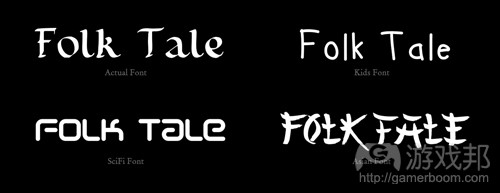
现在有了创意简报,Jennifer开始选择一系列候选字体,并展示了一个黑白板列出候选字体进行考虑。对于不带额外美术设计,仅含排印元素的游戏logo而言,排刷(以及“字体”)可以传达出产品的多种信息。它应该成为logo中所有元素中最显眼的一者,而准备一个黑白板来展示字体,更有助于我们专注于字体并做出选择。以下插图是可传递4种不同含义的字体:
在决定最终字体之前,要仔细考虑字距调整,行距等所有元素。我们并不像要太细的轻量级字体,因为在更小的图片规格时,字体就看不清了,并且它无法支持“橡皮图章”目标。默认的字距调整(字母的间距)也太宽了,所以我们要压缩一下。
样式
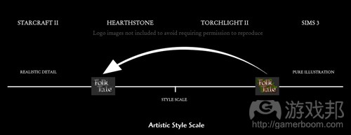
创意简报中就要提到样式的问题,但我们很早就发现Jennifer需要知道logo应该选择的样式范围。我们并不想让logo呈现卡通及儿童风格,并且游戏内部元素也并非现实主义风格。我参考了其他游戏和logo,表达了我们想要的美术风格。
早期主题概念
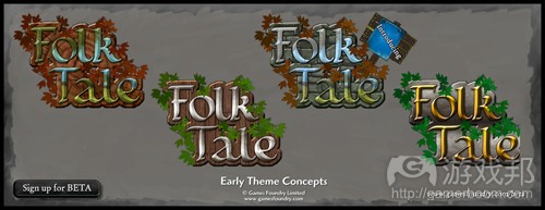
我们从候选字体中做出选择,Jennifer开始着手开发粗略的主题概念。最后除了其中一个,其余选项都将被抛弃,因为它们都不算体面,有些甚至是从游戏内部文本提取出来的内容。
我们团队(代表18-34岁目标用户)喜欢的是那个带有树木年轮纹理和绿叶的logo,因为桔黄色的叶子在褐色的树木纹理中很不显眼。而金属色的字体则引进了游戏中的另外一种资源元素(游戏邦注:游戏中含有树木、铁、石头和食物元素)。
概念提纯
确定了早期主题概念的元素之后,我们又添加了更多想法,Jennier着手改良概念。
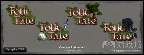
我们尝试了不同组合方法,最终进行了更大的位移以便添加其他元素。添加橡树好像与logo边缘的树叶元素重叠了,所以我们就排除了这个元素,因为它并没有增加“故事”的叙述或视觉效果。而添加游戏中的废墟效果也同样不理想,但添加剑和盾牌却发展了“故事”元素,因为这为主题增添了冒险色彩。但这种画面还是有点凌乱,所以我们就把盾牌也去掉了。
关键设计特性
选择了最终元素,并核对了设计目标之后,现在就该来添加细节元素了。我们开发中的不同调整内容包括:
*选择高光让叶子看起来不那么像荆棘,降低了让游戏看起来体验不佳的潜在心理反应;
*针对细节进行强化,以便它在缩小比例时仍能保持原来的品质;
*添加叶子的阴影以增加深度;
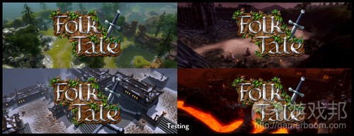
*增加叶子的色差,以便logo更好地融入游戏截图等不同的背景。《Folk Tale》地图拥有许多不同的阴影区,其中包括雪地、火山岩、青山、沙漠和沼泽。因此logo要能够与所有这些背景环境融为一体,但却不可被其掩盖;
*在文本中添加一个微妙的阴影,以便它在褐色树木年轻中更为显眼;
*用黑线勾勒字体以便文本更具可视性;
*添加蓝绿色轮廓光以突显阴影附近的色彩对比;
*重新调整了叶子以免它们影响文本能见度;
*添加一致的定向照明;
*增加文本的金属质感;
*为金属元素添加冷却蓝色调,以使其区别于叶子和树木的自然色调。
测试
最后一轮测试是为了查找比例缩放问题,以证实logo可以在几乎所有场景中生效。下图是其中一个测试幻灯片。
我们在测试中进行了一些次级调整,在启动会议三周之后,我们最终敲定的logo版本如下:
(本文为游戏邦/gamerboom.com编译,拒绝任何不保留版权的转载,如需转载请联系:游戏邦)
Designing Game Logos
by Simon Dean
The following blog was, unless otherwise noted, independently written by a member of Gamasutra’s game development community. The thoughts and opinions expressed here are not necessarily those of Gamasutra or its parent company.
Want to write your own blog post on Gamasutra? It’s easy! Click here to get started. Your post could be featured on Gamasutra’s home page, right alongside our award-winning articles and news stories.
In preparation for hopefully releasing Folk Tale on Steam Early Access next month, we needed to re-design the game logo. Pooling my prior marketing experience and Jennifer’s artistic abilities, we set to work designing one of the most prominent assets and documenting the process in the hope it might help other indie developers, or simply be of interest to members of the
Folk Tale community.
The Brief
Before any visualization work was started, I prepared the creative brief that Jennifer would be working from, splitting design goals into mandatory ( ‘must’ ) and optional ( ‘should’ ) including:
•Must work as a ‘rubber stamp’ that looks natural when combined with other marketing assets e.g. screenshots, cover art
•Must reflect the artistic style of the game ( hand painted with high detail )
•Must communicate the theme of the game ( fantasy medieval theme )
•Must be reproducible at different scales from large posters to small web banners
•Should work in black and white for reproduction on fax machines ( mostly legal documents )
Typography
With the creative brief in hand, Jennifer set about selecting a number of candidate font faces, and presenting a black and white candidate board for consideration. Typography ( aka ‘the font’ ) can communicate so much about a product that quite often you’ll see game logos made purely from typography without additional artwork. It demands the greatest attention of all elements in a logo, and preparing a simple black and white board helps focus purely on the type. For illustration purposes, here are four fonts that communicate four very different things:
Kerning, line spacing, and weight all needed consideration before arriving at the final font face. We didn’t want a lightweight font that was too thin because it would get lost at small scale and not support the ‘rubber stamp’ goal. The default kerning ( spacing between characters ) was also too broad, so we condensed it.
Styling
It should really have been included in the creative brief, but early on we found that Jennifer would require direction on where within the style spectrum the logo should sit. We didn’t want pure illustration which is often more aligned with cartoons and products targeting children, nor does the in-game art style focus on realism. Using other games and logos as references, I was able to communicate the desired art style.
Early Theme Concepts
With our selection made from the candidate fonts, Jennifer set about developing rough theme concepts. As all but one would be throw-away work they were quick and dirty, in some cases pulling from in-game textures.
The team ( representing the target audience demographic of gamers aged 18-34 ) really liked the tree rings texture and green for the leaves; the orange leaves were lost against the brown of
the tree ring board. The metal color of the font would introduce an additional resource from the game ( wood, iron, stone, food ).
Concept Refinement
Having identified elements from the early theme concepts that we wanted to take forward, we added a few more ideas and Jennifer set about refining the concept.
We tried different alignments, and settled with a broader offset that would allow us to add a prop. The oak tree further compounded the leaves at the edges of the logo, so this was ruled out because it didn’t add to either the ‘story’ being told or visual impact. The rendered in-game ruin was discounted because it didn’t feel right. The sword and shield however developed the ‘story’ by adding a hint of adventure to the theme. It still felt a bit busy, so we dropped the shield from the design.
Key Design Features
With the final elements chosen and checked against the design goals, it was time to add the detail. Throughout development various tweaks were made, including
•Specular highlights reduced on the leaves to make them less thorn like, reducing the risk of a subconscious emotive response that the game would somehow be painful;
•Detail was left extra-sharp so that it would be retained during the smoothing that happens when scaling down;
•Shadows were added to the leaves to add depth;
•Leaf color variations were added to help the logo blend with various backgrounds such as screenshots. Folk Tale maps have a lot of different ambient zones including snow, lava, green hill, desert, and swamp. The logo needed to blend against all of these without getting lost.
•A subtle drop shadow was added to the text to help lift it off the brown tree ring board
•A black outline was added to text to help readability
•A cyan rim light was added to help color contrast near the shadows
•Leaves were de-cluttered to prevent obscuring the text
•Consistent directional lighting was added
•Bloom was added to enhance the metallic feel of the text
•The cooling blue hue was added to metallic elements to help differentiate them from the warm natural hues of the leaves and wood
Testing
A final round of testing was performed to check for any scaling issues, and to validate the logo would work in nearly all scenarios. Below is but one of the test slides.
Minor refinements were made during testing, and three weeks after the initial meeting, we had our final logo:(source:gamasutra)







 闽公网安备35020302001549号