点评《时空幻境》败笔:文本内容和“A”按钮
作者:Jake Shapiro
大量的文本内容
开始之前,让我再次重申《时空幻境》是一款非常出色的现代独立游戏。不仅拥有华丽的视觉效果,激动人心的音效,其游戏情节中还贯穿着独特的游戏机制。这款游戏的存在对于《超级马里奥兄弟》来说是一大讽刺。这也是我对该款游戏的批评,但是这种批评是我们作为游戏社区一份子对一款优秀游戏的学习与借鉴。
有人说,《时空幻境》不会讲故事。Jonathan Blow创造了一个体现挫败与伤感的复杂故事,但是他却使用大量的文本内容去阐述这一故事。
开发者希望让《时空幻境》呈现出一种艺术形式。但是如果游戏使用另外一种媒体形式去阐述自己的故事,玩家便会觉得游戏所传达的任何信息都很乏味。
我并不是反对游戏中的文本表达。游戏最初就是由文本冒险游戏发展而来,如《Colossal Cave Adventure》和《Zork》。甚至在现代游戏中,文本模式也优于糟糕的配音选择。
但是依我个人浅见,只有不能通过玩法传达故事的游戏,才需要依赖文本(以及过场动画)模式了。我们之所以大力赞赏Valve的游戏便是因为《半条命》和《传送门》都能够将故事与游戏玩法有效地结合在一起。但是《时空幻境》却使用大量的文本去传达故事内容。如果表达够有趣的话,玩家也不会认为文本内容乏味;但是如果故事内容过于陈旧,角色太过无聊,玩家可能会说《超级玛丽兄弟》也是这样啊,但是话说回来,至少《超级玛丽兄弟》未使用大量的文本内容。
如果Blow摆脱这种表达形式又会是怎样一种情况?“挫败与伤感”的主题将仍然贯穿于《时空幻境》的游戏玩法中。尽管游戏故事可能会变得较为含糊,但是如果抛弃大量的文本表达,Blow便能够更加直白地阐述自己的内心想法。
一个典型的例子是丹麦开发商Playdead的《Limbo》。《Limbo》和《时空幻境》一样都是发布于Xbox Live Arcade平台上的独立2D游戏,并且它们都是在传达一个沉默的男孩追求一个女孩的悲伤故事。
可能因为Playdead深受斯堪的纳维亚式设计的影响,所以他们能够创造出更加生动的游戏体验。《Limbo》中并未突出任何文本内容,游戏中也未设有HUD;并且也没有一个角色会开口说话。游戏只呈现出简单的视觉效果和音乐效果,如此,玩家便能够完全融入游戏场景中,而感受到游戏所呈现的最单纯的情感体验。与此相比,《时空幻想》则将大部分故事内容寄托于文本模式上。
“A”按钮
《时空幻境》游戏设计最让人郁闷的的一点便是关于游戏开始的设置:教授玩家控制游戏。众所周知,游戏总是很难做好教程这一环;Jonathan Blow本意是想让玩家自己学习游戏控制,而不是在屏幕上反复“按压‘A’按钮进行跳跃”。Blow的做法是:
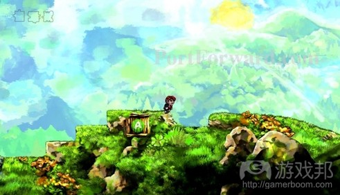
在矿层附近设置有一个呈现Xbox 360“A”按钮的箱子。玩家如果想要跳过矿层就必须按压这个按钮,如此他们就必须了解“A”的含义,即让他们能够跳跃。
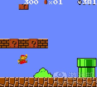
但是事实上这个辅助箱子却完全没有必要。“A”按钮可以说是所有电子游戏控制最基本的元素。甚至是最早的红白机也强调了“A”按钮是游戏中的跳跃控件。所以《时空幻境》对于红白机上大多数设有“按压‘A’跳跃”图标的游戏,如《超级玛丽兄弟》来说完全是一种讽刺。
我只想说,对于足够了解电子游戏并购买《时空幻境》的玩家来说,真的没有必要特别告知他们“按A键进行跳跃”这种操作 。就像是小说不会特意交待玩家“要翻页才能继续阅读”。我能理解有些游戏需向玩家解释复杂控制布局的做法,但是对于向《时空幻境》这种2D平台游戏的控制机制则都是最基础且最直白的,所以无需多加说明。
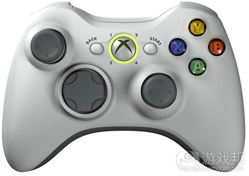
即使是第一次玩平台游戏的玩家在面对《时空幻境》的矿层时,也能够很快就猜出该如何跳跃。在Xbox控制器上“A”按钮的设置非常明显;当玩家手握控制器时,右手大拇指就会自然而然地放置于“A”按钮之上。除此之外,该按钮还是以绿色呈现出来(游戏邦注:绿色是最显著的指示颜色),它是最普遍的“按压按钮”指示。
而我考虑到的第二大问题便是屏幕上的“A”按钮是呈现于一个箱子上。在大多数平台游戏中(游戏邦注:包括《超级玛丽兄弟》),箱子的设置都是让玩家破坏后而获得能量升级。所以当我第一次玩《时空幻境》时,我也想当然地认为只要跳到“A”箱子上方就能够打开它,但是结果却并非如此。我还发现的其他三名跟我犯了相同错误的玩家。
在《时空幻境》中,不只“A”箱子设置是个多余的教程机制,其背离原本游戏类型(创造戏剧性效果)模式更是重要问题所在。Jonathan Blow不仅低估了《时空幻境》玩家的智商,他同样也低估了自己游戏设计的质量,才会在此添加这些不必要的箱子和大量的文本内容。
(本文为游戏邦/gamerboom.com编译,拒绝任何不保留版权的转载,如需转载请联系:游戏邦)
The Great Wall of Text and the ‘A’ Button: Where Braid Fails
by Jake Shapiro on 03/22/12
The Great Wall of Text
Before I start, let me reiterate that Braid is a modern masterpiece of indie game design. It’s got a beautiful visual style, stirring soundtrack, and unique game mechanics that play into the plot. It’s a one-of-a-kind satire of Super Mario Bros. My criticisms that ensue are meant to see how we as a game design community can learn from some of the best.
With that said, Braid has no idea how to tell a story. Jonathan Blow weaves an intricate tale of loss and regret, conveyed mostly through… walls of text.
Braid is moving games forward as an art form, right? That message comes off a bit stale when his own magnum opus relies on another medium to tell its story.
I’m not against writing in games. Gaming’s history is built on text-based adventures like Colossal Cave Adventure and Zork. Even in modern games, text is often a better choice than the medium’s notoriously abysmal voice acting.
But in my humble opinion, modern games should only rely on text (and cutscenes) when it’s absolutely necessary to convey points that couldn’t be accomplished through gameplay itself. We canonize Valve’s games because Half-Life and Portal are so good at weaving storytelling and gameplay together. Braid, however, uses copious amounts of text to give itself meaning. It wouldn’t be nearly as bad if the writing weren’t mediocre. The story is cliché and the characters bland–one could say it’s because it’s a satire of games like Super Mario Bros, but then again, Mario didn’t use walls of text.
What if Blow got rid of this? The “loss and regret” themes are still captured in essence through Braid’s flowing gameplay. The game would be much more ambiguous, but would perhaps capture Blow’s intended emotions in a more pure form if he had avoided the Great Wall of Text.
An example of this in practice is Danish developer Playdead’s Limbo. Both Limbo and Braid are indie 2D platformers initially released on Xbox Live Arcade, and both tell the melancholy story of a silent boy searching for a girl.
But perhaps due to their roots in Scandinavian design, Playdead created a much more moving experience with their game. Limbo features absolutely no text, and there’s no HUD. None of the characters speak. The minimalist visuals are in silhouette and even the music is dissonant. Through this, the game conveys pure emotion in a way no other art form can come close to, because the audience is completely involved. It’s not static, as text is. Braid, on the other hand, relegates the majority of storytelling to text.
The ‘A’ Button
One of the single most frustrating parts of Braid’s design is in its opening moments: teaching players the game controls. Tutorials are notoriously tough to do well in games, and Jonathan Blow had noble intentions of letting the player learn the controls on their own instead of flashing “PRESS ‘A’ TO JUMP” across the screen. Instead, he did this:
A box near a ledge with a picture of the Xbox 360′s ‘A’ button on it. The player can’t jump over this little ledge without pressing the correct button, so it forces them to learn that ‘A’, in fact, makes the character jump.
But this helpful box is completely unnecessary. It’s the ‘A’ button–the most cardinal of all video game controls. Even the original NES featured the ‘A’ button to jump in most of its games. Braid itself is a satire of the most iconic “press ‘A’ to jump” platformer on the NES, Super Mario Bros.
Suffice to say, I doubt many people savvy enough about video games to purchase Braid need to be told to press ‘A’ to jump. This would be like a novel telling the reader “turn the page to read more.” I understand explaining more complex control layouts to players, but 2D platformers like Braid have the most basic and intuitive of all video game control schemes.
Even if someone were playing a platformer for the very first time, when faced with this small ledge to jump overin Braid, they could most likely figure out. The ‘A’ button is prominently displayed on the Xbox controller; when one holds it, their right thumb naturally rests on ‘A’. Not only that, but the button is green–the universal indicator for “press this button.”
My second big issue is that the ‘A’ button onscreen is in a box. In most platformers (including Mario), boxes are something you destroy to reveal a power-up. When I played Braid for the first time, the first thing I did upon seeing this ‘A’ box was jump on it and try to open it, to no avail. The three other people I’ve watched play Braid for the first time have done the exact same.
Not only is Blow’s ‘A’ box redundant as a tutorial mechanism–it’s outright unfaithful to the genre whose conventions it’s attempting to emulate for dramatic effect. I expect many commenters below are going to complain that I’m nitpicking. But if we could nitpick a little, we could improve on one of the greatest games of the past decade. Jonathan Blow underestimates the intelligence of his players in Braid, but he also underestimates the quality of his own game design, muddying it up with unnecessary boxes and walls of text.(source:GAMASUTRA)
上一篇:手机游戏设计需要注意的7个问题
下一篇:手机应用开发者需注意的20个事项






 闽公网安备35020302001549号