


《Pokemon GO》因为让人困惑的UI而获益
作者:Chris Furniss
“用户界面就像个玩笑—-如果你还需要向用户解释它,那它真的就不怎么样了。”
你可能在生活中听到别人说过这样的话或者在Facebook上看到过这样的内容,而这的确是对的!界面最好具有直觉性,且用户界面和用户体验的设计通常都专注于消除摩擦。当你正在设计一款应用或一个网站时,UX或UI设计师的工作便是努力确保体验足够流畅,清晰,且无摩擦。如今许多90后的梦想可能便是生活在《Pokemon Go》的世界中,在那里所有人都是Pokemon训练师并且他们随处都可以发现Pokemon。而当休闲玩家第一次进入游戏时他们会对自己该在游戏中做什么感到困惑,而支撑着他们进一步去探索游戏的便是捕捉全新Pokemon的新颖性。我该如何面对这些家伙?我可以和它们对抗吗?而即使是像我们这样的资深玩家在找到它们时也会感到困惑,这一切便是因为《Pokemon Go》并未提供给玩家该在游戏中该做什么的真正内容。当然我并不是说这样的设计很糟糕,相反地它能够吸引有些人的眼球。我也很喜欢其中的一些主要UX功能,如主要的Pokeball按键被设置在单手操控的最佳位置上。当玩家突然进入开启模式时它甚至会切换成关闭按键。而这种类型的互动方式就足以将UX设计师搞晕了。
不管怎样我相信如果这款游戏是在出现于App Store后才开始创建UX模型,它便不可能拥有现在这般强大的吸引力了。它当然也不可能像现在这样拥有如此强大的社交性!而现在应该也只有Pokemon能够做到这点了。因为强大的品牌足以让人们在对界面感到困难的时候还愿意真正深入游戏中。
有意义的摩擦
在App Store中,大多数免费游戏在教程期间或最初用户体验中都是非常直白的。这里往往都带有一步一步的解释以及明显突出的按键和大箭头让玩家可以清楚地进入游戏中。但随着游戏变得和应用越来越相近,开发者的目标不再是呈现给玩家良好的用户体验了,反而是变成想办法将自己与竞争对手区分开来。网页和应用开发UX是关于消除摩擦,而游戏UX则是关于有意义的摩擦。就像《Pokemon Go》那让人困惑的UX/UI便是使用了这种有意义的摩擦并将其整合到游戏的社交体验中。让我们更详细地进行说明。
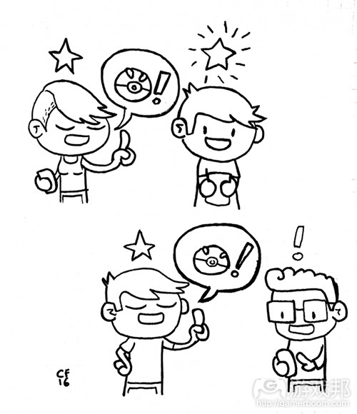
Pokemoncomic(from gamasutra)
分享有关游戏的部落信息能够有效增强玩家的游戏体验。即当玩家清楚自己身处一个很酷的群组时。然后玩家便会开始将其他人带进这个群组中,并会对此深感自豪。
笨手笨脚的教程是典范
对于我来说,《Pokemon Go》的发行最突出的地方并不是其强大的普及性,而是它并未添加排行榜顶端大多数免费游戏中普遍存在的手把手指导的教程内容。我认为他们这么做是有意的,因为要去预测玩家的任何突发行为是一件非常困难的事。但是《Pokemon Go》也因为这种取代了传统教程的突发型教授机制而大获其利。在我看来这种突发型教授机制比传统教程更有效。即通过社交联系这种教授机制能够逐渐提高玩家的用户粘性。就像在《Pokemon Go》中,游戏将提供给充满困惑的玩家一些有关游戏的信息,这不仅会让游戏显得很厉害很无私,同时也将有效缓解玩家的困惑感。当我们提到教授一款游戏内容时,任何游戏内部教程或工具提示其实都不可能提出真正专业的问题。而《Pokemon Go》则设有一个让玩家可以自己打开的提示菜单。虽然我不认为Niantic是故意呈现出一个模糊的UI,但我也相信这是一种不可或缺的游戏体验。因为电子游戏中的UX/UI都是受益于“有意义的摩擦”(不管是有意还是无意)。
让我们假设第一次玩一款全新的桌面游戏。大多数情况下你会向那些玩过游戏的朋友学习如何玩游戏。你可以向他们提问,并获得能让自己获得最好学习的定制型学习体验。但是在电子游戏中我们却很难去复制这样的体验。就像我们很难去创造一个能够代表游戏全部玩家(游戏邦注:即包含不同个性,学习风格,信息处理能力等等)的单一教程系统。而《Pokemon Go》却并未去这么做!
基本条件的改善
尽管我并不认为《Pokemon Go》应该改变它们全部的UX和UI原理,但是我却认为这款游戏中有许多值得改善的“基本条件”。
(免责声明:我玩过好多次《Ingress》,我也曾是《植物大战僵尸》的UX设计师。但是在本文中我却并不是代表着PopCap公司。这些都只是我个人的想法并不能代表任何雇佣我的公司。)
让玩家可以更轻松地从Pokestops中获取道具
除了优化游戏让它能够更快速地加载外,游戏的加载页面也可以多花点心思。而像“与服务器形成同步”等更多相关信息则能够帮助我更好地理解为什么游戏需要花费如此长的加载时间。
而如果我需要长时间看到这样的加载页面,或许游戏可以呈现给我一些不同/多样的画面。例如伴随着“专业技巧”或安全信息的不同加载页面便能够有效避免我在遇到这种情况时感到不耐烦而直接关掉应用的情况。
摆脱Unity所创造的启动画面
我认为Niantic已经购买了Unity的授权。但其实他们完全可以不用这么做的。它就在架构设置中。你可以选择将其关掉。
重新强化核心循环
早前的玩家体验便包含了这种核心循环:
收集你所看到的所有Pokemon>将重复的Pokemon交给Professor去换取糖果>升级并进化Pokemon去获取经验值并获得升级>重复
如果转交是最常见的行动,那游戏最好能让玩家更轻松地执行这一行动。以下便是现在玩家完成这一常见互动所经历的顺序。
1.轻敲主要Pokeball按键。
2.找到你想要转交的重复Pokemon。
3.拉到属性列表最后。
4.等待场所地图呈现出Pokemon最初被发现的地方,因为有时候它并不能马上加载出来所以可能导致转交按键的位置会出现不同。
5.轻敲转交按键并等待一个盒子的跳出。
6.轻敲盒子上的“yes”。
7.等待服务器的确认。
8.重复这些步骤。
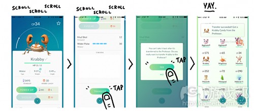
scrollscrollscroll(from gamasutra)
对此游戏要么该将转交按键移至更容易操作的位置上,要么就让玩家能够通过长按Pokemon而获得一个常见行动菜单,如这里所说的转交。
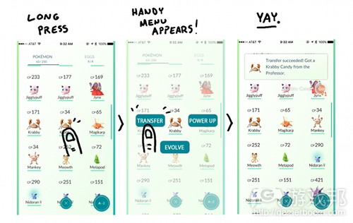
bettertransfer(from gamasutra)
基于环境的教程
当你是第一次遇到体育场时,工具提示可能很有帮助。而一个拳击手套按键和一对拳击手套按键又有什么区别呢?这谁会知道!基于环境的工具提示其实真的很棒,这是Sebastian Long在有关自己对于《Pokemon Go》UX的评价所说的。他大力做了推荐,但是再一次地我仍然认为《Pokemon Go》并不需要大量教程内容或更加清晰的一般行动解释。
也许缺少直觉性的UI并不是Niantic有意制造的,但他们也因此创造出了某种别样效果:强大的社区。我们是很难在游戏中创造突发性行为的。而我们能做的其实就是传达给玩家一些真正优秀的内容然后在游戏问世后再去检查这么做的结果。
(本文为游戏邦/gamerboom.com编译,拒绝任何不保留版权的转发,如需转载请联系:游戏邦)
Pokemon GO and the good things that can come from a bad UI
by Chris Furniss
“A user interface is like a joke – if you have to explain it, it’s just not very good”
You may have heard someone in your life say this or post this on Facebook (perhaps that person is an artist or designer of some sort!) and it’s generally true! Interfaces should be intuitive and user interface and user experience design are usually focused on removing friction. When you’re designing an app or a website, it’s the job of the UX or UI designer to make the experience as streamlined, clear and frictionless as possible. The dream of the 90′s is alive in Pokémon GO – everyone is a Pokémon trainer and Pokémon are everywhere. Pokémon GO’s UX and UI are the subject of just about every single conversation I’ve had about the game. Casual players encountering it for the first time tend to be confused as to how to do anything in the game, bolstered by the novelty of catching a bunch of new Pokémon. What do I do with these guys? Can I fight them? What’s a gym battle? Why can’t I level up my starter Pokémon? Heck, even experienced players such as myself can find themselves confused, mostly because Pokémon GO does very little to teach you about what stuff actually does in the game. I’m not saying it’s poorly designed, but it does raise some eyebrows. I actually really like some of the major UX affordances such as the main Pokeball button being ergonomically placed in the optimal spot for one-handed play. It even turns into the close button after you pop open the modal! That kind of interaction is enough to make a UX designer swoon.
I’m convinced, though, that if they modelled their UX after what else is out there in the App Store the game wouldn’t be as big, wouldn’t be as sticky. It certainly wouldn’t be as social! Only Pokémon could get away with this kind of thing right now. The brand is huge enough to keep people invested even if the interface is confusing.
Meaningful friction
The majority of free to play games in the App Store are very hand-holdy (technical term) during the tutorial/first time user experience. Step by step instructions and exposition are paired with highlighted buttons and big bouncing arrows forcing you through an often patronizing flow. But as games become more like apps, presenting players with a good user experience is not just expected, it can be the thing that differentiates you from your competition. Web and App development UX is about removing friction, games UX is about meaningful friction. Pokémon GO’s confusing UX/UI is applying meaningful friction and is feeding into the dense social experience of the game. Here’s why.
Sharing tribal knowledge about games makes the experience of playing a game better. When you are “in the know” you’re in the cool kids’ club. You then get to initiate other players into the cool kids’ club, and you feel smart for it.
Heavy-handed tutorialization is the norm
The biggest thing that has stood out to me about Pokémon GO’s launch isn’t the ubiquity of the game (literally anyone I see walking down the street staring into a screen I assume are playing Pokémon GO) but the complete lack of hand-holding bouncing arrow tutorialization so ubiquitous in the vast majority of F2P games topping the charts. I doubt the lack of a tutorial was intentional – it’s incredibly difficult to predict any kind of emergent behavior from your player base. But what Pokémon GO is benefitting from right now is a emergent mentorship that almost completely replaces a traditional tutorial. I would argue that this emergent mentorship is even more powerful than an actual tutorial. Mentorship increases engagement through social bonds. You’ve probably experienced this already with Pokémon GO: teaching a confused player something about the game that you’ve figured out already not only makes you feel smart and altruistic, it assuages confusion for the person you’ve mentored in a way that is highly personalized, and therefore more impactful. An in-game tutorial or series of tooltips will never top being able to ask questions of an expert when it comes to learning a game. Pokémon GO has a tips menu that you can bring up on your own (if you manage to find it in the settings menu) but that’s it. I’m not convinced that Niantic intentionally obfuscated their UI, but I think it’s actually integral to the experience. That’s because UX/UI in video games greatly benefits from the application of “meaningful friction” – intentional or not.
Think about playing a new tabletop game for the first time. The majority of the time you’re learning with a friend who has already played the game. You can ask questions, and get your learning experience tailored to the way that you learn best. It is incredibly difficult to replicate this experience in a video game. How do you create a single tutorial system that accounts for 100% of players of your game when there are different personas, different styles of learning and processing information? In the case of Pokémon GO, you don’t! And you reap the rewards.
Quality of life improvements
While I’m not convinced that Pokemon GO should change their overall UX and UI philosophy, I do think that there are a number of quality of life improvements that could be made to the game.
(Disclaimer: I played a lot of Ingress and I’m UX lead for Plants vs Zombies: Heroes. I am not representing PopCap games in this article. These are my own personal recommendations and are not representative of any general thinking by the organization that employs me.)
Make getting items from Pokestops easier
Please don’t make me tap into the Pokestop, wait for the animation to zoom in, wait for the data to load, spin a little thing, then close out of the Pokestop. In Ingress you can tap and hold on a portal to bring up a menu of common actions, including “hack” which is the same as spinning the coin in the center of a Pokestop.
Improve the loading experience
Beyond optimizing the game so that it loads faster, the load screen could use some love. It’s not always the case that I’m just loading game assets. Some more relevant information such as “syncing with server” would help me understand why the game is taking so long to load.
Maybe if I am going to see this loading screen so much, it would be nice to see some different/varied screens. Rotating through a list of 5 different loading screens each with their own “pro tip” or safety message would keep me from just shutting the app off every time it hangs on load. At the very least I’d stop giving an audible grunt every time I see that damned Gyarados on the screen.
Get rid of the made by Unity splash screen.
I assume Niantic has paid for a Unity license. Dudes. You know you can just turn that off, right? It’s in the build settings. You can totally just turn it off.
Reeinforce the core loop
Ok, so the early player experience consists of this core loop:
Collect all the Pokemon you can see > Transfer duplicate Pokemon to the Professor to get candy > Power up and Evolve Pokemon to gain XP and level up > Repeat
If transfer is the most common action, please make it easier to access. Here are the steps you currently have to take in order to complete this incredibly common interaction.
1.Tap the main Pokeball button.
2.Find the duplicate Pokemon you want to transfer
3.Scroll all the way down to the bottom of the stat sheet
4.Wait for the location map showing where it the Pokemon was first found to load because sometimes it doesn’t load right away and it causes the transfer button to move its position.
5.Tap the transfer button and wait for the box to pop up
6.Tap “yes” on the box
7.Wait for server confirmation
8.Repeat
Let’s either move the Transfer button up to a more accessible location, or better yet how about a long press on a Pokemon brings up a menu of common actions, including Transfer. There ya go.
Contextual tutorialization
Tooltips when you first open a gym would be nice – what does that meter do next to the photo? What is the difference between the single boxing glove button and the double boxing gloves? Who knows! Contextual tooltips are fantastic, and it’s something that Sebastian Long talks about in his Pokemon GO UX evaluation post here. He has a ton of great recommendations, but again I’m not convinced Pokémon GO needs an extensive tutorial, or even clearer affordances for common actions.
The less-than-intuitive UI may not have been intentionally confusing on Niantic’s part, but they certainly stumbled upon something magical: the power of the community. It’s incredibly difficult to orchestrate emergent behavior in your game. The best you can do is ship something decent enough to be usable, then observe what happens after your game is in the wild.(source:Gamasutra)

")
")
")
")


 闽公网安备35020302001549号