数万字综述:以空间结构化视角探寻游戏的关卡设计逻辑
篇目1,书摘:以建筑学方法设计游戏关卡
在过去几年中,我发现游戏行业似乎乐于将建筑学作为辅助我们执行设计的一个潜在领域。作为拥有两个建筑学位的游戏开发者,我当然也看到了这两个领域之间的联系。我在还是一名建筑学本科生时就开始与朋友制作小型电子游戏——使用我在课堂上所用的设计软件来绘制游戏的美术内容。因我一些工作室伙伴的建议,我开始在自己的课堂在项目上运用我所学到的游戏设计知识。我认为建筑学与游戏一样,与其用户之间具有象征性的关系,并且设计精良的游戏关卡与建筑大师Frank Lloyd Wright、Le Corbusier、I.M. Pei等人的作品也有异曲同工之妙。我在这两个领域的研究集中体现在一篇关于游戏与建筑学交集的毕业论文中。毕业之后我成了一名游戏开发者,并继续研究建筑理论对关卡设计的运用。这项工作令我撰写出了多篇论文,展开了多次大会演讲,并且现在还出版了一本书。

Cover(from gamasutra)
《An Architectural Approach to Level Design》这本书由CRC Press于6月12日出版,整合了建筑学和关卡设计领域的空间设计理论。本书通过建筑学情境和历史探索了关卡设计原则,为学者和游戏开发专业人士提供了有用的信息。
本文摘录了这本书的一些片段,呈现了可运用于实际关卡设计的基本建筑学元素和一些我自己的游戏玩法和设计日志的插图。这些章节便于读者进一步探索视觉传达的方法,创造玩家的情感反应,鼓励社交互动以及其他对游戏世界来说的重要之事。
看待关卡设计的方法——第1章:建筑学与关卡设计简史
为了全面理解关卡设计中的空间设计原则,我们有必要分析一下现实世界的建筑和电子游戏的惯例。Hal Box,FAIA,Emeritus教授及前德克萨斯州大学建筑学院院长曾主张基于研究和分析来看待建筑学这种教育形式。在这种情况下,“看待”不仅仅用于描述视觉的使用,还可用于处理令建筑与众不同的空间、形式、情境化以及历史元素。
对于关卡设计师来说,这种“看待”可能改变我们对之前游戏关卡的认识——有好也有坏。这样做可能会破坏一些游戏玩家的普遍习惯。例如,在玩游戏过程中“玩家不会向上看”。作为设计师,游戏空间的垂直性可能成为确立一个壮观场景,或者向玩家传递方面的一个重要元素。同理,作为玩家,我们会很本能地直接奔向下一个行动场景而不是暂停下来探索游戏环境。设计师应该以微妙的方法引导游戏环境节奏——在玩家路径中布置叙事元素或者用奖励来刺激探索行为。
Box在自己所著的《像建筑师那样思考》一书中提出了探索和理解一橦建筑的十种方法:
1.了解建筑落成的原因,它的作用,以及它现在的情况。
2.在你四处走动时向上看——注意视觉元素,形式层次,以及建材。
3.通过大小、形状以及它同光线、声音和其他空间的交互来感受其建筑空间。
4.用你的眼睛理解建筑结构的能力,以及该结构如何托起建筑。
5.确定建材在压缩或张驰上的表现,或者它们是重量型还是轻量型的。
6.确定建筑是以何种材料如何构造起来的。
7.检查该建筑在历史上的先例。
8.分析建筑元素的构图、比例以及节奏。
9.观察建筑与其背景是否和谐。
10.分析该建筑为何有别于其他建筑。
显然,这些问题并不全都适用于游戏关卡。虽然关卡的场景艺术可以表示压缩或张驰的结构,游戏艺术本身却并非如此。同理,许多游戏关卡并非由游戏引擎中的刚体对象所决定,因此不会因为引擎的物理系统而崩溃。但是,许多此类观察法在其当前形式下似乎也可运用于游戏关卡,或者可以稍微调整使之符合我们的用途。在这种情况下,我们可以说关卡设计师能够用以下方法来改变自己的观察方法:
1.确定空间所发生的玩法。游戏机制支持什么情况?
2.在四处走动时向上看——注意视觉元素,尤其是与周围环境形成对比或者脱颖而出的美术元素。还要注意向下看——这个空间是否颠倒地运用垂直感从而令你产生危机感?
3.通过大小、形状以及它与光线、声音和其他空间的交互情况来感受游戏空间。体会一下该空间的照明或声音条件让你产生什么感觉?
4.分析关卡的节奏。关卡是否会快速地在你面前自动呈现,还是让你进行探索?它们是必须关卡还是会为探索行为提供额外奖励?
5.这个关卡是否反映了一种玩法风格,还是支持多种玩法?(游戏邦注:例如,死亡模式的地图是否为狙击手、进攻型玩家,防御型等玩家预留了位置?游戏关卡适用于野蛮人,但却不适用于魔法师?)
6.空间如何表达游戏中的故事?其背景或者探索关卡能否让你了解游戏世界?叙事事件是围绕玩家而编写,还是说只有过场动画?
7.检查之前是否存在类似的玩法先例?这些游戏采用了哪种空间体验?
8.分析场景艺术元素的结构、比例和节奏。
9.关卡几何结构与角色的行动能力相比起来情况如何?这一切均在角色可操纵的范围内,还是说关卡空间会对其形成挑战?是否存在超出角色能力范围的东西?如果是,游戏是否提供了能够扩展这些能力的方法?
10.哪些场景艺术元素是重复的?它们是否具有交互性?如果是,它们是否会响应特定的玩法机制?
用这些方式来看待关卡设计,以及本章节中其余部分内容中的建筑和游戏空间先例,这将有助于引导我们探索关卡设计中的空间设计原则。
关卡设计工作流——章节2:关卡设计的工具和技巧
美国建筑师Louis Sullivan常被誉为摩天大厦的创造者,他曾说过“形式要遵从功能”。Sullivan以这个格言确立了一个建筑学现代派的主导原则。现代派是二十世纪早期强调创造形式源自功能的建筑这一主张所定义的建筑学运动。在现代建筑中,装饰物通常是建筑本身或者具有某项用途的产品,而不只是纯粹为了美学效果而存在。与Sullivan相同,Le Corbusier也曾说过,“房子是居住的机器。”他的许多建筑设计与Frank Lloyd Wright、Walter Gropius、Louis Sullivan等人的作品一样,关注的是有目的地为居住者创造一种体验。
关卡设计也同此理。在关卡设计中,开发者心中通常会有一个特定的体验目标。在2008年的一次采访中,Valve关卡设计师Dario Casali指出创造关卡设计理念时“体验是关键”。在本章节早期部分,我们讨论了与用户如何使用游戏空间,以及设计师如何通过空间向用户传达信息有关的关卡设计目标。这些体验式目标能够决定我们关卡设计师如何构造空间:形式遵从功能。
在这个部分,我们将讨论一些包含相同工具的工作流程,我们的切入点就是如何将“形式遵从功能”嵌入游戏设计。
形式遵从核心机制
游戏设计可以通过核心机制这个理念来表现形式遵从功能。核心机制通常被定义为玩家在整个游戏过程中所执行的基本操作。游戏设计师Aki Jarvinen在自己的博士论文中曾创造了一个以核心机制为中心,即设计师从动词入手的设计方法。如果你将核心机制视为玩家在游戏中的基本动作,就能够理解构造每款游戏独特体验的基本元素了。例如,《超级马里奥》就可以说是关于跳跃的游戏。而《塞尔达传说》的主题就是探索,《Katamari Damacy》就是翻滚,《愤怒的小鸟》就是弹射。从这个核心开始,其他添加的动作定义了最终游戏产品的规则。
在设计关卡时,心中存在一个类似的核心机制是一个必要之举。许多新设计师认为各个关卡都应该遵从游戏的核心机制,但我们也可以确定关卡核心机制从而令每个关卡都呈现独特性。这方面的例子就是Valve的《军团要塞2》国的Badwater Basin关卡(详见下图)。
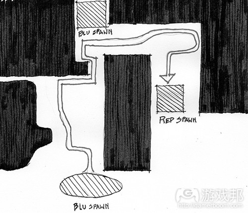
fig 2-43(from gamasutra)
(这是来自《军团要塞2》的Badwater Basin规划图表。地图上标注了RED和BLU队的基地,以及这两个基地之间的主要循环区域和BLU检查点。)
在这个关卡中,游戏的Builders League United(或称BLU)队必须通过一辆轨道上的矿车向对手Reliable Excavation Demolition(或称RED)队的基地投掷一个炸弹。Payload模式的矿车机制采用了《军团要塞2》基于团队的第一人称射击机制的标准并进行了一些调整。这不但改变了玩法机制,还改变了关卡空间几何条件。
Casali所举的一个例子就是关卡中的隧道。在关卡的第一个原型中,设计师将矿道制作成他们运用于其他基本地图的标准宽度。但是,在测试含矿车机制的关卡时,他们发现隧道必须加宽才能同时容纳玩家和矿车。这看似一个小调整,但却可以避免玩家因被矿车堵塞在隧道中而产生的愤怒情绪(详见下图)。
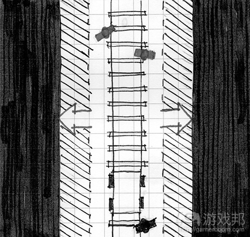
fig 2-44(from gamasutra)
(调整Badwater Basin中的隧道宽度可以让玩家和矿车更好地通过关卡,并且比较不容易削弱攻击方团队的玩法。)
作为关卡设计师,我们的职责就是设计玩家角色与其他玩法元素如何通过关卡。当关卡空间可舒适地容纳参数时,玩家就能够比较轻松地穿越关卡。我们在之后的章节中还将探索当我们创造出将参数推向极致的空间时,就可以实现玩法的戏剧化发展。这些空间包括需要角色尽己所能跳到最远的鸿沟(例如超级马里奥中的world 8-1)或者恐怖游戏中限制玩家行动的走廊,例如《生化危机》(详见下图)。
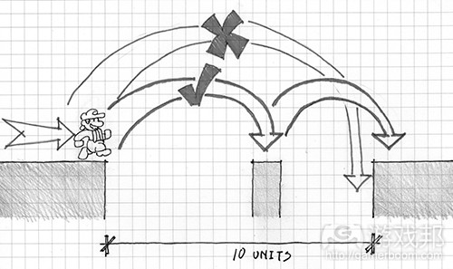
fig 2-45(from gamasutra)
(《超级马里奥》中的关卡8-1令马里奥跳跃到极限。该鸿沟有10个街区那么宽,比马里奥所能跳跃的9个街区还要多1个街区,所以有必要采用一个宽1个街区的中间岛。多数穿过这种鸿沟的策略都需要玩家先跳到一个中间岛,然后再快速跳到另一个岛,这样马里奥的着陆惯性就不会导致玩家坠入深渊。
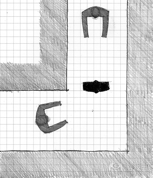
fig 2-46(from gamasutra)
(《生化危机》中许多过道的宽度仅能容纳两名玩家并肩而行。在这种情况下,一个僵尸就足以成为玩家穿过该走道的巨大威胁。这种空间条件还给游戏创造了一种幽闭恐惧症的氛围。)
针对玩法而设计关卡并不仅仅要考虑到尺寸大小的问题。它还意味着针对特定角色的能力(如特殊攻击或行动模式)而设计。如《合金装备》等潜行游戏就提供了一个关于如何根据不同角色行为来构造关卡的出色典例。在这款游戏中,玩家角色Solid Snake拥有一种隐藏在墙壁之后并查看角落的能力。与其他动作游戏相比,这极大改变了90度角落的的含义——它们变成了战略性隐藏地点而不仅仅是关卡空间。为此,组成《合金装备》场景的核武器厂就有许多这样的角落,以便玩家从一个地方潜行到另一个地方,查看角落来寻找自己的下一个避难所。这并非基于尺寸大小或参数的设计,而是基于角色自身机制的布局,其玩法动作创造了角色如何行动或与环境交互的一系列可能。
关卡设计方法论
在本章节早前的内容中,我们讨论了建筑师的方法论,即建筑师用于确定自己想让建筑呈现的形状或方向的基本形式。对于关卡设计师来说,确定关卡的核心机制,方法论是另一个发展关卡空间布局的有用工具。
用方法论执行设计与在纸上或电脑上展开设计极为不同。方法论必须有草图,因此缺乏测量。草图练习能够让设计师在花时间衡量自己的设计版本之前,快速形成想法。关卡设计师方法论的关键在于像绘制空间图表一样勾勒出玩法理念。例如,之前提到的Badwater Basin关卡中的设计方法如果是在两者之间更狭小的区域中来呈现矿车轨道,以及BLU玩家可夺取的更小基地,那么它就会形成两个庞大的混乱场面。
Edmund McMillan在《Indie Game:The Movie》关卡设计讨论中指出,当设计师创造出环境机制时,即与玩法相关的关卡交互环节,它们就必须具有多种可用性。在e4 Software的手机游戏《SWARM》(玩家必须将敌人引进陷陆的平台游戏),程序员/设计师Taro Omiya创造了电子栅栏陷陆的多张草图来形象化它们的不同用途。此外,Omiya等人还在电脑和纸张上制作正式的方法论以便形象化关卡的空间方向(例如下坡、漂浮岛以及平台区域)。
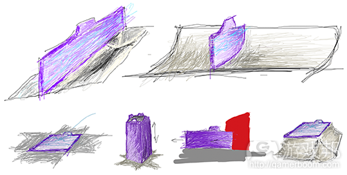
(《SWARM!》设计了电子栅栏陷阱后,他们就绘制了许多玩法草图以形象化它们在不同关卡中的用途)
Whiteblocking数字原型
当开发者在电脑上开始制作数字形式的原型时,他们会通过一个所谓的Whiteblocking流程来创造一个测试关卡。Whiteblocking就是当关卡设计师用一些简单的几何体创造一个关卡,通常是白色或纹理简单的模块来测试关卡是否能够完成他们所需要的玩法目标。在设计过程早期,当设计师试图确定玩家角色的玩法参数和其他东西时,Whiteblocking就有助于确定玩法衡量的情况。同理,设计师也可以用一种类似方法论的做法绘制关卡空间特点的草图,在向关卡添加特定场景美术元素之前,测试不同玩法体验的特定场景的大小和形状(见下图)。
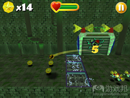
(《SWARM!》中的Whiteblocking显示了关卡中一个引导玩家杀死敌人的重要环节如何在添加场景美术之前以简单的几何体进行测试)
Wbiteblock关卡空间所用的几何体通常是最简单,能够模拟最终关卡设计所使用的碰撞物。碰撞物是游戏引擎中的一个对象组件,可模拟实体对象之间的交互。例如,与一个关卡几何体相关的盒子碰撞物就会导致物体与其他物体之间的互动,就好像它是一个六面的盒子,无论其实际的场景美术外观如何(见下图)。碰撞物可以是简单的几何形状,或者密切贴近有机形状的东西。
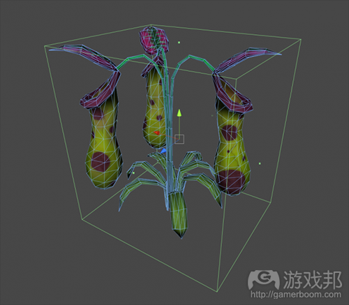
fig 2-52(from gamasutra)
(这个植物有一个盒子碰撞物。虽然其3D模型中有一个有机形状,但游戏中的玩家对象将像对待一个矩形固体一样与之互动)
Valve在其关卡设计过程中广泛使用Whiteblocking方法。他们的关卡编辑器Hammer中的引擎基元构造规则允许开发者通过简单而准确的创建方法快速制作3D关卡原型。Hammer的基元被称为“笔刷”,用于粗略定义关卡空间,之后会进行测试查看是否创造了既定的体验。关卡设计师会看出哪种情况可行或不可行,之后再通过编辑笔刷来调整空间。当设计师发现自己较少编辑主要空间,而是关注更小的细节时,就意味着可以在关卡中添加场景美术内容了。
这是一个迭代性的过程,Whiteblocking会从关卡的方法论式交互形式开始,并将设计师引向更为艺术性和装饰性的设计决策。关卡几何越是确定,标准的场景美术也会随之确定,最科成为关卡建设模块。
建筑空间布置——章节3:基本游戏空间
与之前的章节一样,我们将从建筑学的课程入手。之前我们关注的可用于游戏引擎场景的工具和技巧,这次我们将讨论可运用于游戏的空间布置。
游戏与建筑学的区别就在于现实世界的建筑必须遵从现实规则。例如,现实世界的建筑必须同时具有内部和外部设计——其中一者必然影响另一者。同理,现实世界的建筑学必须考虑到气候、地质、分区管制以及构造现实状况。而游戏领域却没有这些必须处理的情况。这可能意味着像Atelier Ten Architects和GMO Tea-cup Communications Inc.的地球博物馆(一个漂浮在太空的大型椭圆建筑)或者巴西建筑师Oscar Niemeyer生活中的Hidenori Watanave的探索数据雕像——这两者都是存在于虚拟世界《第二人生》中的建筑结构。这会产生基于玩家行动模式、叙事事件或游戏机制等更为自由的空间布局。的确,“内部”和“外部”不过是基于运用于装饰游戏空间的美术元素的描述。
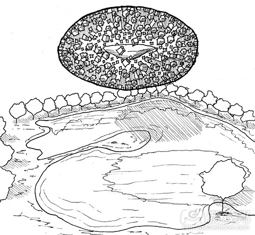
fig 3-1(from gamasutra)
(这是Atelier Ten建筑和GMO Tea Cup Communication Inc的地球博物馆的一张草图。因为该建筑是在虚拟世界中创造,它并不需要任何构架来支撑组成其主体的成百上千个立方体。设计师是用微软Excel表格设计该建筑形式,之后再用一个自动建模程序生成其几何图形)
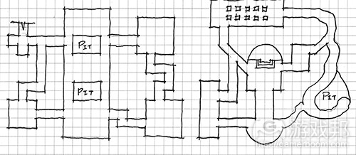
(关卡规划的方法论图表草图。游戏关卡可以呈现不寻常的特点,因为它们并不需要像现实建筑那样遵从内部与外部对应的设计)
了解这些区别之后,游戏的空间设计师就可以在游戏设计的自由环境下利用建筑学知识进行设计。有些知识甚至与关卡如何在许多现代游戏引擎中构建具有概念上的联系。
Figure-ground
我们将探索的第一种建筑空间布置就是Figure-ground,它是源自某个构造的积极和消极空间的美学理念,积极空间描述的是被某个对象所占领的区域,而消极空间描述的则是介于对象之间或处于对象之外的空间(见下图)。
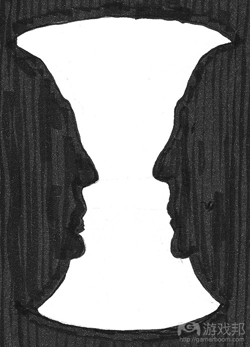
fig 3-3(from gamasutra)
(这个插图就是所谓的Rubin花瓶,它呈现了积极和消极空间的概念以及两者之间的互换。根据观看者对黑白图像的理解,这可以视为一个花瓶的形状,或者两张相互对视的脸。)
建筑学中的Figure-ground理论来自积极空间人物的布置。在规划图中查看时,设计师可以看到建筑的布置开始从地面塑造出空间。的确,Figure-ground图像中的这些空间构造与figure本身的布局一样重要。据建筑设计师Matthew Frederick所述,由已安排好的figure所塑造的空间本身就是一种积极空间,因为它们现在也像figure一样具有形式。从城市设计角度来看,这种有框架的空间通常是广场,院子、公园、节点以及其他人们可以“入驻”的会面区域,而其余消极空间则是让人们穿梭的区域。
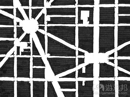
fig 3-4(from gamasutra)
(在筹划figure-ground图像的空间时,很有必要观察积极空间中的建筑如何从消极空间地面创造出空间。这些空间拥有自己的形式,可以视为积极空间。)
Frederick还指出,在利用Figure-ground理论时,figure元素和空间都可以通过区分结构元素的空间,或者创造与附近figure相似的形式的消极空间进行暗示。这与理论神经系统科学家Gerd Sommerhoff引述建筑师Grant Hildebrand所谈的观念相呼应:
“大脑会根据之前经历的事件所形成的画面来预测未来的事件画面。当无法重现之前的经历时,大脑就会准备重新体验这种设定。如果已经确立了预期,该模式就会用一种合成的愉悦感得到强化。”
这样,我们就可以看出figure-ground为何会成为关卡设计师在许多游戏引擎中创造增加性或减少性空间的方法。许多引擎允许设计师在消极的2D或3D空间中创造具有增加性的图像元素。游戏空间通常是使用积极元素,基于通过消极空间的移动机制而形成。在其他机制中,在固定形式中塑造空间可以创造出房间、走廊以及玩家可以奔跑、隐藏、追逐的其他空间。除此之外,设计师还可以通过暗示性的边缘或强调性的空间来向玩家传递信息。
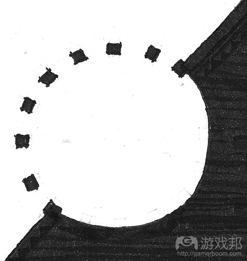
fig 3-5(from gamasutra)
(这个插图显示了figure-ground布局可用于暗示空间或元素)
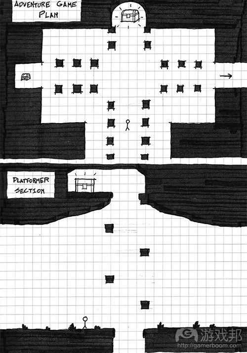
fig 3-6(from gamasutra)
(这些插图表明figure-ground关系可运用于多种游戏空间,暗示性的空间关系可能够成为向玩家传达空间信息的一个有效方法)
Form-Void
Form-Void在许多方面是figure-ground的3维进化版本。它是figure-ground在游戏中的自然运用,可以从一个非上下视角的方向查看游戏空间。在form-void理论中,从固定形式创造出来的空间拥有自己的形式。
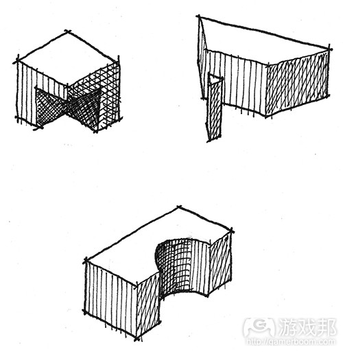
fig 3-7(from gamasutra)
(这是一些形式之间存在form-void关系的例子)
正如figure-ground是用大量元素组成空间的空间布局一样,form-void是通过添加堆块或减除空间来进行的空间布局。这与我们在第二章:关卡设计的工具与技巧所描述的许多游戏引擎的操作方法一样。与之相似,3D美术程序也允许形式之间通过精心建模或Voolean操作实现交互,可用数学方程式以增加或减少的方式来结合3D模型。 Peter Zumthor的Therme Vals或Mario Botta的Casa Bianchi(两者均位于瑞士)等建筑就能够说明form-void关系可运用于塑造露台、门廊、窗户、卧室和其他用途的空间。在游戏中,这种增减方法可用于创造隐藏性的空地、秘密走廊、伏击点甚至是关卡目标。
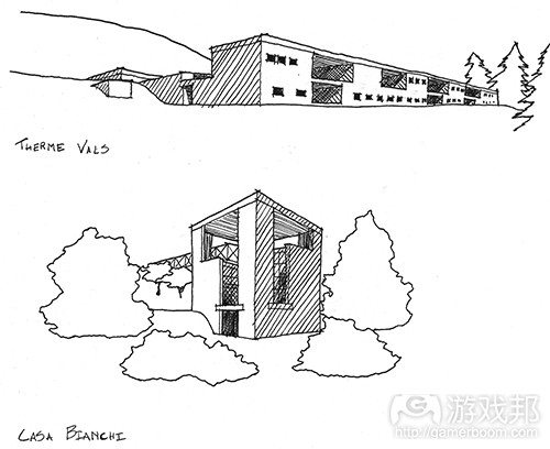
fig 3-8(from gamasutra)
(来自Peter Zumthor和Mario Botta的草图表明形式和虚无可以用于确定空间。)
Arrivals
关卡设计是一种对比艺术。它还是光线、路径以及关于你何去何从的歧义性的艺术。所有的这些元素构成了“arrival”(到达)体验,即你首次进入某个空间的感觉。
我们主要通过到达某空间来向玩家传递信息。这也正是空间促使玩家走向下一个目的地或为玩家提供其路径选择的方式。你进入一个空间的体验来自之前空间所提供的空间条件:如果你进入一个大型空间,那么引你进入其中的之前空间应该是狭窄的,这样才能让新空间显得更大;同理,明亮的空间之前对应的应该是阴暗的空间。建筑师Donlyn Lindon和Charles W. Moore在其著作《Chambers For A Memory Palace》中称John Portman & Associates的Hyatt Regency Atlanta酒店就是这种典型。它又被评论者称为“Jesus Chris Spot”,该酒店落成后商人们从较低的天花板空间进入22层的中庭并向上看时,嘴里都在喃喃着“天哪!”类似的空间体验还可见于基于探索的游戏,例如《塞尔达传说》或《合金装备》系列中进入重要敌人遭遇战,道具获取或故事事件的时候(见下图)。
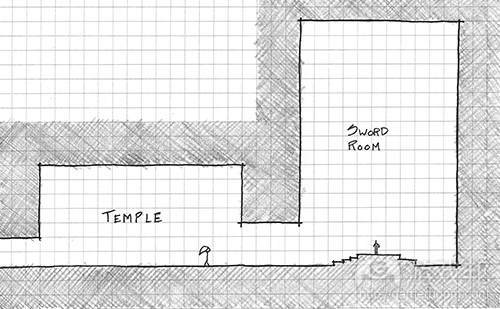
fig 3-9(from gamasutra)
(许多游戏使用对比鲜明的空间条件来突出进入boss房间或目标等重要玩法空间的路径。这是来自《塞尔达:时之笛》中的Temple of Time图表,玩家在此会收到重要的宝剑,这显示了对比鲜明的空间,其拜占庭式的大厅布局则强调了宝剑房间的重要性。)
玩家如何到达空间的另一个重要元素就是他们始于到达点的视角。我们在之后的章节中可以看到,游戏中的摄像角度会对玩家如何理解空间产生重大影响。但是,无论选择什么视角,都有可能产生戏剧化的启示和到达感。在经典建筑中,希腊雅典的帕台农神殿就显示了居住者的视角如何被引向戏剧性启示。在希腊卫城拾阶而上的游客会首先从下方看到帕台农神殿,之后进入卫城前门时,他们就会从西北角看到四分之三的帕台农神殿,而不是以直接的2维视角看到神殿。该路径之后会迫使游客迂回帕台农神殿本身的入口之前在建筑四处转转。游客通过这个路径远比直接走向入口更能获得戏剧性的体验。
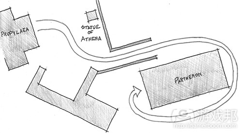
fig 3-10(from gamasutra)
(进入帕台农神殿的入口示意图。游客并不会从入口通道一边进入,而是从角落进入。之后他们就必须绕着建筑走。因为该建筑所有的台阶都同样复杂,所以游客走向入口时可以从所有角度欣赏建筑。)
Genius Loci
最后一个建筑学空间经验与布局的关系较小,但与设计空间的另一个目标关系更为密切。这个经验就是Spirit of Place。这个术语来自一个罗马信仰,即灵魂会扮演城市精灵的角色,保护城镇或其他有人口居住的地方。这个术语被20世纪末的建筑师所采纳,并用于描述一个地方的标识或情感体验。
在第二章节,我们讨论了关卡任天堂力量方法,即设计师创造一个宏观层面的方法或者其关卡的规划,然后分配玩法的高潮时刻 ,就像为游戏杂志创造地图一样。每个玩法的高潮时刻,可以是敌人遭遇战,行动谜题,或者有帮助的阻塞点,都有它们自己的Genius Loci。这些地方是用于休息还是战斗?玩家在这些游戏空间是否该感到放松、紧张或思考?这些问题的答案取决于你所创造的游戏,但却有助于确定你想为关卡创造的体验类型。
除了每个玩法遭遇战,关卡设计师还可以在其游戏空间中植入Genius Loci,并将其作为一种将玩家从一个点转移到另一个点的工具。Genius Loci可以通过光线、阴影、空间布局以及空间大小的操控来创建。如果你为恐怖游戏创造关卡,你所创建的Genius Loci就应该是通过对场景艺术、光照、音效和其他资产的精不挑细选而创造出来的。同理,仅有一点或没有Genius Loci的游戏空间就可能是一个流通空间,也就是玩家转移到下一个目的地的空间。根据你所创造玩法的情况,流通空间可能是激烈遭遇战之间的一次休息机会,或者玩家进入下一个难忘玩法时刻前创造悬念的工具。
篇目2,从空间度量角度分析策略性关卡设计法则
关卡设计中所使用的一个方法就是建筑透视图——即玩家在特定时间与其所在空间的关系。许多采用这种方法的设计并没有更多考虑到涉及玩家、其他代理和环境的动态关系。
本文将探讨3D空间中的动态关系,以便大家了解如何使用动态对象结合水平几何学去调整游戏难度和玩家情感状态。为达到这个目标,本文将通过评估玩家在现代3D第一人称射击游戏(以下简称3D FPS)中可用的策略进行说明。
目标
*通过了解如何让3D FPS关卡更困难或更简单,掌握为游戏虚拟空间调整难度的方法。
*探讨如何使用一系列不同方法实现富有层次感的难度设置。
空间度量
为了用理性方法设计3D游戏空间,我们需要鉴定一系列度量。可改变难度的一个主要度量就是玩家的视线。玩家视线越长,他们就越能够提前作好计划,以策略性思维应对游戏世界。
视线更长也意味着玩家将拥有更多可行的策略性选择,因为他们有更充裕的时间制定计划,并且对环境形势也更为了解。另一方面,削弱玩家视线将使其处于不利形势,因为他们对周围环境所知甚少,也没有足够时间应对特定问题。
我必须指出这种观察结果主要来自FPS游戏。如果用一个更宽泛的词汇来形容,我们也可以用玩家的“情境认知度”来下此结论,但本文主要以关卡设计为中心,所以我将用视线一词来剖析这个概念。
我们可以使用两个关键法则来衡量视线:几何视野所形成的角度(以下简称GFOV),以及图像分辨率保真度,这可以让我们知道玩家实际上可看到多远的东西(图1)。
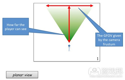
图1(from gamasutra)
几何视野 & 显示视野
处理3D空间渲染问题时,我们主要考虑的是几何视野(图2)。几何视野是最广为讨论的视野度量类型,这个视野就是玩家的摄像镜头。其广度就是衡量截头锥体水平跨度的角度,远处的截面就是游戏引擎可以停止渲染的结束点。这就是所谓的“绘制距离”概念。复杂渲染系统通常用“弧分”(游戏邦注:arc minutes,它是测量小角度的单位,常用于几何学、地图测量及天文学中,1弧分等于1度的六十分之一,可划分为60弧秒)来描述这种视敏度元素。
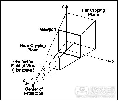
较少被人提及的概念是显示视野,或称DFOV(图3)。这个视野由玩家到显示器之间的距离,以及他们所玩游戏设备的显示器大小所决定。有趣的是,DFOV在导航以及3D空间的后续难度中发挥了极端重要的作用,但这只是针对女性玩家而言。据Tan, Czerwinski和Robertson (2006) 所执行的一项调查结果显示,当DFOV和GFOV角度比例为1:1时,女性玩家会最占据优势。而即使这一比例显著变化,男性玩家在3D空间中的导航能力也甚少受到影响。
入口 & 闭塞口,以及视线
入口是指可让玩家获得比正常情况更长视线的游戏装置。我们可以将围绕在一个工厂水平面更高层的构台视为一种入口,因为玩家在此可以使用开放的建筑平面图看到自己所处位置之下的状况(图4)。这也是我们常看到玩家在某个战略性场景中处于“高地”的原因,因为比起位居地图低处地带,位居高处更能让人们了解周围形势。窗户以及门廊也可作为游戏关卡的入口。
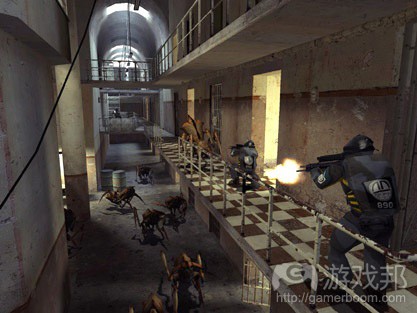
图4(from gamasutra)
可让玩家掌握更多视野的游戏对象所持有的武器都有极为强大的作用。例如可以扩增视线的狙击步枪就是一个典型。但这种强大的能力也会在某些方面打些折扣。狙击步枪虽然可让玩家掌握更长视线,但却会减少玩家的GFOV(图5)。而《Unreal Tournament》中的归航火箭则容易让玩家在使用过程中遭受攻击。
闭塞口也能更改图像保真度,并随之限制周边视觉或者玩家的视距。《毁灭战士3》中使用的手电筒就是一个出色的闭塞装置典型,它兼具这两方面的特点。
从立体视图角度来看,手电筒效果也是一个很有趣的技巧,它让小型空间看起来被人为地扩大了,并促使玩家探索房间或关卡的各个部分(而如果整个房间/关卡被完全照亮时他们根本不会进行这种地毯式的搜索)。从表面上看,《毁灭战士3》的关卡设计与其早期版本相比极为线性化,但玩家却能在狭小的空间中逗留更久,因为这种闭塞设计迫使他们必须花更长时间熟悉每个房间的情况。
《寂静岭2》(图7)所使用的“嘈杂”效果也是一种闭塞装置的替代性方法,它可用于减少玩家视线,从而让他们提高警惕。值得一提的是,这种效果通常还有重要的技术性用意,因为它可以减少制作大型、开放式场景所需的绘制距离,但同时又能给人造成一种大场景的错觉。通常还可以使用雨天、迷雾以及降雪等天气模拟效果来达到同样的目标。
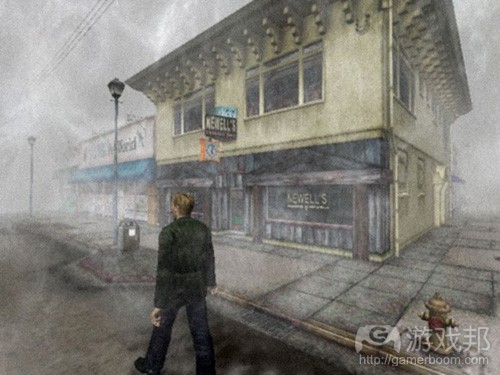
图7(from gamasutra)
关卡设计师可根据游戏情景,使用入口和闭塞法则去调整游戏虚拟空间的难度。图8呈现了有关使用闭塞方法的不同难度情况。在未使用闭塞方法的左图中,玩家具有高度的情境认知度,因为他们可以看透墙面,所有事物一览无余。这意味着他们随时可以应对任何敌人。
而在使用了闭塞方法的右图中,玩家的情境认知度受到限制,因此他们在探索新空间时将经历一个紧张的过程,他们必须迅速掌握空间布局以便针对一系列可能发生的情况部署战略。这些机制含有许多心理学原理,但我们在本文主要探讨如何使用闭塞和入口方法来解决3D空间中的难度升级问题。
二级度量:行动的能力,以及行动的可能性
解决3D空间的合理设计问题时,设计师需要清楚控制界面是如何让人们3D空间中的行动变得更为困难或简单。
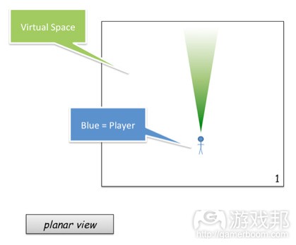
图9(from gamasutra)
当玩家掌握了大量的空间情况时,他们就有更多机会决定究竟要与敌人交战或是逃避敌人。空间也是塑造游戏过程必要情感的基础。最好是通过水平几何空间大小的变化,让玩家看到自己所处环境的反差。
空间需与前面的主要度量——视线相结合起来使用。
即使更大的空间可为玩家创造更多机会,有限的视线也会让这一空间所带来的优势荡然无存,这一点类似于手电筒在《毁灭战士3》中的使用(图9)
当玩家视野的截锥足够大时,他们就会掌握更多优势(图10)。将这两种元素结合在一起,要考虑到游戏空间的大小总会被玩家视野截锥所过滤。因此从难度的度量分级来看,虚拟空间总是居于次位,毕竟玩家最终是通过摄像机系统来感知游戏世界。
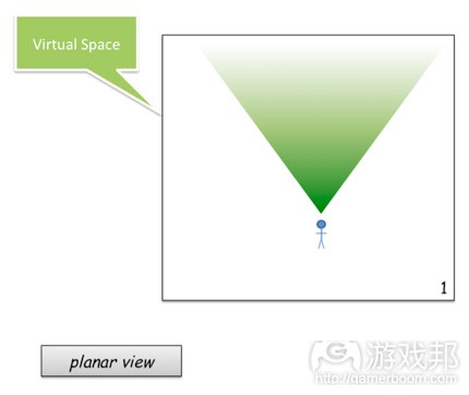
图10(from gamasutra)
接近向量
虚拟空间是玩家判断行动可能性及埋伏可能性的一个权衡途径。理解这个权衡方法的最简单方式就是考虑视线、虚拟空间和敌人接近向量之间的关系。
有三个方法有助于我们理解接近向量如何对游戏难度产生影响。接近向量的难度取决于敌人是否占据玩家当前视野的截锥,玩家是否需要移动视野,或者他们是否需要移动视野并改变所处位置与敌人交战。
*最容易的接近向量:这是指玩家无需调整所在位置或视野,就能直接通过视野看到敌人(图11)
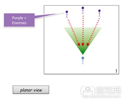
图11(from gamasutra)
*中级接近向量:指玩家需改变自己在3D世界中的视野位置,但不一定改变所处世界位置,就可以看到敌人(图12)。
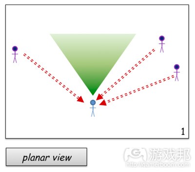
图12(from gamaustra)
*最困难的接近向量:需要玩家改变当前位置,最大化地调整视野才能看到敌人(图13)。
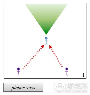
图13(from gamasutra)
当一个敌人接近向量需要玩家改变视野和所处位置时,玩家就会有犯错的可能。这也就增加了我们提高游戏难度的可能性。但为了更深入理解这个度量,我们还需要掌握一点玩家心理。
玩家心理:矫正循环
人类是杰出的“瞎猜者”。我们倾向于通过持续猜测、观察和更正,反复瞎猜解决问题的方法。想象下你打算去取一杯咖啡。你得移动手,观察它所在位置,然后更改移动量以到达目标所在。在你达到目标前,这个过程每秒都会发生好几次(图14)。
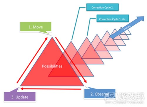
图14(from gamasutra)
从根本上说,我们越是要求玩家更改所在位置或视线,他们就越需要执行大量矫正循环。而矫正循环次数越少,玩家就越容易直达目标。
图14就是我们面对一个静态目标而进行瞎猜过程的一个典型。红色的大三角形代表每个猜测阶段的误差限度,三角形越大,就意味着犯错的可能性越高。
当我们通过移动、观察和更正(更新)而接近目标时,我们会逐渐减少误差限度。然而,如果一个对象持续移动,直达目标的可能性并不会以线性方式减少,正如图14那样。
再举一例,让我们假设玩家正执行针对静态目标的移动、观察、更新等相同过程——他们试图调整自己的准星以便瞄准对象。他们会逐步移动准星直至误差限度越来越小。
现在,假如目标突然对玩家作出回应,并且试图通过扫射而逃脱(图15)。玩家就需要极大更正自己的猜测过程,考虑更多可能性,因此就增加了误差限度,直到他们再次瞄准敌人。
逃脱向量
虽然开放空间给玩家带来了更多被敌人夹击或接近的可能性(游戏邦注:因为敌人可以从更多方向接近玩家),但同时也为玩家创造了许多脱险的机会。
在图16中,玩家的优势在于,他所掌握的逃脱向量要多于敌人的接近向量。我曾在过去的文章中将这些向量称为“扩张向量”,这个元素可以减缓玩家因敌人侵袭而产生的紧张感。
在多数情况下,玩家在第一人称视角的游戏中会首先选择调整自己所处位置,以便将大量敌人尽收眼底——观察人们玩《Serious Sam》时就会发现,他们通常习惯于后退,以便在自己的视野中都能看到敌人。改变所处位置是优于改变视野的良策。在多数时候,玩家会优先选择后退,最小限度地改变视野位置(图17)。
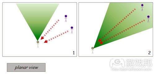
图17(from gamasutra)
在战略性场景中,向敌人扫射总会很有优势,因为比起那些简单地逃离或接近他们的目标,敌人需要更多矫正循环应对扫射目标。你可以从在游戏中移动准星这个情况来考虑。如果玩家朝向敌人后退,虽然目标会变得更小,但却可大量减少调整准星所需的矫正循环(图18)。
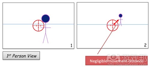
图18(from gamasutra)
当敌人以这种方式移动时,玩家就需要极大更改自己的视野,这种情形就会因为增加误差限度而变得更为困难(图19)。
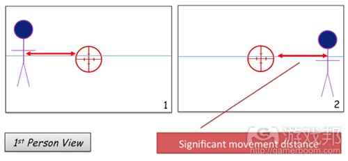
图19(from gamasutra)
水平几何 & 玩家战术
现在我们已经掌握了一些基本度量和玩家心理元素,可以开始观察水平几何如何从难度及情感层面改变这些关系。
图20简单描述了水平几何如何通过影响视野来改变玩家的情感状态和策略。图20的第1帧显示了玩家视野的模拟表现,而第2帧则是闭塞之后的实际视野。
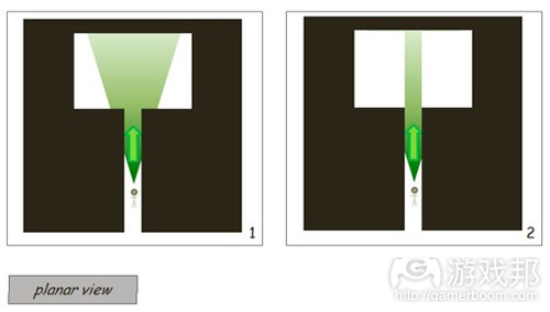
图20(from gamasutra)
在图20中引入一个敌人后,我们可以开始评估水平几何如何改变玩家视线、视角以及逃脱/接近向量。图21展示了玩家通过一个狭窄的走廊走向一个开放空间。
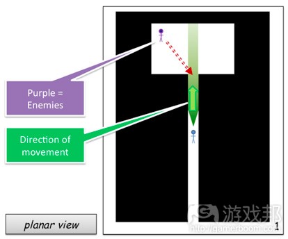
图21(from gamasutra)
由于摄像镜头截锥已被水平几何体所闭塞,玩家无从知晓前方有敌人在巡逻。在这种情况中,玩家形势最为不利。水平几何体减少了他们的可行逃脱向量。由于玩家此时已无法扫射,敌人就掌握了优势,他们可以用较少的矫正循环来锁定玩家。
在这一情况中,玩家需要闯入未知空间与敌人交战。他们不会冒然行事,因为交战需要改变GFOV和所处位置。除此之外,由于房间已经被阻塞,他们对周围环境情况所知甚少——他们甚至可能认为自己正进入另一个狭小的过道。
但这也有一个好处,密闭的空间有时候也会有利于玩家,因为它减少了敌人的接近向量。然后这一形势有利必有弊,玩家逃脱敌人的移动向量也相应减少,所以评估这种场景时需要玩家对敌人行为更为了解。
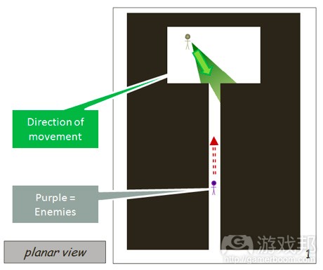
图22(from gamasutra)
如果我们将玩家与敌人的位置对换,形势就会大为逆转——玩家此时就会掌握敌人之前所拥有的优势,而敌人则处于劣势(图22)。
像图22所描绘的这种走廊就是会对玩家产生压迫感的堵塞点,玩家受到压迫时就会觉得异常紧张,并迅速前行以期早点脱离这种环境,在死亡模式类型的场景中尤其如此。
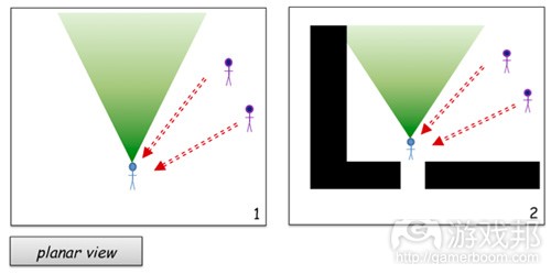
图23(from gamasutra)
图23展示了我们如何通过引入特定水平几何体来改变玩家的战略能力以及随后的情感状态。在图23的第1帧中,玩家正在前行过程中,有两个敌人从玩家视线之外的对角线方向接近他。这种情况类似于图21,但玩家要与敌人交战时就必须改变自己的视野(或所处位置),并将自己逼到一个角落,这样等于是减少了逃脱敌人的可用空间(图24)。
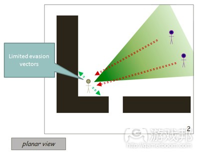
图24(from gamasutra)
迫使敌人穿过堵塞点总会对玩家更为有利。图25改变了图24的场景,将玩家更具有战略优势。图25的第2帧展示闭塞装置在战略角度上为何对玩家更为有利。在这种例子中,玩家有两个可监视的接近向量。当时只有一个敌人,因此他可以使用任意一个接近向量作为逃脱向量,从而迫使敌人进入另一个阻塞点。
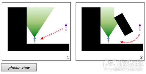
图25(from gamasutra)
图25可以利用水平几何体进一步改变,并添加额外阻塞点(图26)。但这种形势会对玩家不利,因为他们此时拥有过多可能的接近向量。我们可以用“封锁空间”一词来考虑这种场景——玩家在进入下一个游戏空间时就可用这种“封锁空间”策略来确保自己有组织地堵死了潜在埋伏向量。
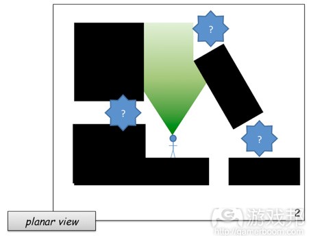
图26(from gamasutra)
图27拥有与图26相同数量的阻塞点,但玩家可以在进前过程中较有条理地封锁各个点。在图26中,玩家任何时候都需要同时警惕三个不同的潜在接近向量,而在图27的线性空间中,他们一次只需考虑两个接近向量。另外,他们还可以渐进性地封锁这些空间以减少接近向量。
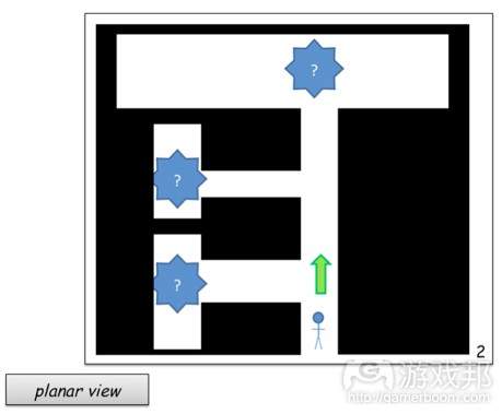
图27(from gamaustra)
随着玩家在图27中的前行,他们开始封闭空间,以免遭遇埋伏。《死亡空间》等游戏就是为了让玩家时时处于紧张和焦虑中而有意打破了这一规则。
多人模式地图也是这一规则的例外情况。图29是一个死亡模式类型的空间,它有意阻止玩家封锁空间。这类空间设计故意采用非线性模式,迫使玩家频频遭遇险境。
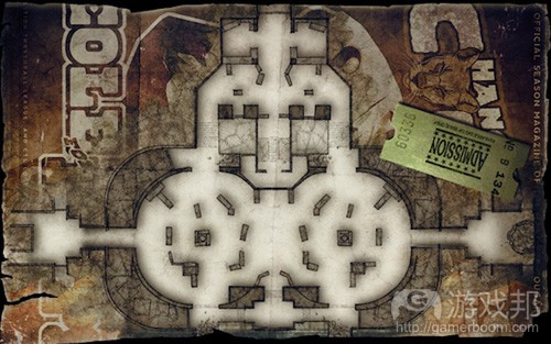
图29(from gamasutra)
高度元素
正如平面物体一样,高度元素也会影响空间度量。在上文内容中,我们已经提到构台如何作为高级的闭塞器,让玩家掌握更多情境认知优势。
这里需要再次强调,从确定难度的度量角度来看,视线的重要性超过了虚拟空间。
虽然玩家所拥有的逃脱向量较为有限,但图30中所描绘的构台却有利于玩家扫射处于较低地势的敌人。将这两种元素结合起来可以让玩家获得最有利的位置。
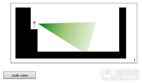
图30(from gamaustra)
为进一步解释这一点,让我们想象玩家处于相反位置的情况(图31)。玩家靠近这个构台边缘时,他们对自己上方位置的视野就会极大受阻。另外,他们要想移除这种闭塞性,唯一可行的方法就是后退。而他们越是后退,离构台就越远,就越容易撞上敌人的枪口,因为此时敌人瞄准玩家开火所需的矫正循环就会越少。
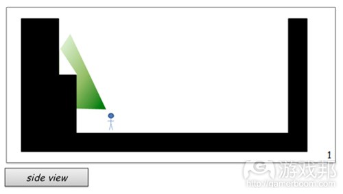
图31(from gamasutra)

- 图31(from gamasutra)
玩家此时若是采取后退行动,并与处于更高位置的敌人交战,就会让自己身陷险境(图32)。虽然最终结果意味着占据构台的敌人不会脱离玩家视野,但玩家自己也更易于成为攻击目标。骨灰级玩家则会意识到要这种情况下后退,需要伴随大量的随机扫射移动才有胜算。
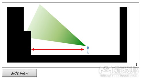
图32(from gamasutra)
这种场景的最困难情况可见于图33。如果我们移除了玩家扫射的能力,并在玩家的路径中添加了一个悬伸出的平台,那么这就会变成一个最困难的空间。玩家的视线受阻,其掌握的情境认知度也更少,更不利于制定行动计划。除此之外,玩家的逃脱选择也非常不利——他们只可能后退而无法采取更有效率的边扫射边撤退行动。
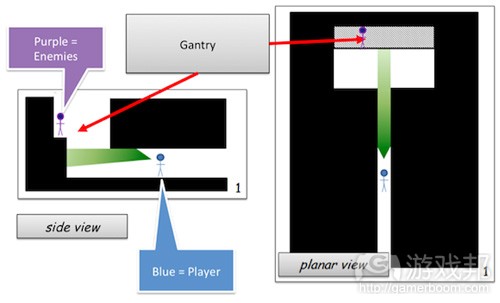
图33(from gamasutra)

- 图33(from gamasutra)
如果我们发现图33中的情况对玩家来说太困难了,我们可以使用合理方法调整水平几何体,逐渐降低难度。例如,在图34中让走廊的高度再高一点,以便玩家看到前面有一个构台。这至少可以让他们知道这个接近向量的潜在危险,这样他们就可以调整自己的视野以适应当前环境,而非被迫增加矫正循环的次数。
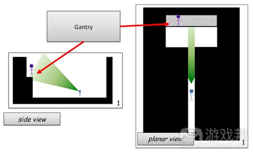
图34(from gamasutra)
总结
从空间对游戏难度及玩家心理影响的层面来看,本文所涉内容还只是冰山一角。理解虚拟空间的下一步就是要认识到在游戏几何学中,我们还要考虑到大量的引力和斥力。我曾在另一篇文章探讨压迫感和漏斗理论的文章中提到了这类元素。
理解动态关系并非本文话题,我们需要了解迫使玩家移动并同水平几何体接触的动力。我想,这里所提到的3D FPS游戏难度升级方法应该也很容易运用于你自己的游戏设计概念。如果在设计游戏空间时考虑到了玩家的情境认知度,那么我们就可以开始植入其他设计工具,例如Jesse Schell的兴趣曲线,以便进一步提升我们的设计。
篇目3,以分子结构法解析游戏空间设计原理
游戏空间是游戏规则和系统运作的环境,是游戏媒介执行机制的空间。当我们谈到游戏空间的设计时,我们有时候会用纯空间的术语描述设计师在设计某种游戏空间时必须实现的东西。
在设计FPS的游戏空间时,你使用自己最喜欢的原型设计工具,画出走廊和房间,这是最糟糕的设计方法。当你用现实的规则设计游戏空间时,你会很难想出有趣的空间谜题。在写字楼似的空间里穿梭能有多少乐趣?
分子设计法是一种运用绘图理论来概念化和调整各种游戏空间类型的方法。这种理想的设计方法意味着在设计空间时,你不必思考空间本身的表现元素。本文仍然同意平面地图的重要性,但是,我们首先需要更好的工具帮我们创造这些平面空间。
本文的前半部分将介绍绘图理论中的一些实用的工具,设计师可以用于概念化各种游戏组件。本文的后半部分将检验这些工具的实际运用。借此,我们将了解到这种抽象的空间实现方法如何促进关卡的重复设计。
绘图基础
绘图理论是数学中一个宽泛而多变的领域;但是本文探讨的图形可以解释空间关系。在绘图理论中,用于解释空间关系核心概念是结点和边(图1)。结点可以表示游戏空间/房间、可拾取物品、重刷点和AI路径点。边可以定义结点之间的关系。
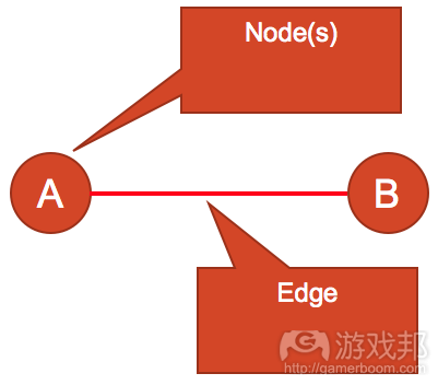
图1(from gamasutra)
图2是一个分子结构,它是由若干个结点通过边连结起来的。在这个例子中,我们围绕玩家出现点确定了一系列标记。这就是用绘图的方法直接描述空间。结点通过边连结起来,这些边确定了玩家和其他结点之间的最短矩离。标记越大,边就应该越长。
这个方法对PVP游戏很管用。在这类游戏中,为了实现平衡,可拾取物品在空间的分布应该大致平均。重复并旋转分子结构就可以对称分布空间中的可拾取物品了。边除了确定结点之间的关系外,还可以表示关卡中的通道或其他路径。在进一步解释以前,我们先看看加粗和定向边。
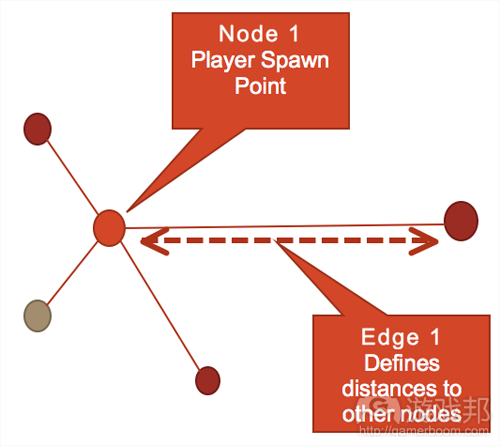
图2(from gamasutra)
我们可以修改边的外观以表示结点之间的不同关系。在图3中,介于A与C之间的边比其他边粗。如果我们使用绘图理论设计空间,那么结点就表示某个游戏空间,那么越粗的边就表示结点之间的关系越直接,而不是表示这两个结点之间的空间更大。
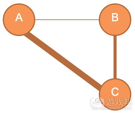
图3(from gamasutra)
我们将图3的分子结构放到图4中,可以看出来,粗边表示的A与C之间的通道是直的,没有阻挡。相反地,A与B之间的细边表示的通道是曲折的,即更复杂。这个例子说明了,边不是描述空间的外观,而是结点之间的关系。
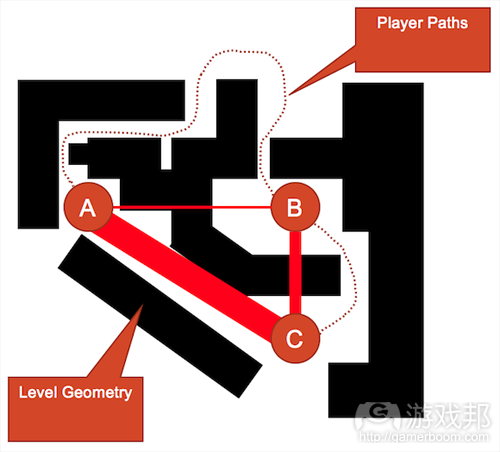
图4(from gamasutra)
我们可以进一步丰富边所传达的信息。图5使用带箭头的边表示A与B之间的不同路径;边越粗,路径就越直接。连结B与C的是一个间接单向的出入口。连结A与C的是另一个单向的出入口。这条边更粗,表明这两个结点之间的关系更直接,曲折程度更低。
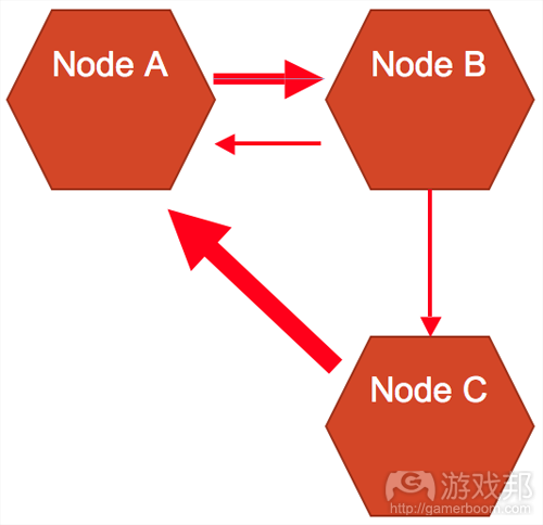
图5(from gamasutra)
结点和边可以表示游戏关卡设计中的任何特征。例如,我们可以用边的粗细表示结点之间的通过难度。用边描述垂直空间,我们可以知道C是地图上的最高位置。还可以看出,只有通过B才能抵达C。介于B与C之间的定向边暗示,B处应该有一个“跳板”,且只能从B跳向C。对于定义特定的分子结构的关键,全凭设计师或团队的考虑。
为了进一步解释使用空间分子设计游戏空间,我们可以看以下例子。图6表示一个简单的空间分子,我们可以看出这是一个线性关卡,适用于单人游戏的地图。粗边没有出现在这个例子中,不过定向边的运用使这个空间谜题变得更有趣了。
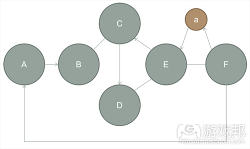
图6(from gamasutra)
图7告诉我们不能用空间分子做什么。使用分子的设计方法是为了将你的创意过程从纯空间理论的约束中解放出来,转而从空间关系的角度创造有趣的环境。尽管图7中的平面地图确实遵循了分子的空间关系,但它只是一个无聊的线性空间。
从空间的角度设计地图还存在其他缺陷。首先,你在平面空间中画地图,产生的一般是线性的、空间连空间的布局。当你的想象空间是二维的,你的地图也将是二维的。因此,你的地图不会产生有趣的垂直空间,更重要的是,从地图的起点看不到目标。
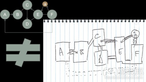
图7(from gamasutra)
图8是相同的空间分子,但设计得更好。这个例子将各个结点作为“游戏空间”,并且用分子的边定义了这些游戏空间之间如何产生交互活动。以下是通关的假设:
在这个例子中,玩家从一个可以远眺山谷(结点A)的平台开始。除了山谷之外,还可以看到游戏区域F,一个高大的人工塔。这是最终目标,它的大小和规模立即让玩家好奇他们如何才能进入这个建筑的内部。玩家注意到,塔的入口是上锁的,但他们可以看到远处的另一个建筑,区域E中的一个大金字塔。这个金字塔有一个宏伟的入口,非常吸引玩家的注意力——它是地图上唯一让玩家有兴趣的另一个点,因此可以吸引玩家朝它走去。
在区域A的起点和金字塔之间,玩家遇到许多障碍:一堵大墙、一座大门关上的桥和一个深水峡谷。玩家有时间从他们的高台位置查看整个场景,对地形有个基本的了解。玩家从A开始计划路线。
玩家从A的高台跳下来——这是一个单向入口。在区域B,玩家必须想办法打开大门。一开始,他们会被跨越峡谷的桥所吸引,但他们很快发现桥被上锁了,并且只能从另一端打开。在桥的附近,玩家注意到有一片岩石区,他们可以从那里跳进河里,并且不会受伤。
玩家入水后,沿着河流达到一片开阔的水域。这里,玩家发现一段楼梯可以通向金字塔所在的高地。进入金字塔后,玩家看到一条地下通道连接着位于区域F的目的地。一旦玩家接近区域F,路就会从玩家身后开始崩塌,所以这是一条不归路。
隐藏的房间a将F与E连接起来,然而它也是一个单向入口,只能从E进入。一旦玩家进入房间,它就开始被大水淹没,阻断通向F的路。这样,玩家就不得不前往区域E。
区域F是目的地,玩家只有进入F才能继续前进。注意,因为区域A是单向入口,区域F被关闭,所以玩家不能返回刚才那片开阔的区域。
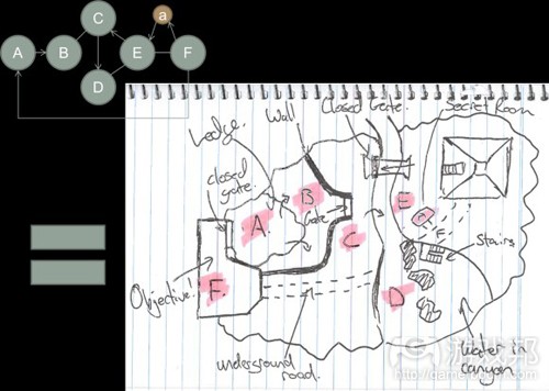
图8(from gamasutra)
图9表现的是对相同分子结构图的另一个解释,这一次我们用更形像的房间来表示空间。
在这个游戏过程中,玩家从A开始,这是一个带两个门的房间,一个打开了一个关闭着。玩家从唯一打开的那个门进入另一个更大的房间B。这个房间有一个门,但是锁坏了打不开,所以玩家知道无法由此通过。在B内部有许多箱子,玩家跳上去才能离开这个房间。
在这个高大的房间上方是一个悬挂着的支架。玩家俯视这个区域可以看到一个房间E。玩家从一个箱子跳到另一个箱子,慢慢地探索垂直空间。当他达到最高位置时,就进入一个小隧道(C),然后逐渐下降。
穿过隧道后,玩家来到户外区域D。在这里,他可以通过楼梯从D到达E。进入E后,玩家可以穿过之前看到的桥。在去F的路上,玩家发现一个可拾取物品,就位于他之前在B达不到的箱子上。如果他决定跳回那个箱子,那么他就必须依次返回B、C、和D。
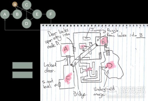
图9(from gamasutra)
图8和图9表明,利用分子设计一个平面地图是一个设计创意空间的好办法。这种概念化的方法迫使设计师在关卡设计的平面地图阶段时必须安排有趣的空间选项。根据我自己的经验,用平面地图设计出来的关卡通常是很无趣的、线性的——这是用纯2D空间创造法制作有趣的3D空间的结果。
更先进的工具
既然我们已经探讨了绘图理论的基本原理,现在就可以探讨一下设计师们设计游戏空间时使用的一些工具。注意,这些工具只是设计师可以使用的一些概念。因为本文挪用了一些想法,所以有些例子必须脱离对这些概念的纯数学解释。本文将探索的绘图概念如下:
*支配理论
*斯坦纳点
*生成树
领土/控制理论
领土理论可以帮助我们理解结点如何产生作用区域(AOE)和这个AOE如何覆盖其他结点。对于从玩家体验的角度解释现存的地图,这是一个特别实用的理论。在这种方法中,各个结点代表“游戏区域”和这个空间的游戏强度。
“游戏区域”这个概念,最初是在设计《半条命》时用于研究和指代“体验密度”的。体验密度是由Valve的设计师们在开发《半条命》时杜撰的。这个概念是指基于距离而非时间的游戏体验。这个基本概念是,玩家应该总是自主选择游戏体验的下一个区域。在玩家来到高密度的区域前,设计师应该给玩家足够多的时间收集掉落物品或单纯地探索地图。
图10是取自《半条命2》的一段地图,从中我们可以看出如何使用领土理论增加体验密度。在这张地图中,我们有三个明显的高密度区域,分别用A、B和C表示。各结点的AOE分别表示各区域的游戏密度。AOE越大,玩家面临的挑战就越大。
如果我们在设计时采用领土理论,那么我们就能使用领土来确保我们不会强迫玩家进入连续的、高密度的游戏区域。也就是说,我们希望用分子设计来确保在不同区域之间,玩家有足够的情绪“冷却”时间。我认为这些冷却区域类似于音乐的动态。在《The Clarinet and Clarinet Playing》一书中,音乐家和作者David Pino将这个概念总结如下:
这么思考:如果你站在海滨眺望一片宽广的大海,你可能会觉得无聊。但是,如果海面上漂着一支小船,你就会觉得大海很有生机,很迷人。类似地,如果你的视野突然被上百只船充满,没有哪一支船会让你留意很久。相同的原则也适用于音乐演出:如果听众体会不到旋律中的微秒变化,他们就会觉得沉闷;但如果除了微妙变化,他体会不到其他东西,他们也仍然觉得无趣……音乐中最重要的元素是它的韵律起伏流动。
为了更好地解释领土理论的作用方式,我们可以使用取自《半条命2》中的相同例子,但我要刻意破坏体验密度(图11)。在图11中,覆盖的游戏区域用重叠的红色AOE表示。从玩家体验的角度看,这就像阅读一本不带标点的书。游戏体验缺少情绪状态的混合,因为玩家“除了微妙变化,他体会不到其他东西了”——用Pino的话说。
为了解决体验密度的问题,我们可以在这张地图上运用领土理论。取决你希望玩家有多少冷却空间,你可以调整“支配重叠”来适应冷却空间。例如,你可以将分子中的重叠结点移除,这样就没有覆盖区域了(如图10)或者你可以修改游戏区域,这样游戏密度就会降低,但是更加频繁(如图12)
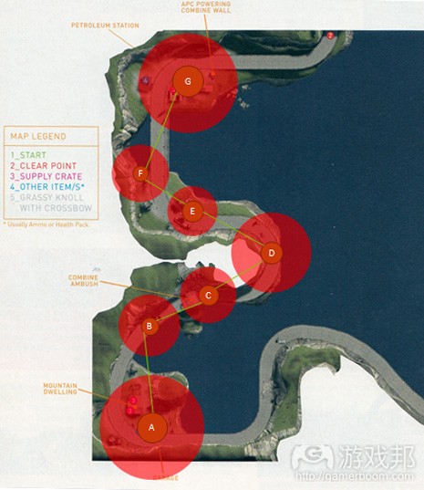
图12(from gamasutra)
从关卡概念化的角度看,领土也可以用于定义“刷出排斥区域”或任何其他类型的“排斥区域”。所谓的排斥区域就是指,在某个区域内某物不允许出现——即另一个结点的领土区域内不允许与其他结点的领土区域重叠。在使用领土理论时,点可以表示可拾取物品或玩家刷出点。因此,红色的AOE就形象地表示事件刷出范围的最小距离。
图13是一个使用领土确定排斥区域的例子。结点代表一个玩家刷出位置,也可以表示其他物品刷出点。这个围绕在结点周围的红色AOE形像地代表另一个刷出可以出现的最小范围。例如,如果我们遵循虚幻开发工具包(UDK)的限制,那么我们可能说根据我们的地图大小,处在相同垂直空间的各个刷出点必须彼此相距至少1024UU。你的领土区域的规则是灵活的;然而,对于这个例子,这个规则是,在这个领土区域内不允许出现其他刷出活动——至少从平面的角度看。
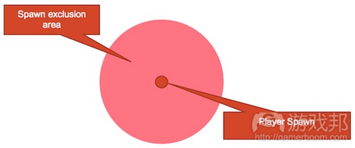
图13(from gamasutra)
图14是一个必须解决的领土问题。这个问题可能是因为重叠刷出或可拾取物品太接近。为了移除重叠部分,我们可以把这些结点分得更开一些,或者简单地使用关卡地形来缓和重叠问题,如图15所示。
但是,当运用领土理论时,你应该有一点常识。一旦你添加上关卡地形,你的设计就会更加复杂,这需要你修改某些规则。
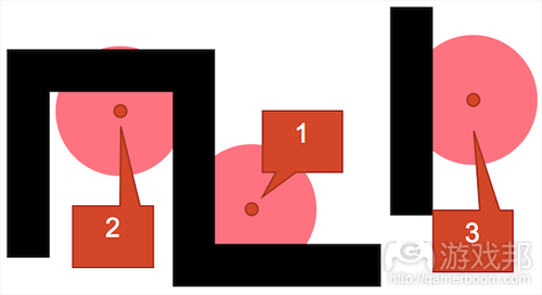
图16(from gamasutra)
在图16的例子中,我使用刷出的排斥系统在一个不对称环境中分布刷出位置。注意,我有意将刷出位置3远离刷出位置1和2。
这么做的原因是,刷出位置1和2的接近向量更少——即在玩家的视域内可以看到任何接近的敌人。而刷出点3的接近向量的弧度很大,玩家的视域不可能覆盖到整个范围,因此必须将这个点与其他点的距离拉大,以弥补这个劣势。
你可以将这个相同的排斥系统运用于其他可拾取物品——可拾取物品越强大,刷出排斥范围就越大。但正如前面提到的,关卡地形和其他因素如可拾取物品和玩家在游戏空间中移动的能力必然要求使用更复杂的分析工具——也就是生成树和斯坦纳点。
使用绘图理论理解玩家的选择和策略
所有游戏关卡都提供空间谜题。这些谜题的形式有很多,运用绘图理论可以改进某些与最佳行动策略有关的谜题,这类谜题经常出现在死斗模式的地图中。
玩家的游戏体验有赖于大量选择;但是,过多的选择与毫无选择一样糟糕。进一步说,玩家通过执行“好”策略选择而得到胜利时,会产生强烈的自豪感。到目前为止,我们已经使用绘图理论解释了游戏空间的结构,;但绘图理论的实用性不仅仅体现这一方面,还体现在考察以人为诡计和策略为主要关切点的关卡设计。我们将结合斯坦纳点和生成树,以及最大化和最小化通道的原理,来理解这些人为因素。
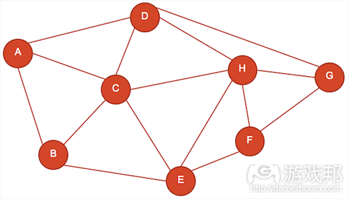
图17(from gamasutra)
图17是一个假想关卡的例子。结点A-E分别表示不同类型的游戏空间,各条边表示玩家从一个空间移动到另一个空间的可用路线。注意,边并不表示通道,而是玩家的选择路径。边的长短是根据路线的复杂程度确定的——也就是,边越长,通过这条路线的时间就越长。在图17中,各个空间(结点)都给玩家提供3到5个不同的选择。从这张图还可以看出,玩家要穿过整个地图需要怎么走。
生成树可以用来寻找结点之间的最佳连接点。我们还可以借助这个工具理解玩家在这个地图上的行为,以及寻找设计不公平或不平衡的方面。如图18所示,我们可以这样使用生成树分布可拾取物品、确定刷出点和放置关卡地形,以抵消任何明显过强的行为策略——可能出现在PVP地图中。
尽管制定关卡的最佳行动策略的确切排列是定义游戏空间的好办法,但我们必须进一步考虑玩家可能想到的诡计和突发事件。比如,玩家走捷径。捷径是指规则之外的一系列策略选择。玩家在任何游戏环境中都会寻找走捷径的机会,一旦他们发现到捷径就会感到非常满足。我们可以通过斯坦纳点理解这种行为。
寻找斯坦纳点就是寻找连接多个结点的最短边的连接点。Raph Koster在他的“游戏数学”的演讲上提到一个例子,可以帮助我们理解如何在游戏中运用斯坦纳点。在他的展示中,Koster表示“如果有三个结点,你要在它们之间创造尽可能最短的路线,那么你需要多少条最短路线?”Koster提出大多数人会做出类似图19的回答。
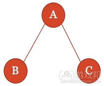
图19(from gamasutra)
这个问题的答案有一点儿偏了,因为它需要另一个结点——斯坦纳点。我们在图20中加入斯坦纳点,这样就得到这个问题的最佳解决方案了。我们可以像看待其他图一样看待斯坦纳点及其所创造的边。在游戏中,我们可以用加粗的定向边帮助确定斯坦纳点如何成为地图上的一个高度元素或另一个单向入口,如传送门或起跳台。
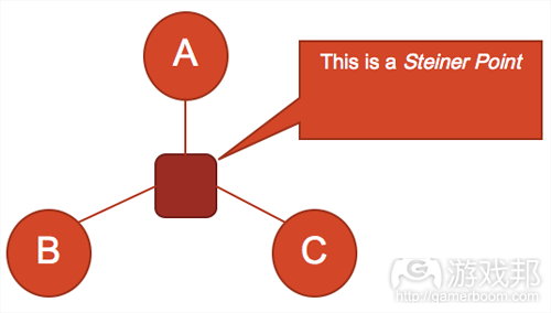
图20(from gamasutra)
斯坦纳点就是一种捷径。它是玩家在探索地图时会找到的一个关卡设计元素。关卡设计师的秘密就是让斯坦纳点在地图上表现得比生成树路线还隐蔽。游戏《边境之地》就是一个好例子。在下图的地图中,大部分的生成树路径是很明确的,表现为清楚的路径和跳台。
斯坦纳点以高度元素的形式存在于这款游戏中,当玩家跳到地图中的某个部分时,也就是跳过生成树的大部分路线,这样就省去了许多路程。《边境之地》的克罗姆峡谷就是这样一个例子:玩家可以从上升的平台跳下来,快速移动到地图上的另一个地方,从而创造一个斯坦纳点(如图21)。
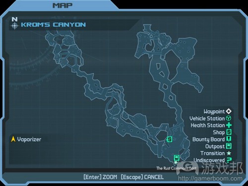
图21(from gamasutra)
图22(取自克罗姆峡谷)表现的是如何在关卡设计中运用生成树和斯坦纳点。在这个例子中,玩家为了从结点A到结点F,必须设计一个生成树方案。这种关系通过一系列渐渐上升的、与桥相连的平台体现在关卡设计中。在部分地图中,许多物品分布也使用了斯坦纳点。
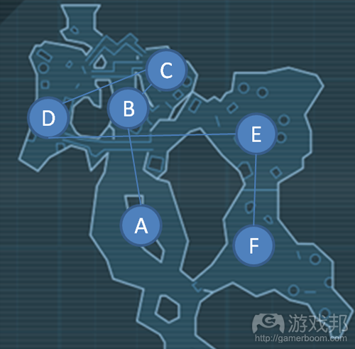
图22(from gamasutra)
我在图23中添加了两个斯坦纳点。不过,在这个空间分子中其实还有其他斯坦纳点,这些点表示放置在高台上的可拾取物品,只有通过物品上方的结点才能得到。所以,这些结点不仅作为捷径与斯坦纳点相连,还是玩家探索作为空间谜题的地图时的收益获得位置。
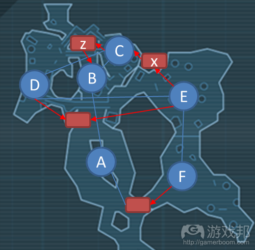
图24(from gamasutra)
现在我们已经知道斯坦纳点如何从空间谜题的水平上发生作用,现在我们可以回顾一下在图17中引入的生成树分子。如果我们将斯坦纳点运用于连接就近范围的结点,那么我们就会得到类似图25的结果。
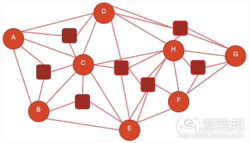
图25(from gamasutra)
这些斯坦纳结点具有多种形式。它们可以作为传送门、关卡地形或甚至是允许快速探索路径的高度元素。图25显示了我们在这个空间设计时可能使用到多少斯坦纳点。根据Koster的说法,太多斯坦纳点对玩家是有害的,因为玩家的选择太多了;也意味着玩家无法执行我所谓的“技术性策略”。基本上,即使玩家能够在这种地图中发现捷径,他们也不会感到有趣,因为捷径太多了。
如果我们使用关卡地形减少可能的斯坦纳点,我们就对玩家的要求就更高了。通过给予他们更少的选择(如图26),我们要求玩家执行比地图上的其他玩家的更好的策略。这么做的优点是,能在这种环境下执行更好策略的玩家会得到更大的满足感,因为他们意识到缺少选择意味着他们解决了更复杂的问题。为了说明斯坦纳点的减少如何影响难度的增加,我们只要看看下面这个取自《辐射3》的例子——图27的右下角部分。
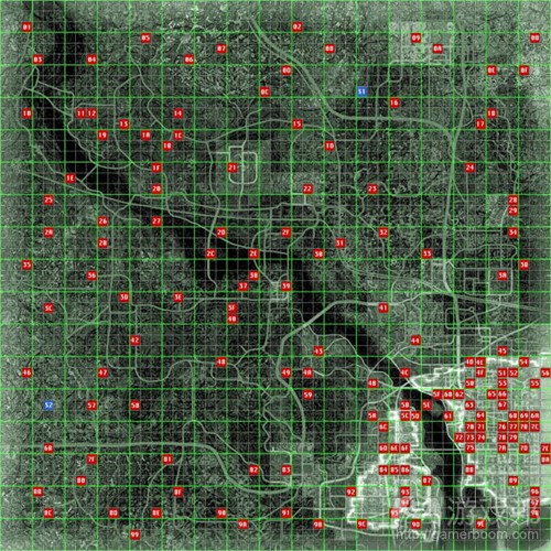
图27(from gamasutra)
在《辐射3》中的前期部分,空间探索问题可以通过简单的生成树解决,即寻找其中的斯坦纳点。这在Vault的南部区域表显得最明显,因为这是地图的第一部分(最东的),也是玩家最想探索的部分。不过,随着难度增加,这些斯坦纳点就大大减少了;这可以从DC地铁系统中看出来,《辐射3》的主线任务的玩家遭遇战就发生在这里。
实际运用
到现在为止,我们已经了解了绘图理论的基本原理和分析了在许多商业案例中的运用,但绘图理论到底如何作为工具用于概念化游戏空间?以下是由Nassib Azar提供的分子设计法的实际运用的案例。
在这个案例中,Nassib测试、执行和提炼了分子概念,以便创造一个平衡的、多人空间,这个空间尽管简单,但玩家能探索到足够多的有趣策略。
Nassib的目的是设计一个有三层体验的地图,这三层体验以三个同心圆表示。游戏空间是死斗模式地图,使用UDK默认游戏类型。外层是由低密度区域组成的,作用是“引诱”玩家进入游戏空间的最内层。
出于这个设计的目的,Nassib用玩家积极尝试杀死对方的次数衡量“密度”。图28是这个地图的草图。这张图显示了瓶颈点、交集点、刷出点和可拾取武器点,当玩家接近地图的中心时,这些点可以用来增加游戏体验的密度。
经过一些初期纸上原型和反馈后,三个不同密度的中心游戏空间的核心想法最终变成一个更具体的分子结构,从而确定空间。图29是早期概念的重制图。在这张图中,我们仍然有相同的一组同心圆表示游戏的密度,但是添加了边,以体现外层如何引导玩家进入中层。
为了达到这个目标,Nassib运用了“浓缩和漏斗”的概念,这种工具可以说明如何迫使游戏空间中的玩家使用各种可以提升情绪状态的游戏元素。在图29中,各个边代表示导向结点的额外的压迫向量。在这个例子中,结点表示用于战斗的空间;导向结点的边越多,这个结点的压迫程度就越高(结果是,游戏体验的密度也更高)。结点大小表示压迫程度的增加,进而增加游戏的密度。
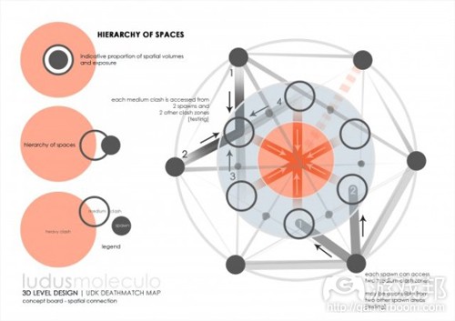
图29(from gamasutra)
即使运用分子设计意味着区别游戏体验和关卡地形,Nassib还是选择研究纯地形的空间表现法是否具有内在的玩家体验价值。Nassib的分子原型的六边型属性值得进一步探究。问题是:分子结构转变成真实的关卡地形后仍然保有原来的设计意图吗?
这个用于定义整个游戏空间的原型分子以灰盒关卡的形式用UDK反复重制。显然,经过原型制作,这个尝试确实有优点;玩家体验的密度随着玩家逼近地图的中心而增加。结点变成通用的游戏空间,而边变成引导玩家进入这些空间的通道。
图30是灰盒的改良版本。从图上可以看出来,原始分子转变成可游戏的空间。在测试时发现,空间大小必须增加,才能适应游戏密度的增加。
空间大小是根据理想的游戏密度的最佳空间大小而确定的。原始分子设计在这方面转换得很好。游戏空间随着玩家向地图中心移动而渐渐增大,然而这个区域又很小,足以迫使玩家采取近战策略,从而增加游戏密度。
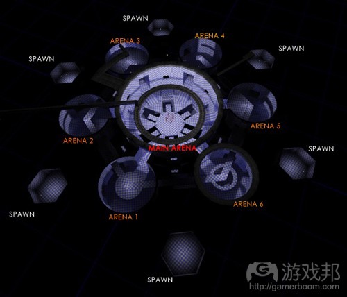
图30(from gamasutra)
为了增加地图中心对玩家的吸引力,必须合理分布各种可拾取武器。用于确定可拾取物品位置的分子主要有两种:可拾取武器可以让玩家更快向地图的中心移动。可拾取的药水会吸引玩家探索各个游戏区域的周边环境。设置这两种性质不同的不仅增加了进攻和防御玩法的不同行动策略,而且有助于将游戏活动平均地分配到整个地图中,而不只是集中在最中心的地区。
图31进一步分解了图30。在中间结点(上左边)的附近,区分了导向它的两类不同的边。边1和边2来自刷出点,而边3和边4来自其他中间结点。这意味着不同的危险程度,因此要由不同的边表示。尽管最初设计假想表明,边1、边2和边3、边4之间存在某类可识别的差异,灰盒几经修改才观察到这个假想的真实样貌,见图32。
从这个灰盒的早期重制版可以看出设计存在根本的缺陷。尽管随着玩家逼近地图中心,游戏密度增加了,并且第二层机制也出现了,但玩家越来越觉得自己只要在地图外圈就能得到很多好处,打到无数刷出的敌人。测试的结果表明,边1和边2上升成为单向入口,可以吸引玩家进入地图,同时防止已经在地图内的玩家进入刷出点。升高的走廊被重新概念化为物理空间,如图33所示。
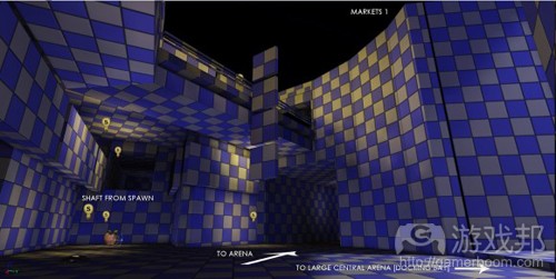
图33(from gamasutra)
分子设计法还有利于可拾取物品的分布,物品放置遵循类似关卡地形的对称分布。尽管对称分布减少了地图设计的工作量,但过多的对称通常是很无聊的,甚至让玩家感到困惑。
为了解决这个问题,应该用不对称作为玩家探索、分布着不同类型武器的房间和游戏机制的标志。使各个房间的布局不同有两个目的:一是帮助玩家探索各个房间,并“感知”各个房间的优势。如果玩家感到不公平,那么无论系统本身多么公平和平衡,玩家也会被他们认为有漏洞的元素所吸引,即使实际上这些元素并没有漏洞。
事实上,第二圈的房间各自包含不同类型的空间分子。这些分子的差异通过不同的阻塞点和掩蔽元素体现出来。从图34和图35中的对比中可以看出这种结果;两张图的房间都在第二圈,各自提供不同类型的游戏体验。
再次重制和测试后,发现玩家更可能进入主要的房间,而不是第二圈/中间房间,但没有达到预期的比例。在中心房间的游戏体验的密度必须非常高,但是要达到理想的体验,玩家流量还不够。当然,这可以通过缩小空间来解决,然而因为关卡美术的大部分已经进入制作阶段,所以有必要寻找替代选择。
为了最大化体验,使玩家刷出点的第二圈出现在第二圈的夹层中。从更上面的刷出点走到中心房间的距离比从地面层的更短,因此会大大增加中心房间的流量,从而达到理想的效果。
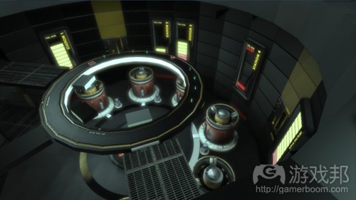
图35(from gamasutra)
与中间房间相比,图36中的两个重叠的刷出点没有相同的“从刷出到沉浸”的时间。换句话说,上面的边与下面的边并不相等,而其实它们应该相等。修改分子设计来改变刷出点的位置,“从刷出到沉浸”的时间差异与之前的刷出点的相比,就可以忽略不计了。
对称分子使地图上的楼梯和电梯分布更公平;然而,在实际设计中,三个电梯的分布被有意区别开来(图37)。这个方法的基本原理是,突出感知不公平的心理状态。测试表明,大多数玩家认为靠近刷出点的楼梯更有优势,这种优势不会被用来反对他们。梯楼本身的设计是不对称的,这么做的作用有两个:一是帮助玩家探索,二是丰富中间房间的游戏体验。
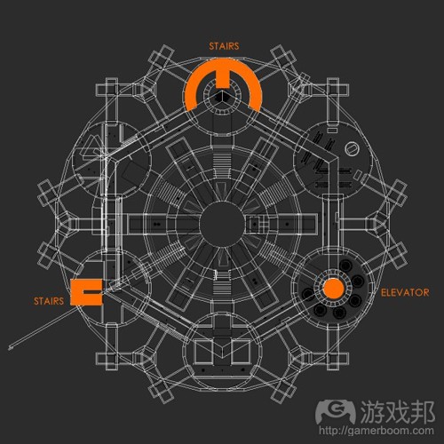
图37(from gamasutra)
另一个用于实现平衡的策略并非出自绘图理论本身,但突出了绘图理论如何帮助解读玩家行为。Kismet脚本会使游戏每过三分钟比较一次分别经过这六个中间房间的玩家的数量,然后确定哪个房间的流量最少。活动量最少的房间就要增加一个触发器。
当玩家激活触发器时,它就会将另一个玩家放入这个空间,玩家互杀完毕后计算击杀数目。(图38是这张地图的俯视图,也就是玩家死前看到的最后一个场景)这有助于增加流量最少的房间的游戏密度,从而通过机制而不是静态绘图创造一个动态平衡的系统。当出现这个场景时,玩家可以选择使用斯坦纳点的方案来解决空间问题——也就是达到目标的最短路线。
一旦脚本确定最少流量的房间,这个地图上的所有玩家就会收到声音和文字通告,让人们知道哪一个中间房间的触发器可以使用了。取决于玩家的当前位置,他们面临两个选择。他们可以通过最短最危险的路径达到中心房间,或者,他们也可以选择通过中间房间的更长但更安全的路径,从而避开中心的冲突区域。
这么做,我们就为玩家创造了两种不同的策略;他们可以使用中间房间作为斯坦纳点或使用外层房间作为生成树(图39)。这些策略性的选项是为了激发玩家的成就感。玩家会感到骄傲是因为他们觉得走捷径达到合适的房间,这是以智取胜的表现。填充在各个房间的关卡资源也起到减少斯坦纳点总数的作用,从而提高找到有限的解决方案的内在价值。
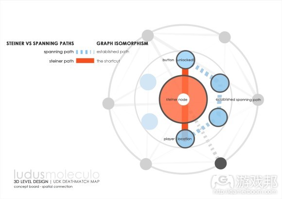
图39(from gamasutra)
最后一张地图经过了8次大修改,既升级了灰盒,也调整了分子结构才变成现在这个样子。每一次修改都以修正后的分子概念为基础,之后才转变成灰盒。所以,各次修改都有明确的目标,这极大地增强了最终成果的效果,特别是考虑到时间非常有限。
结论
Dan Cook和Chris Crawford等人研究了人们玩游戏的动机,启发我们产生学习和改进这些新技术的想法。Raph Koster进一步细化这个概念;人类是寻找模式的机器,当我们在游戏中识别并学会它的模式时,我们就能从游戏中收获快乐。因此,基于模式的分子设计法来定义游戏空间直接迎合了人类天性,的确有实用价值。
另外要记住的一点是,玩家不会把游戏当作平面地图,他们是在自己的视域中感知地图。因此,你希望执行的分子的规模和“可识别度”受制于玩家在任何时候可以感知到的游戏世界。
设计师经常制作迷宫类地图,尽管这种地图从平面角度很容易理解,但通过玩家有限的视角,是绝对无法全整探索的。所以,为了让玩家觉得地图有趣,分子和模式不一定要非常复杂。
相反地,设计良好的游戏空间往往有许多嵌套分子,而不是一个分子就定义了整个游戏空间。从绘图理论的角度看,Nassib Azar制作的实例是比较简单的,但动态游戏元素产生的分子排列的数量为玩家提供了一系列多样而可控制的策略。
值得一提的是,使用绘图理论概念化和分析游戏空间并不是什么新思路,事实上很多人都以各种形式讨论了这个想法。这个研究的灵感最初来源于Raph Koster和他的“游戏数学”展示。我向所有对设计感兴趣的人推荐他的工作。Joris Dormans也写了一些与绘图理论相关的文章,关卡设计师可以当作参考。Dormans的《Adventures in Level Design》和《Level Design as Model Transformation》都很不错,清楚地说明了这个工具的广泛用途。
篇目1,篇目2,篇目3(本文由游戏邦编译,转载请注明来源,或咨询微信zhengjintiao)
篇目1,Excerpts from An Architectural Approach to Level Design
by Christopher Totten
In the past few years, I have noticed a fascination in the game industry with architecture as a field that could be potentially helpful to the way we design. As a game developer with two degrees in architecture I have likewise seen the connections between the two fields. As an undergraduate architecture student I began making small video games with friends – creating art with the design software I used for classes. On the suggestion of some of my studio-mates, I began utilizing what I learned about game design in my class projects. I felt that architecture, like games, had a symbiotic relationship with its users and that well designed game levels had much in common with the work of architects like Frank Lloyd Wright, Le Corbusier, I.M. Pei, and others. Eventually, my work with both fields culminated in a graduate thesis on the intersections between games and architecture. After grad school, I became a game developer and continued my research into the ways architectural theory could be applied to level design. This work has allowed me to write several articles, give a few conference talks, and now publish a book.
Released on June 12th by CRC Press, An Architectural Approach to Level Design integrates architectural and spatial design theory with the field of level design. The book explores the principles of level design through the context and history of architecture, providing information useful to both academics and game development professionals.
Presenting architectural techniques and theories for level designers to use in their own work, practical elements of how designers construct space are addressed along with experiential elements of how and why humans interact with this space. Throughout the text, readers learn skills for spatial layout, evoking emotion through gamespaces, and creating better levels through architectural theory.
This article contains several excerpts from the book showing basic architectural elements that can be applied to practical level design applications along with illustrations from the book taken from my own gameplay and design journals. These sections prepare the reader for further explorations of methods for visual communication, producing emotional responses in players, encouraging social interaction, and other things important to game worlds. I hope you enjoy reading it as much as I have enjoyed researching and writing it. The book can be purchased at http://www.crcpress.com/product/isbn/9781466585416
Ways of Seeing for Level Design – from Chapter 1: A Brief History of Architecture and Level Design
In order to fully understand spatial design principles for level design, it is necessary to analyze precedents from both real world architecture and video games. Hal Box, FAIA, Professor Emeritus and former Dean of the School of Architecture at the University of Texas at Austin argues for an educated form of seeing architecture based on study and analysis. In this case, “seeing” is not used to only describe using the visual senses, but also to process the spatial, formal, contextual, and historical elements that make a building unique.
For level designers, this type of “seeing” can be transformative for how we learn from the levels of previous games – both good and bad. Doing this may involve breaking some habits common to game players. For example, there is a saying that “gamers don’t look up” when playing games. As designers, the verticality of gamespaces can be an important element in establishing the grandiosity of a setting or for communicating direction with players. Likewise, as players, it is common to run directly to the next action scene rather than pause to explore game environments. Designers should look for ways to direct the pacing of a game environment in subtle ways – placing narrative elements in the way of player pathways or incentivizing exploration with rewards.
In his book, Think Like an Architect, Box proposes ten ways for exploring and understanding a building:
1. Learn why a building was built, what it was for, and what it is now.
2. Look up as you walk around – noticing visual elements, layering of forms, and materials.
3. Sense the space by its size, shape, and how it interacts with light, sound, and other spaces.
4. Train your eye to understand the structure of the building and how it holds the building up.
5. Determine how materials are working – in compression or tension – or if they feel heavy or light.
6. Determine how the building was constructed and from what materials.
7. Examine the historical precedents of the building.
8. Analyze the composition, proportions, and rhythms of building elements.
9. Observe the appropriateness of the building to its setting.
10. Analyze what makes the building special from others[i].
Obviously, not all of these apply to game levels. While the environment art of a level can represent structures that are in compression or tension, the game art itself will not be. Likewise, many game levels are held up by the fact that they are not defined as rigidbody objects in the game engine and thus, do not fall according to the engine’s physics system. However, many of these proposed ways of seeing are applicable to game levels in their current form, or may be modified slightly to fit our own purposes. In this way, we may say that level designers can modify their ways of seeing with these methods:
1. Identify what gameplay occurs in the space. What are the game mechanics supported?
2. Look up as you walk around – noticing visual elements, especially art that contrasts the rest of the environment or somehow calls attention to itself. Also look down – is the spaces’s verticality used in reverse to make you feel in danger?
3. Sense the space by its size, shape, and how it interacts with light, sound, and other spaces. How do the lighting or sound conditions make you feel?
4. Analyze the pacing of the level. Does the level usher you through itself quickly or are there opportunities to explore? Are these required or bonuses for extra curiosity?
5. Is there one gameplay style reflected in this level, or are multiple supported? (For example, does a deathmatch map have places for snipers, offensive players, defensive players, etc.? Does a game level play well for barbarians but poorly for mages?)
6. How does the space express the narrative of the game? Is it a backdrop or does exploring the level tell you about the game world in some way? Are narrative events scripted to occur around the player or are there cutscenes?
7. Examine any historical or gameplay precedents? What kinds of spatial experiences were in those games?
8. Analyze the composition, proportions, and rhythms of environment art elements.
9. How does level geometry compare with the movement abilities of your avatar? Is everything well within their capabilities or does the level space challenge these measurements? Is there anything that is outside of these capabilities? If so, does the game offer any way to expand these abilities?
10. What environment art elements are repeated? Are they interactive? If so, do they correspond to a specific gameplay mechanic?
These ways of seeing for level design, as well as the architectural and gamespace precedents found in the rest of this chapter, will guide our explorations of spatial design principles for level design.
Level Design Workflows – from Chapter 2: Tools and Techniques for Level Design
The American architect Louis Sullivan, often credited as the creator of the skyscraper, once famously said, “Form ever follows function.” This was shortened to the famous design idiom, “Form follows function.” With this phrase, Sullivan stated one of the driving principles of architectural modernism. Modernism was an architectural movement of the early twentieth century defined by an emphasis on creating buildings whose form was derived from their purpose. In modernist architecture, ornament was generally a product of the building itself or applied for a purpose, rather than simply for the sake of aesthetics. Similarly to Sullivan, Le Corbusier stated, “The house is a machine for living in.” Much of his architecture, as with the architecture of Frank Lloyd Wright, Walter Gropius, Louis Sullivan, and others was focused on purposefully creating an experience for the occupants.
As we have seen, the same can be said of level design. In level design, developers often design with a specific experiential goal in mind. In a 2008 interview, Valve level designer Dario Casali argued that “experience is key” when creating level design ideas[ii]. Earlier in this chapter, we discussed some goals of level design that related to how users use gamespace and how we as designers communicate to the user through the space. These experiential goals should dictate how we as level designers construct space: form follows function.
In this section, we will discuss some workflow processes that involve these same tools, beginning with how “form follows function” fits into game design.
Form Follows Core Mechanics
The tenants of form follows function thrive in game design through a concept known as the core mechanic. A core mechanic is often defined as the basic action that a player makes throughout the course of a game. In his doctoral dissertation, game designer Aki Jarvinen similarly created a core mechanic-centered design method where designers began from verbs[iii]. If one looks at core mechanics as the basic verb of what a player does in a game, they can understand the foundational elements of what builds each game’s unique experience. For example, Super Mario Bros[iv]. can be said to be about jumping, The Legend of Zelda[v] is about exploring, Katamari Damacy[vi] is about rolling, Angry Birds[vii] is about flinging, and so on. Beginning from this core, other actions are added that define the rules of the final game product.
When designing levels, having a similar core mechanic idea in mind is necessary. While many new designers assume that individual levels should simply follow the core mechanic of the game, it is possible to define level core mechanics to make each unique. An example is the Badwater Basin level (figure 2.43) of Valve’s Team Fortress 2 (TF2)[viii].
Figure 2.43 A plan diagram of Badwater Basin from Team Fortress 2. RED and BLU team bases are marked on the map, as are major circulation areas and BLU checkpoints between the two bases.
In this level, the game’s Builders League United (or BLU) team must push a bomb into their opponent’s, the Reliable Excavation Demolition (or RED) team’s, base via a mine cart on a track. The mine cart mechanic of Payload mode, which Badwater Basin is a map for, takes TF2’s standard team-based first person shooter mechanics and adds a twist. Not only does this change the mechanics of gameplay, but also the conditions of the levels spatial geometry.
One example cited by Casali, who helped design the level, was the level’s tunnel. In the first prototypes of the level, designers made the mine tunnels a standard width that they had used for other basic maps. However, upon playtesting the level with the mine cart-pushing mechanic in place, they realized that tunnels had to be widened to accommodate both players and cart. This seems like a small change, but it prevented a lot of aggrivation from players that had been getting blocked out of tunnels by the cart (figure 2.44.)
Figure 4.44 Modifying the width of the tunnel in Badwater Basin allowed for better circulation of both the player and mine cart through the level and made gameplay less aggravating for the offensive team.
As level designers, it is our job to design to the realities of how player avatars and other gameplay elements move through levels. Traversing levels is comfortable when level spaces comfortably accommodate metrics. As we will explore in later chapters, gameplay drama can be achieved when we create spaces that push metrics to the limit. Such spaces include gaps that require the farthest possible jump a character can do such as the one found in world 8-1 of Super Mario Bros. (figure 2.45) or tight corridors that restrict movement in horror games, such as Resident Evil[ix] (figure 2.46.)
Figure 2.45 This section of Super Mario Bros.’s level 8-1 pushes Mario’s jumping metrics to their limit. The gap is 10 blocks wide, 1 block longer than Mario’s running jump distance of 9 blocks, so using the 1-block-wide middle island is necessary. Most strategies for crossing this gap call for a running jump to the middle island, and then another quick one off the 1-block-wide island so Mario’s landing inertia doesn’t launch the player into the pit.
Figure 2.46: Many hallways in Resident Evil are barely wide enough for two characters standing shoulder to shoulder. In this way, a single zombie in these hallways can become a significant threat for players trying to get past. This spatial condition also gives the game a claustrophobic atmosphere.
Designing to gameplay does not solely have to involve measurements either. It can also mean designing to specific character abilities such as special attacks or movement modes. Stealth games, like Metal Gear Solid[x] provide a great example of how to construct levels based on different types of character movement. In Metal Gear Solid, the player character, Solid Snake, has the ability to hide behind walls and look around corners. This vastly changes the meaning of ninety-degree corners when compared with other action games – they are strategic hiding places rather than just level geometry. As such, the nuclear weapons facility that makes up Metal Gear Solid’s environments has lots of these corners so players can sneak from place to place, looking around corners to find their next refuge. While not measurement or metric based, these kinds of layouts are based on the character’s own mechanics, the gameplay actions that form the range of possibilities for how a character may act or interact with their environment.
Level Design Parti
Earlier in the chapter, we discussed the architect’s parti, basic formal explorations that architects utilize to determine what shape or orientation they want their building to take. For level designers coming off of determining the core mechanics of their level, a parti is another valuable tool for developing the spatial layout of your level.
Designing with parti is quite different than designing on graph paper or computer. Partis are meant to be sketches, and therefore will lack measurement. Sketching exercises allow designers to form ideas quickly before spending the time to plan measured versions of their designs. The key to a level designer’s parti is to sketch gameplay ideas as spatial diagrams. For example, a level design parti of the previously mentioned Badwater Basin level would be two large masses (representing the team’s base areas) with thinner zones of circulation in between the two to represent the mine cart track, and some smaller bases for BLU players to capture, similar to the diagram shown in 2.43.
In his discussions of level design from Indie Game: The Movie, Edmund McMillan argues that once a designer has created environmental mechanics, that is, interactive parts of a level that factor into gameplay, they should be usable in many different ways in order to be valuable. For the e4 Software’s mobile game, SWARM![xi], a ball-roller/platformer game where players had to lure enemies into traps, programmer/designer Taro Omiya created many sketches of the electric fence traps to visualize the different uses they could have (figure 2.47.) Likewise, Omiya and others working on the game made formal Partis on the computer and on paper to visualize spatial orientations of levels such as downhill slides, floating islands, and platforming areas (figure 2.48.)
Figure 2.47 Once designers for SWARM! created the electric fence traps, they sketched many gameplay partis of them to visualize how they could be utilized through different levels.
Figure 2.48 Formal partis for SWARM! show the visualization of different spatial orientations such as hills, tilted ledges, and others.
Digital Prototypes with Whiteblocking
When developers have moved from prototyping off the computer to prototyping in digital form, they create test levels through a process known as Whiteblocking. Whiteblocking is when a level designer creates a level out of simple geometry, most often white or simply-textured blocks (thus the name), to test whether levels accomplish the gameplay goals they want. Early on in the design process, when designers are trying to define gameplay metrics of player characters and other things, Whiteblocking can help determine what gameplay measurements should be. Likewise, designers can draft the spatial characteristics of their levels in a parti-like way, testing the sizes and shapes of certain environments for different gameplay experiences, before specific environmental art is added to a level (figure 2.51.)
Figure 2.51 Whiteblocking done for SWARM! shows how an important section of a level meant to teach players how to kill enemies was thoroughly tested in simple geometry before environment art was added.
The geometry used to Whiteblock level spaces is usually the simplest needed to simulate the colliders that will be used in the eventual final level design. Colliders are a component of objects in game engines that simulate the interaction between physical objects. A box collider attached to a piece of level geometry, for example, will cause that object to interact with other objects as though it is the shape of a six-sided box, regardless of the shape of the actual environmental art (figure 2.52.) Colliders can be simple geometric shapes or can be made to tightly fit organic shapes.
Figure 2.52: This plant has a box collider attached to it. Though its 3D model has an organic shape, player objects in a game will interact with it as though it were a rectangular solid.
Valve uses Whiteblocking extensively in its level design process. The construction rules for engine primitives in their level editor, Hammer, allows rapid 3D level prototyping through simple and precise building. Hammer’s primitives, called “brushes”, are used to roughly define level spaces, which are then playtested to see if the intended experience is created. Level designers see what worked properly and what did not, and then change the spaces by editing the brushes. When the designers find themselves editing little of major spaces and instead focusing on smaller details, the level is ready for environment art.
As an iterative process, Whiteblocking begins with almost parti-like interactive forms of levels and moves designers towards more art and ornament-centric design decisions that are not unlike interior design. As level geometries become better defined, standard pieces of environment art can be defined as well, eventually becoming the building blocks of levels.
Architectural Spatial Arrangements – from Chapter 3: Basic Gamespaces
As with the previous chapter, we will begin with lessons from Architecture. Where last time we focused on tools and techniques that were useful in game engine environments, this time we will discuss spatial arrangements that can be utilized in games.
Games and architecture differ in the fact that real-world Architecture must conform to real-world rules. For example, real-world buildings must both have an interior and exterior – with the shape of one influencing the other. Likewise, real-world architecture must take into consideration weather, geology, zoning regulations, and structural realities. Conversely, these are not things that gamespaces must deal with. To one extreme, this can mean experimental structures such as Atelier Ten Architects and GMO Tea-cup Communications Inc.’s Museum of the Globe[xii], a large elliptical structure formed from cubes floating in space (figure 3.1) or Hidenori Watanave’s explorable database sculpture on the life of Brazilian architect Oscar Niemeyer[xiii] – both former structures within the virtual world Second Life[xiv]. For more day-to-day level design, however, this means gamespaces that are free from interior/exterior requirements. This results in more freeform spatial layouts based on player movement patterns, narrative events, or game mechanics (figure 3.2.) Indeed, “interior” and “exterior” are little more than descriptions based on the art used to decorate the gamespace.
Figure 3.1 A sketch of Atelier Ten architects and GMO Tea Cup Communication, Inc’s Museum of the Globe. Since the building is built within a virtual world, it does not require any structure to hold up the hundreds of cubes making up its main body. The designers designed the buildings form in Microsoft Excel and then generated the geometry in an automatic modeling program.
Figure 3.2 Parti diagram sketches of level plans. Game levels can take on unusual forma characteristics because they do not have to conform to a corresponding interior and exterior as real buildings do.
With these differences in mind, spatial designers for games can take advantage of architectural lessons within the freedom of game design environments. Some of these lessons even have conceptual links to how levels are constructed in many modern game engines.
Figure-Ground
The first architectural spatial arrangement we will explore is that of figure-ground. Figure-ground is derived from artistic notions of the positive and negative space of a composition, where positive space describes the area inhabited by the subject of a piece and negative space describes space outside of or in-between subjects (figure 3.3.)
Figure 3.3 This illustration, known as Rubin’s vase, shows the concept of positive and negative space and how they can be reversed. Based on whether the viewer is interpreting the black or white portions of the image as the negative space, this is either an illustration of two faces looking at one another or of a vase.
Figure-ground theory in architecture comes from the arrangement of positive space figures, often poche’d building masses, within a negative space ground. When viewed in plan, the designer can see how the placement of building figures begins to form spaces out of the ground. Indeed, the formation of such spaces in figure-ground drawings is as important as the placement of the figures themselves (figure 3.4.) According to architectural designer Matthew Frederick, spaces formed by arranged figures become positive space in their own right, since they now have a form just as the figures do[xv]. From an urban design standpoint, these framed spaces are often squares, courtyards, parks, nodes, and other meeting areas where people can “dwell”, while remaining negative spaces are for people to move through[xvi].
Figure 3.4 When mapping out spaces with figure-ground drawing, it is important to observe how the positive space figures create spaces out of the negative space ground. These spaces, having forms of their own, are considered positive space.
Frederick also points out that when utilizing figure-ground, both figural elements and spaces can be implied[xvii], either by demarcating a space with structural elements or by creating negative spaces that resemble the form of nearby figures (figure 3.5.) This echoes theoretical neuroscientist Gerd Sommerhoff who, as quoted by architect Grant Hildebrand, said,
The brain expects future event-and-image sets to be event-and-image sets previously experienced. When repetition of previous experience seems likely, the brain readies itself to reexperience the set. If expectances are confirmed, the model is reinforced, with a resultant sensation of pleasure.[xviii]
In this way, we can see how figure-ground becomes a powerful tool for level designers to create additive and subtractive spaces within many game engines. Many engines allow for the creation of additive figure elements to be arranged within negative 2D or 3D space. Gamespaces are often based on mechanics of movement through negative space, using positive elements as ledges or supports for a player’s journey. Under other mechanics, forming spaces in-between solid forms allows for the creations of rooms, corridors, and other spaces that players can run, chase and hide in. Additionally, designers can communicate with players via implied boundaries or highlighted spaces that use figure-ground articulations like those described by Sommerhoff (figure 3.6.)
Figure 3.5 This illustration shows how figure-ground arrangements can be used to imply spaces or elements.
Figure 3.6 These illustrations show ways that figure-ground relationships can be utilized in many gamespaces, implying spatial relationships can be an effective way of relaying spatial messages to players.
Form-Void
Form-Void (also called solid-void) is in many ways a 3-dimensional evolution of figure-ground. Indeed, it is the natural application of figure-ground in games where the gamespace will be viewed from a non-top-down perspective (figure 3.7.) In form-void theory, spaces that are carved out of solid forms are implied to have a form of their own.
Figure 3.7 Some examples of form-void relationships between forms.
Just as figure-ground is spatial arrangement by marking off spaces with massive elements, form-void is spatial arrangement by adding masses or subtracting spaces from them. This further resembles the operation of many of the game engines described in Chapter 2: Tools and Techniques for Level Design, in how these engines allow for the placement of geometric forms or for their carving out of an endless mass. Similarly, 3D art programs allow for intersections between forms to be realized through either careful modeling or Boolean operations, where mathematical equations are used to combine 3D models in additive or subtractive ways. Buildings such as Peter Zumthor’s Therme Vals or Mario Botta’s Casa Bianchi, both in Switzerland, show how form-void relationships can be used to carve out spaces for balconies, doorways, windows, private rooms, and other functions (figure 3.8.) In games, such additions and subtractions can be used for hidden alcoves, secret passages, sniping spots, or even highlighted level goals.
Figure 3.8 Sketches from Therme Vals by Peter Zumthor and Casa Bianchi by Mario Botta show how forms and voids can be used to define space.
Arrivals
Level design is an art of contrasts. It is also an art of sight lines, pathways, dramatic lead-ups, and ambiguity about the nature of where you are going. All of these elements contribute to the experience of an arrival, the way in which you come into a space for the first time.
Much of how we will communicate with the player is through arrivals in space. It is also in how that space ushers the player towards their next destination or provides the means for players to choose their own path. Much of how you experience a space when you arrive in it comes from the spatial conditions of the spaces that preceded it: if you are arriving in a big space, spaces leading up to it should be enclosed so the new space seems even bigger, light spaces should be preceded by dark, etc. In their book, Chambers For A Memory Palace, architects Donlyn Lindon and Charles W. Moore highlight John Portman & Associates’ Hyatt Regency Atlanta Hotel as featuring such arrival in its atrium space. Dubbed the “Jesus Chris Spot” by critics, it was not uncommon soon after the hotel was built for businessmen to arrive in the twenty-two-story atrium from the much lower-ceilinged spaces preceding it and mutter “Jee-sus Christ!” as they looked upward[xix] Similar spatial experiences are common in exploration-based games such as those in the Legend of Zelda or Metroid series for leading up to important enemy encounters, item acquisitions, or story events (figure 3.9.)
Figure 3.9 Many games use contrasting spatial conditions to highlight the approaches to gameplay-important spaces such as boss rooms or goals. This diagram of the Temple of Time from The Legend of Zelda: Ocarina of Time, where the player receives a narrative-important sword, shows how contrasted spaces and a Byzantine-esque basilica plan emphasize the importance of the sword chamber.
Another important element of how players arrive at spaces is their point of view from the arrival point. As we will see later in the chapter, camera angles in games have a great deal of influence with how a player understands space. However, dramatic reveals and arrivals are possible regardless of the chosen point-of-view. In classical architecture, the procession-like approach to the Parthenon in Athens, Greece shows how an occupant’s point of view is steered towards dramatic reveals. Visitors climbing up the steps of the Acropolis would first see the Parthenon from below. Then, passing through the Propylaea, the portico-like entrance building of the Acropolis, they would be greeted by a three-quarters view of the Parthenon from its Northwestern corner rather than a more 2-dimensional view from straight on. The path then forced visitors to walk around the building before they would wind back to the entrance of the Parthenon itself. From this forced path, visitors got a more theatric approach to the Parthenon than if they had walked straight up to its entrance (figure 3.10.)
Figure 3.10 Diagram of the entry procession to the Parthenon. Visitors did not approach from the entryway side, but from a corner. They then had to walk around the building. Since all elevations of the building were equally intricate, it could be enjoyed from all sides as visitors walked around to the entrance.
Genius Loci
A last architectural spatial lesson is less of an arrangement and more of another goal for designing your own spaces. This lesson is known as Genius Loci, also known as Spirit of Place. This term comes from a Roman belief that spirits would protect towns or other populated areas, acting as the town’s Genius. This term was adopted by late 20th century architects to describe the identifying qualities or emotional experience of a place. Some call designing to the concept of Genius Loci placemaking, that is, creating memorable or unique experiences in a designed space.
In Chapter 2, we discussed the Nintendo Power Method of level design, where the designer creates a macro-scaled parti or plan of their level, then distributes highlighted moments of gameplay as though developing a map for a game magazine. Each of these highlighted moments of gameplay; be they enemy encounters, movement puzzles, or helpful stopping points; have potential for their own Genius Loci. Are these places for rest or for battle? Should the player feel relaxed, tense, or meditative in these gamespaces? The answers to these questions depend highly on the game you are building, but can help you determine the kind of feel you want for your levels.
Beyond individual gameplay encounters, level designers can implant Genius Loci within the entirety of their gamespaces and use it as a tool for moving players from one point to another. Genius Loci can be built through manipulations in lighting, shadows, spatial organization, and the size of spaces – which will all be discussed in detail later in the book. If you are building a level for a horror game, for example, the Genius Loci you build should be one of dread, created through careful selection of environmental art, lighting, sound effects, and other assets. Likewise, spaces in a game with little or no Genius Loci can be circulation spaces, that is, spaces for the player to move through to get to their next destination. Depending on the gameplay you are creating, circulation spaces may be a chance to rest between intensive encounters or tools for building suspense before a player gets to the next memorable gameplay moment.
篇目2,The Metrics of Space: Tactical Level Design
by Luke McMillan [Design]
What makes good level design? PhD and educator McMillan — who’s worked with Ubisoft to create a curriculum for game design — examines how point of view effects players, showcasing a variety of gameplay scenarios which show different tactical choices players may be confronted with.
There are various means of understanding how the perception of 3D spaces in games changes the player’s emotional state.
One methodology used in level design is that of architectural perspective — the relationship of the player and the spaces that they occupy at any given time. Many implementations of this approach do not consider more dynamic relationships involving the player, other agents and the environment.
This article looks at dynamic relationships within 3D space in order to understand how we can use dynamic objects in conjunction with level geometry to adjust game difficulty and the player’s emotional state. To achieve this goal, this article will take the novel approach of evaluating the tactics of players in the context of modern, 3D FPS games.
Objectives:
•An understanding of how we can tailor the difficulty level of virtual spaces in games through a better understanding of what makes 3D FPS levels more or less difficult.
•A look at how difficulty ramping can be achieved using a number of different approaches.
The Metrics of Space
In order to take a rational approach to the design of 3D game spaces, we need to identify a number of metrics. The primary metric that alters difficulty is player line of sight. The greater a player’s line of sight, the more able they are to plan ahead and think strategically about the game world.
Greater line of sight also allows the possibilities for a larger amount of tactical options, as the player will have more time to plan and also a greater situational awareness. On the other hand, reducing the player’s line of sight will result in disadvantaging the player, as they will have less situational awareness and less time to act to certain problems.
I must point out that this observation is in relation primarily to the FPS genre. If we were to phrase this in broader terms, we could make the same conclusions by citing a player’s “situational awareness”; however, as this article is level design-centric, I will instead dissect this notion of line of sight.
We can measure line of sight using two key principles: the angle created by geometric field of view (GFOV) as well as the fidelity of graphical resolution, which will tell us how far the player can accurately see. (Figure 1)
Figure 1
Geometric Field of View & Display Field of View
When dealing with the rendering of 3D spaces, we are primarily concerned with the geometric field of view (Figure 2). The GFO is the most commonly discussed type of field of view metric, as this field of view is that of the player’s camera. The width is represented as an angle that measures the horizontal span of the frustum. The far clipping plane is the point at which the game engine stops rendering. We sometime hear this referred to as “draw distance”. Complex rendering systems will express this element of visual acuity in “arc minutes.”
Figure 2
Less discussed is the concept of display field of view, or DFOV (Figure 3). This is the field of view dictated by the player’s distance to display and the size of the display that they are playing the game with. Interestingly, the DFOV plays an exceedingly important role in the navigation and subsequent difficulty of 3D space, but only for female gamers. Research conducted by Tan,Czerwinski, and Robertson (2006) suggests that female players have the most to gain when the DFOV and GFOV angle is a 1:1 relationship. Interestingly, males seem to be far less affected in their navigation of 3D spaces when this relationship is changed, even dramatically.
Figure 3
Portals & Occluders, and Line of Sight
A portal is any game device that allows for greater-than-usual line of sight. We could consider a gantry that surrounds an upper level of a factory level as a type of portal, as the player is able to use the open floor plan to gain a view of the floor beneath them (Figure 4). This is why we often see players taking the “high ground” in a tactical scenario, as the height elevation allows for a greater situational awareness as opposed to if the player remained on the lower parts of the map. Windows and doorways also constitute portals within game levels.
Figure 4
Any type of weapon of game object that allows the player to have greater control over their view of the virtual world is extremely powerful. Weapons like the sniper rifle, which its ability to increase line of sight, are extremely powerful as a consequence. These powerful abilities, however, are usually compromised in some way. The sniper rifle, although giving the player greater line of sight, will always reduce the player’s GFOV (Figure 5). Or the homing rocket used in Unreal Tournament will leave the player exposed to attack whilst in use.
Figure 5
Occluders can also modify graphical fidelity, and subsequently limit peripheral vision, or the player’s view distance. The flashlight used in Doom 3 is one of the best examples of an occluding device that does both of these things (Figure 6).
Figure 6
The flashlight technique is also interesting from a spatial perspective, as it makes small spaces seem artificially larger, and encourages the player to explore parts of a room or level that they wouldn’t otherwise do if it were fully lit. On face value, Doom 3′s levels have an extremely linear design when compared to the franchise’s earlier titles; however, the player is kept in the smaller spaces longer, as the use of occlusion means that they need to spend longer gaining a situational awareness of each room.
The “noise” effect used in Silent Hill 2 (Figure 7) is also another alternative occluding device, used to reduce the player’s line of sight and subsequently make them feel more cautious. It is also important to note that effects like this often serve an important technical purpose, as they reduce the draw distance required in large, open environments whilst also giving the illusion that the environment is larger than what it seems. We often see simulated weather effects such rain, fog and simulated snow used to achieve a similar goal.
Figure 7
In the context of games, level designers can use the principle of portals and occluders to adjust the difficulty of a game’s virtual space. Figure 8 demonstrate the difference in difficulty associated with using occlusion. In the example of the left, the player has a significantly heightened sense of situational awareness, as they can see through the walls. This will mean that they will be on the “front foot” when it comes to engaging any enemies.
Figure 8
In the example on the right, occlusion is used to limit the player’s situational awareness. By doing so, the player will undergo moments of anxiety when exploring new spaces, as they will need to quickly familiarize themselves with the layout of the space so that they can plan strategically for a number of possibilities. Although there are many psychological outcomes from these mechanisms, in the context of this article, we are dealing primarily with occluders and portals as a function of difficulty ramping using 3D spaces.
Secondary Metric: The Ability to Move, and Possibilities for Movement
When dealing with the rational design of 3D spaces, the designer needs to be aware of how control interfaces can make movement in a 3D space more or less difficult.
Figure 9
When the player has a greater amount of space to operate in, they have increased opportunities for either enemy engagement or enemy evasion. Space also forms the basis of essential emotions of game play. Size variations in level geometry should be used in a way in which the player can observe contrasts in their environment.
The use of space needs to be analyzed with the addition of the primary metric, line of sight.
Even though a large space may offer the player greater amounts of opportunity, a limited line of sight will override any advantage that the space brings with it, and this is similar to the use of the flashlight in Doom 3. (Figure 9)
Alternatively, when the player’s view frustum is sufficiently large enough in comparison to the virtual space, they will be the most empowered (Figure 10). A simple way of thinking about the combination of these two elements is to consider that the size of a game space is always filtered through the player’s view frustum; hence, in terms of a hierarchy of difficulty metrics, virtual space will always be secondary, as the world is ultimately communicated to the player via the camera system.
Figure 10
Approach Vectors
Virtual space is a trade-off for the player between possibility for movement and possibility for ambush. The easiest way to understand this trade-off is by considering the relationship of line of sight, virtual space, and enemy approach vectors.
There are three ways of understanding how approach vectors affect the game’s difficulty. Difficulty of approach vectors is dictated by whether an enemy occupies the players existing view frustum,whether they have to move view frustum, or if they have to move view frustum and change world position to engage.
•Easiest Approach Vectors: Those which the player can see in their immediate view frustum without the need to adjust their position or view. (Figure 11)
Figure 11
•Intermediate Approach Vectors are those where the player must change their view position of the 3D world, but not necessarily their world position. (Figure 12)
Figure 12
•Most Difficult: Any approach vector that requires the player to shift their view the most from its current position.
Figure 13
When an enemy approach vector requires the player to change their view frustum and world position, we are creating the potential for the player to make mistakes. This added possibility for mistakes is what ramps our difficulty. However, in order to understand this metric further, we need to know a little more about player psychology.
Player Psychology: Correction Cycles
Humans are excellent “guesstimaters.” We tend to iteratively guesstimate our way to the solution of problem by continually guessing, observing, and correcting. Imagine you are reaching out for your cup of coffee. You will move your hand, observe its new position, and then update the amount of movement required to meet with the target. This will happen many times per second until you reach your goal. (Figure 14) (This is akin to Steve Swink’s “delicious cupcake” example in Game Feel.)
Figure 14
Basically, the more we expect the player to change their position or line of sight, the more correction cycles we are forcing them to undertake. The lower the number of correction cycles, the easier it is for the player to hone in on their target.
Figure 14 is an example of our guesstimation process when honing in on a static target. The large red triangles represent the margin for error in any guesstimation phase; the larger the triangle, the more room for error in that guesstimation step.
As we hone in on our target via movement, observation, and correction (update), we gradually reduce our margin of error. However, if an object continues to move, then the amount of possibilities will not reduce in a linear fashion, like Figure 14 suggests.
To give another example, let’s assume that the player is undertaking the same process of move, observe, update for a static object — say they are trying to adjust their crosshair so it is over a target. They will gradually move the crosshair until the margin of error becomes lower and lower via this process of refinement.
Now, imagine of the target suddenly reacts to the player and attempts to evade them via strafing away (Figure 15). The player will now need to significantly update their process of guesstimation, bringing more possibilities, and hence a greater margin for error, until they eventually hone in on the enemy again.
Figure 15
Evasion Vectors
Although open spaces open up the possibility for the player to be flanked or approached from many more approach vectors by enemies, more open spaces also allow the opportunity for evasive maneuvers by the player.
In Figure 16, the player has the advantage, as there are more evasion vectors than enemy approach vectors. In a previous article where I dealt with the notion of compression and funnelling, I refer to these vectors as “expansion vectors” — an element which can alleviate the tension caused by compression via enemy encroachment on the player.
Figure 16
In the majority of cases, players in first person perspective games will choose to firstly adjust their world position so that as many enemies as possible can be kept in the current view perspective — watch someone play Serious Sam and they will usually prefer to backpedal away from enemies so they can keep their view frustum on them. World movement change is preferred above excessive view frustum changes. In most cases, a player will choose to backpedal first with minimal changes to view position. (Figure 17)
Figure 17
In a tactical scenario, strafing around an enemy will always be advantageous, as enemies require more correction cycles to attack a strafing target as opposed to one that is simply moving away or towards them. You can think of this in terms of the movement of a crosshair in game. If a player backpedals away from their enemy, then although they are becoming a smaller target, the amount of correct cycles required to adjust the cross-hair is significantly less. (Figure 18)
Figure 18
When an enemy moves in such a way that it causes the player to frequently update their view frustum, the scenario is much more difficult due to the margin of error which is being introduced into the scenario. (Figure 19)
Figure 19
Level Geometry and Player Tactics
Now that we have an understanding of the essential metrics and player psychology, we can now look at how level geometry begins to modify these relationships from both a difficulty perspective as well as an emotional perspective.
Figure 20 is a simple depiction of how level geometry begins to modify the player’s the emotional state and strategy by affecting the view frustum. Frame 1 of Figure 20 shows an artificial representation of the player’s view frustum, whilst frame 2 depicts the actual view frustum after occlusion.
By introducing an enemy into the example used in Figure 20, we can begin to evaluate how the level geometries modify line of sight, view angle and evasion / approach vectors. Figure 21 is an example of the player moving forward along a tight corridor into an open space.
Figure 21
As the camera frustum has been occluded by the level geometry, the player is unaware of the patrolling enemy ahead. In this example, the player is the most disadvantaged. The level geometry is reducing their possible evasion vectors. By removing the player’s possibility to strafe, the enemy has the advantage of requiring fewer correction cycles to target the player.
In this example, the player will need to rush into unknown space in order to engage the enemy. They will be hesitant to do this, as it will require changes to GFOV and world position in order to engage. Further to this, as the room has been occluded, they will have not situational awareness in this environment — they may even believe that they are moving into another tight hallway.
There is, however, an upside; confined spaces are sometimes beneficial for the player, as it reduces the possible amount of approach vectors that an enemy can use against them. The trade-off, though, will always be a reduction in the possible evasive movement vectors, so evaluating this particular scenario requires more knowledge of the enemies’ behaviors.
Figure 22
If we change the player’s position with the enemy’s position, we have a significantly different type of encounter — one that favors the player for all of the same reasons that the enemy was favored in the previous encounter (Figure 22). This is another extension of the notion of compression and funneling that I have discussed previously.
Corridors like those depicted in Figure 22 are choke points which cause compression on the player — when compressed, the player will feel extremely anxious, and move quickly to get out of this environment, especially in deathmatch type scenarios where human players will exploit these choke points.
Figure 23
Figure 23 is a demonstration of how we can modify the player’s tactical abilities and subsequent emotional state by introducing certain level geometries. In frame 1 of Figure 23, the player is moving forward through the frame, and has two enemies approaching them from a diagonal vector, just outside of their line of sight. This example is similar to that of Figure 21; however, when the player goes to engage enemies by changing their view frustum (and/or their world position) they have reoriented themselves into a corner, hence compromising the available space that they have for evasive maneuvers. (Figure 24)
Figure 24
Forcing enemies through choke points will always be advantageous for the player. Figure 25 modifies the scenarios depicted in Figure 24 to turn the tactical advantage towards the player. Frame 2 of Figure 25 demonstrates how an occluding device can be beneficial for the player from a strategic perspective. In this example, the player has two approach vectors to monitor. As there is only one enemy, they can use the either one of the two approach vectors as an evasion vector to force to the enemy into another choke point if they need to.
Figure 25
Figure 25 can be further modified with level geometry to add additional choke points (Figure 26). However, this will start to work against the player, as they have far too many possible approach vectors. We can think of this scenario in terms of “closing off space” — a tactic that players use as a type of checklist to ensure that that they systematically closed off possible ambush vectors before moving onto the next game space.
Figure 26
In Figure 27, we have the same amount of choke points as in Figure 26; however, the player is able to systematically close each one of these off as they move through. In Figure 26, the player needs to manage three different potential approach vectors at any one time, whilst in the linear space of Figure 27, they only every have to manage two at a time. Further to this, they can incrementally close off these spaces to reduce this number further.
Figure 27
As the player moves through the environment as depicted in Figure 27, they begin to close off space, preventing possible ambush (under normal circumstances at least). Games such as Dead Space purposely break this rule in order to keep the player in a constant stage of anxiety:
Multiplayer maps are also a notable exception to this rule. Figure 29 is an example of a deathmatch type space that purposely prevents the player from being able to close off spaces. This type of spatial design is intended to be strictly non-linear, and force confrontation as much as possible.
Figure 29
Height Elements
Just as planar objects affect the metrics of space, so to do height elements. Earlier in the article, we considered how gantries could be used as an advanced type of occluder, allowing the player to gain an advantage as they have greater situational awareness.
It is also important to once again demonstrate how line of sight takes priority over virtual space in terms of metrics that determine difficulty.
Although the player will have limited evasion vectors, a gantry like the one depicted in Figure 30 will give the player strafing abilities whilst they are targeting enemies on the lower floor. The combination of these two elements combined give the player the most advantageous position in this scenario.
Figure 30
To demonstrate this point even further, let us consider the player in the inverse position. Whilst close to the gantry ledge, the player will have a significantly occluded view of the position above them. Further to this, the only way they have of removing this occlusion is to backpedal. As demonstrated in earlier examples, if the player is backpedaling away from the gantry, any enemy attempting to target them will require fewer correct cycles to gain an accurate hit.
Figure 31
To demonstrate this point even further, let us consider the player in the inverse position (Figure 31). Whilst close to the gantry ledge, the player will have a significantly occluded view of the position above them. Further to this, the only way they have of removing this occlusion to backpedal. As demonstrated in earlier examples, if the player is backpedaling away from the gantry, any enemy attempting to target them will require fewer correct cycles to gain an accurate hit.
Figure 32
The player in this scenario takes a risk by undertaking a backpedaling action to engage a potential enemy that is higher than them (Figure 32). Although the eventual outcome will mean that an enemy occupying the ledge gantry will be contained within their view frustum, the player is also making himself or herself an easier target. Ideally, advanced players will begin to learn that any backpedaling in this type of scenario should also be accompanied by large amounts of random strafing movements.
Figure 33
The most difficult iteration of this scenario can be seen in Figure 33. If we remove the player’s ability to strafe and also add an overhanging ledge over the player’s path, then this represents the most difficult iteration of the space. The player has reduced line of sight, hence they are less able to gain situational awareness and plan their actions and possible alternatives. Further to this, the player has had their evasion options compromised in the worst possible way — they only have the possibility for backpedaling rather than the more effective strafing type movements.
Figure 34
If we find that the example given in Figure 33 is too difficult for the player, we can use rational approach to start modifying the level geometry in such a way that we incrementally reduce difficulty. For example, Figure 34 makes the height of the corridor much higher, so that the player can see that there is a gantry ahead of them. This, then, at least lets them know of a potential hazard on this approach vector and they can then adjust their view frustum to accommodate this portion of the environment as they approach, instead of being forced to add multiple correction cycles.
A Conclusion, of Sorts
The term “conclusion” is misleading; in terms of understanding the impacts of space on difficulty and player psychology, what is presented here is merely the tip of the iceberg. The next step in understanding virtual space is to consider that within game geometries, we have a number of attractive and repulsive forces. I have previously discussed the theoretical components of this in another article, which deals with the notion of compression and funneling, and I have hinted at its benefits throughout this article.
Understanding dynamic relationships is the next piece of the puzzle. We need to understand the dynamic forces that compel the player to move and engage with the level geometries. For now, though, this rational approach to difficulty ramping in 3D FPS games can be easily applied to your own design concepts. If spaces are designed with the player’s situational awareness in mind, then we can begin to incorporate other design tools, such as Jesse Schell’s interest curves, to further improve our designs.
篇目3,The Metrics of Space: Molecule Design
by Luke McMillan, Nassib Azar
Introduction
Game spaces provide a context for the game’s rules and systems, and a space for the game agents to perform mechanics. When we go about designing game spaces, sometimes thinking in pure spatial terms clouds what a designer needs to achieve with a certain game space.
For FPS games, sitting yourself down with your favorite prototyping tool kit and drawing corridors and rooms is a recipe for disaster. It is difficult to design interesting spatial puzzles when you are creating game spaces using the rules of reality. How many office blocks are fun to navigate?
Molecule design is a way of applying graphing theory for concepting and fine-tuning of various types of game spaces. This rational approach to design is a means to design spaces without thinking about the representational elements of space itself. This article still accepts the importance of planar maps; however, we need better tools to help us create these first.
This article will examine some useful tools gathered from the field of graphing theory that designers can use to conceptualize various game components. The latter half of this article will examine a real-world application of these tools. By doing so, we will examine how iterations of a level design benefited from this abstracted means of realizing space.
The Basics of Graphing
Graphing theory is a broad and diverse field of mathematics; however, this article discusses graphs that can explain spatial relationships. Core to graphs that explain spatial relationships are nodes and edges (Figure 1). Nodes can represent game spaces / rooms, pickups, spawn points and AI pathing nodes. Edges define relationships between nodes.
Figure 1
Figure 2 is a simple molecule consisting of several nodes, linked by edges. In this example, we have defined a set of tokens around the players spawn point. This is a literal depiction of space using a graphing approach. Nodes become linked by edges, and these define the shortest possible distance between the player and other node. The more powerful a token is, the longer the edge should become.
This approach works well for PvP games — to create a game space with roughly similar distributions of pickups, to achieve game balance. Repeating and rotating a molecule leads to symmetrical distributions throughout the game space. Edges are abstract ways of defining relationships but not necessarily hallways or any other level geometry. To explain this further, we need to look at weighted and directed graphs.
Figure 2
We can manipulate the physical appearance of our edges to help communicate different types of relationships between the nodes. In Figure 3, the edge between nodes A and C is thicker than the rest. If we are using graphing theory to create spaces, and the nodes represent particular game spaces, then the larger edge does not imply a bigger space between the two nodes, but rather a more direct route.
Figure 3
Figure 4 takes our molecule from Figure 3 and uses weighted edges as a guideline to place out level geometry. In this example, heavy weighted edges create a path between nodes A and C that is direct and unimpeded. Alternatively, the thin edge connecting nodes A and B results in a meandering pathway that is complex in nature. This example shows that edges do not depict geometry, but rather the relationship between nodes.
Figure 4
We can further increase the information that an edge communications by adding direction. Figure 5 is an example of a graph that has directed and weighted edges. Figure 5 uses directed and weighted edges to communicate two different ways to get between node A and node B. The thicker edge is more direct than the other. Linking nodes B and C is an indirect one-way gate. The thick edge linking nodes A and C is another one-way gate. The thickness of this edge shows a direct and unimpeded relationship between the nodes.
Figure 5
Nodes and edges can represent nearly any feature of game level design. For example, we could use a system whereby the weight of the lines also tells us about the difficulty of getting between nodes. By using edges to depict vertical space, we could say that node C is the highest point of the map. Node C is then transitive in the sense that it can only be accessed from node B. The one-way direction between nodes B and C might be achieved by having a “jump pad” at node B, pointing towards node C, but not in the opposite direction. It is really at the discretion of the designer and their team to define a key for their particular molecule system.
To further explain the concept of using spatial molecules to create play spaces, let us consider one example molecule and how it should and should not be implemented. The molecule represented in Figure 6 is a simple spatial molecule that defines a linear level progression, suitable for single player type maps. Weighted edges have not been used in this example; however directed edges have been used to create interesting spatial puzzles.
Figure 6
Figure 7 is an example of what not to do with a spatial molecule. The reason to use a molecule-based approach is to free your creative process from thinking in purely spatial terms, and instead think about creating interesting spatial relationships. Although the planar map in Figure 7 does follow the spatial relationships of the molecule, it is a boring, linear space.
There are also a number of other flaws that demonstrate why designing maps from a planar perspective is problematic. First, the linear, room-by-room layout of the map is a direct product of drawing maps out in planar space. When your imaginative space is two-dimensional, your maps will be two-dimensional also. As such, there are no interesting vertical spaces and, more importantly, the objective is not clearly visible from the beginning of the map.
Figure 8 is a better implementation of the same spatial molecule. This example treats each node as a “play space” and uses the edges of the molecule to define how these play spaces can interact with each other. Below is a hypothetical playthrough:
In this example, the player starts on a ledge overlooking a valley (node A). Beside them they can see play area F, a large manmade structure towering over the environment. This is the final objective and its size and scale immediately compels the player to wonder how they can get inside the structure. The player notices that the entry to the tower is locked, but they can see another structure in the distance, a large pyramid in section E of the map. The pyramid has a grand entryway that draws the player’s attention — it is the only other major point of interest in the landscape and as such acts to draw the player towards it.
Between their starting point at section A and the pyramid, the player sees a number of obstacles that they need to overcome: a large wall, a bridge with a closed gate and a canyon filled with water. The player has time to survey the landscape from their elevated position and gain situational awareness. From node A the player begins to plan their route.
The player jumps down from the elevated platform of node A — this is a one way gate. In section B, they need to make their way to the open gate. Initially they will be drawn to the bridge that crosses the canyon, but they soon realize that it is blocked off and can only be open from the other side. Close to the bridge, the player notices that there is a section of rocks which they can use to jump into the river below without taking damage.
Once in the river, they follow it downstream towards a large open section. Here the player finds a set of stairs that will take them up to the plateau containing the pyramid. Once inside the pyramid, there is an underground road which links back to the objective at section F. This road will collapse behind them once they get close to section F so it acts as a one-way gate.
The hidden room, “a”, is connected to F and to E, however it is also a one-way gate and can only be accessed from F. The room will flood once entered, causing it to be blocked off from F, and forcing the player back up into section E.
Section F is the objective, and once inside, the player can continue onwards. Note that because section A is a one-way gate and section F is closed off, the player should not be allowed to return back into the open-area space.
Figure 8
Figure 9 is another interpretation of the same molecule, this time using a more traditional room-based approach.
In this playthrough, the player starts in section A, a large room with two doors, one open and one closed. The player goes through the only open door into a large arena section — B. There is a door in this room, but it is blocked in such a way that the player knows that it is broken and they cannot get through it. Inside B are a number of containers that the player needs to jump between in order to get out of the room.
Above this tall room is a gantry, suspended high above the floor. The player can also see a room overlooking the arena — section E. The player jumps from container to container, slowly exploring the vertical space. Once they are in the highest position they enter a network of small service tunnels (section C) that gradually descend.
After navigating the tunnels, the player drops down into an outdoor section — section D. From here, they can go between D and E via the stair. Once inside E, they can cross the suspended bridge that they saw earlier to their objective. On the way to F, they notice a pickup, situated on a container that they previously could not access via section B. If they player decided to jump down onto this container, then they need to backtrack via, B, C, and D.
Figure 9
Figure 8 and Figure 9 demonstrate how creating a planar map based on a molecule can be an excellent way to creatively problem-solve spatial design. This method of concepting forces the designer to create interesting spatial options at the planar map stage of level design. From my own experiences, designing levels starting at the planar stage more often than not leads to boring, linear progressions which are a consequence of trying to create interesting 3D spaces in a purely 2D creative space.
More Advanced Toolsets
Now that the basics of graphing theory have been discussed, it is time to move on examine some of the tools that designers have at fingertips when going about designing game spaces. It is important to note that these are just some of the concepts available for designers. As this article is appropriating some of these ideas, there are instances where it is necessary to deviate from some of the pure mathematical interpretations of these concepts. This article will explore the following graphing concepts:
Dominion Theory
Steiner Points
Spanning Trees
Dominion / Domination Theory
Domination Theory is a way to understand how nodes can have an area of effect (AOE) and how this AOE might overlap with other nodes. This tool is especially useful to analyze your existing maps from the perspective of player experience. Using this method, each node represents “zones of play” and the intensity of play that happens within each space.
This notion of “zones of play” is something that was originally explored during the design of Half-Life and is referred to as “Experiential Density”. Experiential Density is a term coined by Valve’s designers during the creation of Half-Life. The concept refers to play experience being distance-based, rather than time-based. The basic concept is that a player should always opt-in to the next section of the play experience. They should be given as much time as they need in order to accumulate loot or simply explore before being placed in a situation of high intensity.
Figure 10
Figure 10 is an example taken from Half-Life 2 that demonstrates how dominion theory can be used to promote Experiential Density. In this map, we have three distinct section of high-intensity play represented by nodes, A, B, and C. The area of effect around the nodes is meant to represent the intensity of play in each of these sections. The greater the AOE, the greater the challenge posed to the player.
If we are designing with Experiential Density in mind, then we can use Dominion to ensure that we are not forcing the player into consecutive, high intensity play zones. Quite literally we are looking at molecule design to ensure that we have enough emotional “cool-down” time for the player between zones. I like to think of these cool-down zones as being similar to dynamics in music. In his book The Clarinet and Clarinet Playing, musician and author David Pino sums this notion up well:
Think of it this way: If you look out from the shore upon a great expanse of ocean, you may become very quickly bored. If however the ocean is enlivened by the sudden appearance of an interesting ship, the view is more likely to hold your attention. Similarly, if your view is suddenly filled with hundreds of ships, not any single one of them will hold interest for very long. The same principle holds for the performance of music: If the listener perceives no subtleties he becomes bored; if he detects nothing but subtleties he becomes disorientated and bored… the most important element in any piece of music is its rhythmic flow.
To better demonstrate how Dominion Theory works, let us use the same example from Half-Life 2, but let’s intentionally break the Experiential Density (Figure 11). In Figure 11, the overlapping play sections are represented by the overlapping, red AOEs. From a player experience perspective, this is like trying to read a book with no punctuation. The game experience lacks a satisfactory blend of emotional states as the player “detects nothing but subtleties,” in Pino’s words.
Figure 11
This map, therefore, is a prime candidate to apply dominion theory to in order to solve the problem of Experiential Density. Depending on the amount of cool-down space you wish the player to have you can adjust your rules for “dominion-overlap” to suit. For example, you could remove overlapping nodes from your molecule so there was no-overlap (as per Figure 10) or you could revise your zones of play so that the play intensity is lower, yet more frequent (as in Figure 12).
Figure 12
From a level concepting perspective, Dominion can also be used to define a “spawn exclusion zone” or any other type of “exclusion zone.” An exclusion zone can define an area in which something should not happen — i.e., there should not be an overlap with the dominion of another node. In this application of Dominion Theory, a node can represent a pickup or a player spawn point. The red AOE is therefore a visual representation of the spatial metric that you have decided to use to represent minimum distances to a spawn event.
Figure 13 is an example of using Dominion to define an exclusion zone. The node represents an actual player spawn point, but could be any game token. The red AOE around the node is a visual representation of the minimum distance that another spawn can occur. For example, if we are working within the confines of UDK, then we might say that based on the size of our map, each spawn point must be at least 1024UU away from another if it occupies the same vertical space. The rules of your dominion zones are flexible; however, for this example, the rule is that no other spawns are to happen within the Dominion Zone — at least from a planar perspective.
Figure 13
Figure 14 is a dominion problem that needs to be resolved. The problem may be a result of overlapping spawns or pickups that are too close. We can remove the overlap in dominion by placing these nodes further apart or by simply using level geometry to mitigate overlap, as in Figure 15.
Figure 14
Figure 15
It is important though to use common sense when implementing Domination Theory. Once you start to add in level geometry, you are adding another layer of complexity to your designs that will call for revising some of your rules.
Figure 16
In this example, Figure 16, I have used the spawn exclusion system to spread spawn locations in an asymmetric environment. One thing to note is that spawn point 3 has been intentionally moved further away from spawns 1 and 2.
The reason for this is due to the fact that spawns 1 and 2 have fewer approach vectors — i.e. the player can see any oncoming enemy in their view frustum upon spawn. Spawn point 3, on the other hand, has a wide arc of approach vectors which the player cannot possibly cover within the same view frustum, hence the need to compensate by moving it further away from the other spawn points.
You can apply this same spawn exclusion system to other pickups — the more powerful the pickup, the larger the spawn exclusion should be. As mentioned earlier though, level geometry and other factors such as pickups and the player’s ability to move within the game space will necessitate the use of more sophisticated analytical tools — namely Spanning Trees and Steiner Points.
Using Graphing Theory to Understand Player Choice and Strategy
All game levels provide some type of spatial problem-solving puzzle. These puzzles take a number of forms, but one type of puzzle which can be improved via the application of graphing theory are puzzles relating to optimum movement strategies seen in all well-designed deathmatch style maps.
Players thrive on choice; however, too much choice can be just as bad as too little choice. Further to this, players take great pride in achieving victories via the execution of “good” strategic choices. So far we have used graphing theory to examine the construction of play spaces; however, graphing theory is especially useful when we examine our level designs with human cunning and strategy as our primary concern. The principles of Steiner trees, spanning trees, and maximum and minimum cutting are integral to understanding these human factors.
Figure 17
Figure 17 is an example of a hypothetical level. Each node, designated A-H, represents a different type of play space, and each edge represents how many different ways a player can move from space to space. Note that each edge does not represent a corridor, but rather the player’s options. The length of the edge is short or long based on how complex that particular route is — i.e., the longer an edge, the more time it should take to use that option. In the case of Figure 17, each space (node) has between three to five different options for the player to consider when exploring the space. The graph also communicates how the player needs to move through spaces in order to traverse the map.
Figure 18
Spanning trees can be used to define the most optimal connection of nodes in a graph. This tool can also be useful when we are trying to understand player behavior in a map and look for aspects of the design that may be unfair or unbalanced. We can use spanning trees such as those seen in Figure 18 to help disperse item pickups, define spawn points, and place level geometry to help counteract any significantly overpowered (OP) movement strategies that might emerge in a PvP map.
Although mapping out specific permutations of the optimal movement strategy for a level is a good way to start defining your play spaces, it is essential that we give further consideration for players’ desire to exercise cunning and emergence. A good example of this point is considering the pride that people (not just players) take in identifying shortcuts. A shortcut is a set of strategic choices that sit outside of the norm. Players will look for opportunities like this in any game environment and their discovery and exploitation of this can be very satisfying on an emotional level. A great way of planning for an understanding this behavior comes from the theory of Steiner trees.
A Steiner tree is a type of spatial problem that looks for the shortest interconnection between a number of nodes. The example that Raph Koster gives in his “Games are Math” presentation is a good way to understand the application of Steiner trees in games. In his presentation, Koster states “If you have three nodes and you need to create the shortest possible route between them, what is the shortest amount of edges required?” Koster states that most people will answer something similar to Figure 19.
Figure 19
The answer to this problem is slightly more devious, as it requires adding another node in the puzzle — a Steiner point. Via introducing the Steiner point in Figure 20, we have created the most optimal solution to this puzzle. Steiner points and the edges that they create can be treated just like any other type of graph. In the context of games, we can use weighted and directed edges to help define how a Steiner point might be a height element of a map or may be another one-way gate, like a teleporter or jump pad.
Figure 20
A Steiner Point is a shortcut. It is that element of a level’s design that players will seek out in order to exploit. The secret for level designers is to make the Steiner points in your map seem less obvious than the spanning tree routes. Borderlands is a good example of this. Within the maps, spanning tree paths are clearly defined and for the most part, appear as clearly defined paths and gantries.
Steiner points exist within the game in the form of height elements which allow the player to skip large sections of the spanning trees by jumping down to certain parts of the map, therefore avoiding large path traversal. Krom’s Canyon in Borderlands is just one example where the player can jump down from raised platforms to quickly move to another point in the map, therefore creating a Steiner point (see Figure 21).
Figure 21
Figure 22 (taken from Krom’s Canyon above) is an example of how spanning trees and Steiner points work from a level design perspective. In this example, in order for the player to get from node A to node F, they must enact a spanning tree solution. This relationship is represented in the level design by a set of gradually ascending platforms which are interconnected via bridges. A number of bonus items are implemented in this section of the map via Steiner points.
Figure 22
In Figure 23, two Steiner points have been added. Although there are actually several other Steiner points in this spatial molecule, these nodes are pickups placed on high platforms, only accessible from the nodes above them. As such, not only are these considered to be Steiner points as they offer the player a shortcut, but they are important points of interest for the player that allow them to explore the environment as a spatial puzzle.
Figure 23
Figure 24 expands this particular section of play into an even more defined molecule and adds two other major Steiner nodes that show how the player can traverse the space when they are either ascending or descending.
Figure 24
Now that we have taken a look at how Steiner points operate from a spatial puzzle perspective, lets revisit our spanning tree molecule originally introduced in Figure 17. If we applied Steiner points to link nodes in close proximity, then we would have something similar to what is seen in Figure 25.
Figure 25
These Steiner nodes could take many forms. They could be teleporters, actual level geometry, or even height elements that allow for faster path traversal. Figure 25 shows how many Steiner points we could possibly have in this spatial design. According to Koster, too many Steiner points are bad for human players, because you have provided so much opportunity; there really isn’t much scope to exercise what I like to call “skillful strategy.” Basically, there is no pleasure to be derived from creating shortcuts in this environment because there are so many of them.
Figure 26
If we begin to use level geometry to reduce the amount of possible Steiner points, we are beginning to ask much more of the player. By giving them fewer options (Figure 26), we are asking the player to exercise better strategy than the other players on the map. The upside to this is that players who do well in this environment will take much more satisfaction from its successful completion, as they perceive the lack of options to be indicative of a more complex problem. To demonstrate how a reduction in Steiner points relates to increased difficulty, we need look no further than the Steiner tree problem that we see in the lower, east quadrant of the Fallout 3 overworld (see Figure 27.)
Figure 27 (Click for larger version.)
Spatial navigation problems in the early parts of Fallout 3 are negotiated via simple spanning trees where you have many possible Steiner points. This is most noticeable in the areas to the south of main Vault as this is the first (and easiest) part of the map that the player is expected to explore. As difficulty increases, though, these Steiner points are vastly reduced; this can be seen in the subway system of DC, which the player encounters later in the main quest of Fallout 3.
A Practical Implementation
So far we have examined the basic principles of graphing theory and applied this to the analysis of a number of commercial examples, but how does graphing theory stack up as a tool to concept game spaces? The following is an example of a practical implementation of the theory of molecule design created by Nassib Azar.
In this example, a molecule concept is tested, implemented, and refined in order to create a balanced, multiplayer space, which despite its simplicity, offers players with a significant amount of interesting strategic possibilities to explore.
The core idea Nassib decided to explore was a map design which had three layers of experience, represented as three concentric circles. The game space is a deathmatch style map within the default game type of Unreal Development Kit. The outer layer comprises low intensity zones designed to “feed” players into the innermost section of the game space.
For the purposes of this design, “intensity” is measured by the amount of players actively trying to kill each other within each zone. Figure 28 is one of the preproduction sketches of the map. This diagram explores how choke points, intersections, spawn points and weapon pickups could be used to increase the intensity of the play experience as the player nears the center of the map.
Figure 28
After some initial paper prototypes and feedback, the core idea of three concentric play spaces of varying intensity eventually developed into a more concrete molecule which defines the space as a whole. Figure 29 is an iteration of the early concept. In this iteration, we still have the same set of concentric circles representing intensity of play; however, edges have been added to describe how the outer sections feed into the middle.
To achieve this goal, Nassib applied the notion of Compression and Funnelling, a simple tool which looks at how forcing the player around a game space using various game elements can create heightened emotional states. In Figure 29, each edge represented additional vectors of compression on the nodes they led to. In the case of this example, the nodes represented spaces for conflict; the more the edges leading into a node the higher the compression on that node (and as a result, the higher the intensity of game experience). In this application, node size was used to represent increased compression, and subsequently, intensity of play.
Figure 29 (Click for larger version.)
Although the application of molecule design is meant to create a distinction between play experience and level geometry, Nassib chose to explore whether pure geometrical representations of space have inherent player experience value. The hexagonal attributes of Nassib’s molecule prototypes were worthy of further investigation. The question was: Would the molecule translate to actual level geometry and still retain the original design intent?
The prototype molecule used to define the overall game space went through a number of iterations in the form of grey box levels developed within UDK. It was clear through prototyping that the experiment had merit; the intensity of the player’s experience increases as they work their way towards the center of the map. Nodes became generic play spaces (rooms) and edges became corridors that would feed into these spaces.
Figure 30 is one of the more advanced iterations of the grey box. It shows the implementation of the original molecule into a playable space. During testing, it was found that for intensity of play to increase, the room sizes needed to increase in order to accommodate the increased play intensity.
Room sizes are designed to create the most optimal zone sizes for the desired amount of play intensity. The original molecule design translated well in this regard. Play zones became progressively larger as they player moves towards the center of the map, yet the zones are also small enough to force the players into close proximity combat, hence increasing play intensity.
Figure 30
In order to create a syphoning of players towards the center of the map, a molecule was designed to aid in the placement of various weapon pickups. There are two main molecules used to define token placement. Weapon pickups were embedded in a molecule that forced the player to move quickly towards the center of the map. Health pickups were embedded in a molecule that forced the player to explore the circular boundaries of each play zone. The differing nature of these two molecules not only adds to creating clearly defined and different movement tactics for offensive and defensive play, but also aids spreading play over the entirety of the map rather than the central most zones.
Figure 31 (Click for larger version.)
Figure 31 breaks down the graphing further. In the close up of the medium node (upper left), a differentiation is made between two different edge types leading into it. Edges 1 and 2 come from the spawn point while 3 and 4 are fed from other medium nodes. This suggests a difference in danger level and is therefore represented by expressing the edges differently. Although the initial design hypothesis suggested that there would be some type of discernable difference between edges one and two AND three and four, it took several revisions of the grey box to observe this hypothesis the real world, seen in Figure 32.
Figure 32
Early iterations of the grey box demonstrated a fundamental flaw in the design. Although play was becoming intensified as it reached the center of the map, a secondary mechanic was emerging; players became aware that it was possible to farm the outer ring of the map and rack up numerous spawn kills. As a result of testing, edges [corridors] 1 and 2 were raised to create one-way gates, allowing them to feed players into the map but not allowing players already within the map to access the spawn points. The elevated corridors were re-conceptualized in the physical space as maintenance shafts, as can be seen below in Figure 33.
Figure 33
The placement of pickups also benefited from the molecule design approach and followed a similar symmetrical layout to the level geometry. Although the use of symmetrical molecules creates an easy workflow for designing the map, too much symmetry is often boring and even confusing for players.
To address this issue, asymmetry was used to create navigation landmarks for the players as well rooms that highlighted different types of weapons and game mechanics. Differences in each room’s layout served two purposes: to aid with player navigation and to create “perceived” advantages to each room. Perceived unfairness suggests no matter how fair or balanced a system is, players will be drawn to elements of the game that they believe are broken, even if they are not.
In essence, each room in the second ring contained a different type of spatial molecule. The molecules differed by varying choke points and cover elements. The result of this can be seen in the comparison between Figure 34 and Figure 35; both are rooms in the second ring and both offer different types of play experience within them.
Figure 34
After further iteration and testing, it was found that players were entering the primary room more than the second ring / medium rooms, but not at the expected proportion. The intensity of the play experience needed to be very high in the center room and there simply was not enough player traffic to achieve the desired experience. Of course, this could have been addressed with revising the space to make it smaller, however as much of the level art had already gone into production, it became necessary to look at alternative option.
To amplify this experience, a second ring of player spawn points where created on the mezzanine floor of the secondary ring. The walking distance to the center room from the upper spawns was shorter than the ground floor and therefore encouraged far more traffic to the central room and as such created the desired effect.
Figure 35
The two stacked spawns in Figure 36 did not have the same spawn-to-engagement times to the mid rooms. In other words, the edges above were not equal to those below when they should have been. By changing the position of the spawns in line with the revised molecule design, time to engagement was negligible when compared with the existing spawn points.
Figure 36
Symmetrical molecules create fair distribution of stairs and elevators in the map; however, the actual design of each of these three elevators is varied intentionally (Figure 37). The rationale for this approach was to highlight the psychology of perceived unfairness. Via testing, it was shown that most players thought that the stairs near their spawn point gave them the advantage, and that this advantage was not used against them. Asymmetry was also used in the design of stairs themselves, again this served two functions: to assist with navigation and vary the play experience in the medium rooms.
Figure 37
Another strategy that was used for balancing was not in the graphing theory itself, but highlights how graphing theory can help read player behavior. A Kismet script was created where every three minutes the game would compare the number of players that have passed through each of the six medium rooms and determine which one had the least traffic. The room with the least activity would then spawn a trigger.
When pressed by a player, this trigger would vent every other player into space, killing them and scoring multiple kills for the instigator. (Figure 38 is a view from above the map, and the last thing a player would see before dying.) This encourages “heat” where there is least, therefore creating a dynamic balancing system through mechanics rather than the static graphing. When presented with this scenario, players are given a choice to exercise Steiner point solutions to resolve the spatial problem — what is the shortest route to the target.
Figure 38
Once the script had identified the room with the least traffic, all players in the map receive both an auditory and a console announcement letting them know which medium room the trigger is available in. Depending on the player’s current location, they are presented with two main choices. They can use the risky, but shortest path through the center OR they can navigate the longer, but safer path through the medium rooms, avoiding the central conflict area.
By doing so, we have created two different strategies for players; they can use the middle room as a Steiner node or use the outer rooms as a spanning tree solution (Figure 39). These strategic options play to a player’s sense of accomplishment. The player feels a sense of pride, as they feel they are outwitting the rest by taking a shortcut to the proper room. Level assets used to populate the various rooms also served to reduce the total amount of possible Steiner points, creating higher intrinsic value for finding one of the limited solutions.
Figure 39
The final published map went through eight major revisions, resulting in updates to either the grey box or the molecules themselves to achieve the final product. Underpinning each revision was a revised molecule concept that would then be converted into a grey box. As such, each revision had clear objectives and goals and the final product benefited greatly from this, as time was extremely limited.
Conclusion
People like Dan Cook and Chris Crawford look at how people’s motivation to play games stems from our need to learn and prove these new gained skills. Raph Koster takes this notion further by being even more specific; people are pattern-finding machines and we take pleasure from games when we identify patterns and pre-empt them. It therefore stands to reason that using the pattern-based approach of molecule design to define play spaces immediately plays to this desire.
There is one main consideration to keep in mind; the player doesn’t perceive the game as a planar map; they sense it from their own camera frustum. As such, the scale and “identifiability” of the molecules you want to implement is very much limited by how much of the game world the player can perceive at any one point in the game.
Too often designers create labyrinth type maps, which — although being easily understand from a planar perspective — are absolutely impossible to traverse when viewed through the limited perspective of the player. As such, molecules and the patterns that they create need not necessarily be complex in order for them to be “fun” for the player.
Instead, well designed game spaces tend to have a number of nested molecules, rather than a molecule that defines the space as a whole. The practical example created by Nassib Azar is relatively simple from a graphing perspective, however the amount of molecule permutations created by the dynamic game elements create a diverse, yet manageable set of strategies for the players to explore.
It is important to point out the use of graphing theory to conceptualize and analyze game spaces is not a new idea, but rather one that has been discussed in various forms by different authors. The original inspiration for this research came from Raph Koster and his Games are Math presentation, and I would recommend Koster’s work to anyone interested in rational approaches to design. Joris Dormans also has a few informative articles that deal with how graphing theory can be a powerful tool for level designers. Dormans’ Adventures in Level Design and Level Design as Model Transformation [pdf links] are excellent and display the malleability of this toolset.





 闽公网安备35020302001549号