解析游戏关卡设计中的构图原则
作者:Mateusz Piaskiewicz
在设计一个关卡时,你可以用自己所需的任何物体来构造虚拟环境。这是关卡设计师与风景摄影师之间的区别。你不必去适应自然或建筑的现成元素。你可以极大地影响场景。关卡设计师的工作相当于画家。现在让我们将关卡视为画廊,关卡远景就是图画。这意味着玩家可以从一个构图穿越到另一个构图。
你什么时候应该关心构图?我只能说你必须时刻关注,但这并不太可能。这是一个极耗时间的任务,有时候你也没有必要创建一个令人印象极深的构图。好消息在于创建美观的构图很简单,并且很容易成为你的第二天性。我所遇到的许多设计师就可以制作出很棒的关卡,但他们并不知道如何或何时运这用这些构图。我将在本文展示自己规划和部署美观场景的方法。
你何时何处运用构图原则:
*环境构图——-兼具视觉和玩法区域,玩家可以看到一切的大图。你可以构造一个走廊和房间、城镇、景观,远处地平线和极美妙的背景。这种构图通常只能从少数角度观看,这可以让构图规划更容易一些。
*环境元素构图-—– 装饰物、细节和物体组合等大图的组成部分。如垃圾桶旁的废弃物,地面上的岩石,桌上的东西。这种构图可以从任意角度观看。
*视觉反馈&导航——突出物体,呈现走向物体的路径,引导玩家穿过特定区域。如果玩家的目标就是走向断路器,你就必须将玩家引导到那里,或者向玩家呈现相关路径,这样你就可以运用构图原则来突出那些可能抓住其注意力并更改其行走路程的东西。
构造你所会的一切与模仿自然之间的界线并不明显。你可以创造墙壁上风吹树叶的构图,但其结果可能有点过犹不及了并且不自然。构图是用来安排空间从而产生富有吸引力的画面。树叶只是背景,你没有必要为之构图,除非是一堆需要玩家注意的树叶。大自然在创造美丽的构图,我们应该模仿自然的力量而非伪造自然。
构图基础
构图是场景元素的安排。运用构图原则的场景呈现了一个易于理解并且不会让观者困惑的和谐理念。和谐的构图会自然地将玩家的视线依照我们的计划引向图片元素。和谐会极大影响人们对画面的理解。为了实现和谐的场景,你必须运用色彩、光照、比例、方向和位置来设置场景元素和突出其中一些元素。换句话说,你可以展示画面的重要部分,将背景中的东西隐藏起来。
构图的对立面就是杂乱。在杂乱无章的画面上,你很难判断哪个物体是主导元素。在这种情况下,玩家可能会关注场景中的相关部分。在本文中,玩家与观者的角色是相同的。
构图层次
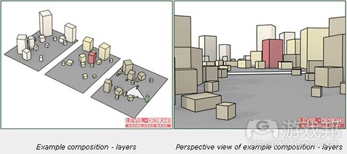
构图可以划分为三个主要层次:前景,中心点和背景。除此之外,你还可以在构图中加入画中点景的层次。
(红色方块——主导元素;黄色方块——构图元素;绿色方块——观众;白色圆锥——观众视线;灰色平面——地形)
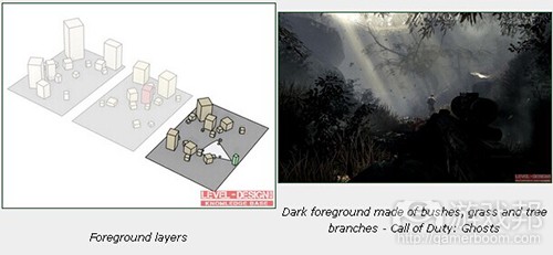
前景层次
这是距离观众最近的层次。这系列层次是作为前奏,为构图的主导元素创造框架。它在游戏中常被忽视。前景是用于让玩家注意到最重要的层次——中心点。记住前景的构图元素必须与构图中的其余元素具有逻辑上的联系。提亮前景物体可以将这个层次从其他层次中分离出来,从而创造一种场景隔离的效果。暗化前景物体则可以创造一种空间感,因为它与其余层次的对比更加鲜明了。通常情况下,我们只能看到物体的轮廓,你无需担心这一情况,在这个层次你并不需要显示细节和色彩。
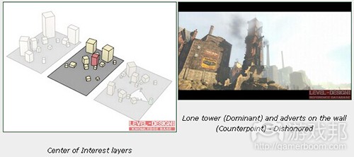
中心点
层次就是构图主导元素所处的位置。主导元素是构图的焦点,它不可与场景其余物体相混合,但仍然要与这些物体保持一致性,它应该更为明亮,并处于具有优势的位置,以便从其他元素中脱颖而出。有了主导元素,我们就有可能快速为场景的主题命名,例如:“在山间含有中世纪警戒塔废墟的冬季场景”,其中的中世纪废墟就是主导元素,山峰则是背景元素。你可以用主导元素来讲述一个场景的故事,并为该场景创造独特的标识。你必须规划好自己的构图,以便主导元素能够成为观众第一眼注意到的物体。要确保没有严重遮盖该主导元素的障碍物,但也无需担心重叠其他层次的物体。中心点可以有一个以上的主导元素。构图中的另一主导元素就称为平衡点。它可以是一幕“市集广场边有个破损坦克的喷泉”这种场景。喷泉是首个主导元素,但坦克残骸也同样引人注目。当观众了解所有的主导元素时,他就会开始在中心点寻找细节以及背景层次。
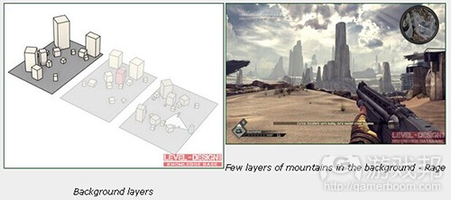
背景层次
这是为构图收尾的层次。多数背景层次的主要内容是地平线和天空。背景层次通常采用平静而起源于配色方案,以及细节较少的物体。这有助于观众将注意力集中到主导元素。这些层次的用途就在于烘托主导元素的轮廓,强化场景比例,创造深度并减少场景隔离感的印象。有个可强化深度的效果就是空中视角(也称为色调或氛围视角)。这个层次要避免使用强烈的色彩,犀利的线条和太多细节。
点景物
这是拥有活跃元素的可选层次,例如人类或动物形象。多数用来作为场景转移,比例参照或者引导视线的元素。注意人物的姿态或面部方向。它是一个极吸引眼球的东西,堪比主导元素。你可以用人物的视线来引导观众眼球,观众会注意到人物的脸并查看他究竟在看什么。
观察参数
让我们从玩家将观看构图的观察点(地点或区域)入手。在你添加观察点之前,要先想想玩家观看构图的垂直和水平角度,以及玩家能够触及多少个观察点。
视角
这个角度决定了玩家如何察看主导元素。你可以通过修改主导元素的大小,高度或位置来更改视角以便实现更强的效果。
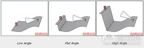
*低角度——从上往下看主导元素。这样的图片要以显示深度和透视感。这个角度可以让玩家在构图层次上获得更多可见度。你可以用它来作为玩家优势,并允许他来规划自己的战略或探索路径。
*平角度——从水平线看主导元素。这种场景让人感觉很平淡和无趣。多数情况下与强大主导元素和高构图视角并用。你可以通过适当降低玩家与主导元素之间的地形高度来修饰透视感和深度。
*高角度——从底部看主导元素,它简直主导了整个构图。它给人一种在主导元素的对比之下自觉渺小的感觉。
(红方块——主导元素;绿方块——观众;白锥体——观众视线;灰色平面——地形)
构图角度
这是观众察看构图层次的角度。你可以通过更改这个角度,调整场景的透视感和深度。
*前角:当构图层次远离观众时,这个角度效果极佳,例如地平线上的山脉可以直达观众的视线。当层次与它们不同时就会呈现良好的深度。靠近观众的构图可能会变得平庸而单调,因为人们很难看到透视感。
*半前角:开始能够看到透视感的角度。这是用于狭窄场景的极佳角度。
*半边角:这是可让透视感发挥最佳效果的角度,也是运用最普遍的角度。
*边角:这个角度可完美显示富有距离感的模式。但是,如果没有强大的主导元素的模式,这种构图视角就会很单调。
(红方块——主导元素;绿方块——观众;白锥体——观众的视线;灰色平面——地形)
观察点
如果观众无法移动时,创造构图就很简单了,因为他们会看到我们想展示的构图元素。如果观众可以自由切换场景,那么情况就会变得很复杂。电子游戏中的构图可以从任意角度和位置观察。你必须确保玩家能够从你所安排的位置看到构图。
为了引导玩家,你可以使用阻塞点或漏斗方法。这两者都属于类似走廊空间的类型,这些地点实际上并没发生什么特殊情况。我们通过无趣的漏斗可以确信玩家并没有关注玩法事件或细节。在这类空间中,玩家只会沿着路径寻找有趣的事物。如果你可以在一个走廊中抓住玩家吸引力,你就可以流畅地更改其角度将玩家视线引向构图的主导元素。这个方法极适用于线性关卡,你能够设计构图框架,并确保玩家会看到你希望他们看到的构图。玩家看到构图所站立的地方就称为观察点。
(红方块——主导元素;绿圆形—–观察点;绿方块——观众;白锥形——观众视线;灰平面——地形)
让我们看看以上截图。屏幕和背景中的塔与屋顶线条和城市广场的形状相得益彰。在玩家离开火车站(后面)的时候这个构图看起来效果最佳。它通过引导玩家透过漏斗——车站唯一的出口大门,实现了完美的观察角度。
在半线性关卡中,我们必须考虑多个观察点。构图应该以一种从各个观察点看起来都具有吸引力的方式来创建。
在《毁灭战士BFG》中,你可以看到设计师如何精心创造构图。其中的主导元素堪比导航辅助器,从各个方面看起来都很棒。
在开放世界关卡中,观察点会很大,所以检查玩家可以观察构图的所有角度是极为繁琐的工作。某个构图可能看起来很完美,但如果从不同角度来看,却有可能迅速变得一团狼籍。在你还不知道玩家会从哪里出现的时候,就很难使用小型构图元素。即使是这样,你还是有可能将主要构图原则运用于突出的主导元素,构图中最大元素的对称性和平衡性。你总能挑选到一些主要路径,并创造一个从主要路径上所挑选观察点看起来可行的构图。
(红方块——主导元素;绿圆形——观察点;绿方块——观众;白锥形——观众视线;灰平面——地形)
构图元素的定位
定位
主导元素的位置可能极大改变构图的接受程度。这正是我们为何必须遵从一些基本原则以确保实现自己想要的效果。绘画或摄影有一系列关于如何创造构图的原则。你可以选择黄金比例作为辅助。
*静态(对称性)构图——主导元素设置于画框中央。构图看似人为合成,较为清晰。当你想强调模式或建筑时可以用这种方法。
(红方块——主导元素;黄方块——构图元素;灰平面——地形)
*动态(不对称)构图——主导元素不在画框中央。位置是由定位规则来决定。构图看起来是自然形成,较为凌乱。可以用这种方法来模拟自然场景。确保你在主导元素和屏幕边缘之间留有空白。
(红方块——主导元素;黄方块——构图元素;灰平面——地形)
平衡性
构图元素的位置是由平衡性来决定的。换句话说,也就是构图中每个对象的吸引力。更具吸引力的对象就能够抓住观众的眼球。太过于招摇或者过于重要的对象会产生一种该场景很简单和无趣的感觉。为了平衡场景,你必须决定每个对象的视觉比重。我指的并不是物理概念上的质量,而是其色彩亮度和强度,大小和细节。视觉比重是我们都能感觉到的东西,但并非人人都能意识到这一点。与相关元素的参数相比较,你就能够说出哪个对象更轻哪个更重了。
*重视觉比重——大规模,细节丰富,暗色,强烈色彩,对比鲜明。
*轻视觉比重——小规模,刻板形象,浅色,软色,对比不鲜明。
绘制一条可将你的构图一分为二的垂直线段。确定你构图元素的视觉比重。主导元素应该获得最高比重,而弱小元素应该拥有最低比重。这意味着主导元素的比重应该与构图另一侧的多个低比重元素相当。可以让物体尚着构图画框移动来达到你所想要的平衡感。你可能想让两边的视觉比重一样,或者通过移动物体令其更靠近或远离主导元素,从而创造更为强烈的构图。
(红方块—–主导元素;黄方块——构图元素;灰平面——地形)
引人注目的事物
有时候你必须确保自己的构图主导元素获得它所值得的关注。你可以使用一些额外技巧来虏获玩家眼球。
细节
细节密度方法与细节和平淡空间的对比有关。细节丰富的地点可以轻松获得玩家注意力,因为那里有东西让他们看。你可以通过细节考虑该在哪个地方使用更多物体或更丰富的纹理。你还可以使用标记、文本、海报、涂鸦、绘画和雕像来获取玩家注意力。
线段
通过设置构图中的元素,在特定方向绘制线段,我们就能够引导玩家眼球。我们将这种线段称为引导线。你必须突出这些线段并设置它们的方向。即使是玩家位置或摄像视角的小调整也可能极大改变场景的接受度。构图中的线段有两种类型:
*实际线段:通过边缘和构图元素绘制出来的可视线段。
*虚拟线段:在构图上并不明显,它是由绘制出画中点景物视线方向的构图元素所组成。这些线段存在我们的想象中。你可以用它来丰富构图和突出元素。
线段方向应该是平静而柔和地流淌空过场景,艱是与主导元素的方向一致。这可以创造一种和谐感。通常构图元素会绘制出一条引向主导元素的线段,但有些开放式构图中的线段也会在不显示主导元素的情况下柔和地引导场景。这些线段多位于背景或前景层次。硬线条和边缘是为主导元素或其他重要构图元素所保留的。
*水平线:用于为场景塑造宽度和深度。静态、稳定和平静,极适用于地平线。你可以用它来创造令人印象深刻,广阔和没有变化的场景。要避免在前景和中心点层次使用大量水平线段。即便你设计一个停车位,你也需要汽车和其他物体来打破停车位的水平线。
*垂直线:用于突出构图的高度和强度,并创造一种庞大或庄严感的印象。你可以将其用于那些必须令玩家难忘的物体。
*曲线:我喜欢使用建筑术语中的“美丽线条”来形容。它是一种弯曲,“S”形蜿蜒流过构图的线条。它可以让构图看起来柔和而自然。
*有角线段:可以让人产生一种动态和积极场景的印象。
色彩
你可以用对比和色彩饱和度来捕捉玩家眼球。色彩是向玩家传递信息的重要方法之一。这就是所谓的视觉语言。选择一种强烈的色彩或进行鲜明对比,可以给你的构图或你的关卡导航创造深刻的印象。确保选择一种适合你构图的颜色,并且不要让它与你游戏的视觉语言相冲突。有时候抓住玩家眼球就需要你选择一种稍微有别于游戏主色调的色彩。
光线
光照与阴暗表面的对比可以塑造场景的基调和深度。没有对比的构图一般会很无趣和了无生气。你可以用光对比来突出一些构图元素,例如点亮物体的前面或者轮廓令物体浑身发光。要妥当地点亮最重要的物体,构图中的其余元素应该被阴影所掩盖或者只能有较小的光亮。这一点不可违逆,因为多数玩家还不习惯从暗处寻找有趣之物。确保光的强度、色彩和方向之间有明显的区别。你用于突出物体的光应该遵从美术方向,配色方案和场景照明原则。这样你就可以将玩家引向退出口或者向其显示可拾取的道具。
比例
更大的构图元素会比场景中的其他物体更扎眼。如果所有物体都同样大小就会产生一种嘈杂和单调感。你可以更改每个物体的比例,以便更大的物体获得玩家关注。这可以是位于山顶的大型雷达盘,或者摩天大楼。这样的物体总会更显眼。你还可以颠倒过来,将构图中最小的物体作为最重要之物,但这种做法有点冒险。一般来说,占据更大屏幕空间的大型元素更易获得关注。
运动
你可以通过添加构图中的移动元素来增强主导元素。这可以是一面旗帜,一柱烟火,一只飞鸟或者一个行人。
提示
*要让你的构图在每个层次都保持一致性。
*你可以将前景层次与其他层次相混合(道路,物体位置)。
*给予玩家数秒时间来注意、分析和理解构图。
*如果主导元素在观众视线之上,你可以创造梯子或斜坡。在倾斜的地形上,玩家会自然向上看并注意到主导元素。
*构图需要空间。注意狭窄的街道和建筑。如果它们太靠近彼此了,就没有办法设置观察点了。
*使用一个构图主题,避免一次性讲述太多故事。
*应该妥善点亮主导元素,丰富其细节和色彩。背景和前景区域的细节和色彩不能太多。
*主导元素太弱或者构图太嘈杂都会快速令玩家分心。
*缩小背景层次的物体比例,以便创造一种该物体在较远方向的感觉。
*让玩家的注意力一次只集中在一件事物上。确保在战斗后,玩家总有喘息和欣赏风景的时间。
*如果构图并不在观众的视域范围那也没有什么不对。要确保主导元素没有隐藏在角落或躲在某物后。
*许多游戏使用不同的视域角度。第一人称视角游戏的视域角度介于60至100度之间。角度越高,你的视域就越广,但物体会变得越小,场景就会被拉长。
*如果你规划了过多构图层次,可能就会显得太杂乱,构图元素也会变得凌乱不堪。
*令构图融入现成的玩法远比打破玩法获得一个良好的视角更容易。(本文为游戏邦/gamerboom.com编译,拒绝任何不保留版权的转载,如需转载请联系:游戏邦)
Composition in Level Design
by Mateusz Piaskiewicz
Composition in Level Design
When designing a level you’re able to freely compose your virtual environment with any objects you want. This distinguishes level designers from the landscape photographers. You don’t have to adopt to existing elements of nature or architecture. You can affect the scene dramatically. A level designers’ work can be compared to that of a painter. Now let’s see the level as the art gallery and the level vistas as paintings. It means that a player can traverse from one composition to another.
When you should care about composition? Well, I would have to say that you have to do it all the time but that’s simply not possible. It’s very time consuming and sometimes there’s no need to build mind blowing compositions in the middle of nowhere. The good news is that building pretty compositions is very simple and will easily become your second nature. A lot of designers I’ve met can make awesome levels but they don’t know how or when to apply these compositions. In this article I’ll present you with my way of planning and implementing beautiful environments.
When and where you can apply composition rules:
Environment Composition – Big picture, everything that the player sees, both visual and gameplay areas. You can compose single corridors and rooms, towns, landscapes, far horizon views and stunning backgrounds. That kind of composition is often seen from only few directions, that makes planning of the composition easier.
Environment Elements Composition – Set dressing, details, groups of objects that are parts of the big picture. Garbage around the dumpster, rocks on the ground, stuff on a desk. That kind of composition can be seen from arbitrary angles.
Visual Feedback & Navigation – Highlight the objective, show the way to the objective, guide the player through a specific area. If the player’s objective is to get to the chopper and you need to navigate the player there or you simply want to show the player where he should go then you can apply composition rules to highlight something that will catch his attention and change his wandering course.
There’s a thin line between composing everything you can and imitate nature or natural mess. You can create composition of leaves that wind blew by the wall but the result might be simply overdone and unnatural. Composition is used to arrange space into appealing picture. Leaves are only background, there’s no need to compose that unless that’s an important pile of leaves that should get player’s attention. Nature is creating beautiful compositions, let’s simulate the power of nature instead of faking it.
Composition Basics
Composition is an arrangement of scene elements. Scenes with applied rules of composition presents a harmonic idea that is easy to understand and isn’t confusing to the observer. Harmonic composition smoothly guides the player’s eye through the image’s elements just as we planned. Harmony has a huge impact on the understanding of an image. In order to achieve a harmonic scene you need to set down the components of your scene and emphasize some of its elements by using color, lighting, proportions, direction and position. In other words, you can show the important part of the screen and hide things that are only background.
The opposite to composition is chaos. On chaotic images it’s hard to determinate which element acts as dominant. In this situation the player can focus attention on relating parts of the scene. In this article the player and observer interchangeably.
Composition Layers
Composition can be divided into three main sets of layers: Foreground, Center of Interest and Background. Additionally you can include the staffage layer in your composition.
Example composition – layers
Perspective view of example composition – layers
Red cube – Dominant; Yellow cubes – Composition elements; Green cube – Observer; White cone – Observer’s eye sight; Gray plane – Terrain
Foreground Layers
Layers that are the closest to the observer. This set of layers acts as a prelude and creates a frame for the composition’s dominant. It’s commonly overlooked in games. Foreground is used to focus the player’s attention on the most important layers – Center of Interest. Remember that composition elements from the foreground have to have a logical connection with the rest of the composition. Brightening foreground objects can separate this layer from other layers which creates an effect of scene isolation. Darkening objects on the foreground gives the feeling of space because the contrast is enhanced in regard to the rest of the layers. Often, only a silhouettes of objects are visible and you don’t have to worry about that, on this layer you shouldn’t show details and colors.
Foreground layers
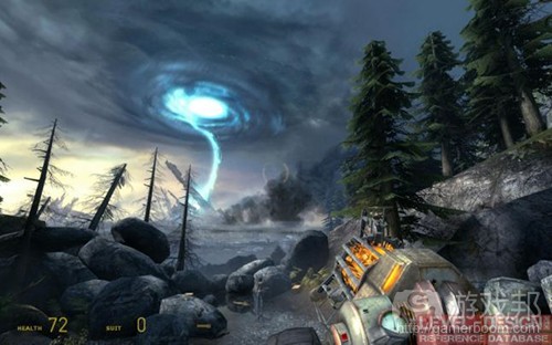
Dark foreground made of bushes, grass and tree branches – Call of Duty: Ghosts
Center of Interest
A layer or layers on which the composition’s dominant is placed. Dominant is the focal point of the composition, it can’t merge with the rest of the scene’s objects but it still has to be consistent with those objects, it should be brighter and set in a advantageous position to stand out from other elements. Thanks to the dominant it’s possible to quickly name the theme of a scene, for example: “Winter scene with the ruins of a medieval guard tower in the mountains” where medieval ruins are the dominant and mountains are the background. You can use dominants to tell a story of the scene and build the unique identification of the scene. You need to plan your composition so that the dominant will be the first object which the observer will notice. Make sure that there are no obstacles that heavily cover the dominant but don’t worry about the objects that overlap other layers. Center of interest can hold more than one dominant. The other dominant in the composition is called the counterpoint. As an example it could be a scene “Fountain on the market square with a wreck of a tank”. Fountain is the first dominant but the tank wreck also asks for attention. When the observer will get to know all the dominants he’ll start to look for a details on the center of interest and the background layers.
Center of Interest layers
Lone tower (Dominant) and adverts on the wall (Counterpoint) – Dishonored
Background Layers
Layers that are closing the composition. Mostly background layers which main contents are the horizon and sky. Background layers are marked with calm and moody color scheme and less detailed objects. This helps keep the observer’s eye on the dominant. The purpose of these layers is to bring out the dominant’s silhouette, impress with the scale of the scene, create depth and eliminate the impression of scene isolation. An effect that can emphasize the depth is aerial perspective (also known as tonal or atmospheric perspective). Avoid using strong colors, sharp lines and lots of detail.
Background layers
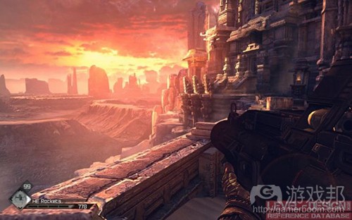
Few layers of mountains in the background – Rage
Staffage
Optional layer with living elements, for instance human or animal figures. Mostly used as a scene diversion, a scale and proportions reference or the eye guiding element. Pay attention to the figure’s pose or face direction. It is a big eye catcher and it can compete with the dominants. You can use it to guide the observer’s eye by showing the figure’s line of sight. The observer will notice the figure’s face and will check what he’s looking at.
Alyx watching what is happening on the horizon. She helps determinate the proportions of the scene and her line of sight draws attention to the event on a horizon. – Half-Life 2: Episode 2
Observation Parameters
Let’s start from the observation places (spots or zones) from which the player will be watching the composition. Before you add observation places think under what vertical and horizontal angle the player will approach the composition and how many observation spots the player will be able to reach.
Sight Angle
This angle defines how player will be able to observe the dominant. You can change the sight angle to achieve bigger impact by modifying the dominant’s size, height or placement.
Low Angle – Dominant is seen from above. The image can show depth and perspective. This angle gives the player a great visibility on the composition layers. You can use it as the player’s advantage and allow him to plan his tactics or exploration route.
Flat Angle – Dominant is seen from the ground level. Scene feels flat and boring. Mostly used with strong dominants and high composition angles. You can fake the perspective and depth by smoothly lowering the height of the terrain between player and the dominant.
High Angle – Dominant is seen from the bottom and is literally dominating the composition. It gives impression of being small when compared with the dominant.
Low Angle
Flat Angle
High Angle
Red cube – Dominant; Green cube – Observer; White cone – Observer’s eye sight; Gray plane – Terrain
Composition Angle
Angle in which the observer sees the composition layers. By changing this angle you’re able to adjust the perspective and depth of the scene.
Front Angle – This angle performs really good when composition layers are far from the observer, for instance hills on the horizon running straight up to the line of sight. When the layers differ from themselves it draws a nice depth. Compositions that are close to the observer can get flat and monotonous because of barely seen perspective.
Half-Front Angle – Angle on which perspective starts to be visible. Great angle to use in narrow spaces.
Half-Side Angle – Angle on which perspective performs its best. Most commonly used angle.
Side Angle – This angle perfectly shows the pattern running along with the distance. However, without a strong dominant and pattern this type of composition angle can be monotonous.
Front Angle
Side Angle
Red cube – Dominant; Green cube – Observer; White cone – Observer’s eye sight; Gray plane – Terrain
Observation Spots
Building the composition is very simple when the observer is not able to move and he’s watching the composition elements that we want to show to him. Things are getting complicated when the observer can freely traverse through the scene. Compositions in video games can be watched from arbitrary angles and positions. You have to make sure that the player is able to reach the composition from places you’ve arranged.
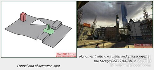
To guide the player you can use choke point or funnel methods. Both are the types of corridor-like spaces where actually nothing special happens. Thanks to that boring tunnels we can be sure that the player is not focused on gameplay events or details. In such spaces player will just traverse along the path looking for interesting things. If you caught the player in such a corridor you can smoothly change its angle to guide the player to the composition’s dominant. This method works perfectly on linear levels, you’re able to design the composition’s frame and make sure that the player will see your composition as you wanted to. The place where player has to stand to see the composition is called the observation spot.
Funnel and observation spot
Monument with the screen and a skyscraper in the background – Half-Life 2
Red cube – Dominant; Green circle – Observation spot; Green cube – Observer; White cone – Observer’s eye sight; Gray plane – Terrain
Let’s look at the screenshot above. Screen and the tower in the background are perfectly fit with the line of roofs and the shape of a city square. This composition looks best when the player is leaving the train station (behind). A perfect observation angle is achieved by leading the player through the funnel – a door that is the only exit from the station.
On half-linear levels we need to worry about more than one observation spot. The composition should be built in a way that it will look appealing from every observation spot.
In Doom 3 BFG: Resurrection of Evil you can see how the designer took care about the composition. This dominant acts as a navigation helper and looks nice from every side.
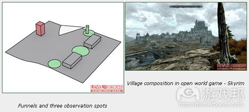
On open world levels the observation spot gets really big so checking all the angles where players can observe the composition is very laborious. A composition can look perfect but when looked at different angle it can quickly turn it into mess. It’s hard to use small composition elements when you don’t know where the player will be coming from. Even then it’s possible to apply main composition rules like a standing out dominant, asymmetry and balance on the biggest elements in the composition. You can always pick a few main paths and build a composition that will work if seen from the selected observation spots on the main paths.
Funnels and three observation spots
Village composition in open world game – Skyrim
Red cube – Dominant; Green circle – Observation spots; Green cube – Observer; White cone – Observer’s eye sight; Gray plane – Terrain
Composition Elements’ Positioning
Positioning
The position of the dominant can dramatically change the reception of the composition. That’s why it’s very important to follow a few basic rules to make sure that we’ll achieve the effect we wanted to. Painting or photography has a set of rules on how the composition should be build. You can pick the golden ratio or rabatment of rectangle rule as an aid.
Static (Symmetric) Composition – Dominant is set in the middle of the frame. Composition seem to be synthetic, made by human, clean. Use it when you want to highlight patterns or architecture.
Symmetric position of the dominant
Monument at the town square – symmetric composition – Bioshock: Infinite
Red cube – Dominant; Yellow cubes – Composition elements; Gray plane – Terrain
Dynamic (Asymmetric) Composition – Dominant is aside from the middle of the frame. The position set down by one of the positioning rules. Composition feels organic, made by nature, dirty. Use it to simulate nature scenes. Make sure that you leave a margin between a dominant and the edge of the screen.
Asymmetric position of the dominant
Asymmetric composition, a path to the castle – Dishonored
Red cube – Dominant; Yellow cubes – Composition elements; Gray plane – Terrain
Balance
Placement of composition elements is dictated by balance. In other words, the attractiveness of each object in the composition. More attractive objects will catch the observer’s attention. Too attractive or too heavy objects will create the feeling that the scene is simple and boring. To balance your scene you need to determinate what is the visual weight of each object is. I don’t mean the physical mass but its color brightness and intensity, size and detail. Visual weight is something that we all feel but not everyone can recognize it. Compare the elements’ parameters and you’ll be able to tell which objects are lighter and which are heavier.
Heavy visual weight – Large scale, detailed, dark color, intensive color, heavy contrast.
Light visual weight – Small scale, stark appearance, light color, soft color, light contrast.
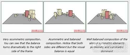
Delineate a vertical line that will divide your composition into two pieces. Define the visual weight of your composition’s elements. Dominant should get the highest weight, small and faded elements should get the lowest. It means that the dominant’s heavy weight has to be equalized with a few low-weight elements on the other side of the composition. Move the objects around the composition’s frame to get the balance you want to achieve. You may want to have the visual weights equal on both sides or get a more aggressive composition by moving the weight close to the dominant or far from it.
Very asymmetric composition. You can see that the balance turns dramatically to the right side of the frame
Asymmetric and balanced composition. Notice that both sides are different but the visual balance is equal
Well balanced composition of the almost symmetric elements positioning and symmetric dominant
Red cube – Dominant; Yellow cubes – Composition elements; Gray plane – Terrain
Eye-Catchers
Sometimes you’ll need to make sure that your composition’s dominant will get the attention it deserves. You can use a few additional tricks to catch the player’s eye.
Details
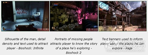
The detail density method is based on a contrast of detailed and bland spaces. The detail-rich spots will get the player’s attention simply because there are things to watch. By detail you can consider a place where you’re using more objects or more rich textures. You can also use symbols, text, posters, graffiti, paintings and a figure to catch the player’s attention.
Silhouette of the man, detail density and text used to attract player – Bioshock: Infinite
Portraits of missing people attracts player to know the story of a place he’s exploring – Bioshock 2
Text banners used to inform player about the places he can explore – Rage
Lines
By setting elements of the composition to draw lines in certain directions we’re able to guide the player’s eye. We call it the leading lines. You need to emphasize those lines and set their direction. Even a small change of player’s position or camera angle can dramatically change the reception of the scene. There are two types of lines in the composition:
Practical lines – Visible lines drawn by edges and composition elements.
Virtual lines – Not obviously drawn on the composition but made by composition elements that draw directions like staffage’s line of sight. Those lines are drawn in our imagination. You can use that to enrich your composition and emphasize
The lines’ direction should calmly and softly flow through the scene in or with the dominant’s direction. That makes a feeling of harmony. Often the composition elements are set to draw a line that guides to the dominant but there are some open compositions where lines are softly led through the scene without showing the dominant. Those lines are mostly in Background or Foreground layers. Hard lines and edges are reserved for dominants or other important composition elements.
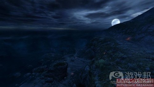
Horizontal Lines – Used to bring out breadth and depth to the scene. Static, stable and calm. Works perfectly on horizons. You can use it to build impressive, wide and monotonous scenes. Avoid using a lot of horizontal lines on foreground and center of interest layers. Even if you’re designing a parking lot you’ll need the cars and other object to break the parking’s horizontal line.
Horizontal sea line makes the scene feels calm – Dear Esther
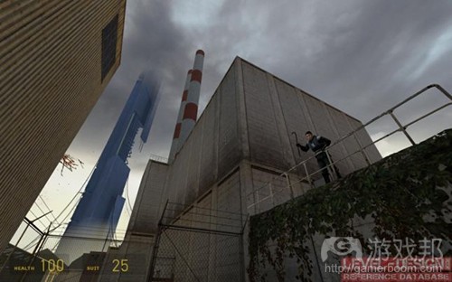
Vertical Lines – Used to highlight the height and strength of the composition and create the impression of enormous size or monumental scale. You can use it for the objects that have to impress the players.
Vertical lines drawn by chimneys and edge of the yellow building supports leading line of the skyscraper – Half-Life 2
Curved Lines – I like to use a “Line of Beauty” term from landscape architecture for that. It’s a curvy “S” shaped serpentine that smoothly runs through the composition. It makes the composition feel soft and natural.
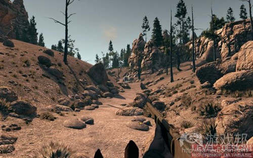
Curvy and wavy path line drawn by rocks – Call of Juarez: Bound in Blood
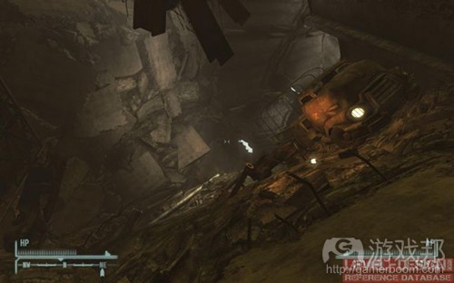
Angled Lines – Angled lines will give the impression of dynamic and active scene.
Inside collapsed tunnel – Fallout: New Vegas
Colors
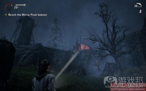
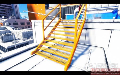
You can use contrast and color saturation to catch the player’s eye. Color is one of the most important methods to communicate with a player. That communication is called the visual language. Picking an intense color or making heavy contrasts can make a big impact on your composition or on your level’s navigation. Make sure to pick a color that fits your color palette and that it won’t collide with the visual language of your game. Sometimes to catch the player’s eye you’ll need to pick a color that stands out a bit from the game’s color palette.
Barn color is completely different from other elements of composition. Still this color is well saturated and fits into the scene – Alan Wake
Intensive orange catwalk stairs used to navigate the player – Mirror’s Edge
Lights
Contrast between lit and shadowed surfaces builds the mood and depth of a scene. Composition without the contrast would be considered flat and boring. You can use light contrast to emphasize some of the composition’s elements by lighting the front of the objects or its silhouette to get a light glow around the object. The most important objects should be well lit, the rest of the composition’s elements should be covered with shadows or lights with smaller intensity. You shouldn’t invert that effect, players are mostly not accustomed to look at very dark spots to find something interesting. Make sure that there’s a visible difference of light intensity, color and direction. The light you’ve used to highlight an object should follow the art direction, color palette and scene lighting rules. With this method you can navigate the player to the exit doors or show him an item to pick up.
Strong light used to show beautiful horizon and emphasize the depth – Rage
Color and light used to guide player through the corridor – Call of Duty: Black Ops 2
Silhouette used to emphasize the composition. Blue light is used to make the stature readable – Bioshock: Infinite
Scale
Bigger composition elements will get more attention than the rest of the scene. Objects that are all the same size will make an impression of a flat and chaotic scene. You can change each object’s proportions so the bigger objects will catch the player’s eye. That could be the large radar dish on the top of a mountain or a skyscraper. Such an object will always stand out from the scenery. You can also invert that rule. The most important object in a composition could be the smallest but it’s a bit risky. The big elements cover a bigger screen space and get attention more naturally.
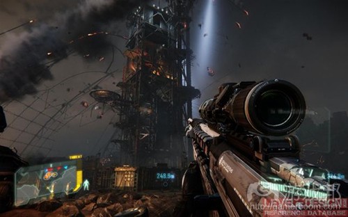
Giant building construction that gets player’s attention – Crysis 3
Chimneys are catching player’s eye, an electric poles are leading the player to the city – Fallout 3
Motion
You can make your dominant stronger by adding moving elements to your composition. It could be a flag, smoke, fire, bird or walking human.
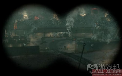
Smoking steam train as the only moving element in the composition – Sniper Elite V2
Hints
Keep your composition consistent on every layer.
You can blend the foreground layers with other layers (roads, object placement).
Give the player a few seconds to notice, analyze and understand the composition.
If the dominant is above the observer’s line of sight you can build the scarp or stairs. On a slanted terrain the player will naturally look up and notice the dominant.
Composition needs space. Watch for narrow streets and buildings. If it’s too close to each other there will be no way to set up an observation point.
Use one composition theme and avoid telling to many stories at a time.
Dominants should be well lit, detailed and colored. Background and foreground areas should get less detail and color.
Too weak dominants or too chaotic compositions will quickly lose the player’s attention.
Scale down the objects on a background layer to imitate that the objects are further away than they really are.
Keep the player’s interest on only one thing a time. Make sure that after the fight there’s always time to take a breath and admire the view.
There’s nothing wrong with compositions that don’t fit in the observer’s field of view. Just make sure that the dominant isn’t hidden in the corner or behind an object.
A lot of games are using different Field of View (FOV) angles. For First Person Perspective (FPP) games the FOV angles oscillate from 60 to 100 degrees. The higher the angle is the more you can see in the FOV but objects will get smaller and the scene will give the impression of being stretched.
If you’ll plan too many composition layers it may get too messy, the composition elements can get really chaotic.
It’s easier to fit the composition into existing gameplay than break the gameplay just to have a nice view for a moment.(source:gamasutra)
下一篇:探讨以约束条件限制玩家选择的问题










 闽公网安备35020302001549号