开发者分享《Aqua Kitty》的美术制作过程
作者:Dugan Jackson
《Aqua Kitty》原本将是一款街机风PC射击游戏,但初次发布却是在Sony的PSMobile平台(Vita和其他设备),后来又登录Xbox360,现在才再次回归PC。
这款游戏的制作团队只有三个人:Dugan(美术)、Gabor(代码)和Electric Cafe(音乐和音效)。另外,包装盒是由David Hankin设计的。在这款游戏中,玩家扮演一只驾驶潜水艇的猫,它要保持水底的矿工猫免受机械海怪的侵害。
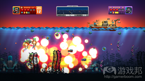
紧接着PC版的完成和发布,我写了这篇短文来介绍《Aqua Kitty》的美术的制作过程(下图是成品的截图)。我们还有这款游戏的“绿灯计划”网页。
初期开发
一开始,我们并不明确要做什么游戏,但很清楚我们做的游戏应该小、简单,只需要我们腾出业余时间就能完成。接着,我们实验了很多不同的设计原型。
这个阶段只需要基础的美术;如果一开始就在图像上花太多时间,而最终版却没有用上,那就太浪费了。
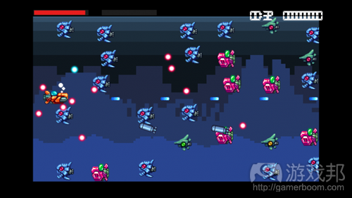
以下是我们早期实验的一些截图:
你可以看到玩家潜水艇的早期版本,那时候还没有加入猫和其他作为敌人的鱼类。这个屏幕是固定由右向左滑动的,这时的背景也没有视差(游戏邦注:视差就是从有一定距离的两个点上观察同一个目标所产生的方向差异)。
我们修改了很多次原型,一度打算做成益智射击游戏,后来又改成宝石收集、农场、飞行……
从定下做成非常小的游戏的目标开始,这款游戏的范围就一直在扩大。当我们实现了一些令我们满意的核心机制时,我们就专注于添加美术元素了。
开发中期
敌人制作
最开始制作的两种敌人是鹦鹉螺(Nautilus)和古鱼(Paleofish)。它们的设计灵感来源于史前海底生物,鹦鹉螺类(Nautiloids)和邓氏鱼(Dunkleosteus)。
根据参考图,我们重新把它们绘制成带有引擎和推进器的机械生物。古鱼的长条形的鱼身不太合适,所以最后只留下了头部形状。
每一种敌人都有固定的调色板,以模仿老式16bit游戏的风格,但确切的颜色数量不会受到老硬件的限制。这就保证美术具有复古风,又有丰富的颜色(现代复古)。
上图是一个迭代的过程。有时候,某些细节放在静止的图像看起来不错,而放在游戏中活动的物品上,却让人觉得困惑,所以粗糙的装饰和精致的细节之是应该保持平衡。粗糙的形状和轮廓往往是眼睛第一眼识别出来的,之后才会注意作为补充的小细节。
这些设计也受到敌人的移动和活动方式的影响。矮胖的古鱼游戏得慢,光滑的点点鱼游戏得快,胖嘟嘟的河豚鱼会突然弹出来……
每一种敌人都有明显的主色调,使它们在游戏场景变得拥挤时仍然容易被玩家识别出来。在快节奏的射击游戏中,用眼角就能分辨哪个敌人是哪个,是非常重要的,因为这样玩家才有可能迅速做出开火或移动的反应。
老游戏《R-Type》就是一个经典的例子。在这款游戏中,红色的飞船按特定的模式移动,黄色的飞船走沿着路径走直线,而蓝色的行走者会停下来发射导弹,等等。
爆炸
爆炸效果应该醒目,这才是良好的因果反馈。当玩家摧毁敌人时,应该用显著的视觉效果使玩家获得满足感。
作为《Metal Slug》和《R-Type》的大粉丝,我们把它们作为制作象素风格的爆炸的参考。
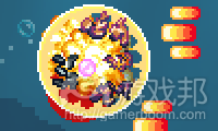
这款游戏中的大部分爆炸是用不同的绘制元素做成的——爆炸环、冲击波以及大的和小的两种爆炸动画。
每一种敌人都有自己专属的毁灭动画,第一帧都重复绘制分裂的碎片。因为大部分能量是在爆炸发生那一刻释放的,所以从动画上看,分裂会随着时间越来越慢。
身体分解与其他爆炸元素一起产生最终的效果。元素随机化很重要,因为如果固定的动画一次又一次地播放,就会变得非常明显,无论这些动画做得有多么精细。我们给次级爆炸位置和小冲击波的角度添加了一定的随机性。
至于河豚鱼和炸弹爆炸,我们使用递增混合模式,这在一般的16bit游戏中是看不到的。使用递增模式是为了使颜色更加丰富,因为它会根据爆炸层的下层颜色生成新的颜色。
递增模式的缺陷在于,色彩可能会太过白亮,所以我必须保证背景的颜色处于某个明度值内。
海浪
海浪动画很难做。
我们使用的参考之一是IREM公司制作的一款叫作《In The Hunt》的游戏。那款游戏中有各种漂亮的波浪,我们花了一些时间研究它们是怎么做的。
我不希望《Aqua Kitty》中的海显得太平静,但也不能太汹涌。所以,不要有白浪滔天,但仍然要有一定的起伏运动。
我先用正统状波浪模拟近处的波浪,还用更大的波浪图形覆盖在后面。
这个时候还不用细节,主要轮廓最重要。接着我再做波浪的更大部分,并把波浪拉长了一点儿。
事实上这个波浪有12帧,波良会上下起伏,而不是单纯的水平移动,我们可以在游戏中实现那种效果。对整体形状满意后,我就可以继续添加细节了。
最后的结果使用了4层波浪,第一层是比较小的正弦状波浪,它后面的三层波浪的颜色随着距离而加深。这四层波浪的移动频率都不相同,这样做出来的海面显得更热闹。
用Gamemaker(Yoyo games)制作这些波浪的原型是非常有用的。我可以很快测试想法,然后放到实际的游戏当中。
玩家潜水艇
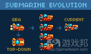
回想2002年时,我用空闲时间制作《GBA》的DEMO。但是,我只用贴图美术做出了滚动屏幕和可操作的飞船。
这个老飞船成为《Aqua Kitty》的潜水艇的基础,但还用于其他需要玩家角色上下移动探索洞穴、靠声纳导航的游戏中。
但《GBA》中的是飞船而不是潜水艇。
从《GBA》版本看,分辨率增加意味着添加更多细节。我们做了一些变体,尝试了不同风格的机体和推进器。我们放弃了发射鱼雷和主发射器变成带冷却管的机械枪筒的想法。因为在水下环境,这种武器是不科学的,但伸出枪筒,开火时绕到背后还是可行的。
做完所有修改后,我们不改了,而是进行测试。像做这类修改时,不要因为贪图新鲜的变化,否则可能会浪费时间。最好能一次做多个修改,然后放上一阵子,再回顾。
添加猫以后,我们继续添加上下倾斜的动画。如果没有这些动画,潜水艇会显得非常死板,而有这了些动画就会生动许多。我们还使推进器速度与潜水艇的一致,这样在游戏中,潜水艇移动得越快,推进器就会旋转得越快。
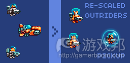
玩家的小伙伴之一,增援者,一开始的头盔比较小。作为静止图象时看着不错,但在游戏中很难达到相当的效果。所以为了匹配玩家的潜水艇,又增大了头盔并且把服装颜色改成桔色的。
我们很快发现桔色的服装并不好,因为当敌人的炮弹四处飞时,很难把它们与玩家潜水艇区分开来。所以在最终版里又换成灰色的了。
LOGO制作
LOGO制作是件麻烦的任务。有时候可能做得很快——比如《Gravity Crash》的图标就只用几天就完成了,但有时候要花更长的时间。《Aqua Kitty》的LOGO就费了我们不少时间。
一开始我决定做成伪3D的风格。
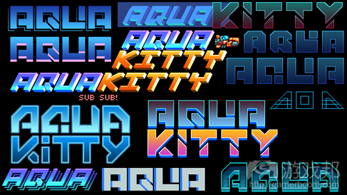
但经过几次调整后,我仍然不满意,所以又重画了。我尝试了很多不同的形状和风格:
LOGO的制作重点是,要复古、易识别(有助于玩家浏览游戏时发现它)和可拓展。当你需要制作放在网站上的横幅广告或菜单上的小图标时,你就知道可扩展性是多么重要了。
最终版如下图所示:每个字母占8×8象素网格,粗的部分宽为12象素(游戏邦注:相当于1.5个网格方块的宽)。网格非常有用,因为方便排列字母。
最终版上还增加了猫艇长和它的行动口号。
背景和潜水艇
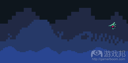
游戏的背景是用若干以不同速度移动的贴图层制作的。我们最初的想法是,进一步像素化,以增加复古风格的景深。
非常粗糙的画面,我想你也会这么评价吧。这个风格与精细的潜水艇和敌人不相符。所以在游戏开发完后,我们又对背景尝试了许多设计。
我们修改了几次明度,发现更亮的图层放在最上面似乎效果不错,但那意味着背景必须总是接近不显眼的黑色。
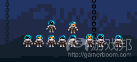
从上图可以看出,我们对猫矿工尝试了不同的头部大小和头盔风格。他们一度有用来挖海底宝石的气钻,但实验证明那个设定并不适合。
我还尝试添加一些图像使地形更模糊。一开始,修改后的效果不错,但之后测试了几天,我又觉得不太合适,于是又改回原来的扁平阴影的风格。
我们也给海底添加了细节,但试玩时总是觉得干扰太大,于是都删掉了(比如幽灵水母)。
射入海水中的光线也是非常像素化的,但与背景一样,太粗糙了,所以也重制了。
我们再一次用Gamemaker实验那些光线。我只要用简单的脚本就可以重刷、淡入淡出和缩放光线。一旦我完成,这些东西就可以入进游戏中,并写出代码。
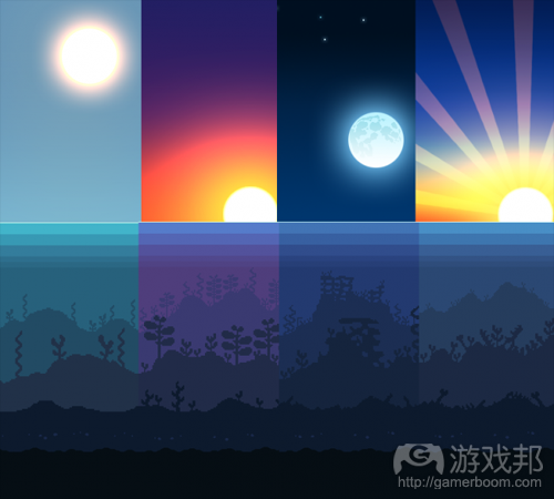
这些光线的大小和透明度是随机的——随着时间淡入淡出和缩放。它们使用了递增混合模式,所以无论它们下面的图层是什么,光线都会变亮。每个主题场景只需要两种不同颜色的光线。
下面是不同主题场景使用的光线。最终版游戏可以看到这些效果。
包装盒和海报
当《Aqua Kitty》被移植到Xbox360平台时,我们需要新的包装盒。我先是搜索了一些老式日本PC游戏引擎和Amiga游戏盒,希望从中选择一种风格:
有了一些想法后,我画了非常粗糙的草图:
很惊艳吗?这个封面的构图是,底部有一只螃蟹朝玩家开火,两枚鱼雷追着玩家,作为敌人的鱼埋伏在摇曳的水草后面。
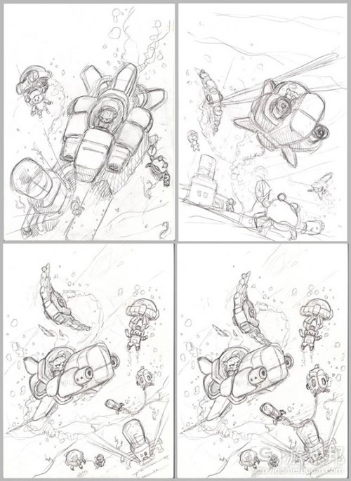
我没有时间设计海报,所以就请了一位非常有经验的美工David Hankin劳代了。我给他看了几张草图,让他选一张进一步加工。
David首先用铅笔完善了草图的设计。一旦选定设计,所有不同的元素都要尽量画到不独立的图层中。使用图层便于随时调整构图。
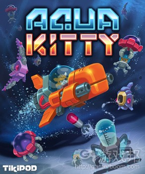
一个版本完成后,我们可以根据需要做修改,直到得到我们满意的结果。
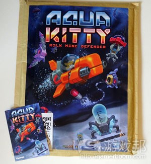
我们后来又做了CMYK版本,用于印刷纸制海报和卡片,我们发现切换到CMYK会使游戏LOGO发生小小的变化(因为CMYK可用的颜色比RGB的少)——所以得重新平衡一下,使颜色不显得那么死板。
对于Xbox360游戏机,完整的“Aqua Kitty – Milk Mine Defender”的名称确实太长了,所以我们把它简化为“Aqua Kitty”。下图是打印出来的CMYK海报和卡片,注意“AQUA”的颜色比较暗淡:
删除道具和物品
最后我再说说没有放进游戏成品的美术材料。
水母。红色版水母非常适合放在关卡的最后,因为它是主要敌人,应该非常显眼。
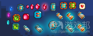
各种可拾取物品——宝石和牛奶胶囊。
原版的潜水艇转向动画。在真正的潜水艇做出来以前,我们用这些做测试:
多种金鱼设计。我仍然很喜欢桔色的和灰色的,希望有一天可以把它们放进其他游戏中吧。三只眼的那一种相当傻,也许我们应该做一款RPG版《Aqua Kitty》,这样你就可以和这些家伙交谈了。
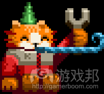
我们还设计了一种泵潜艇,也是由猫操纵的,可以停靠在牛奶站。乌贼敌人和精英怪黑点点鱼。不知道警察潜水艇要做什么,也许会出现“紧急”敌人。还有钻孔猫,负责在海底收集宝石。
(本文为游戏邦/gamerboom.com编译,拒绝任何不保留版权的转载,如需转载请联系:游戏邦)
Aqua Kitty – Milk Mine Defender: Art Creation Process
by Dugan Jackson
Aqua Kitty is an arcadey shooter originally made for PC, but ended up being released first as a launch title for Sonys PSMobile platform (Vita plus other devices), then on Xbox360 and now back on PC once again.
The game was made by a small team comprising of Dugan (Art), Gabor (Code) with music and sound effects by Electric Cafe. The box art was created by David Hankin. In the game you play a cat piloting a submarine, protecting milk mining kittens under the sea from mechanical sea creatures.
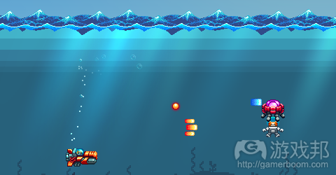
To tie in with the completion and release of the PC version I have put together this small post to help explain how some of the art was created and developed throughout the production (below is a screenshot of the finished product). We also have a Steam Greenlight page for the game.
Initial Development.
Very early on when game development began, we didn’t know exactly what we were going to make but wanted to make a game which would be small, simple and could be created in our spare time.
So lots of experimentation then followed as we tried out different design prototypes.
Only basic art is needed at this stage as you risk wasting too much time creating images that may never be used in the final version of the game.
Here you can see some in this screen shot of an early experiment:
You can see an early version of the player submarine, before cats were involved – as well as very early Paleo and Pointy fish enemies. The screen was fixed scrolling right to left, and the parallax background was working at this point too.
The game changed many times through different prototypes – at one point it was a puzzley shooter, and then we had gem collecting, gem mining, ferrying…
From aiming to be a very small game, the scope grew. Once we got to a point where we were happy with some core mechanics, we could begin to focus the game and start adding new art.
Developing Aqua Kitty.
ENEMY CREATION
The first two enemies to be made were the Nautilus and Paleofish. These were designed around prehistoric sea creatures, Nautiloids and Dunkleosteus.
Using this reference they would then be redrawn as mechanical creatures with engines and propellers. A long fish body wasn’t practical for the Paleofish so it ended up being mostly all head shaped.
Each enemy was given a fixed colour palette to keep it true to the old 16bit Amiga feel, but the exact number of colours and palette were not limited by old hardware. This way the art keeps a retro feel but with a richer diversity of colour (modern retro).
They all went through a few iterations too. Sometimes details that looked fine when just a still image looked confusing when the creature was zipping about ingame, so a balance had to be struck between chunky panelling and small finer details. Bold shapes and silhouettes tend to be the first thing the eye reads, then smaller details should compliment those.
The designs were also influenced by how the enemy would move or act. Paleofish slow and boxy, Pointyfish sleek and speedy, Puffafish bloated ready to pop, and so on.
Each enemy needed a distinct core colouration to make them easy to spot when the game gets busy. It’s important in a fast paced shooter to be able to tell from the corner of your eye which enemy is which, as it allows you to react quickly to how they might move or fire.
R-Type is just one old game which is a very good example of this, red ships move in one particular manner, yellow ones travel in-line along a path, blue walkers stop to fire missiles etc.
EXPLOSIONS
When things explode they need to be substantial, `meaty`(not actual meat of course!) – this gives good cause and effect feedback to the player. They have destroyed an enemy, so they get clear satisfying visual reward.
Being a big fan of Metal Slug and R-Type, they acted in part as research for how to go about making pixel art explosions.
Most of the explosions in the game are made as a composite of different drawn elements – blast rings, shockwaves and both large and small drawn explosion animations.
Each of the enemies also has its own custom destruction animation, where each frame is redrawn disintegrating bit by bit. As most of the energy of the explosion happens at the beginning of the event, you’ll notice more of a punch at the start of the animation and a gradual slowing dissipation as time goes on.
The body disintegration is layered along with other explosion elements to produce the final result ingame. Randomisation of elements is a good thing to do where possible, as its very obvious if a fixed animation is played over and over again, regardless of how detailed it might be. We added a degree of randomness to the position of the child explosions that are triggered as well as the angles of the small blast waves.
For the Puffafish and bomb explosions we used additive blend mode which wasn’t something you would expect to find in the average 16bit era shmup. Additive mode when used with care can give a richer depth to the colours onscreen, as it generates a whole range of new ones depending what is underneath.
The danger with additive is that you risk overly whiting out, so I had to make sure the backgrounds all stayed within certain luminance values.
SEA WAVES
Ah the waves animations… these were quite hard to make.
One of the visual references for this game was an old IREM one called In The Hunt, a push-scrolling submarine shooter with very pretty art. That game has a variety of fantastic looking waves and some time was taken examining how they worked.
In Aqua Kitty I didn’t want the sea to be too calm, but also not too rough. So no crashing waves, but still have a definite heaving motion.
I started with a sin wave to simulate a small near wave, and also blocked out a larger more sweeping wave shape.
There was no point going crazy with detail at this point, the main overall shape was most important. Next I concentrated on the larger part of the wave and elongated the canvas a little.
There were actually 12 frames at this stage. The wave was made to rise and fall but not move horizontally, we could do that ingame instead. Once happy with the overall shape, I could move onto the detailing which took quite a while to do.
The final result uses 4 layers of waves, a smaller one at the front based on the old small test sin wave, and 3 larger ones which are progressively darker the further back they go. They all move along at different rates to help give the illusion of a turbulent sea.
Gamemaker (by Yoyo games) proved helpful in prototyping elements like these waves. I could test out ideas quickly in a basic setup I created, then that could be expanded on in the actual game.
PLAYER SUBMARINE
Back in 2002 I helped worked on a GBA demo briefly in my spare time. We only got as far as making the screen scroll with some tiled artwork and having a controllable ship though.
This old ship art started as the basis for the submarine in Aqua Kitty, but had also been used in a top down format for a different game idea which had you exploring caves in the darkness, relying on sonar to navigate about.
The GBA art was more a spaceship than a submarine, with rockets at the back.
From the GBA version, the resolution was increased which meant more detail could be added. A few variations were made, trying different styles of bodywork and propellers. Once we had ditched the idea of firing torpedoes the main guns then became more like machine gun barrels with cooling vents. This makes no logical sense underwater of course, but helped make the barrels stand out and also suited them recoiling backward as they fire.
After any change was made, it was left ingame for a while so it could be tested out. When making changes like these care should be taken that it doesn’t seem better just because it is new, a lot of time can be wasted doing small tweaks if you are not careful. So it can be better to do a number of changes in one pass, then leave alone for while, then review.
Later once the cat pilot was added we then moved on to adding up and down tilt animations. Without these the craft looked really stiff, but with them it feels much more dynamic. We also tied the propeller speed to the sub speed, so you can see ingame that the faster you move the faster it spins.
One of the the player pickups, the support gunners, began with very small heads. It was another one of those things that seemed fine as a still image, but ingame was really hard to make out. So their heads were increased and suits made orange to match the player sub.
The orange suits proved to be a bad idea, as it confused the difference between them and the player when the enemy bullets were flying – so they were switched back to greyish outfits once again in the final version.
LOGO ITERATION
Making Logos can be tricky. Sometimes they can come together quickly – like the one made for a game called Gravity Crash (for JAW Ltd) which was done in just a few days, but others can take some time to develop. Aqua Kitty was one of those that took time to complete…
For a while I was determined to make a pseudo 3D slanted logo work.
But after numerous tweaks I still wasn’t happy and so went back to the drawing board to try to begin afresh. This meant trying lots of different shapes and styles:
Key considerations for the logo were for it to look retro, read easily from a distance (important to help people find the game when browsing) and be scalable. Scalability is useful later down the line when you might need to make banner art for a webstore or tiny icons for a console menu screen.
The final version was made on a 8×8 pixel grid, with the main thicker lines being 12 pixels wide (1.5 grid squares wide). Sticking to the grid was useful as it created rules for how the letters should be built, as you have to come up with solutions that fit those rules.
And the final version also had the main cat pilot added to it as well as the tagline below it.
BACKGROUNDS AND SUNBEAMS
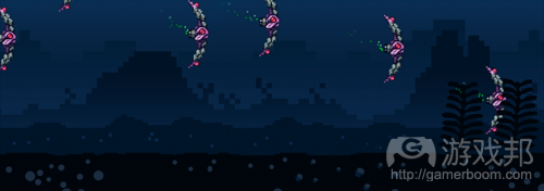
The backgrounds of the game are made of several tiled layers that move at different speeds when you scroll along. The initial idea was for them to pixelate the further away they were, like a retro style of depth of field.
Pretty chunky looking I think you will agree – the style didn’t match well with the sharply detailed player and enemy sprites. So as the game developed, so did the backgrounds and a number of designs were tried out.
Brightness order was switched around a few times – logically it would seem to make sense to have the lighter layers nearest but that meant backgrounds would always be near black which wasn’t very exciting.
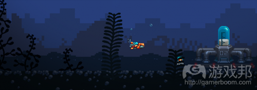
Also in this picture above you can see tests for the miner kittens, trying out different head sizes and positions as well as different helmet styles. At one point they had pneumatic drills and were digging up gems from the seabed to collect – but that was another gameplay experiment that didn’t work out so well.
I also tried adding gradients at one stage to make the levels feel more hazy. At first the change looked great, but then after playtesting them for a few days they just didn’t feel quite right so the flat shaded style came back instead.
Different types of detail was added to the seabed too, but it was always found to be too distracting when playing, so it got the chop (as did the ghost jellyfish).
The sunbeam effects began as very pixelly art too, but like the backgrounds they proved to be too chunky and were reworked.
Gamemaker was again used initially as a testbed to try out the beams. I could spawn, fade and scale them with a very simple script. Once I had a good result working, those timings could be taken over to the game and coded in properly.
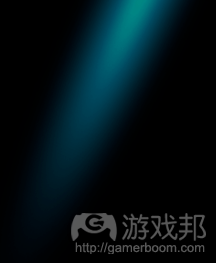
(A single beam image. Being additive it has no alpha edges and is instead surrounded by black which is of course 0,0,0 RGB and as such adds nothing)
The beams have some randomness to their initial size and transparency – fade in and scale up until scaling back down and fading out – each with variable timings. They are set with additive blend mode so they brighten up whatever they sit above. Only two different coloured beams were needed in the end per area theme.
Below is a mockup towards the end of development of how the different themed areas would look. It was further worked up into what can be seen in the final game.
BOX AND POSTER ARTWORK
When Aqua Kitty was ported back to Xbox360, we needed a new box art graphic for use on the 360 store. I started things off by researching some old Japanese PC Engine and Amiga box covers I remembered liking to help choose a style:
(All images ? their respective owners)
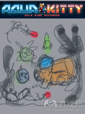
With an idea in mind I then made a very rough sketch:
Amazing yes? (not really) – action packed with a crab at the bottom left firing at the player, two torpedoes closing in, enemy fish chasing behind and big swirly plants framing the scene.
I didn’t have time to develop the poster so deferred instead to a very experienced games artist called David Hankin who would be able to do a much better job. When he got involved I passed over the sketches and reference to him so he could further work up and improve the cover art.
David then tried out a number of layouts in pencil first of all. Once a design was selected all the different elements were painted in on separate layers where possible. Using layers gives flexibility to adjust the layout easily at any time.
Once a version was ready, we could review it and make tweaks if needed then review again until everything looked just right.
We later made a CMYK version to be used to print posters and postcards, and found switching to CMYK altered the game logo quite a bit (due to CMYK having less colours available than RGB) – so it needed some rebalancing to make it look less dulled.
For the Xbox360 console the full “Aqua Kitty – Milk Mine Defender” title was actually too long so we had to chop it off to be just “Aqua Kitty” to get it accepted. Below is the CMYK poster and postcard once printed, note how the turquoise in AQUA is dulled:
DELETED ITEMS AND OBJECTS
Finally, here is a collection of some of the art that never made it into the finished game.
Jellyfish test designs and colours. The final red version worked best in the end as its a key enemy so should stand out the most:
Various pickups – gems and milk capsules:
Original modified sub turn animation (zoomed in). Made for testing purposes before the proper art was made for the submarine:
Many types of goldfish designs. I still like the orange and grey ones quite a bit and will try to work them into another game someday. The triple eyed ones are quite silly too, maybe we should make an Aqua Kitty rpg where you can get to explore and talk to all these creatures:
Here we have an alternate pump type. Also old test tankers piloted by kittens that would dock into milkstations. A squid enemy and an elite styled black Pointyfish. Not sure what the Police submarine was for, maybe a `hurry up` style enemy that would appear if you took too long. There is also a drilling kitten, harvesting gems from the seabed:
Well this is the end of my post, I hope you found it an interesting read.(source:gamasutra)


















 闽公网安备35020302001549号