解析游戏开发者如何选择颜色算法
作者:Herman Tulleken
改变颜色是一个丰富游戏内容的好办法,并且比较容易执行。但困难的是如何选择漂亮的色彩组合。本文将介绍一些选择颜色组合的知识。
颜色的基本知识
颜色是非常复杂的。颜色是在光、材质、眼睛和大脑以及少量心理因素的共同作用下产生的。
尽管你不需要知道所有与颜色有关的物理学、生物学和心理学知识,但你必须了解一些背景知识。
以下是选择色彩范围的要点。
数字化色彩理论与颜料的色彩(化学颜料、晶体颜色)理论大不相同。事实上,无论如何混合颜色,也不可能产生自然界中的所有颜色。你可以在颜料店买一种非常亮的绿色,但电脑屏幕能产生的最接近的颜色也达不到相同的饱和度。当你研究颜色的算法时,请确保你使用的色彩模式是是数字RGB。
RGB和许多其他色彩模式的矢量距离与我们的感觉到的差异是不一样的。
这些灰色是等距排列的。但请注意,亮度较高的灰色之间更容易区分。
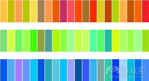
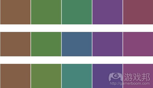
在每一排,饱和度差距为5%。注意,某些颜色是不能区别的。另外,色相也受到亮度的影响。较淡的蓝色比较深的蓝色更容易区分,而较暗的品红色比较淡的品红色更容易区分。
当你选择看起来距离“相同”的颜色时,你就必须注意到这些差异。通常来说,你必须使用基于感觉的色彩空间(如LAB色彩)或在其他色彩空间中做适当的调整。
感觉上,LAB色彩空间更统一,是理想的色彩选择算法的基础(游戏邦注:PS专家们应该知道只操作LAB通道而不操作RGB通道,色相调整的人为痕迹更少)。
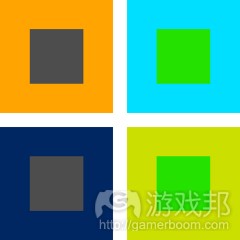
色彩感知不是绝对的。颜色的产生受到周边色彩的影响。给当前颜色选择匹配颜色或组合多个颜色时,这是一个重要的考虑因素。
色彩和谐理论。尽管很难解释为什么某色彩组合比另一种看起来更好,但我们可以通过色彩和谐理论来理解它。
程序性调色板的使用
程序性调色板可用于:
1、在连续产生的场景中得到更多变体,如《翼飞冲天》。
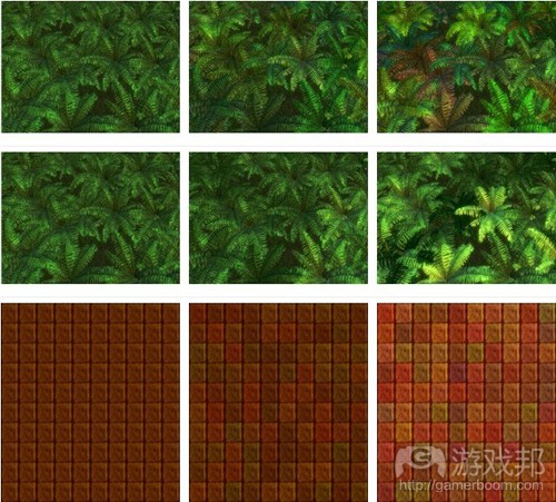
2、从单一材料中得到更多变体,如上图所示。
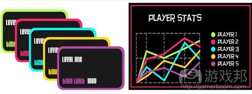
3、给界面部件自动生成颜色,如早期版本的Microsoft Excel和Open Office Calc中的图像。
注意
当选择算法时,你必须考虑以下几点:
1、你需要多少种颜色?很少还是很多?固定的数量还是任意数量?
2、颜色之间的关系是什么?例如,是否形成和谐的三色组合?
3、你的颜色组合的对比度是高还是低?
4、在程序性色彩选择中使用什么颜色?
5、颜色是否传达含义?是否需要匹配现实世界的元素?是否采用象征手法,以区分不同类型的元素?
6、你需要什么类型的变体?连续生成的变体?还是同一个场景中的变体?
算法
1、从预设中选择随机颜色
这是非常简单的一种算法,且容易执行。它只适用于小色板,当然所用色板都受限于初始设置。但是,它可以与其他算法相结合,以产生更大的色彩组合。
2、统一的随机RGB
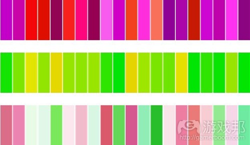
这是程序性色彩选择的最简单的算法,也就是给三个RGB通道分别设置随机值。
color = new Color(Random(), Random(), Random())
这种算法产生的颜色组合通常并不好看。没有愉悦视觉的结构性、关系性和图案。以下所有算法都试图限制色彩产生,以便在色彩之间形成关系性或连贯性。
3、随机偏移量
这种算法通过计算给定颜色的小量随机偏移来推断色彩范围。
这种算法容易执行,只要计算各个RGB组件的随机偏移量就可以了。另一种办法是,根据随机偏移量改变颜色值。
float value = (color.r + color.g + color.b)/3;
float newValue = value + 2*Random() * offset – offset;
float valueRatio = newValue / value;
Color newColor;
newColor.r = color.r * valueRatio;
newColor.g = color.g * valueRatio;
newColor.b = color.b * valueRatio;
在某些情况下,随机改变值可以模拟阴影,使场景更有深度。
通常来说,这种算法:
1、不适合要求高对比度的小色板。
2、适合基本色确定且重复多次的装饰性场景。
3、适合有缝的着色贴图(使用无缝贴图得到变体更费功夫)。
最大偏移量的效果取决于基本色:
基本色的饱和度越低,结果色彩越丰富。
不同的色相有不同的感觉变化度。例如,如果基本色是黄色,那么结果比基本色是绿色时更丰富。
4、从渐变中选择
在以下代码案例中,Gradient.GetColor的参数介于0到1,在渐变中产生相应的颜色。
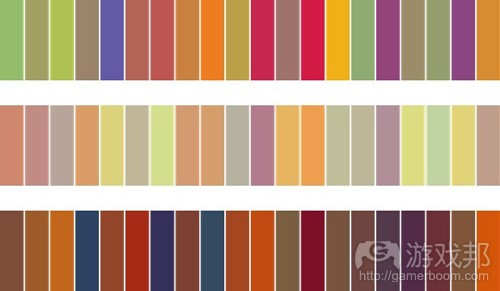
统一随机(Uniform Random)在0到1之间随机选择值,并映射到渐变中以选择颜色。这可以产生结构性效果,但原来就是渐变的色彩组合除外。
网格(Grid)在选择已知数量的颜色时非常实用,因为可以保证两种颜色之间的接近(沿着渐变)程度不会超过1/n。
这对于传达信息的颜色非常有用,如果颜色数量很小的话。
抖动网格(Jittered Grid)在用少量(你已经知道颜色数量)颜色产生更多变体时很实用。这种算法的一个缺点是,序列中的颜色不能保证彼此之间的差距相同。你可以通过限制误差量为颜色之间的最小距离来解决这个问题。
for(int i = 0; i < n; i++)
color[i] = gradient.GetColor((i + Random.NextFloat()) * intervalSize)
抖动网格非常适用于选择少量的颜色,这样多次选择就会产生不同的结果。
maxJitter = …//some value between 0 1nd 1
for(int i = 0; i < n; i++)
color[i] = gradient.GetColor(
(i + 0.5 + (2 * Random.NextFloat() – 1) * maxJitter) * intervalSize);
黄金比例(Golden Ratio)是选择颜色序列的一种方案,不一定是预设,所以连续选择的颜色总是彼此相距很远,且不重复(尽管颜色会越来越接近之前选择过的颜色)。
offset = Random.NextFloat();
for (int i = 0; i < n; i++)
color[i] = gradient.GetColor(offset + (0.618033988749895f * i) % 1);
这种算法适用于选择界面上的连续性高对比度颜色。
5、在其他色彩空间中选择随机通道
例如,使用HSL色域可以产生良好的结果。
6、标准色彩和谐
选择标准色彩和谐的随机颜色的方法基本上是一样的:限制色相数量,控制饱和度和明度。我们可以使用通用的三色系和合适的参数来产生各种色彩和谐。
这种算法需要若干参数;最重要的是两个偏角和两个角度范围。
这种算法的最简单形式如下:
1、选择随机参考角度。
2、在完全范围内选择随机角度(三个范围角度加在一起)。
3、如果这个角度小于第一个范围,那就保留。
4、否则,如果这个角度大于第一个范围,但小于前两个范围之和,那就由第一个偏移度补偿它。
5、将这个角度添加到参考角度。
6、以这个角度作为色相的颜色就能产生三色和谐。
以下是这处算法的C#执行算法,产生了给定数量、具有可控饱和度和明度的颜色。
public static List GenerateColors_Harmony(
int colorCount,
float offsetAngle1,
float offsetAngle2,
float rangeAngle0,
float rangeAngle1,
float rangeAngle2,
float saturation, float luminance)
{
List colors = new List();float referenceAngle = random.NextFloat() * 360;
for (int i = 0; i < colorCount; i++)
{
float randomAngle =
random.NextFloat() * (rangeAngle0 + rangeAngle1 + rangeAngle2);if (randomAngle > rangeAngle0)
{
if (randomAngle < rangeAngle0 + rangeAngle1)
{
randomAngle += offsetAngle1;
}
else
{
randomAngle += offsetAngle2;
}
}HSL hslColor = new HSL(
((referenceAngle + randomAngle) / 360.0f) % 1.0f,
saturation,
luminance);colors.Add(hslColor.Color);
}return colors;
}
这个算法更直观地说,就是将参考和偏移角度置于相应范围的中央。
1、选择随机参考角度。
2、在完全范围内选择随机角度(三个范围角度加在一起)。
3、如果这个角度小于第一个范围,那就减少它相当于第一范围的一半角度。
4、否则,如果这个角度大于第一个范围,但小于前两个范围之和,那就由第一个偏移范围减去第二个范围的结果来补偿它。
5、否则,用第二个徧移角度减去第三个范围来补偿它。
6、将这个角度添加到参考角度。
7、以这个角度作为色相的颜色就能产生三色和谐。
更多变量
1、有了这个算法的置中版本,很容易提供(而不是生成)参考角度,和与其他颜色选择算法相结合。
2、通过选择随机饱和度和随机明度(可能在给定参数的范围内)可以添加更多变量。这可能改变和谐方案,因为饱和度/明度突出了边缘颜色。但在很多时候,这并不成问题。
3、色相可以统一选择,而不是在整个范围内随机选择。这保证颜色的色相差距最小。
4、如果参数合适,我们可以生成普遍的色彩方案:
A、类似的:选择第二和第三范围为0。
B、互补的:选择第三范围为0,第一偏移角度为180。
C、补色分割:选择徧移角度为180+/-一个小角度。第二个和第三范围必须小于这两个偏移角度的差值。
D、三色系:选择徧移角度为120和240。
7、三色混合
这个算法需要三种颜色,随机混合以产生色板。
这种标准的算法会产生大量灰色调颜色。如果效果不理想,可以通过限制三色中的其中一色的量来控制灰度。以下是这个算法的例子(如果灰度控制是1,那就相当于标准算法。)
public static Color RandomMix(Color color1, Color color2, Color color3,
float greyControl)
{
int randomIndex = random.NextByte() % 3;float mixRatio1 =
(randomIndex == 0) ? random.NextFloat() * greyControl : random.NextFloat();float mixRatio2 =
(randomIndex == 1) ? random.NextFloat() * greyControl : random.NextFloat();float mixRatio3 =
(randomIndex == 2) ? random.NextFloat() * greyControl : random.NextFloat();float sum = mixRatio1 + mixRatio2 + mixRatio3;
mixRatio1 /= sum;
mixRatio2 /= sum;
mixRatio3 /= sum;return Color.FromArgb(
255,
(byte)(mixRatio1 * color1.R + mixRatio2 * color2.R + mixRatio3 * color3.R),
(byte)(mixRatio1 * color1.G + mixRatio2 * color2.G + mixRatio3 * color3.G),
(byte)(mixRatio1 * color1.B + mixRatio2 * color2.B + mixRatio3 * color3.B));
}
可以使用不同的混合算法,例如减少混合量或色相插值。
以下你可以看到设置灰度值的效果。左边的灰度值为0,右边的为1。
单色材质
与手绘材质不同,程序改变的材质可能看起来非常单调和无趣。
这个问题可以通过几种方法来解决。这些方法都要求相当高的艺术修养,但理解技术和其运作方式(如何影响艺术传达)也是非常重要的。
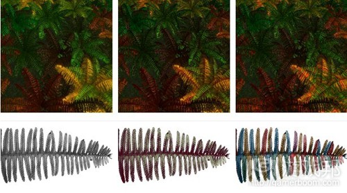
使用有色材质。这种基本材质必须是完全灰度的。给它们上色会抵消最终的颜色,可以用于本地色彩变量。
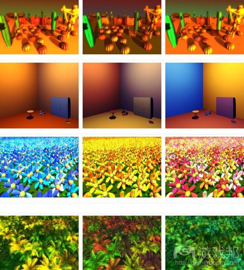
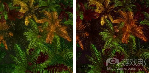
通道独立色彩修正。有时候可以通过分别调整通道值来得到良好的效果。在下图的例子中,阴影呈红色(左边的图片没有经过色彩修正)。
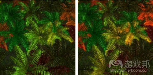
使用有色光。在稍有不同的角度上使用有色光,单调的材质可以变得更细腻。如下图的场景中有三种性质相同的光,但右图的光是红色、蓝色和绿色(3倍强度,以补偿各种光中缺少的通道)。
准备美术材料
准备美术材料需要认真计划。最大的难题是想出如何一致地分离材质。为了便于读者了解这个过程,以下我解释了我自己准备本文图片的方法:
1、蕨类使用单一材料。各种蕨类从当前设置中随机选择颜色,这样我就可以方便地编写颜色选择的脚本。
2、每一部分的花都使用不同的材料。只有花瓣必须改变颜色,所以我必须修改一部分网格(花瓣)的脚本以调整颜色。
3、空间场景再次在网格的各个部分中使用分离材料。此时,我使用设置所有副网格颜色的全局脚本。
你可以看到,这个过程可能很复杂,特别是如果你要用不同的算法来给不同的元素上色,并且对象也很复杂。
以下是准备美术材料的同个小技巧:
1、如果你用程序性颜色叠加你的灰度材质,覆盖大范围灰度范围的材质必须更灵活。你的颜色应用算法或你选择的颜色可能总是减少最后的对比度,但要恢复就更困难得多。
2、认真计划你修改最终结果的方法,以免返工(这是一个普遍的艺术原则,但如果你体表和这个技术,这一条就更显重要了)。例如,至少有四种方法可以加深颜色:改变材质、改变颜色选择算法的输入、改变光照、或改变后期效果。你可以简单地调整循环,以免浪费时间。一个策略是,给所有东西做一个基准面,然后在按材质、算法、光照、后期效果的顺序调整它们。
3、在这些情况下,可能索引颜色比较实用,因为各个索引相当于色板中的一种颜色,而不是给各种颜色使用不同材料。
4、在牺牲磁盘空间而获得性能的情况下,你可以提前准备材质。(本文为游戏邦/gamerboom.com编译,拒绝任何不保留版权的转载,如需转载请联系:游戏邦)
How to Choose Colours Procedurally (Algorithms)
by Herman Tulleken
Changing the colours of art can be a great way to increase the amount of content in your game, and add variety and richness. It is relatively easy to implement. What is not always as easy is to get a set of colours that looks nice. This article gives some ideas for choosing colour palettes that look nice.
A few things about colour
Colour is surprisingly complex. How colour works is determined by the physics of light and materials, the biology of our eyes and brains, mixed with a bit of psychology.
Although you don’t need to know all about the physics, biology, and psychology of colour vision, it is useful to have some background information (which you can find references to at the end of this article).
For palette choosing, there are a few important points.
Digital colour theory differs considerably from theories based on pigments (or chemicals, or metals in crystals). In fact, no system of colour mixing can produce all colours that occur in nature. You can buy a dark very bright green from a paint shop, but the closest colour your screen can reproduce will look desaturated (just look at images of painted colour wheels). When you research colour for algorithms, make sure that they apply to digital RGB colour.
Vector distances in RGB and many other colour models don’t correspond to differences in perception.
Brightness
These greys are equally spaced. But notice how much easier it is to distinguish between lighter greys.
Hue differentiation.
In each row, the hue differs by 5%. Notice that certain colours cannot be distinguished. Also notice that it is different depending on the brightness. Lighter blues is more distinguishable than darker blues, while darker magentas are more distinguishable than lighter ones.
This fact becomes important when you try to select colours that look “equally” far apart; in general, it cannot be done without using a perception-based colour space (such as LAB colours), or making appropriate adjustments in other colour spaces.
Here is a bit more on the matter:
http://en.wikipedia.org/wiki/Color_difference#Tolerance
Here is an a way of computing a useful colour distance that may come in handy later:
http://www.emanueleferonato.com/2009/08/28/color-differences-algorithm/
http://www.emanueleferonato.com/2009/09/08/color-difference-algorithm-part-2/
Lab colour spaces are intended to be perceptually more uniform, and may be the basis of colour selection algorithms that give visually more pleasing results. (Photoshop gurus will know that hue adjustments have fewer artefacts when manipulating LAB channels and not RGB channels).
Colour perception is not absolute. Colours appear differently depending on surrounding colours. This is an important factor when selecting colour palettes that work with existing palettes, or combining more than one palette.
Here is more information on colour contrast effects:
http://www.uxmatters.com/mt/archives/2006/01/color-theory-for-digital-displays-a-quick-reference-part-ii.php#colorContrastEffects
Colour harmony theory. Although why certain combinations of colours look better than others is somewhat of a mystery, theories of colour harmony is a good place to start understanding many good-looking palettes.
See for example:
Basic overview http://www.malanenewman.com/color_theory_color_wheel.html
An overview of different theories http://colour-emotion.co.uk/harmony.html
Uses of procedural palettes
Procedural palettes can be used to:
Get more variety in successively generated scenes, such as in Tiny Wings.
To get more variety from a single asset, as shown below.
To get automatic colours for interface components, such as in the (notoriously ugly) graphs of earlier versions of Microsoft Excel or and Open Office Calc.
Considerations
When selecting algorithms, you must think about what you need:
How many colours do you need? A few, or many? A fixed number, or an arbitrary number?
How should the colours in the palette relate to one another? For example, should the colours form a harmonic triad?
Do you need a high contrasts palette or a palette with a minimum vector distance between colours?
What colours will be used with the procedurally selected colours?
Will you colour convey meaning? Do they need to match real-world elements? Are they used symbolically to distinguish between different types of elements?
What type of variety do you need? Variety in successive generations? Variety in a scene?
7 Algorithms
1. Choosing random colours from a handpicked pre-set
This very simple algorithm gives the most control, and is easy to implement. It is only useful for smaller palettes, and of course all palettes are limited to the original set. However, it can be combined with other algorithms to give bigger sets of colours.
2. Uniform Random RGB
The simplest algorithm for selecting colours procedurally is to simply choose random values for each of the three RGB channels.
color = new Color(Random(), Random(), Random())
This algorithm gives sets of colours the are usually quite ugly. There is no structure, no relationship among colours in the palette, no pattern that pleases the eye. All the algorithms below attempt to constrain the colours generated so that there are relationships or coherence among colours.
3. Random Offset
This algorithm computes a palette by computing a small random offset from a given colour.
An easy implementation simply calculates random offsets for each of RGB components. An alternative is to just change the value of the colour by a random offset.
float value = (color.r + color.g + color.b)/3;
float newValue = value + 2*Random() * offset – offset;
float valueRatio = newValue / value;
Color newColor;
newColor.r = color.r * valueRatio;
newColor.g = color.g * valueRatio;
newColor.b = color.b * valueRatio;
Changing the value randomly can in certain cases simulate shadows (see the middle row below), so that a scene looks like it has more depth than it really has.
In general, this algorithm is:
Not good for small palettes where high contrast is desired.
Good for enriching a scene where the base colours are defined and repeated many times.
Good for colouring tiles with seams (to get more variance with seamless tiles requires a bit more work. See the section Dynamic Colouring in Getting More from Seamless Tiles).
The effect of the maximum offset you choose is different based on the base colour:
The less saturated the base colour, the more colourful the result is perceived.
Different hues will have different perceived variance. For example, if the base colour is yellow, the result will be perceived as more colourful than if the base colour was green.
4. Selecting from a gradient
In the code examples below, Gradient.GetColor takes a parameter between 0 and 1 and generate the corresponding colour on the gradient.
Uniform Random Randomly select values between 0 and 1, and map this to the gradient to select colours. This gives little structure, except for that already inherent in the gradient.
Grid This is useful for selecting a known number of colours, with the assurance that no two colours will be closer to each other (along the gradient) than 1/n.
This is useful for colour which convey information, if the number of colours is small.
Jittered Grid This is useful to get more variety with a small number of colours, where you know the number of colours up front. (The variety is not among the colours, but among different generations).
for(int i = 0; i < n; i++)
color[i] = gradient.GetColor((i + Random.NextFloat()) * intervalSize)
Using a jittered grid works well for a small selection of colours, so that multiple generations give different results. One disadvantage of using a jittered grid is that colours in the sequence are not guaranteed to be equally distinct from each other. You can address this by limiting the amount of jitter to guarantee a minimum distance between colours:
maxJitter = …//some value between 0 1nd 1
for(int i = 0; i < n; i++)
color[i] = gradient.GetColor(
(i + 0.5 + (2 * Random.NextFloat() – 1) * maxJitter) * intervalSize);
Golden Ratio This is a scheme to select a sequence of colours, not necessarily up front, so that consecutively selected colours are always far from each other. Colours never repeat (although, over time, colours become close to previously chosen colours).
offset = Random.NextFloat();
for (int i = 0; i < n; i++)
color[i] = gradient.GetColor(offset + (0.618033988749895f * i) % 1);
This algorithm is useful for selecting colours for contrast in an interface, where high contrast between successive colours is guaranteed.
Here is an article explaining why this works:
http://martin.ankerl.com/2009/12/09/how-to-create-random-colors-programmatically/
5. Selecting random channels in other colour spaces
For example, good results can be obtained using the HSL colour space.
Random Hue
Random Saturation
Random Luminance
Random Saturation and Luminance
6. Standard Colour Harmonies
http://www.websiteoptimization.com/speed/tweak/color-harmony/
Methods for choosing random colours for standard colour harmonies all work basically the same: limit the possible choices of hue, and control saturation and luminance. We can use a generic triadic algorithm with suitable parameters to generate a variety colour harmonies:
The algorithm takes a few parameters; the important ones are two offset angles, and two angle ranges.
The simplest form of the algorithm works as follows:
Select a random reference angle.
Select a random angle in the total of the range (the three range angles added together)
If the angle is smaller than the first range, keep it
Otherwise, if the angle is bigger than the first range, but smaller than the sum of the first Two ranges, offset it by the first offset angle
Otherwise, offset it by the second offset angle
Add this angle to the reference angle
The colour with this angle as hue is a colour generated with the triad harmony
Here is a C# implementation of this algorithm that generates a given number of colours with controlled saturation and luminance.
public static List GenerateColors_Harmony(
int colorCount,
float offsetAngle1,
float offsetAngle2,
float rangeAngle0,
float rangeAngle1,
float rangeAngle2,
float saturation, float luminance)
{
List colors = new List();
float referenceAngle = random.NextFloat() * 360;
for (int i = 0; i < colorCount; i++)
{
float randomAngle =
random.NextFloat() * (rangeAngle0 + rangeAngle1 + rangeAngle2);
if (randomAngle > rangeAngle0)
{
if (randomAngle < rangeAngle0 + rangeAngle1)
{
randomAngle += offsetAngle1;
}
else
{
randomAngle += offsetAngle2;
}
}
HSL hslColor = new HSL(
((referenceAngle + randomAngle) / 360.0f) % 1.0f,
saturation,
luminance);
colors.Add(hslColor.Color);
}
return colors;
}
The algorithm can be made a bit more intuitive by centring the reference and offset angles in corresponding ranges.
Select a random reference angle.
Select a random angle in the total of the range (the three range angles added together)
If the angle is smaller than the first range, reduce it by half the first range.
Otherwise, if the angle is bigger than the first range, but smaller than the sum of the first two ranges, offset it by the first offset angle minus the second range.
Otherwise, offset it by the second offset angle minus the third range.
Add this angle to the reference angle.
The colour with this angle as hue is a colour generated with the triad harmony.
More varieties
With the centred version of the algorithm, it is easy to supply (instead of generating) the reference angle, making it possible to chain the algorithm with other colour selection algorithms.
More variety can be added by selecting random saturation and random luminance (possibly within a range from given parameters). This can potentially change the harmonic scheme by fringe colours being emphasized by their saturation / luminance. In many cases this is ok.
The hue can be selected uniformly instead of randomly across the total range. This will insure colours are a minimum hue-distance apart.
With suitable parameters, we can generate common colour schemes:
Analogous: Choose second and third ranges 0.
Complementary: Choose the third range 0, and first offset angle 180.
Split Complementary: Choose offset angles 180 +/- a small angle. The second and third ranges must be smaller than the difference between the two offset angles.
Triad: Choose offset angles 120 and 240.
7. Triad Mixing
This algorithm takes three colours, and mixes them randomly to create a palette.
The standard algorithm produces many grey colours. If this is not desired, the amount of greyness can be controlled by limiting the contribution of one of the three colours. This version of the algorithm is given here (if the greyControl is 1, it is equivalent to the standard algorithm).
public static Color RandomMix(Color color1, Color color2, Color color3,
float greyControl)
{
int randomIndex = random.NextByte() % 3;
float mixRatio1 =
(randomIndex == 0) ? random.NextFloat() * greyControl : random.NextFloat();
float mixRatio2 =
(randomIndex == 1) ? random.NextFloat() * greyControl : random.NextFloat();
float mixRatio3 =
(randomIndex == 2) ? random.NextFloat() * greyControl : random.NextFloat();
float sum = mixRatio1 + mixRatio2 + mixRatio3;
mixRatio1 /= sum;
mixRatio2 /= sum;
mixRatio3 /= sum;
return Color.FromArgb(
255,
(byte)(mixRatio1 * color1.R + mixRatio2 * color2.R + mixRatio3 * color3.R),
(byte)(mixRatio1 * color1.G + mixRatio2 * color2.G + mixRatio3 * color3.G),
(byte)(mixRatio1 * color1.B + mixRatio2 * color2.B + mixRatio3 * color3.B));
}
Different mixing algorithms can be used, for example subtractive mixing, or hue interpolation.
Low Grey Value
Medium Grey Value
High Grey Value
Below you can see the effect of setting the grey value. On the left it is 0, on the right it is 1.
Monochromatic Textures are Boring
Unlike hand-painted textures, textures altered procedurally can look flat and uninteresting.
There are several ways to deal with this issue. All of them require intensive artist input, but it is important to understand the techniques and how they work (and how they will affect the art pipeline).
Use coloured textures. The base textures need not be totally greyscale. Painting them with colours will offset the final colour, and can be used for local colour variations.
Channel independent colour correction. Sometimes a good effect can be obtained by adjusting values for channels independently, for example, by a post-effect. In the example below, for example, shadows have been made a bit redder. (The image without any colour correction is shown on the left).
Using coloured lights. By using coloured lights at slightly different angles, flat textures become more nuanced. Below, the scenes below are lit with the same three lights, but on the right the lights are coloured red, blue and green (and 3 times the intensity to compensate for the missing channels in each light).
Preparing Art
Preparing the art requires careful planning. The biggest challenge is figuring out how to consistently separate textures. To give you an idea of what is involved, here is how I prepared the images for this article:
The ferns use a single material. Each fern randomly selects a colour from the currently set up scheme, so I could just plunk the script on the colour selection script.
The flowers use different materials for each part. Only the petals must change colour, so I had to modify the script to link to a part of the mesh (the petals) to adjust the colours.
The room scene again uses separate materials for each part of the mesh. In this case I used a global script that sets the colours of all submeshes.
You can see that it can become complicated, especially if you colour different elements using different algorithms, and have complicated objects.
There are a few other tips when it comes to preparing the art:
If you multiply your grey textures with procedural colours, textures that covers a wide grey spectrum are more flexible. Your colour application algorithm or the colours you choose can always reduce the final contrast, but it’s much harder to put it back in.
Carefully plan how you will tweak the final result, to minimise back and forth. (This is a general art principle, but becomes even more important if you use this technique). For example, to there are at least four ways to make something darker: change the texture, change the input of the colour selection algorithm, or change the lighting, or change the post effects. You can easily land in a tweaking loop that can waste a lot of time. One strategy is to get base levels for all these, and then tweaking them in this order: texture, algorithm, lighting, post effects.
In some cases it may be useful to use index colours, where each index corresponds to a colour from the palette, instead of using separate materials for each colour.
To gain performance at the expense of disk space, you can pregenerate your textures.(source:devmag)
















 闽公网安备35020302001549号