蹩脚网站设计不利于提升游戏销量
作者:Javier Cabrera
游戏开发商们为了做一款游戏要耗资上百万美元,因为要捕捉动作、雇用声优、购买最新的虚幻引擎使用权(或自制)和组建团队等,甚至还要在马克杯上打LOGO做广告。这就是今天的游戏业。但是,当你访问他们的网站,你感觉如何?糟透了,全都糟透了。我甚至找不到一个设计良好的游戏网站作案例;什么才叫作“设计良好”?这里我指的不是颜色或图像。我要说的是让开发商损失销售额的憋脚设计。你几乎不能想象有谁会通过这种网站购买游戏。你要思考的只有一个问题:为什么,到底为什么开发商会做出这么差劲的网站?
不过,这对独立开发者来说是个好消息。他人的失败意味着自己的机会。这些游戏巨头们忙着讨好游戏评论网站IGN,没空注意到我们已经后来居上了。这就是我们的机会。独立游戏开发者应该分析开发商们做不好网站的原因并吸取教训,知己知彼方能扭转与其竞争的不利局势。
蹩脚网站是怎么诞生的?
最简单的答案是:他们不知道怎么做得更好了。大多数游戏开发商会有专人负责市场营销活动。这些人目标明确,就是出售游戏。然而,现在的市场,搞营销要做的工作非常多:你得与媒体打招呼、发邮件、联络发行商、与应用商店一起制定营销战略、组织活动、管理社交网的帐户等等。实在是繁杂。他们的工作太多了,所以他们为了创建游戏网站而向程序员求助,怪不得他们。
所以在大多数情况下(不是全部,但大多数),程序员接到的任务并不是他们擅长的。另外,程序员自己的工作也很多。所以他们又找了一个美工来帮忙。现在我们有三类完全不懂网站设计和在线营销的人来做他们不擅长的事了。猜猜结果怎样?除了完成“这一点小事”,他们还有自己的工作要赶。营销人员得营销游戏,程序员要写代码,美工忙着绘画。
所以,丑陋的网站就诞生了。
蹩脚网站真的让他们损失吗?
当然,如果你以我所谓的“育碧标准”看待这种网站的话。快速问答:育碧网站是怎么样的?不要看,马上回答。不知道?好吧,现在再问你TellTale的网站又是怎么样的?明白了?看吧,你可能通过他们的网站购买过他们的一款游戏,如果没有,那么答案就是:CYPHER的网站是怎么样的?当然,因为你可以看到本文附带的图片,所以你知道了。然而,你还是不知道育碧的网站是怎么样的。假设你知道是怎么样的,那么现在回答这个问题:
你通过ubisoft.com购买了多少游戏?通过gog.com呢?通过Steam呢?现在你知道了。
EA意识到自己在网站这方面做得不够好。还好他们有觉悟。所以除了搞好线下营销、举办活动、联系媒体和招募展位Show Girl,他们还做了一个明智的决定:他们选择将辛苦挣来的钱用来制作在线网站和自己的应用商店ORIGIN(Steam的第一个直接竞争对手)。
他们损失了多少销售额?
我要责怪墨守成规的发行商们。游戏开发商忙着做好游戏,所以游戏发行商的任务就是通过改进和解决问题来开拓市场。然而在这个漫长的过程中,他们忘记了自己的工作。他们犯了错。承认吧,你根本不知道什么叫网站。所以你知道损失了多少钱吗——这些钱可能足够Valve建立Steam;足够CDProjekt建立GOG;足够GamersGate推出自己的平台,足够Desura和苹果应用商店大搞一翻。
足够他们输掉整个市场。是的,线下游戏仍然卖得动,但不再像以前那么多了;没人会否认这个残酷的真相。在线销售是世界上所有游戏开发商的首要销售渠道,然而他们却因为自己的网站(或者根本没有自己的网站)损失越来越多的销售额。如果你能想到这个事实,那你也会觉得确实太可笑了。他们怎么办?又找发行商。这一次,他们找的是网络发行商。
我不是说他们不需要找在线商店。我是说,他们应该也制作自己的在线商店。HumbleBundle的人早就明白这一点了,所以现在他们做得很好了。
一次访问可能就是一笔销售。一笔销售可能就是一位玩家。现在我们的游戏《CYPHER》争取到一点优势了。这点我不否认。十多年来,我一直从事网站设计和开发,所以我知道怎么做我们的网站。
CYPHER vs Steam vs GOG
当我们发布《CYPHER》时,有人认为我们疯了。不只是因为《CYPHER》是自Infocom的人进军Valhalla后的第一款商业文字冒险游戏,还因为它的网站“很难浏览”。有人甚至说它“一塌糊涂”。事实上是,《CYPHER》的网站有很强的设计意图,目的只有一个:吸引某一类玩家购买。
游戏杂志上的80年代复古风格广告是这个网站的视觉灵感来源。我们想让经历过那个年代的玩家回顾那些年,那时玩家们还会花一点时间看广告。而现在的玩家什么也不看,只想点击点击再点击!疯了!让我点击!购买按钮在哪里!我要点击!
好吧,并不是所有人都这样。我们针对的是那些玩过80年代文字冒险游戏,并且在阁楼里收藏了很多游戏杂志的玩家。这些人仍然留着他们的VCR:他们才是网站的目标。这种设计是我们给予所有复古迷玩家的礼物。结果是,效果太好了。
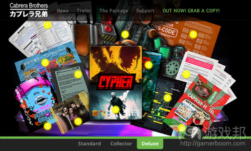
(这是网站的目录页面。我敢说你们小时候都做过这种事:将所有好东西摊在地板上,把游戏放在中间。这就是为什么我们要这么设计。)
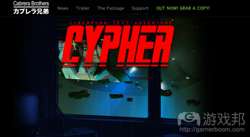
我们的目标受众很特别:他们有耐心,所以我们要奖励他们的耐心。这些人有耐心浏览网站,所以我们设计了一艘划过NeoSushi天空的飞船问候他们。
许多人问我们为什么我们要将“立即购买”的按钮放在页面底部,这显然违背了网页设计的原则。人们不会滚动页面的。他们讨厌滚动页面。一看到滚动页面,人们就想发火,想砸显示器。那为什么?因为网站设计根本没有原则。一种原则适用于一种目标市场,但不一定适用于另一个。虽然有些人要求屏幕中间有一个大按钮,旁边显示他们的支付金额和一串“立即购买”的大字,但有些人要求首先明白他们凭什么购买你的游戏。
对于CYPHER的网站,我们针对的是后一类人。就这么简单。这个网站成功了,虽然在Steam和GoG上没有成功(我们试过了),但我们觉得没有差别:销售额就是证明。我不会透露我们的销售额是多少,因为这是商业机密,但我可以告诉你们:我们的销售成绩足以维持我们在今年开发另一款游戏,并且Carlos终于可以镶他的金牙了。
最重要的是:我们网站成功了,是因为我们制定了计划;我们有做市场调查、UI设计和易用性实验。这些努力的成果给目标受众留下深刻印象,自然拉动了销售额。
你如何利用这些信息?
在制作网站以前,独立游戏开发者应该三思而后行。他们不应该只是做一些HTML文件,就以为完事了。你应该先做市场调查。谁会看你的网站?所有人。但谁更可能购买你的游戏?那就是你的市场。对于一般的网站,你可以采用“以不变应万变”的网站设计方案。但是,当你要出售一种产品或一种服务时,你必须瞄准你的目标受众。如果你的网站搞砸了,你的整个经营就失败了。
如果在一个月里,销售额为零。 育碧/EA可不着急。他们不靠网站销售,所以他们不担心。他们举办大量活动,请了很多衣着暴露的Show Girl来跳舞助兴。我为他们叫好。当你的钱和他们一样多时,你的游戏也很容易出手。请一些滑稽明星做宣传,你得到的关注不会比新闻媒体给的少。
但在这里,我们说的不是新闻媒体。我们说的是通过网站销售。人们买你的游戏,这才是最重要的。让IGF明星赚人气,你只要销售量就好了。要达到目的又不靠“美人计”的唯一办法就是制作一个网站销售你的游戏。
现在,你就知道为什么游戏开发商的网站那么糟糕,为什么他们会损失销售额。
总结
最终,我们的网站成功了,它吸引了目标受众和新玩家,但我们犯了一个致命的错误:我们没有给媒体提供简化版本或营销人员所谓的“宣传资料袋”。我将在之后的文章中告诉读者如何制作一份完美的宣传资料袋。我会给大家带来一点惊喜的。(本文为游戏邦/gamerboom.com编译,拒绝任何不保留版权的转载,如需转载请联系:游戏邦)
Why Game Developers have Crappy WebSites and How Many Sales are they losing?
by Javier Cabrera
So they spent a million buckazoids doing a game that has it all: motion capture, voice actors, the latest unreal engine license (or something of their own), teams strategically scattered all over the world and even coffee mugs with their logo on. Amazing. That’s today’s game industry. But what happens when you go to their websites? They suck. Every single one of them. I haven’t found one good example of a well designed game website: and when I say well designed I’m not talking about colors or images, no… I’m talking about crappy designs that makes them lose money with each visit. You can’t possible think someone will order a game through one of those sites. All you end up thinking is why, oh God why game developers have crappy websites?!
That’s good for us indies. It means opportunity. Those big fishes are too busy sending pancakes to someone at IGN to notice us coming from behind. This is our chance. Read on and learn why game developers have crappy websites and what can you do as an indie game developer to take advantage of this situation.
Why are they losing money?
The short answer: because they don’t know any better. Most game companies usually have someone who work the marketing campaigns. This person is well-intentioned and all she/he wants to do is get the game on the stores. In today’s market there’s a ton of work to be done in terms of marketing: you have to talk to the press, send emails, see publishers, coordinate the marketing strategy at the offline stores, do events, presentations, manage several social network accounts, etc. It’s a tough racket. They have their plate full and I don’t blame them when they turn around to one of the programmers for help when they have to make the game’s website.
So in most cases (not all, but in most cases) the programmer ends up doing something he/she isn’t ready for. Besides, programmers have their plate full too (and it’s one hell of a plate to fill let me tell you). So they end up bringing one of the artists into the equation, so “it looks good”. Now we have three people who don’t know nothing about (and they don’t have to) web design and online marketing doing something they aren’t ready for. Guess what, on top of this “little new responsibility”, they also have to finish their own jobs. Marketers have to market the game, programmers have to code (a lot) and artists have to blow minds with their art.
And so, the ugly website from hell that doesn’t sells shit is born.
Are really losing money?
Of course they are. Sure, you look at it from what I call the “ubisoft perspective”. Quick question: what does the Ubisoft website looks like? And their shopping cart? Don’t look, just answer. No? Okay, now how the TellTale website looks like? Got it? See? You have probably bought one of their games through their website or steam, and if not, answer this: what does CYPHER website looks like? Of course, you are here so you know, and yet, you don’t have a clue what Ubisoft (one of the biggest –if not the biggest– game companies on this side of the milky) website looks like. That says something right there, but let’s move on. Say you know what the ubisoft website looks like. Now answer this:
How many games have you bought through ubisoft.com? And through gog.com? And through Steam? Now you know.
EA was the one to realize they were not doing as good as they should have on the internet. Good for them. Despite all their offline marketing, events, press contacts and booth babes, they made a wise move: they chose to invest some of that hard earned money online and created ORIGIN, the first Steam direct (haha) competitor.
How Many Sales are They Losing?
I blame traditional publishers. Game developers are too busy doing what they do best: games. It has always been the job of game publishers to push the market to a better tomorrow by improving what we had and solving mistakes along the way. Somewhere in that long journey, they forgot the riddle of steel. They dropped the ball gentlemen. Admit it. You don’t know what the hell the web is for. So how many sales you ask? Enough for Valve to create Steam. Enough for CDProjekt to create GOG. Enough for GamersGate to show up at the party. Enough for Desura and the AppStore to make a move of their own.
Enough for them to lose the entire market. Yes offline games still sells, but not as much as it used to; no one can denny this awful truth. It is actually funny if you think about it: through the whole wide world, online sales are on top of game developers sales and yet, those same game developers are losing more and more sales through their own websites (or not making one at all). Here’s the opportunity for freedom and what do they do? They go with publishers again. This time, online publishers.
I’m not saying they don’t need to go with online stores. I’m saying they should be also creating their own. The folks of HumbleBundle understood this early on and now look at how well they are doing.
Each visit can be a sale. Each sale, is a player. Now we had a small advantage with our game CYPHER, I won’t deny it. I’ve been working in web design and development for the last +10 years, so I knew exactly what had to be done with our website.
CYPHER vs Steam vs GOG
When we launched CYPHER some people thought we were crazy. Not only because CYPHER was the first commercial text adventure to see the light since the Infocom guys went to Valhalla, but because the website was “difficult to browse”. Some even went as far as to call it “a mess”. The truth is, CYPHER website was a labor of the mind, carefully calculated pixel by pixel to meet only one criteria: sell to a certain group of gamers.
The old 1980 advertisements from game magazines were the visual inspiration for the website. We wanted to take gamers who lived through that wonderful era back to the years where you actually HAD a damn minute to read. Today’s gamers want to click click click click! Madness! Let me click! Where’s the buy button! I want to click! naw! naw! meme cat! meme cat!.
Well, its not like that for everyone. Our target was the guy/gal who had played text adventures back in the 80′s and has collections after colletions of beautiful game magazines laying somewhere on his/her attic. The people who still keeps their VCR: that’s the people the website is aimed for. The design is a gift from us, to all those hardcore retro enthusiasts. And boy… it worked amazingly well.
This is what the order page looks like. I bet you used to do this when you were a kid too: spread all the goodies on the floor and the game in the middle. That’s why we made it look like this.
Our target audience is special: they are the patient kind, so we give them a little present for their patience. Those who were patient enough to wait at the top of the page were greeted by a giant blimp crossing the skies of NeoSushi. You know the movie.
Many asked us why we put the “buy now” button at the bottom of the page since (apparently) goes against all good practices of web design. People don’t scroll pages. They hate scrolling pages. They get violent. They get mad, they throw stuff at the screen. Then why? Because there are no rules in web design, that’s why. What works for a target market, doesn’t work for another. While some people requires to have a big ass button throw at the center of the screen with the exact amount they will be paying and a big “click here TO BUY NAW! NAW!” text underneath, others demand to know WHY they need to order your game first.
With CYPHER’s website, we aimed to engage those players. Simple as that. The website was a success, we didn’t hit Steam or GoG (although we tried) but it made no difference to us: the sales went through the roof. I’m not going to share how much we sold, because that’s ninja-top-secret, but I’m going to tell you this: we sold enough so we can make another game this year and Carlos can finally buy his gold teeth.
Bottom line: the website worked for us ONLY because there was a plan behind it; there was market research, there was UI design and there were usability practices in use: all that was put together into one fine package that impressed the right people and brought more sales to us.
How can YOU take advantage of this information
Indie game developers should think twice before making a website. They shouldn’t just drop some HTML files and get on with it. Specially indie devs. You should do market research first. Who is going to read your page? Everyone. But who is more likely to buy from you? That’s your market. You can do a one-fit-all on webdesign. No when it comes down to sell a product or service. You need to target an audience and you need to target it right. You screw up your website, the whole operation goes down.
You are looking at zero sales a month here. Ubisoft/EA can handle that. They don’t sell through their website, they don’t care. They have the floor of some local event fill with babes dancing half naked and I applaud them; because when you get the kind of money those guys have it gets THAT easy to sell a game. Throw some geek-star into the equation and you get yourself all the attention news outlets can offer.
But we aren’t talking about news outlets here. We are talking about sales through your website. People buying your game, which ultimately, is all that matters to you. Let the IGF star of the month keep the fame: you want sales, and the only way to do that without getting naked and dancing at the PAX floor is having a web site that sells your game.
Now you know why game developers have crappy websites and why they are losing sales.
One last thing: what we learned from CYPHER
At the end of the day, our website was up to the challenge and it worked amazingly well for us engaging a specific audience AND newcomers, but we made a fatal flaw: we didn’t provided the press with a simpler version or what marketers like to call “a press kit”. Stay tuned for the next post, I’ll show you how to make the perfect press kit… and will throw in a little surprise too.
If you found this post useful, go check my profile for my every-day blog: IndieLife. Cheers and keep sharing Gamasutra articles with your indie friends!(source:gamasutra)







 闽公网安备35020302001549号