分析《The Elder Scrolls V: Skyrim》UI设计失误
作者:Eric Schwarz
我曾经在之前的一篇文章中对《Skyrim》的电脑用户界面以及端口(如性能不佳)进行了抨击。而在我写完那篇文章之后,该游戏开发商Bethesda发行了游戏的1.1补丁,修改了许多界面问题(游戏邦注:如键盘与鼠标控制的不一致),但是我们也不得不承认,这个版本的游戏仍然存在很多问题,有可能是为了配合“2011年11月11日”这个难得一遇的发行日期而因此忽视了许多细节问题。
尽管用户界面问题有许多内容值得我们进行讨究,而我之前也写过许多关于这一方面内容的文章,但是对于《Skyrim》的用户界面,我认为应该进行详细的审阅,不应该只是停留在我所抱怨的电脑兼容性和可用性中。坦白地说,《Skyrim》的用户界面是我遇到过最不满意的一个。虽然《Skyrim》是Bethesda旗下最出色的游戏系列,并且是相对于以前游戏的完善性,每次进入这款游戏都让我感到一种挫败感,而且这个界面本身也违背了许多基本设计原则,也许是因为这样才让我更加郁闷吧。
公平地说,《Oblivion》和《辐射 3》的用户界面也不是很优秀。它们的布局会让玩家感动困惑和矛盾,游戏中有太多的跳格,菜单,内嵌菜单,以及多页的菜单和附属屏幕等。此外,在《辐射 3》中,3分之2的屏幕空间都占满了“Pip-boy 3000”——这是一个带有许多着色器的奇特模型,虽然没有任何特别的游戏功能(但是看起来却不会杂乱,是吧?)看到这两个例子,Bethesda也许就会再次回到绘画板中去完善游戏的布局。
Bethesda大胆的iPod式设计,带有许多清晰明了的字体,以及滚动式的“封面浏览”菜单都看起来很明朗,消除了以前菜单中一些累赘内容,并且能够更有效地组织信息。说实话,这在缺少《神鬼寓言3》那种交互式3D图像的现代掌机游戏时代里的确是一次彻底的重新设计。但是,与《神鬼寓言3》一样,《Skyrim》也完全忽视了惯例的存在,也因此证实了Bethesda并不善于进行用户界面设计。
空间利用不合理
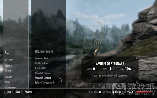
第一个,也是最显著的错误,并且是与早前游戏类似的一个问题便是,这款游戏对于空间的滥用。尽管HUD是最简洁有效的方法,但是却因此忽视了许多基本的设计规则。当我们打开游戏的菜单,我们将会在屏幕的右边或者左边看到一个单一的工具条,包含了一列分类表。虽然在库存表中有10个不同的条目(游戏邦注:这取决于玩家所选择的道具类型),但是这个列表的默认位置却不是在屏幕的最上方,而是在屏幕正中间。
虽然这种设置能够让玩家更快地进行阅读,但是很显然,你并不能一下子看到所有条目。如果是在控制器中,玩家就必须移动手柄才能阅读菜单上的其它内容。而在电脑上,你也必须拉动滑块才能点击最下方的条目,尽管在屏幕上还有许多真正可以点击的条目。
如上图所示,尽管还有许多额外空间,但是因为列表错误的定位使得这些空间只能够闲置在旁。
事实上,如果选择这些类别中的一项将能够显示第二个菜单,而这个菜单中则记录了子范畴中的所有条目,如魔药或者武器等。但是对于下方条目来说,这些最多只能容纳10个条目的目录和魔法类别却完全是个灾难。因为绝大多数条目对于格式都有很大的要求,特别是各种魔药,材料,事物等道具,如果这时候不能合理地使用屏幕空间并根据特定的美学布局进行适当定位,那么玩家有可能就必须花费10秒钟甚至更久的时间去寻找他们想要的道具。但是如果能够添加另外一列,便能够几乎完全地解决这个问题,将列表放在屏幕的最上方而不是正中间能够减少玩家不必要的操作。
最后是关于道具或者法术等的呈现。尽管,让3D模式或者特定道具的质点效果占据了整个屏幕的50%以上空间有时候是个不错的主意,但是这时候道具属性以及描述的屏幕占有量就仅为20%。其实我完全不理解为什么会这样。这时候玩家在目录中的绝大多数时间都将用于滑动鼠标寻找道具,而不是关注3D模式。此外还有另外一个用于检验模型细节的选项,所以为何它们会默认占据了这么多空间?我想这可能是为了通过展示美好的模型而体现美术设计人员的倾心投入,但是让这么多不重要的功能占领绝大多数空间就是游戏界面的错误所在了。
文本 vs.图像
《Skyrim》菜单的一个显著特点是,它们几乎未使用任何图像,而是用文本取代,并主要通过字母顺序进行排列。这是近来许多现代游戏所频繁使用的一种模式,它是打着“摆脱《俄罗斯方块》目录”的旗号进行销售,或者说是一种“流线型化模式”。不幸的是,这种模式同时也错过了图像和图标所拥有的许多优势,而这也是文本所不具备的。
虽然灵活的排序选项以及文本的使用并不是错误的决定,但是我想要在这里强调的是,文本,特别是在电视屏幕这种显示空间较局限的平台上,它所需要的空间远远比图标多得多,而且也比较难以识别。这些用于定义Skyrim菜单系统的冗长目录几乎占据了一半的屏幕空间,而如果是传统或者像角色扮演游戏之类的目录图标,就不再需要庞大的3D模式,也就能够节省出大量的屏幕空间了。
角色扮演游戏的一个最显著特征,特别是在西方国家中,都很强调“纸娃娃”形象,或者说是游戏角色的图示。传统上,游戏的图像经常会受到一些技术限制(甚至是早前的《上古卷轴》),就像是一些强调细节和独特特征的游戏界面经常让许多普通游戏引擎无能为力。但是随着时间的流逝,这种做法已经不再盛行,主要是因为很多现代游戏都能够在游戏或者过场动画期间呈现出精细的3D玩家角色。
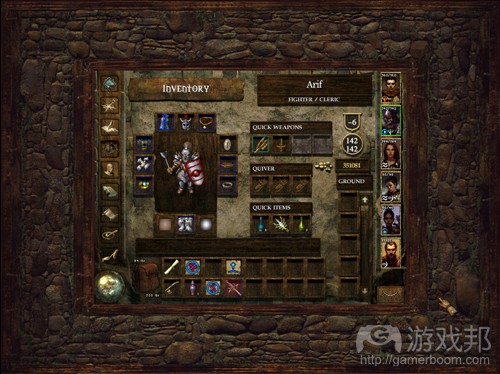
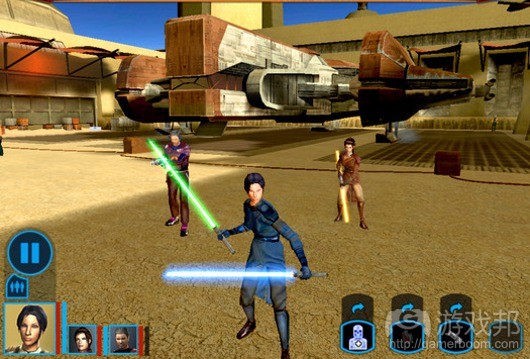
如上图,尽管游戏手柄并未得到明显优化,但是《Icewind Dale》以及其它使用Infinity Engine开发的游戏都更加侧重于图像表现而非文本。
尽管最初游戏中都用“纸娃娃”的形象去表达游戏角色,而无需创造出高清晰且形象的动画形象,体现出脸,性别,装备,服饰等,同时它也未表现出用户界面的一些重要目的。而这种“纸娃娃”其实也并不是空壳子的存在,它同样也能够表现出角色的装备,如全副武装,佩戴武器,携带附身符等等。而如果能够再附上一列“装备”目录表,玩家便能够更快速更明了地知道自己在何种时间佩戴了何种道具。
但是,《Skyrim》用上述说到的3D模式替换掉“纸娃娃”功能,所以导致玩家很难去辨识游戏角色在特定时间使用了何种道具。举些例子来说,如果我在游戏中的角色是一名勇士,除非我在进入游戏的那一刻就佩带着武器,要不我真的不知道自己的装备是什么,因为我只能在后面看到屏幕的指示才能知晓答案。而如果我扮演的是名魔术师,那么除非我在一开始就知道自己具有何种法术,要不我只能乱按快捷键了,并且可能会因此发射出许多错误的法术。
比较《Skyrim》与《Icewind Dale》的用户界面,我们会发现比起现代技术以及苹果主导着的技术产业,早前的无限引擎能够生产出更多直接有效,且更具有吸引力的用户界面。早前的引擎不仅拥有好看的图像,而且玩家只要简单地点击鼠标,便能够快速地找到每一件道具,获得更多详细的信息,不必再面对像《Skyrim》菜单中不知所云的道具装备以及欠缺的道具选择了。甚至是15年前的一款游戏《Arena》在这方面也胜于《Skyrim》。
用户界面发展史上最糟糕的屏幕
这个小标语一点都不夸张。因为在我眼中《Skyrim》真的在朝着这个“史上最糟糕的界面元素”靠近着。主要体现在用于升级的技能菜单中。它几乎违背了所有用户界面设计原则,而且它这么做仅仅是出于一个原因,也就是“炫耀”它出众的图像。
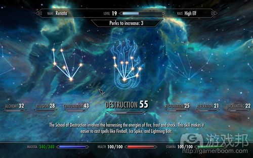
如上图,它的技能屏幕也未能够提供给你明确的技能选择。
屏幕上的技能设置就像是布满夜空的星座,而每一个星座都代表了一种特殊的技能。在我印象中,以前的《Elder Scrolls》便布满了各种星座,但是换到现在的《Skyrim》,我们却找不到“满天繁星”了。我貌似离题了。但是诚实的说,《Skyrim》的确存在许多屏幕问题需要我一一罗列出来:
1.根本不可能一下子看到所有技能。如果你想要知道自己的技能级别,你就必须左右移动你的鼠标,并且花费几秒钟的时间关掉一些输入窗口,然后将目录移动到你所希望的地方。
2.浪费了许多额外的屏幕空间。比起直接罗列出独立的图像,游戏只是提供与图像相关的链接,而因此导致屏幕一次只能陈列出一些道具。
3.同时违反了游戏世界与现实世界中的一些惯例。从小开始,我们接受的教育便是从左到右去阅读资讯,并从上到下去罗列条目。而这种惯例不只适用于现实生活与工作中,也同样是众多玩家所熟悉的一种游戏习惯。但是,《Skyrim》却按照从右到左的方法去罗列条目,而因此违反了我们所认可的条目罗列直觉。
4.默认目录出现在屏幕中间而非左边。尽管将玩家当前选择的技能罗列在屏幕中间显得更为直观,但是实际上这在无形中增加了玩家的任务,即他们不得不左右扫射,寻找其它技能条目。
5.不论是左边还是右边的列表设置都意味着玩家很难从“起始点”开始进行选择。通常情况下,在游戏中我们总是希望信息是按照一个较为连贯的方式进行排列,但是在《Skyrim》中,左右两边的罗列方式却破坏了玩家心目中的信息空间结构。除此之外,因为我们看不到屏幕以外的内容,所以如果某些内容不能立马体现出来,你便不能够明确地告诉玩家这些条目与其它条目之间的关系。
6.电脑上的控制方式太过于混淆,且很难使用。玩家只能够将目录移到左右两边才能用鼠标进行点击。试想一下当你要点击一个较偏的道具,那么这种设置对你来说真的有够郁闷。我的意思是,难道在这款游戏中鼠标就是只是一个光标的存在吗?
7.在查看不同技术的能力,或者进行升级时,玩家一次只能够看到一种技能的相关信息。这就使得他们很难一眼看穿所有信息,并且难以比较并衡量不同技能的优势所在。
8.玩家不得不回到技能菜单去改变不同的技能。在电脑以及控制器中所设立的控制方法需要玩家利用“后退”按钮关闭整个技能屏幕,而不是回到主菜单中。为什么要做这些背离惯例的设置?我也不知道。
9.操纵不同的技能是一个乏味且困难的过程。在游戏中,比起目录,技能是通过不同的星星(星座)表现出来,而玩家必须使用“模拟手杖”或者“鼠标指针”去“通过”这些星星。如果你的移动不够精准,你就不得不浪费更多时间去通过选择错误的技能。此外,你从一个技能移动到另一个技能需要耗费2秒钟,而如果你想要找到一些不同的技能,你可能需要花费更多精力和时间了。
10.用户界面因素以及摄影视角阻碍了某些技能。比起一眼就能够看到所有技能,这款游戏中的摄影视角让玩家一下子只能看到部分技能。有时候,我们通常不能在屏幕截图中看到“新增加的额外技能”,游戏中一些本应该显现的技能却经常被忽视,而让玩家不得不要求游戏增加新技能。
11.当玩家获得升级时,他们也不能够改变自己之前所做的选择。选择一种技能后改变想法了?如果你误按了后退按钮是否会将自己踢回菜单页面?糟糕,你陷入自己的选择困境中了。几乎我之前玩过的每一款单人角色扮演游戏都带有“确认改变”按键,而这个按钮的功能是基于菜单而不是玩家所选择的道具。但是为什么《Skyrim》却不采用这种做法呢?
虽然不知道是谁设计了这款游戏的用户界面,但是我真的不能理解他们怎么能无视游戏中这么多基本问题的存在,一般来说,在游戏开发过程中肯定会有人对游戏进行测试并提出不足之处,但是这款游戏却没有。甚至只能让玩家在游戏中忍受这些让人郁闷的界面问题。
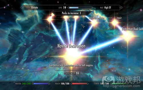
如上图,其实无处不在的光标并不会太糟糕,但是漫无目的的滚动就是它真正的问题所在了。
也许,游戏设计者曾想到一个主意——“如果让星座中的不同星星代表不同的技能,这也许是个不错的方法。”然后美术设计人员便会开始构思这个观点,并描绘出真正好看的图像以及角色。但是,如果不落实行动,从用户界面的视角去看待这个观点,并权衡一切因素,如此导致的结果只能是乏力且无趣的。有时候,开发者会执着于自己所认可的观点,并以此影响游戏的其它元素,而在这个例子中,Bethesda的设计者便是至始至终地坚持着自己的想法。结果,为了维护一个好看的图像而导致游戏中某些最重要的界面因素遭到了破坏。
结语
我想再次强调,在《Skyrim》中我度过了有趣的游戏时间。除了我所抱怨的用户界面以及游戏的电脑版本之外,这款游戏真的很优秀,很有趣,至少比起Bethesda早前的游戏进步了许多。除此之外,在《Skyrim》也有一点关于用户界面的因素我很喜欢,也就是在选择菜单时的鼠标姿态。我真的不想指出是谁的错,我也并未在Bethesda工作,不了解他们的企业文化,也不知道谁在做决策,以及员工在制作游戏中有多少“自由”。简单地来说:关于我的抱怨并不参杂任何个人情绪,我只是真心希望他们能够在此进行改进。
虽然如此,我实在不能理解带着如此糟糕的用户界面怎么会让《Skyrim》成为一款AAA级游戏?如果Bethesda没有一名专门的界面设计者或者工程师,那么他们就必须赶紧进行招聘了。如果他们仍旧执着于以美学为代价而牺牲功能和可用性,那么我想这家公司有必要针对这些问题进行更深入的思考了,想想如何做才能够让玩家的游戏体验不受到破坏。用户界面是游戏中最重要的一部分,所以值得所有开发者加以重视。(本文为游戏邦/gamerboom.com编译,拒绝任何不保留版权的转载,如需转载请联系:游戏邦)
User Interface Analysis: Skyrim
by Eric Schwarz
In my previous article, I took a pretty scathing and critical look at Skyrim’s PC user interface, as well as some of the issues with the port in general, such as poor performance. Bethesda released a day-one 1.1 patch just after I had written the article, which fixed a number of the interface problems (such as inconsistent keyboard and mouse controls), but it’s clear that the shipping version of the game still had some major problems, and likely that the PC version fell by the wayside in order to hit that majestic “11/11/11″ shipping date.
Though user interface is something that one can write books on, and has been the subject of a number of my previous articles, Skyrim’s user interface is something which I feel deserves specific scrutiny beyond the PC compatibility and usability complaints I voiced. Indeed, Skyrim has, for all its sleekness, has, to be completely frank, one of the worst user interfaces I have had the displeasure of using. Skyrim, the game, is one of Bethesda’s best works and a substantial improvement over previous ones, I do want to stress… but actually interacting with the game is an exercise in frustration, and the interface itself violates so many fundamental design tenets that it’s downright upsetting.
Oblivion and Fallout 3, it’s fair to say, did not have the best user interfaces. Their layouts were a bit confusing and inconsistent, there were too many tabs, menus, nested menus, menus with multiple pages and sub-screens, etc. Moreover, in Fallout 3, close to two-thirds of the screen space was taken up by the Pip-boy 3000, a fancy model with lots of shaders which had precisely no gameplay function whatsoever (but it sure did look neat, huh?). One would think that after these two instances, Bethesda would go back to the drawing board and try to improve things for the better.
Initially, it looked that way. Bethesda’s bold new iPod-esque design, with plenty of clean, futuristic fonts and scrolling “cover flow” menus was clean and seemingly efficient, removing a lot of the excess baggage of previous menus and more effectively organizing information. It’s fair to say that this is one of the more radical redesigns of a user interface in a modern console game short of Fable III’s interactive 3D Sanctuary. However, like Fable III, Skyrim completely forgets that conventions exist for a reason… and demonstrates that Bethesda really have not learned very much about designing interfaces at all.
Poor Use of Space
The first, and most glaring fault, and a problem shared with their previous games no less, is an almost criminal misuse of space. Though the heads-up-display is minimalistic and efficient actually getting into the menus demonstrates an almost complete ignorance of even the most basic design rules. Upon opening up one of the game’s menus (inventory or magic are the two most common), one is greeted with a single sidebar on the left or right side of the screen, containing a list of categories. While there are ten distinct entries on the inventory list (depending on what types of items the player has), the default position for the list is not at the top of the screen, but at the center of the screen.
While this is immediately more readable, it quickly becomes apparent that not all entries can fit on-screen at once. On a gamepad, this means that sometimes you’ll need to do additional scrolling to be able to read some of the additional items in the menu. On the PC, you’ll need to actually scroll the list just to be able to click on the items that fall off-screen, even though there is more than enough real estate on screen to click each of them.
Despite all that extra space up top, the default list position makes no use of it whatsoever.
Actually selecting one of these categories will reveal a second menu which lists all items within that sub-category, i.e. potions or weapons. However, whereas a single column works for the smaller, ten-items-at-most list for inventory and magic categories, for the items underneath, it’s a complete disaster. While only a few items won’t put any stress on the format, when you have potentially dozens or even hundreds of items, as in the case of various potions, ingredients, food items, and so on, this misuse of screen space and fixation on adhering to a specific aesthetic means that sometimes it can take ten seconds or more to even reach the item you’re looking for. Adding another column would have mitigated the problem almost entirely, and placing the default list position at the top of the screen rather than the center would have further reduced additional scrolling.
Finally, there’s the item or spell display itself. Though it likely seemed a good idea at the time, over 50% of the screen space is taken over by a 3D model or particle effect of a given item, with attributes and a short description taking up close to 20% of the entire usable screen space. Why this is, I cannot fathom. Most of your time in the inventory will be taken up scrolling through items, not staring at 3D models. Furthermore, a separate option to examine the models in detail already exists – so why do they take up so much room by default? I imagine the goal was to show off the pretty models their artists no doubt worked very hard on, but to devote so much screen space to such a non-essential function is a major interface slip-up.
Text vs. Pictures
One immediately apparent characteristic of Skyrim’s menus is that they almost entirely eschew pictures, instead replacing everything with text, sorted alphabetically in most cases. This is a trend I’ve seen in a lot of modern games lately, and is often sold as “getting rid of the Tetris inventory” or the more general “streamlining.” Unfortunately, such a mode of thinking completely misses out on some of the many advantages that pictures and icons have over text.
While smart sorting options and using text aren’t outright bad decisions, I want to stress, text, especially on a TV screen where real estate is more limited, takes up significantly more room than icons can, and have the immediate downside of being less easily identifiable. Those lengthy lists which define Skyrim’s menu systems could take up half the space if more traditional and RPG-like inventory icons were used instead – and it would have further eliminated the need for a large 3D model to take up the majority of screen space.
One of the most defining features of RPGs, especially in the West, has been a paper doll feature, or a graphical representation of the in-game character. Traditionally, this was done (even in previous Elder Scrolls games) due to technical limitations, as highly-detailed and unique sprites were often beyond the graphical capabilities of many game engines. Over time, this practice has generally waned, mostly because modern games are able to display a high-detail 3D representation of the player character anyway, either during gameplay or in cutscenes.
Though clearly not optimized for a gamepad, Icewind Dale and other Infinity Engine games accomplish far more with pictures than with text.
Though the paper doll was initially included in games as a compromise, a way to have a customizable character without needing to create high-detail animated sprites for every possible combination of races, sexes, equipment, clothing, and so on, it also ended up serving a very important purpose as far as user interface goes. The paper doll, more than just a vanity, helped to instantly and immediately express exactly what items a player character had equipped – what suit of armor, what weapon, what magic amulet, and so on. When coupled with an “equipped” inventory sorter of some variety, it meant that players could quickly and easily figure out what items they had equipped at any given time, literally at a glance.
Skyrim removes the paper doll function entirely in favor of the aforementioned 3D models, and the result is that it’s actually harder to figure out what one’s character is using at a given time. Playing as a warrior, unless I have my weapon at the ready, I genuinely have no idea what I have equipped, potentially until it’s too late and I meet the game over screen. Playing as a mage, unless I have my spells at the ready, I have no idea what I can cast at a given moment, leading to much mashing of hotkeys – and furthermore, as many spells share similar visual effects, often I find myself casting the wrong spell for a situation because I can’t even tell them apart until I’ve fired them off.
Comparing the interface in Skyrim to the interface in Icewind Dale, it seems that the old Infinity Engine was capable of producing a more immediately usable, quicker, and more attractive interface than all the modern technology and theft from Apple in the world could. The pictures look good, it’s easy to see what each item is, there are reams of more detailed information to be had at a single mouse click, quick-slots are easy to set up, it’s never a mystery what items I have equipped, and there’s even something tactile about the weighty sound effects and item selection lacking from Skyrim’s sterile menus. Even Arena did some things better than Skyrim, and that was over fifteen years ago.
The Worst Screen in the History of UIs
That header is not hyperbole. I think that Skyrim has genuinely managed to lay claim to the title of “worst interface element ever made.” It comes in the form of the skills menu, used primarily for leveling up. It violates almost every single rule about designing user interfaces, and it does so for only one reason – to show off a pretty picture.
Among many other problems, the skills screen doesn’t even give you an idea of how many skills there are to choose from.
The gimmick with the skill screen is that it resembles a number of constellations in a night sky, with each constellation representing a specific skill. I was under the impression that in previous Elder Scrolls lore, it was birthsigns that were the constellations, but I guess that idea was thrown out the window as birthsigns have been removed in Skyrim. But I digress. There are honestly so many issues with this screen that I am just going to list them one-by-one.
1.It’s impossible to see all the skills at once. Want to know what your skill level in something is? Prepare to do some additional left and right scrolling. Depending on what skills you use, this could mean several seconds and close to a dozen discrete inputs to move the list along to where you want it.
2.It wastes a lot of extra screen space. By linking each of the headers to an image, instead of, say, displaying multiple rows or a vertical list with independent images, the numer of items on screen at once is further limited.
3.It needlessly violates conventions both in games and in the real world. From an early age, we are taught to read information left to right, and to list items top to bottom. This convention may not be the ultimate in organization, but it works and most players are going to be used to it. Instead, Skyrim presents a left-to-right list of items which is completely counter-intuitive to our existing understanding of how lists work.
4.The default point is the center, not the left side. Though it may seem more intuitive to place the currently-selected skill in the middle of the screen, in actuality it creates more work for the player, as the eyes have to travel both left and right to view other skills.
5.The list scrolls both left or right, meaning there is no “starting” point to go from. Usually in a game I want to know my information is organized in some sort of coherent way, but in Skyrim, the left and right scrolling ruins any spatial organization of information players might have. Furthermore, anything that’s off-screen might as well not exist at all, so if it’s not immediately visible, you probably won’t have a clue of exactly where it is in relation to the other items.
6.On the PC, the controls are baffling and awkward. Mouse clicks only move the list one position left or right. Think you can click on one of those far-off items to select it? Too bad. I mean, really, what do you think that mouse even is, a cursor or something?
7.When it comes time to inspect the perks in the skill trees themselves, or level up, only one perk’s details are visible at one time. This makes it impossible to view information at a glance, and furthermore means that it’s harder to compare different perks to one another and weigh trade-offs.
8.You have to go back from the perk menu to change to a different skill. The way the controls are set up both on PC or gamepads, using the usual “back” button actually closes the entire skills screen, rather than going back to the main list. Why the needless break from convention? I certainly couldn’t tell you.
9.Navigating through different perks is a tedious and difficult process. Rather than using a list, perks are represented by stars in each constellation, and must be “traveled” to using the analogue stick or mouse pointer. If you’re imprecise with your movement, be prepared to waste time as you travel to the wrong perk selection. Furthermore, it takes around two seconds to move from one perk to the next, which itself can grow irritating if you want to find something at the opposite end of the perk tree.
10.UI elements and camera perspective can actually block out perks that should be visible. Instead of being able to see all the perks at once, the angle of the camera means that only a handful of them are even visible in the first place. In some cases, such as the “Perks to increase” counter visible in the screenshot, the titles of perks that should be visible are actually blocked out entirely, requiring additional scrolling.
11.When leveling up, there is no way to go back on a selection you’ve already made. Chosen a perk and then change your mind? Maybe pressed the back button by mistake and kicked yourself out of the menu again? Too bad, you’re stuck with your choice. Almost every single RPG I’ve ever played has had a “confirm changes” button somewhere, usually upon fully exiting a menu rather than immediately after selecting a given item. Why it’s not in Skyrim, I can’t say.
I honestly do not know who designed this portion of the interface, but it has so many elementary problems that I have trouble understanding how it even made it into the game – surely, somewhere, someone must have said “you know, this doesn’t really work well”? And yet they didn’t – it’s in the game, and players have to suffer through it.
As if scrolling everywhere wasn’t bad enough, doing it in different directions presents its own share of issues.
I have a theory about what likely happened. Somewhere, a designer came up with the idea… “it’d be cool if there were constellations, with all these stars on it representing skills.” Then, some artist whipped up a neat concept that looked really pretty, and everyone was on board. However, in not sitting back and asking exactly how it would work from a user interface perspective, what the trade-offs were, and so on, the result was something not at all enjoyable to use, or intuitive. Developers sometimes get married to an idea they really like, to the point where it can sometimes interfere with the rest of the game… in this case, Bethesda’s designers were probably dead-set on this idea. As a result, one of the game’s more important interface elements was utterly ruined… all for the sake of a pretty picture.
Conclusion
I again want to stress that I have been enjoying my time with Skyrim. The game is great, it’s a lot of fun, and aside from my complaints with the interface and the PC version of the game, it really is a great experience compared to previous Bethesda titles…. and for what it’s worth, there is one thing about the UI I do like – the mouse/stick gestures for selecting menus does work very well. I also don’t want to point any fingers at anyone in particular; I don’t work for Bethesda, I don’t know their company culture, and I don’t know who makes exactly what decisions, or how much freedom and back-and-forth there is. Put simply: there is nothing personal about my complaints, and I genuinely hope they are ot taken that way.
Even so, I have trouble understanding how such a, frankly, badly-designed user interface ever made its way into a supposed triple-A game. If Bethesda don’t have a dedicated interface designer or engineer, then it’s clear they need to get one as soon as possible. If they’re willing to sacrifice so much functionality and usability for the sake of aesthetic gimmickry, on the other hand… well, then I think maybe there are deeper problems at Bethesda that the company needs to work out, and in a way which doesn’t leave their players saddled with the soiled fruits of their experimentation. The interface is one of the most important parts of the game; it’s time to see it given the respect and attention it deserves.(source:gamasutra)
上一篇:细数游戏设计师常犯的10大错误






 闽公网安备35020302001549号