解析游戏UI对引导玩家执行操作的重要性
游戏邦注:本文原作者是Sumo Digital成员Alex Moore,他首先说明了UI的重要性,并以《神秘海域2》为例,解答了传统HUD制作欠佳的原因。
我喜欢考虑做出一款好游戏和一款超级游戏之间的差别:理解UI如何与游戏体验相适应。我之所以写出这篇文章,是受到了上世纪八十年代的一本书的启发:
众所周知,如上图所示,UI(用户界面)就是用户与电脑之间的沟通桥梁,负责传输二者之间的信息。我们通过UI输入信息,又通过UI取回反馈。这最简单的概念之一,也最难处理好的东西之一。
软件公司肯花大价钱研究UI,是因为他们可以借助UI来完成某些使用困难的东西。游戏公司也在UI上耗费相当多的功夫,但往往把它当成与开发过程的其他环节相分离的单元。
你确实可以说当一支UI小组结束了开发工作,插入他们的内容时,2D HUD元素就占据整个游戏体验了;但你却可能无法确切地说出团队何时明白UI为何物、为何如此重要。
万物皆UI
你首先要明白,游戏中的所有东西都属于UI,无论是什么类型的游戏。但因为我个人对第三和第一人称射击游戏的制作比较有经验,所以我就以射击游戏为例。所谓UI,从正门的宽度到墙壁的高度,所有环绕着玩家的东西都是UI的组成部分。
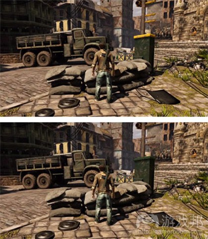
以上两幅图片取自《神秘海域2》,且其中一幅已经被我PS过了。你能发现二者有何不同吗?如果你玩过这款游戏,即使有些地方不是很明显,你也一眼就能看出差异:第一张图中有大块的黄色。这就是该游戏使用的视觉语言——玩家可以爬上那个黄色的物体。这对身处游戏世界的玩家而言,相当于一种明显的指示,因此,不需要覆盖顶端的2D元素。
这是一个比较显著的例子,但有些看似微不足道的东西也可能起到引导玩家的作用。如果你想让玩家进入某个通道,那就在通道上添加一个闪光灯,或者在遥远的地平线添加一个显著的轮廓作为路标:每一个元素都是在告之玩家所处位置和前进方向。识别图形是人类大脑最惊人的部分之一,但这种能力是福也是祸。说它是祸,因为我们得彻底依靠这种识别能力。如果团队成员不能遵过这套规则,游戏就会遭殃,因此,你得启用你的视觉语言集合,然后清晰地表达你的意图。
在《神秘海域2》的例子中,我们得出的要点是,不只是把能爬的东西涂成黄色,还要确保玩家不能攀爬的地方不是黄色。一致性是关键。这样会不会把《神秘海域》变成一个“找黄色的东西爬上去”的游戏?是有那么一点儿。但也不必批评:这至少还有点乐趣。开发者意识到这一点后,就更加创意地处理黄色的物品——有时候有点儿模糊,但玩家找到时又变得足够清晰(游戏邦注:或弹出提示信息);如果你不能尽早找到黄色的物品,你就会怀疑是自己的问题,而不是游戏本身的缺陷。
HUD
若干年前曾出现一股趋势:摆脱传统的HUD。因为大家认为这种传达信息给玩家的方法已经过时了,是时候改善了。能不能抛掉传统的HUD,很大程度上,取决于游戏的类型,但如果做得好,没有传统2D HUD的游戏也让人感觉良好。问题是,能做得好的情况极其少——《金刚》仍然是最佳典范之一。那么,为什么会这么困难呢?
好吧,HUD归根到底其实与控制器有关。
设计师总有一个大野心(我也感到愧疚),就是确保控制器的每个键都映射一个功能。但是,控制器上的按键那么多,意味着功能也不会少,所以,给予于家的反馈肯定是相当之多。
关于平衡游戏功能和游戏在智能手机更易使用的原因,还有非常多讨论可以写出来,不过我现在仅能以一句话奉劝设计师:可以使用控制器上的每一个按扭,但请注意按键对用户体验的影响。
你创造的每一种功能、每一种新添加的特征,必须让玩家理解——实现的办法很多,不要单纯地相信一个2D HUD就可以帮你解决问题。2D HUD可以广泛使用,但如果你能和整个美工、关卡小组的成员同心协力,你会发现,除了2D HUD,可以派上用场的工具还有很多。(本文为游戏邦/gamerboom.com编译,如需转载请联系:游戏邦)
Opinion: UI Is The Game, The Game Is UI
by Alex Moore
[In this reprinted #altdevblogaday-opinion piece, Sumo Digital's Alex Moore explains why everything in a video game is the user interface, using Uncharted 2 as an example -- and why traditional heads up displays are rarely done very well.]
I’d like to look at one of the things that makes the difference between a good game and a great game: understanding how the user interface fits into the experience. I’m going to do this with the help of some 1980s text book magic:
As we all know, the user interface is, as shown in my amazing diagram above, the bit that sits between us humans and them computers. It takes input from us and gives us a response back. It’s one of the simplest concepts to understand, yet one of the hardest things to actually get right.
Software companies spend a fortune on research into user interfaces because they can make something successful or render something clever too difficult to use. Game companies do spend a fair amount on UI, but often as a disconnected unit from the rest of development.
You can really tell when a UI team has been brought on towards the end of development to plug in their bit, and 2D HUD elements dominate the experience. Conversely, you can really tell when a team understands what UI is and why it’s so important.
Everything Is The User Interface
The biggest thing that takes time to understand is that everything in a game is the user interface. It doesn’t matter what kind of game it is but, as my experience lies in third- and first-person shooters, I’ll use those as an example. Everything from the width of your doorways to the height of the walls that surround the player is part of the user interface.
As an example, on the right are two pictures. Spot the difference between the original shot from Uncharted 2 and my photoshopped one. If you’ve played the game you’ll instantly know, and even if you haven’t it should be fairly obvious: there’s a good chunk of yellow on the top image. This is the visual language Uncharted uses – the player can climb on yellow things, and therefore this is a strong signpost to the player in the world. 2D elements aren’t required to be overlaid on top.
This is a strong example, but things that may seem trivial can be used to guide a player around. It’s common to add a flashing light to a doorway you want the player to go through, or adding a memorable silhouette on a distant horizon as a landmark: each and every element gives information to the player as to where they should be going. Its ability to spot patterns is one of the most amazing parts of the human brain, which can be a blessing and a curse. A blessing because it enables us to be very subtle in some of the language we create for the game, and a curse because we have to remain thoroughly consistent with it. To achieve this, you need to have your visual language set and clearly communicated to the team, because if they don’t adhere to a set of rules, the game will suffer.
The point here is that, in Uncharted’s case, it’s not just about painting anything that can be climbed yellow: it’s also about making sure that there isn’t anything that the player can’t climb painted yellow as well. That consistency is the key. Does this turn Uncharted into ‘hunt the yellow thing to climb next’? Yes, a bit. But that’s not a criticism: it’s part of the fun. The developers realised that and become more creative with what is yellow – sometimes slightly obscurely but often clear enough that when you do find it (or the hint system kicks in), you feel that you were at fault for not finding it earlier, not the game.
(I’m aware that Uncharted 2 changes from yellow to red ledges at one point, something that I’m sure caused a lot of discussions on the team. Ideally I don’t think it should have changed, though by the point that it did, players were so far into the game that they inherently understood the rules of what could and couldn’t be climbed on because the rest of the art style remained consistent.)
Heads Up
There was a big trend a few years ago to try and get rid of the traditional heads up displays (HUD), a feeling that it was an outdated method of relaying information to the player and that we can do better. It depends a lot on the type of game, but when done well, a game without a traditional 2D HUD can feel very good. The problem is, it’s very rarely done well – King Kong is still one of the best examples of it. So, why is it so difficult?
Well, a lot of it actually comes down to these things on the right:
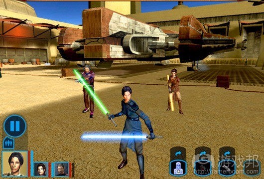
There’s a big desire from designers (and I’m guilty of this as well) to make sure that every button on the controller is mapped to a function. And there’s a lot of buttons. Which means a lot of features. Which, in turn, means a lot of things to give feedback to the player on.
There’s a whole other discussion to write about with regards to balancing your feature set to the needs of your game, and also why gaming on a smart phone is so much more accessible, but for now I’ll conclude with this for designers: it’s absolutely fine to use every button on the controller, but be aware of the knock on effects that has to the user experience.
Every function you create, every feature added, has to be understood by the player. There are many ways of achieving that, but don’t just believe that a 2D HUD can do the job for you. It can go a long way, but if you get your entire art and level team on board as well you’ll discover there are many more tools in the box.(source:gamasutra)
上一篇:触屏互动界面或成游戏未来发展方向


 闽公网安备35020302001549号