iOS应用的人性化界面设计原则
优秀用户界面遵循的是基于用户思考和工作方式而非设备性能的人性化界面设计准则。不具吸引力、复杂或不合逻辑的用户界面甚至可以导致一款绝佳的应用看似很难使用。漂亮、直观和富有吸引力的用户界面能够提升应用的功能性并吸引用户关注。
美学完整性
美学完整性指的并非应用界面有多漂亮,而且应用外观与功能的整合程度如何。比如,允许用户完成创造性任务的应用通常会将精致的装饰性元素放在背景之中,同时通过提供标准控制和行为等方式来突出任务。假如此类应用有着过分复杂的用户界面,用户或许就会对其感到相当迷茫。
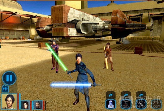
在提供拟真性任务的应用(游戏邦注:比如游戏)中,用户期待能够看到有趣的漂亮界面。尽管人们并不期待能够在游戏中完成某种创造性任务,但他们依然希望游戏的外观能够与体验相符。
一致性
界面的一致性允许他们将某款应用中获得的知识和技能用于其它应用中。一致型的应用并非对其他应用毫无独创性的复制,这种应用利用的是人们已经熟悉的标准和范例。
要判断应用是否符合一致性原则,你需要考虑如下问题:
1、应用是否与iOS标准保持一致?是否正确使用系统提供的控制、视图和图标?是否以可信赖的方式整合设备的功能?
2、应用本身是否具有一致性?文字是否使用的是统一的属于和字体?相同的图标是否代表着相同的含义?当人们在不同的地方实施相同的动作时,他们能否预测出结果?应用中的自定义用户界面元素的外观和行为是否相同?
3、应用是否与先前的版本保持一致?词语和含义是否与之前相同?基本概念是否保持不变?
直接操作
如果用户可以直接操作屏幕上的物体,他们就更能为人物所吸引,也更容易理解动作的结果。iOS用户的直接操作感因多点触控界面而得到增强。使用手指来操作使他们更能感受到对屏幕上物体的操作杆,因为他们无需使用鼠标之类的工具就可以直接点击这些物体。
比如,如果要直接放大或缩小某区域的内容,用户无需点击聚焦控制,只需要在屏幕上做出滑动手势即可。在游戏中,玩家移动屏幕上的物体来与之直接互动。比如,游戏可能会在屏幕上显示组合锁,让玩家滑动来解锁。
在iOS应用中,人们可以体验的直接操作包括:
1、旋转或移动设备来影响屏幕上的物体
2、使用手指来控制屏幕上的物体
3、用户马上可以看到他们的动作产生的结果
反馈
反馈表示对用户动作的认可,告知他们过程正在发生之中。人们希望看到自己在执行控制后立即得到反馈。
iOS内置应用以某些显而易见的改变来对用户的每个动作作出回应。比如,当用户点击某列表选项时,它会立即高亮显示。如果按住数秒时间,有些应用会显示对该功能的说明信息。
精致的动画也是种反馈的方式,帮助用户认清动作的结果。比如,屏幕上新增一行加载条,使得用户可以从视觉上追踪进展的过程。
音效也能够给予人们反馈信息。但是不应该将音效作为主要或唯一的反馈机制,因为人们或许会在过于嘈杂或必须关闭声音的环境中使用应用。
隐喻
如果应用中的虚拟物品和动作隐喻着现实世界中的物体和动作,那么用户就会迅速掌握应用的使用方法。软件应用的典型隐喻便是文件夹的使用:在现实世界中人们将东西放在文件夹中,因而他们也能够迅速理解电脑上将文件放在文件夹中的想法。
最棒的隐喻能够破除现实生活中的物体或动作限制。比如,人们可以在电脑的文件夹中放入无限的内容,而这正是实物文件夹受到限制之处。
iOS能够提供很棒的隐喻效果,因为它能够支持丰富的图像和手势。人们与屏幕上的物体进行互动,许多情况下的操作类似于现实世界中的物体。iOS中的隐喻包括:
1、点击iPod回放控制
2、游戏中对物体进行拖拽、轻打或重击
3、滑动On/Off开关
4、轻拍照片页面
5、点击选项来做出选择
通常来说,效能最好的隐喻不会过于复杂。比如,如果软件文件夹必须要放在虚拟档案柜中,那么前者的实用性就会大大降低。
用户控制方式
初始化和控制动作的应该是人,而不是应用。虽然应用可以建议用户采取某种做法或对危险的后果做出警告,但应用不可从用户手中抢夺决定权。最棒的应用会把握好其中的平衡,既能够给人们提供他们所需的内容,也可以帮助他们避免危险的后果。
如果行为和控制较为熟悉并可以预测结果,用户就会觉得自己对应用的控制性较强。如果操作所需的动作简单且直观,那么用户可以很轻易地理解并记住他们。
人们希望能够有机会在某个动作开始之前将其取消,也希望有机会能在开展有毁灭性潜在后果的动作之前进一步确认。最后,用户还希望能够在任务进行过程中将其终止。(本文为游戏邦/gamerboom.com编译,如需转载请联系:游戏邦)
Human Interface Principles
A great user interface follows human interface design principles that are based on the way people—users—think and work, not on the capabilities of the device. A user interface that is unattractive, convoluted, or illogical can make even a great application seem like a chore to use. But a beautiful, intuitive, compelling user interface enhances an application’s functionality and inspires a positive emotional attachment in users.
Aesthetic Integrity
Aesthetic integrity is not a measure of how beautiful an application is. It’s a measure of how well the appearance of the app integrates with its function. For example, an app that enables a productive task generally keeps decorative elements subtle and in the background, while giving prominence to the task by providing standard controls and behaviors. Such an app gives users a clear, unified message about its purpose and its identity. If, on the other hand, the app enables the productive task within a UI that seems whimsical or frivolous, people might not know how to interpret these contradictory signals.
Similarly, in an app that encourages an immersive task, such as a game, users expect a beautiful appearance that promises fun and encourages discovery. Although people don’t expect to accomplish a serious or productive task in a game, they still expect the game’s appearance to integrate with the experience.
Consistency
Consistency in the interface allows people to transfer their knowledge and skills from one application to another. A consistent application is not a slavish copy of other applications. Rather, it is an application that takes advantage of the standards and paradigms people are comfortable with.
To determine whether an app follows the principle of consistency, think about these questions:
Is the application consistent with iOS standards? Does it use system-provided controls, views, and icons correctly? Does it incorporate device features in a reliable way?
Is the application consistent within itself? Does text use uniform terminology and style? Do the same icons always mean the same thing? Can people predict what will happen when they perform the same action in different places? Do custom UI elements look and behave the same throughout the app?
Within reason, is the application consistent with its earlier versions? Have the terms and meanings remained the same? Are the fundamental concepts essentially unchanged?
Direct Manipulation
When people directly manipulate onscreen objects instead of using separate controls to manipulate them, they’re more engaged with the task and they more readily understand the results of their actions. iOS users enjoy a heightened sense of direct manipulation because of the Multi-Touch interface. Using gestures gives people a greater affinity for, and sense of control over, the objects they see onscreen, because they’re able to touch them without using an intermediary, such as a mouse.
For example, instead of tapping zoom controls, people can use the pinch gestures to directly expand or contract an area of content. And in a game, players move and interact directly with onscreen objects. For example, a game might display a combination lock that users can spin to open.
In an iOS application, people can experience direct manipulation when they:
Rotate or otherwise move the device to affect onscreen objects
Use gestures to manipulate onscreen objects
Can see that their actions have immediate, visible results
Feedback
Feedback acknowledges people’s actions and assures them that processing is occurring. People expect immediate feedback when they operate a control, and they appreciate status updates during lengthy operations.
The built-in iOS applications respond to every user action with some perceptible change. For example, list items highlight briefly when people tap them. During operations that last more than a few seconds, a control shows elapsing progress, and if appropriate, the app displays an explanatory message.
Subtle animation can give people meaningful feedback that helps clarify the results of their actions. For example, lists can animate the addition of a new row to help people track the change visually.
Sound can also give people useful feedback. But sound shouldn’t be the primary or sole feedback mechanism because people may use their devices in places where they can’t hear or where they must turn off the sound.
Metaphors
When virtual objects and actions in an application are metaphors for objects and actions in the real world, users quickly grasp how to use the app. The classic example of a software metaphor is the folder: People put things in folders in the real world, so they immediately understand the idea of putting files into folders on a computer.
The most appropriate metaphors suggest a usage or experience without enforcing the limitations of the real-world object or action on which they’re based. For example, people can fill software folders with much more content than would fit in a physical folder.
iOS provides great scope for metaphors because it supports rich graphical images and gestures. People physically interact with realistic onscreen objects, in many cases operating them as if they were real-world objects. Metaphors in iOS include:
Tapping iPod playback controls
Dragging, flicking, or swiping objects in a game
Sliding On/Off switches
Flicking through pages of photos
Spinning picker wheels to make choices
In general, metaphors work best when they’re not stretched too far. For example, the usability of software folders would decrease if they had to be organized into a virtual filing cabinet.
User Control
People, not applications, should initiate and control actions. Although an application can suggest a course of action or warn about dangerous consequences, it’s usually a mistake for the app to take decision-making away from the user. The best apps find the correct balance between giving people the capabilities they need while helping them avoid dangerous outcomes.
Users feel more in control of an app when behaviors and controls are familiar and predictable. And, when actions are simple and straightforward, users can easily understand and remember them.
People expect to have ample opportunity to cancel an operation before it begins, and they expect to get a chance to confirm their intention to perform a potentially destructive action. Finally, people expect to be able to gracefully stop an operation that’s underway. (Source: developer.apple.com)


