游戏操作菜单及按钮设计需知要素
作者:Rob James
也许你刚完成一款出色的Flash游戏,现在就只缺一个菜单界面,只需花五分钟完成一个背景图,插入一些文本内容,然后就大功告成了。
但有时候我却为一些游戏感到失望,它们本身是非常不赖的东西,但却有个糟糕的菜单设计。虽然菜单并非游戏机制核心所在,其重要性需让位于游戏玩法,但开发者多花点精力制作游戏菜单其实也没有什么坏处。
保持风格一致性
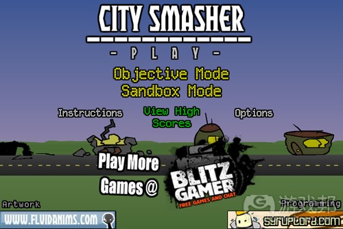
怎样才能算是优秀的菜单系统?其一就是易于使用,并且与主体风格保持一致。就拿《City Smasher》这款由syrplord和fluidAnim共同开发的游戏举例,它的菜单乍一看并无不妥,但实际上却完全与主体风格不搭调,并且易让人产生困惑。
问题出在哪呢?首先它让我费了好大的功夫才摸索出游戏玩法。玩家首先该看到的是“City Smasher”这个标题,但最抢眼的却是“play more”这个莫名其妙的链接,后面我才推敲出我得点击这种类型的文本按钮才行得通,但这个时候我已经兴味索然了。我怀疑就算它的玩法再好,也很可能会因为这种菜单设计而错失许多潜在玩家。
我承认自己是个有点老套死板的人,但我只是希望按钮更清晰明确,知道哪些东西可以点击,哪些只是一般文本内容。如果你想在游戏中添加按钮,也许就得让它看起来像按钮,但如果是拿文本当按钮,可能就会让玩家不知所措。在《City Smasher》这款游戏中,无论是文本按钮还是一般文本,它们使用的基本上是同种字体,这容易产生恼人之感。毕竟在互联网时代,大家都已习惯点击按钮,如果是一个文本链接也都会有一个下划线或者使用不同颜色的字体,或者至少会想法让它看起来有所不同。
按钮设计
那么究竟该如何设计良好的按钮?以下有些小贴士可供各位参考:
字体
从上图可发看出,左侧使用的字体很不妙,更糟的是如果它的文本采用了动态形式,那就更不容易大家辨识了。最不可取的是它采用了“新罗马字体”,看起来真让人不敢恭维。
如果你没有采用新罗马字体,那就得选择一种放大时看起来很时尚,缩小时可识度又较高的字体。一般来说,加粗字体更适用于按钮这种小物体,因为它们辨识度更高。
圆角
我是一个圆角控,因为它看起来很棒,但如果你是使用Flash圆形框工具并且要设置边框,那就得确保“线条丰满”,因为Flash在画圆角曲线时会有一些问题,使线条看起来残缺不全,这会影响圆角的美观。
调色盘
UI设计有一个极为简单的颜色设计准则,那就是尽量少用多色。如果你可以只用一种主色,那就再好不过了,总之减少颜色类型使用量会更具时髦感,不会让游戏因色彩过于繁杂而使人反感。
滤镜
Flash 8有一些强大的滤镜功能,例如阴影/发光效果等。它们看起来确实很赞,但不可过度使用这些功能。上图左侧就是那种滥用系统默认设置效果的按钮设计,而右侧的按钮就显得更加简约而体面。
当然如果你真的不想使用按钮图标(游戏邦注:有许多游戏也没有使用这种设置)那就得选对字体,Heli boarding就是选择文本字体这方面的典范,这主要是因为其设置并无凌乱之感。还有一点需要注意,除了不要将字体随便散落于菜单屏幕之上,最好是将它们规范地排列成行,将其中最重要的内容在第一时间展示于人。但奇怪的是,还是有许多游戏淡化按钮的存在,而不是将其呈现于明显之处。
总之要记住菜单和按钮虽然并非游戏主体,但它们却能代表人们对游戏的第一印象。(本文为游戏邦/gamerboom.com编译,如需转载请联系:游戏邦)
UI Design for Game Menusby Rob James
by Rob James
Well you’ve finished your most excellent latest flash game all that’s left is to stick on a menu screen. 5 minutes later with a picture in the background, slap a few bits of text around and the jobs done, sweet.
I despair sometimes, there are some great games out there with truly dreadful menu design. OK it’s not going to make it a better experience, and the game play is the most important thing but it really doesn’t hurt to put a bit of effort into making the menu as good as the actual game.
Using Consistency
So what is a good menu system ? One that’s easy to use, where everything is consistent. Take “City Smasher” for example, a great game by syrplord and fluidAnim. The game itself is a brilliant 10 minute basher, the menu on the other looks alright but is completely inconsistent and confusing.
So whats wrong? Firstly it took me ages to work out how to play the game. The first thing you see is the title “city smasher” but otherwise the most noticeable link is “play more” – no, TRY AGAIN! I finally worked out that I had to click on one of those mode buttons, but by this stage I was really bored. I suspect that despite the brilliance of the game potential players will have given up before this discovery.
Call me old fashioned but I expect it to be clear where the buttons are, some items are click-able, some are just text. If you want a button in a game, maybe make it a button, if you use text for buttons it’s hard to work out what’s what. In City Smasher the same fonts have been used as both buttons and text, which is highly annoying, be consistent. On the web people are used to clicking on buttons, if it’s a text link its usually underlined or a different colour, or at least try and make it clear.
Button Design
So what makes a good button design. Well firstly here’s some tips:
Fonts
The one on the left is a pretty awful button but what makes it worse is for some reason the text is set to dynamic so it will turn off anti aliasing on that font. Which makes it look all horrid and jaggy. Even worse is that the dreaded “Times New Roman” has been used, it looks hideous, don’t do it.
If you aren’t going to use Times New roman choose a font which is readable, you may have some ultra cool font which looks great when large but pick something which is easy to read when its small. Bolder fonts are better for small items like buttons as they are great for readability.
Rounded Corners
I’m a fan of rounded corners, they look great, but if you do them with the flash rounded box tool and want an outline make sure you “turn lines to fills” flash has a few problems drawing rounded curves to straight and you’ll invariably end up with kinks and they look horrid.
Colour Pallete
With colours there’s a fairly simple rule with UI design, try to use as few as possible, if you can get away with one main colour it looks better, its much more stylish to be minimal in your use of colour, it will stop your art turning into a psychedelic nightmare.
Filters
Flash 8 has some great new filters for things like drop shadows/glows etc. They look great but don’t over do them. The start on the left is the usual “oh the default will do” looks a bit harsh. The one on the right is a nice subtle variation.
Of course if you don’t want to use buttons (and a lot of games don’t) try and pick a clear font, Heli boarding does this a great job of using just text, mainly because there’s no clutter. Also rather than scattering text all around the screen the menus are in a column with the most important thing at the top. Although rather oddly the button you are over fades out rather than being highlighted, another thing which quite a lot of games do.
Well that’s about all for now, remember the menus and buttons don’t make a game but they are the first thing people see and first impressions do count.(source: mochiland)






 闽公网安备35020302001549号