Playdom设计师回顾《Wild Ones》成功变身过程
游戏邦注:本文原作者是Playdom游戏设计师Joshua Dallman,他改进了《Wild Ones》一些游戏机制、视觉效果等设计,成功扭转了该游戏的发展颓势,使其华丽转身成为Playdom的头牌社交游戏。他在文中通过丰富的图片和具体实例,展示了该游戏脱胎换骨的过程。
我在一年前结束了几个月的外包设计工作,成为以Playdom联合创始人Ling Xiao为主导的内部工作室首席设计师。我在这个工作室的第一个任务是重整一个状态不佳的项目—–回合制射击游戏《Wild Ones》。
单是游戏设计这个环节(不含市场营销和广告推广),我就让这个游戏增加了44%的DAU(日活跃用户)、25%的MAU(月活跃用户)和整整四倍的收益。那时由于Facebook政策发生变化,该平台所有游戏都在走下坡路。
《Wild Ones》现在是Playdom的头号种子,其每日用户流量占据该工作室所有游戏的四分之一。
正常情况下,社交游戏的规则是根据用户反馈参数制定出来的。现在这东西就代表进化和先进。我们认为在用户反馈参数问世之前,整个游戏开发过程几乎处于原始未开化的黑暗时代。
但是那些接受并且将用户反馈参数视为准则的公司,只是在那些能够通过参数反馈出来的内容优化上取得了点成绩,而这些反馈内容通常只是整个游戏缺陷的冰山一角。
拙劣的游戏设计是无法通过用户反馈指数看出来的;果子甜不甜,尝一尝才知道。用户反馈参数充其量只能说明有内容崩溃了,却无法指出具体原因所在。我认为尽管用户反参指数确实能让设计师更上一层楼,但它只是增强你的设计感,而不是取代设计感。
无需查看它的用户反馈参数,我就已发现《Wild Ones》这个游戏实在有太多设计漏洞百出,而且心里也已经有谱了。只要看这个游戏的总体表现,我凭经验就知道它本可以做得更好。
为什么我这么有自信断言它能做得更好?主要是因为这个游戏理念有广泛的吸引力和成功的先例。这种类型游戏的普遍性几乎堪比《Snake》,而《Artillery》、《Human Cannonball》、《Scorched Earth》、《百战天虫》、《iShoot》、《愤怒的小鸟》等大量轨道型射击类游戏也已经数不胜数,无需我再赘述。
《百战天虫》系列更是这类型游戏的佼佼者,推出了大量续集和移植版本,而且还在Xbox Live Arcade平台上长盛不衰。
《百战天虫》用可爱的卡通人物、武器和主题布景来缓和过激的战斗场景,从而聚集了更多粉丝和休闲玩家。同时,这个游戏仍然不乏技巧性和挑战性,满足了更多讲究策略的硬核玩家的需求。人人都爱《百战天虫》,它迷人、有趣、休闲和易上手。我很希望《Wild Ones》也能像《百战天虫》一样大热追捧。
然而那时的《Wild Ones》,实在是不堪入目、困难重重,不值一玩。我为自己定下的最高目标是,通过增加游戏的易玩性,引进更多游戏玩家,次级目标则是提高用户留存率,最后一个目标是设计出之前没有的新型创收渠道,同时保证该渠道能够为玩家所接受。
为什么把重点放在易玩性上?与大部分游戏设计师一样,我们都有相同的硬核游戏背景——例如MUD游戏、《龙与地下城》、《毁灭战士》、《半条命》和MMORPG游戏等等。当《宝石迷阵》和《美女餐厅》定义了一代休闲游戏时,我就不再锁定游戏市场上那一小撮骨灰级硬核玩家,而是迫不及待地进军“游戏为人人”的市场。
我认为,硬核游戏和休闲游戏的最主要区别在于易玩性。硬核玩家得重装他们的Linux系统核心使之与游戏兼容;而对于休闲玩家,哪怕要多点一下鼠标,都会吓退不少人。
凭借深厚的游戏背景知识,我知道应该关注的重点在哪里。《Skee Ball》是第一款因提高易玩性而大获其益的游戏。原版游戏中又大又长的滚道、笨重的球,真是特别难上手。当这款在十年后改头换面时(游戏邦注:在今天的电子游戏厅里,仍然可以看得到这个游戏小巧玲珑的新面孔),它的人气开始一路爆涨。我认为只要简单地改进游戏易玩性和提升设计,《Wild Ones》里的球也能那么容易击中目标时,《Wild Ones》也能人气飙升。
以下是我达成目标的十大设计调整:
1、无限命值
问题鉴定:在之前的设定里,玩家会出现在地图上,一旦死亡,那就是在游戏中永远地挂了,除了退出,否则不可能再进行游戏。这种创新最早是由《反恐精英》提出的,为的是增加FPS这类游戏的紧张感,而在此之前,这种类型的游戏传统上支持玩家无限复活。
但这种紧张感和惩罚对于休闲游戏,未免太过苛刻。休闲游戏应该以奖励、表扬和互动为原则。我的第一个也是最重要的设计决定就是,给玩家无限的命值,使玩家能够在一个定时回合里玩个够,且不必受到失败的惩罚。
解决方案:当玩家死亡,玩家的鬼魂就浮在屏幕上(这里是受到《Toe Jam & Earl》的启发),之后玩家便可复活。这个改动只是简单的一小步,不过却带来了多个积极作用。
首先,玩家经历了整个游戏回合,而不是其中的一部分,这不仅使玩家产生了游戏黏性,还保证了留存率(防止玩家在漫长的等待和无聊的张望中退出游戏)。另外,无限命值提高了交易量,因为玩家在整个回合里一直在射击,消耗越多子弹,就越需要花钱再买。
但无限命值也带来了一种循环效应,玩家互杀次数越多,彼此的敌意就越深,就越要提升武器等级来报仇,结果就是所有玩家的开支都会增大。这也意味着玩家能带入游戏的武器将不再受限(之前限制是防止游戏过早结束),而且武器的杀伤力能做得更大,甚至是到一击必杀的程度,反正挂掉这种事已经不成问题了(丢脸才是最大的惩罚了)。
另一个好处是改变了这种二元格局——一人是赢家(即保持得分最多的最后一个人为赢家),其他人都是输家。而调整后,无论得分多少(击杀多少)的玩家都觉得自己也是个赢家。这一调整有如此之多的优点,实际上值得写一整篇文章对它大书特书了。
可以说这个调整是做对了。用户反馈参数是不可能揭露出这种情况的。少数硬核玩家激烈反对这个调整,但调整后的游戏减少了惩罚,仍然奖励技巧性的玩法,吸引了更多玩家融入游戏。这确实是游戏重获新生的一剂强心针。
社交游戏设计者可能会认为给予玩家无限的生命值来吸引玩家是个很不高明的手段,这和在基于精力值的游戏中给玩家无限精力一样低级。不同点在于,挂掉的玩家(耗尽精力)并不是因为自己的作为或不作为而走上绝路,而是其他玩家的行动操纵着游戏走势,这对休闲玩家毫无疑问是很不公平的。
没什么办法可以让你免于早死丧命,无限命值可以让新玩家和铁杆玩家同时受益,不管怎么说,设计者总是不希望新玩家还没融入游戏就耗尽精力吧。
让玩家直接购买贵重的生命值商品这种做法确实很诱人,但这么做可能摧毁你苦心培养和积累起来的用户黏性,以及玩家的付费意愿。我把生命值变成了无限制的商品,而武器则以另一种“无限”形式存在——它让玩家源源不断地耗损弹药,每一声枪响都是钱币的哗哗声。
2、轻松开火
问题鉴定:在原版游戏里,玩家要打出一枪真是不容易——首先要找到鼠标的光标,然后调好合适的射击角度,再按下鼠标键,观察那一击的去向,最后松开鼠标。不仅是步骤多,还有时效性,这又给射击这个技术活增加一道障碍。
解决方案:观察了大量轨道射击类游戏的控制设置(包括侧视平台的高尔夫游戏)后,我去掉了原来的那种时效性的射击装置,设计了一种交替控制装置——玩家只要移动鼠标来调整箭头的角度和长度就能分别控制射击的方向和威力,且只要点击一下鼠标就能开火。
在以“加强瞄准”为卖点的升级版游戏里,这两种控制设置基本上都会在游戏中同时存在(现在市场转而亲睐这种易玩的设计特点了)。
这种标准化时效性瞄准方法在易玩性方面大大升级,现在这种巨大的、渐变颜色、多重时效、与角色尺寸相当的箭头,取代了当初那种小型的、模糊的、比人物还小的测量条。
此外,我增加了角度值和射击威力值,使交互作用更清晰。或许我们还可以看出更多有待改进的地方,但我认为最重要的就是角度和射击威力。
3、移动控制
问题鉴定:在原版游戏里,角色的移动设置真的是极其失败和纠结。因为地形的裂隙,角色常常掉进坑里,然后就再也爬不出来了。显然,大脑-鼠标-角色之间的过渡并不连贯。
另外,任何地形的改变看起来都直接限制了角色的移动,因为角色甚至跳不过最简单的一道障碍。角色移动在这个游戏里撑起半边天,半边天塌了,这游戏还能有多大趣味呢?通过键盘控制角色的移动这种设定,会直接把休闲玩家逼上绝路。
解决方案:在游戏指南里删除所有强调键盘操作的内容。重新设计后,玩家只需简单地控制和点击鼠标,就能掌控角色的移动。
我最初是打算让角色背个飞行背包来移动到目的地,但程序员巧妙地改变了游戏算法,重新平衡了角色移动,使之有效地响应玩家的指示,这样就不必大规模地增加飞行包了。
这个调整很简单:角色跳得越高,函数就越大,这样玩家基本上就能无障碍地抵达目标点,当然这里面还涉及很多算法。这是个很好的经验教训,巧妙的编程可以修复崩溃的设计,而不必在游戏中增加其他设计和功能,这一点实在很强大。
4、武器齐登场
问题鉴定:原版游戏限制了外带武器数量,只能随身带两件玩家一开始就选定的武器。说实话,这实在是太无趣了。这类游戏的乐趣在于能够使用各式武器打得遍地开花。而人为的限制却会影响游戏黏性(以及武器消耗量,从而减少了交易量),并且这种限制的唯一目地就是防止玩家带太多弹药进游戏,导致玩家速战速决,过早走向永久性死亡。
从游戏规则的明确性和实用性的观点来看,这种武器外带限制其实颇令人不快。如果玩家有武器却不让带,这并没有多大意义。也就是说,如果玩家有10件武器,却只能带规定数目(不管是2件还是几件,总之不能秒杀敌人)的武器进入游戏。限制武器数量以及这种规定本身都不合理——另外,从来没有什么用户反馈参数能反映出这种糟糕的情况。
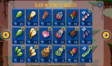
解决方案:既然玩家已有无限命值,那就没有理由限制玩家的军火数量。所以,这种限制被删除了;对于强力武器的“一次游戏的最大射击数”的规定也被取消了。现在玩家能够操上所有家伙,任意开火。我们在游戏里增加了一个“武器选择”键,里面包括了玩家的所有武器。这个设置就是这么简单、直观、清楚!
5、50种新武器
问题鉴定:这个游戏总体上来说慢节奏、讲技术、反高潮,并且沉闷。它需要更多动作、更简单的动作、更大的高潮和更多的兴奋点。这个游戏居然只提供10件武器——这就是所有的武器和破坏力了。它需要更多武器(至少某个时期),这不是再加一件两件的问题,也不是10件20件就能解决的。而是大量,大量的武器!
解决方案:再增加50种武器,加上原来的10种武器,共计60种武器。以现存的武器为模型,我设计了他们的变体作为新武器添加到游戏中,这样就不必再编写新武器程序了。
作为设计师,我认为在编写出更多程序和做出更多设计前,最大化价值首先是出自现有资产。这通常是一种偷懒的设计。
有了这么多武器,玩家在每个级别都能有专属武器,并且主菜单会通知玩家下一阶武器已解锁——这对提高于玩家留存率至关重要。
新武器在游戏的华丽转身中扮演了最耀眼角色。我设计的新武器比角色大。这不仅增加了游戏的兴奋点和高潮,也使游戏更易上手(大爆炸是玩家得高分的最简单方法)。
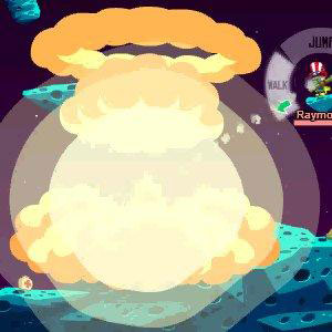
之前所有的武器运用的是那种简单、平面、拙劣的动画爆炸效果。在调整中,我们花了大量的时间在开发多图层、动态尺寸和旋转的新动画效果,形成了一个无限的爆炸图层集合。因此,每一种武器的爆炸效果都是独一无二的,这意味着每一种武器的特征、效果和价值都进一步提升了。
在交易方面,许多人忘记了产品消耗的循环效应——为了让玩家重复购买弹药,必须让玩家对产品满意,让他们觉得物有所值。强化后的爆炸效果增加了使用产品的价值,这样玩家会更积极地再次购买以重复体验那种效果。
玩家很难瞄准目标,这是另一个提升易玩性的难题。这对玩家的射击动作提出了一个苛刻的要求——精准。为了解决新武器的这个问题,我增大了武器的总体射击范围,同时保持效果的最大伤害在较小的范围上。通过这个简单的算法调整,即使是很小的炮弹也有很大可能得到一些分数,同时,直接近程射击仍然保持高得分。调整的结果就是,每个玩家都能得到更多分数,但技术型玩家仍然占优势。
武器的变体有特小号、小号、中号、大号、特大号和超大号可供选择。武器的型号越高,威力也越大。超大号的武器能以鲸鱼用户为目标了——这是社交游戏的共同设计策略。
既然玩家可以无限重生,做出比角色还大的武器也没什么不可能了。我最喜欢的绿色、全屏尺寸、秒杀激光枪叫作“Gamma Star”(当然是出自《Death Star》中的致命电波),其实它更恰当的名字应该是“Game Over”,因为它会破坏屏幕上90%的地形,同时葬送90%玩家的性命。
这些新武器同时解决了另一个问题——一般的玩家总觉得自己不能影响游戏的局势。有了更大的武器,我敢保证就算玩家没打中,那一下也够震撼了。玩家至少得到一种存在感——自己的举动对游戏也并非毫无作用。
如果玩家总是能买得起,谁关心这个武器威力有多大?一件武器打出价值5美元的一炮,那一下足够其他玩家重启电脑了——这里只是在开一个玩笑,不过相信人人都知道,强悍的武器总会让玩家慷慨解囊。
武器打出的是幽默和欢乐的火花——被击中的角色爆炸效果做得像卡通动画片一样。不断地调整和改善这些武器,就是为了让玩家能真正享受游戏的乐趣。
我相信我花在设计、改善和平衡武器上的时间—-以时钟指针走的圈数算的两周,一定能使最终产品大放异彩。在这里,我只是想让玩家享受到更多乐趣和简单的快乐。这也是用户反馈参数无法实现的一点。
6、简化菜单
问题1:Game Lobby菜单增加了进入游戏的障碍,这就极有可能提高玩家退出的概率。玩家必须点击“ready”来继续或暂停游戏,这真是多此一举。
解决方案:撤掉lobby设置;当游戏屏幕正在加载时,让玩家自动进入准备状态。在等待其他玩家的屏幕加载和同步时,屏幕只会显示一个计时器,而实际上一切都在按部就班地进行。
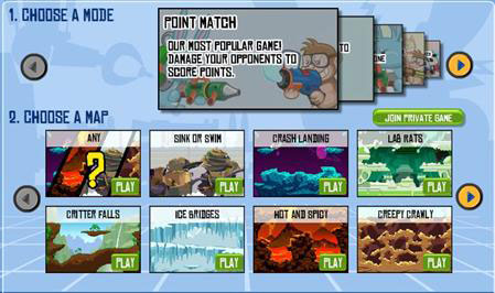
问题2:因为原版的级别选择界面设定,玩家只能郁闷地一次次滚动游戏类型选择画面,且一次只能看到一种游戏类型。最后玩家只能从一大堆带着过多自定义选项的游戏类型里挑一个出来。
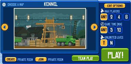
解决方案:在一个界面上显示所有(或许多)选项,玩家只需点击一下小图标就能进入各个游戏类型;用简单的游戏分类取代原版那种繁琐的自定义选项。游戏分类中包含了各个游戏类型的描述。这样玩家只需选择一个游戏类型,就相当于选择完了所有自定义选项,同时有效地过滤似类选项。
7、移除风向
问题鉴定:风向和风速增加了游戏的复杂性,玩家因此很难射击,特别是还没学会适应风的新手—-更别说瞄准目标了。玩家每次转身,风向随之改变,这再次增加了游戏难度。在只有角度值和威力值的二维坐标系里,射击难度是呈线性递增。而在射击的三维坐标系里,第三条变量轴“风”的加入,与角度值的X轴和威力值的Y轴相结合,使命中的难度系数呈指数型增长。
解决方案:删除关于风的设定。没有风的干扰,射击变得更简单,特别是对那些早就已经对射击角度和威力犯难的新手。
这是我做出的一个极端的选择,而团队里许多人认为这样会减少游戏乐趣,但风的存在是以大量的易玩性为代价换取少量的乐趣。没有风,这个游戏会发展得更好。
8、交易重设
问题鉴定:我不评论产品的交易化或非交易化,我只能讨论游戏设计调整前后的显著变化。考虑到这点,泛泛地说,我让这款游戏的收益增加了五倍,这可不是通过一夜甩卖就能创造的业绩。
我能详细说的是,原来的交易系统是出自初级水准的交易设计师之手,他们几乎将所有东西都当成交易商品。
什么钱都想赚的策略无异于什么策略也没有。许多人认为零售包装销售太过原始,微交易模式才够先进,但如果游戏充斥铺天盖的微交易商品,这也并非高招,而且最终可能一无所获。
有些人认为设计师应该为玩家着想,然后供其所需、投其所好。这也不对。如果是那样,设计师是处在一个被动位置上,玩家反而成了主人。
事实上,设计师才应该掌握主动权,有了设计师的创造才有玩家的一切。设计师创造玩家的需求、引导玩家的交易。所以问题不是“玩家要什么?”而是“设计师想让玩家要什么?”
偷懒的游戏设计会把选择的余地留给玩家——这就相当于设计师双手一摊,“抱歉,我不明白,我不知道要收你什么钱,你得告诉我。”
明智的设计师应该这么说,“这东西我送你玩,这东西你得舍得花钱,这东西你得掏信用卡了。”
虽然用户反馈可以引导游戏交易的设计和优化(例如了解玩家开销最大的商品种类,依此改进游戏交易设计),但基本上是由设计师决定供需关系和最优商品交易种类。
在原版《Wild Ones》里,交易设定相当简单——什么东西都卖。这不仅减少了玩家的购买欲望,退一步说,也抑制了玩家黏性和留存率,因为游戏并没有提供足够有黏性的功能。
解决方案:我的解决方法非常彻底—-所有的地图、角色和服装都免费(或者便宜得相当于免费)。而把交易的中心放在玩家最渴求的东西——武器上。其他任何东西都用于刺激用户黏性和增加留存率。
我们没有足够的地图可卖,且出售地图本身也并非智举。角色数量也不多,基本的用户黏性和留存率以大量的免费角色为基础,然后玩家会根据自己的个性装扮这些角色。
服装是玩家角色个性化的必须品,而个性化又是留存率的重要保证。玩家把角色装扮得酷,他们在角色上投入就越多,对角色的感情也越深——因此,我想让玩家尽情地个性化自己的角色,这样他们就越有动力和兴趣玩这个游戏。玩家人数就是这么提升上来的。
另一个免费化游戏服装的原因是,如果角色的个性化与状态相关,玩家在角色个性化上的投入还会更多。这种状态是指玩家在战场上使用昂贵和稀有武器的频率所散发出来威慑敌人的能力,而不是指玩家戴什么颜色的帽子。这帽子只是为了让玩家觉得自己与角色有所联系,它并不会让玩家腰包瘦身。
再者,我断定最让玩家渴求,激动人心的道具莫过于——武器,我们扩大了商品阵容、出售大量高级武器,游戏的虚拟交易始终以武器为核心,其他所有设置都只是一种辅助和补充。其他增加黏性和留存率的功能充其量只是一种副产品,而不能当成主要的收益增长点。
我认为游戏交易特征的调整,可以反映设计师想让游戏在哪些方面赚到钱这一点。出售消耗品毫无疑问比出售耐用品更胜一筹。
我可以卖等级、角色和服装等耐用品。武器当然也属于耐用品——持续的消耗和补充,方便使用和替换。显然,武器是交易的基础,更是游戏的核心所在。所以我得保证自己的设计以武器为中心,并且鼓励玩家消耗武器。如果达不到要求,我就一直修改设计,直到满足要求。
9、新的游戏HUD
问题鉴定:HUD没有清楚地显示赢家,不太符合社交游戏的特点;玩家无法得知游戏时间,所以游戏的结束总是显得很突然;旋转计时器以秒计时,每一分每一秒拧紧的都是玩家的心。
解决方案:新的角色界面展示了每个玩家的角色形象、名称、生命条和等级,点击后还会出现其他信息;游戏时间条显示在HUD上;把旋转计时器变成可视的环型倒计时器,且有意抹掉了上面的数字,这样它仍然可发挥计时和显示时间的功能,同时还能减轻的玩家的紧迫感和压力。
它所显示的社交功能反映出用户界面得到极大的改进,因为玩家之间的竞争始终是游戏发展的动力,而新的用户界面为玩家提供了竞争目标,因此,这个设计调整很有必要,也非常巧妙。
10、细节提升
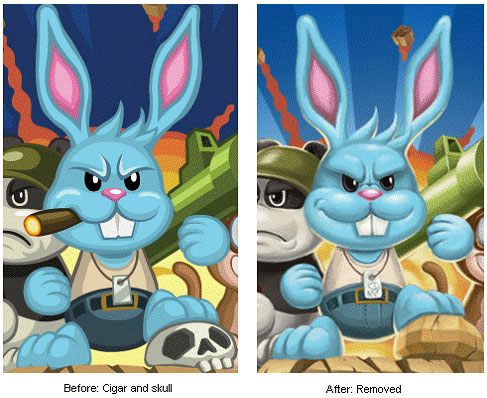
问题鉴定:游戏吉祥物”Sargent Bunny”总是叼着一根烟,脚踏敌人的头盖骨。除了这一点,游戏的其他元素都是儿童向的或是全年龄向的。
解决方案:我比较主张要么让游戏走紧张路线(一堆夸张刺激的笑点,类似《Itchy & Scratchy》的氛围),要么明确地保持游戏的兔巴哥风格。就算其他地方一尘不染,一旦设计师在游戏中稍微加入一点成人向和带硬伤的东西,所得的结果不言而喻,那就是细节影响大局。
在广告业里,这叫品牌形像管理,游戏设计师对这个概念的理解一定要明确,容不得一点含糊。一个偶然蹦出一两个刺激镜头的儿童游戏不是儿童游戏的经典,也不算刺激性游戏的杰作,而是懒散的品牌管理催生出的案例。
最后,我把嵌入游戏里的所有香烟和头盖骨的美术设计都删除了。没有人注意到这个变化,除了那些怕孩子被成人游戏带坏的父母。而事实上,这游戏和《百战天虫》一样很适合孩子体验。
总结
玩家群体对这个调整的反应如何?在某个周末,一些最大的游戏调整落实了,立即吸引了无数玩家前来捧场——尽管之前做了充足的准备工作,我们的服务器还是崩溃了三天。
我几乎没法处理蜂拥而来的游戏流量和交易利润,程序员团队日以继夜地抢修服务器。玩家数量创下记录,在线率空前绝后,交易量前所未有,最重要的是,这个游戏的乐趣也到达极致。
并非所有人都乐意看到这个变动——-一些硬核玩家叫停我的设计,并留下“我讨厌新版《Wild Ones》,解雇那个游戏设计师,恢复原版游戏里的风设定和射击技巧”等不少这类极端的评论:
{Playdom的人听着:99%的玩家讨厌新游戏。我们要恢复到一个月以前——风、水、一条命、只有10件武器、数字计时。我不会再玩这个垃圾了!!(复制粘贴如果你同意)——一条典型的粉丝评论}
质量反馈表明,对于这类玩家来说,这个游戏调整过头了,现在变得有些可怕——但玩家数量、在线时长和交易量的反馈结果是,完全不是这么回事;多数玩家喜欢新游戏,它的成功已经是无可辩驳的事实。为了救活一个游戏而做的设计调整,你得小心,不要为了一棵哗哗作响的树而放弃一片静默不语的森林。那些留下来花钱玩游戏的人从来不发言——他们靠行动说话。而那些讨厌新游戏的人生怕我们不知道。
我们流失了一些玩家了?当然是。但这也是值得的,因为新游戏变得更有趣、更易玩、更吸引玩家。做出调整时我对已存在的玩家群体有所考虑,所以我弃他们而去(这个游戏最终还是靠射击技术),但我不能只为他们做打算。毕竟原玩家群体本来就没有让这个游戏真正地成功过,所以如果只指望他们,这整个游戏将不会有任何实质性的改变。
当一个游戏发展式微,就很有必要做出大规模、实质性的调整,哪怕只是让设计师稍微不太满意的小地方也要大刀阔斧地改动。如果设计师只是着眼于看着顺眼的地方,那这个游戏就只能一步步走向没落了。
我的设计方向与Ling Xiao的想法一致,他很直接地授权我对这个游戏做出彻头彻尾的调整——这是对我最大的信任,而其他高管们可能害怕和怀疑我对现存的交易(尽管量小)基础做出如此大规模的调整。Ling Xiao确实明智,他料到如果我们固执地按原版运营下去,我们能得到的也就像以前那么多,总之重大调整势在必行。
游戏的本质是一种服务,而不同于传统的包装类产品。我们总是能测试自己做出的调整,甚至反复执行。这就是游戏的美好之处,害怕迈出改变的步伐,就是在拒绝成功和赢利。作为一个设计师,除了游戏的成功和赢利,我对其他东西没兴趣,我毫无畏惧地追求成功和赢利。
如果你在制作一款社交游戏或者在补救一款游戏,请把易玩性当成首要考虑因素:不要只是易操作,还要易消费。如果你的游戏什么钱都想赚,这就和什么赚钱策略都没有一样。所以脚踏实地精心做好一个交易项目就好——确定玩家的消费兴奋点,然后围绕这个点好好做。
无论如何要与现代接轨、要把情报收录器嵌入游戏、要追踪游戏各方面的统计数据,然后一一解释这些精心分析过的数字的含义——但别把这些数字捧上神坛顶礼膜拜,因为它只是把已经发生了的事情作为数据输出告诉设计师。如果基础设计在核心环节上出了错,这些数据就只是一堆进进出出的垃圾,不用指望它们能为修复游戏提供什么金玉良言。要保证游戏设计规划统计数据,而不是统计数据主宰游戏设计。
最后,别害怕对一个衰落的游戏做出重大的设计调整。改变越多收获越多。如果产品真的在走下坡路,就必须果断跨出安乐窝,勇于尝试新的方向。如果害怕失去玩家,那就什么也别做了,别怨任何人,要怪就怪自己不乐意涉足未知的世界、去寻找成功。
我们整队人马超过12名成员,大家齐心协力完成了这款游戏的大改造,我必须承认,没有他们的扎实和周全的工作,我的设计调整只能是纸上谈兵,且《Wild Ones》很久以前就该只是落日残阳了。它现在反而坐上了Playdom的头把交椅,在超过40个游戏的DAU流量里它就占了25%,现在仍比以前更有趣而且人气不减。(本文为游戏邦/gamerboom.com编译,转载请注明来源:游戏邦)
[Designer Joshua Dallman dives into 10 critical factors in the redesign of Wild Ones, which saw the game transform from a failure into Playdom's top social title, and offers up a comprehensive picture with concrete examples on how to do it.]
One year ago I went to work for Playdom, joining as the studio design lead for an internal studio led by co-founder Ling Xiao after doing contract design work for months for projects such as Social City. My first project in the studio was to fix a game that wasn’t performing well — that game was the turn-based artillery shooter Wild Ones.
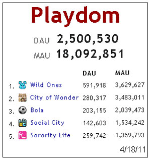
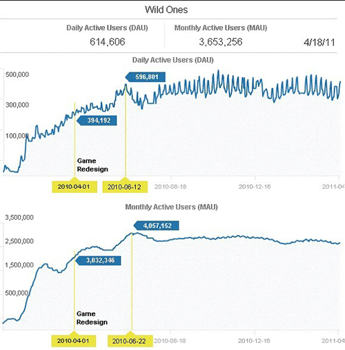
Through game design alone (no marketing tricks and no ad spend) I increased DAUs by 44 percent, increased MAUs by 25 percent, and quadrupled revenue, at a time when policy changes put all games on Facebook in decline.
It’s now Playdom’s number one game, comprising a quarter of its entire daily traffic. Here’s how I did it.
Normally, the rule in social games is to direct by metrics. This is considered evolution, the next wave, modern. We think of the days before metrics as the dark ages, brute, unsophisticated.
Yet companies that evolve to use metrics then direct by metrics alone find success only in optimizing what can be perceived by metrics, which is often just the tip of the iceberg.
Bad game design is imperceptible to metrics; you have to play something to know it’s bad, and you have to know bad design when you see it. Metrics can show that something is broken, but not what is broken. I say this because although metrics will indeed take you to the next level as a designer, they amplify your design sense, not replace it.
When I looked at Wild Ones, I saw so many crippling mistakes of bad design that I didn’t have to look at a single metric — nor did I — to determine what was wrong, or how to fix it. I only saw how the game was performing overall and knew from my experience that it should have been doing way better.
Why was I so confident it should have been doing better? Chiefly, because the concept behind the game has such broad appeal and historical precedent. The genre itself goes very far back as a casual game. Its ubiquity is almost that of Snake. I’m not going to do a history of the genre, but its history includes Artillery, Human Cannonball, Scorched Earth, Worms, iShoot, Angry Birds, and dozens of successful others in the artillery trajectory genre.
The Worms series in particular has been wildly successful, with many sequels and ports, and ranks as a consistent bestseller on Xbox Live Arcade.
Worms has done a great job of softening the aggressive war aspect with cute cartoon characters and cute weapons and themes to draw a wider audience and more casual player base in. Meanwhile, the game was still skill based and challenging enough for more strategic core players. Everyone loves Worms; it has universal appeal and is fun, casual, and accessible. I wanted to see Wild Ones hit the numbers that a Worms-like game would.
However, in its original state at the time, Wild Ones was far too intimidating, difficult, and unrewarding for a wider audience to play. The high level goal I set out for myself was to grow the game by reaching out to a larger audience by increasing the game’s accessibility. My secondary goal was to grow retention by increasing game accessibility. My final goal was to monetize the game by designing a completely new monetization strategy where there was none before, and making sure that the monetization was as completely accessible as possible.
Why the focus on accessibility? Like most designers and those in the game industry, I come from a common shared hardcore game background — MUDs, Dungeons & Dragons, Doom, Half-Life, MMORPGs, etc. When Bejeweled and Diner Dash defined a generation of casual games, I eagerly jumped ship to the promise of “games for everyone” instead of a small hardcore fraction of the market.
I see the primary difference between hardcore and casual games being that of accessibility. Hardcore players will recompile their Linux kernel to make a game compatible with their system; casual players are so sensitive as to drop out of a funnel in significant numbers if asked to make just one extra click to get into the game.
My background informed my area of focus. Historically, Skee Ball was the first amusement game to benefit from accessibility improvements — its original form was designed with a huge, long bowling lane, and a large, heavy ball, making it difficult to play. A decade later, it was redesigned to be the tiny size you still see in arcades today, and that’s when its popularity exploded. I wanted to make the ball easier to throw in Wild Ones, and the game easier to play to capture that same explosion in popularity through simple accessibility and game design improvements.
Here were the ten big design changes I made to accomplish these goals:
1. Unlimited Life
Problem identified. In the previous design, players would spawn on a map, and once killed, would remain permanently dead in that game, unable to perform any game action other than exiting — which players did. This was an innovation in Counter-Strike, adding tension to the FPS genre where unlimited respawns were previously the norm.
However, this tension and resulting punishment is highly inappropriate in a casual game where the rule is to reward, praise, and offer opportunity to interact. My first and most important design decision was to offer unlimited life to players that they may play continuously through a timed round and never be punished with the inability to interact.
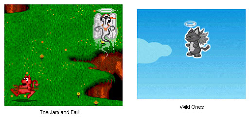
Solution. When players die, their ghost now floats to the top of the screen (inspired by Toe Jam & Earl) and then they respawn. That’s it. Dead simple (excuse the pun). However, this has a number of positive effects.
First, the player is engaging throughout the whole round, instead of only part of it, which drives up engagement (duh), but also drives up retention (keeps them from quitting while waiting and bored watching) and as a bonus drives up monetization, because the player is shooting the whole round instead of only part of the round, and the more they shoot, the more they consume, and need, and spend.
However, there is an echo effect, in that the more players kill each other, the more antagonistic they get about killing each other, upping their weapons grade tier — thereby upping the ante for all players in the room. This also provided the benefit of releasing constraints on what weapons you could bring into the game (restricted before to keep games from ending too soon), and allowing weapons to do bigger and even one-hit-kill damage as death was no longer a big deal (humiliation being the biggest punishment).
Another benefit was by changing the winner determination from last man standing to most points scored, it made all players who scored any points (any hits) feel like winners, instead of a purely binary one winner/all other losers. This one change had so many benefits it could practically be a whole article unto itself.
Suffice to say, it was the right thing to do, and no metric could expose that (short of post-release A/B). A minority of hardcore players vehemently opposed this change, but the feature opened the game to wider player base by making it less punishing and more engaging while still rewarding skill with points all in one stroke, and was a big “single reason” for the rebooted game’s success.
N.B. Social game designers may look at giving unlimited life to drive engagement a cheap tactic, akin to giving unlimited energy to an energy-based game to drive engagement and calling it a success when it’s a foregone effect. The difference here is that the player who died (“ran out of energy”) did not do so based on their own action or inaction; it was another player’s action that forced that game state, making it feel potently unfair to a casual player.
There is also no way to pay past it, nor pay or engage to increase your potential to avoid future death so quickly. It was also doled out universally to new players and engaged players alike, whereas with energy you do not want new players to run out of energy before they have a chance to get engaged.
Monetizing the valuable commodity of life directly was tempting, but doing so would gut the engagement you need to get players playing long enough to be motivated to
monetize in the first place. Instead, I wanted to make life an unlimited commodity so that the weapons used against that unlimited commodity could be similarly dispensed in “unlimited” fashion — each shot consuming ammo and making us money.
2. More Accessible Firing Controls
Problem. In the original design, in order to shoot you first have to find your mouse cursor, find your character, place your mouse outside your character at the desired angle to fire at, hold down the mouse button, observe the tiny shot power meter rising up, observe the point the meter reaches the desired location to fire at that shot power, then release the mouse button.
Not only were there many steps, but it was timing-based, adding another layer of skill and obstacle to the game.
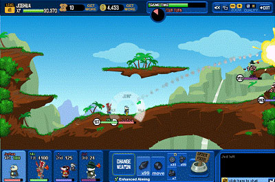
Solution. After reviewing many trajectory game controls (including a side-view platform-style golf game!) I designed an alternate control input that removed the timing-based shooting and had players move their mouse to control the angle and length of an arrow that represented the angle and shot power of the shot, then fire with a single click.
Ultimately the two controls were both released in the game, with the updated version touted as the “Enhanced Aiming” version (now there’s a marketing spin for an accessibility feature!)
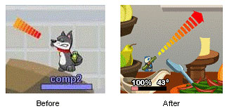
However, even the standard timing-based aiming got a big accessibility upgrade in the form of a huge, gradient-colored, multiple-times-the-character-sized arrow pointing where you’re shooting, replacing the tiny, subtle, smaller-than-the-character meter previously used.
Additionally, I added angle and shot power numeric readouts to make the interaction clearer. It could be seen as too much information, but I feel it exposed the two most important numbers in the game since the days of Artillery — angle and shot power.
3. More Accessible Movement Controls
Problem. Moving your character in the game was extremely frustrating and felt like a constant battle, rather than a seamless brain-to-mouse-to-avatar meld. Due to the destructible terrain, the player would constantly fall in holes, then be unable to get out.
Additionally, any terrain changes at all seemed to immediately restrict the player’s movement, as they were unable to jump over the simplest of obstacles. Since movement was half the game, this made half the game frustrating and not fun. In addition, movement was taught using the keyboard as control input, which is a kiss of death for casual games.
Solution. Removal of keyboard emphasis for controls in tutorial, and in-game, and a rebooted movement scheme where you simply aim with the mouse and the avatar moves where you click and hold.
My initial design called for a jetpack to stream you to your mouse cursor destination, though with some wizardry a programmer was able to change the algorithms and re-balance the movement such that the character effectively moves where you aim without having to add a new jetpack feature wholesale.
The simple answer is that the character jumps higher and the math is much looser to make sure you can almost always get to where you want to go without getting constantly stuck, though under the hood there is much more involved This was a great lesson for where engineering ingenuity can offer solutions to fix broken design without having to add more design and features to the product, which is never as elegant.
4. Allow All Weapons into Game
Problem. The previous design used a weapons loadout, restricting weapons to just a couple that the player selects at game start. This is, to be blunt, extremely dull.
The fun in this genre is in being able to fire lots of different types of weapons to experiment with. The loadout artificially choked engagement (and consumption, so therefore monetization) and its only purpose was specifically to keep players from bringing too much power into games — which, due to permanent death, would end the game too quickly.
The weapons loadout was also extremely confusing and inaccessible from both a game rule clarity and usability standpoint. It didn’t make sense that you could have weapons you couldn’t bring into the game, and further confusing still was why, if you had 10 of a weapon, you could only bring a certain number of shots of that weapon into the game (say, 2, or any low arbitrary number that didn’t instantly kill an enemy). The rules didn’t make sense and neither did the displayed numbers — it was a mess, and again, no metric could ever point to this.
Solution. With unlimited lives, there was now no reason to restrict weapons used in the game. The loadout was deleted; the “max shots per game” for powerful weapons
rule was deleted. You can now bring your whole inventory, and every shot quantity of that inventory, into the game, and dispense punishment as you see fit. A “choose weapon” button was added to select among your whole inventory. This was simple, intuitive, clear, and is how it should work!
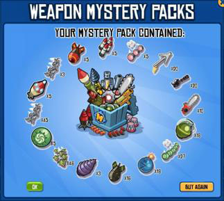
5. 50 New Weapons
Problem. The game overall was slow-paced, skill-based, anti-climactic, and dull. It needed more action, easier action, bigger climaxes, and more excitement. It also had a meager offering of about 10 weapons, total. For a game that is all about weapons and destruction, it needed more weapons — period. Not one or two. Not 10 or 20.
Solution. 50 new weapons, for about 60 weapons total. I designed new weapons to be entirely based on existing weapons, as variants, with no new weapon programming for any new weapon.
As a designer I believe in maximizing value out of current assets first before putting more demand on engineering and art for new assets, which is often lazy design.
By having this many weapons, I was able to offer players one new weapon per level, and advertise the next weapon to be unlocked on the main menu — critical to drive retention.
These new weapons were absolutely the crown jewel and crucial centerpiece to the reboot. I designed the new weapons to be larger than life. This not only gave the game more action, excitement, and climax, but also made it more accessible to play, as big explosions are an easy way to score big points with gamers.
A single, flat, badly animated explosion was previously used as the art output for every shot of every weapon. Significant time was spent on new animations using multiple layers and dynamic sizing and rotation to create an unlimited array of explosion combinations from a limited base set of original layers, creating unique per-weapon explosion effects for all weapons and adding further character, impact, and value to the weapons.
An area of monetization that many people forget is that of the dispensing stage of the product consumption cycle; a player needs to feel satisfied in the consumption of their purchased product in order for them to re-purchase. The enhanced explosion effects added to the value of the dispensed product such that players are more motivated to re-purchase to experience the effect over and over again.
Part of the game’s difficulty with accessibility was that it was very difficult to make shots hit their targets; you had to be exacting and precise. To solve this with the new weapons, I increased their overall shot radius while keeping the maximum damage area of effect small. This was a simple math change that allowed players firing even small shots to have a high probability of scoring at least some points, while keeping the reward of direct close shots high by keeping those high-scoring. A simple change that gave everyone more points, while keeping skill shots in the hands of skilled players.
The size variants allowed me to make extra-small, small, medium, large, extra-large, and obscenely-large weapon variations, with extra-small being engagement-currency based to onboard into more expensive versions of the weapon, for a weapon that would otherwise never have a “free trial” mini-version, as its effect is too premium.
The highest “obscene” category allowed me to specifically target whales, a common social game design tactic.
The unlimited respawn change allowed me to make truly larger-than-life weapons, my favorites being the green, entire-screen-sized instant-kill laser named “Gamma Star” (after the Death Star’s deadly beam, of course) and the aptly named “Game Over” nuke which destroys 90 percent of the screen’s terrain and players.
These new weapons also allowed me to fix the problem of average players feeling ineffective and unable to affect the game state. By making larger weapons, I could ensure that players could at least take out large chunks of the terrain even if they wildly miss their shot, making them feel at least able to affect the game state, instead of feeling like their presence and interaction with the game doesn’t matter.
Who cares how powerful a weapon is when you can always price it appropriately? For $5 a shot I’d sell a weapon that reboots other players’ computers! I’m kidding, but you get the point; obscenely powerful weapons are balanced by simply being obscenely expensive.
Weapons were themed to strike humor and fun — hence the cartoonish anvil and the Earthworm Jim-inspired cow that goes splat with green goo when tossed. These weapons were endlessly tweaked and refined with love to create a weapon set and game that would truly be a joy to play.
I believe the time and extra care I spent designing, refining, and balancing these weapons — two weeks of straight around-the-clock work — shines through in the final quality of the product. Here more than anywhere, I simply wanted to make players feel visceral pleasure and simple joy. And there is simply no metric for tracking that.
6. Menu Streamlining
Problem. Game lobby menu adds friction to game entry, and an additional point and opportunity to exit. Players have to click “ready” to continue, stalling the game unnecessarily.
Solution. Kill the lobby; make players automatically ready upon screen load. The screen serves as a timer alone, as it waits for other player games to load and synch, but everything happens automatically and quickly.
Problem. Level select screen forces players to tediously scroll through one level at a time and select from a confusing selection of overwhelming, hardcore, overly-custom options.
Solution. Show all (or a large quantity of) levels on a single screen as thumbnails with one-click entry to play each; replace myriad custom options with simple categories of game types, including descriptions of each game type, which effectively just pre-selects confusing custom options, leaving the same amount of choice but filtered more effectively.
7. Removal of Wind
Problem. Game mechanic of wind direction and speed adds additional complexity to game and reduces probability of successful shots, especially for new players who haven’t learned to adjust to wind — let alone fire shots, period. The changing wind on every turn further exacerbates the problem. In the same way that 3D is exponentially, not incrementally, more difficult for players to navigate than 2D, the third axis variable of “wind” makes it exponentially more difficult to shoot when compounded with the X axis of angle and Y axis of shot power.
Solution. Kill wind. No wind makes it easier to shoot, especially for new players, and angle and shot power optimizing alone is already engaging and difficult enough to try and master.
This was a polarizing design choice I made with many on the team feeling it reduced game fun, but it was a minor fun enhancer that carried major accessibility costs, and the game grew and retained far better without it.
8. Unfocused Monetization Design
Problem. I cannot speak to the monetization or non-monetization of the product, I can only discuss public figures on Appdata and publically obvious game design changes before and after. With that in mind, I can make the non-specific relative comment that I increased monetization five-fold, and that the pattern held, and was not just an overnight fire sale.
What I can discuss in detail is that the original monetization design is that of most first-time or amateur monetization designers, which is trying to make money off of everything.
This is the same as having no strategy at all. Many consider retail box product sales to be the dark ages, and microtransactions to be the modern way to do it, but just tossing microtransactions into your game across the board is blunt, and won’t get results.
Some think you have to understand what your players want, then monetize around that. That is also wrong. In that scenario, you are being reactionary instead of proactive; you are the slave instead of the master.
In reality, you are the designer and you create the experience the player has. You create needs for the player, and you direct the player to monetization via your design. So the question is not “where are players spending?” The question is “where do you want to design players to spend?”
Lazy design will leave monetization areas to the players — it will throw its hands up and say “I’m sorry, I don’t understand this, and I don’t know where to charge you, so you tell me.”
Instead, your design should say, “this is where I want you to play for free, this is where I want you to feel some pain, and this is where I want you to unequivocally pull out your credit card.”
There is some optimizing from feedback from players — namely what within a category they spend the most on — and there are definitely surprises. But it is ultimately up to the designer to construct the framework that drives supply and demand to the bottlenecks and motivations that will monetize best.
Quite simply, in its original design, we attempted to sell everything in Wild Ones, an experience akin to walking into a movie theater and seeing the seats, fixtures, and employee outfits all being pushed in equal proportion to the movie ticket itself. This led to not only less than desired levels of monetization, to say the least, but stifled engagement and retention as well, because it failed to exploit features that were engagement features as engagement features.
Solution. My solution was radical — make all maps, characters, and clothing free (or as cheap as free) and open from the get-go, with monetization design centered around the most desirable thing players want in the game — weapons. Everything else used to drive engagement and retention.
There weren’t enough maps to sell, and selling maps is a poor choice for monetization anyway, as maps are the platform for engagement. Characters were also few in quantity and a critical mass of free characters was needed for basic engagement and retention and player customization of their personality.
Clothing is an agent of player avatar customization, which itself is an agent of retention, as the more you customize your avatar the more invested and personal you feel with it — therefore, I wanted players to customize away so that they stay long enough to enjoy the real motivation and status of the game, blowing people up.
Another reason to make clothing free in this case is that monetization of avatar customization works best when there’s status associated with that customization. Here, the status is in your ability to inspire shock and awe on the battlefield via your willingness and frequency of use of expensive and rare weapons – not what color fedora you’re wearing. The hat is just a fun extra to make you feel connected to your character; it’s not a bottleneck that gets you to pull out your wallet.
Focus on the most needed and desired content, then market the heck out of that
Again, I determined what the most desirable, inspiring category of content was in the game — the weapons — then monetized aggressively around that, both by expanding the product lineup within the game and through careful onboarding and an aggressively high ratio of premium currency weapons. I then used all other features as engagement and retention features to support that core monetization. Engagement and retention features can still have some small percent of monetization items, but should not strive to make income, and receive it only as incidental occasional byproduct.
When I discuss the matter of where a designer wants to make money, I’m talking about aligning that with the greatest monetization characteristics for opportunity. Selling consumables unequivocally trumps selling durables.
Here I could sell durables like levels, characters, and clothing, or weapons, which are constantly consumed, constantly needed, easily used and replaced, and core to the central game loop. Obviously weapons are where I want to base my monetization, so I make sure the design centers around and encourages their consumption, and if it doesn’t, I change the design until it does and fits.
9. New In-Game HUD
Problem. HUD does not show a clear winner, is not social; game time is not communicated so game seems to end abruptly; turn timer counts down second by second, unnerving casual players.
Solution. New social display shows each players avatar, name, life bar, and ranking (e.g. 1st/2nd/3rd/4th) with additional info when clicked; game time shown as bar on HUD; turn timer changed to visual circle countdown timer with intentionally no numbers shown to reduce stress and pressure while still communicating how much relative time is left.
The social display represented the most useful UI improvement, as competition is the key thing that drives the game, where other UI changes were either necessary due to other design changes made or were simply opportunistic improvements.
10. Mature Game Art
Problem. Game mascot (“Sargent Bunny”) often pictured smoking a cigar space marine style, with his paw on the skull of an enemy corpse. All other game art is children’s or all-ages appropriate.
Solution. I’m all for edgy — but either make the whole game edgy and take it decidedly in that direction (lots of campiness, Itchy & Scratchy vibe) or keep it decidedly in the Looney Tunes arena. As soon as you add a little adult and hardcore vibe to just one tiny area of your otherwise sanitized game, it pollutes the whole game.
In advertising they call this brand identity and management, and you can’t have a confused one. It’s either a kids’ game, or it’s edgy. A kids’ game with one or two edgy screens by accident is lazy brand management, not some kind of best of both worlds between kids’ game and edginess.
To that end, I removed all cigars and skulls from game art on multiple screens where they had snuck in. Nobody noticed the art change except the parents that were stopping their kids from playing due to mistakenly thinking it was an adult game from the cues provided, when in fact it is exactly age appropriate for their child in the same way Worms is.
In Closing
How did the community respond to the changes? The weekend that some of the biggest changes were deployed got so many people playing — and staying — that it melted our servers for three days, despite ample preparation beforehand.
We literally couldn’t handle the incoming surge of traffic and interest in the game, and the team’s engineers worked around the clock to fix it. Players played the game in record numbers, stayed playing in record numbers, bought in record numbers, and most importantly, had record amounts of fun.
Wild Ones DAU and MAU statistics before and after the game redesign and still holding steady
Not everyone was happy with the changes — some players called for my termination, leaving comments such as “I hate the new Wild Ones, fire the game designer, bring back wind and skill into the game” with hundreds of similar negative comments.
The qualitative feedback coming in was that the game changed too much for the player base and was now terrible — but the quantitative feedback for number of players, session lengths, and monetization told a completely different story, showing that players loved the new game, and it was thus an unequivocal success. In live game design you have to be careful not to design around the vocal minority, thereby ousting the silent majority. Those who played and stayed and paid never said a word — they spoke with their actions. Those that hated it made sure we knew it.
Did we lose some players? Absolutely. But that cost was worth it to bring the game to a wider audience and make it more fun and accessible for everyone. Changes were made with consideration to the established player base so that I wasn’t alienating them (the game was still about skill in the end), but not with exclusive consideration. The established player base, after all, was not making the game a true success in the first place, so to design with exclusive consideration towards them would change the overall product by none.
When a game is failing to perform as desired, big, substantial changes need to be made of the size and scope to the point where making them makes you slightly uncomfortable. If you stay only within your comfort zone, you are only propping up and maintaining a failing status quo.
The biggest credit besides my design direction goes to my boss Ling Xiao who quite frankly had the chutzpah to allow me to make changes this dramatic where other executives might have had fear and doubt about changing a game so dramatically with an existing, monetizing (though poorly) player base. Ling was smart enough to know that if we kept doing what we’ve always done, we’d get what we’ve always gotten, and that big changes were needed.
This is the nature of games as a service as opposed to traditional boxed product, and the beauty is we can always test any changes we make, and even revert if needed.
Being afraid of making changes to live games is the same as being afraid of success and profits with live games, and I have no interest in anything other than success and profits as a designer and I pursue those fearlessly.
If you’re working in social or live games, consider accessibility your top priority: not just play accessibility, but monetization accessibility. If your game is trying to make money off of everything, that is the same as having no monetization strategy, so craft one. When crafting one, don’t look at where players want to spend money, determine where players should be spending money, then craft the design around that to create that reality.
By all means, join the modern age and embed tickers in your game and track statistics on absolutely everything, then pour over those numbers with good analysts to determine their meaning – but don’t hold them up as if they’re an all-seeing eye, as they only tell you what’s happening after the fact, as output. If the base design is broken at its core, it’s going to be garbage-in, garbage-out, and the data will tell you nothing meaningful that can be used to fix the core game. Be modern, then go beyond that by making sure that design rules statistics, not statistics ruling design.
Lastly, don’t be afraid to make big design changes for a failing product. Incremental changes will give you incremental gains. If your product is truly failing to perform as desired, you need to step outside your comfort zone and try a radical new direction. If this makes you fear alienating your audience, then by all means keep doing what you’re doing and let the product slowly sink into obscurity, but don’t blame anyone but yourself for your own lack of willingness to leap into the unknown and find success.
There was an entire team of over a dozen people who worked on this reboot and helped make it a success — I don’t want to name them individually at the risk of omitting anyone — but I do need to acknowledge that without their hard and thoughtful work, my design changes would have existed only on paper and in theory, and Wild Ones would have long ago been sunset as a disappointment.
Instead, it’s currently sitting as Playdom’s number one game, comprising 25 percent of its entire DAU traffic from a portfolio of over 40 games. And it’s still more fun than ever to jump in for a quick game and blow shit up.(source:gamasutra)








 闽公网安备35020302001549号