万字长文,关于游戏关卡设计原则的关联阐述,上篇
篇目1,行业精英解答十大游戏关卡设计问题
作者:Coray Seifert
在过去5年里,Level Design in a Day成员都会在游戏开发者大会上聚在一起讨论关卡设计。而今年,Gamasutra提供给我们一个很棒的机会,即通过与游戏开发社区进行Q&A而与更多用户进行互动(不再只是面向几百个参加者)。
所以我们聚集了一群关卡设计精英(游戏邦注:选自今年的AAA Level Design in a Day Bootcamp名册上),并且他们都同意以圆桌会议的形势回答Gamasutra社区的问题。
Neil Alphonso:Splash Damage首席设计师
Jim Brown:Epic Games首席关卡设计师
Joel Burgess:Bethesda Game Studios高级设计师
Steve Gaynor:The Fullbright Company联合创始人
Seth Marinello:艺电/Visceral Games关卡设计师
(编者)Coray Seifert:Slingo总裁兼产品开发负责人
许多问题都是特别针对于关卡设计的技术,不过也有许多人对更广泛的制作问题,工具开发以及引擎局限等提出了自己的疑惑。
我总是说关卡设计是一种应用型游戏设计。这是一种专业化技术,也是关于技术,机制和无形乐趣等元素的广泛研究。因此,不管你所遵循的是怎样的游戏开发原则,你还有许多需要学习的地方。
我们的第一个问题是来自Bloomfield College Game Design的学生Roger Rosa:
1.在完成第一个关卡后关起设计师通常会遇到的问题或留心的主要内容是什么?关卡设计中哪些常见的缺陷会被忽视掉?
Jim Brown–通常我都会留意两大元素,即是否凌乱以及设定是否成立。因为设计师的自满或者快速完成某些“无聊的”设计环节,我们经常会在脚本,外观,以及关卡设计中发现各种漏洞。如果你能够专注于细节内容并重视每一个关卡环节,你便能省去许多不必要的麻烦(即更快,更明确且更轻松地进行设计)。
其次,关卡设计师经常会创造一个关卡假设,即玩家也能够像他们那样通过某一关卡。但是要知道,关卡设计师已经玩过自己设计的内容不下500次,但是玩家却并非如此,所以他们有可能在错误的时刻往后退,在混乱的时刻启动触发器,迷路,或者基于任何方法而摧毁你的关卡。当系统承受了过大的压力时,第一张通过地图将成为“黄金通道”并快速瓦解。除此之外,有时候我们只需要“把事情做好”,所以第一张通过地图也只要如此,然后我们便需要对性能,内存,节奏和难度进行大规模优化。
Steve Gaynor–我认为第一张通过地图应该呈现出相关布局和流程,而第二张则强调灯光和可见性。掌握空间的形状,大小和连通性是第一步,而在此之后你需要像玩家那样尝试着玩看看,并思考“我要何时进入这一空间?该往哪走?敌人来自哪里?如果迷失了方向我该如何引导自己向前进?”
有关这些问题的两大元素便是视线和灯光。你必须决定玩家在关卡的每个角度能够看到什么,以及看不到或者看不清什么。举个例子来说吧,如果玩家进入一个空间,并看到远处墙上的两扇门,那么是否其中一扇门比另一扇更加重要?玩家是否应该先进入其中一扇?也许你可以设置一个阻挡视线的障碍,如此他们便只能先看到其中的一扇门,并直到到达第一扇门时才能看到第二扇,如此他们便能顺利进入第一扇门了。
如果光线的设置没有差别的话,玩家便很难判断哪个属于优先选择对象了。你可以通过聚光灯和阴影去突出重要的目标,从而让玩家第一眼便注意到它。当你明确了流程,并帮助玩家瞄准重要的对象时,你便可以着手处理一些较小的细节元素,即在空间里添加各种内容。
Seth Marinello–当我完成了关卡布局后,我需要做的第一件事便是审视空间的大小和视线,从而进行可见性策略规划。因为我们在《死亡空间》里所创造的环境非常精细,所以我们必须在初始阶段基于性能而划分空间。最糟糕的情况便是,在基于GPU完善一个复杂空间后几个月我们才想起去划分空间。
关于一些被忽视的问题,我发现在早期开发阶段我们很难去明确游戏的节奏。没有对话和脚本的关卡将显得非常空洞,而反馈往往也是关于添加更多战斗,最后便导致节奏问题一直被拖到最后还未能得到解决。我们必须意识到这一点并规划好时间去处理这些问题。
我们的第二个问题是来自Twitter用户@Skizomeuh:
2.为什么现在的hub导向游戏那么少(基于关卡设计)?就像《银河战士》或《Hexen》等游戏。
Neil Alphonso–简单的来说是因为基于hub的关卡设计已经被开放世界所吞噬了。流式技术的发展以及艺术创造管道的完善都意味着关卡设计中许多限制因素得到了解决,从而实现了更加紧凑的游戏体验。Rocksteady的《阿卡姆疯人院》的发展便是非常典型的例子,即从hub导向向流线型开放世界模式而发展。当然了,现在也仍有设计师在使用hub导向原则,但是不可能像之前那么普遍了。
1.jpg)
level_arkhamcity(from gamasutra)
Steve Gaynor–这个问题的答案源于不同层面–从技术上来看我们很难呈现出一个更开放且更自由的空间(基于视距,关卡流媒体技术等等)。基于设计角度来看还存在各种变量,因为你必须考虑“如果玩家从东部而非北部进入这个空间会怎样?如果他们在清楚了下一个领域后又回去的话会怎样?我该如何在一个开放的hub空间里引导他们走向下一个目标?”
hub导向的关卡设计非常明确,即倾向于玩家导向型探索,面向更“真实的”世界,并且因为你可以在玩家再次访问时改变任何领域的状态(而非延伸空间的面积),所以也具有内容再利用优势。但是设计师需要做出一些投资才能顺利完成这些设定。
Joel Burgess–我认为主要原因还是我们很难有效完成hub的创造。如果再次使用hub的话,你便需要投入大量时间去改变状态,然后完善hub并对玩家的行动做出反应。你可以通过使用相同的布局而有效做到这一点。《天际》中的“Dark Brotherhood Sanctuary”和《辐射3》中的“Mothership Zeta”便是如此。
我认为《Splinter Cell: Double Agent》是一款非常优秀但却被埋没了的hub导向型游戏。这款游戏解决了创造hub的问题,即将其更好地与游戏玩法融合在一起并作为NPC的存在空间。
我们的下一个问题是来自日本东京的@DCharlieJP:
3.关卡设计师知道游戏引擎的局限性吗?他们将如何在设计过程中解决这一问题?
Steve Gaynor–引擎的技术限制将定义我们作为关卡设计师能够做的一切事情。
而如何解决这些问题取决于你所使用的技术的状态—-如果你使用的是一个稳定且已建立的引擎,那么你所面对的局限性便会更加清楚,并且是从一开始自上而下地发展;如果在设计过程中技术也组装好了,那么程序员和设计师之间的交流便能更加顺畅,但是如果你不知道面对着何种局限性,那么便会遭遇更多不确定元素和挫折。
作为关卡设计师,你的部分工作便是提供帮助去超越技术上的局限性,并发现真正可行的方法,从而明确在引擎最终稳定后哪些局限性问题能够得到彻底解决。
Jim Brown–如果关卡设计师不清楚他们的引擎的能力,那么该项目便岌岌可危。任何项目最后的优化过程都是最复杂的,但是如果设计师缺少理解力便有可能创造出一些难以被接受且属于范围之外的内容(并导致不得不重新设计);如此便会浪费预算,浪费时间和精力。
你必须在框架内进行设计,即确保你的团队和引擎都有制作能力,并且你还必须始终牢记所有目标,即使是在原型创建过程中。当然了,你需要先确保项目目标获得了所有团队成员的肯定。
基于Gears,我们可以使用UE3进行设计,所以我们事先便清楚自己想要高级着色器和多样性角色。作为一个团队,我们同意使用第三人称视角并舍弃“近距离”战斗,以此突出这些引擎功能。显然这将影响着整体的设计,并深刻影响着屏幕上的敌人数量,建筑规模以及相关脚本。
Neil Alphonso–关卡设计师必须熟悉其游戏引擎的内在运作,但是技术发展的快节奏却让他们很难做到这一点。而这也是需要在整个团队进行共享的责任;技术负责人需要为关卡和资产创造提供指南,关卡设计师需要为游戏提供符合环境视觉保真度的布局,而设计师则需要尽可能保证高质量并达到高帧率的目标。
在现代开发中,工具的使用能够帮助设计师们更轻松地做到这些,而自动过程也能帮助他们在问题还未太糟糕之前落实解决。设计师必须在原型创建过程中先解决任何机制上的风险,否则它们将渗入到整体的游戏中,并最终导致开发资源的浪费。
下一个问题是来自游戏产业专家,同时也是Kabam的总经理Mike Sellers:
4.工具和参数:你是如何知道玩家是否喜欢关卡,他们不会迷失于其中或受挫?对此还有许多解决方法,但是很多人都不清楚这些玩法。
Joel Burgess–尽早且频繁地将关卡呈现在玩家面前,并观察他们游戏。不要等到关卡优化完或者发行商/制作人等安排测试时才这么做。挑选某些人并让他们面对一些设置或引导较少的关卡。鼓励他们在游戏过程中畅所欲言。而你则不能干扰他们,不要提供任何帮助或进行纠正。除非绝对必要,否则请忽视所有直接的问题。
你从玩家身上所获得的未经过滤的反馈将是最好的指明灯,将帮助你更好地应对各种内部参数。
Jim Brown–最简单的答案便是关注并观察。尽管这听起来很简单,但是很多设计师却经常会忽视这一点。设计师总是会因为过度沉迷于自己的工作而忽略了其它元素。几年前我曾经说过,设计师的工作是“成为玩家的拥护者”,而不是创造自己喜欢的事物,或忽略玩家在体验游戏时所扮演的角色。你是在为他们创造游戏而不是自己!
也就是说,可用性测试,焦点小组,热图,状态追踪等分析工具都非常有效,设计师最好能够在适当时候加以利用。他们也可以多花些时间去掌握基本的心理学原理。人类的大脑非常奇特,并且不一定会按照我们所理解的方式而运转。设计师需要观看别人是如何玩自己的游戏,并抱着虚心的态度。了解玩家的想法才能帮助你成为更加出色的设计师。
Neil Alphonso–最省钱的方法便是观看其他人玩游戏,并做下记录。如今许多工作室甚至使用生物辨识数据从各种测试中挖掘更多有用的信息。在过去几年里追踪参数的工具有了很大的改善,并且如果目标是更大规模的用户,那么设计师定能获得更加客观的信息。Valve面向《半条命2》和《军团要塞2》所做出的改变都是基于Steam的参数。
下一个问题是来自@Jeremy LaMont:
5.当你想要获得玩家的关注时,你会使用何种策略?或者只是“让他们自己到处走”?
Steve Gaynor–我更倾向于让玩家“到处走”。但是如果你真的想要引导玩家前往一个特定的地点,你就需要想办法吸引他们的注意力了。
这也是我在今年的GDC大会上关于LDIAD教程的演讲“Narrative Techniques for Storytelling in Level Design”所强调的内容。关于这点有很多很棒的方法:使用灯光和影子去突出重要的对象,删除周边地区任何不相干的内容,有针对性地设置玩家的前进道路,从而让他们可以直接走向最重要的内容。
你肯定希望清楚且集中地呈现出最重要的内容,从而让玩家清楚并乐意接近这一内容,而不是让玩家感觉是设计师强迫他们这么做的。
Joel Burgess–你可以采取多种方法去呈现紧急的暗示,如选择合适的音乐,采用漏斗式布局方法或最小化那些有可能让玩家分心的元素。
关卡设计师必须清楚,玩家在看到一个较亮的对象的同时又发现远方出现了可爱的场景时会是怎样的感受。
面对这种情境他们首先需要做的便是明确是否该采取某种做法。计时器,UI提示,过场动画和其它设备都能够吸引玩家的注意,但同时他们也必须清楚不同玩家也会做出不同的选择,就像有些玩家需要引导,而有些玩家更在乎光亮。虽然迷失方向或困惑会让玩家受挫,但是粗率的关卡设计也会让他们倍感失望。
Neil Alphonso–我所使用的主要工具是密度,即:对象的密度,移动的密度,或者互动性的密度等等。我发现这是告诉玩家他们正待在一个“重要的”地方的好方法。同时这也能用于维持一些间接引导方法;你该如何引导玩家是取决于整体游戏及其创造性方向,而不是基于一个特定的关卡。这也是为何我们经常在影片或UI中传达一些重要事件的主要原因。
如果你给予玩家错失重要信息的机会,那么许多玩家便都有可能走上这条道路。这并不能怪玩家不留意,而是你根本不知道玩家在玩游戏时会因为哪些内容分心。
我们的下一个问题是来自Full Sail的毕业生@MrDonaldYoung:
6.你会多久让玩家离开一次黄金之路,并且是否需要其它资源去完成这一设置?
Steve Gaynor–这么做是必要的。游戏的灵魂就在于互动性,而互动性便意味着任何玩家都不可能拥有相同的游戏体验。如果你能够在不同玩家的游戏体验中添加更多差异性,那么他们便更能感受到彼此间的联系,例如他们会想“我决定到那里,我决定探索这个额外的空间,我发现一些别人没做过的事。”
作为一个主要路径以及拥有各种选择的空间,你必须让玩家能够在此深入挖掘并思考。如果你认为非主要路径空间的制作成本是基于“我们创造了多少玩家看不到的内容”,你大可以去创造一些强制性内容,确保每个玩家所面对的体验都是相同的,如此便没人会“错过”任何内容了。如果你认为可选择空间带给玩家的自我引导,投资,探索和发现都属于内在且无形的价值,那么整体的游戏体验将比你在电子数据表上所确定的更加完善。
Joel Burgess–我个人的选择是在任何可能时机包含一些不必要的内容。这既能奖励那些付诸探索的玩家,也能让游戏世界更加真实,即更加倾向于玩家及其故事。幸运的是,Bethesda旗下90%的游戏都未提供黄金之路,我们总是将资源花费在一些不重要的内容上。这便是我们的游戏所呈现出的部分感觉,不过不同游戏所面临的情况也不同。
.jpg)
level_deadspace(from gamasutra)
Seth Marinello–我会尽可能频繁地这么做。如果游戏能够提供给玩家更多机遇去获得独特的体验,让他们感觉自己找到了一些特别的事物,那么玩家便会更加重视游戏。
在为《死亡空间》设定关卡时,我尝试着包含了两种类型的选择内容,即“财宝口袋”和“测试房间。”首先便是有关探索的奖励;假设我设定了一条很长的走廊,但是通道只有一半的路程,那么我便需要在最后设定一些有趣的内容而吸引玩家。通过奖励去推翻空间中的种种界线,你便可以将一个死胡同变成新发现。
测试房间就如其名,是一个独特且不同于关卡通道的空间。我尝试着利用这些房间去扩展世界,让玩家感觉到世界的真实性—-这也是我为何要在我们的奇幻关卡中设置像广场,浴室,洗衣店等来自人类领域的内容的重要原因。
我们的下个问题是来自电子游戏记者,同时也是翻译家的@andymonza:
7.重玩价值vs.过场动画。真的能将这两个者整合在同一个游戏体验中吗?
Jim Brown–当然了,但这也意味着设计师必须放弃部分控制(但这却不一定是件坏事!),并且需要可靠的系统(游戏邦注:即基于灵活的脚本,强大的AI以及巧妙的世界建造等等)去保持新鲜的游戏体验。《战争机器:审判》使用S3(智能生成系统)而随机创造敌人并改变每次生成的地点,《求生之路》使用Director去控制节奏,《天际》能够避免游戏世界中各种遭遇的重复——这些只是众多例子中的一小部分,并且每一款游戏都还在使用动画和脚本序列(尽管少于其它游戏)。
我认为,将控制权交回玩家手上是一种很棒的设置,并且能够让玩家按照自己的想法去创造游戏故事。而《行尸走肉》之所以拥有较高的重玩价值是因为它并未将玩家束缚在唯一的前进道路上。
Neil Alphonso–如果能够提供可略过的过场动画的话,自然再好不过。
关键在于过场动画的内容总是不够灵活,因为它们主要是来自被动的媒体形式。电影机制和游戏机制是完全不同的两回事,如果将它们强行组装在一起只会弄巧成拙。因为重玩价值通常都是源自机制的深度和多样性,所以重玩价值和过场动画并不相配。
所以真的有可能将其整合到一块吗?是的,但是在传统的AAA级游戏中我们很难做到这一点。不过有时候,传统也是用来打破的不是吗!
Seth Marinello–对于大多数基于故事的游戏来说,过场动画是非常重要的一部分内容,但是它们却经常违背了灵活的游戏玩法这一理念。有些工作室尝试着创造分支过场动画去维持力量感,但是这么做的代价却非常昂贵,且不一定总是能成功。作为设计师和故事创造者,我认为设计师最好能够以受玩家驱动的方法去传达这些信息,如果这点失败后再将过场动画与游戏玩法维系起来。我们总是会利用各种机会而创造出相对应的过场动画去呈现主角所控制不了的其它事件。基于这一方法,我们并不需要玩家做出任何决定。
Kyttaro Games的@gnomeslair问道:
8.你们是如何使用相同的元素去呈现出完全不同的游戏结果?
Joel Burgess–在像《天际》和《辐射3》这样大型的游戏,我们就必须尽可能有效利用每一个元素。
我们必须抹去任何有关该如何使用某一元素的先行观念。抵制诱惑,从未将一个特定的设置类型与特定的遭遇或游戏类型维系起来。如果你能够混合更多元素,你便有可能发现更多多样性潜能。
基于这种期望,你便能够鼓励自己和团队从一个更开放的角度去思考如何执行各种机制,图像资产等等内容。这便意味着你的功能设置将更有活力并能够验证各种漏洞。
Seth Marinello–从游戏玩法的角度来看,创造出玩家能够理解的模式并以不同形式体现出来能够有效地传达出乐趣体验。你需要创造出玩家能够精通的任务,然后进一步延伸以提供更加复杂的挑战—-《传送门》便是基于这种设计。
Jim Brown–随着技术的不断完善,做到这一点已经不是什么难事了。更高的分辨率以及更好的材料意味着我们能够基于不同方式规划,循环并再次使用相同模式。更多多边形模型以及完善的渲染工具也意味着我们可以添加更多细节到不同模型领域中,以不同方式将其呈现出来。
最后,我认为获得好结果的最好方法便是真正理解现实世界的建造和心理学原理——如果你能够呈现出一些看起来“真实”或者符合“常规”的内容,人们便会下意识地接受它。对于关卡设计师来说,将关卡与有限的资源整合在一起将变成有趣的谜题,或者游戏本身。
倒数第二个问题是来自职业玩家兼游戏制作人Kal Shah:
9.制作人是如何帮助关卡设计师分担工作,并完善整体过程?
Steve Gaynor–作为制作人的最大优点便是为团队的人扫除障碍而去做最有价值的事。设计师们可能面临的阻碍是:没有空间能够添加游戏玩法;缺少支持关卡的图像资产;没有适当的机制去确保关卡的可玩性。所以如果设计师,制作人和其它部门人员可以进行开放交流,他们便能说:“我想要执行第一关的猎枪战斗,但是猎枪的敌人却不具功能性,”或者“我需要围绕着坠落的直升机创建游戏玩法,但是我却不知道它的大小”,如此便能够帮助其它部门人员更有效地规划工作。
除此之外,制作人也可以推动关卡设计师去扫清各种障碍——例如基于Maya授权和来自环境设计师的简短教程,关卡设计师便可以在等待真正模型的过程中创建一个临时模型;或者与程序员合作去运行脚本,从而让管家设计师能够基于脚本创建新功能的原型,而无需等到代码的完成。这不仅能帮设计师与其它部门的工作人员更好的进行沟通,同时也能让他们更加自立,有效完善生产力并推翻种种障碍。
Seth Marinello–制作人可以采取两种方法去帮助关卡设计师,第一种方法便是作为不同团体之间的接口–每个关卡都要经历从简单到完善的发展,设计师需要投入大量时间去整合各种内容并追踪每个组件的发展过程。如果制作人能够承担这些工作,那么设计师便拥有更多时间去迭代游戏玩法和性能脚本。第二种方法便是提供给设计师有用的意见。在设计过程中,设计师很容易忽略掉怎样的体验才是最适合终端用户,而制作人便能够帮助他们在进行测试前找出问题所在。
Neil Alphonso–对于许多开发工作来说,关卡便是最后的目的地;即我们经常说关卡是“检验行动的开始。”所以制作人在关卡设计过程中能够提供的最重要的帮助便是确保组件的即时交付,从而让关卡设计师能够有效地完成工作。随时提供临时交付内容也很重要,因为这能帮助关卡设计师更快速地面向不断发展的内容而调整相应关卡。如果交付对象是图像资产的话就难办了,因为图像设计师是不会提交任何“未完成”的内容。所以制作人需要确保交付途径能够包含许多整合阶段,即确保图像内容的创造不会阻碍关卡的设计。
我们的最后一个问题是来自育碧的关卡设计师Myles Kerwin:
10.我想知道关卡设计师在过去十年里取得了怎样的发展,并且你们认为在接下来的时间又会出现怎样的变化。
Jim Brown–我认为关卡设计是一种濒临灭绝的技术。关卡设计理念是伴随着在线游戏而出现。人们至始至终都能够创造独立的关卡。一开始我们需要自己完成所有工作,包括创造纹理,编写程序,撰写脚本,设计,设置灯光和路径等等!而最近的游戏公司开始将这些任务分配到特定人员手上,即出现了灯光专家,技术设计师,编剧,游戏玩法设计师,可用性专家等等。
而关卡设计师也变成了特定领域的专家,即专攻于谜题设置。随着界限越来越模糊,也许以后我们将很难再明确“关卡”的设定了。现在的关卡设计师还必须掌握如何整合各种相关系统。可以说,我们不仅不能再变回一般技术师,同时我们还需要扩展技能组合去适应整体的游戏设计,即包含关卡,生物,武器,战斗,视觉效果,脚本,性能可用性等等。
Seth Marinello–在过去十年里,关卡设计工作的最大改变便是从画笔过度到静态模型。从《雷神战锤》一直到早前基于Source引擎的游戏,关卡设计师都还是扮演着环境设计师的角色。从那以后我们便放下了许多编辑工作而专注于3D模型编程,如Maya。如此我们的游戏视觉效果也得到了很大的完善,但同时也彻底改变了关卡设计师在这一过程中的角色。现在的我们不只是创造者,同时也是整个团队对于关卡的看法的收集者。后来的几年我们见证了许多带有开放环境的游戏取得了巨大的成功,我也希望在今后几年里关卡设计师能够更加侧重实验而非依赖于脚本。
Joel Burgess–当我最初对关卡设计产生兴趣时,这还是一项单人工作。早前的制图人需要创造出关卡的每个元素,从布局到灯光再到脚本。但是在几年后,即当我真正进入这个产业时,这种情况便发生了改变。那时候,像PS2和Xbox等主机要求更高的视觉保真度,并且开发工具也比之前更高级更复杂。关卡设计变成了一个更加分散的过程,即通常需要2至3个人扮演着某一特定的角色。
那些不喜欢过度专业化分类的人会认为这一发展前景十分暗淡。虽然我知道设计师更希望专注于脚本或布局工作,但是我个人更愿意涉及游戏开发的所有工作,并且我也发现那些全能的关卡设计师总是能够将许多不相干的元素组成最出色的游戏玩法。而专攻于某一领域则不能培养出这种全能型关卡设计师。
我认为现在的我们正处在游戏和关卡设计的顶端。在保真度不断提升的同时,各种类型和规模的游戏也迎来了更加广阔的发展空间。这对于所有关卡设计师来说都是个好消息,因为不管拥有怎样的技能和兴趣,你都能找到一款最适合自己的游戏类型,并在此发挥作为关卡设计师的所长。
篇目2,Dan Taylor关于优秀游戏关卡设计的10个建议
作者:Dan Taylor
在过去数年我有幸在许多出色的游戏工作室就职。令我惊讶的是每个工作室都采用了完全不同的关卡设计方法,即使其基本内容极为相似。有些工作室采用了逻辑化,近乎机械拟 的方法构建关卡,而有些公司则是一骨脑地抛出多个理念,寄希望于某些理念可行。虽然每种方法都有其优势,但我发现要创造兼具逻辑性和创新性的关卡,还是需要一种规范关 卡设计核心元素的方法。我从自己的设计背景中寻找灵感,想起了Dieter Rams的《优秀设计十大原则》中的内容。虽然这些原则是产品设计的极佳指导,并且加上一点创造性的诠 释,将其直接运用于关卡(和任务)设计确实需要一些魄力。但在此我要将其作为一个宽松的模版,以便创造设计出色电子游戏关卡的十大原则(游戏邦注:有些原则还适用于系 统和叙事设计),并列举一些出色的游戏案例,说明这些原则的可行性。
优秀的关卡设计应该富有趣味
多数情况下,玩家与关卡的核心交互方式就是导航——即其穿越整个关卡的过程。所以关卡的布局、照明、标识和其他视觉提示元素都应该创造一种玩家凭直接而自然导航的“流 程”。从美学角度来看,游戏关卡应该整合起来创造一致的视觉语言,通过使用玩家可以认知的颜色和形状,直观地穿过整个关卡,如图1:
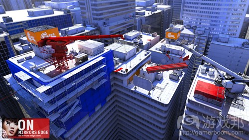
镜之边缘(from gamasutra)
(图1:《镜之边缘》——其整体美术风格意在引导玩家安然穿过关卡。即使是游戏中的办公电脑屏保程序,也在引导玩家走向正确的方向。)
这看起来像是一个相当明确的引导……但重要的是要理解“直觉”与“趣味”间的区别。尽管游戏应该让玩家在穿过关卡的基本过程中毫不费力,但导航式的玩法也可用来创造趣 味。可以将特定区域隐藏起来,增加关卡深度,以及玩家探索游戏时的重玩性(只要你提供了必要的视觉或叙事线索),或者创造一些让玩家迷路或困惑的区域,以便制造一种剧 烈的紧张感,如图2:
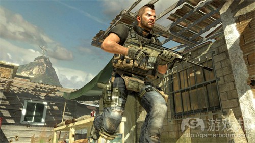
现代战争2(from gamasutra)
(图2:《现代战争2》——这款游戏中的Favella关卡是一个疯狂建筑的迷宫,其中的敌人会从四面八方向你涌来。玩家很难在此找到出口。这种设计是不是很紧张和令人兴奋?当 然!《现代战争》中的Favella关卡还是一个垂直性关卡设计的绝佳典型,这是令关卡导航富有趣味性的重要方面。)
在设计有趣的导航流程时要注意,不可让你的其他游戏玩法元素为此妥协。想象一下《现代战争2》中紧张的战斗场景切换到《镜之边缘》中的跑酷关卡……其关卡中的导航和武术 元素将完全彼此冲突。这也正是DICE保持《镜之边缘》轻松战斗元素的一个重要原因。
另外还要注意确保设计关卡的时候要考虑三个围度人,使用垂直性保持空间导航的趣味性。
优秀关卡设计并不需要依赖故事元素
我有个导师曾经告诉我,优秀的交流碎片好比是一个被破坏的圈圈。作者创造了这个圈圈,但却给读者留下一些由他们自己去填补的空隙。但要谨慎处理这个空隙!如果它太渺小 了,读者就不会注意到;太大了,你就可能失去读者,因为他们无法连上这个圈圈。那么我们该如何创造这个圈圈和游戏关卡中的空隙?首先要认识到关卡中的三个关键叙事方面 :
*显性:文本或对话所传递的信息,例如任务目标或过场动画。
*隐性:这是通过环境提示所传递的故事(见图3)。
*突发性:这是由玩家穿越关卡时所创造的故事。
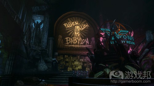
生化奇兵(from gamasutra)
(图3:《生化奇兵》——Rapture之城及其沦陷的故事,是由玩家根据墙上的贴画、涂鸦、破坏的环境等叙事道具所想象出来的。)
关卡设计师应小心创造显性叙事内容,因为这正是组成我们“圈圈”的要素,而隐性、突发性内容才是创造“空隙”,令关卡与众不同的最重要元素。使用“环境提示”将故事融 入游戏世界,并以“隐性”故事激发玩家的想象,让玩家通过玩法选择(游戏邦注:包括使用哪种武器、走哪条路,用什么方法解决问题等选择)来创造“突发性故事”(如图4) 。这些元素允许玩家以自己的行动和想象来填补“空隙”,这总比将一切东西都端到你面前更有益处。
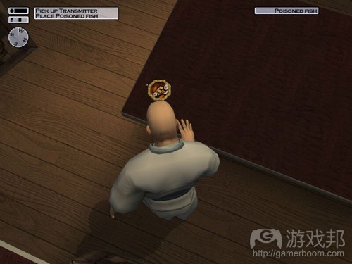
Hitman 2(from gamasutra)
(图4:《Hitman 2》——玩家自己决定要讲述什么故事:用枪开火扫清一切障碍,还是悄悄潜入,偷死鱼之后再溜之大吉。)
优秀关卡设计会告诉玩家该做什么,而不是如何去做
通过选择机制赋予玩家自述故事的权力,玩家就不会对自己的目标茫然不知。开发者可以通过简单、显性、文本式的目标,正确使用路标以及其他助航设备来明确游戏目标;你的 关卡目标要具有视觉上的独特性,可以使用地理位置、形式、照明和动画令其区别于周围环境。
有了导航性玩法,以及更开放性的目标,关卡就会更有趣味。可以通过迷惑玩家完成一个目标来创造富有吸引力的挑战——只要实际目标足够明显。这是另一种“破坏的圈圈”, 例如图5所示,关卡目标一目了然,但我们无从知晚如何实现。
针对“如何实现”这个方面,不应该强迫玩家使用单一的技能来解决一个目标,他们要如何完成挑战应该取决于其自身想法,也不应该惩罚玩家即兴发挥,使用不同于设计师精心 创造的解决方案。这是优秀的突发性叙事所需具备的另一要素。
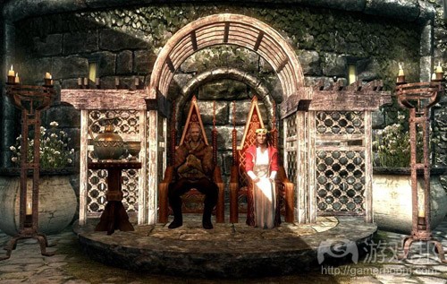
天际(from gamasutra)
(图5:《天际》——该游戏中的Dark Brotherhood任务并没有指明你如何杀死目标人物,只是告诉你必须杀死他们。游戏还提供额外的奖励目标(例如杀死目标之后隐藏尸首), 允许玩家设置自己的挑战难度)
游戏设计元老Mark Cerny曾告诉我们,要为玩家呈现一系列并列的目标,允许他们自主选择完成顺序,每完成一个目标就提供对之后目标有益的奖励。这种方法可以让玩家获得一 种控制感,Cerny的作品《Ratchet & Clank》系列就体现了这一点(见图6)。
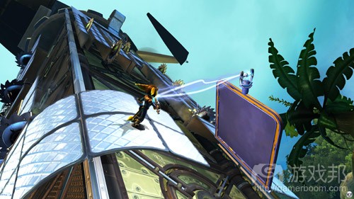
ratchet & Clank(from gamasutra)
(图6:《Ratchet & Clank》——在原版游戏中,玩家会面临一系列可任意选择探索的星球。每探索完一个星球,就可以收集到一个有利于探索下一个星球的道具,其关卡设计包 含了一些首次玩游戏时无法解琐的机制)
优秀关卡设计总会让玩家获得新知识
Raph Koster在其《趣味理论》一书中说明了人类大脑如何根据周围环境来处理信息,并将其转化成之后更易于处理信息的模式。从玩游戏角度来看,这说明我们很大一部分乐趣来 自学习知识,连续掌握不同的机制。Koster提醒我们,如果玩家理解了这种模式,很容易就掌握了游戏机制,他们很快就会厌烦并退出游戏。只有优秀的关卡设计才可能避免这种 情况。
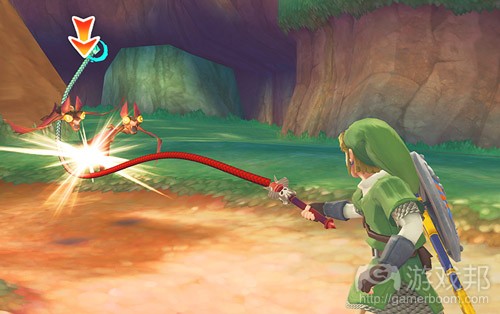
塞尔达传说(from gamasutra)
(图7:《塞尔达传说》——该系列每款游戏中的地下城都是一个新装备的教程……游戏的最后一个boss战役会要求玩家用上他的每个装备来制服敌人。)
优秀的关卡应该引进新游戏机制,或者调整旧机制令玩家重新评估自己已经掌握的技能。游戏应该让玩家在整个游戏中持续评估自己所学到的技能,确保每个关卡都能呈现新鲜玩 法。Bethesda的Todd Howard在DICE 2012 Keynote Address演讲中就以学习 – > 玩 -> 挑战 -> 意外这一循环来衡量《天际》关卡设计。这不但是本原则的延伸,还引出了下一 个设计要点……
优秀关卡设计应该令人意外
已有许多文章探讨过如何使用经典的Aristotelian技巧来衡量游戏。标准的高vs低强度,探索vs战斗,休息vs行动等“过山车”曲线是一种评估关卡设计的优秀基准,也是保持玩 家粘性的重要工具,但其持续重复性会迅速成为一种例行公事。对于交互式媒体来说,我们还有更合适的衡量技巧,但即使是设计很到位的关卡,如果没有一些意外的起伏,也难 以给人留下深刻的印象。
这里的意外不一定是很大的震撼或情节转折……其核心在于急剧上升的不确定性,用游戏设计大师Alex Mandryka的话来说,它就是趣味的根本。从关卡设计上来说,意外可以是独 特的环境,可以是传授玩家新机制的时刻,将山穷水尽转变为柳暗花明,或者难度曲线中的急剧变化。(见图8)
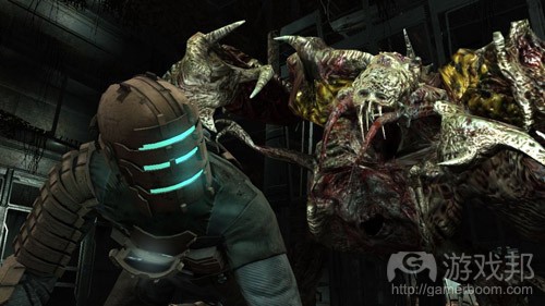
死亡空间2(from gamasutra)
(图8:《死亡空间2》——当Isaac返回在《死亡空间2》中的Ishimura时,他在15分钟内不会碰到另一个丧尸。这种节奏变化创造了一种极端紧张感……令人意外的是,这种设计 产生了一个开心的结果:这个关卡中的怪物太大了,无法置于原版游戏Ishimura布局中的任何地方,所以关卡设计师只能将其置到玩家到达转输中心时……而此时玩家才走完了一 半的关卡!)
关卡设计师不应该畏惧自己的设计风险!不要复制自己最喜欢的游戏中的关卡……只有尝试非常规的东西(见图9)才能创造真正出人意料的体验。这其中的决窍就在于如何管理这 些风险——在纸上设计,在脑中想象最终成品……并尽早创造可玩原型。尽早检验自己想法的可行性,否则就只能在测试阶段眼睁睁地看着它们被淘汰。
Urban Chaos(from gamasutra)
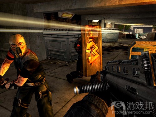
(图9:《Urban Chaos》——在你完成游戏之后观看谢幕画面时,游戏突然又重启了,你发现自己在游戏中干掉的恶棍复活了,他们知道你住在哪里,并决定执行报复计划,令沉 浸在其中的玩家战栗不已,这种落幕方式真是太棒了,这也难怪其开发商Rocksteady能够如此成功。
6、优秀的关卡设计使玩家觉得自己强大
电子游戏是逃避现实的天堂,应该是纯粹而简单的。玩家会愿意逃到一个比他们生存的世界更加世俗的地方吗?关卡设计师不应该要求玩家做他们在现实生活中就能做的事——你 的任务目标应该是避开平庸的、重复的活动,总是给玩家有趣的、好玩有活动。这听起来似乎很明显,但甚至最优秀的游戏开发者有时候也会忘记这条最基本的原则,正如喜剧演 员Dara O’Brien所说的。

Red Faction Guerrilla(from gamasutra)
(《Red Faction Guerrilla》:用枪破坏桥的支架,相当直观,让人觉得强大。)
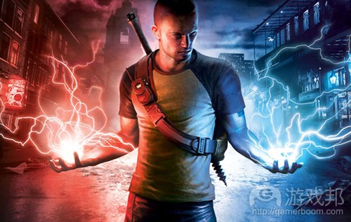
为了让玩家真正觉得自己强大,他们的行为必须在游戏世界中有显著的效果。在低级的、直接的水平上,这可以是与游戏世界中的物品的交互活动(或更通常的,推毁物品),但 如果这样还不能使玩家立即获得破坏的满足感,你可以把你的关卡做成脚本,以其他方式反映玩家的影响,像《inFAMOUS 》中的帝国城和新玛莱的市民。
Infamous(from gamasutra)
(《ImFAMOUS 》:因果系统被完整地结合到开放世界的关卡设计中,玩家被迫在分散的副线任务中做出道德选择(分散炸弹和拯救市民,或者引爆炸弹获得能量),平民会朝你的 敌人或者你扔石头,这取决于你的游戏风格。)
对于《荣誉勋章:英雄2》,我们希望使次要目标不只是隐藏的纳粹卷宗的消费清单,所以我们制作了副线任务,让玩家可以拯救同盟军队、困在遍布于关卡中的某些地点。这些军 队一旦获救,就会与玩家并肩作战,使玩家觉得这是自己的行为的直接结果,是对自己的行为的奖励。
7、优秀的关卡设计允许玩家控制难度
游戏的难度是最难控制的部分之一。容易、中等和困难的设置虽然是一种标准方法,但当玩家还没玩过第一关所以不知道自己的水平能达到什么程度时,就叫他们决定自己要玩什 么难度的,仍然会让玩家觉得不知所措。
一个系统的解决方法是动态难度,也就是让敌人随着玩家经验更变得更加强大(掉落物品也更加珍贵),例如《辐射》、《天际》等。
然而,这种方法并不总是管用的,所以设计良好的关卡必须允许玩家自己管理难度,即灵活地使用风险和奖励。完成关卡或任务的基本路径必须让一般水平的玩家觉得节奏合适、 挑战适中(有一定的惊喜),但还要有一些针对技术水平高的玩家准备的路径(或针对新手的选择)。无论何时玩家必须做出路径选择时,都应该明确地使用关卡语言让玩家知晓 风险和奖励,确保玩家是在知情的情况下做出决定。

burnout paradise(from gamasutra)
(《Burnout Paradise》:高水平的玩家可以冒险走捷径,即图中被黄色障碍挡住的路。捷径的难点在于路径狭窄,从游戏镜头看,奖励可能不太明显,也就是节省时间和爽快感 。)
这个原则在赛车游戏中表现得很明显,但同样适用于其他类型的游戏,如射击游戏或RPG;在后者中,这些高风险/奖励的元素可能表现为放在难以接近(但容易看到的)的位置的 强力武器,或有背对着玩家的守卫的旁路(擅长潜行的玩家可以偷溜过去)。这些捷径也可能表现为谜题,需要玩家多费一些脑筋才能想到,甚至可以插入可选择的、次级目标( 游戏邦注:如寻找U船指挥官并杀死他以解锁强化手枪),从而增加游戏的重玩价值。
skyrim(from gamasutra)
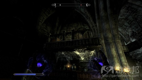
(《天际》:从主路径上看,这个小屋是看得到的,但没有明显的入口;玩家必须想办法跳上去,撬开锁才能拿到宝物。对于热衷宝物的玩家来说,他们是愿意多费一些功夫寻找 线索的。)
8、优秀的关卡设计是高效的
游戏可利用的资源是有限的,无论是硬件限制(如系统内存)还是产品实际情况(如艺品容量)。最大化那些资源的使用,通过良好的设计最大化资源效率是设计师的职责。在关 卡设计中,这意味着当你要使用一种动物时,不仅要把它从头到尾做出来,而且要做得快,做出来后还能重复利用……
模块设计是你的朋友——聪明的设计师不会设计关卡,而是设计一系列模块,然后把它们组装在一起形成一个又一个的关卡。
对这些模块稍加修改,你可以制作出无数的变体,用更少的工作量和冒更小的风险做出更多关卡。利用这种技术制作关卡,一方面可以使玩家觉得关卡熟悉,有助于他们学习和精 通你的机制,另一方面又不会觉得关卡毫无新意,而是仍然有挑战性和惊喜的。
有空可以玩一玩《天际》的Bethesda工具箱或《辐射》,你会很惊讶:这么小的团队怎么能够做出这么多出色的内容……这都是模块化的功劳。这么高程度的模块化可能不一定适 用于所有游戏,但在不同程度上可以运用于所有游戏。制作《荣誉勋章》时,制作人要求我们制作“战斗时刻”——时长为30秒到5分钟、战斗玩法紧凑的片段,我们可以用它们快 速制作原型和重制,拼成不同的情境,最后做成许多有趣的关卡。这使设计师得以花更少的时间制作更多但仍然有趣的内容。
美工团队会花大量时间修饰关卡,虽然大部分时候玩家对这些美丽的场景只是走马观花。重复使用关卡的区域不仅能节省资金成本,而且减少了必须记忆的关卡几何的数量。有些 关卡空间是需要重复经过的,设计师必须确保这些空间是可以双向通行的,最好能进行一定的修改,使玩家第二次经过相同的空间时仍然有一些新鲜感。
Halo-3-The-Ark-26-Scarab-Vs-Scorpion-Tank(from gamasutra)
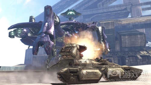
(《光晕3》:在这个关卡中,Master Chief要穿越一片大沙漠,之后还要返回来!但是,制作团队给Master Chief 一个超级坦克,使返程的旅程别有趣味。)
优秀的设计师应该充分利用关卡的点点滴滴,提供需要探索才能完成的隐藏目标,例如《光晕3》中的skull、《战争机器》中的COG标签和《刺客信条》中的羽毛……利用这些东西 可以在不增加额外的关卡制作量的情况下,延长游戏时间。
这些可收集的元素,与前面提到的风险/奖励路径和次级目标一样,都有助于增加游戏的重玩价值,产生更高的效率。但请确玩家完成这些目标有长期的动机,如显著不同的游戏体 验或明显的奖励(新的增益道具、武器等)。最好的是,把动机整合到游戏剧情中,让他们体验到情境,像《铁臂阿童木》一样。

Astro_Boy_Omega_Factor(from gamasutra)
(《铁臂阿童木》:这款GBA游戏仍然是如何增加重玩价值的经典例子。第一次通关游戏后,玩家对结局并不会太满意……但玩家可以使用自己收集到的所有道具进入旧关卡中的新 区域,解锁更多关卡和道具,最后获得真正理想的结局。)
9、优秀的关卡设计会调动情绪
最近,美国最高法院正式宣布电子游戏属于艺术……根据字典,使它们“成为一种美丽的、有吸引力或超越一般意义的产品或表达,根据美学原则”。
但这是对什么组成艺术的稍微实用主义的分析。从纯主观的角度看,我认为艺术是为了刺激情绪反映的东西;绘画、雕塑、摄影、音乐、电影……都是为了鼓励它们的受众产生某 种情绪性反应而被制作出来的。对于电子游戏,更是如此。
最适合用于类比关卡设计的经典艺术形式也许就是建筑了……多少个世纪以来,建筑师一直在玩转人们的情绪。例如,建筑师会根据他们想激发观者的什么情绪来确定窗户的高度 ——窗户低于膝盖会让人觉得强大;高于肩膀会让人觉得压迫和禁闭。
建筑师已经把Mazlow的需求层次理论(如果要直接运用于关卡设计,那就太抽象了)改编成一系列非常实用的建筑学原理,帮助设计师制作情绪性空间。这些理论,结合传统的空 间指标,可以用于在关卡中制造我所谓的“空间共感”,今年的《古墓丽影》正是巧妙地运用了这个原理。
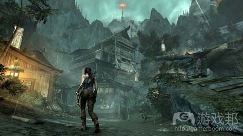
tomb raider(from gamasutra)
(《古墓丽影》:在她的最新冒险中,Lara Croft穿过狭窄、封闭的洞穴、植物蔓生的原始丛林、令人头晕目眩的山崖……各个空间都是精心挑选的,旨在引发玩家的不同情绪反 应。)
事实上,玩家对关卡的情绪反应确实太重要,所以在一开始设计关卡时就应该考虑到。为此,你要挑选可以使玩家产生你所需要的情绪的空间指标、剧情元素和游戏机制。想产生 困扰的感觉?让敌人AI追赶玩家。想产生愉快的感觉?让玩家在开阔的路上奔跑。想产生绝望的感觉?让玩家在有限的时间内解决几乎不可克服的困难。所有这些都可用于引发玩 家的情绪性反应。
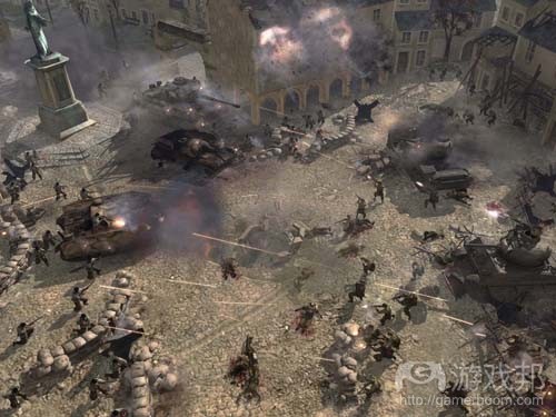
defualtcam_church(from gamasutra)
(《英雄连2》:在这个任务的最后一幕中,玩家的小队被迫返回教堂。玩家陷入困境,必须抵挡纳粹直到援兵到达。怎么知道坚持到什么时候?计时器?不是。纳粹的剩余数量? 不是,敌人是杀不绝的……是玩家小队的命值。只有当玩家快丧命时,援兵才会出现。也许有些不公平……但这个玩法有效地使玩家在面对无尽的敌人时产生绝望感。且当最终获 救时,放松的感觉也更加强烈!)
10、优秀的关卡是由游戏的机制驱动的
“书籍让你想象非凡的东西,电影让你看到非凡的东西。那么电子游戏呢?电子游戏让你做非凡的事情。”
最重要的是,优秀的关卡设计是由互动作用—-游戏的机制驱动的。游戏关卡不只是为机制提供情境,还提供它们存在的现实。
我喜欢把游戏关卡描述为,传递玩法所借助的元物理介质。这听起来有些不自然,但它的真正意思是,你的关卡应该是一个传递玩法的系统,其主要功能是利用你的机制来产生有 趣的体验。拓扑学、建筑、目标、迭代、战斗情境等……都应该首先服务于突出你的所有精华的玩法系统。
为此,必须先全面地理解游戏的机制,再开始设计关卡。当系统和关卡是同时设计时,这就不可能了……但你至少应该对正在制作的系统有一个大概的了解(并且相信它们会制作 完成,这样你就不会觉得自己正在为一个完全没有完成的特征浪费时间)。在这种情况下,好处是如果你有一个不错的关卡想法,你可以寻找必要的玩法系统来支持它。
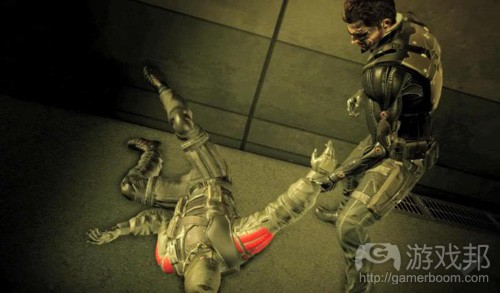
Deus Ex Human Revolution(from gamasutra)
(《杀出重围:人类革命》:游戏的副线任务旨在突出特殊的机制:在一个任务中,玩家必须把不省人事的人拖到悬崖边,把刺杀伪造成自杀。)
当我谈论系统时,我还指AI,这是经常被忽略的东西,却时时造成数不尽的问题。关卡设计师的大量时间是用于折腾AI。好好培养与AI团队的关系……这样你才能了解他们已经计 划了什么特征、他们才能知道你面临什么问题。谁知道呢……如果你跟他们打好交道,他们可能甚至会为你设计的埋伏制作专门的AI行为。

Batman Arkham City(from gamasutra)
(《蝙蝠侠:阿甘之城》:这个开放世界中到处是谜题,鼓励玩家寻找新方式使用自己的装备。这产生了非常高的设计效率,使玩家觉得自己是游戏世界中最了不起的侦探,而不 只量个只会揍人的打手。)
总是记住,交互性才是使电子游戏有别于其他娱乐媒体的东西。书籍有故事,电影有画面、游戏有互动。如果你的关卡设计不能显示你的游戏机制,那么玩你的游戏还不如看电影 或看书。以上。我想澄清的一点是,我并不认为这些原则就是确定的……但是,我希望它们能成为关卡设计的良好开头。我希望它们像游戏本身一样,继续提炼和完善。
总之,以下是我对这10条原则的概括:
1、有趣:用清楚的视觉语言引导玩家通过主要路径,通过垂直空间、次要路径、隐藏区域和迷宫元素增加关卡的趣味。
2、不依赖文字来叙述故事:除了由故事和目标唤起的明确剧情,优秀的关卡设计会通过环境表达剧情,让玩家通过玩法选项产生自己的剧情。
3、告诉玩家要做什么,而不是怎么做:确保任务目标是明确的,但让玩家以自己喜欢的、可行的方式和任意顺序来完成它们。
4、总是教玩家新东西:通过在游戏过程中不断引入新机制,保持玩家的沉浸感;通过修改或以其他方式重得使用,来防止旧机制变得乏味。
5、惊喜:线性节奏并不总是适合互动媒体,但所有的关卡都使用标准的“过山车”模式也是不行的。为了创造新鲜的体验,优秀的关卡设计不怕在节奏、美学、地点和其他元素上 冒险。
6、使玩家觉得自己强大:电子游戏是逃避现实的场所,所以应该避开世俗。另外,优秀的关卡设计通过让玩家体验自己的行为(立即的、即时玩法、长期的)结果,使玩家觉得自 己是强大的。
7、允许玩家控制难度:一般水平的玩家可以通过主要路径完成任务,高水平的玩家可以通过高风险/奖励的路径获得满足感。
8、高效的:资源是有限的。优秀的关卡设计通过模块、双向玩法和充分利用游戏空间最大化游戏的重玩价值。
9、刺激情绪:为了刺激玩家产生目标情绪,要选择合适的机制、空间指标和剧情元素。
10、由游戏的机制驱动:最重要的是,通过关卡体现游戏的机制,突出电子游戏的独特属性——交互性。
篇目3,书摘:以建筑学方法设计游戏关卡
作者:Christopher Totten
在过去几年中,我发现游戏行业似乎乐于将建筑学作为辅助我们执行设计的一个潜在领域。作为拥有两个建筑学位的游戏开发者,我当然也看到了这两个领域之间的联系。我在还是一名建筑学本科生时就开始与朋友制作小型电子游戏——使用我在课堂上所用的设计软件来绘制游戏的美术内容。因我一些工作室伙伴的建议,我开始在自己的课堂在项目上运用我所学到的游戏设计知识。我认为建筑学与游戏一样,与其用户之间具有象征性的关系,并且设计精良的游戏关卡与建筑大师Frank Lloyd Wright、Le Corbusier、I.M. Pei等人的作品也有异曲同工之妙。我在这两个领域的研究集中体现在一篇关于游戏与建筑学交集的毕业论文中。毕业之后我成了一名游戏开发者,并继续研究建筑理论对关卡设计的运用。这项工作令我撰写出了多篇论文,展开了多次大会演讲,并且现在还出版了一本书。
《An Architectural Approach to Level Design》这本书由CRC Press于6月12日出版,整合了建筑学和关卡设计领域的空间设计理论。本书通过建筑学情境和历史探索了关卡设计原则,为学者和游戏开发专业人士提供了有用的信息。
本文摘录了这本书的一些片段,呈现了可运用于实际关卡设计的基本建筑学元素和一些我自己的游戏玩法和设计日志的插图。这些章节便于读者进一步探索视觉传达的方法,创造玩家的情感反应,鼓励社交互动以及其他对游戏世界来说的重要之事。
看待关卡设计的方法——第1章:建筑学与关卡设计简史
为了全面理解关卡设计中的空间设计原则,我们有必要分析一下现实世界的建筑和电子游戏的惯例。Hal Box,FAIA,Emeritus教授及前德克萨斯州大学建筑学院院长曾主张基于研究和分析来看待建筑学这种教育形式。在这种情况下,“看待”不仅仅用于描述视觉的使用,还可用于处理令建筑与众不同的空间、形式、情境化以及历史元素。
对于关卡设计师来说,这种“看待”可能改变我们对之前游戏关卡的认识——有好也有坏。这样做可能会破坏一些游戏玩家的普遍习惯。例如,在玩游戏过程中“玩家不会向上看”。作为设计师,游戏空间的垂直性可能成为确立一个壮观场景,或者向玩家传递方面的一个重要元素。同理,作为玩家,我们会很本能地直接奔向下一个行动场景而不是暂停下来探索游戏环境。设计师应该以微妙的方法引导游戏环境节奏——在玩家路径中布置叙事元素或者用奖励来刺激探索行为。
Box在自己所著的《像建筑师那样思考》一书中提出了探索和理解一橦建筑的十种方法:
1.了解建筑落成的原因,它的作用,以及它现在的情况。
2.在你四处走动时向上看——注意视觉元素,形式层次,以及建材。
3.通过大小、形状以及它同光线、声音和其他空间的交互来感受其建筑空间。
4.用你的眼睛理解建筑结构的能力,以及该结构如何托起建筑。
5.确定建材在压缩或张驰上的表现,或者它们是重量型还是轻量型的。
6.确定建筑是以何种材料如何构造起来的。
7.检查该建筑在历史上的先例。
8.分析建筑元素的构图、比例以及节奏。
9.观察建筑与其背景是否和谐。
10.分析该建筑为何有别于其他建筑。
显然,这些问题并不全都适用于游戏关卡。虽然关卡的场景艺术可以表示压缩或张驰的结构,游戏艺术本身却并非如此。同理,许多游戏关卡并非由游戏引擎中的刚体对象所决定,因此不会因为引擎的物理系统而崩溃。但是,许多此类观察法在其当前形式下似乎也可运用于游戏关卡,或者可以稍微调整使之符合我们的用途。在这种情况下,我们可以说关卡设计师能够用以下方法来改变自己的观察方法:
1.确定空间所发生的玩法。游戏机制支持什么情况?
2.在四处走动时向上看——注意视觉元素,尤其是与周围环境形成对比或者脱颖而出的美术元素。还要注意向下看——这个空间是否颠倒地运用垂直感从而令你产生危机感?
3.通过大小、形状以及它与光线、声音和其他空间的交互情况来感受游戏空间。体会一下该空间的照明或声音条件让你产生什么感觉?
4.分析关卡的节奏。关卡是否会快速地在你面前自动呈现,还是让你进行探索?它们是必须关卡还是会为探索行为提供额外奖励?
5.这个关卡是否反映了一种玩法风格,还是支持多种玩法?(游戏邦注:例如,死亡模式的地图是否为狙击手、进攻型玩家,防御型等玩家预留了位置?游戏关卡适用于野蛮人,但却不适用于魔法师?)
6.空间如何表达游戏中的故事?其背景或者探索关卡能否让你了解游戏世界?叙事事件是围绕玩家而编写,还是说只有过场动画?
7.检查之前是否存在类似的玩法先例?这些游戏采用了哪种空间体验?
8.分析场景艺术元素的结构、比例和节奏。
9.关卡几何结构与角色的行动能力相比起来情况如何?这一切均在角色可操纵的范围内,还是说关卡空间会对其形成挑战?是否存在超出角色能力范围的东西?如果是,游戏是否提供了能够扩展这些能力的方法?
10.哪些场景艺术元素是重复的?它们是否具有交互性?如果是,它们是否会响应特定的玩法机制?
用这些方式来看待关卡设计,以及本章节中其余部分内容中的建筑和游戏空间先例,这将有助于引导我们探索关卡设计中的空间设计原则。
关卡设计工作流——章节2:关卡设计的工具和技巧
美国建筑师Louis Sullivan常被誉为摩天大厦的创造者,他曾说过“形式要遵从功能”。Sullivan以这个格言确立了一个建筑学现代派的主导原则。现代派是二十世纪早期强调创造形式源自功能的建筑这一主张所定义的建筑学运动。在现代建筑中,装饰物通常是建筑本身或者具有某项用途的产品,而不只是纯粹为了美学效果而存在。与Sullivan相同,Le Corbusier也曾说过,“房子是居住的机器。”他的许多建筑设计与Frank Lloyd Wright、Walter Gropius、Louis Sullivan等人的作品一样,关注的是有目的地为居住者创造一种体验。
关卡设计也同此理。在关卡设计中,开发者心中通常会有一个特定的体验目标。在2008年的一次采访中,Valve关卡设计师Dario Casali指出创造关卡设计理念时“体验是关键”。在本章节早期部分,我们讨论了与用户如何使用游戏空间,以及设计师如何通过空间向用户传达信息有关的关卡设计目标。这些体验式目标能够决定我们关卡设计师如何构造空间:形式遵从功能。
在这个部分,我们将讨论一些包含相同工具的工作流程,我们的切入点就是如何将“形式遵从功能”嵌入游戏设计。
形式遵从核心机制
游戏设计可以通过核心机制这个理念来表现形式遵从功能。核心机制通常被定义为玩家在整个游戏过程中所执行的基本操作。游戏设计师Aki Jarvinen在自己的博士论文中曾创造了一个以核心机制为中心,即设计师从动词入手的设计方法。如果你将核心机制视为玩家在游戏中的基本动作,就能够理解构造每款游戏独特体验的基本元素了。例如,《超级马里奥》就可以说是关于跳跃的游戏。而《塞尔达传说》的主题就是探索,《Katamari Damacy》就是翻滚,《愤怒的小鸟》就是弹射。从这个核心开始,其他添加的动作定义了最终游戏产品的规则。
在设计关卡时,心中存在一个类似的核心机制是一个必要之举。许多新设计师认为各个关卡都应该遵从游戏的核心机制,但我们也可以确定关卡核心机制从而令每个关卡都呈现独特性。这方面的例子就是Valve的《军团要塞2》国的Badwater Basin关卡(详见下图)。
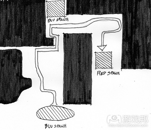
fig 2-43(from gamasutra)
(这是来自《军团要塞2》的Badwater Basin规划图表。地图上标注了RED和BLU队的基地,以及这两个基地之间的主要循环区域和BLU检查点。)
在这个关卡中,游戏的Builders League United(或称BLU)队必须通过一辆轨道上的矿车向对手Reliable Excavation Demolition(或称RED)队的基地投掷一个炸弹。Payload模式的矿车机制采用了《军团要塞2》基于团队的第一人称射击机制的标准并进行了一些调整。这不但改变了玩法机制,还改变了关卡空间几何条件。
Casali所举的一个例子就是关卡中的隧道。在关卡的第一个原型中,设计师将矿道制作成他们运用于其他基本地图的标准宽度。但是,在测试含矿车机制的关卡时,他们发现隧道必须加宽才能同时容纳玩家和矿车。这看似一个小调整,但却可以避免玩家因被矿车堵塞在隧道中而产生的愤怒情绪(详见下图)。
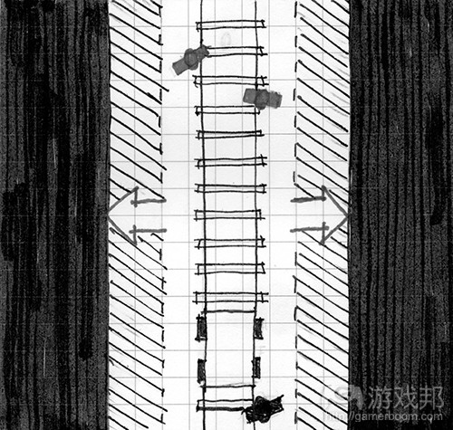
fig 2-44(from gamasutra)
(调整Badwater Basin中的隧道宽度可以让玩家和矿车更好地通过关卡,并且比较不容易削弱攻击方团队的玩法。)
作为关卡设计师,我们的职责就是设计玩家角色与其他玩法元素如何通过关卡。当关卡空间可舒适地容纳参数时,玩家就能够比较轻松地穿越关卡。我们在之后的章节中还将探索当我们创造出将参数推向极致的空间时,就可以实现玩法的戏剧化发展。这些空间包括需要角色尽己所能跳到最远的鸿沟(例如超级马里奥中的world 8-1)或者恐怖游戏中限制玩家行动的走廊,例如《生化危机》(详见下图)。
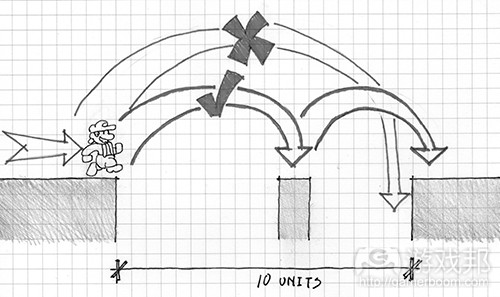
fig 2-45(from gamasutra)
(《超级马里奥》中的关卡8-1令马里奥跳跃到极限。该鸿沟有10个街区那么宽,比马里奥所能跳跃的9个街区还要多1个街区,所以有必要采用一个宽1个街区的中间岛。多数穿过这种鸿沟的策略都需要玩家先跳到一个中间岛,然后再快速跳到另一个岛,这样马里奥的着陆惯性就不会导致玩家坠入深渊。
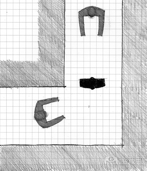
fig 2-46(from gamasutra)
(《生化危机》中许多过道的宽度仅能容纳两名玩家并肩而行。在这种情况下,一个僵尸就足以成为玩家穿过该走道的巨大威胁。这种空间条件还给游戏创造了一种幽闭恐惧症的氛围。)
针对玩法而设计关卡并不仅仅要考虑到尺寸大小的问题。它还意味着针对特定角色的能力(如特殊攻击或行动模式)而设计。如《合金装备》等潜行游戏就提供了一个关于如何根据不同角色行为来构造关卡的出色典例。在这款游戏中,玩家角色Solid Snake拥有一种隐藏在墙壁之后并查看角落的能力。与其他动作游戏相比,这极大改变了90度角落的的含义——它们变成了战略性隐藏地点而不仅仅是关卡空间。为此,组成《合金装备》场景的核武器厂就有许多这样的角落,以便玩家从一个地方潜行到另一个地方,查看角落来寻找自己的下一个避难所。这并非基于尺寸大小或参数的设计,而是基于角色自身机制的布局,其玩法动作创造了角色如何行动或与环境交互的一系列可能。
关卡设计方法论
在本章节早前的内容中,我们讨论了建筑师的方法论,即建筑师用于确定自己想让建筑呈现的形状或方向的基本形式。对于关卡设计师来说,确定关卡的核心机制,方法论是另一个发展关卡空间布局的有用工具。
用方法论执行设计与在纸上或电脑上展开设计极为不同。方法论必须有草图,因此缺乏测量。草图练习能够让设计师在花时间衡量自己的设计版本之前,快速形成想法。关卡设计师方法论的关键在于像绘制空间图表一样勾勒出玩法理念。例如,之前提到的Badwater Basin关卡中的设计方法如果是在两者之间更狭小的区域中来呈现矿车轨道,以及BLU玩家可夺取的更小基地,那么它就会形成两个庞大的混乱场面。
Edmund McMillan在《Indie Game:The Movie》关卡设计讨论中指出,当设计师创造出环境机制时,即与玩法相关的关卡交互环节,它们就必须具有多种可用性。在e4 Software的手机游戏《SWARM》(玩家必须将敌人引进陷陆的平台游戏),程序员/设计师Taro Omiya创造了电子栅栏陷陆的多张草图来形象化它们的不同用途。此外,Omiya等人还在电脑和纸张上制作正式的方法论以便形象化关卡的空间方向(例如下坡、漂浮岛以及平台区域)。
Whiteblocking数字原型
当开发者在电脑上开始制作数字形式的原型时,他们会通过一个所谓的Whiteblocking流程来创造一个测试关卡。Whiteblocking就是当关卡设计师用一些简单的几何体创造一个关卡,通常是白色或纹理简单的模块来测试关卡是否能够完成他们所需要的玩法目标。在设计过程早期,当设计师试图确定玩家角色的玩法参数和其他东西时,Whiteblocking就有助于确定玩法衡量的情况。同理,设计师也可以用一种类似方法论的做法绘制关卡空间特点的草图,在向关卡添加特定场景美术元素之前,测试不同玩法体验的特定场景的大小和形状(见下图)。
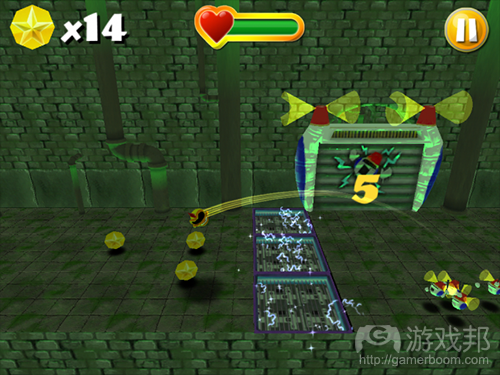
fig 2-51b(from gamasutra)
(《SWARM!》中的Whiteblocking显示了关卡中一个引导玩家杀死敌人的重要环节如何在添加场景美术之前以简单的几何体进行测试)
Wbiteblock关卡空间所用的几何体通常是最简单,能够模拟最终关卡设计所使用的碰撞物。碰撞物是游戏引擎中的一个对象组件,可模拟实体对象之间的交互。例如,与一个关卡几何体相关的盒子碰撞物就会导致物体与其他物体之间的互动,就好像它是一个六面的盒子,无论其实际的场景美术外观如何(见下图)。碰撞物可以是简单的几何形状,或者密切贴近有机形状的东西。
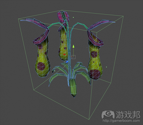
fig 2-52(from gamasutra)
(这个植物有一个盒子碰撞物。虽然其3D模型中有一个有机形状,但游戏中的玩家对象将像对待一个矩形固体一样与之互动)
Valve在其关卡设计过程中广泛使用Whiteblocking方法。他们的关卡编辑器Hammer中的引擎基元构造规则允许开发者通过简单而准确的创建方法快速制作3D关卡原型。Hammer的基元被称为“笔刷”,用于粗略定义关卡空间,之后会进行测试查看是否创造了既定的体验。关卡设计师会看出哪种情况可行或不可行,之后再通过编辑笔刷来调整空间。当设计师发现自己较少编辑主要空间,而是关注更小的细节时,就意味着可以在关卡中添加场景美术内容了。
这是一个迭代性的过程,Whiteblocking会从关卡的方法论式交互形式开始,并将设计师引向更为艺术性和装饰性的设计决策。关卡几何越是确定,标准的场景美术也会随之确定,最科成为关卡建设模块。
建筑空间布置——章节3:基本游戏空间
与之前的章节一样,我们将从建筑学的课程入手。之前我们关注的可用于游戏引擎场景的工具和技巧,这次我们将讨论可运用于游戏的空间布置。
游戏与建筑学的区别就在于现实世界的建筑必须遵从现实规则。例如,现实世界的建筑必须同时具有内部和外部设计——其中一者必然影响另一者。同理,现实世界的建筑学必须考虑到气候、地质、分区管制以及构造现实状况。而游戏领域却没有这些必须处理的情况。这可能意味着像Atelier Ten Architects和GMO Tea-cup Communications Inc.的地球博物馆(一个漂浮在太空的大型椭圆建筑)或者巴西建筑师Oscar Niemeyer生活中的Hidenori Watanave的探索数据雕像——这两者都是存在于虚拟世界《第二人生》中的建筑结构。这会产生基于玩家行动模式、叙事事件或游戏机制等更为自由的空间布局。的确,“内部”和“外部”不过是基于运用于装饰游戏空间的美术元素的描述。
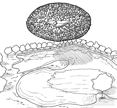
fig 3-1(from gamasutra)
(这是Atelier Ten建筑和GMO Tea Cup Communication Inc的地球博物馆的一张草图。因为该建筑是在虚拟世界中创造,它并不需要任何构架来支撑组成其主体的成百上千个立方体。设计师是用微软Excel表格设计该建筑形式,之后再用一个自动建模程序生成其几何图形)
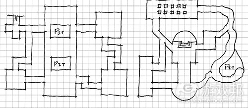
fig 3-2(from gamaustra)
(关卡规划的方法论图表草图。游戏关卡可以呈现不寻常的特点,因为它们并不需要像现实建筑那样遵从内部与外部对应的设计)
了解这些区别之后,游戏的空间设计师就可以在游戏设计的自由环境下利用建筑学知识进行设计。有些知识甚至与关卡如何在许多现代游戏引擎中构建具有概念上的联系。
Figure-ground
我们将探索的第一种建筑空间布置就是Figure-ground,它是源自某个构造的积极和消极空间的美学理念,积极空间描述的是被某个对象所占领的区域,而消极空间描述的则是介于对象之间或处于对象之外的空间(见下图)。

fig 3-3(from gamasutra)
(这个插图就是所谓的Rubin花瓶,它呈现了积极和消极空间的概念以及两者之间的互换。根据观看者对黑白图像的理解,这可以视为一个花瓶的形状,或者两张相互对视的脸。)
建筑学中的Figure-ground理论来自积极空间人物的布置。在规划图中查看时,设计师可以看到建筑的布置开始从地面塑造出空间。的确,Figure-ground图像中的这些空间构造与figure本身的布局一样重要。据建筑设计师Matthew Frederick所述,由已安排好的figure所塑造的空间本身就是一种积极空间,因为它们现在也像figure一样具有形式。从城市设计角度来看,这种有框架的空间通常是广场,院子、公园、节点以及其他人们可以“入驻”的会面区域,而其余消极空间则是让人们穿梭的区域。
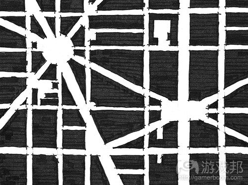
fig 3-4(from gamasutra)
(在筹划figure-ground图像的空间时,很有必要观察积极空间中的建筑如何从消极空间地面创造出空间。这些空间拥有自己的形式,可以视为积极空间。)
Frederick还指出,在利用Figure-ground理论时,figure元素和空间都可以通过区分结构元素的空间,或者创造与附近figure相似的形式的消极空间进行暗示。这与理论神经系统科学家Gerd Sommerhoff引述建筑师Grant Hildebrand所谈的观念相呼应:
“大脑会根据之前经历的事件所形成的画面来预测未来的事件画面。当无法重现之前的经历时,大脑就会准备重新体验这种设定。如果已经确立了预期,该模式就会用一种合成的愉悦感得到强化。”
这样,我们就可以看出figure-ground为何会成为关卡设计师在许多游戏引擎中创造增加性或减少性空间的方法。许多引擎允许设计师在消极的2D或3D空间中创造具有增加性的图像元素。游戏空间通常是使用积极元素,基于通过消极空间的移动机制而形成。在其他机制中,在固定形式中塑造空间可以创造出房间、走廊以及玩家可以奔跑、隐藏、追逐的其他空间。除此之外,设计师还可以通过暗示性的边缘或强调性的空间来向玩家传递信息。
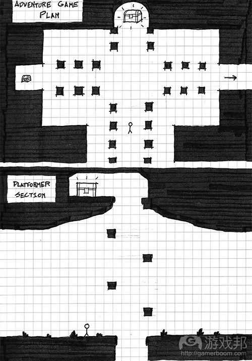
fig 3-6(from gamasutra)
(这些插图表明figure-ground关系可运用于多种游戏空间,暗示性的空间关系可能够成为向玩家传达空间信息的一个有效方法)
Form-Void
Form-Void在许多方面是figure-ground的3维进化版本。它是figure-ground在游戏中的自然运用,可以从一个非上下视角的方向查看游戏空间。在form-void理论中,从固定形式创造出来的空间拥有自己的形式。
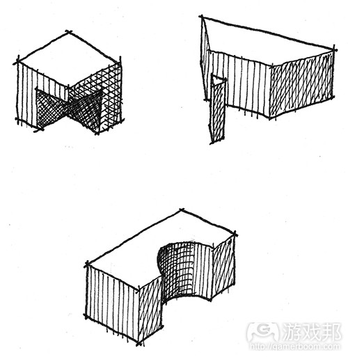
fig 3-7(from gamasutra)
(这是一些形式之间存在form-void关系的例子)
正如figure-ground是用大量元素组成空间的空间布局一样,form-void是通过添加堆块或减除空间来进行的空间布局。这与我们在第二章:关卡设计的工具与技巧所描述的许多游戏引擎的操作方法一样。与之相似,3D美术程序也允许形式之间通过精心建模或Voolean操作实现交互,可用数学方程式以增加或减少的方式来结合3D模型。 Peter Zumthor的Therme Vals或Mario Botta的Casa Bianchi(两者均位于瑞士)等建筑就能够说明form-void关系可运用于塑造露台、门廊、窗户、卧室和其他用途的空间。在游戏中,这种增减方法可用于创造隐藏性的空地、秘密走廊、伏击点甚至是关卡目标。
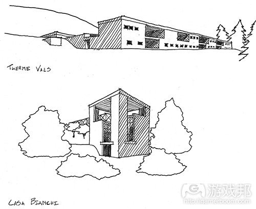
fig 3-8(from gamasutra)
(来自Peter Zumthor和Mario Botta的草图表明形式和虚无可以用于确定空间。)
Arrivals
关卡设计是一种对比艺术。它还是光线、路径以及关于你何去何从的歧义性的艺术。所有的这些元素构成了“arrival”(到达)体验,即你首次进入某个空间的感觉。
我们主要通过到达某空间来向玩家传递信息。这也正是空间促使玩家走向下一个目的地或为玩家提供其路径选择的方式。你进入一个空间的体验来自之前空间所提供的空间条件:如果你进入一个大型空间,那么引你进入其中的之前空间应该是狭窄的,这样才能让新空间显得更大;同理,明亮的空间之前对应的应该是阴暗的空间。建筑师Donlyn Lindon和Charles W. Moore在其著作《Chambers For A Memory Palace》中称John Portman & Associates的Hyatt Regency Atlanta酒店就是这种典型。它又被评论者称为“Jesus Chris Spot”,该酒店落成后商人们从较低的天花板空间进入22层的中庭并向上看时,嘴里都在喃喃着“天哪!”类似的空间体验还可见于基于探索的游戏,例如《塞尔达传说》或《合金装备》系列中进入重要敌人遭遇战,道具获取或故事事件的时候(见下图)。
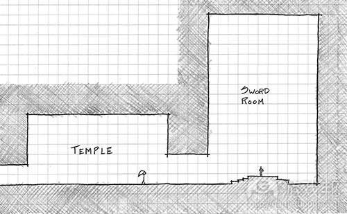
fig 3-9(from gamasutra)
(许多游戏使用对比鲜明的空间条件来突出进入boss房间或目标等重要玩法空间的路径。这是来自《塞尔达:时之笛》中的Temple of Time图表,玩家在此会收到重要的宝剑,这显示了对比鲜明的空间,其拜占庭式的大厅布局则强调了宝剑房间的重要性。)
玩家如何到达空间的另一个重要元素就是他们始于到达点的视角。我们在之后的章节中可以看到,游戏中的摄像角度会对玩家如何理解空间产生重大影响。但是,无论选择什么视角,都有可能产生戏剧化的启示和到达感。在经典建筑中,希腊雅典的帕台农神殿就显示了居住者的视角如何被引向戏剧性启示。在希腊卫城拾阶而上的游客会首先从下方看到帕台农神殿,之后进入卫城前门时,他们就会从西北角看到四分之三的帕台农神殿,而不是以直接的2维视角看到神殿。该路径之后会迫使游客迂回帕台农神殿本身的入口之前在建筑四处转转。游客通过这个路径远比直接走向入口更能获得戏剧性的体验。
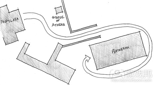
fig 3-10(from gamasutra)
(进入帕台农神殿的入口示意图。游客并不会从入口通道一边进入,而是从角落进入。之后他们就必须绕着建筑走。因为该建筑所有的台阶都同样复杂,所以游客走向入口时可以从所有角度欣赏建筑。)
Genius Loci
最后一个建筑学空间经验与布局的关系较小,但与设计空间的另一个目标关系更为密切。这个经验就是Spirit of Place。这个术语来自一个罗马信仰,即灵魂会扮演城市精灵的角色,保护城镇或其他有人口居住的地方。这个术语被20世纪末的建筑师所采纳,并用于描述一个地方的标识或情感体验。
在第二章节,我们讨论了关卡任天堂力量方法,即设计师创造一个宏观层面的方法或者其关卡的规划,然后分配玩法的高潮时刻 ,就像为游戏杂志创造地图一样。每个玩法的高潮时刻,可以是敌人遭遇战,行动谜题,或者有帮助的阻塞点,都有它们自己的Genius Loci。这些地方是用于休息还是战斗?玩家在这些游戏空间是否该感到放松、紧张或思考?这些问题的答案取决于你所创造的游戏,但却有助于确定你想为关卡创造的体验类型。
除了每个玩法遭遇战,关卡设计师还可以在其游戏空间中植入Genius Loci,并将其作为一种将玩家从一个点转移到另一个点的工具。Genius Loci可以通过光线、阴影、空间布局以及空间大小的操控来创建。如果你为恐怖游戏创造关卡,你所创建的Genius Loci就应该是通过对场景艺术、光照、音效和其他资产的精不挑细选而创造出来的。同理,仅有一点或没有Genius Loci的游戏空间就可能是一个流通空间,也就是玩家转移到下一个目的地的空间。根据你所创造玩法的情况,流通空间可能是激烈遭遇战之间的一次休息机会,或者玩家进入下一个难忘玩法时刻前创造悬念的工具。
篇目4,解析游戏关卡设计中的构图原则
作者:Mateusz Piaskiewicz
在设计一个关卡时,你可以用自己所需的任何物体来构造虚拟环境。这是关卡设计师与风景摄影师之间的区别。你不必去适应自然或建筑的现成元素。你可以极大地影响场景。关卡设计师的工作相当于画家。现在让我们将关卡视为画廊,关卡远景就是图画。这意味着玩家可以从一个构图穿越到另一个构图。
你什么时候应该关心构图?我只能说你必须时刻关注,但这并不太可能。这是一个极耗时间的任务,有时候你也没有必要创建一个令人印象极深的构图。好消息在于创建美观的构图很简单,并且很容易成为你的第二天性。我所遇到的许多设计师就可以制作出很棒的关卡,但他们并不知道如何或何时运这用这些构图。我将在本文展示自己规划和部署美观场景的方法。
你何时何处运用构图原则:
*环境构图——-兼具视觉和玩法区域,玩家可以看到一切的大图。你可以构造一个走廊和房间、城镇、景观,远处地平线和极美妙的背景。这种构图通常只能从少数角度观看,这可以让构图规划更容易一些。
*环境元素构图-—– 装饰物、细节和物体组合等大图的组成部分。如垃圾桶旁的废弃物,地面上的岩石,桌上的东西。这种构图可以从任意角度观看。
*视觉反馈&导航——突出物体,呈现走向物体的路径,引导玩家穿过特定区域。如果玩家的目标就是走向断路器,你就必须将玩家引导到那里,或者向玩家呈现相关路径,这样你就可以运用构图原则来突出那些可能抓住其注意力并更改其行走路程的东西。
构造你所会的一切与模仿自然之间的界线并不明显。你可以创造墙壁上风吹树叶的构图,但其结果可能有点过犹不及了并且不自然。构图是用来安排空间从而产生富有吸引力的画面。树叶只是背景,你没有必要为之构图,除非是一堆需要玩家注意的树叶。大自然在创造美丽的构图,我们应该模仿自然的力量而非伪造自然。
构图基础
构图是场景元素的安排。运用构图原则的场景呈现了一个易于理解并且不会让观者困惑的和谐理念。和谐的构图会自然地将玩家的视线依照我们的计划引向图片元素。和谐会极大影响人们对画面的理解。为了实现和谐的场景,你必须运用色彩、光照、比例、方向和位置来设置场景元素和突出其中一些元素。换句话说,你可以展示画面的重要部分,将背景中的东西隐藏起来。
构图的对立面就是杂乱。在杂乱无章的画面上,你很难判断哪个物体是主导元素。在这种情况下,玩家可能会关注场景中的相关部分。在本文中,玩家与观者的角色是相同的。
构图层次
构图可以划分为三个主要层次:前景,中心点和背景。除此之外,你还可以在构图中加入画中点景的层次。
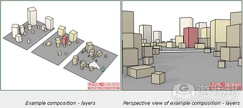
figure 1(from gamasutra)
(红色方块——主导元素;黄色方块——构图元素;绿色方块——观众;白色圆锥——观众视线;灰色平面——地形)
前景层次
这是距离观众最近的层次。这系列层次是作为前奏,为构图的主导元素创造框架。它在游戏中常被忽视。前景是用于让玩家注意到最重要的层次——中心点。记住前景的构图元素必须与构图中的其余元素具有逻辑上的联系。提亮前景物体可以将这个层次从其他层次中分离出来,从而创造一种场景隔离的效果。暗化前景物体则可以创造一种空间感,因为它与其余层次的对比更加鲜明了。通常情况下,我们只能看到物体的轮廓,你无需担心这一情况,在这个层次你并不需要显示细节和色彩。
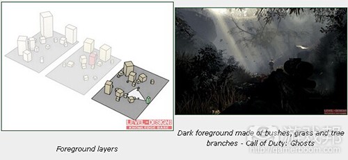
figure 2(from gamasutra)
中心点
层次就是构图主导元素所处的位置。主导元素是构图的焦点,它不可与场景其余物体相混合,但仍然要与这些物体保持一致性,它应该更为明亮,并处于具有优势的位置,以便从其他元素中脱颖而出。有了主导元素,我们就有可能快速为场景的主题命名,例如:“在山间含有中世纪警戒塔废墟的冬季场景”,其中的中世纪废墟就是主导元素,山峰则是背景元素。你可以用主导元素来讲述一个场景的故事,并为该场景创造独特的标识。你必须规划好自己的构图,以便主导元素能够成为观众第一眼注意到的物体。要确保没有严重遮盖该主导元素的障碍物,但也无需担心重叠其他层次的物体。中心点可以有一个以上的主导元素。构图中的另一主导元素就称为平衡点。它可以是一幕“市集广场边有个破损坦克的喷泉”这种场景。喷泉是首个主导元素,但坦克残骸也同样引人注目。当观众了解所有的主导元素时,他就会开始在中心点寻找细节以及背景层次。
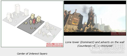
figure 3(from gamasutra)
背景层次
这是为构图收尾的层次。多数背景层次的主要内容是地平线和天空。背景层次通常采用平静而起源于配色方案,以及细节较少的物体。这有助于观众将注意力集中到主导元素。这些层次的用途就在于烘托主导元素的轮廓,强化场景比例,创造深度并减少场景隔离感的印象。有个可强化深度的效果就是空中视角(也称为色调或氛围视角)。这个层次要避免使用强烈的色彩,犀利的线条和太多细节。
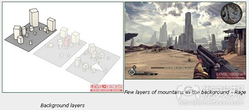
figure 4(from gamasutra)
点景物
这是拥有活跃元素的可选层次,例如人类或动物形象。多数用来作为场景转移,比例参照或者引导视线的元素。注意人物的姿态或面部方向。它是一个极吸引眼球的东西,堪比主导元素。你可以用人物的视线来引导观众眼球,观众会注意到人物的脸并查看他究竟在看什么。
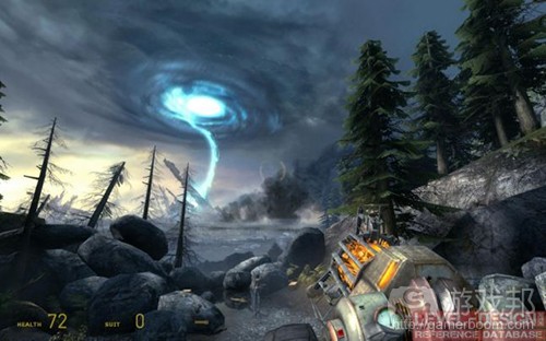
figure 5(from gamasutra)
观察参数
让我们从玩家将观看构图的观察点(地点或区域)入手。在你添加观察点之前,要先想想玩家观看构图的垂直和水平角度,以及玩家能够触及多少个观察点。
视角
这个角度决定了玩家如何察看主导元素。你可以通过修改主导元素的大小,高度或位置来更改视角以便实现更强的效果。
*低角度——从上往下看主导元素。这样的图片要以显示深度和透视感。这个角度可以让玩家在构图层次上获得更多可见度。你可以用它来作为玩家优势,并允许他来规划自己的战略或探索路径。
*平角度——从水平线看主导元素。这种场景让人感觉很平淡和无趣。多数情况下与强大主导元素和高构图视角并用。你可以通过适当降低玩家与主导元素之间的地形高度来修饰透视感和深度。
*高角度——从底部看主导元素,它简直主导了整个构图。它给人一种在主导元素的对比之下自觉渺小的感觉。
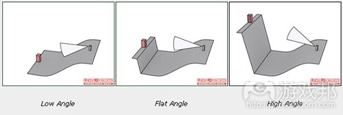
figure 6(from gamasutra)
(红方块——主导元素;绿方块——观众;白锥体——观众视线;灰色平面——地形)
构图角度
这是观众察看构图层次的角度。你可以通过更改这个角度,调整场景的透视感和深度。
*前角:当构图层次远离观众时,这个角度效果极佳,例如地平线上的山脉可以直达观众的视线。当层次与它们不同时就会呈现良好的深度。靠近观众的构图可能会变得平庸而单调,因为人们很难看到透视感。
*半前角:开始能够看到透视感的角度。这是用于狭窄场景的极佳角度。
*半边角:这是可让透视感发挥最佳效果的角度,也是运用最普遍的角度。
*边角:这个角度可完美显示富有距离感的模式。但是,如果没有强大的主导元素的模式,这种构图视角就会很单调。

figure 7(from gamasutra)
(红方块——主导元素;绿方块——观众;白锥体——观众的视线;灰色平面——地形)
观察点
如果观众无法移动时,创造构图就很简单了,因为他们会看到我们想展示的构图元素。如果观众可以自由切换场景,那么情况就会变得很复杂。电子游戏中的构图可以从任意角度和位置观察。你必须确保玩家能够从你所安排的位置看到构图。
为了引导玩家,你可以使用阻塞点或漏斗方法。这两者都属于类似走廊空间的类型,这些地点实际上并没发生什么特殊情况。我们通过无趣的漏斗可以确信玩家并没有关注玩法事件或细节。在这类空间中,玩家只会沿着路径寻找有趣的事物。如果你可以在一个走廊中抓住玩家吸引力,你就可以流畅地更改其角度将玩家视线引向构图的主导元素。这个方法极适用于线性关卡,你能够设计构图框架,并确保玩家会看到你希望他们看到的构图。玩家看到构图所站立的地方就称为观察点。
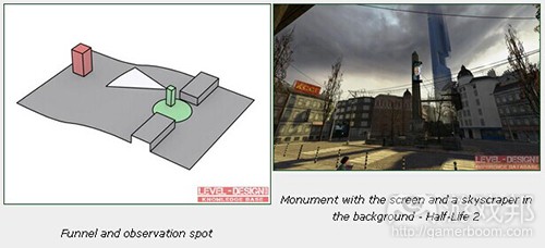
figure 8(from gamasutra)
(红方块——主导元素;绿圆形—–观察点;绿方块——观众;白锥形——观众视线;灰平面——地形)
让我们看看以上截图。屏幕和背景中的塔与屋顶线条和城市广场的形状相得益彰。在玩家离开火车站(后面)的时候这个构图看起来效果最佳。它通过引导玩家透过漏斗——车站唯一的出口大门,实现了完美的观察角度。
在半线性关卡中,我们必须考虑多个观察点。构图应该以一种从各个观察点看起来都具有吸引力的方式来创建。

figure 9(from gamasutra)
在《毁灭战士BFG》中,你可以看到设计师如何精心创造构图。其中的主导元素堪比导航辅助器,从各个方面看起来都很棒。
在开放世界关卡中,观察点会很大,所以检查玩家可以观察构图的所有角度是极为繁琐的工作。某个构图可能看起来很完美,但如果从不同角度来看,却有可能迅速变得一团狼籍。在你还不知道玩家会从哪里出现的时候,就很难使用小型构图元素。即使是这样,你还是有可能将主要构图原则运用于突出的主导元素,构图中最大元素的对称性和平衡性。你总能挑选到一些主要路径,并创造一个从主要路径上所挑选观察点看起来可行的构图。
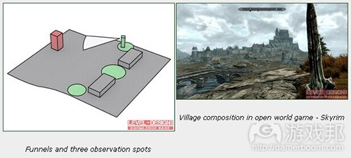
figure 10(from gamasutra)
(红方块——主导元素;绿圆形——观察点;绿方块——观众;白锥形——观众视线;灰平面——地形)
构图元素的定位
定位
主导元素的位置可能极大改变构图的接受程度。这正是我们为何必须遵从一些基本原则以确保实现自己想要的效果。绘画或摄影有一系列关于如何创造构图的原则。你可以选择黄金比例作为辅助。
*静态(对称性)构图——主导元素设置于画框中央。构图看似人为合成,较为清晰。当你想强调模式或建筑时可以用这种方法。

figure 11(from gamasutra)
(红方块——主导元素;黄方块——构图元素;灰平面——地形)
*动态(不对称)构图——主导元素不在画框中央。位置是由定位规则来决定。构图看起来是自然形成,较为凌乱。可以用这种方法来模拟自然场景。确保你在主导元素和屏幕边缘之间留有空白。

figure 12(from gamasutra)
(红方块——主导元素;黄方块——构图元素;灰平面——地形)
平衡性
构图元素的位置是由平衡性来决定的。换句话说,也就是构图中每个对象的吸引力。更具吸引力的对象就能够抓住观众的眼球。太过于招摇或者过于重要的对象会产生一种该场景很简单和无趣的感觉。为了平衡场景,你必须决定每个对象的视觉比重。我指的并不是物理概念上的质量,而是其色彩亮度和强度,大小和细节。视觉比重是我们都能感觉到的东西,但并非人人都能意识到这一点。与相关元素的参数相比较,你就能够说出哪个对象更轻哪个更重了。
*重视觉比重——大规模,细节丰富,暗色,强烈色彩,对比鲜明。
*轻视觉比重——小规模,刻板形象,浅色,软色,对比不鲜明。
绘制一条可将你的构图一分为二的垂直线段。确定你构图元素的视觉比重。主导元素应该获得最高比重,而弱小元素应该拥有最低比重。这意味着主导元素的比重应该与构图另一侧的多个低比重元素相当。可以让物体尚着构图画框移动来达到你所想要的平衡感。你可能想让两边的视觉比重一样,或者通过移动物体令其更靠近或远离主导元素,从而创造更为强烈的构图。
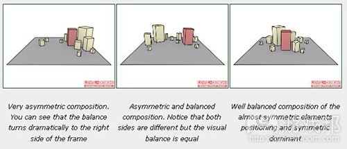
figure 13(from gamasutra)
(红方块—–主导元素;黄方块——构图元素;灰平面——地形)
引人注目的事物
有时候你必须确保自己的构图主导元素获得它所值得的关注。你可以使用一些额外技巧来虏获玩家眼球。
细节
细节密度方法与细节和平淡空间的对比有关。细节丰富的地点可以轻松获得玩家注意力,因为那里有东西让他们看。你可以通过细节考虑该在哪个地方使用更多物体或更丰富的纹理。你还可以使用标记、文本、海报、涂鸦、绘画和雕像来获取玩家注意力。
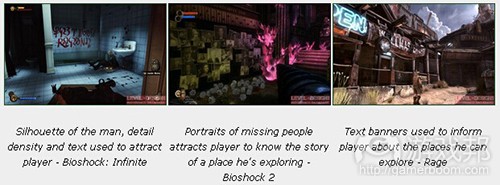
figure 14(from gamasutra)
线段
通过设置构图中的元素,在特定方向绘制线段,我们就能够引导玩家眼球。我们将这种线段称为引导线。你必须突出这些线段并设置它们的方向。即使是玩家位置或摄像视角的小调整也可能极大改变场景的接受度。构图中的线段有两种类型:
*实际线段:通过边缘和构图元素绘制出来的可视线段。
*虚拟线段:在构图上并不明显,它是由绘制出画中点景物视线方向的构图元素所组成。这些线段存在我们的想象中。你可以用它来丰富构图和突出元素。
线段方向应该是平静而柔和地流淌空过场景,艱是与主导元素的方向一致。这可以创造一种和谐感。通常构图元素会绘制出一条引向主导元素的线段,但有些开放式构图中的线段也会在不显示主导元素的情况下柔和地引导场景。这些线段多位于背景或前景层次。硬线条和边缘是为主导元素或其他重要构图元素所保留的。
*水平线:用于为场景塑造宽度和深度。静态、稳定和平静,极适用于地平线。你可以用它来创造令人印象深刻,广阔和没有变化的场景。要避免在前景和中心点层次使用大量水平线段。即便你设计一个停车位,你也需要汽车和其他物体来打破停车位的水平线。
*垂直线:用于突出构图的高度和强度,并创造一种庞大或庄严感的印象。你可以将其用于那些必须令玩家难忘的物体。
*曲线:我喜欢使用建筑术语中的“美丽线条”来形容。它是一种弯曲,“S”形蜿蜒流过构图的线条。它可以让构图看起来柔和而自然。
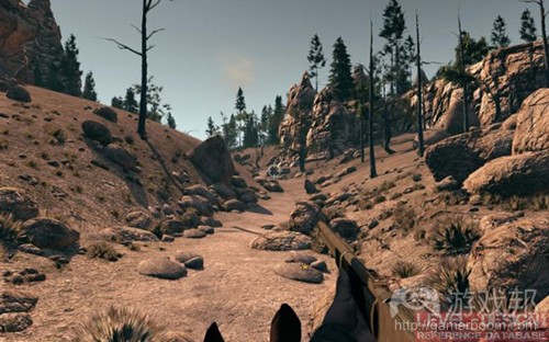
figure 17(from gamasutra)
*有角线段:可以让人产生一种动态和积极场景的印象。
色彩
你可以用对比和色彩饱和度来捕捉玩家眼球。色彩是向玩家传递信息的重要方法之一。这就是所谓的视觉语言。选择一种强烈的色彩或进行鲜明对比,可以给你的构图或你的关卡导航创造深刻的印象。确保选择一种适合你构图的颜色,并且不要让它与你游戏的视觉语言相冲突。有时候抓住玩家眼球就需要你选择一种稍微有别于游戏主色调的色彩。
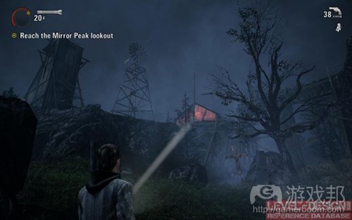
figure 19(from gamasutra)
光线
光照与阴暗表面的对比可以塑造场景的基调和深度。没有对比的构图一般会很无趣和了无生气。你可以用光对比来突出一些构图元素,例如点亮物体的前面或者轮廓令物体浑身发光。要妥当地点亮最重要的物体,构图中的其余元素应该被阴影所掩盖或者只能有较小的光亮。这一点不可违逆,因为多数玩家还不习惯从暗处寻找有趣之物。确保光的强度、色彩和方向之间有明显的区别。你用于突出物体的光应该遵从美术方向,配色方案和场景照明原则。这样你就可以将玩家引向退出口或者向其显示可拾取的道具。
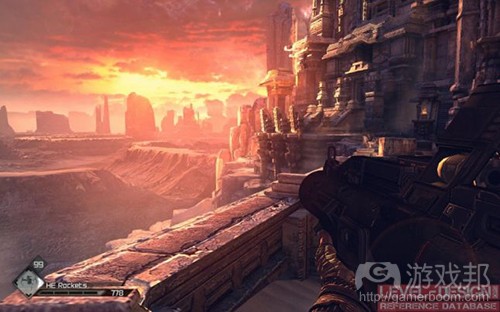
figure 21(from gamasutra)
比例
更大的构图元素会比场景中的其他物体更扎眼。如果所有物体都同样大小就会产生一种嘈杂和单调感。你可以更改每个物体的比例,以便更大的物体获得玩家关注。这可以是位于山顶的大型雷达盘,或者摩天大楼。这样的物体总会更显眼。你还可以颠倒过来,将构图中最小的物体作为最重要之物,但这种做法有点冒险。一般来说,占据更大屏幕空间的大型元素更易获得关注。
运动
你可以通过添加构图中的移动元素来增强主导元素。这可以是一面旗帜,一柱烟火,一只飞鸟或者一个行人。
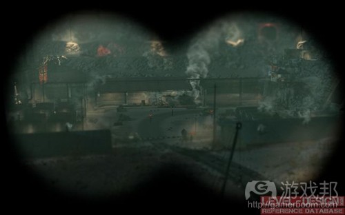
figure 23(from gamasutra)
提示
*要让你的构图在每个层次都保持一致性。
*你可以将前景层次与其他层次相混合(道路,物体位置)。
*给予玩家数秒时间来注意、分析和理解构图。
*如果主导元素在观众视线之上,你可以创造梯子或斜坡。在倾斜的地形上,玩家会自然向上看并注意到主导元素。
*构图需要空间。注意狭窄的街道和建筑。如果它们太靠近彼此了,就没有办法设置观察点了。
*使用一个构图主题,避免一次性讲述太多故事。
*应该妥善点亮主导元素,丰富其细节和色彩。背景和前景区域的细节和色彩不能太多。
*主导元素太弱或者构图太嘈杂都会快速令玩家分心。
*缩小背景层次的物体比例,以便创造一种该物体在较远方向的感觉。
*让玩家的注意力一次只集中在一件事物上。确保在战斗后,玩家总有喘息和欣赏风景的时间。
*如果构图并不在观众的视域范围那也没有什么不对。要确保主导元素没有隐藏在角落或躲在某物后。
*许多游戏使用不同的视域角度。第一人称视角游戏的视域角度介于60至100度之间。角度越高,你的视域就越广,但物体会变得越小,场景就会被拉长。
*如果你规划了过多构图层次,可能就会显得太杂乱,构图元素也会变得凌乱不堪。
*令构图融入现成的玩法远比打破玩法获得一个良好的视角更容易。
篇目1,篇目2,篇目3,篇目4(本文由游戏邦编译,转载请注明来源,或咨询微信zhengjintiao)
Level Design in a Day: Your Questions, Answered
by Coray Seifert
For the past five years, the Level Design in a Day crew has gathered in the hallowed halls of the Game Developers Conference to discuss all things level design. This year, the fine folks at Gamasutra offered us an awesome opportunity to interface with a much broader audience than the few hundred folks that usually attend the session by doing a Q&A with the game development community at large.
To that end, we’ve brought together a panel of esteemed Level Design experts, hand-picked from the roster of this year’s AAA Level Design in a Day Bootcamp — which runs all day on Tuesday, March 26. They’ve agreed to answer the Gamasutra community’s questions in the form of this roundtable feature.
Neil Alphonso: Lead Designer – Splash Damage
Jim Brown: Lead Level Designer – Epic Games
Joel Burgess: Senior Designer – Bethesda Game Studios
Steve Gaynor: Co-Founder – The Fullbright Company
Seth Marinello: Level Designer – EA / Visceral Games
(Editor) Coray Seifert: Vice President, Product Development – Slingo
While many of these questions are specifically focused on the craft of level design, there are a number of great quandaries that delve into broader production concerns, tools development, and engine limitations.
I always say that level design is applied game design. It is both a hyper-specialized craft and a broader study of the intersection of technology, mechanics and largely intangible fun. Thus, there are some great learnings in this feature — and in our GDC tutorial offerings — no matter what game development discipline you may come from.
Our first question comes from Bloomfield College Game Design student Roger Rosa:
1. What are common mistakes or key things level designers look for after the first pass of a level is finished? What are some common flaws in level design that tend to be overlooked?
Jim Brown – The two main things I tend to look out for are sloppiness and poor assumptions on the part of the LD. The vast majority of bugs in scripting, cover, collision, and general level design happen because someone gets complacent or rushes through the “boring” parts of design. If you have good attention to detail and treat every aspect of the level as important, then you’ll be much better off (faster, cleaner, easier) in the long run.
Secondly, LDs sometimes build a level assuming that the player will proceed through it in the same manner that the LD who built it will get through it. Just because you’ve played it 500 times doesn’t mean the end user has, and they will be facing backwards at the wrong moment, hit triggers out of order, go the wrong way, and break your level in every way imaginable. First pass maps tend to be very “golden path” and quickly fall apart when the systems are stressed. Aside from that, we sometimes just need to “get things working” so first pass maps do just that… and then need massive optimizations in performance, memory, pacing, and difficulty.
Steve Gaynor – For me, the first pass is layout and flow, the second pass is lighting and visibility. Knowing the shape, size, and connectivity of spaces is a good first step, but as soon after this as possible, you need to start playing through like a player would and think, “When I enter this space, how do I know where to go? How do I know where enemies might be coming from? How do I orient myself if I get turned around and lose my way?”
The two biggest aspects of these issues are sightlines and lighting. You have to determine what the player can see from each point in the level, and what is occluded. For instance, if you enter a space and you can see two doors on the far wall, is one more important than the other? Is the player supposed to enter one first? Maybe set up a sight blocker so they only see one door first, and can’t see the second one until they’ve reached the first one, and so in all likelihood will go in there first instead of skipping it. Can I see entrances, egresses, and important objects?
If the lighting is too even, nothing is prioritized. Look at how you can throw spotlights and shadows around to highlight important things, so the player can get a lay of the land on first glance. Once you have the flow laid out, and a good idea of what the player’s visual understanding of the major concepts in the spaces will be, you’re in a good position to move on to smaller nuts-and-bolts aspects of placing incidentals in each room.
Seth Marinello – Once I have a white box layout of the level complete, one of the first things I will do is review the room sizes and sightlines in order to plan out our visibility strategy. Since the environments we create for Dead Space are so high-detail, it is very important we get a handle on how the space can be divided for performance at an early stage. One of the worst things that can happen is having to slice a room in half after months of trying force an over-complex space through the GPU.
As to overlooked problems, I find pacing can be hard to read early in development. Without dialog and scripted moments, a level can feel empty and the feedback tends to add more combat, resulting in pacing problems once the rest of the content comes online. It is important to be aware of this and schedule polish time to address these issues.
Our second question comes from Twitter user @Skizomeuh:
2. Why are there so few hub-oriented games (in terms of level design) nowadays? I’m thinking of games like Metroid Prime or Hexen.
Neil Alphonso – The short answer is that hub-based level design has essentially been eaten by open worlds. Advances in streaming technology and improved art creation pipelines have meant that many of the constraints that originally put the “level” in “level design” are dissolving away, allowing for more seamless experiences. A perfect example of this is the evolution from Rocksteady’s Arkham Asylum, which is hub-based, to the streaming, open world model of Arkham City. Many of the principles of hub-based level design still apply, but ultimately not as much backtracking is required.
Steve Gaynor – The answers to this come on all different axes — it can be harder technically to allow for more open, free-flowing spaces (based on view distance, level streaming tech, and so forth). There are also many more variables from a design perspective, since you have to consider “What if the player comes into this space from the east instead of north? What happens if they backtrack after clearing the next area? How do I direct them to their next goal when the space is an open hub instead of a hallway?”
The benefits of hub-based level design are clear — much more player-directed exploration, a more “real-feeling” world, and the advantages of content reuse since you can change the state of an area when the player revisits it, instead of having to build more square footage. But it takes a few specific kinds of investment to pull it off.
Joel Burgess – I think the main reason may just be that hubs are tough to pull off well. Revisiting a hub can get stale fast — you may end up spending a great deal of time implementing state changes and otherwise having the hub evolve and react to player actions. That work can end up overwhelming any savings you may have gained by reusing the same layout. We ran into this with both the Dark Brotherhood Sanctuary in Skyrim and Mothership Zeta in Fallout 3, for example.
For what it’s worth, one current-gen, hub-based game that I think is unsung is Splinter Cell: Double Agent. This game also solves a sticky problem of crafting a hub which accommodates gameplay as well as being a convincing living space for NPCs.
Our next question is from @DCharlieJP in Tokyo, Japan:
3. How aware are level designers of the limitation of the game engine? How is this factored in and/or communicated in the design process?
Steve Gaynor – Oh, very aware. The technical constraints of the engine define everything you can do as a level designer.
How it’s factored in depends a lot on what state the tech is in — if you’re working with a stable, established engine, your constraints can be much more clear and top-down from the beginning; if the tech is still being assembled while the game is being designed, the dialogue between programming and design is more fluid, but can also be more uncertain and frustrating, if you don’t know exactly what your constraints are.
But on some level, part of your job as an LD in this case is to help push the limits of the tech, and discover what it’s capable of as well as what you would LIKE it to be capable of, in order to help figure out what the constraints will end up being when the engine does stabilize.
Jim Brown – If LDs aren’t fully aware of their engine’s capabilities, the project is at an extreme disadvantage. The last bit of polish at the end of any project is usually the most difficult — and that’s always expected — but a lack of understanding that leads to building something entirely out of scope (or otherwise causes major redesigns) is unacceptable and wasteful; it can kill budgets, schedules, and careers.
You have to build within the framework of what your team and engine are capable of producing, and you have to keep those goals in mind even when prototyping. And of course, you have to ensure that project goals are aligned across the entire team.
With Gears, for example, we were just starting in on UE3, so we knew up front that we wanted advanced shaders and high-poly characters. As a group we agreed on a third person camera and close “intimate” combat distances to highlight those engine features. That obviously influenced design across the board, and had to be kept in mind at all times as it affected the number of enemies on screen, scale of architecture, and encounter scripting in big ways.
Neil Alphonso – Level designers need to be as familiar with the inner workings of their game engine as they can be, but the pace of technological change can make this very difficult! In the end, this is a responsibility that needs to be shared throughout the team; the tech leads need to provide guidelines for level and asset creation, the level designers need to provide a layout that can marry this with the environmental visual fidelity targets for the game, and the artists need to push as much quality as they can within that and still hit framerate goals.
Tools have made this somewhat easier in modern development, as automated processes can flag any problematic areas before it gets too painful to change them. Anything mechanically risky really needs to be addressed in a prototype well before production, because unless it is or becomes something that is used game-wide, the chances of development resources being dedicated to it for such isolated use are significantly lessened.
The next question comes from games industry veteran and Kabam General Manager, Mike Sellers:
4. Tools and Metrics: How do you know how players like the level, aren’t getting lost, frustrated, etc? There are some good solutions for this but they’re also unknown for a lot of people (even pros).
Joel Burgess – As early and as often as possible, get people in front of the level and watch them play it. Don’t wait for the level to be polished or for your publisher/producer/whomever to arrange a playtest session. Grab somebody and sit them down with as little setup or guidance as possible. Encourage them to vocalize as they play. Then: Shut up. Don’t interrupt, don’t help, don’t correct. Ignore direct questions unless absolutely necessary.
The unfiltered feedback you get from players will always be the best guiding light, and will often help you win internal arguments you had already been having.
Jim Brown – The simplest answer is to watch and pay attention. And while that sounds obvious, it’s probably the most overlooked. It’s not uncommon for designers to get too attached to their work. If you’re too involved or too invested, you tend to lose sight of the bigger picture. A few years ago in my LDIAD talk I mentioned that the designer’s job is to “be an advocate for the player” — you can’t just build things that you like, or lose sight of what the player’s role is in experiencing your game. You’re building for them, not yourself!
That said, usability testing, focus groups, heat maps, stat tracking, and any other number of analytical tools are incredibly useful and should be employed whenever possible. It’s also well worth the time to read up on some basic psychology. The human brain is a crazy thing, and doesn’t always work the way you would assume. Watch as other people play through your work, and keep an open mind. Getting into the head of the average gamer will make you a better designer.
Neil Alphonso – The lowest-cost method is simply watching somebody play, and diligently taking notes! Many studios even now use biometric data to help mine more useful information out of these sorts of tests. Tools for tracking metrics on a large scale have improved significantly over the years however, and can provide much more clinical information when a big enough audience sample size is provided. Valve’s changes to Half-Life 2 and Team Fortress 2 that have been based on Steam metrics have shown that with enough actionable information, frustration points (or “shelf moments”) can be lessened significantly.
5. How do you change your approach when you want a player to PAY ATTENTION or GO HERE DIRECTLY versus “It’s okay to wander around”?
Steve Gaynor – I definitely tend toward allowing as much “it’s okay to wander around” time as possible. But if you really, truly need to direct the player to one specific point (for tutorialization or whatever) it’s all about generating focus.
This is what a lot of my talk on “Narrative Techniques for Storytelling in Level Design” is going to be about at the LDIAD tutorial at GDC this year. There are a number of best practices: Use spotlighting and silhouetting to highlight important objects, remove any extraneous interactive objects from the surrounding area, arrange the player’s path so they walk head-on into the important part of the scene, and many others.
You basically want the important stuff front-and-center and clearly visible, so the player will be aware of it and engage with it willingly, instead of being “forced” to do so by the designer.
Joel Burgess – There are many ways you can communicate urgency cues subtly, like choosing appropriate music, incorporating funneling elements into your layout or minimizing elements that may distract the player. Sometimes it’s not enough.
Level designers everywhere understand the discomfort of watching players examine a light fixture while a lovingly scripted scene plays out a few feet off-screen.
The first thing to do in these situations is to determine whether you should actually do anything at all. Timers, UI prompts, cutscenes and other devices can help direct attention, but know the difference between a player that needs guidance and one that simply cares more about that cool light fixture. Being lost and confused as a player can be frustrating, but heavy-handed level design is always frustrating.
Neil Alphonso – My main tool for this is density, which can take many forms: it can be density of objects, density of movement, or density of interactivity, and that’s just to name a few! I find it a good way to subtly tell a player that they’re in an “important” place. But this method is used to maintain a decidedly indirect method of directing a player; how heavy-handed you can be with directing the player is more down to the game or creative direction of the entire game, rather than how it is handled in a given level. It’s why essential events are often conveyed during cinematics or with UI.
If you give the player the chance to miss what you deem as critical information, chances are that many of them will indeed miss it! This isn’t because players are unobservant, but more because you never know what distractions a given player might have when they’re playing the game.
Our next question is from Full Sail graduate @MrDonaldYoung:
6. How often should you create situations for the player to go off the golden path, and is it worth the extra resources to do so?
Steve Gaynor – It’s absolutely worth it. The soul of games is interactivity, and interactivity means that no two players are going to have precisely the same play experience. The more variance you can add between two players’ experience of your game, the more of a personal connection they’ll feel — “I decided to go here, I decided to explore this extra space, I found something that other people didn’t.”
Having as minor a crit path as possible, and as much optional space as possible, gives the player much more to dig into and think about and own for themselves. If you think of the production cost of non-crit path space in terms of “look how much content we’re building that the player might never see!” you can easily talk yourself into making everything mandatory, every player’s experience the same, so no one “misses” anything. But if you think of the inherent, intangible value of the feelings of self-direction, investment, exploration and discovery that optional spaces provide the player, the overall experience is improved much more than you can easily quantify on a spreadsheet.
Joel Burgess – My personal preference is to include non-essential content whenever possible. This rewards players who explore, but it also helps make the world feel less artificially focused on the player and her story. Luckily for me, about 90 percent of any Bethesda game is off the golden path, so we’re used to spending resources on non-essential content. That’s part of the feel of our games, though; your situation may vary.
Seth Marinello – The basic answer is as often as possible. The more opportunities for players to have a unique experience, to feel like they found something special, the more important the game will be to them.
When laying out a level for Dead Space I try to include two kinds of optional content — “treasure pockets” and “beta rooms.” The first is simply a reward for exploring; if I have a long hallway, for example, and the alpha flow only takes the player halfway down it, there should be something interesting at the far end, even if it is a pickup. By rewarding pushing the boundaries of the space, you can turn a dead end into a discovery.
Beta rooms are exactly what they sound like, a space that is both unique and separate from the alpha path of the level. I try to make these rooms build out the world more, make it feel inhabited — this is why I tend to build in human spaces like quarters, bathrooms, and laundry facilities to our sci-fi levels.
Our next question comes from video games journalist and translator @andymonza:
7. Replay value vs. cinematic sequences (usually from heavy scripting). Is it truly possible to make the two coexist in the same experience?
Jim Brown – Absolutely — but it means that the designers have to give up on a bit of their control (which is not necessarily a bad thing!) and you have to have reliable systems (flexible scripting, strong AI, smart world building, etc.) in place to keep the experience fresh. Gears of War: Judgment uses S3 (Smart Spawn System) to randomize enemies and change spawn locations in every encounter, Left4Dead uses the Director to control pacing, Skyrim has a matrix of possibilities that avoids repetition in world encounters — and these are just a few examples. Each of those titles still makes use of cinematics and scripted sequences, albeit less frequently than other titles.
In my personal opinion, this is an incredibly great thing as it puts the control back in the hands of the player, and allows them to make the game story more uniquely their own. Even The Walking Dead has a heavy use of cinematics paired with high replay value because they don’t tie their players down to one single path that must be adhered to.
Neil Alphonso – If the cinematics are skippable, then yes!
The key issue is that cinematic content isn’t flexible, because it borrows so heavily from what is a passive form of media. The mechanics of what makes film work and what makes games work are fundamentally different, and trying to marry them at a base level often ends in tears. As replay value most often comes from mechanical depth and variety, this can truly be an odd coupling!
So is it possible? Yes, but in a traditional triple-A sense this is a hard battle to justify fighting. But sometimes, traditions are made to be broken!
Seth Marinello – Cinematics are an important part of most narrative-driven games still, but they are inherently counter to the idea of flexible gameplay solutions. Some studios have invested in creating branching cinematic moments to try and maintain a sense of agency but this tends to be expensive and not always successful. As designers and storytellers I think this energy is better focused on finding ways to convey the same information in a more player-driven manner, and when that is impossible to use cinematics as a bridge between gameplay moments. Whenever we can, we try to make scripted moments be in response to some event outside of the protagonist’s control. That way we don’t have the character making decisions without the player’s input.
Kyttaro Games’ @gnomeslair asks:
8. How do you reuse similar elements for vastly different gameplay results?
Joel Burgess – With games as big as Skyrim and Fallout 3, it’s very important that we’re able to make effective use (and re-use) of every element at our disposal. This is a big part of the topic I’ll be covering during our LDiaD session at GDC, in fact.
One good thing to do is to try and erase any preconceived notions of how elements should be used. Resist the temptation to strongly associate a specific setting type with a specific encounter or gameplay type. The more that you enable yourself to mix and match these elements, the more potential variety exists for you to discover.
By setting this expectation internally, you also encourage yourself and the team to think in more open terms about how you’ll implement various mechanics, art assets, and the like. This means your feature set will (hopefully) be more robust and bug-proof overall.
Seth Marinello – From a gameplay standpoint, creating patterns that the player will understand and then dressing those in different guises is key to delivering a fun experience. You need to create tasks which the player can master, and then ramp them to provide further challenge — Portal is a textbook example of this kind of design. As others have mentioned, this is a topic that we will cover in more depth at this year’s LDiaD session.
Jim Brown – This has definitely gotten easier as technology has improved. Higher resolution textures and better materials mean we can scale, rotate, and reuse models in different ways without them looking too similar. Higher poly models and improved rendering means we can add more detail to different areas of the models, and then light them differently to vary how they appear.
Ultimately, however, I think the best way to get good results here is to have an understanding of real world architecture and psychology — if something looks “real” or appears “normal” people will subconsciously accept much more than you’d think. There’s a certain amount (and style) of repetition that happens in nature, and a general look to shapes and structures that the brain will accept without too much filtering. For the LD, putting together a level with limited resources becomes a fun puzzle, or game of its own.
Our penultimate question comes from pro gamer and game producer Kal Shah:
9. What things can a producer do to make the job of a level designer easier and improve the process as a whole?
Steve Gaynor – The biggest benefit of production is making sure that no one is blocked from doing the most valuable work they could be doing right now. The kinds of things that block designers are: Not having a space built that they need to put gameplay into; not having art assets that their level will be based around; not having mechanics in place that are required to make their level playable. So having open communication between design, production, and the other departments to be able to say, “I need to be implementing the first pass of the shotgun fight, but the shotgun enemies aren’t functional yet,” or, “I need to build gameplay around the crashed helicopter, but I don’t know what its dimensions are” will help other departments prioritize their work.
But aside from just giving other people work, it can be even more useful for production to facilitate ways for level designers to unblock themselves — for instance, providing a Maya license and a brief tutorial with an environment artist, so that an LD can model a temp mesh while they wait for the real one; or working with programming to get script actions so that the LD can prototype new functionality through scripting instead of waiting for completed code. Helping designers communicate better with other departments, but also be more self-sufficient, will improve productivity and reduce blockers.
Seth Marinello – There are two major ways a producer can aid the level design process. The first is as an interface between groups – as a level goes from white box to final, lots of content needs to be integrated and tracking the progress of each component can take a lot of time. If there is a producer there than can do that legwork and ensure progress is getting made on the key assets the designer is free to iterate on gameplay and performance scripting. The second is as an external sounding board for design. It is easy to get too close to a design and lose sight of what the experience will be like for an end-user, a producer can help catch issues BEFORE your work goes through the focus test wringer.
Neil Alphonso — Levels are the final destination for a lot of development work; an often-used phrase is that levels are “where the rubber hits the road.” Because of this, the most critical thing a producer can do to help the level design process is to ensure timely delivery of the components that make up the level designer’s work. It’s also important to provide interim deliverables whenever possible, as this helps the level designer to more quickly adapt the level to the evolving content. This can be particularly tricky with art assets, as artists can be notorious for not submitting something that is “unfinished.” Ensuring that the pipeline includes many phases of integration as art content is being made ends up being hugely effective risk mitigation for unforeseen complications hampering a well-playing level.
Our final question comes from Ubisoft level designer Myles Kerwin, via the Level Design in a Day Facebook Group.
10. I’d like to hear about how Level Design has evolved over the past decade, and how you think it will change in the years to come.
Jim Brown – I think that level design — in the classic sense — is an endangered craft. The concept of level design first came into being with the advent of online gaming. People could make self-contained levels that they worked on from beginning to end. We made our own textures, did our own programming, scripting, design, lighting, pathing… everything! More recently, companies have separated that work out among many specific talents: lighting specialists, tech artists, scripters, gameplay designers, usability experts, and everything in between.
As such, LDs became micro-specialists who were very good at one piece of the puzzle. Moving forward, it will be harder and harder to identify what a “level” is as the lines get blurred. There are so many systems involved now that you have to understand how they all work together. I bet we’ll not only go back to being generalists, but actually expand our skill sets into general game design – levels, creatures, weapons, combat, visuals, scripting, performance, usability and anything involved in crafting an “experience” rather than just a “level.”
Seth Marinello – In the last decade the biggest fundamental change in the level design workflow has been moving away from brushes to static meshes. From Quake 1 all the way through the early Source games the level designer was also the environment artist. Since then we have moved a lot of the work out of our editors and into 3D modeling programs like Maya. This has vastly improved the visual quality of the games we can make, but at the same time drastically changed the role of a level designer in the process. Now, we are not just creators but also integrators and collaborations with whole teams supporting the vision of a level. In the last few years I have seen a lot of games succeed with more open environments; I hope over the coming years we see level design focus on enabling experimentation over following a script.
Joel Burgess – When I first got interested in level design, it was very much a one-man operation. Early mappers would create every aspect of their levels, from layout to lighting to scripting. Just a few years later, as I got into the industry, that was already changing. New-at-that-time consoles like the PS2 and Xbox demanded higher visual fidelity, and dev tools were more robust and complex to use than before. Level design became a more distributed process, often involving 2 or 3 people in more specialized roles.
This may seem like a bleak prospect for those who are uninterested in heavy specialization. While I have known designers who prefer to focus on scripting or layout exclusively, I personally enjoy dabbling in all aspects of game dev, and have historically found that well-rounded LDs thrive at bringing together disparate elements as great gameplay. Specializing runs somewhat counter to cultivating this kind of LD.
I think we’re at an exciting cusp for games and level design right now, though. While the upper end of fidelity continues to rise, there’s more room than ever for games of all types and scale. This is great news for level designers, because no matter what unique combination of skills and interests you may have, there’s a game out there for which you’re the perfect LD.
篇目2,Ten Principles of Good Level Design (Part 1)
by Dan Taylor
The following blog post, unless otherwise noted, was written by a member of Gamasutra’s community.
The thoughts and opinions expressed are those of the writer and not Gamasutra or its parent company.
Over the years I’ve had the privilege of creating levels at many great game studios. One thing that surprised me was that each of these studios had a totally different approach to level design, even though the basic content was extremely similar. Some had a logical, almost robotic approach to constructing levels, whereas others just threw as many ideas at the wall as possible, in the hope that something would stick. Whilst each approach had its advantages, it occurred to me that there must be a way of formalising the core elements of good level design in order to create levels that are both logical and innovative. I looked to my classic design background for inspiration, and was reminded of Dieter Rams’ Ten Principles for Good Design. Whilst these principles serve as a fantastic guide for product design, and, with a bit of creative interpretation, high-level game design, applying them directly to level (and mission) design required slightly too much force.
Instead, I’ve used them as a loose template, to create ten Ramsian principles for designing compelling videogame levels (with the occasional detour into the realms of systems and narrative design) supported by some examples of great games in which you can observe these principles at work…
Good level design is fun to navigate
In most cases, the player’s core method of interaction with your level will be navigation – the process of actually traversing the level. Careful layout, lighting, signage and other visual cues should create a natural “flow” to the level that guides the player instinctively through it. From an aesthetic aspect, a game’s levels should all work together to create a consistent visual language, through the use of colour and form, that the player can learn, to progress intuitively through the level (Fig. 1).
Figure 1: Mirror’s Edge – in DICE’s seminal 1st person parkour game, the entire art style is geared to guide the player elegantly through the level. Even the screensavers on office computers help to point the player in the right direction.
This may seem like a fairly obvious guideline… but here it is important to understand the difference between “intuitive” and “fun”. Whilst basic progress through the level should be effortless, navigational gameplay can also be used to create fun. It is entirely appropriate to hide areas from the player, to add depth and replayability through exploration (as long as you provide the necessary visual or narrative clues), or to create areas where the player feels lost or confused, to create a sense of dramatic tension (Fig. 2).
Figure 2: Modern Warfare 2 – the Favella level in MW2 is a maze of crazy buildings, with enemies coming at you from all sides. Is it easy to find your way out? No. Is it tense and exciting?
Absolutely! Modern Warfare’s Favella level is also an excellent example of verticality in level design, which can be an important aspect in making a level fun to navigate.
The main caveat while designing fun navigability is that it should not come at the expense of your other gameplay elements. Imagine the intense combat of Modern Warfare 2 in the crazy parkour levels of Mirror’s Edge… the navigational and martial elements of the level would be completely at odds with each other. There’s a good reason why DICE kept the combat in Mirror’s Edge nice and light.
And be careful not to fall into the same trap as Khan… always be sure to think in three dimensions when designing your level, and use verticality to keep
the space interesting and fun to navigate!
Good level design does not rely on words to tell the story
A mentor of mine once told me that a good piece of communication is like a broken circle. The author creates this circle, but leaves a small gap for the
readers to fill in themselves. But care has to be taken with this gap! If it is too small, the reader won’t notice it; too big and you risk losing the
reader, who won’t be able to connect the circle. So how do we create the circle and the gap in a game level? First it is necessary to understand the three
key narrative aspects at work in a level…
Explicit – this is anything that is called out by text or speech, e.g: a mission objective or cut-scene
Implicit – this is the story told by the environment through mise en scène (Fig.3).
Emergent – this is the story told by the player as he goes through your level
Figure 3: Bioshock – the city of Rapture, and the story of its demise, is brought to life in the player’s imagination through careful use of narrative props (posters, graffiti, corpses, environmental damage, picture walls, etc…)
Whilst the level designer should take care in crafting the explicit narrative, as it is this that forms our “circle”, it is the latter two elements that create the all-important “gap” and really make a level stand-out. The use of mise en scène physically integrates the story into the game world and stimulates the player’s imagination with implicit narrative, while emergent story is written by the player through the medium of gameplay choice: which weapons to use, which route to take, which style to solve a problem with, etc… (Fig.4). These elements allow players to fill in the “gap” with their own
actions and imagination, which is much more rewarding than having everything handed to you on a plate.
Figure 4: Hitman 2 – the player decides which story to tell: go in guns blazing and wipe everyone out… or sneak in, poison the fish and get out before anyone even notices you’re there.
Good level design tells the player what to do, but not how to do it
Having been given the power to tell his own story though choice of mechanics, the player must never be in any doubt as to what their objective is. This clarity is typically created by simple, explicit, text-based objectives, proper use of waypoint markers, and any other navigational aids you may have; your level’s objectives should be visually distinct, using location, form, lighting and animation to make them clearly stand out from their surroundings.
Having said that, as with navigational gameplay, there is some fun to be had with more open-ended objectives. Compelling challenge can be created through obfuscation of the means to completing an objective… as long as the actual objective is clear. This is another example of the “broken circle”. E.g: “Assassinate Vittoria Vici” (Fig.5)… the what of this objective is crystal clear… the how is not.
And on the subject of “how”, players should never be forced to use a singular technique to solve an objective; how they complete the challenges laid-out should be up to them, and players should never be punished for improvising a solution to the designer’s meticulously thought-through scenario. This is another requisite for good emergent narrative.
Figure 5: Skyrim – the Dark Brotherhood missions in Skyrim don’t specify how you kill your marks, just that you kill them. They also give additional, bonus objectives (like hiding the body afterwards), empowering players to set their own level of challenge.
Veteran game designer Mark Cerny tells us that the player should be presented with a number of concurrent objectives, which can be completed in any order, with the reward for each one providing an advantage for subsequent objectives. This approach gives players power over the order in which they complete their tasks, creating the feeling of control (albeit an illusory one). You can see this approach in his work on the Ratchet & Clank series (Fig. 6).
Figure 6: Ratchet & Clank – in the original Ratchet & Clank, the player was presented with a number of planets to explore in any order they choose. The completion of each planet resulted in the collection of a gadget (e.g. magnetic boots) that allowed subsequent planets to be played (or re-played) differently, through level design that included unlockable mechanics not necessarily available on the first play-through.
Good level design constantly teaches the player something new
In his book “A Theory of Fun”, Raph Koster explains how the human mind enjoys processing information from the world around it into patterns for easier processing later. In gameplay terms this implies that a large part of the fun is generated by the learning, and subsequent mastery, of your various mechanics. Koster cautions that if players understand the pattern and master the mechanics too easily, they’ll quickly become bored and stop playing. This risk of boredom can only be avoided with good level design.
Figure 7. The Legend of Zelda – every dungeon in every Zelda game is a tutorial for the new piece of equipment you find in it… with the dungeon’s boss being the final test (always with a clever little twist). The game’s final boss battle usually requires the player to use every single piece of his equipment to win.
A good level should either introduce a new game mechanic, or put a spin on an old one to make the player re-evaluate his or her established paradigm. On a larger scale, this constant learning should be measured out across the entire game, to make sure that each level delivers fresh gameplay. Bethesda’s Todd Howard outlines the Learn – > Play -> Challenge -> Surprise loop used to pace Skyrim in his DICE 2012 Keynote Address, which is not only a great extension of this principle, but leads nicely into the next one, which is…
Good level design is surprising
There have been many articles on how to use classic Aristotelian techniques to pace your game, and this approach has served books and movies well for aeons. Whilst the standard “roller-coaster” curve of high vs. low intensity, exploration vs. combat, rest vs. action, etc… serves as a good base-line for level design, and is important for maintaining player engagement, its constant repetition can quickly become de rigueur. There are pacing techniques that are more appropriate for an interactive medium, but even with great pacing levels will have trouble being memorable without the sudden spike in intensity that comes from surprise.
Surprise does not necessarily have to be a big shock or a plot twist… at its core, surprise could be considered as a rapid surge in uncertainty which, according to game design visionary Alex Mandryka, is the very essence of fun. In terms of level design, surprise could take the form of a unique setting, a moment that teaches the player something new about a mechanic they’ve already been using for a while, turning the corner to see a beautiful vista, or a radical change in pacing (Fig. 8).
Figure 8: Dead Space 2 – when Isaac returns to the Ishimura in Dead Space 2, he doesn’t encounter another necromorph for about fifteen minutes. This change in pace creates extreme tension…
Surprisingly, this excellent design came about as a happy coincidence: the monster this level was designed to showcase was too big to fit anywhere in the original Ishimura layout, and so the level designers couldn’t use it until the player reached the central transport core… which was half-way through the level!
Level designers should not be afraid to take risks with their design! Don’t just replicate a level from your favourite game… take an existing trope and turn it on its head! It’s only through trying something unusual (Fig. 9) that a truly innovative and surprising experience can be created. The trick is knowing how to manage these risks – design on paper… picture the final product in your mind’s eye… and create a playable prototype (A.K.A. grey-box) as early as you can. Show that your crazy ideas will work as soon as possible… or watch them get cut as your Alpha Milestone catches up with you!
Figure 9: Urban Chaos – after you complete the game, and sit through the credits, the game suddenly starts back up, and you find yourself getting some much needed R ‘n’ R at home.
Unfortunately, all the gangs you busted in the game know where you live and decide to exact their revenge! The player has to scramble through his home, grab his trusty sidearm from under the sink, and finish off the criminal scum once and for all! This post-credit surprise was beautifully executed… it’s no wonder that the developers, Rocksteady, went on to bigger things.
Following on from the principles discussed earlier in Part 1, let’s get stuck in to the final five, starting with…
Good level design empowers the player
“Dream no small dreams for they have no power to move the hearts of men.” – Goethe
Videogames are escapism… pure and simple. Why would players want to escape to somewhere more mundane than their existing lives? Level Designers should never ask players to do something that they can easily do in real life – your mission objectives should shun banal and repetitive chores, and always be interesting and exciting! This may sound obvious, but even the best game developers can sometimes lose sight of this basic principle, as comedian Dara O’Brien points out.
Figure 10: Red Faction Guerrilla – taking out a bridge’s support struts with the concrete-eating nano-rifle is, quite frankly, freakin’ awesome.
For players to experience true empowerment, their actions must have a noticeable effect on the game world. On a low, immediate level this could be the interaction with (or, more usually, the detruction of) objects within the environment, but, if you don’t have the immediate gratification of destructible scenery, like Red Faction (Fig. 10), you can script your levels to reflect the player’s influence in other ways, like the citizens of Empire City and New Marais in inFAMOUS (Fig. 11).
Figure 11: inFamous – the karma system is fully integrated into the open-world level design, with scattered side-missions that force the player to make moral choices (diffuse the bombs and save the citizens, or detonate them to absorb their power), and a populace that will throw rocks at your enemies… or you, depending on your play-style.
For Medal of Honor Heroes 2, we wanted to make the secondary objectives more than just a shopping list of hidden Nazi dossiers, so we created side-missions where the player could rescue allied troops, trapped at certain locations hidden throughout the level. These troops, once freed, would fight alongside the player, which made him/her feel that there was a direct consequence, and reward, for his/her actions.
Good level design allows the player to control the difficulty
The difficulty of games is one of the hardest things to get just right. The standard technique of having Easy, Medium and Hard difficulty settings feels particularly arcane when you consider that players are asked to make this decision before they have even attempted the first level, and thus have no idea of which setting is appropriate for their skill level.
A systematic approach to this is to implement dynamic difficulty, most noticeable in games like Fallout & Skyrim, where the enemies become more powerful (and treasure more valuable) based on the player’s experience – thus adjusting the challenge on the fly, to suit the player’s competence.
However… such systems are not always available, and so a well designed level must allow players to manage difficulty themselves, through clever use of risk and reward. The basic path through your level or mission should be properly paced for a player of moderate ability, with the appropriate peaks and troughs of challenge (along with a splash of surprise), but there should be areas off the main path that present a clear opportunity for the skilled player (or an
easier option for those less adept). Whenever the player has to make a path choice, both the risk, and resultant reward should be clearly called out using the level’s language (as mentioned earlier), enabling the player to make an informed decision (Fig. 12).
Figure 12: Burnout Paradise – Skilled players can take a risk and aim for short cuts, which are clearly called out by yellow barriers (a recurring motif). Difficulty is indicated by the narrowing of the track, and the reward, which may not be obvious from the in-game camera, is a reduced time and a sweet bit of air.
Whilst the manifestation of this principle may be obvious for a racing game, it is still equally applicable to other genres, like shooters or RPGs, where these high risk/reward areas might take the form of a powerful weapon that is in a tricky to reach (but easy to see) spot, or a flanking route with a guard whose back is turned, allowing players skilled in stealth the opportunity to sneak past. These side-paths can also constitute a puzzle, requiring a little more cerebral skill to access (Fig. 13), and can even be worked into optional, secondary objectives (e.g. Find the U-boat commander and kill him to unlock the enhanced Luger), making them more apparent and extending your replayability.
Figure 13: Skyrim – The chest is clearly visible from the main path, but has no obvious access; players have to use a dragon-shout to leap a chasm (an advanced technique) and pick a lock if they want to collect the treasure. All the clues are clearly visible for the keen player who is ready to put in a little extra effort to get some cool swag.
Good level design is efficient
A game only has a finite amount of resources to draw from, ranging from hardware limitations (like system memory) to production realities (such as art capacity). It’s the designer’s responsibility to maximise the use of those resources, and create efficiency through good design. In level design this means not only using the whole animal, from nose to tail, but doing it quickly, and more than once…
Modular design is your friend – a smart designer won’t design a level, he/she will design a series of modular, mechanic-driven encounters, that can be strung together to create a level. And another level. And another level.
By applying simple modifiers to these modules you can create variation, building more levels with less work, and less risk. This technique also creates a series of familiar encounters that the player can use to learn and master your mechanics, while the modifiers applied to these encounters keep them fresh by providing increased challenge and surprise.
Take time out to play with any of Bethesda’s tool-kits for Skyrim or Fallout and you can quickly see how a relatively small team were able to create so much awesome content… it’s all modular. Such a high level of modularity might not work for every game, but it can certainly be applied to any game in varying degrees… For Medal of Honor the Producer tasked us with creating “Battle Moments” – sections of intense combat gameplay, ranging from 30 seconds to 5 minutes, which we could rapidly prototype and iterate on, before stitching them together in different contexts to make a number of exciting levels. This enabled the designers to build a lot more content in a lot less time, and still keep it interesting.
Your trusty art team will spend a considerable amount of time making your levels look amazing, when most of the time the player will plough through their beautiful work in a matter of seconds. Reusing areas of your level not only gets you more bang for your art buck, but alleviates the amount of level geometry you have to keep in memory. This can sometimes be referred to as back-tracking, which has a somewhat derisory connotation, and so, as a designer, one must be careful to make sure such spaces are designed for bi-directional gameplay, preferably with a key modifier on the second pass (Fig. 14).
Figure 14: Halo 3, Mission 6: The Ark – In this level, Master Chief fights his way along a large stretch of desert… and then all the way back again! But, as you’d expect from a team like Bungie, they keep it fresh… by giving the Chief a super-powerful tank to make the return journey in, thus using the same space for very different gameplay.
A good designer should use every last bit of the level, by providing implicit objectives that require exploration to complete – the skulls in Halo 3, the COG tags in Gears of War, the feathers in Assassin’s Creed… all designed to extend the gameplay time with no extra hit to level production.These collectible elements, along with the risk/reward paths and secondary objectives mentioned in the previous principle, will all contribute towards your game’s replayability, generating further efficiencies. But be sure that there is a long-term incentive for completing these gameplay objectives like a significantly different play-experience or a clearly telegraphed reward (new power-ups, weapons, etc…). Better yet, give them context by integrating them into your narrative like Astro Boy Omega Factor(Fig. 15).
Figure 15: Astro Boy Omega Factor – This GBA title is still one of the best examples of replayability ever made. Upon finishing the game on the first play-through, you get a somewhat unsatisfying ending… but you are flung back in time so you can use all the power-ups you have collected to access new areas of old levels, unlocking more levels and power ups, and the true, extremely awesome ending.
Good level design creates emotion
Recently, the U.S. Supreme Court officially classified Videogames as art… which, according to the dictionary, makes them “the quality, production, expression, or realm, according to aesthetic principles, of what is beautiful, appealing, or of more than ordinary significance”.
But this is slightly pragmatic analysis of what constitutes for art. From a purely subjective stand-point, I would posit that art is anything specifically created to provoke an emotional reaction; paintings, sculpture, photography, music, movies… are all created to encourage some kind of emotional response in their recipient. This is particularly true for videogames.
The classical art form that is, perhaps, most analagous to level design is architecture… and architects have been messing with people’s emotions for centuries. For example, architects will vary the height of windows depending on the motional response they are trying to evoke: place them below knee- height, and widows create a sensation of power and voyeurism… place them above shoulder-height, and they create a sense of persecution and encarceration.
Architects have adapted Mazlow’s Heirarchy of Needs (which are defintely too abstract for direct application to level design) into a series of very useful architectural concerns that can help deigners create an evocative space. These theories, along with the more traditional use of spatial metrics, can be used to create what I like to call “spatial empathy” witihin your levels, something which this year’s Tomb Raider does with aplomb (Fig. 16).
Figure 16: Tomb Raider – In her latest adventure, Lara Croft is taken from narrow, claustrophobic caves, through sprawling, epic jungles, to vertiginous mountain ascents… with each space carefully selected and crafted to elicit a range of varying emotions.
In fact, the player’s desired emotional response to your level is so important, that it should always be the starting point of your design. From there, you can drill down and select which spatial metrics, narrative elements and game mechanics can be deployed to best create that response. Want to create a feeling of persecution? Place enemy AI that actively hunts the player. Want to create a feeling of exhilaration? Engage the player in a high-speed chase on the open road. Want to create a feeling of desperation? Give players a time-limit and an almost insurmountable objective (Fig. 17). All of these devices, and more, have been used in games with the express intention of eliciting an emotional response through the game’s mechanics.
Figure 17: Company of Heroes – Carentan – In the final act of this mission, the player’s squad are forced to fall back to a church. Trapped in a corner, the player has to hold off the Nazis until reinforcements arrive. What dictates when this will happen? A timer? No. The number of Nazi’s remaining? No, there are infinite enemies… it’s the player’s squad’s health.
Reinforcements will only appear just as the player is about to die. A little unfair, perhaps… but this gameplay conceit creates a palpable feeling of desperation against overwhelming odds. And extreme relief when finally rescued!
Good level design is driven by your game’s mechanics
“Books let you imagine extraordinary things. Movies let you see extraordinary things. And videogames? Videogames let you do extraordinary things” – unknown
Above all else, great level design is driven by interaction – the game’s mechanics. Game levels don’t just provide context for mechanics, they provide the very reality in which they exist.
I like to describe a game level as the meta-physical medium through which gameplay is delivered. This may sound fancy and contrived, but what it really means is that your level should be a gameplay delivery system, whose primary function is to leverage your mechanics to create a great experience. Topology, architecture, objectives, interactions, combat scenarios, etc… should all be designed first-and-foremost to highlight all your great gameplay systems.
To do this successfully, it’s important to have a thorough understanding of your game’s mechanics before embarking on your level design. This is not always possible when systems and levels are being designed concurrently… but you should at least have an idea of the sort of systems that are being built (as well as a trust that they will be built, so that you don’t find yourself wasting time designing around incomplete features that aren’t quite ready yet). The up-side in this situation is that the relationship works both ways: if you have a cool idea for your level, you can request the necessary gameplay
systems to make it work.
Figure 18: Deus Ex Human Revolution – the side-quests in this game were designed to highlight specific mechanics; in one mission the player has to use his ability to drag unconscious bodies to pull a drugged victim over a cliff and make an assassination look like suicide.
And when I talk about systems, this includes AI… something that can easily be overlooked, creating untold problems. A surprising amount of a level designer ’s time is taken up with bending mischievous AI to his or her will! Develop a relationship with your AI team… so you know what clever features they’ve got planned, and they know what issues you are having. Who knows… if you ask them nicely, they may even create special behaviours for that cool sniper ambush
you designed.
Figure 19: Batman Arkham City – the Riddler challenges spread throughout the open-world, cleverly reuse existing mechanics, encouraging the player to find new ways to use his equipmet. This makes for some great design efficacy , as well as creating cerebral gameplay that fuels the fantasy of being the world’s greatest detective, and not just some guy in a cape who’s really good at beating people up.
Always remember that interactivity is what makes videogames different from any other form of entertainment: books have stories, movies have visuals, games have interaction. If your level design isn’t showcasing your game mechanics, your players might as well be watching a movie or reading a book.
And that’s ten! I want to be clear that in no way do I consider these principles to be definitive… but hopefully they are a good start to creating a base- line standard of quality and innovation in level design. I expect them to be continually refined and tweaked, much like a game itself.
To conclude, here are the 10 principles, summed up in my poor imitation of Rams’ succinct, simplistic style, for quick and easy reference when building your levels.Good level design…
Is fun to navigate – It uses a clear visual language to guide the player along the primary path, and creates interest through verticality, secondary paths, hidden areas and maze elements.
Does not rely on words to tell a story – Aside from the explicit narrative called out by story and objectives, good level design delivers implicit narrative trough the environment, and provides players with gameplay choice from which to create their own emergent narrative.
Tells the player what to do, but not how to do it – It makes sure mission objectives are clearly communicated, but lets players complete them any way they like, and, where feasible, in any order.
Constantly teaches the player something new – It keeps the player engaged by continuously introducing new mechanics all the way through the game, and prevents old mechanics from becoming stale by applying modifiers or reusing them in unusual ways.
Is surprising – Classic Aristotelian pacing is not always appropriate for an interactive medium, and it is not enough to simply pace all your levels to the standard “rollercoaster” model. Good level design is not afraid to take risks with the pace, aesthetics, locale and other elements to create an experience that is fresh.
Empowers the player – Videogames are escapism and, as such, should eschew the mundane. Furthermore, good level design reinforces players’ empowerment by allowing them to experience the consequences of their actions, in both the immediate, moment-to-moment gameplay, and in the long term, through the holistic design of all levels.
Allows the player to control the difficulty – It gears the main path toward players of basic ability, presenting advanced players with optional challenge through clearly communicated opportunities of risk and reward.
Is efficient – Resources are finite. Good level design creates efficiencies through modularity, bi-directional gameplay and integrated, exploratory bonus objectives that make use of the whole play-space.
Creates emotion – it begins at the end, with the desired emotional response, and works backwards, selecting the appropriate mechanics, spatial metrics and narrative devices to elicit that response.
Is driven by the game’s mechanics – above all, it showcases the game’s mechanics through the medium of the level, to reinforce the uniquely interactive nature of videogames.
篇目3,Excerpts from An Architectural Approach to Level Design
by Christopher Totten
In the past few years, I have noticed a fascination in the game industry with architecture as a field that could be potentially helpful to the way we design. As a game developer with two degrees in architecture I have likewise seen the connections between the two fields. As an undergraduate architecture student I began making small video games with friends – creating art with the design software I used for classes. On the suggestion of some of my studio-mates, I began utilizing what I learned about game design in my class projects. I felt that architecture, like games, had a symbiotic relationship with its users and that well designed game levels had much in common with the work of architects like Frank Lloyd Wright, Le Corbusier, I.M. Pei, and others. Eventually, my work with both fields culminated in a graduate thesis on the intersections between games and architecture. After grad school, I became a game developer and continued my research into the ways architectural theory could be applied to level design. This work has allowed me to write several articles, give a few conference talks, and now publish a book.
Released on June 12th by CRC Press, An Architectural Approach to Level Design integrates architectural and spatial design theory with the field of level design. The book explores the principles of level design through the context and history of architecture, providing information useful to both academics and game development professionals.
Presenting architectural techniques and theories for level designers to use in their own work, practical elements of how designers construct space are addressed along with experiential elements of how and why humans interact with this space. Throughout the text, readers learn skills for spatial layout, evoking emotion through gamespaces, and creating better levels through architectural theory.
This article contains several excerpts from the book showing basic architectural elements that can be applied to practical level design applications along with illustrations from the book taken from my own gameplay and design journals. These sections prepare the reader for further explorations of methods for visual communication, producing emotional responses in players, encouraging social interaction, and other things important to game worlds. I hope you enjoy reading it as much as I have enjoyed researching and writing it. The book can be purchased at http://www.crcpress.com/product/isbn/9781466585416
Ways of Seeing for Level Design – from Chapter 1: A Brief History of Architecture and Level Design
In order to fully understand spatial design principles for level design, it is necessary to analyze precedents from both real world architecture and video games. Hal Box, FAIA, Professor Emeritus and former Dean of the School of Architecture at the University of Texas at Austin argues for an educated form of seeing architecture based on study and analysis. In this case, “seeing” is not used to only describe using the visual senses, but also to process the spatial, formal, contextual, and historical elements that make a building unique.
For level designers, this type of “seeing” can be transformative for how we learn from the levels of previous games – both good and bad. Doing this may involve breaking some habits common to game players. For example, there is a saying that “gamers don’t look up” when playing games. As designers, the verticality of gamespaces can be an important element in establishing the grandiosity of a setting or for communicating direction with players. Likewise, as players, it is common to run directly to the next action scene rather than pause to explore game environments. Designers should look for ways to direct the pacing of a game environment in subtle ways – placing narrative elements in the way of player pathways or incentivizing exploration with rewards.
In his book, Think Like an Architect, Box proposes ten ways for exploring and understanding a building:
1. Learn why a building was built, what it was for, and what it is now.
2. Look up as you walk around – noticing visual elements, layering of forms, and materials.
3. Sense the space by its size, shape, and how it interacts with light, sound, and other spaces.
4. Train your eye to understand the structure of the building and how it holds the building up.
5. Determine how materials are working – in compression or tension – or if they feel heavy or light.
6. Determine how the building was constructed and from what materials.
7. Examine the historical precedents of the building.
8. Analyze the composition, proportions, and rhythms of building elements.
9. Observe the appropriateness of the building to its setting.
10. Analyze what makes the building special from others[i].
Obviously, not all of these apply to game levels. While the environment art of a level can represent structures that are in compression or tension, the game art itself will not be. Likewise, many game levels are held up by the fact that they are not defined as rigidbody objects in the game engine and thus, do not fall according to the engine’s physics system. However, many of these proposed ways of seeing are applicable to game levels in their current form, or may be modified slightly to fit our own purposes. In this way, we may say that level designers can modify their ways of seeing with these methods:
1. Identify what gameplay occurs in the space. What are the game mechanics supported?
2. Look up as you walk around – noticing visual elements, especially art that contrasts the rest of the environment or somehow calls attention to itself. Also look down – is the spaces’s verticality used in reverse to make you feel in danger?
3. Sense the space by its size, shape, and how it interacts with light, sound, and other spaces. How do the lighting or sound conditions make you feel?
4. Analyze the pacing of the level. Does the level usher you through itself quickly or are there opportunities to explore? Are these required or bonuses for extra curiosity?
5. Is there one gameplay style reflected in this level, or are multiple supported? (For example, does a deathmatch map have places for snipers, offensive players, defensive players, etc.? Does a game level play well for barbarians but poorly for mages?)
6. How does the space express the narrative of the game? Is it a backdrop or does exploring the level tell you about the game world in some way? Are narrative events scripted to occur around the player or are there cutscenes?
7. Examine any historical or gameplay precedents? What kinds of spatial experiences were in those games?
8. Analyze the composition, proportions, and rhythms of environment art elements.
9. How does level geometry compare with the movement abilities of your avatar? Is everything well within their capabilities or does the level space challenge these measurements? Is there anything that is outside of these capabilities? If so, does the game offer any way to expand these abilities?
10. What environment art elements are repeated? Are they interactive? If so, do they correspond to a specific gameplay mechanic?
These ways of seeing for level design, as well as the architectural and gamespace precedents found in the rest of this chapter, will guide our explorations of spatial design principles for level design.
Level Design Workflows – from Chapter 2: Tools and Techniques for Level Design
The American architect Louis Sullivan, often credited as the creator of the skyscraper, once famously said, “Form ever follows function.” This was shortened to the famous design idiom, “Form follows function.” With this phrase, Sullivan stated one of the driving principles of architectural modernism. Modernism was an architectural movement of the early twentieth century defined by an emphasis on creating buildings whose form was derived from their purpose. In modernist architecture, ornament was generally a product of the building itself or applied for a purpose, rather than simply for the sake of aesthetics. Similarly to Sullivan, Le Corbusier stated, “The house is a machine for living in.” Much of his architecture, as with the architecture of Frank Lloyd Wright, Walter Gropius, Louis Sullivan, and others was focused on purposefully creating an experience for the occupants.
As we have seen, the same can be said of level design. In level design, developers often design with a specific experiential goal in mind. In a 2008 interview, Valve level designer Dario Casali argued that “experience is key” when creating level design ideas[ii]. Earlier in this chapter, we discussed some goals of level design that related to how users use gamespace and how we as designers communicate to the user through the space. These experiential goals should dictate how we as level designers construct space: form follows function.
In this section, we will discuss some workflow processes that involve these same tools, beginning with how “form follows function” fits into game design.
Form Follows Core Mechanics
The tenants of form follows function thrive in game design through a concept known as the core mechanic. A core mechanic is often defined as the basic action that a player makes throughout the course of a game. In his doctoral dissertation, game designer Aki Jarvinen similarly created a core mechanic-centered design method where designers began from verbs[iii]. If one looks at core mechanics as the basic verb of what a player does in a game, they can understand the foundational elements of what builds each game’s unique experience. For example, Super Mario Bros[iv]. can be said to be about jumping, The Legend of Zelda[v] is about exploring, Katamari Damacy[vi] is about rolling, Angry Birds[vii] is about flinging, and so on. Beginning from this core, other actions are added that define the rules of the final game product.
When designing levels, having a similar core mechanic idea in mind is necessary. While many new designers assume that individual levels should simply follow the core mechanic of the game, it is possible to define level core mechanics to make each unique. An example is the Badwater Basin level (figure 2.43) of Valve’s Team Fortress 2 (TF2)[viii].
Figure 2.43 A plan diagram of Badwater Basin from Team Fortress 2. RED and BLU team bases are marked on the map, as are major circulation areas and BLU checkpoints between the two bases.
In this level, the game’s Builders League United (or BLU) team must push a bomb into their opponent’s, the Reliable Excavation Demolition (or RED) team’s, base via a mine cart on a track. The mine cart mechanic of Payload mode, which Badwater Basin is a map for, takes TF2’s standard team-based first person shooter mechanics and adds a twist. Not only does this change the mechanics of gameplay, but also the conditions of the levels spatial geometry.
One example cited by Casali, who helped design the level, was the level’s tunnel. In the first prototypes of the level, designers made the mine tunnels a standard width that they had used for other basic maps. However, upon playtesting the level with the mine cart-pushing mechanic in place, they realized that tunnels had to be widened to accommodate both players and cart. This seems like a small change, but it prevented a lot of aggrivation from players that had been getting blocked out of tunnels by the cart (figure 2.44.)
Figure 4.44 Modifying the width of the tunnel in Badwater Basin allowed for better circulation of both the player and mine cart through the level and made gameplay less aggravating for the offensive team.
As level designers, it is our job to design to the realities of how player avatars and other gameplay elements move through levels. Traversing levels is comfortable when level spaces comfortably accommodate metrics. As we will explore in later chapters, gameplay drama can be achieved when we create spaces that push metrics to the limit. Such spaces include gaps that require the farthest possible jump a character can do such as the one found in world 8-1 of Super Mario Bros. (figure 2.45) or tight corridors that restrict movement in horror games, such as Resident Evil[ix] (figure 2.46.)
Figure 2.45 This section of Super Mario Bros.’s level 8-1 pushes Mario’s jumping metrics to their limit. The gap is 10 blocks wide, 1 block longer than Mario’s running jump distance of 9 blocks, so using the 1-block-wide middle island is necessary. Most strategies for crossing this gap call for a running jump to the middle island, and then another quick one off the 1-block-wide island so Mario’s landing inertia doesn’t launch the player into the pit.
Figure 2.46: Many hallways in Resident Evil are barely wide enough for two characters standing shoulder to shoulder. In this way, a single zombie in these hallways can become a significant threat for players trying to get past. This spatial condition also gives the game a claustrophobic atmosphere.
Designing to gameplay does not solely have to involve measurements either. It can also mean designing to specific character abilities such as special attacks or movement modes. Stealth games, like Metal Gear Solid[x] provide a great example of how to construct levels based on different types of character movement. In Metal Gear Solid, the player character, Solid Snake, has the ability to hide behind walls and look around corners. This vastly changes the meaning of ninety-degree corners when compared with other action games – they are strategic hiding places rather than just level geometry. As such, the nuclear weapons facility that makes up Metal Gear Solid’s environments has lots of these corners so players can sneak from place to place, looking around corners to find their next refuge. While not measurement or metric based, these kinds of layouts are based on the character’s own mechanics, the gameplay actions that form the range of possibilities for how a character may act or interact with their environment.
Level Design Parti
Earlier in the chapter, we discussed the architect’s parti, basic formal explorations that architects utilize to determine what shape or orientation they want their building to take. For level designers coming off of determining the core mechanics of their level, a parti is another valuable tool for developing the spatial layout of your level.
Designing with parti is quite different than designing on graph paper or computer. Partis are meant to be sketches, and therefore will lack measurement. Sketching exercises allow designers to form ideas quickly before spending the time to plan measured versions of their designs. The key to a level designer’s parti is to sketch gameplay ideas as spatial diagrams. For example, a level design parti of the previously mentioned Badwater Basin level would be two large masses (representing the team’s base areas) with thinner zones of circulation in between the two to represent the mine cart track, and some smaller bases for BLU players to capture, similar to the diagram shown in 2.43.
In his discussions of level design from Indie Game: The Movie, Edmund McMillan argues that once a designer has created environmental mechanics, that is, interactive parts of a level that factor into gameplay, they should be usable in many different ways in order to be valuable. For the e4 Software’s mobile game, SWARM![xi], a ball-roller/platformer game where players had to lure enemies into traps, programmer/designer Taro Omiya created many sketches of the electric fence traps to visualize the different uses they could have (figure 2.47.) Likewise, Omiya and others working on the game made formal Partis on the computer and on paper to visualize spatial orientations of levels such as downhill slides, floating islands, and platforming areas (figure 2.48.)
Figure 2.47 Once designers for SWARM! created the electric fence traps, they sketched many gameplay partis of them to visualize how they could be utilized through different levels.
Figure 2.48 Formal partis for SWARM! show the visualization of different spatial orientations such as hills, tilted ledges, and others.
Digital Prototypes with Whiteblocking
When developers have moved from prototyping off the computer to prototyping in digital form, they create test levels through a process known as Whiteblocking. Whiteblocking is when a level designer creates a level out of simple geometry, most often white or simply-textured blocks (thus the name), to test whether levels accomplish the gameplay goals they want. Early on in the design process, when designers are trying to define gameplay metrics of player characters and other things, Whiteblocking can help determine what gameplay measurements should be. Likewise, designers can draft the spatial characteristics of their levels in a parti-like way, testing the sizes and shapes of certain environments for different gameplay experiences, before specific environmental art is added to a level (figure 2.51.)
Figure 2.51 Whiteblocking done for SWARM! shows how an important section of a level meant to teach players how to kill enemies was thoroughly tested in simple geometry before environment art was added.
The geometry used to Whiteblock level spaces is usually the simplest needed to simulate the colliders that will be used in the eventual final level design. Colliders are a component of objects in game engines that simulate the interaction between physical objects. A box collider attached to a piece of level geometry, for example, will cause that object to interact with other objects as though it is the shape of a six-sided box, regardless of the shape of the actual environmental art (figure 2.52.) Colliders can be simple geometric shapes or can be made to tightly fit organic shapes.
Figure 2.52: This plant has a box collider attached to it. Though its 3D model has an organic shape, player objects in a game will interact with it as though it were a rectangular solid.
Valve uses Whiteblocking extensively in its level design process. The construction rules for engine primitives in their level editor, Hammer, allows rapid 3D level prototyping through simple and precise building. Hammer’s primitives, called “brushes”, are used to roughly define level spaces, which are then playtested to see if the intended experience is created. Level designers see what worked properly and what did not, and then change the spaces by editing the brushes. When the designers find themselves editing little of major spaces and instead focusing on smaller details, the level is ready for environment art.
As an iterative process, Whiteblocking begins with almost parti-like interactive forms of levels and moves designers towards more art and ornament-centric design decisions that are not unlike interior design. As level geometries become better defined, standard pieces of environment art can be defined as well, eventually becoming the building blocks of levels.
Architectural Spatial Arrangements – from Chapter 3: Basic Gamespaces
As with the previous chapter, we will begin with lessons from Architecture. Where last time we focused on tools and techniques that were useful in game engine environments, this time we will discuss spatial arrangements that can be utilized in games.
Games and architecture differ in the fact that real-world Architecture must conform to real-world rules. For example, real-world buildings must both have an interior and exterior – with the shape of one influencing the other. Likewise, real-world architecture must take into consideration weather, geology, zoning regulations, and structural realities. Conversely, these are not things that gamespaces must deal with. To one extreme, this can mean experimental structures such as Atelier Ten Architects and GMO Tea-cup Communications Inc.’s Museum of the Globe[xii], a large elliptical structure formed from cubes floating in space (figure 3.1) or Hidenori Watanave’s explorable database sculpture on the life of Brazilian architect Oscar Niemeyer[xiii] – both former structures within the virtual world Second Life[xiv]. For more day-to-day level design, however, this means gamespaces that are free from interior/exterior requirements. This results in more freeform spatial layouts based on player movement patterns, narrative events, or game mechanics (figure 3.2.) Indeed, “interior” and “exterior” are little more than descriptions based on the art used to decorate the gamespace.
Figure 3.1 A sketch of Atelier Ten architects and GMO Tea Cup Communication, Inc’s Museum of the Globe. Since the building is built within a virtual world, it does not require any structure to hold up the hundreds of cubes making up its main body. The designers designed the buildings form in Microsoft Excel and then generated the geometry in an automatic modeling program.
Figure 3.2 Parti diagram sketches of level plans. Game levels can take on unusual forma characteristics because they do not have to conform to a corresponding interior and exterior as real buildings do.
With these differences in mind, spatial designers for games can take advantage of architectural lessons within the freedom of game design environments. Some of these lessons even have conceptual links to how levels are constructed in many modern game engines.
Figure-Ground
The first architectural spatial arrangement we will explore is that of figure-ground. Figure-ground is derived from artistic notions of the positive and negative space of a composition, where positive space describes the area inhabited by the subject of a piece and negative space describes space outside of or in-between subjects (figure 3.3.)
Figure 3.3 This illustration, known as Rubin’s vase, shows the concept of positive and negative space and how they can be reversed. Based on whether the viewer is interpreting the black or white portions of the image as the negative space, this is either an illustration of two faces looking at one another or of a vase.
Figure-ground theory in architecture comes from the arrangement of positive space figures, often poche’d building masses, within a negative space ground. When viewed in plan, the designer can see how the placement of building figures begins to form spaces out of the ground. Indeed, the formation of such spaces in figure-ground drawings is as important as the placement of the figures themselves (figure 3.4.) According to architectural designer Matthew Frederick, spaces formed by arranged figures become positive space in their own right, since they now have a form just as the figures do[xv]. From an urban design standpoint, these framed spaces are often squares, courtyards, parks, nodes, and other meeting areas where people can “dwell”, while remaining negative spaces are for people to move through[xvi].
Figure 3.4 When mapping out spaces with figure-ground drawing, it is important to observe how the positive space figures create spaces out of the negative space ground. These spaces, having forms of their own, are considered positive space.
Frederick also points out that when utilizing figure-ground, both figural elements and spaces can be implied[xvii], either by demarcating a space with structural elements or by creating negative spaces that resemble the form of nearby figures (figure 3.5.) This echoes theoretical neuroscientist Gerd Sommerhoff who, as quoted by architect Grant Hildebrand, said,
The brain expects future event-and-image sets to be event-and-image sets previously experienced. When repetition of previous experience seems likely, the brain readies itself to reexperience the set. If expectances are confirmed, the model is reinforced, with a resultant sensation of pleasure.[xviii]
In this way, we can see how figure-ground becomes a powerful tool for level designers to create additive and subtractive spaces within many game engines. Many engines allow for the creation of additive figure elements to be arranged within negative 2D or 3D space. Gamespaces are often based on mechanics of movement through negative space, using positive elements as ledges or supports for a player’s journey. Under other mechanics, forming spaces in-between solid forms allows for the creations of rooms, corridors, and other spaces that players can run, chase and hide in. Additionally, designers can communicate with players via implied boundaries or highlighted spaces that use figure-ground articulations like those described by Sommerhoff (figure 3.6.)
Figure 3.5 This illustration shows how figure-ground arrangements can be used to imply spaces or elements.
Figure 3.6 These illustrations show ways that figure-ground relationships can be utilized in many gamespaces, implying spatial relationships can be an effective way of relaying spatial messages to players.
Form-Void
Form-Void (also called solid-void) is in many ways a 3-dimensional evolution of figure-ground. Indeed, it is the natural application of figure-ground in games where the gamespace will be viewed from a non-top-down perspective (figure 3.7.) In form-void theory, spaces that are carved out of solid forms are implied to have a form of their own.
Figure 3.7 Some examples of form-void relationships between forms.
Just as figure-ground is spatial arrangement by marking off spaces with massive elements, form-void is spatial arrangement by adding masses or subtracting spaces from them. This further resembles the operation of many of the game engines described in Chapter 2: Tools and Techniques for Level Design, in how these engines allow for the placement of geometric forms or for their carving out of an endless mass. Similarly, 3D art programs allow for intersections between forms to be realized through either careful modeling or Boolean operations, where mathematical equations are used to combine 3D models in additive or subtractive ways. Buildings such as Peter Zumthor’s Therme Vals or Mario Botta’s Casa Bianchi, both in Switzerland, show how form-void relationships can be used to carve out spaces for balconies, doorways, windows, private rooms, and other functions (figure 3.8.) In games, such additions and subtractions can be used for hidden alcoves, secret passages, sniping spots, or even highlighted level goals.
Figure 3.8 Sketches from Therme Vals by Peter Zumthor and Casa Bianchi by Mario Botta show how forms and voids can be used to define space.
Arrivals
Level design is an art of contrasts. It is also an art of sight lines, pathways, dramatic lead-ups, and ambiguity about the nature of where you are going. All of these elements contribute to the experience of an arrival, the way in which you come into a space for the first time.
Much of how we will communicate with the player is through arrivals in space. It is also in how that space ushers the player towards their next destination or provides the means for players to choose their own path. Much of how you experience a space when you arrive in it comes from the spatial conditions of the spaces that preceded it: if you are arriving in a big space, spaces leading up to it should be enclosed so the new space seems even bigger, light spaces should be preceded by dark, etc. In their book, Chambers For A Memory Palace, architects Donlyn Lindon and Charles W. Moore highlight John Portman & Associates’ Hyatt Regency Atlanta Hotel as featuring such arrival in its atrium space. Dubbed the “Jesus Chris Spot” by critics, it was not uncommon soon after the hotel was built for businessmen to arrive in the twenty-two-story atrium from the much lower-ceilinged spaces preceding it and mutter “Jee-sus Christ!” as they looked upward[xix] Similar spatial experiences are common in exploration-based games such as those in the Legend of Zelda or Metroid series for leading up to important enemy encounters, item acquisitions, or story events (figure 3.9.)
Figure 3.9 Many games use contrasting spatial conditions to highlight the approaches to gameplay-important spaces such as boss rooms or goals. This diagram of the Temple of Time from The Legend of Zelda: Ocarina of Time, where the player receives a narrative-important sword, shows how contrasted spaces and a Byzantine-esque basilica plan emphasize the importance of the sword chamber.
Another important element of how players arrive at spaces is their point of view from the arrival point. As we will see later in the chapter, camera angles in games have a great deal of influence with how a player understands space. However, dramatic reveals and arrivals are possible regardless of the chosen point-of-view. In classical architecture, the procession-like approach to the Parthenon in Athens, Greece shows how an occupant’s point of view is steered towards dramatic reveals. Visitors climbing up the steps of the Acropolis would first see the Parthenon from below. Then, passing through the Propylaea, the portico-like entrance building of the Acropolis, they would be greeted by a three-quarters view of the Parthenon from its Northwestern corner rather than a more 2-dimensional view from straight on. The path then forced visitors to walk around the building before they would wind back to the entrance of the Parthenon itself. From this forced path, visitors got a more theatric approach to the Parthenon than if they had walked straight up to its entrance (figure 3.10.)
Figure 3.10 Diagram of the entry procession to the Parthenon. Visitors did not approach from the entryway side, but from a corner. They then had to walk around the building. Since all elevations of the building were equally intricate, it could be enjoyed from all sides as visitors walked around to the entrance.
Genius Loci
A last architectural spatial lesson is less of an arrangement and more of another goal for designing your own spaces. This lesson is known as Genius Loci, also known as Spirit of Place. This term comes from a Roman belief that spirits would protect towns or other populated areas, acting as the town’s Genius. This term was adopted by late 20th century architects to describe the identifying qualities or emotional experience of a place. Some call designing to the concept of Genius Loci placemaking, that is, creating memorable or unique experiences in a designed space.
In Chapter 2, we discussed the Nintendo Power Method of level design, where the designer creates a macro-scaled parti or plan of their level, then distributes highlighted moments of gameplay as though developing a map for a game magazine. Each of these highlighted moments of gameplay; be they enemy encounters, movement puzzles, or helpful stopping points; have potential for their own Genius Loci. Are these places for rest or for battle? Should the player feel relaxed, tense, or meditative in these gamespaces? The answers to these questions depend highly on the game you are building, but can help you determine the kind of feel you want for your levels.
Beyond individual gameplay encounters, level designers can implant Genius Loci within the entirety of their gamespaces and use it as a tool for moving players from one point to another. Genius Loci can be built through manipulations in lighting, shadows, spatial organization, and the size of spaces – which will all be discussed in detail later in the book. If you are building a level for a horror game, for example, the Genius Loci you build should be one of dread, created through careful selection of environmental art, lighting, sound effects, and other assets. Likewise, spaces in a game with little or no Genius Loci can be circulation spaces, that is, spaces for the player to move through to get to their next destination. Depending on the gameplay you are creating, circulation spaces may be a chance to rest between intensive encounters or tools for building suspense before a player gets to the next memorable gameplay moment.
篇目4,Composition in Level Design
by Mateusz Piaskiewicz
Composition in Level Design
When designing a level you’re able to freely compose your virtual environment with any objects you want. This distinguishes level designers from the landscape photographers. You don’t have to adopt to existing elements of nature or architecture. You can affect the scene dramatically. A level designers’ work can be compared to that of a painter. Now let’s see the level as the art gallery and the level vistas as paintings. It means that a player can traverse from one composition to another.
When you should care about composition? Well, I would have to say that you have to do it all the time but that’s simply not possible. It’s very time consuming and sometimes there’s no need to build mind blowing compositions in the middle of nowhere. The good news is that building pretty compositions is very simple and will easily become your second nature. A lot of designers I’ve met can make awesome levels but they don’t know how or when to apply these compositions. In this article I’ll present you with my way of planning and implementing beautiful environments.
When and where you can apply composition rules:
Environment Composition – Big picture, everything that the player sees, both visual and gameplay areas. You can compose single corridors and rooms, towns, landscapes, far horizon views and stunning backgrounds. That kind of composition is often seen from only few directions, that makes planning of the composition easier.
Environment Elements Composition – Set dressing, details, groups of objects that are parts of the big picture. Garbage around the dumpster, rocks on the ground, stuff on a desk. That kind of composition can be seen from arbitrary angles.
Visual Feedback & Navigation – Highlight the objective, show the way to the objective, guide the player through a specific area. If the player’s objective is to get to the chopper and you need to navigate the player there or you simply want to show the player where he should go then you can apply composition rules to highlight something that will catch his attention and change his wandering course.
There’s a thin line between composing everything you can and imitate nature or natural mess. You can create composition of leaves that wind blew by the wall but the result might be simply overdone and unnatural. Composition is used to arrange space into appealing picture. Leaves are only background, there’s no need to compose that unless that’s an important pile of leaves that should get player’s attention. Nature is creating beautiful compositions, let’s simulate the power of nature instead of faking it.
Composition Basics
Composition is an arrangement of scene elements. Scenes with applied rules of composition presents a harmonic idea that is easy to understand and isn’t confusing to the observer. Harmonic composition smoothly guides the player’s eye through the image’s elements just as we planned. Harmony has a huge impact on the understanding of an image. In order to achieve a harmonic scene you need to set down the components of your scene and emphasize some of its elements by using color, lighting, proportions, direction and position. In other words, you can show the important part of the screen and hide things that are only background.
The opposite to composition is chaos. On chaotic images it’s hard to determinate which element acts as dominant. In this situation the player can focus attention on relating parts of the scene. In this article the player and observer interchangeably.
Composition Layers
Composition can be divided into three main sets of layers: Foreground, Center of Interest and Background. Additionally you can include the staffage layer in your composition.
Example composition – layers
Perspective view of example composition – layers
Red cube – Dominant; Yellow cubes – Composition elements; Green cube – Observer; White cone – Observer’s eye sight; Gray plane – Terrain
Foreground Layers
Layers that are the closest to the observer. This set of layers acts as a prelude and creates a frame for the composition’s dominant. It’s commonly overlooked in games. Foreground is used to focus the player’s attention on the most important layers – Center of Interest. Remember that composition elements from the foreground have to have a logical connection with the rest of the composition. Brightening foreground objects can separate this layer from other layers which creates an effect of scene isolation. Darkening objects on the foreground gives the feeling of space because the contrast is enhanced in regard to the rest of the layers. Often, only a silhouettes of objects are visible and you don’t have to worry about that, on this layer you shouldn’t show details and colors.
Foreground layers
Dark foreground made of bushes, grass and tree branches – Call of Duty: Ghosts
Center of Interest
A layer or layers on which the composition’s dominant is placed. Dominant is the focal point of the composition, it can’t merge with the rest of the scene’s objects but it still has to be consistent with those objects, it should be brighter and set in a advantageous position to stand out from other elements. Thanks to the dominant it’s possible to quickly name the theme of a scene, for example: “Winter scene with the ruins of a medieval guard tower in the mountains” where medieval ruins are the dominant and mountains are the background. You can use dominants to tell a story of the scene and build the unique identification of the scene. You need to plan your composition so that the dominant will be the first object which the observer will notice. Make sure that there are no obstacles that heavily cover the dominant but don’t worry about the objects that overlap other layers. Center of interest can hold more than one dominant. The other dominant in the composition is called the counterpoint. As an example it could be a scene “Fountain on the market square with a wreck of a tank”. Fountain is the first dominant but the tank wreck also asks for attention. When the observer will get to know all the dominants he’ll start to look for a details on the center of interest and the background layers.
Center of Interest layers
Lone tower (Dominant) and adverts on the wall (Counterpoint) – Dishonored
Background Layers
Layers that are closing the composition. Mostly background layers which main contents are the horizon and sky. Background layers are marked with calm and moody color scheme and less detailed objects. This helps keep the observer’s eye on the dominant. The purpose of these layers is to bring out the dominant’s silhouette, impress with the scale of the scene, create depth and eliminate the impression of scene isolation. An effect that can emphasize the depth is aerial perspective (also known as tonal or atmospheric perspective). Avoid using strong colors, sharp lines and lots of detail.
Background layers
Few layers of mountains in the background – Rage
Staffage
Optional layer with living elements, for instance human or animal figures. Mostly used as a scene diversion, a scale and proportions reference or the eye guiding element. Pay attention to the figure’s pose or face direction. It is a big eye catcher and it can compete with the dominants. You can use it to guide the observer’s eye by showing the figure’s line of sight. The observer will notice the figure’s face and will check what he’s looking at.
Alyx watching what is happening on the horizon. She helps determinate the proportions of the scene and her line of sight draws attention to the event on a horizon. – Half-Life 2: Episode 2
Observation Parameters
Let’s start from the observation places (spots or zones) from which the player will be watching the composition. Before you add observation places think under what vertical and horizontal angle the player will approach the composition and how many observation spots the player will be able to reach.
Sight Angle
This angle defines how player will be able to observe the dominant. You can change the sight angle to achieve bigger impact by modifying the dominant’s size, height or placement.
Low Angle – Dominant is seen from above. The image can show depth and perspective. This angle gives the player a great visibility on the composition layers. You can use it as the player’s advantage and allow him to plan his tactics or exploration route.
Flat Angle – Dominant is seen from the ground level. Scene feels flat and boring. Mostly used with strong dominants and high composition angles. You can fake the perspective and depth by smoothly lowering the height of the terrain between player and the dominant.
High Angle – Dominant is seen from the bottom and is literally dominating the composition. It gives impression of being small when compared with the dominant.
Low Angle
Flat Angle
High Angle
Red cube – Dominant; Green cube – Observer; White cone – Observer’s eye sight; Gray plane – Terrain
Composition Angle
Angle in which the observer sees the composition layers. By changing this angle you’re able to adjust the perspective and depth of the scene.
Front Angle – This angle performs really good when composition layers are far from the observer, for instance hills on the horizon running straight up to the line of sight. When the layers differ from themselves it draws a nice depth. Compositions that are close to the observer can get flat and monotonous because of barely seen perspective.
Half-Front Angle – Angle on which perspective starts to be visible. Great angle to use in narrow spaces.
Half-Side Angle – Angle on which perspective performs its best. Most commonly used angle.
Side Angle – This angle perfectly shows the pattern running along with the distance. However, without a strong dominant and pattern this type of composition angle can be monotonous.
Front Angle
Side Angle
Red cube – Dominant; Green cube – Observer; White cone – Observer’s eye sight; Gray plane – Terrain
Observation Spots
Building the composition is very simple when the observer is not able to move and he’s watching the composition elements that we want to show to him. Things are getting complicated when the observer can freely traverse through the scene. Compositions in video games can be watched from arbitrary angles and positions. You have to make sure that the player is able to reach the composition from places you’ve arranged.
To guide the player you can use choke point or funnel methods. Both are the types of corridor-like spaces where actually nothing special happens. Thanks to that boring tunnels we can be sure that the player is not focused on gameplay events or details. In such spaces player will just traverse along the path looking for interesting things. If you caught the player in such a corridor you can smoothly change its angle to guide the player to the composition’s dominant. This method works perfectly on linear levels, you’re able to design the composition’s frame and make sure that the player will see your composition as you wanted to. The place where player has to stand to see the composition is called the observation spot.
Funnel and observation spot
Monument with the screen and a skyscraper in the background – Half-Life 2
Red cube – Dominant; Green circle – Observation spot; Green cube – Observer; White cone – Observer’s eye sight; Gray plane – Terrain
Let’s look at the screenshot above. Screen and the tower in the background are perfectly fit with the line of roofs and the shape of a city square. This composition looks best when the player is leaving the train station (behind). A perfect observation angle is achieved by leading the player through the funnel – a door that is the only exit from the station.
On half-linear levels we need to worry about more than one observation spot. The composition should be built in a way that it will look appealing from every observation spot.
In Doom 3 BFG: Resurrection of Evil you can see how the designer took care about the composition. This dominant acts as a navigation helper and looks nice from every side.
On open world levels the observation spot gets really big so checking all the angles where players can observe the composition is very laborious. A composition can look perfect but when looked at different angle it can quickly turn it into mess. It’s hard to use small composition elements when you don’t know where the player will be coming from. Even then it’s possible to apply main composition rules like a standing out dominant, asymmetry and balance on the biggest elements in the composition. You can always pick a few main paths and build a composition that will work if seen from the selected observation spots on the main paths.
Funnels and three observation spots
Village composition in open world game – Skyrim
Red cube – Dominant; Green circle – Observation spots; Green cube – Observer; White cone – Observer’s eye sight; Gray plane – Terrain
Composition Elements’ Positioning
Positioning
The position of the dominant can dramatically change the reception of the composition. That’s why it’s very important to follow a few basic rules to make sure that we’ll achieve the effect we wanted to. Painting or photography has a set of rules on how the composition should be build. You can pick the golden ratio or rabatment of rectangle rule as an aid.
Static (Symmetric) Composition – Dominant is set in the middle of the frame. Composition seem to be synthetic, made by human, clean. Use it when you want to highlight patterns or architecture.
Symmetric position of the dominant
Monument at the town square – symmetric composition – Bioshock: Infinite
Red cube – Dominant; Yellow cubes – Composition elements; Gray plane – Terrain
Dynamic (Asymmetric) Composition – Dominant is aside from the middle of the frame. The position set down by one of the positioning rules. Composition feels organic, made by nature, dirty. Use it to simulate nature scenes. Make sure that you leave a margin between a dominant and the edge of the screen.
Asymmetric position of the dominant
Asymmetric composition, a path to the castle – Dishonored
Red cube – Dominant; Yellow cubes – Composition elements; Gray plane – Terrain
Balance
Placement of composition elements is dictated by balance. In other words, the attractiveness of each object in the composition. More attractive objects will catch the observer’s attention. Too attractive or too heavy objects will create the feeling that the scene is simple and boring. To balance your scene you need to determinate what is the visual weight of each object is. I don’t mean the physical mass but its color brightness and intensity, size and detail. Visual weight is something that we all feel but not everyone can recognize it. Compare the elements’ parameters and you’ll be able to tell which objects are lighter and which are heavier.
Heavy visual weight – Large scale, detailed, dark color, intensive color, heavy contrast.
Light visual weight – Small scale, stark appearance, light color, soft color, light contrast.
Delineate a vertical line that will divide your composition into two pieces. Define the visual weight of your composition’s elements. Dominant should get the highest weight, small and faded elements should get the lowest. It means that the dominant’s heavy weight has to be equalized with a few low-weight elements on the other side of the composition. Move the objects around the composition’s frame to get the balance you want to achieve. You may want to have the visual weights equal on both sides or get a more aggressive composition by moving the weight close to the dominant or far from it.
Very asymmetric composition. You can see that the balance turns dramatically to the right side of the frame
Asymmetric and balanced composition. Notice that both sides are different but the visual balance is equal
Well balanced composition of the almost symmetric elements positioning and symmetric dominant
Red cube – Dominant; Yellow cubes – Composition elements; Gray plane – Terrain
Eye-Catchers
Sometimes you’ll need to make sure that your composition’s dominant will get the attention it deserves. You can use a few additional tricks to catch the player’s eye.
Details
The detail density method is based on a contrast of detailed and bland spaces. The detail-rich spots will get the player’s attention simply because there are things to watch. By detail you can consider a place where you’re using more objects or more rich textures. You can also use symbols, text, posters, graffiti, paintings and a figure to catch the player’s attention.
Silhouette of the man, detail density and text used to attract player – Bioshock: Infinite
Portraits of missing people attracts player to know the story of a place he’s exploring – Bioshock 2
Text banners used to inform player about the places he can explore – Rage
Lines
By setting elements of the composition to draw lines in certain directions we’re able to guide the player’s eye. We call it the leading lines. You need to emphasize those lines and set their direction. Even a small change of player’s position or camera angle can dramatically change the reception of the scene. There are two types of lines in the composition:
Practical lines – Visible lines drawn by edges and composition elements.
Virtual lines – Not obviously drawn on the composition but made by composition elements that draw directions like staffage’s line of sight. Those lines are drawn in our imagination. You can use that to enrich your composition and emphasize
The lines’ direction should calmly and softly flow through the scene in or with the dominant’s direction. That makes a feeling of harmony. Often the composition elements are set to draw a line that guides to the dominant but there are some open compositions where lines are softly led through the scene without showing the dominant. Those lines are mostly in Background or Foreground layers. Hard lines and edges are reserved for dominants or other important composition elements.
Horizontal Lines – Used to bring out breadth and depth to the scene. Static, stable and calm. Works perfectly on horizons. You can use it to build impressive, wide and monotonous scenes. Avoid using a lot of horizontal lines on foreground and center of interest layers. Even if you’re designing a parking lot you’ll need the cars and other object to break the parking’s horizontal line.
Horizontal sea line makes the scene feels calm – Dear Esther
Vertical Lines – Used to highlight the height and strength of the composition and create the impression of enormous size or monumental scale. You can use it for the objects that have to impress the players.
Vertical lines drawn by chimneys and edge of the yellow building supports leading line of the skyscraper – Half-Life 2
Curved Lines – I like to use a “Line of Beauty” term from landscape architecture for that. It’s a curvy “S” shaped serpentine that smoothly runs through the composition. It makes the composition feel soft and natural.
Curvy and wavy path line drawn by rocks – Call of Juarez: Bound in Blood
Angled Lines – Angled lines will give the impression of dynamic and active scene.
Inside collapsed tunnel – Fallout: New Vegas
Colors
You can use contrast and color saturation to catch the player’s eye. Color is one of the most important methods to communicate with a player. That communication is called the visual language. Picking an intense color or making heavy contrasts can make a big impact on your composition or on your level’s navigation. Make sure to pick a color that fits your color palette and that it won’t collide with the visual language of your game. Sometimes to catch the player’s eye you’ll need to pick a color that stands out a bit from the game’s color palette.
Barn color is completely different from other elements of composition. Still this color is well saturated and fits into the scene – Alan Wake
Intensive orange catwalk stairs used to navigate the player – Mirror’s Edge
Lights
Contrast between lit and shadowed surfaces builds the mood and depth of a scene. Composition without the contrast would be considered flat and boring. You can use light contrast to emphasize some of the composition’s elements by lighting the front of the objects or its silhouette to get a light glow around the object. The most important objects should be well lit, the rest of the composition’s elements should be covered with shadows or lights with smaller intensity. You shouldn’t invert that effect, players are mostly not accustomed to look at very dark spots to find something interesting. Make sure that there’s a visible difference of light intensity, color and direction. The light you’ve used to highlight an object should follow the art direction, color palette and scene lighting rules. With this method you can navigate the player to the exit doors or show him an item to pick up.
Strong light used to show beautiful horizon and emphasize the depth – Rage
Color and light used to guide player through the corridor – Call of Duty: Black Ops 2
Silhouette used to emphasize the composition. Blue light is used to make the stature readable – Bioshock: Infinite
Scale
Bigger composition elements will get more attention than the rest of the scene. Objects that are all the same size will make an impression of a flat and chaotic scene. You can change each object’s proportions so the bigger objects will catch the player’s eye. That could be the large radar dish on the top of a mountain or a skyscraper. Such an object will always stand out from the scenery. You can also invert that rule. The most important object in a composition could be the smallest but it’s a bit risky. The big elements cover a bigger screen space and get attention more naturally.
Giant building construction that gets player’s attention – Crysis 3
Chimneys are catching player’s eye, an electric poles are leading the player to the city – Fallout 3
Motion
You can make your dominant stronger by adding moving elements to your composition. It could be a flag, smoke, fire, bird or walking human.
Smoking steam train as the only moving element in the composition – Sniper Elite V2
Hints
Keep your composition consistent on every layer.
You can blend the foreground layers with other layers (roads, object placement).
Give the player a few seconds to notice, analyze and understand the composition.
If the dominant is above the observer’s line of sight you can build the scarp or stairs. On a slanted terrain the player will naturally look up and notice the dominant.
Composition needs space. Watch for narrow streets and buildings. If it’s too close to each other there will be no way to set up an observation point.
Use one composition theme and avoid telling to many stories at a time.
Dominants should be well lit, detailed and colored. Background and foreground areas should get less detail and color.
Too weak dominants or too chaotic compositions will quickly lose the player’s attention.
Scale down the objects on a background layer to imitate that the objects are further away than they really are.
Keep the player’s interest on only one thing a time. Make sure that after the fight there’s always time to take a breath and admire the view.
There’s nothing wrong with compositions that don’t fit in the observer’s field of view. Just make sure that the dominant isn’t hidden in the corner or behind an object.
A lot of games are using different Field of View (FOV) angles. For First Person Perspective (FPP) games the FOV angles oscillate from 60 to 100 degrees. The higher the angle is the more you can see in the FOV but objects will get smaller and the scene will give the impression of being stretched.
If you’ll plan too many composition layers it may get too messy, the composition elements can get really chaotic.
It’s easier to fit the composition into existing gameplay than break the gameplay just to have a nice view for a moment.


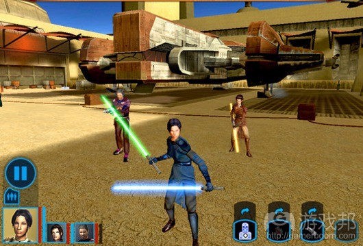



 闽公网安备35020302001549号