万字长文,与新手教程优劣比照设定相关的文章分析,上篇
篇目1,游戏新手教程设计应避开的8大误区
作者:Ernest Adams
早期的游戏行业是视频游戏(包括掌机游戏和大型街机游戏)的天下,但这类视频游戏却总让玩家备受折磨,因为这类型游戏并未提供给玩家足够的游戏教程,玩家几乎完全依靠自己的力量去战胜游戏中不断涌现的敌人。玩家失败的时候,也正是这些街机游戏大量吸金之时。
因为电脑游戏难于大型电玩游戏,所以它们经常在游戏开始前提供给玩家一些游戏说明。但是今天,我们已经不能指望还有多少玩家会耐心阅读这种说明,所以便开始采用新手教程向玩家介绍用户界面和游戏玩法,让他们清楚游戏目标或者任务,以及他们能够在游戏中得到何种奖励等。
最近我有幸担任Extra Credits Innovation Awards大赛评审团中的一员,而这也就意味着我必须尝试一些新游戏,而且不得不在很短的时间内快速学会这些游戏。
但是在这个过程中我却遇到了一些带有低劣新手教程的游戏,所以我不得不针对此事提出看法。
虽然新手教程的功能是用来教授玩家玩游戏,但是游戏设计者并不是教师。我们希望游戏中能够充满挑战,所以不希望提供给玩家一个“全盘透露”的新手教程,而是希望玩家能够通过观察并体验游戏过程,学习到更多东西。
Playdom副总裁Raph Koster曾经指出,当玩家在掌握了一种游戏后,他便能够感受到这款游戏设置的乐趣所在,但是这个过程却远远不够。新手教程也不能只是帮助玩家掌握游戏玩法。它还必须让玩家知道他们的游戏任务是什么,他们能从游戏中获得何种奖励等。新手教程的作用是让玩家了解游戏的一些基本要素,为他们在游戏初期提供帮助,而不是引导他们如何过关斩将,直至游戏结束。我发现最近很多游戏的新手教程做得并不得体,以下我将列出新手教程必须避开的8大误区。
game tutorial(from blog.fantage.com)
强迫玩家阅读新手教程。玩家在每一次打开游戏时,都必须再次阅读新手教程,不论他是否已经熟悉了游戏流程。如此反复地向玩家解说他已经熟悉的事怎么能不让他们感到厌烦呢?而且这种设置也在无形中浪费着玩家的娱乐时间。
新手教程作为游戏的第一或第二个环节,经常会不可避免地出现于游戏中。而且如果玩家能够自行控制新手教程的播放,关掉或跳过自己已经熟悉的信息提示,那么他们也不会因此感到烦躁了吧。
最简单的解决方法便是把新手教程环节与游戏过程独立开来,并设置成为玩家可以自行选择的环节。对于很多游戏角色而言,包括战士,运动员,驾驶员,甚至是国王和城市规划者等,在开始进行正式的游戏体验前接受新手教程的“培训”是非常重要的。但是如果你实在不想把新手教程从主体游戏中区分开,那么你就必须确保玩家能够按照自己的需求,选择是否阅读该教程,或直接进入游戏环节。
提供过多繁琐信息。一整个屏幕上都是文字介绍,玩家不得不烦躁地点击着鼠标阅读一页又一页教程内容。使用这种仿中世纪的语言(即冗长繁琐的表达)进行描述并不符合时代潮流,更糟的是,玩家并不容易被这种循循劝诱式的独白陈述所收买。例如“The A button swingeth thy sword! Essay it now. Aye, ’tis well done”便是使用中世纪语言叙述的新手教程。
我还发现,这种叙述方式常常使用大标题或者海报标题的字体进行描述,而因此破坏了游戏的整体画面感。
曾经我玩过一款日本游戏,它的新手教程非常长,甚至第一页内容就需要我拉着鼠标阅读10分钟之久。显然,我不可能长时间地记住这么多的内容,常常是玩到游戏最后就忘记了将近一半的教程内容。但是我认为,如果玩家能够边玩游戏边学习,那么他们便能够快速又牢固地掌握游戏玩法了。
除此之外,不要让玩家一直阅读游戏的背景故事。例如在电影《星球大战》中,从“内战时期”到“整个银河恢复自由”这整个背景叙述过程只花费了1分14秒。所以,既然大导演George Lucas(《星球大战》导演)都觉得这个时间绰绰有余了,你又何必执拗于游戏背景的长短呢。比起背景来说,更重要的是让玩家了解游戏接下一步的发展情节。
未能准确描述按钮和菜单项。如果你只是提及某个按钮但却未向玩家详细指明,那么这种新手教程将会让玩家感到厌烦。例如虽然你在新手教程里描述“点击屏幕左上方的Sell按钮”,但是屏幕上方却出现了5个不同的按钮并且没有一个按钮标示着“Sell”字样。同样的,如果你指示玩家选择菜单项,但是玩家却会因为找不到菜单项的位置而无从下手。
比起文本描述,带有标识的按钮更有效率,它不仅能够帮助节省屏幕空间,而且也不需要游戏设计者更多地考虑定位问题。所以游戏设计者必须通过新手教程教会玩家每一个按钮标识的意义和功能等。
当你在描述每一个按钮时,最好能同时在屏幕上突出那个对应的按钮,例如你可以在那个按钮周围添加金色的亮光,让玩家能够一眼分辨出,并因此记住它。
当你在描述菜单项的使用时,最好能把整个过程呈现给玩家,即不要只是说“你可以在定制菜单选项的图形标签中找到它”,而换成“选择帮助>参考>定制菜单>图形标签”。后者的描述能让玩家对此过程一目了然,但是却很少游戏能够按照这一步骤进行描述。
遗漏教程步骤。有些游戏的新手教程常常会在描述过程中遗漏了下一个游戏步骤,使玩家不得不在充斥着陌生的按钮和菜单项中疑惑不已。当玩家因此失去耐心而打算离开游戏时,游戏说明又会突然蹦出屏幕,使玩家对此感到莫名其妙。
比起其它游戏步骤,新手教程的设计应该更为周密,细致。而且如果你的游戏较为不同,或者说主题较为新颖,那么你就更应该考虑如何做才能更加妥当地向玩家介绍游戏。我不反对有限的教程内容,但是如果是那种会卡在解释中途的教程,我就不报任何好感了。所以不论你想要如何表达游戏内容,都必须保持整个教程的周密性。
惩罚缺少经验的玩家。当玩家在新手教程的游戏过程中失利后,便会被退回之前的游戏位置重新开始游戏。这种游戏设置会让玩家感到沮丧。
最让我不能忍受的是,当我在游戏中学习如何跳跃时,经常会因为一些小失误而掉落到之前的位置,且需要我再花费2分钟的时间才能回到现在的游戏点。这种设置在正常的游戏过程中已经很讨厌了,更何况是在新手教程中呢。因为玩家通常都希望能够在自己失利的位置再次开始游戏挑战。
当我在为Innovation Awards活动尝试新游戏时,一款游戏的新手教程让我印象深刻,因为玩家有可能在新手教程里就输掉整个游戏。这款游戏的新手教程并未明确指明玩家的游戏目标,但是我也尽力按照它所指示的进行游戏,可是出乎意料的是,当我走到游戏的最后几个环节时,它却告知我“被淘汰了”。对于在游戏一开始就面临这种打击确实心里会不好受。我认为新手教程应该让玩家轻松完成游戏并带着积极的心态开始完整的游戏体验。如果玩家在新手教程中输掉了比赛,那么也等于这个新手教程失去了玩家。
奉承或批评玩家。当玩家每次完成准确按下一个回车键这种极简单的任务时,便会听到“非常棒”这种过于夸张的表扬,并且玩家每回操作都会听到这种声音。这种激励手段好比是在赞扬一个刚学会扣扣子的四岁小男孩。
另一种情况就是,当玩家在游戏中出错时,还会听到一些“批评”的话语,甚至会出现“你好逊”之类的犀利评价。极少有新手会喜欢因自己的一点小失误而听到这种批评的话语。
无需赘述,新手教程所体现出的情感语调应该是正面且具有鼓励性,而不能带有任何屈尊俯就的意味。虽然在现实生活中,那些有建设性的批评不可或缺,但过度的批评就鲜有人可以接受了。
强迫玩家阅读完所有的教程内容。玩家通常能在阅读部分的新手教程后便掌握了游戏技巧,熟悉了游戏图片,并能够开始进行游戏。但是很多游戏的设置却让玩家不能自如进行选择。因为游戏设计者认为那是他们精心设计的新手教程,不论玩家是否愿意,都应该认认真真地看完所有内容才能开始进行游戏。
如果你的新手教程与游戏过程是相互孤立的,那么玩家便可以随时离开教程页面而进行游戏。但是如果你的新手教程是与游戏进程结合在一起,那么你必须让玩家能够自行选择是否阅读新手教程。
未提供任何新手教程。如果整个游戏既未包含HUD界面,也未提供任何屏幕指示,玩家全凭自己的独创性和直觉进行游戏,那么他们将不可能长时间沉迷于这种类型的游戏。并未提供任何指示而把玩家孤身置于一个完全陌生的游戏世界中,这种游戏怎么能让玩家产生依赖感呢?
我在这次的Innovation Awards大赛中就遇到了一款这种类型的游戏。一开始我对它的UI就不带任何好感。它展示的是3D第一人称游戏画面,但呈现的却是摇摇晃晃的视角,感觉人物角色因极度虚弱而失去方向感。
而且因为这款游戏并未提供任何新手教程,我必须反复摸索它所谓的直觉式用户界面,只为打开游戏中的一扇“门”而花费了5分钟时间。
迄今为止这种人机交互的直觉型用户界面被捧上神坛已有十年之久,但我却不得不直言,这根本行不通。因为除非你正在制作一款电脑教程游戏,否则电脑中的任何输入设备都不可能与游戏所模拟的现实世界的活动作出回应。
追溯到世嘉的Genesis(游戏邦注:家用游戏机)时期,那时我正致力于开发《Madden NFL》,我在游戏中设置了相关的指示,即告诉玩家如何通过使用三个按钮以及方向盘“开始游戏,抱着球前行,将其传给其他接收者,接收者抓到了球,并带着球前进”等功能。因为在Genesis时代并没有足够的游戏空间让我们插入新手教程,所以我们只能通过捆绑销售的游戏指南向玩家传递相关的游戏信息。
任天堂Wii控制器以及今天的Kinect体感周边设备的出现使这个话题重新浮出了水面,同时也有很多玩家希望能够体验《Minority Report》式的操作界面。我想说的是,这些人肯定早已忘记,或根本就不知道为何鼠标会早于触屏设置出现。因为比起鼠标,触屏设备不适于长久使用,它会导致玩家的手臂因为长时间游戏而变得酸痛麻木。就像《Minority Report》所展示的技术一样,这种操作方式虽然看起来很酷,但却不适宜长久使用。
当然了,如果玩家拥有一些较为专业的游戏装备,包括飞行模拟装置的高端操纵杆或者《Donkey Konga》中使用的DK Bongos等,那他们便不再需要新手教程了。但是你却不能指望玩家都能拥有这些设备,除非你的游戏也搭售这些设备,这意味着你还得针对他们的普通控制器另外再设计一个新手教程或操作指南。
简单的来说,你的用户界面必须能够映射整个游戏世界的活动,而且不管通过什么方式或者在什么地方,你都必须让玩家对此界面感到熟悉且充满兴趣。同时你也不能完全按照自己的直觉设计新手教程,因为你在游戏设计过程中已经无数次地经历了游戏体验,对这款游戏可以说是了如指掌了,但是对于玩家来说,他们仍是这款游戏的新手,所以你必须为他们量身定做一个新手教程。
总结
也许一些读者会认为我所陈述的并非是什么建设性的批评意见。虽然我在全文一直阐述不要做什么,什么是禁忌,但是我却还未告诉你什么才是正确的做法,怎样才能创造出最优秀的新手教程。因为游戏类型的多样化,所以我们很难针对它们创造出一些通用准则。例如射击游戏的新手教程与建筑类或管理类游戏的新手教程明显不同。所以我想我能给的最好建议便是,你必须通过一些游戏新手测试你的新手教程(也包括游戏)是否合理,是否有效,且是否能被玩家接受。
篇目2,精简压缩版的新手教程设计8误区
作者:Pete Collier
教会玩家玩游戏真的非常重要。如果游戏设计忽略或者误解了这一点,那么你们在游戏中所做的努力将很难传输到玩家心里。以下我将列出如何做好这一点的一些方法,而其中绝大部分是我的经验之谈,就是因为做错了才能吸取更多教训不是吗?让我们好好学习如何才能不在这方面继续犯错:
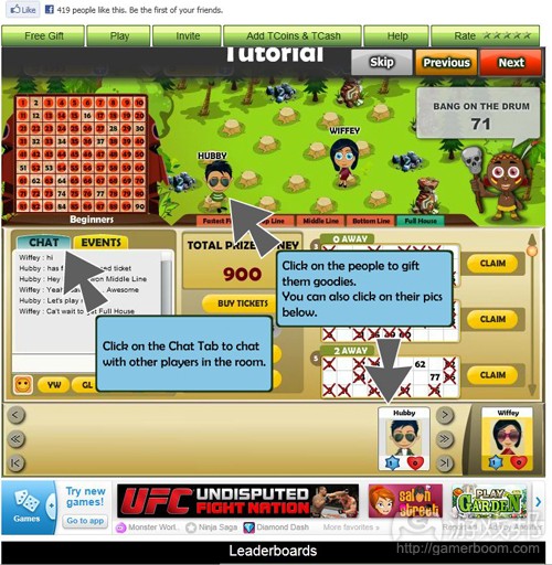
game tutorial(from socialgamesobserver.com)
1.不要一下子教授太多内容:没有人喜欢压力,更别说是在享受游戏乐趣的时候了。人们都有自己的饱和点,所以不可能一下子承受并接受太多信息。所以尽量将传授内容压缩到最佳范围。
2.杜绝死缠烂打:当你教授了一些新的内容后,留给玩家一点喘息时间。源源不断地往玩家的脑子里灌输新手教程将会让他们感到烦躁而不知所措。对于人们来说,学习任何新事物都是一种挑战,都需要劳心费神,所以一定要给玩家一些缓冲时间,这样他们才能更好地去理解所学到的内容。
3.巩固知识:向玩家证实你所教授的内容对她们是有帮助的。通常,人们总是会轻视那些多余的信息。而强调新知识或技巧的利益将能够提高这些内容的关联性并让玩家更想去重视它们。
4.千万别传授那些玩家已经掌握的内容:对于那些学习能力较强或者有强烈好奇心的人来说,他们也许已经猜到了你将要教授什么内容了,所以你可以选择让他们不用接受教程或者至少不要让教程不请自来。
5.玩家的自我发现和自我意识其实更加重要:让学生能够自己探索和发现是成为一名优秀老师所必须具备的技巧之一。如果你的新手教程只允许玩家完全按照你的指示而行动,那么这真的有够枯燥!
6.不要摆出一副居高临下的姿态:没有人会乐于接受别人的谆谆教诲,所以你最好不要总是当着玩家的面“教育”他们。以帮助为目标的指导也许更有效,但是这并不等同于使用office助手(游戏邦注:Microsoft paperclip,让用户可将文档都保存在一个文档库而便于收集,整理和查阅)。
7.在对方未提出问题之前不要主动提供答案:似乎这听起来很简单,因为人们通常不会主动去关注那些自己没有疑惑的问题的答案。换句话说,你可以在提供答案之前先引出问题。
8.最后,也是最重要的是,不要让自己陷入一个让人唾弃的窘境,如果你做不到这一点,前面的所有方法也都救不了你了。当玩家不理解教程时,千万不要嘲笑或戏弄他们,这是一件非常不智的举动,因为玩家将会以此而讨厌你以及不招人待见的游戏。他们既然喜欢并选择学习你的游戏,你就需要致以他们最诚挚的敬意。
篇目3,Aki Jarvinen谈社交游戏新手教程设置
游戏邦注:本文作者是Digital Chocolate首席社交游戏设计师Aki Jarvinen,他在文中讲述了游戏指南设置对引玩家入门,保证用户留存率的重要性。
新手教程及免费模式
因为免费模式已成为社交游戏约定俗成的运营模式,所以游戏保证用户留存率的功能设计也开始发生变化。开发商已经不能再指望玩家会因自己花钱下载了一款游戏,锲而不舍地克服重重困难,独立摸索游戏的玩法。
玩家的时间也很宝贵,所以他们不可能只为尝试新一款游戏,就直接付钱给开发商。这样一来,开发商就不得不在病毒式传播和游戏玩法设置上多下功夫,才能有效吸引这些玩家的眼球。游戏的核心机制和社交功能,必须在第一时间就亮出来,在头几分钟就抓住玩家的心,否则他们一旦离开就再也不会回头了。
farmville1-tutorial(from gamerboom.com)
这种说法已经是老生常谈,各种各样的游戏指南、新手教程正是为了满足这一需要而设置。游戏指南有多种形式,比如HUD游戏攻略、任务指示等,它们都可以体现一款游戏的功能设置和机制等相关情况。
另外,免费体验的游戏样本除了扮演市场营销工具的角色,还能发挥新手教程的功能。
那么社交游戏的新手教程究竟有多重要?首先要谈谈Facebook的本质,它是一个天然的信息传播平台,用户每天都在更新好友人数,添加新资料等等,这个在线社交网站并非天生就具备像Flash游戏门户网站一样的吸引力。但Facebook却能产生一种社会认同的心理效应:人们普遍有一种从众心理,如果看到许多人都在做同一件事,自己也会跟着认同这件事的价值。如果某个和我一样拥有共同价值观、看法和其他社交联系的人,也在玩这款游戏,我可能也会想去尝试一下。这时候如果该游戏有提供简短的新手教程,我就可以自己花点时间去摸索,如果学会了就有可能从中找到大量的乐趣。
撰写本文的目的是讨论社交游戏新手教程的意义所在,同时针对它们的设计原则发表我的看法。我将在下文中将从用户界面设计(UI)、游戏体验、漏斗分析、服务设计这几个角度来解析新手教程的设计要点。
新手教程是用户界面的切入点
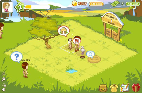
玩家刚进入游戏界面时,首先看到的总是一个冷清的场景,比如说寸草不生的田地,空荡荡的好友列表,在这个时候,新手教程就是引导玩家正式开始游戏体验的一种有效过渡方式。下图是我们的社交游戏《Safari Kingdom》的界面,有许多用户界面提示信息可引导玩家去执行游戏任务。有些玩家可能更乐衷于自己找到游戏玩法,但对非游戏玩家来说,新手教程的存在就很有必要了。
safari kingdom(from gamerboom.com)
上图实际上并非用户初次进入Facebook游戏界面中的场景,而是他们按新手教程完成操作后的情形。之后我还会再以其他的热门Facebook游戏为例,解读它们将核心游戏机制融入新手教程的操作方法。
在《社交网站界面设计》(Designing Social Interfaces)一书中,作者克里斯汀·克拉姆利什(Christian Crumlish)和埃林·马龙(Erin Malone)频频提到的一词就是“onboarding”,即帮助用户开始游戏并与网站进行互动的一个热身过程。他们的一些观点同样适用于社交游戏开发:当一个Facebook用户(游戏邦注:尤其是非游戏用户)通过点击链接进入游戏界面时,如果有一个新手教程可以手把手地引导他玩游戏,他完全有可能成为该游戏的忠实粉丝。
“onboarding”这个概念来自人力资源管理领域,克拉姆利什和马龙认为“onboarding”这个过程包含三个步骤:适应、吸收、加速。要让玩家适应、熟悉游戏进程,就得先给他们提供一些必要的道具、资源等游戏设置机制,给他们创造一个良好的开端。
吸收过程主要针对社交网站环境而言,如果用户的好友在玩某游戏,用户与好友一起体验游戏的可能性就会大大提高。加速过程是指用户深入挖掘游戏的所有功能,向更具难度的游戏任务发起挑战。
社交游戏的核心机制是UI
Eitan Glinert曾经在Gamasutra的一篇关于游戏功能使用方法的文章中指出,“多数开发者都偏爱直截了当,开门见山式的UI,所以就会广泛植入游戏的任务指南,因为它们可以创建一个可靠的游戏控制系统,为玩家提供有益的帮助和引导。”这一点也同样适于社交游戏。
玩家看到游戏UI中的提示内容时,就会了解到该游戏的核心机制。所以社交游戏可以参照PC上的RTS游戏,通过HUD游戏攻略,将游戏的关键玩法传授给玩家。
社交游戏的新手教程有一个显著特征,它会在用户眼皮底下走完所有流程,玩家别无选择,只能耐心看它演示完毕。
有些游戏会选择非游戏主角的动画形象,即界面解说员来引导玩家进行相关操作,植入这些任务解说员是为了让新手教程看起来更加人性化,而非冰冷生硬的功能说明书。
关于UI设计,克拉姆利什和马龙所掉到的一些“onboarding”技术,也可以直接用于设计社交游戏的新手教程:
·不要过度分散玩家的注意力。这可以通过“手把手”的引导方式来实现,让玩家在新手教程的指示下逐步完成相关操作,在游戏开发者看来,这些内容也正是玩家应该通过UI和游戏机制学到的东西。
·应该通过游戏网站或游戏应用的具体实例,让玩家了解游戏机制、目标、资源和奖励之间的联系。奖励机制要以让社交游戏获得积极的用户反馈,关卡结构则是社交游戏最基本的升级系统,它同时发挥了游戏目标和奖励系统的作用。一般而言,玩家通过新手教程的指导,至少都会顺利进入第二关。
·要善于搜集和利用现存玩家的相关信息,可以将这些信息打包整理起来,以便增加重复访问量和游戏推荐次数。比如在一个追踪网站中,如果用户的搜索历史记录通过筛选成为备用信息,就可以为新手教程的优化提供更多参考信息。
在Facebook游戏或其他社交游戏中,这个步骤有助于通过病毒式传播,强化社交功能与游戏本身的关联。
开发者很有必要了解上述三个步骤在“onboarding”过程中的结束方式。如果玩家知道怎么在游戏中的农场中铲出一块平地时,他们就会很想自己去摸索剩下的程序。但他们要是并不清楚怎么进行下一步操作,而UI也没有提供充分的帮助时,游戏就很有可能流失客源。
新手教程可激发玩家好奇心
出色的新手教程可以有效引导玩家积极融入游戏体验过程中。如果一块空地并没有“播种”的要求,玩家可能就会中途退出,除非后来受到病毒式传播的影响,或者好友怂恿鼓动,他们才有可能回心转意重新体验该游戏。通过用户界面或者病毒式传播渠道、社交功能设计,让玩家迈过这个槛,正是社交游戏保证用户留存率的第一步。
席德·梅尔(Sid Meier)曾经在一次GDC大会上表示,游戏开始头15分钟就应该富有黏性、有趣,同时为玩家提供奖励,并体现后面的游戏机制。如果是在社交游戏领域,新手教程一开始就得在这15分钟,甚至更短的时间内吸引玩家,才有可能获得后续发展。
从游戏设计角度来看,这也就意味着开发者必须通过这15分钟,反映游戏的整体目标和次级目标,让玩家不得不持续玩游戏,舍不得轻易罢手。在社交游戏中,这种方式的影响力堪比市场营销的技巧,即创造了一种稀有价值,比如说未开启的功能和关卡,勾起玩家的好奇心。在这种好奇心的驱动下,玩家就会频频回头,对游戏恋恋不舍。
免费模式是新手教程大量涌现的重要原因之一,开发者得想方设法让玩家购买虚拟货币、解围功能等付费选项,新手教程在此时就能派上用场了,它可以引导玩家到游戏中的商店进行消费。
Facebook上的游戏应用已经被称为“社交”和“病毒”游戏,实际上它是两者的合体,所以社交游戏的新手教程也就兼具了邀请好友、通过病毒式传播渠道发送Facebook消息这两种功能。
不过,社交游戏开发商Playfish曾经指出,Facebook上的游戏体验是一种社交现象,玩家的口碑传播、好友讨论等社交行为,会让新手教程的作用大打折扣。因为用户很可能通过好友或者同事获知某款游戏的玩法,在这种情况下,玩家之间的社交关系就完全取代了新手教程的功能。与病毒式传播一样,这种在现实中的或网络上的用户关系,对游戏的玩法推广大有禆益。
但社交游戏开发者们很显然并不这么认为,所以Facebook上的社交游戏才会无一例外地推出了自己的新手教程,部分是因为游戏的第一印象很关键,只有获得了用户的好感,才有可能被推荐给更多玩家。
社交游戏的新手教程会指导玩家逐步完成相关操作,在这个过程中就会形成一种虚拟的漏斗效应,即并非100%的玩家都会跟着新手教程一直走到最后,必定会有人在中途退场。这些离开的用户比例就称为流失率,而一路走到最后的玩家比例则称为转化率。
一般来说,因为游戏奖励机制比其他应用功能更吸引用户,所以社交游戏的转化率远高于其他应用。有不少第三方服务工具,比如KISSmetrics、Kontagent和MixPanel可以帮助分析社交的游戏的转化率及流失率。
MixPanel的分析指出,如果用户的游戏进程走到了第二步,有90%的玩家还会接着看新手教程的指示,这个比例远高于其他类型的Facebook应用,这也足以证明在线社交游戏对用户的确具有相当大的杀伤力。
漏斗分析很有助于指出新手教程的瓶颈,可以分辨出那些让玩家中途退出的环节,但很难判断玩家究竟是否查看了新手教程的文字内容,也无法说明这种瓶颈现象产生的原因。
漏斗分析的结果还有一个很重要的发现:如果你的新手教程并不具有黏性,有可能是因为社交游戏本身的设计出现了问题。
新手教程分析:三分钟准则
我在下文中挑选出的几款游戏都已经积累了一定的知名度,因此针对它们的新手教程解析,更有助于论述社交游戏的新手教程设计必须注意的要点。
我对这些游戏的新手教程进行了记录,通过深入分析发现,要保证玩家留存率,开发商就必须注意新手教程结束后的游戏状态,以及游戏本身的刺激因素。
以下表格所列的六款游戏,是2010年经常活跃在Facebook游戏排行榜前十名的社交游戏。从中可以看出,每款游戏的新手教程的时间长度均少于4分钟。不过也有些游戏还会添加一些额外任务指示的功能,或者在后续游戏环节中植入迷你型的游戏指南,当然,这种功能一般只针对那些已发展到高级阶段的玩家而设置。
这个表格还详细列出了这些新手教程每一分钟内所包含的操作步骤。从理论上讲,每多执行一个步骤都有可能多流失一名玩家,因此多数新手教程都会在第一分钟里安排最多的操作步骤。第一分钟最容易吸引玩家的注意力,随后新手教程就会通过购买、出售社交游戏等资源来体现游戏的设置机制。

chart(from gamerboom.com)
这个图表还指出了热门社交游戏的核心机制——游戏虚拟形象、个性化服务,以及设定好友、种植、饲养、清除购买和出售记录等功能。
这些新手教程并没有什么显著的差别,由于在当前的社交游戏开发过程中,游戏功能等元素总是借鉴前人的成功案例而设置,因此它们之间只是运行方式有所不同而已。在上述六款游戏中,仅有《快乐水族馆》(Happy Aquarium)的新手教程解说员,采用的是非游戏主角的动画形象(如下图所示)。
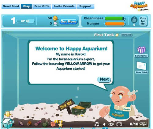
Happy Aquarium(from gamerboom.com)
作为“第一代Facebook游戏”的代表,《Mafia Wars》的新手教程内容非常稀少,部分原因是它属于非富媒体的Facebook游戏,另一个原因是它拥有庞大的用户规模,这些热情玩家不遗余力地向四周传播,节省了新手教程的工作量。
不过说到底,只有掌握了一定玩家基础的社交游戏才有可能从这种病毒式传播中获益,对既无交叉推广渠道,又无市场营销门路的新游戏来说,最稳妥的办法还是准备一份完善的新手教程,这样才更好地自我推广。
不过,《Mafia Wars》的用户界面仍然塞了大量的信息,这种任务提示方式其实很容易令玩家消化不良,产生视觉疲劳。
事实上,据Zynga公司的Mark Skaggs所称,该游戏的新手教程已经随机砍掉了两个操作步骤,结果《Mafia Wars》的漏斗分析结果增加了25个百分点,但用户反馈信息却很消极。
这个案例说明,新手教程的长度或具体内容,并不需要与UI或游戏复杂程度成正比,关键是要让玩家对自己所看到的信息产生好奇心,然后按照核心游戏设置、智能的UI设计、后续跟进的新手教程等提示性信息付诸行动。
如果你的游戏理念、核心机制是围绕现实生活中人们所熟悉的事物所设计,比如光顾一家餐厅、开发一块农场、管理一家水族馆、成立一个黑帮等等,新手教程的设计也可以参照此法,这样可以更省心省力地为玩家创造一个理想的开端。
新手教程的设计准则
上文的表格还将新手教程的设计分成了时间长度、起点和结束三个要素,如果我们回顾“onboarding”这个过程,就会发现这些新手教程的设计都已融入了适应、吸收、加速这三个内容。
以下三部分内容有助于开发者更深入地考察新手教程的流量:
·开端
*如何让玩家一开始就接触到游戏的核心机制?
*游戏开始之初应该为玩家提供什么资源和机制?
*新手教程要选用哪种解说员形象?哪种类型的声音?
·结束
*玩家会在什么情况下退出游戏?
*新手教程的结尾有无兴奋内容可让玩家留连忘返?
*有无刺激元素让玩家不断返回游戏界面?
*UI设计是否具有足够吸引力,可诱使用户产生好奇心并点击进入游戏?
·结构和时间长度
*游戏核心机制和刺激性元素是什么,它们的出场顺序如何?
*在头60秒钟内,新手教程可展示多少核心机制?
*新手教程的虚拟漏斗中有多少个步骤?玩家关注新手教程的平均时间长度是多久?
*新手教程是否与游戏复杂程度成正比?
*是否还有可优化或删除的内容?或者还可以尝试缩短新手教程的环节,让玩家通过不断体验,自己摸索出更多高级的机制和游戏功能?
在社交游戏开发过程中,有些新手教程会尽量体现整个游戏理念,但游戏总要经过不断地升级,所以新手教程就没有必要植入过多的游戏功能,否则新手教程也得随着游戏的升级而不断更新,这其实是一件吃力不讨好的事情。
但需要注意的是,社交游戏开发是一项长期的事业,只有不断升级、重新设计、植入和采用新功能和内容,才有可能保证用户留存率。因此,社交游戏要让玩家了解游戏新功能,就得考虑对新手教程进行调整,或者在游戏中植入“迷你型游戏指南”。
篇目4,新手教程或影响社交游戏首周用户留存率
作者:Tim Trefren
我们有很多客户都是社交游戏开发商,因而比较熟悉Facebook应用的趋势。近期我们发现的大趋势是,游戏利用教程来提升新用户留存率。还有个相关趋势是,游戏发布后数周的留存率对游戏的存活时间至关重要。以下将详细分析这两个趋势。
教程给玩家的印象
zynga_funnel(from insidesocialgames)
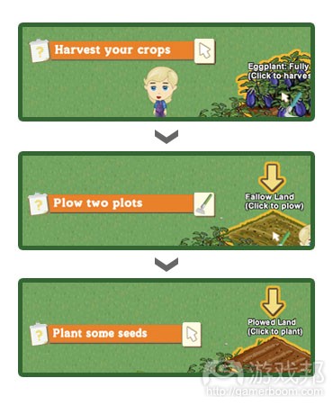
我们见过较为成功的做法是基于教程的注册过程。规划精巧的教程可以解除玩家上手游戏的烦恼,教授新用户如何玩游戏。
如果你对这种方法不甚熟悉,可以看下《FarmVille》的注册过程。《FarmVille》的3步教程详细教授你如何收获、耕地和种植。
现在你已经对这个概念有所了解,让我们看看我从一些游戏中收集的数据。
数据
此项分析最令人印象深刻的发现是,每教程步骤推进率平均超过90%。也就是说,一旦某用户开始教程,他们就有超过90%的概率继续实施教程每个步骤。
但这不包括第一步,让玩家开始教程比让他们继续完成教程步骤要难得多。
首步转化率:71.4% 后续步骤转化率:95.06% 完成比率:37.9%。
现在许多公司都在利用教程技术。转化率从未出现95%这么高的数值,但教程似乎确实做到了。
访问留存率趋势
我还注意到留存率行为的另一大趋势。虽然各个游戏的访问留存率在数值上不甚一致,但却有一定的相似性。
访问留存率指的是访问者在首次访问后回头与应用互动的概率。
访问者被分成多个群组(游戏邦注:也称为“同类者”),然后分析整个群组的行为。根据访问日期分组是最普遍采用的方法。比如,5月3日访问游戏的人设为一组。
将访问者分组之后,你可以在接下来数周进行跟踪,查看每个群组中回到站点的数目。
现在,我们来看看各种不同游戏的某些留存数据。为收集这些数据,我首先选取了使用我们服务的几款不同社交游戏。然后,我观察每款游戏每周的平均留存率。
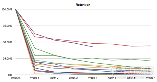
以下是不同游戏周留存率示意图:
retention(from insidesocialgames)
我们可以看到,从表面上来看,留存率数值有很大差别。有些游戏的留存率长期维持在50%左右,有些游戏迅速跌近0%。
然而有趣的是,尽管绝对留存率各不相同,各游戏间的留存率变化趋势却很相似。它们都在首周过后急剧下滑,接下来数周趋于平缓。如果你再细心些观察,会发现接下来几周的周留存率几乎没有差别。
我们可以进一步计算出相邻两周间的转化率(游戏邦注:比如第3周数值除以第2周数值)。以下是转化率示意图:

retention_conversion(from insidesocialgames)
是否发现什么规律呢?游戏从发布之初到第1周的转化率各不相同,从最低的1.76%到最高的62.83%。但是,无论初始转化率是高还是低,接下来几周几乎所有游戏的转化率都接近80%。
换句话说,游戏首周的用户有80%的概率在接下来几周会回到游戏中。
这意味着首周留存率很重要,因为你一旦留住用户1周时间,他们就很有可能长久选择这款游戏。这种现象也产生了另一个问题:为何我们所选的这些游戏的表现都如此相似呢?或许社交游戏就是如此,所有游戏的留存用户都有80%到95%的概率每周回到游戏中?如果事实真是如此,这意味着你只需要控制初始留存率即可。开发商们,是时候编写和润色游戏教程了!
篇目1,篇目2,篇目3,篇目4(本文由游戏邦编译,转载请注明来源,或咨询微信zhengjintiao)
篇目1,The Designer’s Notebook: Eight Ways To Make a Bad Tutorial
by Ernest Adams
[In his latest Designer's Notebook column, veteran Ernest Adams takes a frank and factual look at in-game tutorials, explaining exactly what games do wrong so you can make sure that, when you set out to create your tutorial, you do it right.]
In the early days of the game industry there were video games (console or arcade) and home computer games. Video games threw you into the deep end of the pool: you faced an onslaught of enemies with minimal instruction and you either sank or swam. Mostly you sank, which is how arcade games made their money.
Computer games were more complicated than arcade games, so they gave the players manuals to read before starting to play. These days we don’t expect players to read manuals, so we give them tutorials instead. Tutorials introduce the player to the user interface and the gameplay. They should explain how the player interacts with the game world, what she’s trying to achieve, and (briefly) why.
Recently I had the privilege of serving on the jury for the Extra Credits Innovation Awards, which meant that I had to play — and therefore, learn to play, several games in a hurry.
One or two had tutorial modes so bad that I decided we’d better talk about them. Bad manuals and/or bad tutorials are already Twinkie Denial Conditions, but the Bad Game Designer, No Twinkie column in which I introduced them didn’t go into much detail.
Tutorial modes exist to teach the player, and game designers are not natural teachers. We’re used to creating challenges, not explaining principles. Throughout most of the game, the players are expected to learn things on their own through observation and experimentation.
As Raph Koster has pointed out, much of the fun of gameplay come from learning to master the game, but this process is inefficient. The tutorial shouldn’t be like that. It should tell players what to do and show them what happens when they do it. It should let the players master the basic elements of using the software — guiding them into the shallow end rather than throwing them into the deep end. But as I recently discovered, there are a lot of ways to do it badly. Here are a few.
Force the player to take the tutorial. Whenever the player starts the game over, make him go through the tutorial again. Do this even if he has played it a dozen times before. Bore him with explanations of things he already knows. Irritate him with tiresome trivial challenges. Waste 10 or 20 minutes of his time before he can get to the fun part.
Games often include unavoidable tutorials because the tutorial also constitutes the first level or two of the game. There’s not much harm in this if the player can turn the game’s advice off, or interrupt it. But making the player struggle through a swamp of information he already knows is tedious and annoying.
The simplest way to resolve this is to put the tutorial in its own optional area, separate from the rest of the game. It works for many game roles. Soldiers, athletes, pilots, and for that matter, kings and city planners all go through training phases before they start their real work. If you really want to build your tutorial as part of your main game, make sure the player can turn the teaching elements off and just play straight through.
Square Enix’s Nier
Make the player read a lot. Give the player screen after screen after screen of introductory material to read, with nothing to do but press a button to move from one to the next. Write it in faux-medieval language full of anachronisms, or worse yet, as the monologue of some tiresome mentor character with a lot of irritating verbal mannerisms. (“The A button swingeth thy sword! Essay it now. Aye, ’tis well done.”) Display it all in an ugly typeface that was originally intended for headlines or poster titles, but never for large blocks of text.
I once played a Japanese game whose tutorial mode consisted of ten solid minutes of pressing a button to move to the next screen of text. Of course, by the time I reached the end I had forgotten half of it. Players will remember much more if they learn by doing.
While I’m at it, don’t make the player read huge amounts of back story, either. The opening crawl of the first Star Wars movie takes one minute and 14 seconds, from “It is a period of civil war” until “restore freedom to the galaxy” fades off the screen. If that was enough for George Lucas, it’s enough for you. Let the players learn the rest from context.
Describe buttons and menu items badly. You can make your tutorial mode even more irritating by including references to a button without identifying it clearly. For example, say “Press the Sell button in the upper left of the screen” when there are five different buttons up there and none of them labeled Sell. Similarly, tell them to choose menu item X when no menu item X is visible. Put the actual menu item X down a level or two in the menu tree with no instructions about where to find it.
Buttons with icons on them take up less screen real estate than text does, and they don’t have to be localized as much, so they’re generally a good idea. However, the player needs to learn what the icons mean and what the buttons do, and the tutorial should teach this.
When your text refers to a button, highlight the button on the screen at the same time – put a golden glow around it or something, and make it pulse or flash.
If you refer to something down in the menu tree, be sure to indicate the whole path. Don’t say, “You can find it on the Graphics tab of the customization menu,” say “Select Help > Preferences > Customize and choose the Graphics tab.” This might seem obvious, but you would be surprised how few games do it!
Leave steps out. Get partway through a step-by-step tutorial and then suddenly stop giving the player instructions. Leave her on a game screen full of buttons and menus with no idea what she’s supposed to do next. After she has hesitantly tried something, suddenly start giving instructions again without any reference to what she just did.
Some tutorials need to be more thorough than others. The more unusual your game, or unfamiliar its subject matter, the more you need to explain things. I’m not objecting to limited tutorials here, but to a tutorial that starts out with a detailed explanation and then suddenly disappears. Whatever level of detail you choose, maintain it throughout.
Punish the player’s inexperience. When the player makes a simple mistake, go back a long way and explain everything again in excessive detail — or make the player go back a long way. You can drive his frustration level up by punishing small errors with long delays.
When I’m trying to learn how to jump in a game, one of the things I hate most is falling down a long chasm that takes me two minutes to climb out of before I can try the jump again. This is bad enough in normal gameplay, but it’s inexcusable in a tutorial mode. When a player fails at a jump, or any other physical challenge, she should be able to try it again immediately.
One of the games I played for the Innovation Awards had a tutorial in which you actually lose the game! It wasn’t very clear about what I was trying to achieve, but I tried to do what it told me to, and at the end, it said I had lost. I can hardly think of a more discouraging start to a game. Completing the tutorial should have give the player positive emotional rewards. If the player fails at the tutorial, then clearly the tutorial itself has failed.
Patronize or humiliate your player. Tell the player “Very good!” in an overly chirpy voice when he has successfully managed to find and press the Enter key. Do it every time he does this. Praise him as you would a four-year-old who has just learned to button his own shirt.
Alternatively, humiliate your player when things go wrong. Tell him what a loser he is. New players love being harshly criticized for not knowing the very things that the tutorial is there to teach them.
This doesn’t require much explanation. The emotional tone of a tutorial should be positive and encouraging without being condescending. As in the rest of life, constructive criticism is useful, but abuse is not.
Force the player to complete the whole tutorial. It’s possible that partway through your tutorial, the player will feel that she’s got the picture and is ready to go ahead and start the game. Oh, no. Not a chance. You put a lot of effort into that tutorial and she is going to have to finish it whether she likes it or not. After all, it’s your game, not her game.
If you have a separate tutorial level, let the player quit it and move on. If your tutorial is built into your ordinary level progression, let the player turn off the tutorial elements.
Don’t give them a tutorial at all. Devise what you think is an ingenious and totally intuitive interface, preferably without a HUD or any on-screen indicators that would prevent the players’ complete immersion into your brilliant universe. Make it so transparently obvious that no instruction is needed. Throw them in and wish them luck.
One of the games I had to judge for the Innovation Awards did exactly that. The UI left me nauseated — its 3D first-person view weaved drunkenly around, apparently in an effort to convey the notion that my avatar was feeling sick and disoriented.
It worked; before long, so was I. It also took me five minutes of experimentation with its supposedly intuitive user interface just to figure out how to open a door.
The totally intuitive user interface has been a holy grail of human-computer interaction for decades now. I’ll be blunt: there’s no such thing. Unless you’re making a computer game about using a computer, the machine’s input devices are unlikely to correspond to the real-world activity that the game simulates.
I worked on Madden NFL as far back as the Sega Genesis days, and I can tell you that choosing a play, then snapping the ball, passing it to one of several receivers, catching it, and running with it are not trivial with three buttons and a D-pad. We did it very successfully — but we still had to ship a manual with the game. There wasn’t room for a tutorial in a Genesis cartridge.
The arrival of the Wii controller and more recently the Kinect has moved the issue to the foreground again, and some people are very excited about the possibility of Minority Report-style interfaces. These folks have forgotten — or probably never knew — why the computer mouse was invented in the first place. Touch screens are tiring to use for long periods, because you have to hold your arm up all the time. Waving your arms around, as in Minority Report, is even more tiring. It might look very swishy and cool, but you can’t do it for hours on end.
Players don’t need a tutorial as much if they have specialized gear, of course — a high-end joystick for flight simulators (but they’ll still have to press a key on the keyboard to lower the landing gear), or the DK Bongos for playing Donkey Konga. But you can’t count on the player owning these devices unless you ship them with the game, and that means he still needs a tutorial or a manual for his ordinary controller.
Put simply, your user interface must map the machine’s controls to game-world activities, and somehow, somewhere, you’re going to have to explain that mapping. And your interface almost certainly isn’t as intuitive as you think it is. You’ve been playing your own game for months or years, so it’s second nature to you, but your players are new to it. They need a tutorial. Really.
Conclusion
Some of you might have noticed that this isn’t very constructive criticism. I have identified a number of things not to do, but I haven’t told you how to create a good tutorial. That’s because it’s hard to create general rules for a medium as diverse as ours is. A tutorial for a shooter game will necessarily be very different for one
from a construction and management simulation. The best positive advice I can offer that covers all the cases is, be sure you try out your tutorial on complete novices — and your game too, for that matter.
篇目2,Teaching Players how to Play your Game
Pete Collier
Teaching the player how to play your game is incredibly important. Under no circumstances should this area of game design be overlooked because getting it wrong means players may never see all the hard work you’ve put into the rest of the game. So the following is a list of what I’ve learnt about how to get it right…mostly from getting it wrong myself…but hey…that’s the best way right! So without further ado here it is:
Don’t teach too much too soon: No one likes to feel overwhelmed, even less so when they are playing your game to have fun. People have saturation points, throw too much at them and the information overflow will go unheard. Keep things bite-sized.
Don’t be remorseless: Once you have taught something new allow time for the information to set in. Remorselessly moving on from one tutorial to another will makes players feel uncomfortable and not able to cope. Learning something new is a challenge and mentally taxing, so allow players time to feel good about doing it.
Reinforce: Demonstrate to the player the benefits of what you’ve taught. People are fairly efficient at marginalising seemingly redundant information. Reinforcing the benefits of a new piece of knowledge or skill will raise its relevance making it much more likely to be retained.
Nothing is worse than teaching something when the lesson has already been learnt: So for quick learners or inquisitive players who’ve already figured out what you’re about to teach them, allow them to opt out or at the very least shut you up.
Self-discovery and self-realisation are worth so much more to a player than anything you have to say: Make it as easy as possible for this to happen, that’s part of the skill of being a good teacher. Designing your tutorial in a restrictive way that only allows for the game to play according to your lesson plan is dumb, don’t do it.
Don’t try to be a teacher: People don’t like having that psychological inferiority of having to be taught something. So the less you rub it in their faces the better. Aim to be more of companion helping to guide them and no I don’t mean a ^@#!*#% Microsoft paperclip.
Don’t give the answers before the questions: Sounds simple doesn’t it, but if people haven’t asked the questions then they won’t see the relevance of your answers. In other words present them with the problem before giving them the solution.
Finally here is my number one tip, if you go away with anything from this then let it be this, and it’ll sound obvious, but here goes…Don’t be a bastard: There you go I said it. Any hint of you revelling in the players’ lack of understanding by mocking or teasing etc is incredibly naughty and a bit silly because this more than anything else will make the player hate you and your stupid game. They are doing YOU the favour by wanting to learn how to play YOUR game, so show them some respect.
So there it is, it’s a pretty simple list but comprises everything I’ve learnt and stands me in good stead. Do you have any more tips that you can add? Have I missed something? Please do add them on the comments below. Finally good luck with tackling this part of your game, it’s a fascinating and challenging area of design, let me know how you get on.
篇目3,Introduction: Tutorials and the Freemium business model
As the freemium business model is becoming de facto standard in social games, the key design features factoring into acquiring and retaining players are shifting. Developers can no longer trust that their players will make the effort of learning the ropes of their game through a set of challenges, just because they have spent tens of dollars to get the game at their hands.
Because players of social games do not fork out money to have the chance to try out a game, their time is of precious quantity. Therefore developers need to catch and hold their attention both through viral spread and gameplay itself. The core mechanics and social benefits of the game need to be sold to the players in a matter of minutes. Otherwise, they might never come back.
This of course is not entirely new, as we are familiar with tutorials from a variety of games. Gameplay tutorials have come in various forms, ranging from HUD walkthroughs to quests that showcase the world and mechanics of the game.
Furthermore, free playable demos are marketing material that function not only as teasers, but also as tutorials.
What is then particular to the importance of tutorials in social games? One answer lies in the spontaneous nature of Facebook as a distribution platform: With the constant flow of friend updates, news items, and so on, an online social network is not inherently captivating to the degree that even a Flash game portal is.
Yet it is an environment based around social proof: our tendency to see an action as more appropriate when others are doing it. If someone I regard a friend with whom I share values, opinions, or other social factors is playing this game, maybe I should try it too. A tutorial is the bite-sized dose of play that I can invest my time into, and in the best possible case, it might even turn out to be worthwhile in terms of fun.
The goal of this article is to give an overview of social game tutorials, and identify general structural principles for their design. I will look at tutorial design from the perspectives of user interface (UI) design, play experience, funnel analysis, and service design. The observations are based on analyzing tutorials of social games, research for my forthcoming book on social games, and my work on the design of the tutorials of social games, such as Safari Kingdom.
Tutorials as entry points to the user interface
Introducing a tutorial is a way to facilitate overcoming the familiar cold-start problem of a social game: Often a literally empty grid and possibly empty friends list. The image below shows our game Safari Kingdom. A number of user interface indicators communicate its core mechanics, enticing players into executing them. Some players might get on with this, by pure exploration, but for those regarding themselves as non-gamers, a tutorial is in place.
In fact, the image depicts the end state of completing the tutorial, rather than the starting point of launching the application within Facebook. Later we will take a look at a number of popular Facebook games, and how they orchestrate similar core game mechanics into a tutorial sequence.
In their book Designing Social Interfaces, Christian Crumlish and Erin Malone write about “onboarding”, i.e. the process which helps people to get started and oriented with a web site. Much of their points are valid in social game development as well: When a Facebook user follows a link to the game, he is essentially taken a leap of faith, and needs to be guided by hand to get on board with the game — something especially relevant for non-gamers.
The notion of onboarding originates from human resource management. Crumlish and Malone identify three key steps in onboarding: accommodate, assimilate, and accelerate. In terms of games, accommodation is about giving the necessary tools to the player, i.e. the necessary game mechanics and resources to start with.
Assimilation gains a specific meaning from the context of the social network: It accounts for assimilation into the progress of one’s friends playing the game, and the benefits from playing parallel to your friends. Acceleration then is about getting the player to engage with the game’s full feature set and its possibilities.
UI is the core mechanics in social games
Writing about game usability in a Gamasutra feature, Eitan Glinert writes: “Most developers prefer straightforward UI learning. To this end, tutorials are commonplace, as they provide a safe environment for learning controls and mechanics while providing meaningful assistance and guidance.” This is essentially the approach social games are adapting as well.
What is relevant is that as the player is learning the UI of the game, he is supposed to learn the core mechanics of the game in the same sitting. Therefore social game tutorials integrate teaching key gameplay actions into a HUD walkthrough, in similar fashion as, e.g., RTS games do on the PC.
A specific trait of social game tutorials is that they tend to be explicitly intrusive, rather than camouflaged into the game fiction: there usually is no option to surpass them, and they run on the level of the user interface — in your face, quite literally.
Some games do employ non-player characters as tutors, or as so-called interface agents as they are called in software design terms. In general, introducing the character aims at giving the tutorial a friendlier and less functional touch.
In terms of UI design, Crumlish & Malone mention a handful of onboarding techniques, which can be directly applied to tutorial design in your social game:
* Limit user focus to avoid becoming overwhelmed. This most often takes the form of the “lead by hand” approach, where the player is guided through a funnel of specific steps, which the developers have deemed to be the ones the player needs to learn in terms of UI and mechanics.
* At the same time, the user should be trained in the core use cases of the site or application, in order to learn what the value offering is. Again, translated into the specifics of game and tutorial design, this is essentially training the player to understand the causal relations between mechanics, goals, resources, and rewards.
Especially positive feedback through abundant rewards is something that social games, on the footsteps of downloadable casual games, seem to be doing. The leveling structure is a fundamental gating system in social games, and therefore its role both as a goal structure, and a reward system, is significant. Usually the player levels up at least to level 2 during the tutorial.
* Finally, taking advantage of existing user information and packaging it into an accessible form relevant for instant use can encourage repeat visits and referrals. For example, on a travel site, if the user’s search history is filtered into a ready-made selection of choices, to serve a more spontaneous and frictionless re-booking, her end goal has been “accelerated” in terms of onboarding.
In Facebook games, or any social network game for that matter, this step is making the social graph from the network visible and relevant to the game, in terms of social fun and virality.
It is important to realize where the three-step process of onboarding ends. Once the player learns the lay of the land — quite literally, in grid-based farming games, for example — they typically want to be left alone to explore. Yet this can be a breaking point: if the player has not internalized what can or should be done next, and the UI does not support re-discovering the core mechanics, the casual player is as good as lost.
Successful tutorials create the curiosity gap
This is particularly relevant in social games, which rely on the “initiate and wait” type of game mechanics. This dynamic brings along the challenge of easing the player from the strongly sequential tutorial flow to asynchoronous gameplay, where something significant happens only after a certain time interval.
If an empty plot does not “beg” for seeds, play might stop right there, unless virality or friends manage to pull the player back. How to help your player across this gap in your social game is the first step for retention — this can be either by the means of user interface, or viral, and/or social design.
Sid Meier, in his recent GDC talk, was reportedly emphasizing how the first 15 minutes of a game have to be engaging, rewarding, fun, and foreshadow the rest of the game. In social games, tutorials try to get players engaged right from the start, towards those crucial 15 minutes — or even a shorter playtime.
In game design terms, this is about clear communication of an overall goal and the sub-goals, and giving the player always something to do. In social games, this takes a turn towards marketing-like techniques of influence, such as creating scarcity and the so-called curiosity gap through, e.g. locked features and levels. The gap functions as an addictive pull that makes players continue and come back.
Tutoring for viral spread and monetization
There is another reason for tutorials’ abundance in social games, stemming from the freemium model. The developers need to initiate their players into the monetization options, i.e. virtual goods, gameplay assists, etc. This need becomes evident in the visit to the in-game store, which is frequently included in social game tutorials. If the money is to be sunk to the game, the money sinks need to be part of the core mechanics, but whether they should be integrated to the tutorial needs to be carefully considered.
Game applications in Facebook have been dubbed both “social” and “viral” games — they are arguably both, and this has consequences for tutorials as well: inviting friends and sending Facebook news stream items to virally spread is frequently integrated to the tutorial flow.
However, social game developers such as Playfish have mentioned that Facebook gaming is a social phenomenon where players’ social practices, such as word of mouth, or watercooler discussions, discount the importance of tutorials. The game might spread through a friend or a colleague showing to another how it is played. In the cases that this happens, it is the social context that takes the role of the tutor: the physical or online network effect works for the good of the game, in similar fashion as viral spread.
Yet such off-game virality does not seem to be something social game developers are counting on. Without exception, every social game on Facebook nowadays has a tutorial of some sort. Part of the reason is that the first impression might be paramount to his or her willingness to refer the game to friends.
Tutorial as a set of metrics
As a sequence of steps where the player is guided by hand to click from one step to the next, social games’ tutorials create a funnel where less than 100 percent of those who start go all the way to the end. The rate of this kind of leakage is commonly called drop off rate, whereas a player who has finished the tutorial and keeps on playing is added to the conversion rate.
In general, conversion rates with social game tutorials are higher than with other apps, as game mechanics are generally more rewarding than most other applications. Third-party services, such as KISSmetrics, Kontagent, and MixPanel, offer tools for analyzing the funnels of your game.
Mixpanel has reported that with social games, if the user advances beyond the second step, over 90 percent of the users stay for the whole tutorial, even if it has a significant number of steps. This is considerably higher than with other types of Facebook applications, which testifies for the pull of games in online social networks.
Funnel analysis is useful for identifying bottlenecks in the tutorial flow — possible steps where players drop off due to getting stuck, losing their interest, or something similar. Yet behavior within steps, for instance whether players read the text content of the tutorial, is difficult to be measure, and therefore the reasons for what causes a bottleneck in the tutorial funnel might be ambiguous.
Moreover, the funnel should be treated as a sequence more than the sum of its parts: If you are not able to produce an engaging tutorial, perhaps there is something in need of fixing in your game itself.
Tutorials analyzed: The three minute standard
The tutorials chosen for a closer analysis have been seen and interacted with by million’s of eyeballs, so dissecting them should tell us something worthwhile about tutorial design.
I screen-recorded my play of the tutorials for documentation and further analysis. For instance, the state that the player is left into is quite hard to identify without a possibility to return to analyze the tutorial — yet in terms of retaining the player after the tutorial is completed, the end state and the incentives it leaves the player with are crucial.
Automate Game Builds with FinalBuilder
The following table breaks down the flow of six games that frequent the ten most popular social games according to Appdata.com.
As the times spent in different sections, and the tutorial as a whole, depend on the pace with which the player responds to the instructions, the times presented in the article cannot represent exact values.
Yet, it can be presumed that they stay within rough margins of what constitutes an average tutorial playthrough, and therefore the axis of time is broken down to scale of minutes. This should be enough for our purposes.
The table shows that each game has a tutorial that can be completed in less than four minutes. Some of the games do sprinkle additional feature introductions or mini-tutorials to the game flow after the initial tutorial, but in these cases, the player has already advanced from the superficial involvement of the tutorial to a stronger commitment for repeated play.
The number of steps during each minute is also included in the table. In theory, each step introduces another chance to lose a player, i.e. making your funnel contract. Presumably it is here that games fair better than other applications. Without exception, the first minute presents the most steps in the games analyzed. The first minute is taxing the player’s attention the most, but then the tutorials ease from the core mechanics to handling resources through buying and selling, the social features, etc.
The table also gives a fairly accurate picture of the core mechanics of popular social games: Avatar creation and customization, social mechanics, such as assigning friends, planting, feeding, cleaning buying, and selling.
The differences in tutorials are not very notable — as with other aspects of social game development at present, features are copied and conventions are established rapidly based on successful solutions made by other developers. Therefore, the differences that can be identified in the tutorials are only slight variations in approach. Only one of the six games, Happy Aquarium, uses a non-player character as an interface agent in the tutorial.
The tutorial in Mafia Wars, due to its nature as a “first generation” Facebook game, is quite sparse, at least in its present form. Partially this is due to the game being a less media-rich early Facebook game, but besides that the case might very well be that Mafia Wars’ tutorial requirements have been supplanted by the social tutoring context which has reached a tipping point of sorts while the game was gaining its immense popularity.
Ultimately, a social game is only able to achieve this after a certain viral growth, and therefore for a new game breaking through to the market without the benefits of cross-promotion and marketing, the tutorial is a crucial part of discovery that leads to repeated engagement with the product.
On the other hand, Mafia Wars’ user interface contains a lot of information, which means a tutorial in the form of a complete UI walkthrough would be laborious for the player.
In fact, Zynga’s Mark Skaggs mentioned in a recent GDC talk that they randomly cut two steps from the tutorial, which led to 25 percent increase in the funnel results, but negative feedback from players. Funnel numbers can be pumped up to make your tutorial appear quantitatively more efficient, yet qualitatively it might suffer.
This case example goes to show that the length or detail of the welcome tutorial should not be directly proportional to UI or game complexity.
The key is to get the player to become curious about all the information available to him, and then make him act upon it through the core gameplay, smart UI design, and follow-up tutorials — ideally in this order, for engagement that stems organically from the fun of the game.
As a developer you are definitely easier off if your game concept and its core mechanics are coined around a familiar sequence of events: In terms of social psychology, visiting a restaurant, farming a plot, taking care of an aquarium, starting as a novice gangster all represent schemas that we are intuitively familiar with from real life and/or popular fiction. Therefore building your core mechanics and tutorial on the same sequence of events provides an inherently more accessible starting point.
Single player practice in Wild Ones works as a way to return to the tutorial.
The structure of your game as a product, i.e. how it fuses gameplay and monetization, does have consequences for the focus of the tutorial. In case the game is primarily about individual matches between players (e.g. a Wild Ones by Playdom), and only secondarily about a persistent, over-arching goal structure, then a possibility to re-access the tutorial in the form of practice is important for player engagement and retention.
Tutorial design guidelines
The structure of the table also suggests a design framework for social game tutorials, with a set of constraints concerning length, start and end states, and the structure with which the core game mechanics are introduced. If we return to the notion of onboarding, at least traces of the three steps of accommodation, assimilation, and acceleration can be found in all of the tutorials.
The following aspects are of particular use when thinking about your social game’s tutorial flow:
* Start:
o How do you kickstart the player into the core mechanics?
o What resources and mechanics should be available?
o Who is tutoring the player, and what is the tone of voice?
* End:
o In what situation is the player left?
o Is there punctuation to the end of the tutorial, an uplifting crescendo that leaves the player positively hanging?
o Are there incentives to instantly carry on? Is something left “cooking” so that the player wants to return and smell the kitchen?
o Does the UI “beg” to continue clicking, i.e. does it leave the player into a middle of a flow that he is curious and engaged enough to carry through?
* Structure & Length:
o What are the core mechanics and incentives the player is presented, and in which order?
o How much of the core mechanics can be communicated in the first 60 seconds?
o How many steps are there in your tutorial funnel? What is the overall average duration players are supposed to spend with the tutorial?
o Is this in line with the complexity of your game?
o Are there bottlenecks you could streamline or remove — perhaps make a gamble that a shorter tutorial springboards the player into a commitment where learning the advanced mechanics and features organically grows from repeated plays?
Tutorials evolve through metrics and the service aspect
In social game development, one might go as far as say that game concepts should be pitched in the form of a tutorial. On the other hand, due to iterative development, implementing the tutorial in its entire functionality might be best to be left as the last thing to be implemented. Otherwise the tutorial might end up being iterated with each launch candidate of the game, which is not necessarily cost-effective.
Nevertheless, nailing the tutorial both in terms of the funnel and the learning experience at a certain point of the product lifecycle does not mean the work ends there – developing social games is about constant design, redesign, implementation and deployment of new features and content. In effect, players need to be told about new features, which might mean that revisions of tutorials or ‘mini-tutorials’ are needed. Nevertheless, this should be seen as a positive aspect of the service business process where social game design and development is embedded.
篇目4,Mixpanel: Social Game Developers Use Tutorials to Get Crucial Early Retention
Tim Trefren
Because a range of our customers are social game developers, we can get a high-level look at trends they’re seeing in their Facebook applications. One of the big trends we’re seeing is that games are using tutorials to generate strong retention among new users. A related trend is that this initial retention is critical to the health of your game, in the weeks following launch. Here’s a closer look.
Impressive Results From Tutorials
One thing we’re seeing succeed is the tutorial-based signup process. A well-crafted tutorial removes all the ambiguity out of getting started and helps teach a new user how to play the game.
If you’re not familiar with this technique, the FarmVille signup process is a good example. FarmVille explicitly teaches you how to harvest, plow, and plant seeds with a 3-step tutorial.
Now that you’re familiar with the concept, let’s take a look at the data I’ve compiled from a number of games.
By The Numbers
The most impressive finding of this analysis is that individual steps in a tutorial convert at over 90% on average. Meaning, once a user has started a tutorial, they have a greater than 90% chance of continuing at each step.
This doesn’t include the first step, however – as you might expect, it’s harder to get users to start a tutorial than it is to get them to complete additional steps.
First step conversion rate: 71.4% Additional step conversion rate: 95.06% Overall completion rate: 37.9%
Many companies are now utilizing the tutorial technique, and it clearly deserves its popularity. Conversion rates of 95% are practically unheard of, but tutorials appear to be delivering these results.
An Interesting Trend in Visitor Retention
Another thing I noticed was a strong trend in retention behavior. There are some remarkable similarities in the *pattern* of visitor retention across games, despite the differences in the actual numbers.
Before I go any further, here’s a quick overview of the concept: Visitor retention is the percentage of visitors who come back and interact with an application after their first visit.
Visitors are chunked into groups—also known as ‘cohorts’—and then analyzed based on the the behavior of the group as a whole. The most common method is to group by visit date. For example, one group might consist of all the visitors who were first seen in the week starting May 3rd.
Once you have grouped your visitors, you can track them over the following weeks and see how many from each cohort return to the site.
Now let’s look at some actual retention numbers for a variety of different games. To compile this data, I first took a sample of the different social games using our service. Then I looked at the average week-over-week retention for each game.
Here’s a graph of the average weekly retention rates for the different games:
You can see that on the surface, the retention numbers are pretty different – some of these games have long-term retention rates close to 50%, while others rapidly approach 0%.
However, the interesting thing to note is that while the absolute retention rates are different, the pattern of retention is very similar across games. They all have a massive dropoff after the first week, with relatively flat retention in the following weeks. If you take a closer look, the ‘flat’ parts of the graph run nearly parallel, meaning they have very similar weekly conversion rates.
We can take a closer look by calculating the “conversion rate” – (e.g. week 3 divided by week 2, etc) between adjacent weeks. Here’s a graph with this transformation:
See a pattern? At the first point on the x-axis (Week 0-1), we can see that the initial conversion rate ranged from 1.76% on the low end to 62.83% on the high end. The interesting part comes later, though – no matter what the initial conversion rate between weeks 0 and 1, the following weeks convert at close to 80% across all of the games.
Basically, this means that once you’ve had a user for at least a week, they have an 80% chance of coming back each following week.
This suggests that your initial retention rate is critical, because once you’ve retained users for a week you are likely to keep them for quite a while. This behavior also raises another question: why do almost all of the games in our sample exhibit this behavior? Is it possible that this is just how social games work – retained users have an 80 – 95% chance of returning each week? If so, this could mean that the only thing you have control over is the initial retention rate. Time to write and polish your tutorials.




 闽公网安备35020302001549号