综述:关于好的游戏图标效能分析和设定还原的相关解构
本文总共由7篇系列分析构成
篇目1,关于优化手机应用图标的6点建议
手机应用的图标和盒装游戏的封面设计一样重要。就像身处实体店的货架中一样,用户会浏览应用商店,寻找能够吸引自己眼球的产品。开发者不要让自己的应用淹入在众多应用图标中。下面是若干热门iOS应用的图标设计特点:
1. 呈现游戏物体
多数触屏游戏都很像是玩具。它们都很容易理解,因为它们锁定单个互动物件。产品图标应清楚呈现玩家将操作的物体。《愤怒的小鸟》图标并没有呈现弹弓,而是突出小鸟。
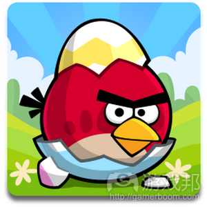
angry birds logo( from androidapplog.com)
在Mobile Games Forum上,Fishlabs的Michael Schade谈到,他希望公司《Volkswagen》游戏的标志是汽车形象,但Volkswagen坚持采用公司的图标。他认为汽车图像更能够有效帮助他们取得成功。
2. 呈现用户操作内容
Cut-the-Rope-icon(from applerama)
这仅次于突出物件,但形象呈现玩法操作所起的作用也非常显著。《割绳子》图标的内容是“沿此处剪开”标记(游戏邦注:剪刀加虚线),但呈现更隐秘的线索也可行。《水果忍者》图标所呈现的就是运动中的模糊刀片,而《愤怒的小鸟》则是通过漫画背景效果示意推进意义。
3. 跳出框框
这是突出运动元素的另一有效漫画效果策略。首先,你需要设定框框。这些通常呈白色或银色,这样它们就不会干扰我们的视觉效果。然后你会希望物体能够延伸到框框之外。《NFL Flick quarterback》图标所呈现的是,足球员倚在框框之外。《水果忍者》的飞溅果汁刚好落在框框上。《愤怒的小鸟》图标中的云彩既是框框,又是背景。
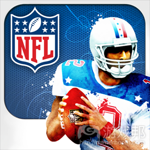
NFL Flick Quarterback(from iappfind.com)
4. 指向玩家
和著名的“I need YOU”海报一样,许多热门应用图标直接指向观众。《Monopoly》图标中的招牌角色将手伸出框框之外,直接指向玩家。《Words with Friends》字母方块出现在框框之外,边缘指向玩家。和采用此效果的图标相反,很多图标看起来颇为单调和静态,几乎难以从背景中区分出来。
Monopoly icon(from iosicongallery.com)
5. 采用基本色
对很多游戏来说,这点必不可少,例外情况是:游戏旨在呈现粗糙外观,例如,《Hatchi》或《Stickman cliff diving》,这些游戏主要采用白色和灰色。重点是,图标应采用明亮色彩,或完全不融入色彩;热门应用图标的色彩一般都不多。
words-with-friends-icon(from redbull.co.uk)
6. 不要体现名称
游戏名称已标记于图标旁,所以你完全无需将其体现在图标中(游戏邦注:除非游戏已经非常出名)。例如《侠盗猎车手》就可以体现名称,但其他作品则就不适合这么做。
GTA icon(from ifans.com)
篇目2,开发者分享设计及优化游戏Logo的经过
为了在下个月向Steam Early Access发布《Folk Tale》做准备,我们需要重要设计游戏logo。鉴于我之前的市场营销经验,以及Jennifer的美术功底,我们决定设计出最杰出的资产,并记录下这一过程,希望对其他独立开发者有所帮助。
简介
在开始任何视觉化工作之前,我准备了Jennifer将要接手的创意简报,将设计目标划分为强制性(必须完成)以及可选项(应该可以完成)两种类型:
*必须让它结合其他营销资产(例如截图、封面艺术)的时候看起来像“橡皮图章”一样自然;
*必须思考游戏的美术风格(手绘细节);
*必须传达游戏主题(奇幻的中世纪主题);
*必须能够根据海报、网页条幅等不同规格进行缩放设计;
*最好可能用于传真机进行黑白复印(多数法律文件的需要)。
排印
现在有了创意简报,Jennifer开始选择一系列候选字体,并展示了一个黑白板列出候选字体进行考虑。对于不带额外美术设计,仅含排印元素的游戏logo而言,排刷(以及“字体”)可以传达出产品的多种信息。它应该成为logo中所有元素中最显眼的一者,而准备一个黑白板来展示字体,更有助于我们专注于字体并做出选择。以下插图是可传递4种不同含义的字体:
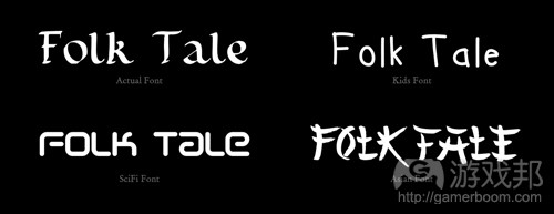
Folk Tale–fonts(from gamasutra)
在决定最终字体之前,要仔细考虑字距调整,行距等所有元素。我们并不像要太细的轻量级字体,因为在更小的图片规格时,字体就看不清了,并且它无法支持“橡皮图章”目标。默认的字距调整(字母的间距)也太宽了,所以我们要压缩一下。
样式
创意简报中就要提到样式的问题,但我们很早就发现Jennifer需要知道logo应该选择的样式范围。我们并不想让logo呈现卡通及儿童风格,并且游戏内部元素也并非现实主义风格。我参考了其他游戏和logo,表达了我们想要的美术风格。
早期主题概念
我们从候选字体中做出选择,Jennifer开始着手开发粗略的主题概念。最后除了其中一个,其余选项都将被抛弃,因为它们都不算体面,有些甚至是从游戏内部文本提取出来的内容。
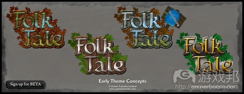
early theme concepts(from gamasutra)
我们团队(代表18-34岁目标用户)喜欢的是那个带有树木年轮纹理和绿叶的logo,因为桔黄色的叶子在褐色的树木纹理中很不显眼。而金属色的字体则引进了游戏中的另外一种资源元素(游戏邦注:游戏中含有树木、铁、石头和食物元素)。
概念提纯
确定了早期主题概念的元素之后,我们又添加了更多想法,Jennier着手改良概念。
concept refinement(from gamasutra)

- concept refinement(from gamasutra)
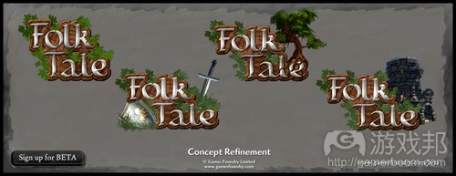
我们尝试了不同组合方法,最终进行了更大的位移以便添加其他元素。添加橡树好像与logo边缘的树叶元素重叠了,所以我们就排除了这个元素,因为它并没有增加“故事”的叙述或视觉效果。而添加游戏中的废墟效果也同样不理想,但添加剑和盾牌却发展了“故事”元素,因为这为主题增添了冒险色彩。但这种画面还是有点凌乱,所以我们就把盾牌也去掉了。
关键设计特性
选择了最终元素,并核对了设计目标之后,现在就该来添加细节元素了。我们开发中的不同调整内容包括:
*选择高光让叶子看起来不那么像荆棘,降低了让游戏看起来体验不佳的潜在心理反应;
*针对细节进行强化,以便它在缩小比例时仍能保持原来的品质;
*添加叶子的阴影以增加深度;
*增加叶子的色差,以便logo更好地融入游戏截图等不同的背景。《Folk Tale》地图拥有许多不同的阴影区,其中包括雪地、火山岩、青山、沙漠和沼泽。因此logo要能够与所有这些背景环境融为一体,但却不可被其掩盖;
*在文本中添加一个微妙的阴影,以便它在褐色树木年轻中更为显眼;
*用黑线勾勒字体以便文本更具可视性;
*添加蓝绿色轮廓光以突显阴影附近的色彩对比;
*重新调整了叶子以免它们影响文本能见度;
*添加一致的定向照明;
*增加文本的金属质感;
*为金属元素添加冷却蓝色调,以使其区别于叶子和树木的自然色调。
测试
最后一轮测试是为了查找比例缩放问题,以证实logo可以在几乎所有场景中生效。下图是其中一个测试幻灯片。
我们在测试中进行了一些次级调整,在启动会议三周之后,我们最终敲定的logo版本如下:

final logo design(from gamasutra)
篇目3,分享开发者测试筛选应用图标的3种方法
你的应用图标好比是一个位于非常喧闹的杂货街上的店铺门面。
如果它足够温馨和友好,有趣并富有吸引力,你就能够鼓励人们进入店内走走看看,如果它了无生气或寒酸,那就难免无人问津的惨状了。
应用图标的确是值得开发者投入的一个元素。有家顶级游戏公司的联合创始人曾告诉我,他们花了3个月时间为一款怪物RPG游戏设计图标。而我们的首款游戏也曾测试了64个不同版本的图标,以便从中找到最佳方案。
app icons(from iteratingfun)
(这是我们过去数周测试的一些图标样本)
那么你如何执行有效的A/B测试以找到最出色的图标呢?
在此我将分享一些分享以助你进行判断。
1.良好的方法
有一个快速、简单而廉价的测试方法就是使用PickFu.com这类服务。它们可以执行简单的A vs B测试,通常可作为走向众包平台(如Amazon Mechanical Turk)的前端,询问参与者他们更喜欢哪一个选择。
优点:
*廉价
*非常快速
*能够根据用户群体特征进行筛选
缺点:
*带有测试者的主观偏见
*要服从参与者的自我意识
*缺乏真正的意图与情境
2.更好的方法
下一步你可以使用Facebook Ads这类平台。它可以让你在许多用户面前同时部署多个版本,以便衡量点击率情况。
优点:
*迅速
*能够根据兴趣、用户特点进行定向测试
*较少主观因素
*样本大小具有灵活性
缺点:
*用户意图和情况更为接近实情,但还不是真正的用户意图
*为获得统计数据,可能需要根据样本量投入许多成本
3.最佳做法
最好的测试方法就是,在你的应用可能被发现(游戏邦注:例如通过广告和应用商店排行榜)的这种情境下,找一名真正的用户进行测试。对iOS和Android平台而言,开发者可以选择AdMob、iAds、inMobi、Millenial Media等网络投放广告。而像付费墙等刺激性奖励渠道则无法准确衡量用户的真正兴趣所在。
除了点击率之外,你还可以通过绑定广告网站SDK等方法衡量安装及应用开启的转化率。这样才能考察玩家对你的游戏描述和登录页面的感觉是否与其产生的兴趣(这里指的是游戏图标)一致。
如果你的应用尚未发布怎么办?那你可以另外设置一个独立的测试帐号并在那里运行广告。Android平台就是一个很好的渠道。如果你想低调行事,还可以针对特定地区测试应用和推广活动。
优点:
*真正无主观偏见和具有代表性的用户
*准确的情境
*灵活的样本量
*衡量准确的转化率
缺点:
*需耗费一定时间绑定SDK,审核创意及衡量周期更长
*为获得统计数据,可能需要根据样本量投入许多成本
篇目4,分析应用图标的种类及其适用范围
拥有一个极具吸引力的应用图标十分重要,这关系到潜在玩家对游戏的第一印象,影响到他们下载应用,以及开启和重新开启应用的决定。在我看来,制作一个优秀的应用图标,首先要传达出游戏的主题。假如你制作了一款高质量的游戏,那最好向玩家展示游戏的趣味性。但如果许多极为相似的应用也使用了这种外观设计策略,即使是出色的图标也可能淹没在众多竞争者之中。
我根据今年1月25日应用商店热门游戏总营收排行榜、高营收RPG排行榜、高营收冒险游戏的应用情况制作了一个表格,将各个应用图标划分为以下几类:
*卡通人物
*逼真人物
*卡通动物
*逼真动物
*相对逼真的静物
*形象化/抽象化元素
我对于用来鉴别身份和性诱惑的图标设计也很感兴趣(看过那些《Evony》广告吧?),并为那些表现出强烈的男性或女性倾向的图标制作了专栏。因为我想解答一个问题——性别鉴定如何在应用图标中发挥作用?
但要说明的是,并非所有拥有明显性别特征的应用图标都被归入这些专栏中。例如,我就忽略了那些从肩膀、臀部来看像是使用了男性人物的图标,因为我并不认为这种设计使用了与《现代战争》(出现了男性的脸)相同的性别鉴定设计方式。这可能是我这种方法的缺陷,我希望能够更细致地研究应用图标中的性别设计元素。
我做这种调查的部分原因是,只有人眼才能评价创意性。如果我遇到了一些数值分析可以解答的问题,就会交付费营销和分析团队,让他们提供尽量准确的回答。但目前还没有哪种可以解读图标美术风格的指令,所以要回答这个问题,我只能采用较少的数据集合,以及一个并不完美的印象主义分类法。
我发现我针对这些图标的命名很有限。卡通化和逼真化这种说法很不准确,也有点误导性。在此,逼真带有细节丰富的倾向,而卡通化的含义更为广泛。许多被我划入“逼真化”类型别的图标其实带有动画风格,本身并不逼真,它们的逼真感来源于其使用的可捕捉真实事物细节的技术。这就是我所能想到的最佳描述术语。
*我使用这种区分法是因为它很适合描述两种主要的人类外观风格。也很适合反映游戏的目标用户是男性(逼真化)还是女性(卡通化)。在展现女性角色时,这一理念尤其正确。根据我从Facebook网页游戏所搜集到的历史应用数据,那些带有奇幻主题,呈现“逼真化”女性角色的PvP游戏,一般最吸引男孩玩家。而带有现实主题的游戏(游戏邦注:例如《美女餐厅》或《Campus Life》)则属于瞄准女性的游戏。
*这种逼真化/卡通化分类最不适合描述动物,许多此类应用(包括Gaia的《Monster Galaxy》系列)排在中间席位。我认为这是因为怪物养成游戏较少出现明显的性别化倾向,它们吸引的群体多为儿童用户。
*卡通风格的图标在拥有大众用户的游戏中也更为常见(游戏邦注:例如《Clash of Clans》、《Jetpack Joyride》、《Temple Run》)。原因很简单:未划分性别的通俗图标更易吸引大众用户。关键在于,为吸引此类大众用户的游戏设置这种相得益彰的图标。
*另外,我还发现在高营收榜单中,有许多与《Minecraft》相关的应用,《Minecraft》已然不只是单纯的游戏,而是一个平台。
*形象化/抽象化的图标中就是两种类型,一者是具象主义的(形象化),另一种是非具象主义的(抽象化)。我发现老虎机应用图标兼具这两种类型(作为图标和游戏,它们都呈现了自身的抽象性:它们只是一些带有图片的随机数字生成器)。我无法理解为何现在还有这么多老虎机应用,但事实就是如此。除了老虎机应用,我也很惊讶为何有这么多游戏会采用这种形象化/抽象化图标设计,因为在我看来,这真是一种呈现游戏内容的糟糕选择。
*在高营收榜单上,呈现强烈性别特征角色的图标分布均衡。在此我要说明的是,如果你要打性别化的招牌,最好让男性或女性角色同样显眼。
*如果你查看下其中的子类,就会发现总营收榜单所出现的极大差别。RPG就是子类中的一个极端分化的典型,此类游戏的图标更常使用人物形象。其中女性角色(通常是男性视角的女性形象)是其他应用的两倍以上。这可能说明使用美女形象是这类游戏所采用的普遍策略,或者说这类游戏图标已经过度饱和了。
*比起其他两个排行榜,冒险游戏似乎更常使用逼真化的静物,但我并不是说逼真化的图标就更好或更坏,而是说你应该根据自己的营销活动所瞄准的榜单目标而更改图标。
*最后,我查看了顶级应用排行榜(详见下图),发现前9或前10款应用获得了大量的曝光度和收益。
app icons(from gamasutra)
*我的调查样本数量十分有限,我查看的是这三个排行榜前100名的应用。上述结论多取自前100名应用的情况。《Kingdoms of Camelot》和《Marvel War of Heroes》是我所谓的“逼真化”应用图标。在前10名营收、付费和免费榜单中,除了《She-Hulk》之外,没有一款应用的图标采用女性形象。但子类应用情况并非如此,前10名RPG榜单中有两款应用含有女性形象。
查看了上百个应用图标之后,我重新调整了自己原来的理念,意识到有些策略在特定游戏类型中更为常见,这在子类应用排行榜中表现尤其明显。如果你想适当改进原有游戏题材,了解它所适合的位置,有助于让你的设计更符合玩家预期;如果你的游戏是一个根本性的创新,了解这一点则有且于让游戏更为与众不同。
篇目5,开发者谈图标设计对于成功游戏的重要性
在可下载的电子游戏发展过程中,低调的盒子设计师也一直在思考着游戏的外包装的发展。
他们总是承担着极具挑战的任务:设计出具有宣传作用的包装——让潜在的用户可以通过该包装去评判内部的游戏内容,让游戏角色或游戏世界更加鲜明化,这也是单凭游戏内部资产所难以做到的。
如今的iOS游戏设计师也担负着相同的任务,但是与之前的设计师(面对的是DVD规格的套筒,有光泽的纸板盒或者其它特别版本的内容)不同的是,他们必须在不足72×72的像素范围内呈现出相同的内容。
如今的App Store中共有70多万款应用的图标在吸引着用户的注意,而设计师必须在此突破众多竞争者,突显自己游戏的同时清楚地呈现出玩家所希望看到的游戏体验。
图标的重要性
醒目的图标至关一款游戏的成功。
如今已经出现了越来越多面向初创游戏开发商提供图标制作服务的专业设计师,他们承诺自己的设计能够有效地提高游戏销量,帮助游戏窜上排行榜的前列,并最终挤进App Store的首页。
这些独立门户的专家们是否就是万灵的销售员或设计人才?
不管怎样,开发者总是未能挪出更多的精力或注意力去把握这些低像素内容。或者是我们将图标的重要性给夸张化了——也许它只是开发者未能在App Store中取得好成绩的借口?
Chillingo(游戏邦注:发行了大热游戏《愤怒的小鸟》和《割绳子》)的联合经理Chris Byatte说道:“永远不要低估一个醒目的图标所需要的细节和优化。”
“App Store中的激烈竞争意味着图标在吸引消费者注意的重要性。通常情况下图标都是消费者对应用的第一印象,所以如果应用的图标不够突出,未能有效吸引玩家的注意力,那么这款游戏便很容易被忽视。”
icon(from pocketgamer)
《愤怒的小鸟》和《割绳子》的图标有何突出之处?
“开发者不应该只是将图标当成一种随意的艺术品,而应该是整个包装中非常重要的一部分。任何优秀的图标都不是匆忙设计下的产物。”
醒目的图标
Neon Play的首席执行官也是《Flick Football》的创造者Oli Christie说道:“醒目的图标非常重要。当你在逛超市时,某些包装突出的商品总是能够吸引你的眼球——这便是它们独特的品牌化。而图标也就是应用的外包装。”
Spilt Milk Studios的创始人兼《Hard Lines》的联合创造者Andrew Smith认为,与其它媒体的盒子艺术一样,应用图标设计也需要设计师投入更多精力与思考。
他说道:“这是用户接触某一游戏或应用最先看到的内容。所以与游戏盒子或专辑封面的设计师一样,图标设计师也需要对此投入更多关注度。”
Tag Games的艺术总监Stewart Graham(曾与许多产业巨头,如育碧,Square-Enix,艺电以及BBC等合作过)认为,任何优秀的图标设计的重要组成部分都可以被量化。
他说道:“用户希望看到干净,鲜明且大胆的设计;避免文本,而只是通过简单的图像或元素去概括主要的游戏内容。”
过多的文本内容并不是好事。有些设计师总是会将游戏的内容整合到图标上,但这么做却是多余的,因为通常情况下游戏名称总是会出现在图标下方。所以最有效的图标便是不包含任何文本内容的图标。
icon(from pocketgamer)
Oli Christie并不喜欢《F1 2011》或《极品飞车》的图标。
Christie同意这一观点,他说道:“设计师必须在创造图标时避免陷入一些根本的误区。设计师必须确保图标的清晰与直白,不会让玩家感到疑惑。图标必须能够一下子就吸引玩家的眼球,并激发他们深入了解游戏的兴趣。”
“你并不需要将应用的名称添加到图标上,特别是游戏图标。《F1 2011》或《极品飞车:最高通缉》的图标设计便非常糟糕:整体太过暗淡,不够清晰,且还将游戏名称挤在本来就过于狭小的空间里。”
添加光泽或删去光泽
Graham非常欣赏那些能够将苹果所强加的限制转变为优势的设计师们。
他说道:“有些设计师有效地利用了边界限制(如《Lego Life of George》),也有些设计师将整个图标完全覆盖于边界之上(如《龙之谷》和《神庙逃亡》)。”
“这么做能让用户带有一种错觉,即认为图标变大了。有些设计师使用光芒覆盖方式添加了光泽,也有些设计师删除了这种光泽去突显图标。”
“有些图标乍看之下显得不够专业(如《My Horse》),但是多加留意的话就会发现这些图标简单且切题,所以更能有效地突显于众多图表中。所以设计师的必杀技便是找到一种具有吸引人的外观且能够保留最初理念的图标设计。”
“比起华而不实的艺术品,图标的最初理念更有帮助。《神庙逃亡》在这一点上便非常突出,所以这也是我非常欣赏的图标设计。”
icon(from pocketgamer)
Stewart Graham所欣赏的图标设计《Lego Life of George》和《My Horse》
尽管Christie认为图标设计非常重要,但是他却不确定是否有必要雇佣“专业的”设计师。
“优秀的2D设计师,特别是曾参与过某些项目的设计师应该能够创造出有效代表应用的图标。如果你拿不定主意或不知道该选择哪个图标,社交媒体将能帮你做出决定。”
“对于《Traffic Panic London》和即将发行的《Jewel Jumper》,我们便呈献给用户三种图标,让他们选出自己最喜欢的图标。”
游戏本身才是制胜法宝
Christie相信图标设计是至关一款游戏是否能在App Store中获取成功的一大关键元素(“开发者需要花更多时间于图标设计中”),而Tag的Stewart则认为这并不是最重要的元素。
“一个优秀的图标固然重要,但是即使图标未能达到标准也不会彻底摧毁一款游戏。一款真正优秀的游戏以及有效的推广工作也能帮游戏获得较高的排名,并让它突显于众多竞争者间——而不管它是否拥有一个引人注意的图标。”
Smith也认可这一观点:“我认为图标只是帮助游戏获取成功或赢得竞争的一大要素。开发者不能忽视这一点,但同时这也不是他们唯一需要关注的内容。”
“我不清楚还有什么比制作出一款真正优秀的游戏更加重要。”
篇目6,如何创造一个吸引眼球的应用图标
你见过不带图标的成功应用吗?
相信肯定没有。
因为图标就是应用的包装,与零售商品一样,良好的包装也是一种重要的营销工具。它可以吸引用户注意力及激发好奇心:有时候人们靠近观察商品就是为了看看它的包装,体验一下近距离接触的感觉。
人类喜欢视觉内容。这是一种可以令大脑兴奋的娱乐形式。优秀的包装不仅仅可以吸引人们注意力和推广产品,它还可以让人们清楚:
*应用内容
*开发者未提到的一些有价值的细节
如果你没有下点功夫创造出色的应用图标,你的应用也就只能在榜单压底了。
本文旨在为开发者提供一些避免出现这种情况的建议。我将在此讨论有助于你设计应用的一些建议。
app icons(from guimobile.net)
确保应用图标令人眼前一亮的建议
建议1.用一两个词来介绍产品用途
你该如何只用两个词(最多3个)来描述应用?它似乎是个艰巨的任务,但它会迫使你用最简化和最基础的形式对应用进行设想:即你想让访客对应用产生的想法和体验。
没错,就是体验而不是好处。
因为你的应用标题和描述已经描述了人们下载它可以得到的好处。现在来想象一下可以更好地描述这种体验的视觉元素或对象。令其保持简洁性,并将你产品的好处和特点浓缩成一个简单的理念和体验。
下一步,就是添加细节令其虏获用户眼球,让人们远远瞥一眼就能产生过目不忘的印象。
建议2:不要使用过时的图像
因为这会影响人们对应用的第一印象。
人们想知道开发者的确在用心创造应用。要将图标视为应用的包装,令其具有吸引力,这样人们才会有兴趣去点击查看,哪怕只是为了点开看大图。
如果想采用某张照片,最好将其转化成插画式的图标。
建议3:仔细挑选颜色
最近针对应用图标的研究发现,在6个月内排名榜单前列并且图标最受欢迎的应用中,蓝色是最普遍的颜色(占比35%),其次是绿色(14%)和红色(13%)。此外,研究还指出最佳应用图标一般会结合2至3种颜色。
色彩可以影响人们的心理,并且可以吸引注意力和暗示一种体验。一种色彩需要实现这两者的平衡才能够脱颖而出。例如,红色令人惊悚,早期针对iPhone图标的研究结论是“鲜红色令人产生‘错误,不要碰它’这类心理暗示。”
使用对比色,可以创造更深层次的色彩氛围,并令其吸引眼球,例如较暗的背景搭配明亮的前景,反之亦然。
建议4:避免使用文本
避免在图标中添加文本。图标应该是一种传递或介绍新理念的符号形式。如果你必须在其中加入文本,那一定要尽量精简。这方面的优秀典型包括Pinterest、Vine、Pocket、Ness和Snapguide。
总结——测试你的应用图标
要在多种手机壁纸的环境中测试你的应用图标。你必须从用户角度来考虑:并非人人都会使用你在测试过程中所采用的壁纸,你也不能强求这一点。
篇目7,设计完美手机应用图标的五个简单步骤
人类是非常肤浅的物种。尽管我们都认为应该根据内涵来判断某人,然而,我们的最终决定总是受到外表的影响。
好吧,不管你想到了什么,我们这边要说的可不是约会,我要讨论的是应用图标如何影响消费者决定是否下载某游戏。
因为这些小方块—-有时带圆角,有时没有,确实会影响你的应用的下载量。此外,设计得太差的图标可能导致平台所有者拒绝发布你的产品。
在6月的全球苹果开发者大会上,差劲的图标设计被列为开发者遭App Store拒绝的三大原因之一。
所以,本着助人为乐的精神,我写了这篇短文告诉大家如何制作出完美的应用图标。漂亮的图标不仅讨平台开发者喜欢,还能取悦相当一部分的消费者。
1、研究设计趋势
还记得几个月以前从苹果设备的系统iOS6转变为iOS7的热闹场景吗?
对于开发者,苹果系统的任何版本更新通常以消除bug为中心,但这一次,iOS7又出新招了—-全新的外观。
是的,iOS7“变平了”,改变了消费者查看主界面的方式,但最重要的是,图标发生了变化。
原版系统的拟真设计不见了,换上经过苹果首席设计师Jony Ive批准的图标风格—-虚假、平面化、活泼的颜色和精细的阴影。
竞争平台Windows Phone等的开发者,过去也习惯于设计“平面化”的应用图标,而苹果改变方向意味着iOS开发者不得不做出重大转变,以适应新趋势。
以下图所示的YouTube的图标为例:与新版的相比,老版的“小电视”放在iOS7的屏幕上会显得非常搞笑。
在设计领域,改变是司空见惯的现象,虽然你总是拒绝改变的余地,但接受改变更能确保人们搜索到应用后,更愿意把它们留在屏幕上。
icons(from pocketgamer)
Apple的老版YouTube图标(左)和Google最新的YouTube图标(右)
所以,在你开始制作图标以前,先Google或Bing一下最近的设计潮流是什么,确保能把它们融入你的应用图标设计中。
2、了解市场竞争
你必须保证你的图标遵守了当下的设计惯例,保证它们适合放在用户的主屏幕上,但更重要的是,保证它们脱颖而出,战胜目标市场上的其他竞争者。
寻找平衡点绝不容易,但看看某种类型的游戏竞争多么激烈—-比如在App Store中搜索“消除类”游戏,结果如下图所示,你就知道设计一个有个性的图标是多么重要的事。
正如苹果的UX专家Mark Stern最近在演讲中所说的,“如果图标看起来不错,制作得很用心,那么就有理由相信,该应用的其他部分也设计和制作得一样好。”
因此,花点时间搜索App Store和其他应用市场,找找潜在的竞争对手,看看哪个做得突出,并借鉴对方的优点为己用。
3、图标与角色相结合
游戏最重要的元素之一就是令人难忘的角色。把角色融入图标可以增加个性,而有个性的游戏图标除了在第一时间抓住人的眼球,甚至在数年后,仍然在玩家的记忆中占据特殊位置。
无论我们说的是马里奥还是刺猬索尼克,或是让人记忆犹新的《侠盗猎车手5》中的Trevor,特别的角色都能够在玩家的脑中留下烙印,帮助玩家记忆他们所在的游戏。
它们还有助于让你的应用图标在激烈的竞争中脱颖而出。
看看以下三个例子:《Murder Files》、《Ridiculous Fishing》和《Badland》。玩家投入时间和金钱培养的角色被当作图标的前层,使玩家更容易在App Store中发现它们的存在。
appicons(from pocketgamer)
根据这条建议,你的主要挑战是把主角以最合适的方法融入图标中,以上三个例子就是榜样。
在这三个例子中,角色支配了整个图像,但每一个都与图标结合得很好。
《Ridiculous Fishing》中的Billy坐在地上摆弄他那可笑的机关枪;《Murder Files》中的Hannah Dakota捕捉到英式精英的神韵;《Badland》把游戏的华丽场景与它的主角相结合,形成非常强烈的视觉效果。
通过把角色融入图标,你的游戏就有了个性化的印记,这样玩家就更容易在众多图标中一眼发现你的游戏。
4、保持简单
与其他手机相关的东西一样,图标设计也要力求简单。
甚至在“平板手机”革命之后,屏幕尺寸仍然比较小,无论是在应用商店中还是安装在主屏幕上,图标能占据的也不过是小于一平方厘米左右的空间。如果你没有注意到这一点,后果将不堪设想。
自由图像和网页设计师Axel Hunter认为,简单就是核心。
“当说到应用图标的设计时,我坚定地拥护‘少即是多’原则。”
“与看起来好看一样,简单的设计意味着设计师可以选择突出最关键元素,而不是把不重要东西铺满整个图标。”
那么,怎么保持图标简单?Hunter提出一条重要原则。
“强大而简单的设计要求只有一个图像,且它与品牌或应用的主题具有紧密的关系。”
总之,这意味着你的图标中不能有文本,以便给必须的图像元素腾出足够的空间,颜色最好选择互补色但不要太多太杂;如果你的游戏不是人物导向型的话,那么图标形状最好特殊一点。
在注意力短暂的时代,谁能最快突出要点,谁就能成功。所以,一定要记住适可而止。
5、测试,测试,再测试
做到以上四点,你设计的图标距离完美应该不太远了;但是,除非别人看到它,否则你不可能知道你的设计到底成不成功。第三方的建议大有作用。
例如,如果你的游戏是角色导向型的,你有四个主要角色,你要突出哪一个?
如果你的游戏没有角色(也许你做的是拼图游戏),那么突出游戏中元素如宝石会不会更好?或者想出一个独特的设计?
单纯地搜索应用商店可能很难找出答案,因为很难确定一款游戏是成功还是失败,特别是对于它的图标。
幸运的是,23snaps工作室的营销总监Meaghan Fitzgerald给我们提了一条非常棒的建议—-借助广告的力量。
“我有网页市场营销的背景,我习惯于对所有营销活动的元素进行A/B测试,所以转行到营销手机应用这个更加困难的领域,我觉得很怪异。”
“然而,当说到应用图标,我希望就如何优化图标本身作更多研究。这让我开始思考,我们可以如何使用已有的营销渠道,如Facebook和Google广告来测试图标的不同版本,看看哪一个的点击率更高和受众接近我们现有的用户基础。
“我们用Facebook广告(这个更便宜)做测试,因为我们希望带动我们的品牌在Facebook上的知名度。每一个变体的文本描述都保持不变,只改变了图标—-我们有三个不同的版本。
“最后,赢家诞生了,它被当作最终版进入App Store。在决定使用哪个图标时,最好能测试一下。”
毕竟这是非常方便的事,而且还很容易执行。
你可以在广告网站上发布一系列关于各个图标变体的介绍,这样做的成本很低,不出一天就能看到反馈—-快速寻找可以帮助确定哪个图标会在应用商店的页面上大放光彩的信息。
以上就是制作手机应用图标的五个步骤。
看起来似乎没什么大不了,但设计良好的图标可以带动下载量,让用户更愿意把你的图标留在主屏幕上,甚至有助于媒体报道—-这是那些看重大小的人的解药。
(本系列由游戏邦编译,转载请注明来源,或咨询微信zhengjintiao)
篇目1,Is your logo losing you customers? 6 ways to improve it
The logo for your mobile app is as important as the cover design for a boxed game. Just like a shelf in a physical store, your customers browse the app store, waiting for something to stand out and grab their attention. Don’t get lost in the sea of icons. Here are some key design features of top logos from the iOS app charts:
1. Show the object of play
The majority of touch-screen games are like toys. They are easy to understand because they centre on one object of interaction. Your logo should clearly show the object that users will play with. The Angry Birds logo doesn’t show the slingshot, it shows the bird.
At the Mobile Games Forum, Michael Schade from Fishlabs mentioned that he wanted the logo for their Volkswagen games to be an image of the car, but Volkswagen insisted on using their company logo. He was pretty sure that an image of the car would have further boosted their success.
2. Represent what users will do
This is secondary to showing the object, but it does help if you can graphically symbolise the action of play. Cut the rope features a ‘cut here’ sign with scissors and a dotted line, but more subtle cues also work. Fruit Ninja shows the blurry shape of a blade in motion, while Angry Birds uses a comic-book background effect to imply propulsion.
3. Jump outside the frame
This is another great comic-book trick to emphasise movement. First, you need to include a frame. These are usually white or silver, so as not to get in the way visually. Then, you want to make the object extend beyond it. The logo for NFL Flick quarterback shows the footballer leaning outside the frame. The juice splatters on Fruit Ninja appear to have landed right on the frame itself. The clouds in the Angry Birds logo are a frame and a background at the same time.
4. Point toward the player
Just like the famous ‘I need YOU’ poster, many top app logos point straight at the viewer. Monopoly shows the mascot gesturing out towards you, his hand outside of the frame. Words with Friends has letter tiles flying out, the edge pointing towards the customer. In contrast to logos that use this effect, many others look flat and motionless, causing them to fade into the background.
5. Use primary colours
This is a must for the majority of games, with notable exceptions: if your game is meant to look charmingly primitive, like Hatchi or Stickman cliff diving, use plain white or grey. The point is to either go for bright, strong colours or no colour at all; there are very few pastels in the top apps charts.
6. Don’t use the name
The name of your game is already written next to the logo, so you have no good reason to include it in the logo, unless your game is already famous. Grand Theft Auto? Fine. Anything else? Probably not.
篇目2,Designing Game Logos
by Simon Dean
The following blog was, unless otherwise noted, independently written by a member of Gamasutra’s game development community. The thoughts and opinions expressed here are not necessarily those of Gamasutra or its parent company.
Want to write your own blog post on Gamasutra? It’s easy! Click here to get started. Your post could be featured on Gamasutra’s home page, right alongside our award-winning articles and news stories.
In preparation for hopefully releasing Folk Tale on Steam Early Access next month, we needed to re-design the game logo. Pooling my prior marketing experience and Jennifer’s artistic abilities, we set to work designing one of the most prominent assets and documenting the process in the hope it might help other indie developers, or simply be of interest to members of the
Folk Tale community.
The Brief
Before any visualization work was started, I prepared the creative brief that Jennifer would be working from, splitting design goals into mandatory ( ‘must’ ) and optional ( ‘should’ ) including:
•Must work as a ‘rubber stamp’ that looks natural when combined with other marketing assets e.g. screenshots, cover art
•Must reflect the artistic style of the game ( hand painted with high detail )
•Must communicate the theme of the game ( fantasy medieval theme )
•Must be reproducible at different scales from large posters to small web banners
•Should work in black and white for reproduction on fax machines ( mostly legal documents )
Typography
With the creative brief in hand, Jennifer set about selecting a number of candidate font faces, and presenting a black and white candidate board for consideration. Typography ( aka ‘the font’ ) can communicate so much about a product that quite often you’ll see game logos made purely from typography without additional artwork. It demands the greatest attention of all elements in a logo, and preparing a simple black and white board helps focus purely on the type. For illustration purposes, here are four fonts that communicate four very different things:
Kerning, line spacing, and weight all needed consideration before arriving at the final font face. We didn’t want a lightweight font that was too thin because it would get lost at small scale and not support the ‘rubber stamp’ goal. The default kerning ( spacing between characters ) was also too broad, so we condensed it.
Styling
It should really have been included in the creative brief, but early on we found that Jennifer would require direction on where within the style spectrum the logo should sit. We didn’t want pure illustration which is often more aligned with cartoons and products targeting children, nor does the in-game art style focus on realism. Using other games and logos as references, I was able to communicate the desired art style.
Early Theme Concepts
With our selection made from the candidate fonts, Jennifer set about developing rough theme concepts. As all but one would be throw-away work they were quick and dirty, in some cases pulling from in-game textures.
The team ( representing the target audience demographic of gamers aged 18-34 ) really liked the tree rings texture and green for the leaves; the orange leaves were lost against the brown of
the tree ring board. The metal color of the font would introduce an additional resource from the game ( wood, iron, stone, food ).
Concept Refinement
Having identified elements from the early theme concepts that we wanted to take forward, we added a few more ideas and Jennifer set about refining the concept.
We tried different alignments, and settled with a broader offset that would allow us to add a prop. The oak tree further compounded the leaves at the edges of the logo, so this was ruled out because it didn’t add to either the ‘story’ being told or visual impact. The rendered in-game ruin was discounted because it didn’t feel right. The sword and shield however developed the ‘story’ by adding a hint of adventure to the theme. It still felt a bit busy, so we dropped the shield from the design.
Key Design Features
With the final elements chosen and checked against the design goals, it was time to add the detail. Throughout development various tweaks were made, including
•Specular highlights reduced on the leaves to make them less thorn like, reducing the risk of a subconscious emotive response that the game would somehow be painful;
•Detail was left extra-sharp so that it would be retained during the smoothing that happens when scaling down;
•Shadows were added to the leaves to add depth;
•Leaf color variations were added to help the logo blend with various backgrounds such as screenshots. Folk Tale maps have a lot of different ambient zones including snow, lava, green hill, desert, and swamp. The logo needed to blend against all of these without getting lost.
•A subtle drop shadow was added to the text to help lift it off the brown tree ring board
•A black outline was added to text to help readability
•A cyan rim light was added to help color contrast near the shadows
•Leaves were de-cluttered to prevent obscuring the text
•Consistent directional lighting was added
•Bloom was added to enhance the metallic feel of the text
•The cooling blue hue was added to metallic elements to help differentiate them from the warm natural hues of the leaves and wood
Testing
A final round of testing was performed to check for any scaling issues, and to validate the logo would work in nearly all scenarios. Below is but one of the test slides.
Minor refinements were made during testing, and three weeks after the initial meeting, we had our final logo:
篇目3,A/B testing your icon (good, better, best)
startup marketing
Your app icon is like a shop front, on a very busy retail street.
Warm and welcoming*, interesting and attractive and you’ll encourage people to wander inside and check it out Drab or shabby (drabby!) and few will bother to look.
* I mean seriously, who could resist that cute a baby dragon?
It’s clearly something people think is worth investing in. A co-founder of a top game company told me it took them 3 months to come up with the icon for one of their monster RPGs. For our first game we tested over 64 different versions on the way to identifying a winning icon.
One of the many tests we did over the course of several weeks
So how do you actually conduct an effective a/b test to come up with a great icon?
There are several ways – here are a few approaches in order of increasing accuracy.
1/ Good
One easy way to run a very fast and cheap test is to use a service like PickFu.com. They do simple A vs B tests, typically as a front end to a crowdsource platform like Amazon Mechanical Turk, where the participants are asked which they prefer.
Pros:
•Cheap
•Very fast
•Ability to filter by demographic
Cons:
•Bias of tester self selection
•Subject to participant self awareness
•Lack of real intent and context
2/ Better
Next up you can use a platform like Facebook Ads. This let’s you deploy multiple versions in parallel out in front of many eyeballs and measure click through percentages.
Pros:
•Fast
•Ability to target by interests, demographics
•Less bias
•Flexible sample sizes
Cons:
•Intent and context is closer but not same as real intent
•Can cost a lot depending on sample size to get statistical significance
3/ Best
The best way to test is to actually test with a real audience in the context they would discover your app once launched (ie ads and appstore charts). For iOS and Android this can mean ads on networks including AdMob, iAds, inMobi, Millenial Media etc You don’t want to use incentivized channels like offerwalls as they aren’t an accurate measure of actual self-generated user interest.
Beyond just clickthroughs, you can also measure true conversion to installs and app opening, by integrating the ad networks’ SDKs. Ie- do the players feel your game description and landing page reflects what they were interested in, which was the icon. (A whole another story on whether the game matches to what they expected when they installed)
What if you app isn’t already launched? Then you can setup a separate test account and run the ads to point there. Android is good that way. Also you can restrict the test app and campaign to certain geographies if you want to keep it fairly low key.
Pros:
•Truly unbiased and representative audience
•Accurate context
•Flexible sample sizes
•Measure actual conversion
Cons:
•Takes time to integrate SDKs, approve creatives and measure – cycles are longer
•Can cost a lot depending on sample size to get statistical significance
篇目4,Picking the Perfect App Icon
by Greg Pollock
The following blog was, unless otherwise noted, independently written by a member of Gamasutra’s game development community. The thoughts and opinions expressed here are not necessarily those of Gamasutra or its parent company.
Want to write your own blog post on Gamasutra? It’s easy! Click here to get started. Your post could be featured on Gamasutra’s home page, right alongside our award-winning articles and news stories.
Having a compelling app icon is important to an app’s success, first when potential players are making the decision to download and later when they’re opening or re-opening the app. Creating a good icon is, in my opinion, first of all about expressing what the game is. Presumably you are making a quality game and honestly presenting its fun is your best bet for getting players. But even a great icon for a great game can get lost in the noise if many superficially similar apps are using the same representational strategies. Knowing what icons your app will be situated near can help you choose one that will stand out from the pack.
I made a spreadsheet where I took a snapshot of overall top grossing overall, top grossing RPG, and top grossing Adventure on 1/25/13, categorizing each icon as one of the following.
•Cartoon person
•Realistic person
•Cartoon animal
•Realistic animal
•Relatively realistic inanimate object
•Iconic/abstract
I am also interested in the use of gender for both identification and sexual attraction (we’ve all seen those Evony ads, right), and made columns to track when a strongly gendered male or female figured showed. Because of the question I wanted to answer–how does gender identification work in app icons–not all figures who appear to have a gender are tagged in those columns. For example, I omitted figures that, judging by shoulder and hip width, are probably male, because I do not think this kind of representation is using gender identification in the same way that something like Modern War (which has a close up of a man’s face) does. This could well be a flaw in my methodology and I would be happy to see a better study focused on gender in app icons.
Part of the reason for doing this study–as well as the reason for the softness of my methodology–is that creative judgments require a human eye. When I have a question that numerical analysis can answer, I trust our marketing and analytics team to give as precise a response as possible. But there’s no command that can read the art style of an icon, and so to answer this question I had to accept a small data set and an imperfect, impressionistic method of categorization.
Part of what I discovered were the limits of my rubric. The distinction between cartoonish and realistic as I use is very imprecise and a little misleading. Here, realistic tends to mean detailed while cartoonish means broad. A lot of the icons that I class as “realistic” are done in an anime style and are not realistic per se, but realistic in that they use techniques that would capture the detail of real things. This was the best terminology I could come up with.
•I used this distinction because it works pretty well for describing the two major styles of human representation. It also maps pretty well to whether the target audience for a game is male (realistic) or female (cartoonish). This is especially true when women are represented. Very “realistic” women front grindy PvP games with high fantasy themes, which, based on historical app data from Facebook web games, I believe do best with boys. Cartoonish women front games with realistic themes (paradoxically enough) like Diner Dash or Campus Life. Again, this repeats a pattern seen in Facebook web games.
•The realistic/cartoonish distinction works worst for describing animals, where many icons (including Gaia’s Monster Galaxy franchise) sit in the middle. I think this is because monster training games are less discretely gendered and are more likely to be popular with kids.
•Cartoonish icons also appear more common in games with the largest audiences (Clash of Clans, Jetpack Joyride, Temple Run). This makes sense: an accessible icon that doesn’t divide by gender has a larger addressable audience (than, say, an anime babe in a metal bikini). The key, of course, is to put such an icon on a game that is also addressed to a similarly large audience.
•An aside: there are a lot of Minecraft-related apps in the top grossing charts. Minecraft isn’t a game, it’s a platform.
•The iconic/abstract category was originally two categories–iconic and abstract–attempting to parse the difference between representational (iconic) and non-representational (abstract). I broke down under the weight of slots apps, which are both iconic and abstract. (I would say that as icons and games they represent their own abstraction: they are just random number generators with pictures). I cannot understand how there are still so many slots apps, but there are. Slots aside, I was surprised how many games use iconic or abstract strategies when it seems to me like a bad way to represent a game. This is something I learned.
•In top grossing, strongly gendered characters split evenly. I take this to mean that if you are making a gender play, either a male or a female character has equal chances of standing out to your audience.
•If you look at subcategories, there are striking differences from overall top grossing. RPG is a good example of the extreme deviation that happens in a subcategory, where app icons use human much more frequently than in overall top grossing. There is also a marked change in gendering, with women (and most often women represented through a male gaze) more than doubling the number seen in overall. This could either mean that using a babe is a strategy with consistent results or that it is oversaturated.
•Adventure seems to use realistic inanimate objects more than the other two charts. I don’t take this to mean that a realistic icon is s better or worse, but that you might change your icon to match the goals of a marketing campaign targeting a particular chart.
•Finally, I looked at the very top of the overall charts (screenshot below), since the top nine or ten apps get the lion’s share of exposure and revenue.
•The sample size is by definition very low, which is why I wanted to look at the top 100 of three charts in the majority of my study. The rates of representation are about what we see in the top 100. Kingdoms of Camelot and Marvel War of Heroes, for example, are apps I would class as “realistic,” and they have about as much representation in the top 10 as in the top 100 grossing. One thing of note: in the top 10 of grossing, paid, and free, there are no women except for She-Hulk tucked in the corner of the Marvel icon. The same is not true of the subcategories, where two apps in the top 10 of RPG have female characters.
After looking at a few hundred app icons I’ve been able to refine my initial idea of matching the image to the game. Certain strategies are more common for certain game types, and those tendencies become more exaggerated when you look at the subcategory charts where they are selected for. Knowing where you’ll fit can help you play to your audience’s expectations, if you’re going for a modest improvement on an existing genre, or give them something that will stand out if your game is likewise a radical innovation.
篇目5,Hip to be square: Is icon design crucial to a game’s success?
by Simon Parkin
In the midst of all the invention, progress and convenience heralded by the downloadable video game revolution, spare a thought for the unassuming box artist.
Their task has always been a challenging one: to design packaging that acts both as an advertisement – a cover by which a potential buyer can judge the game therein while browsing – and a means of bringing the game’s characters or world to vivid life where the more limited in-game assets struggle.
Today’s iOS game artists are charged with a similar task but where their forebears worked with DVD-sized sleeves, glossy cardboard boxes or the indulgent acreage of the special edition, they must perform the same feats in a paltry 72×72 pixel square.
Not only that but with over 700,000 other game icons vying for consumers’ attention on the App Store, the artist’s work must make the game stand out from the crowd while simultaneously articulating something about the experience that players might expect therein.
Pixel power
Much has been made of a striking icon’s importance to a game’s success.
So much so, in fact, that a cottage industry of icon-specific expert designers has sprung up, artists offering solutions to the upstart game developer, promising their designs will secure the sales needed to bump the game up the charts and onto a hallowed spot on the App Store home screen.
Are these self-classified experts snake oil salesmen or design savants?
Either way, rarely has so much energy and attention been afforded to such a small clutch of pixels. Has the importance of the icon been overstated – perhaps a welcome scapegoat for developers who fail in the App Store lottery, a chance to blame the icon for failure rather than the game within?
“Never underestimate the attention to detail and polish that is required for a striking icon,” says Chris Byatte, co-general manager of Chillingo, publisher of some of downloadable gaming’s biggest-hitting titles such as Angry Birds and Cut the Rope.
“The level of competition on the App Store means it’s imperative that icons visually appeal to consumers. Icons are often the first time consumers engage with an App, therefore, if the icon isn’t striking enough to capture the interest of players, then the game could easily be overlooked.
How important were Angry Birds and Cut the Rope’s icons?
“Developers should not consider it as arbitrary artwork but rather a key component of the whole package. A great icon can not be rushed.”
Strike it rich
Oli Christie, CEO of Neon Play, creator of Flick Football agrees: “A striking icon is hugely important. When you walk through the aisles at your local supermarket, certain items catch your eye, normally because of their packaging – their unique branding. An icon is just like packaging for your app.”
For Andrew Smith, founder of Spilt Milk Studios and co-creator of Hard Lines, app icon design requires as much thought and effort as box art in other media.
“It’s the user’s first exposure to a particular game or app,” he says. “I believe the same attention that was spent on game boxes and album covers should be spent on the icon.”
Stewart Graham, art director at Tag Games, development partner with industry heavyweights such as Ubisoft, Square-Enix, EA and the BBC, believes the key components to great icon design can be quantified.
“Clean, crisp, bold design; little to no text, simple graphic or element that sums up the game [are key],” he says. ”
Too much text is always a bad thing to do. Lots of people try to include the game name in the icon, but it’s not necessary as the name is always below the icon. The best icons have no text at all.”
Oli Christie is no fan of F1 2011 or Need for Speed’s icons
Neon Play’s Christie agrees: “There many fundamental mistakes that shouldn’t be made when creating a great icon. It shouldn’t be cluttered, unclear or make you try to work out what it is. It should smack you in the eye, intrigue you or excite you.
“You don’t really need, especially with game icons, to include the title of the app in the icon. F1 2011 or Need for Speed: Most Wanted is a prime example of poor icon design; it is too dark, unclear and filled with a title which does not need to be there.”
Shine on, shine off
Graham applauds those designers who work creatively with the limitations imposed by Apple.
“Some people use a border to great effect (Lego Life of George), sometimes making the main subject art overlapping onto the border (DragonVale, Temple Run).
“This sometimes gives the illusion of a larger icon. Some people choose to use the shine overlay to add some gloss, but others make their icons stand out by leaving the shine off.
“There are icons, that on the face of it look a bit slap dash and unprofessional (My Horse) but on closer inspection, they manage to stand out in the crowd by remaining simple and to the point. The Holy Grail is to find an icon design that looks cool but is also totally original in its idea.
“An original idea in your icon will help more than a slick piece of art. Temple Run did this and still stands out as probably my favourite icon design.”
Stewart Graham’s favourites, Lego Life of George and My Horse
Despite his belief in the significance of the icon, Christie is unsure of the need to hire a ‘specialist’ designer.
“A great 2D artist, especially if he/she has worked on the project should be able to create icons which represent the app. If you’re stuck for ideas or can’t decide which is best, social media is a great tool.
“For Traffic Panic London, and future title Jewel Jumper, we used a simple a) b) c) voting for our users to decide which icon they liked best.”
In the game
While Christie believes icon design is one of the key factors in a game’s success on the App Store (“developers need to spend a disproportionate amount of time on icon design as it’s one of the fundamental routes to success on the App Store”) Tag’s Stewart is less sure that it’s the most important factor.
“A good icon is important, certainly, but it’s not a make or break deal breaker if it’s not up to scratch. A good enough game, with good enough promotion will rack up enough rating scores to make it stand out on its own, regardless of the icon.”
Smith agrees: “I think [the icon] is just one of many factors that contribute to success, or rather to a game standing out. It’s not to be glossed over, but it isn’t the only thing, nor the most powerful.
“Although, I’m not sure there is a most powerful thing, other than making a great game.”
篇目6,How Can You Create an Attention Grabbing App Icon?
by Puneet Yamparala
Have you seen successful app without an icon?
Like ever?
That’s because the app’s icon is its packaging, and like retail products a good package is a great marketing tool. It draws attention and curiosity: at times people go closer (read ‘tap’) just to see what the package looks and feels like from up close (think “welcome to my app’s page!”).
As humans we love visuals. It’s a form of entertainment that excites our brain. When it comes to packaging, a great package does more than engage their attention and market the product. It also shows them that:
What the app is about, and
That the developers have left no detail unturned to bring something worthwhile
If you don’t put the needed effort into creating great icons, your app will simply get bogged down under the charts.
This post seeks to highlight tips that can help develops avoid just that. In this post I will discuss tips that will aid you design engaging and compelling designs for your app.
Tips that will make sure your icon is STELLAR and ACTIONABLE
Tip 1: Always Start by Stating Your App’s Purpose in one or two words
How will you describe your app in TWO (or at max THREE) words? It might be a hard task, but it will force you to visualize your app in the simplest and most rudimentary form: the idea and the experience with which you want your visitors to connect to.
Experience, yes.
Not benefits.
Because your app’s title and description exist to describe the benefits people will gain by downloading it. Now imagine the visual components or objects and themes that can best describe what the experience is about. So keep it simple, and shred your app’s benefits and features down to one simple idea and experience.
Next, it’s time to add the details so that it catches their attention and is recognizable and differentiable at a glance and also from a distance.
Tip 2: Don’t Use Stock Images
Stock images?
Praises be to the Binary Lords of the App Underworld!!
Don’t, please don’t!
You’ll simply massacre the first impression.
People want to know that the developer has put in effort into creating the app. Think of the icon as your app’s packaging. Make it inspiring so people would want to tap it even for the sole sake of seeing what it looks like bigger.
If a photo has stricken your imagination, convert it into an illustrated icon.
Tip 3: Carefully Select Colors
A recent study on app icons found a breakdown of the most preferred icons in the top charts over 6 months, and found that blue (35%) an overwhelmingly common color, followed by green (14%) and red (13%). Furthermore, the study pointed out that the best icons had a combination of multiple colors (2-3).
Colors have a psychological effect and can focus our attention as well as induce an experience. It requires a careful balance between these two to make the colors stand out. For example, red is shocking however, one of the earliest studies on iPhone icons summed it up with “Bright red feels like its saying ‘error, don’t take this one’.”
Use contrasting colors. It creates a deeper color ambiance and hence makes it eye-catching, e.g. a darker background with a light foreground or vice-versa.
Tip 4: Avoid Text
Avoid adding text to the icons. Icons are supposed to be a form of symbols that communicate ideas, or introduce new ones. If you have to add text, keep it minimal. Great examples include Pinterest, Vine, Pocket, Ness, and Snapguide.
In Conclusion — Test Your App Icon
Test your app icon on multiple wallpapers. You have to work from the perspective of the user: not everyone will be using the wallpaper you used to test it, nor can you impose it.
篇目7,5 simple steps to designing the perfect app icon
by George Osborn
Human beings are superficial creatures. Despite the fact that we all love the idea that we only judge something on the quality of what lies within, external appearances always have an impact on our final decision.
And no, despite what you think, we’re not talking about dating here – rather, we’re talking about the way app icons influence the decisions consumers make about which titles they or do not download.
Because those little tiny squares – sometimes with curved edges, sometimes not – have a genuine impact on just how many downloads your title can amass. What’s more, poorly designed ones can result in your release being rejected by the platform holder.
At WWDC back in June, poor app icon design was listed as one of the top three reasons developers find themselves banned from the App Store. Ouch.
So, kind souls that we are, we’ve elected to serve up a short and snappy guide to delivering the perfect app icon – one that will enable you to keep the platform holders happy and, in the process, please a few consumers along the way too.
Research design trends
Remember all the hullabaloo about the shift from iOS 6 to iOS 7 in the past few months?
For developers, any update to Apple’s OS tends to revolve around ironing out any bugs the new version throw their way, but this time, iOS 7 had another trick up its sleeve. An entirely new look.
Yes, iOS 7 went ‘flat’, which as a result, changed the way consumers view their home screens and – most importantly – what icons they want sat on them.
Gone was the skeuomorphism of the original OS and the fake materials that came with and in came the aforementioned Jony Ive approved flatness, with bright colours and subtle shading aiding Apple’s icons with the “follows your eyes around the room” 3D effect of parallax.
While developers on rival platforms, such as Windows Phone, were well used to keeping their app icons ‘flat’, Apple’s change in direction meant iOS developers had to make a big shift to fit in with the new way of doing things.
Just take a look at YouTube’s icons below: the old novelty TV would look ridiculous on iOS 7 in comparison to their newest iteration.
Evolution is the order of the day in design and, while you’ve always got room to say no to it, fitting in with it makes sure that people searching for apps or displaying them on your home screen are more likely to keep them.
Apple’s old YouTube icon vs. Google’s latest ‘flat’ version
So, before you set out to make your icon, sit down with your good friend Google (or Bing, if that’s your poison) and make sure you know which way the prevailing winds of design are going to make sure you can get them into your app’s sails.
Scope out the competition
While you do have to make sure that you’re sticking to design convention of the day to ensure your app icon fits in both on user’s home screen and, perhaps more importantly, your chosen marketplace, standing out from the crowd is equally important.
Finding the right balance is anything but easy, but a quick look at how packed certain genres can get – such as a search for “match 3″ games on the App Store below – just proves how important it is that your icon offers some form of distinction.
As Mark Stern, UX Evangelist at Apple, said in a recent talk, “if an icon looks great, and it’s been carefully crafted, it’s reasonable to assume that the rest of the design of the app is also great and also well-crafted.”
Take the time out, therefore, to spend your time searching through the App Store and other marketplaces for potential gaming rivals, identify which ones stand out and thoee that fade into the background and create a portfolio of the best to help inspire you onto design greatness.
Give it a bit of character
One of the best things about gaming is the creation of memorable characters. Gaming icons that both catch your eye at the time and, even years on, retain a special place in the player’s memories.
Whether we’re talking Mario and Sonic, or – to bring things up to the current day – Trevor in Grand Theft Auto V, special characters have a habit of burning themselves deep into the player’s brain and, as a result, helping to translate the game they inhabit to the audience.
They also happen to be great for helping to make your app icon stand out from the crowd.
Take a look at the examples below: Murder Files, Ridiculous Fishing, Badland. The characters players invest their time and money into are up front and making their presence known on the App Store front.
Based on this advice, your major challenge is showing off your main character in the best possible light to get attention within the icon, with the above serving as valuable examples.
In all cases, the characters dominate the image, but each takes the opportunity to inject their icon with character.
Vlambeer’s Billy is letting off his ridiculous machine gun rounds, the quaint iOS 7 friendly Hannah Dakota captures Murder Files quintessentially Britishness and Badland balances the game’s superb environment with its protagonist to produce a strong image.
By bringing out the character in your game into your icon, you put the stamp of individuality on your title and makes sure that users identify your game as something distinct from everything else.
Keep things simple
As with all things related to mobile, simplicity is essential to success when it comes to icon design.
Even after the ‘phablet’ revolution, screen sizes are still relatively small and an app icon either in an app store or installed on a home page has little more than a few square centimetres to call its own – a factor that can lead to disaster if you aren’t careful.
That’s something Axel Hunter, a freelance graphic and web designer, believes. To him, simplicity is at the heart of everything.
“When it comes to the design of an app icon I am a firm believer that less is more,” Hunter told us.
“As well as looking cool, having a simple design also means that the designer can choose a particular essential element and polish it instead of overloading and cluttering the icon.”
So how can you keep things simple? Hunter has one major rule to follow that’ll help you along the way.
“Strong, simple design is key featuring one single graphic that has a strong relationship with either the brand or the app’s theme,” he concludes.
In short, that means you need to give essential graphical elements room to breathe by discarding text from the icon, selecting from a small palette of relevant and complementary colours while creating unique shapes to help you stand out if your game isn’t character driven.
In the land of the short attention span, those who can make their point quickest will win. So always keep that in mind when you’re finalising your icon design.
Test, test, test
Doing all the above is likely to get you most of the way towards designing a great icon but, chances are, you’ll won’t know you’ve struck gold until other people see it. Advice from third parties can make all the difference.
For instance, if you’ve got a character driven game and you have four amazing characters, who do you feature?
And if you haven’t got a character in your game (perhaps you’re making a puzzler) would it be better to feature, say, an in game gem or would it be better to come up with a unique design instead?
The answer can be tough to find through the app stores themselves, as it’s difficult to pin down a game’s success or failure specifically to its icon.
Fortunately, Meaghan Fitzgerald, head of marketing at 23snaps has come up with a great way of working out which icon works best – all via the power of advertising.
“Coming from a web marketing background, I used to A/B testing every element of my marketing campaigns so it was strange to move to a mobile world where that is much harder,” Fitzgerald told us.
“However when it came to the app icon, I wanted to do some more research on how we could optimise the icon itself. That got me thinking about how we could use our existing marketing channels, like Facebook and Google ads, to test out different versions of our icon and see which got the best click through rate with an audience similar to our existing user base.
“We did the test with Facebook ads, which were inexpensive, as we wanted to drive awareness of our brand on Facebook. We kept the text in the ad exactly the same in every variation but just changed the icons – we had three different options.
“In the end, there was a pretty clear winner, which ended up going into the App Store. It was a great way to test the icons before we committed to a winner.”
Pretty handy stuff then. Best of all, it’s very easy to set up.
You can set up a string of adverts boasting each of your icon variants on an ad network with a tiny budget in a couple of hours from scratch and get the results back within a day – an invaluably quick turnaround for information that’ll help you make sure that your app icon shines on the App Store pages.
So that’s our five step round up to creating an iconic app icon for your game.
It may seem like a small thing, but a well designed icon can lead to more downloads, keep your app on a user’s home screen and can even help boost any press coverage you get; a perfect antidote to those who say that size matters.




 闽公网安备35020302001549号