如何创造富有沉浸感的游戏入口
作者:Nathan Lovato
任何作品都有两个能够给观众留下深刻印象的组成部分:介绍和总结。对于游戏来说,第一印象甚为关键。用户可能在任何时刻离去。甚至是在他们还没有领略到游戏的美妙之处时就已经退出。
换句话说,你的游戏入口决定着用户留存的成败。
何处开始,何时结束?
这里所说的游戏入口,并不是指游戏的首个关卡。我认为整个游戏体验始于用户开启应用的那一瞬间至进入游戏首个关卡这段时间。过于冗长而无趣的载入画面与糟糕的新手教程一样会损害用户体验。
游戏入口包含游戏标题画面,载入画面,新手教程等。
我们可以进行一些小调整来优化实际关卡之外的用户体验。
在载入画面保持玩家的兴趣
你的游戏如果内存不大,载入速度很快,那就再好不过了!
但如果你制作的是面向多种用户和平台的在线游戏,你的载入时间可长可短。我开发的是HTML5游戏。在采用3G网络的移动设备上,一款2MB的游戏都需要1分钟下载时间。
等待60秒是一个极为无趣的过程,甚至会令用户抓狂。玩家可能只需经历一次载入画面即可。但这个过程就是他们对游戏的第一印象。而人类本性通常会让我们仅凭第一印象就轻下结论。
对于玩家来说,如果其初次体验很糟糕,游戏令人抓狂,载入画面很丑陋,那就意味着游戏也很不堪。
就是这么简单。但我们该如何优化载入画面呢?
首先,你的载入画面必须反映游戏的美术风格。你可以将自己最棒的美术素材放在载入画面!可以重用游戏中的内容,无需专门针对载入画面制作重新制作插图。
你唯一需要增加的素材就是进度条。设置进度指示器很关键,有了进度条就可以让人感觉游戏载入速度变得更快了。
但是,有了进度条还不够。人们并不喜欢等待。他们就是想直接开始!作为游戏设计师,我们有不少现成的工具可以制作有趣的载入画面!
我们可以制作游戏中的游戏。这可能是我们项目的特制版本或浓缩版本。在游戏发展史上采用这一方法的作品还不多见。但这却并非鲜事:早在Commodore 64盛行的年代,《Skyline Attack》的载入画面中就已经植入了一个迷你游戏。但我们甚少利用这一机会令自己的游戏与众不同。
这种微小的细节却可能产生极大的影响。
(PS1平台的《Ridge Raoer》载入画面含有一款类似经典街机游戏《Galaxian》的小游戏)
我们只需在下载其他内容之前,载入一个游戏资产的子集。之后,我们就要做一个选择了:
*制作一款独特的小型迷你游戏
*以简化方式重用游戏中的玩法
第1种选择相当直观。我们可以设计一款只能在载入界面玩的游戏。它很小巧简单,只需数秒就能完成。不要忘了:玩家在载入画面停留的时间最多数十秒,他们没有时间掌握复杂的游戏规则。重用游戏核心机制这个办法并不适用于所有类型的游戏(如RTS或RPG等复杂的游戏)。我们必须提取游戏中的一个独特而简单的机制。这种迷你游戏必须简单易上手,无需新手教程引导。
但是,重用核心玩法对于玩家来说却是个绝佳的机会,有利于他们:
*立即体验真正的游戏内容
*演练自己在首个游戏回合的技能
作为设计师,这是一次很棒的训练。它迫使我们想出有效而富有创意的设计。另外,我们无需投入大量时间设计迷你游戏。这种游戏只要简单而有趣就行了。
我们设计这种小型迷你游戏时可以参考某些任天堂DS和Wii游戏,例如《WarioWare》等party游戏。《Bayonetta》则是让玩家在载入界面训练技能的一个绝佳游戏典型。
玩家经过载入画面之后,所有玩家将看到的下一个步骤就是标题画面。
进入主菜单
大多数游戏都会在玩家开始玩游戏时呈现主菜单,甚至是启动画面。
与其他许多玩家一样,你不得不对着无趣的启动画面盯上好几秒。在AAA游戏中尤其如此,其启动画面甚至无趣到让一些玩家不得不绞尽脑汁想法跳过这种画面。
没有必要强行植入logo试图令游戏品牌深入人心。应该首先为玩家提供其所需的内容。你可以在游戏尾声的鸣谢画面呈现公司logo。这样玩家才会真正在乎你的logo,不需要你乞求他们就能记住logo。
所以,省略启动画面吧!如果你必须植入启动画面,至少要允许玩家立即跳过这一画面。启动画面是令玩家抓狂的根源之一。
显著的标题画面
玩家在某些节点会进入标题画面。此时,我们又再次让他们获得流畅或是抓狂的体验。这种标题画面的目的就在于给玩家留下印象。
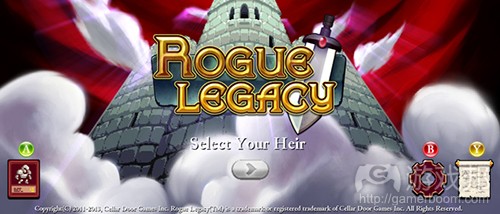
玩家首次接触你的游戏时,没有必要让他们体验多层次的菜单。还是那个道理:人们想直接开始。用户在第一次玩游戏时没有必要接触整个菜单。尽管这是个公认的用户体验设计法则,但还是有大量游戏一直在用繁冗的菜单浪费玩家时间。《Rogue Legacy》在这方面则是一个优秀范例。
你想让玩家摁下开始按钮玩游戏。在玩家初来乍到时,你不需要呈现关卡选择画面。如果当前只能呈现一个关卡,你还有必要让玩家选择关卡吗?当玩家摁下开始按钮,就应该允许他们立即玩游戏。
实际上,玩家首次启动游戏时,你甚至应该跳过主菜单。或者像《The Last of Us》或《Xenoblade》一样提供极富深度的情感体验。
除非你的游戏要求玩家选择模式,或者掌握复杂的规则,不然就应该让游戏立即开始!你可以在游戏中呈现一个选项按钮,除此之外,让玩家在首次游戏时跳过标题画面也不过花费数分钟的编码时间。需要注意的是:你仍然需要为玩家预留一些缓冲时间,不会让他们马上输掉。你应该预留一些玩家输入的时间,或者让他们在安全区中进行操作。
但你还是得制作一个标题画面。当玩家第二次返回游戏时,他们可能会载入之前保存的版本,也可能想重新开始玩游戏,而这就是呈现标题画面的时机。
主菜单风格
你的主菜单风格要与游戏保持一致。它也是玩家对游戏的一个印象。
你的主菜单应该像餐厅的开胃菜,它要回答玩家的一个基本问题:为什么我要摁下开始按钮?
首先,要让主菜单呈现活力!你可以使用游戏中的粒子效果和动画角色,或者一个滚动背景来修饰菜单。让那些玩家没有接触的按钮呈现动画效果。
你的菜单还应该适时响应玩家的输入。玩家无论何时接触到按钮时,都要让按钮做出回应。你可以在玩家摁下时令按钮比例放大,玩家松开时则恢复原样。
你还可以让其他UI和背景元素呈现交互性。在玩家接触这些元素时,令其呈现渐变效果。在此我所指的是任何类型的游戏资产。这可以是背景中的树,角色,游戏logo或标题等。可以让它们触发一个优美而简单的动画。但无需在此投入过多开发时间!你可以重用来自游戏的渐变,粒子系统和动画内容。
你的每个渐变和动画都应该具有“突然性”,即能够迅速响应。这极富吸引力和有效性。举个例子,我认为一个按钮渐变时间应该介于0.2至0.4秒之间。玩家眼睛可能还来不及看清,但却能够准确感觉到这种变化。
《Rogue Legacy》就有一个极为有效的开始菜单。它具有可靠而清晰的构图。摁下一个按钮,你就可以看到选项或者进入游戏。
具有可玩性的主菜单
你可以制作一个具有可玩性的新颖菜单。比如使用游戏的主角来导航菜单选项。植入具有可玩性的主菜单是设计师甚少使用的方法。
我们很难找到在这方面表现良好的游戏,《Braid》是其中为数不多的典型之一。其菜单富有意义并提供了深度的情感体验。它将你引进Braid的世界,让你进入解决游戏中棘手问题的情绪中。
在《Dustforce》中,其关卡选择区实际上是一个热身区域。它是一个巨大的中心并发挥菜单功能。其难度甚至会让玩家无法令角色进入之后的关卡!该游戏极为困难和富有技巧,这种设计选择也颇具意义。
具有可玩性的菜单较有罕见也是有原因的。你还是想让玩家马上进入游戏,所以移动角色令其引导玩家进入一个关卡或选项,这总会比直接导航一个基本UI更缓慢。
直奔主题
“直奔主题”这个词多用于文学领域,其理念非常简单:你想让玩家直接开始玩游戏。在玩家一进入游戏时,他们就可以开始玩了。不需要冗长的游戏介绍,直接就能进入游戏玩法。如果你制作的是故事型游戏,你可以首先提供一段游戏玩法,之后再引进游戏故事等其他内容。
《Limbo》就是直奔主题方面的游戏典型。玩家只需摁压一个按钮,就能够进入游戏。他并不知道自己身处何方,他不知所措。他只能靠自己的脚步去探索这个世界。这种设计决策与该游戏阴暗的基调相得益彰。
《Journey》也提供了类似的出色体验。其主菜单较为简单,会缓缓融入游戏指南和玩法中。
直奔主题这种方式并不适用于所有游戏类型。但对于游戏设计师来说,它仍然是一种值得考虑和借鉴的方法。
F2P游戏的经验
F2P游戏一般会直接让玩家进入游戏世界。多数时候,它们会先提供一个逐步引导的新手教程。在引导玩家开始游戏方面来看,这并非它们最擅长的领域。但它们在此却提供了一种有趣的调整:让玩家先尝尝游戏结束的滋味。
一般来说,我们开始玩F2P游戏时,总会先接触到比之后环节更多的选项。当然,这并非F2P游戏的专利,只是这类游戏更常采用这种做法。在任天堂游戏机Super Famicon平台上的《Tales of Phantasia》开篇就是一群强大的英雄面临一个超级强大的boss。而玩家此时马上就会知道游戏结尾是什么情况了,知道这将是一场史诗般的战役,这种感觉太棒了!
我并不喜欢F2P游戏的这种设计倾向,即先提供流畅的玩法体验,之后又将其剥夺。在单人模式游戏中,你并不希望游戏以这种方式呈现。你仍然希望早期游戏具有引人入胜的体验。游戏早期就让玩家一瞥游戏尾声的庐山面目,这种做法还必须对应游戏理念和故事。
何时该打破这些规则
所有游戏都是独特的。所有项目都有不同的需求。作为设计师,你对游戏风格要有清晰的目标。也许你想让游戏漫延挥之不去的神秘感,也许你想让它显得平和而缓慢。我在上文提到的原则或许能够运用于各类游戏,尤其是休闲游戏。
但这些原则关注的是让你的游戏更具易用性和流畅性。其目的是提供即时趣味性。你应该根据自己的目标用户打破或调整这些规则。你设计游戏的目的最重要。
我还坚信我们对游戏易用性与流畅性的理解可以为其他设计师提供借鉴。我们理解易用性的原则之后,就可以择其一而行,无需纠结于其他的选择。
如果你想为自己的游戏创造一个强大的入口,记住以下两点:
*让游戏入口贴近游戏风格与节奏
*让玩家体验游戏
总之,其理念还是那句话:人们想直接玩游戏。那就让他们玩吧。(本文由游戏邦编译,转载请注明来源,或咨询微信zhengjintiao)
How to Create Immersive Game Intros
Nathan Lovato
There are two critical parts of any creation that leave a trail in the viewer’s mind: the introduction and the conclusion. In the case of a game, the first impression is even more important. The user can decide to leave at any moment. In particular, before they got a taste of the game’s best moments.
In other words, your game’s intro can make or break its retention.
Where does it start, where does it end?
By introduction, I do not only mean the first level of your game. I am thinking about the whole experience from the moment the user launches the application to the first level of your game. A long, boring loading will hurt the user’s experience as much as a bad tutorial would.
The introduction encompasses your game’s title screen, loading, tutorial, etc.
There are plenty of little changes we can make to improve the user’s experience outside of the actual levels. As well as in your first level.
Keeping players entertained during your loading
Your games may be lightweight and have a fast loading. Great!
But if you make online games like me, for a wide variety of users and platforms, your loading time can vary a lot. I work on HTML5 games. On mobiles, with a 3G Internet connection, a 2MB game will take a whole minute to download!
Waiting for 60 seconds is extremely boring. Frustrating even. The player may only have to go through the loading screen once. Yet, this is the first taste he will ever have of your game. And we human beings unconsciously make judgments within split seconds (scientific paper here).
If our first experience is frustrating, the game is frustrating. If the loading screen looks ugly, the game is ugly.
It is that simple. We have to polish our loadings. But how?
First of all, your loading screen needs to give a taste of your game’s aesthetics. You can put your best artworks on it! Don’t hesitate to reuse content from the game. There is no need to create a unique illustration just for the loading.
The only unique asset you may want to add is a progress bar. Having any progress indicator is critical. And with progress bars in particular, you can make your game’s loading feel faster.
However, progress bars are not enough. People don’t like to wait. People Want to Get Started! As game designers, we have a wide arsenal of tools we can use to even make fun loadings!
We can make a game in the game. Be it a unique one or a lean version of our actual project. Few titles used that approach in gaming history. This is nothing new though: on the Commodore 64, Skyline Attack had a mini game in its loading screen. But we rarely exploit that opportunity to set our game apart from others.
It is a small detail that can make a big difference.
Ridge Racer’s loading screen on PS1 includes a clone of the arcade classic Galaxian
We only have to load a subset of our game’s assets before downloading everything else. Then, we have to make a choice. We can:
make a small, unique minigame
reuse our game’s gameplay in a simplified way
The first option is pretty straightforward. We can design a game that will only be playable from the loading screen. It only has to be lightweight. And so basic it can be picked up within seconds. Don’t forget: the player will spend at most a few dozens of seconds on the loading screen. He won’t have the time to learn a complex set of rules.
Reusing your game’s core mechanics will not work for all types of games. If your game is complex, like an RTS or an RPG, for instance. We need to extract a unique, simple mechanic from the full game. The minigame has to work without a tutorial.
However, reusing your core gameplay is an exceptional occasion for the player to:
get a taste of the actual game immediately;
start training for his first gameplay session.
And as designers, this is a great exercise. It forces us to come up with an efficient and creative design. By the way, it is not necessary to spend a lot of time on the minigame. It only has to be simple and entertaining.
Some Nintendo DS and Wii titles offer an outstanding reference for small, efficient mini games. I.e. party games like WarioWare. Bayonetta offers a great example of a game that lets the player train during loadings.
Once they got past the loading screen, the next important step all players will go through is your title screen.
On our way to the main menu
With most projects, the players will have to go through your main menu every time they play. They will even have to go through your splash screens every time they play.
Like many other players, you have certainly stared at boring splash screens for never-ending seconds. In particular in AAA games. Splash screens are boring to the point where players even come up with solutions to skip the un-skippable.
Forcing your logo into the mind of players is not necessary. Give them what they are coming for first. You can always showcase your company’s logo later in the intro credits. And after that outstanding finale. That way, the players will actually care about your logo. They will remember you. Without you even asking for it.
You get the point. Forget splash screens! If you must have splash screens, at least make them skippable in an instant. Splash screens are but a source of frustration.
A striking title screen
At some point, the player arrives to the title screen. Once again, we have the power to offer him either a fluid or a frustrating experience. Title screens ought to leave a mark on your mind!
The first time a person plays your game, you don’t need her to go through multiple layers of menus. The same idea always holds true: people want to get started. The user shouldn’t have to go through the whole menus on the first play. Although this is UX design 101, lots of games still have the player waste time in superfluous menus. Rogue Legacy is a game that does it right.
You want your player to be able to press the start button and get going. On the first play, you don’t need to show a level selection screen. What is the purpose of the level selection if you only have one available? When the player presses the play button, he should be able to play right away.
Actually, the first time the player launches the game, you could even skip the main menu altogether. Or offer a deep emotional experience as in The Last of Us or Xenoblade. Powerful, yet sober.
Unless your game requires the player to pick a mode, or to learn a complex set of rules, get the game going! You can always put a button to access the game’s options in-game. On top of that, skipping the title screen the first time somebody plays your game only takes minutes to code. One warning though: you should still leave some space for the player not to lose right away. You should either wait for the player input or put him in a safe zone.
You still have to make a title screen though. When the player comes back to your game a second time, he may want to load a previous save. Maybe he wants to start a new game as well.
Your main menu’s feel
Your main menu is like the rest of your game: it should share its feel. Once again, it is an occasion to give the player a taste of your project. A bland menu won’t cut it.
Your main menu is like a restaurant’s room: it is an appetizer. It answers a fundamental question: why should I press the play button?
First of all, make it move! The menu has to feel alive. You can use particles, animated characters from the game, or simply a scrolling background. Whenever the player is not touching the buttons, animate them!
Your menu should also respond to the player’s inputs. For one, whenever the player touches a button, the button should always react. You can basically scale it up when it’s touched, and scale it down when the touch is released.
You can also make other UI and background elements interactive. Simply tween them on touch. I am talking of any type of game assets in that case. This could be a tree in the background, a character, the game’s logo or title, etc. Just have it trigger a nice, simple animation. No need to spend hours on it! You can reuse tweens, particle systems and animations from the rest of the game.
Each and every of your tweens and animations should “snap”. The concept of snap is specific to animation: an animation that snaps is just like a snap of your fingers. It is reactive and fast. It is both appealing and efficient. I think that the image of a finger snap works well. To give you specific numbers, a button scale tween should take between 0.2 and 0.4 seconds. It doesn’t give too much time for the eye to see it, but it is enough for the player to feel it.
Once again, Rogue Legacy offers a strong example of an efficient start menu. It has a solid, clear visual composition. One button press, and you are either in the options or in the game.
Rogue Legacy’s title screen is both clean and clear
A touch of originality: Playable main menus
You can make an original menu by making it playable. That is to say using your main character to navigate through the options. Implementing a playable main menu is an approach that designers rarely take.
It is hard to find an example of a game that does it right. Braid is one of the few game titles that managed to pull it off. Its “menu” is meaningful and offers a deep emotional experience. It pulls you into Braid’s world. It puts you in the right mood to solve the game’s tough problems.
In Dustforce, the level selection zone actually serves as a warm-up area. This first area is a huge hub and acts as a menu. It even makes it hard for you to move your characters to the later levels! The game being very hard and technical, this choice makes sense.
If playable menus are rare, it is for a good reason though. You still want your player to get into the actual game very fast. Moving the character to a given door to access a level or option will always be slower than navigating a basic UI.
Starting in medias res
In medias res is a Latin expression that means “in the action”. It is mostly used in the literature, to describe a story that starts in the midst of action. The idea is very simple: in the case of a game, you want the player to start the game hands on. As soon as he gets in, he can already play. No longer intro cinematic, direct gameplay. This echoes back to the idea that people want to get started. You can start first with a phase of gameplay, and introduce the story later. At least if you are not making a story-driven game.
Limbo is an exceptional example of a game starting in medias res. And of the principles outlined above. One button press, and the player is in the game. He doesn’t know where he is. He is lost. He discovers the world a little more with each step he takes. This design decision works beautifully with Limbo’s dark setting.
Journey offers a similar kind of outstanding experience. Its main menu is lean and flows nicely into the game’s introduction and gameplay.
Starting in medias res is once again not right for all games. But it is an option to consider and keep in mind as a game designer.
A lesson from F2P games
Free to play games actually tend to throw the player in the middle of the game world straight away. Most of the time, they start with a slow step-by-step tutorial. This is actually not what they do best in terms of getting people started. However, there is one interesting twist that they offer: they give the player a taste of the end game.
In general, when we start a F2P game, we have access to more options than in the actual later parts of the early game. Well, free to play games are not the only ones to do that. I am pointing at F2P titles mostly because they generalized this practice. On Super Famicom, Tales of Phantasia started with a team of powerful heroes facing a cool overpowered boss. Right away, as a player, you knew what the end game had to offer. You knew that it would get epic. And it felt great!
I don’t like the way free to play games tend to do it. They offer a fluid gameplay experience that they then take away from you. In a single player game, you don’t want to show what the game has to offer that way. You still want the early game to feel compelling. Giving a glimpse of the end game also has to work with your concept and story.
When should you break those rules
All games are different. All projects have different requirements. As a designer, you should have a clear goal as far as your game’s feel is concerned. Maybe you want your game to have a lingering feel of mystery. Maybe you want it to feel peaceful and slow. The principles I outlined above can be interesting for all sorts of games. In particular for casual games.
However, those principles focus on making your game slightly more accessible and smoother. They are about providing instant fun. Depending on your specific audience, you may want to break or adapt the rules outlined above. What matters is that you do it on purpose, for good reasons. It should be a coherent design decision, and not a plain oversight.
Also, I firmly believe that our understanding of what makes games accessible and fluid is interesting to learn for any designer. Once we understand the principles of accessibility, we can pick the ones we need and leave others aside.
If you want to create a powerful intro for your game:
• Make it fit your game’s feel and rhythm
• Get the player playing
All in all, the idea is always the same: people want to get started. Get them started.(source:gameanalytics)
上一篇:分享2D平台游戏寻径方法(1)
下一篇:列举独立开发者的零预算营销方法


