万字长文,以案例入手从游戏玩法角度谈游戏角色的设定
今天让我们来讨论《求生之路2》的角色设计的视觉清晰度。在最近几年Valve关于这方面的学习取得了进一步的发展,所以我们有必要去剖析他们所获取的经验教训。
让我们带着背景,并考虑三个主要元素:轮廓/规模,颜色/模式以及材料/细节。

Left-4-Dead-1-Old-New-Comparison(from blogspot)
上图是修改前和修改后的《求生之路》中的幸存者(在Turtle Rock Studios被Valve所收购之后)。
Valve在视觉上的大胆尝试可以追溯到《半条命2》。但是《半条命2》更突出的还是让人印象深刻的角色,而非本文所讨论的主题,即这是一款带有非常友好的非玩家角色的单人游 戏,区别于团体协作的多人游戏。
从实际意义上来看,我指的是那些将为游戏玩法带来实际影响的元素。对此我们需要着眼于《军团要塞2》。
玩家应该还记得,最初的《军团要塞2》(大约在1998年)是基于更现实的视觉效果和游戏玩法。(如图)
team-fortress-2(from blogspot)
但是在游戏的开发过程中却出现了许多不同游戏的冲击,最显著的便是《战地》系列游戏。
最终开发者彻底修改了《军团要塞2》,即变成一款接近于《Quake》但却带有倾向于20世纪经典商业插画的干净且具有风格的游戏。
我们可以从中看出Moby Francke独特的视觉风格,而从局外人的角度来看,《军团要塞2》拥有强大的艺术性视觉效果。(当然了,角色设计朝着视觉清晰度发展还归功于其他设计 师,但从Francke的作品来看,我认为他是该公司中最杰出的设计师。)
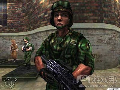
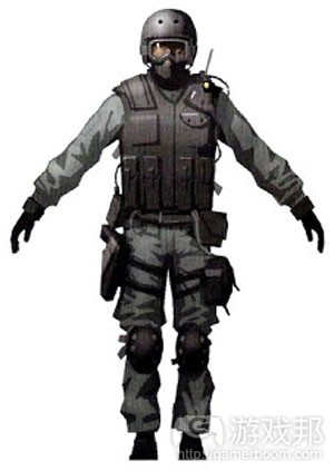
在致力于《军团要塞2》之前,他创造了《反恐精英:起源》的造型表(如图)。
model sheets(from blogspot)
尽管角色设计主要是由《反恐精英》的mod版本所决定,但却也不能忽视造型表本身的呈现。主要的形状和轮廓深受细节或纹理的影响。
这是主导着《军团要塞2》成功的一大理念:清楚,整洁的外观。《反恐精英:起源》的造型与《反恐精英》最初的角色并没有太大的区别,但它们却是经过反复完善才最终变成我 们所看到的《军团要塞2》。
下图便是Moby Francke为《军团要塞2》所设计的一个角色。虽然呈现出的是与《反馈精英:起源》一样的造型表,但是基于游戏风格,《军团要塞2》的角色具有更显著的轮廓。 让我们进一步讨论《军团要塞2》的各种角色设置。

character design(from blogspot)
轮廓/大小
甚至一些休闲玩家也知道轮廓设计问题。这是设计任何电子角色时所需要掌握的最重要的元素。你是否能够只依靠轮廓便判断出下面的角色?
关于《军团要塞2》,Valve意识到如果能让玩家更快速明确其他角色并明确相关信息(游戏邦住:对方是敌还是友,或者属于何种类别),那么玩家便会更加重视游戏。基于团队 的竞争性多人硬核游戏的需求不仅推动着《军团要塞2》的视觉效果变得更加吸引人,同时也将游戏玩法的需求透明化了。这种透明化也经过完善再次出现于《求生之路1》和《求 生之路2》中。
我们可以将角色设计放置在一个跨越了自然化(如《求生之路》)到风格化再到抽象化(如《太空入侵者》)的范围中。虽然从名义上看这些角色都属于人类,但是他们的轮廓却 大相径庭。更加风格化的游戏总是能够提供更大的空间让玩家去定制角色的轮廓。
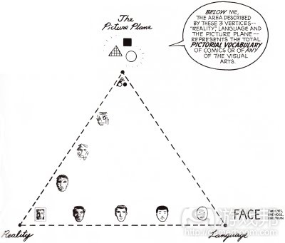
Scott McCloud的漫画《Understanding Comics》便呈现出了“画报词汇”这一理念——既能用于电子游戏中也适用于漫画中。
McCloud-comic-vocabulary(from blogspot)
当游戏变得更加抽象或者更加倾向于图中三角形的右边时,轮廓间的差异性便能更清楚地呈现出来。游戏机制同样也将进行追踪,尽管它不具备多大的关联性(还有许多游戏带有
现实的图像以及更加抽象的机制和世界)。
即最开始人类是以正常人类的轮廓而出现,我们需要思考他所传达的各种不同信息—-高度,重量,性别,年龄等;形状间的关系(持有武器可能呈现出独特的轮廓),角色最常见 的姿势,动画风格等等。因为轮廓是能够帮助玩家识别角色的最重要元素之一,所以我们必须确保轮廓能够清楚地呈现出来,或者与背景分离开来。
值得注意的是,在《求生之路》中,轮廓也能传达一些重要的信息,如角色受重伤—-当角色的生命值较低时,他便会通过弯腰,蹒跚行走等形式表现出来。
轮廓其实也等同于大小。即轮廓既能帮助玩家识别角色,同时也能呈现出角色的各种大小,如此角色的可读性也就大大提高了。在《求生之路》中,所有角色都具有可读性的大小/ 轮廓,如此不同角色便能够被有效地区分开来。
颜色/模式
这是最缺少关注的优秀视觉角色设计的一大元素。关于颜色和模式的清楚且简单的应用能够帮助我们有效地区分不同的角色—-从这点看来《求生之路》的角色设计真的很突出。
让我们着眼于《求生之路1》和《求生之路2》的角色理念,然后考虑其配色方案,通过将所有元素应用到相同的迷你人型(如模版)中而进行颜色区分。熟悉这些角色的玩家都能 清楚地说出他们八个人的名字:
基于不同配置的简单且强大的颜色组合将创造出让人印象深刻且能够轻松分辨出来的角色,这对于功能角色设计至关重要。
材料/细节
材料和细节是最难进行说明的元素,但对于整体呈现来说仍然至关重要。适当的材料选择(闪闪发光的盔甲或者武器vs.喷砂面)非常有帮助,特别是当玩家未能获得其它有效信息 时。
微弱的光线将导致玩家很难分辨出颜色,并只能依靠轮廓进行判断。而一些特别的反光材质也具有可读性(比起那些低光度材质而言)。(这也是为什么现实世界的武器会强调消 光处理以及磷化处理的主要原因,以确保武器不会在黑暗中显现出来。)
glow-y位体是我们能够有效支持电子游戏角色设计的秘密武器。多亏了glow-y位体,不管是Sam Fisher(游戏邦住:《细胞分裂》中的主要角色)还是Marcus Fenix(《战争机器 》中的主要角色)都能在黑暗的中轻松地前行。不管你的动力装甲是缺少冲击力还是清晰度,发光的技术位体都能够帮助你有效地将其呈现出来。
细节是关于其它元素的全方位描述,即包括角色的整体视觉复杂性。同时我们也需要仔细考虑游戏的整体复杂性,以及这与游戏玩法之间的关系。
Marcus Fenix以及其他《战争机器》中的COG便是非常典型的例子:只要有效部署一定的技巧,并结合一些显著元素,如glow-y位体,我们便能够将游戏角色有效地呈现在玩家面前 。
但却不是人人都能做到这一点,就像《虚幻竞技场3》虽然拥有与《战争武器》类似的图像,但却未能呈现出有效的视觉设计。在团队游戏中,我们需要使用一块红色或蓝色的外壳 去覆盖远处的角色和车辆,从而确保玩家能够更快速地察觉到它们。
在这第二部分,我们将考虑在第一部分中讨论的关键特征——轮廓/比例、颜色/纹样和材质/细节,看看我们是否可以在考虑游戏玩法的前提下,把不太理想的角色概念表达得更清 楚。
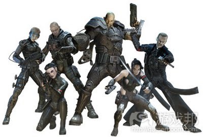
我选择最近刚刚通关的一款游戏《Clive Barker’s Jericho》中的角色作为分析和改进的样本。
Jericho squadpic(from designreboot.blogspot)
这款游戏因为某些原因而不太受欢迎,但仍然有一些颇具创意的概念。玩家操作的是一支6人团队,正好满足本文的目的。使玩家一眼就将这支团队的各个成员区别开来,虽然有困 难,但是非常重要的。

jericho concept(from designreboot.blogspot)
(Hanne Lichthammer是游戏中不死的纳粹头目,哥特风更加明显。)
问题是,这款游戏是围绕哥特风黑暗系(甚至是团队里的黑人也像死人一样面色惨白)超自然特种部队展开的。
除了Delgado(拿枪的大家伙)和Church(身材娇小的忍者),在战斗或光线不足的情况下(游戏邦注:这两种情况经常出现,并且往往同时出时),其他成员都不好辨别。下图显 示了原版角色和他们的名字,以便你知道我在本文中指的是他们当中的哪一位。

jericho_squad(from designreboot.blogspot)
从哪开始呢?这个团队的问题主要是外形特征不突出和角色定位比较老套。Delgad是个说话粗鲁的拉丁裔,Father Rawlings是个枯瘦的南方牧师,Black是个好战的同性恋狙击手 。
现在,我们先看看角色的外形:整个小队肤色苍白,着装以黑色金属为主,这种哥特式恐怖风格很适合这款游戏。但大问题正是出在这里,我们分成两方面说。
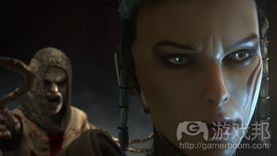
jericho(from designreboot.blogspot)
首先,从玩家的投入和参与角度看,这6个角色都不讨喜——他们会魔法,又带着武器,这么强大的一伙人足够对付炼狱世界的任何困难了;并且,游戏机制和小说都设定他们可以
复活小队成员,无限补充弹药—-还需要玩家的帮助吗?
最糟糕的地方就是。这几个准备拯救世界的哥特族,他们的着装风格不正是与炼狱世界完美契合吗?换句话说,他们与环境缺少戏剧性反差。很难想象这样的角色在这么合拍的环 境中感到恐惧和害怕,因为他们不像是去异世界战斗,更像是回老家探亲。
再者,即使我确实寄希望于这种可憎的老套设计,我常常无法一眼将各个角色辨认出来。他们当中个把人穿着黑色紧身衣,因为使用的是富有光泽的材质,所以在光线不好的地方 ,一定程度上提高了能见度,但作用并不算大。大多数成员的服装上都装饰有古代北欧文字般缠绕的金银丝,大概是为了弥补形状单一的缺陷,但并不太成功。

jericho_colorswatch(from designreboot.blogspot)
上图是从几张代表性的游戏环境的截图中提取象素平均值后做成的色板。这款游戏场景的主导元素是雾、烟、火,融合得恰到好处。横尸遍野、血流成河、残垣断壁的炼狱场景主 要呈暖色调,通常偏暗色系。
谢天谢地,Jericho小队穿的不是血红色的衣服,不然一定会跟背景混在一起。但是黑色服装也不够显眼,特别是在黑暗的环境中(对恐怖游戏倒是合适)。
所以,需要解决的问题就是:形状/轮廓差异化(在不显示颜色的情况下)、暖色调和低光环境下的材质和细节可见度、以及角色使玩家产生适度的同情和恐惧。
简化图
作为美术人员,总是很有立即绘制角色的冲动,但这种方法其实并不实用,因为在设计这么庞大的团队时,重复设计会浪费大量时间。所以我们应该有意识地简化设计方法——这 不仅可以防止美术人员在充分考虑以前就投入过多精力,还可以让缺少或完全没有绘画才能的人也能参与角色设计过程。
这六人团队是由两支小分队Alpha和Omega组成的,我们先画出简单的示意图。
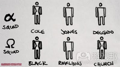
squad_picto1(from designreboot.blogspot)
我使用简单的示意图代表角色,这样我就不会过早地为上色和渲染分心。
画得太好的角色可能会掩盖设计缺陷,以致于发现问题为时已晚——那时候用于游戏的模型和材质都做好了。到那时再做修改既浪费钱又浪费时间;还不如在修改尚不费成本的阶 段就将问题消灭在笔头和笔擦之中。
比例
现在我们已经画好三男三女的简单轮廓。原设计的角色比例关系不错,所以我们将沿用原设计的比例。
Cole是“正常”身材的女性,是“正常”身材的男性,Delgado是当中块头最大的, Black是女角色中最高的。我们将把Rawlings画得瘦直一些,把Church设计得娇小一些,以突出 她的忍者身份。如下图所示:

squad_picto2(from designreboot.blogspot)
看起来很简单,本来就是,不过别着急,基础是关键。将所有角色放在同一张上也是有帮助的——虽然很小,但有利于通盘检查和对比所有角色的设计。
轮廓
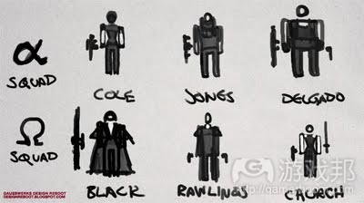
squad_picto3(from designreboot.blogspot)
在这里,最大的变化是给Black穿了一套狙击手专用的伪装衣,而不是游戏中的那种紧身衣(那使她与Cole非常雷同)。其他方面,我在这个阶段最关注的是如何提高能见度。经验 告诉我,当设计一支超自然特种部队时,灵活是最重要的,所以我基本上是在考虑领子和袖子的长度。
尽管服装在这个阶段还不明确,但我已经在考虑把Cole的护目镜做得更大更夸张,以增强她的朋克范儿;Jones的服装领子做得高一些,起到防护作用,使他看起来像防爆兵; Rawling的外套还是像原设计那么大(显然开发团队在这里也意识到这些问题,Church的概念设计中并没有笨重的护甲。他们可能是意识到在黑暗环境中将难以辨别角色,也可能是 觉需要突出角色的女性特征,或二者兼有)。
纹样和颜色
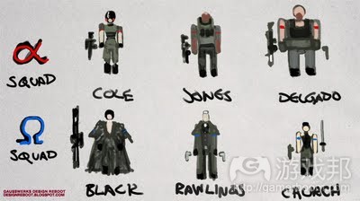
squad_picto4(from designreboot.blogspot)
因为大部分游戏场景都是红色系或土色系,所以我给角色服装选择了互补色:绿色——更准确地说是橄榄绿。我用这个颜色是因为考虑到游戏小说和玩家识别的问题:即使世界面 临灭顶之灾,我也很难苟同政府不会给它的秘密机构“超自然国防部”(如果存在这么个部门的话)提供可观的资金。
我又进一步想到这支秘密部队,或者姑且算作超自然国防队:如果他们没有最先进的装备和隐形黑鹰直升机作为交通工具,会怎么样?世界仍然是要拯救的,但没有与他们的能力 一样大的预算,谁会相信他们能拯救世界?所以高端的装备会使这支小队看起来更强大,更拉风,总比所有角色都穿同样粗糙的高科技哥特装来得好。
之后我还会再解释这些概念,但由此可知,角色们将变得更有军人范儿。我让这支团队中的黑人回归正常黑人的肤色,并且使他显得稍微和善。
我还给两组成员以相应颜色的识别臂章。出人意料的是,这不过是拣回原设计丢掉的创意:如果你仔细观察这6个角色的设计,你会发现只有下面一组角色有戴红色臂章。
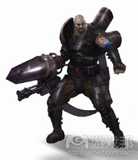
jericho delgado(from designreboot.blogspot)
在Delgado原来的概念设计(如上图)中,你可以看到蓝色的臂章。我只能猜测,Alpha分队原本有蓝色臂章,以呼应Omega分队的红色臂章,但为了体现真正的哥特风,这个设计被 抛弃了,因为他们认为,当一支小分队有臂章,而另一支小分队没有臂章时,两支小分队就已经被区别开来了。
事实上,我是在撰写本文一半时才发现Omega分队有红色臂章,再次证明角色设计的不成功。我只能想到,红色和蓝色臂章的设计其实更好,所以我重新设计时把它们拣回来了。
总结

dvt6ia(from designreboot.blogspot)
以上是这个阶段的gif动态图。由图可见,设计这么一批角色并突出各自的特征,并不需要多少时间或绘画才能。如果你是美术设计人员,在你开始绘制详细的分解图以前,先画出 这样的简化图是很明智的。时间就是金钱;当你浪费了一整天做设计,结果美术总监看到你的成果立马要求你重来,这时你就知道时间的可贵了。
最后,奉上完整的概念加修订说明。
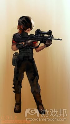
dossier_cole(from designreboot.blogspot)
我夸张了她的标志性特征,也就是头盔。另外,她的动作是角色轮廓的另一个主要特征。
Cole的头盔(60年代宇航员头盔的改版)使她与其他角色的区别一目了然。她的改良FAMAS突击步枪视野会传入头盔HUD中;她的步枪弹药可以与Delgado的武器共享。
姿势:肩部后倾——以专业而自信的姿势拿着步枪。
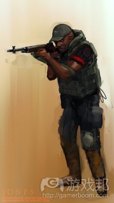
dossier_jones(from designreboot.blogspot)
Jones是“正常”身材的射击手;装束与现代士兵差不多。
他具有心灵感应能力(游戏邦注:这个角色令人联想到美剧《迷失》中的一个角色Miles Straume,他能够聆听死者的心声)。他带着一把老式M14,可以与Black的狙击步枪共享弹 药。
姿势:经验丰富的现代军人的标准射击站姿。
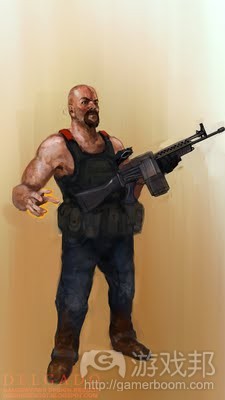
dossier_delgado(from designreboot.blogspot)
Delgado仍然配备重装武器,但去掉了原设计中明显装饰性、老一套的风格。虽然在原设计中,他右臂的装备很有意思,但太扎眼了,使人忽略了他是一个活人,也很脆弱的事实。
Delgado的右手不再是原设计中的大手套,而改成了他的宠物火焰精灵。他的枪是复古式斯通纳63。
姿势:昂首挺胸,坚定有力。
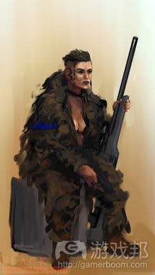
dossier_black(from designreboot.blogspot)
Black保留了原设计的粗放风格,但去掉了不合适的装备。因为穿着与背景相似的伪装衣,一旦拉上拉链,她就不容易成为敌人的攻击目标。她的武器是CZ700狙击步枪,与Jones共 享308弹药。
姿势:保持狙击兵的警觉的坐姿。
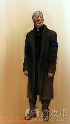
dossier_rawlings(from designreboot.blogspot)
Rawlings被设计成非战士的形象,这与他的术士能力更契合,并且有战略上的考虑——作为团队中的牧师类角色,他的自我防护能力比较差。
他是相当喜怒无常、神经质、说话滔滔不绝的南方人;Jericho团队给他取了一个外号——“灵魂暗夜”。
姿势:拘束,怒容。
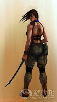
dossier_church(from designreboot.blogspot)
Church仍然是忍者扮相,但服装更讲究了。忍者的血统体现在她背上的神秘纹身上。她的武器是意大利的幽灵M4冲锋枪和日本刀。
姿势:完全是忍者的样子。
正如前文提到的,再次修改的版本将会更具体地解释Jericho和相应的设计图。
就如何强化视觉清晰度而言,在我的新设计中我还没有充分地解释,但这篇文章已经说得够长了,是吧?
相关拓展阅读:篇目1,篇目2(本文由游戏邦编译,转载请注明来源,或咨询微信zhengjintiao)
Visual Clarity in Character Design (Part I)
With the release of Left 4 Dead 2 coming up, let’s talk about visual clarity in character design. Valve has learned quite a bit about doing it right in recent years, so it’s worth dissecting a few of the lessons they’ve learned.
We’ll start with some background, and then cover three main concerns: silhouette/scale, color/patterns, and materials/detailing. In another update, we’ll apply these lessons to less than successful character designs in another existing game and see what we come up with.
The L4D Survivors before and after major reworking, after Turtle Rock Studios’ absorption into Valve proper.
Valve’s visual bravura arguably dates to Half-Life 2. But HL2 was more of a breakthrough in terms of memorably drawn characters, rather than a variety of pragmatic concerns we’ll be discussing here–a single player game with invincible/high health friendly NPCs is not the same as designing for team/co-op multiplayer.
By pragmatic, I mean the kinds of things that have a direct impact on gameplay. For this, we’ll look at Team Fortress 2.
Players may remember that TF2 was originally–circa 1998 or so–going for a more realistic visual and gameplay style (seen at left).
Thankfully while in development, in they were soundly swooped by a number of different games, most notably the Battlefield series of games.
TF2 was ultimately redesigned closer to the original Quake mod roots of the game, but with a clean, stylized look harkening to the work of classic 20th century commercial illustrators.
We see the particular stamp of Moby Francke’s visual style, which from an outsider’s perspective seems to be the strongest artistic voice on where TF2 would end up, visually. (I have no doubt this greater movement toward visual clarity in character designs was due to others artists as well, but Francke’s work seems the single best artist at the company I can point to.)
Prior to his work on TF2, witness his Counter-Strike: Source model sheets (below and to the right).
While the character designs had already been more or less decided with the mod version of Counter-Strike, notice the presentation of the model sheet itself. Major shapes and silhouettes are emphasized over detailing or texture.
This is a crucial concept governing much of the successfulness of TF2: a clean, uncluttered, “readable” look. The CS:S models are not hugely different from the original CS characters, but they are an iterative improvement and a step toward what would become TF2.
Below, one of Moby Francke’s character designs for TF2. Same presentation for the model sheets as for CS:S, but with the style of the game he’s able to work in more memorable silhouettes. Simply by considering the various TF2 characters with relation to each other you can reverse-engineer most of these lessons–but let’s talk about them more in detail.
Silhouette/Scale
Even some of the most casual players are probably aware of silhouette design issues. This is perhaps the single most important factor when designing any videogame character. Look below–do you have trouble identifying any of the characters below solely by their silhouettes?
With TF2, Valve realized that the more quickly the player needs to identify other characters and act on that information (friend or foe, what class the other player is) the more important it becomes. The demands of a hardcore, team-based competitive multiplayer game helped drive the visual style for TF2 to not only be attractive, but also transparent to the needs of the gameplay. This transparency would be honed and show up again with L4D 1 and 2.
Character designs can be placed on a spectrum from the naturalistic (L4D) to stylized, to the almost completely abstract (say, Space Invaders). Above, these characters are all nominally human, but their silhouettes vary wildly. The more stylized the game, generally the more wiggle room you’ll have to play with in terms of defining through silhouette.
Scott McCloud’s Understanding Comics has a very useful lens to consider this concept–the “Pictorial Vocabulary”–that applies equally as well to videogames as it does to comics. (A more detailed version with examples of this is available here.)
As games become more abstracted either up or to the right of this triangle, the more dramatic the differences in silhouette (may) become. Game mechanics tend to track similarly, though it is not strictly correlated. (There are a lot of games with somewhat realistic graphics but highly abstract mechanics and world.)
Start with a normal human silhouette, think about the various different messages it sends–height, weight, gender, age; the interrelations of shapes (held weapons also count a lot for unique silhouette), the character’s most common postures, style of animation, etc. Silhouette is one of the most identifying factors so long as the character in question is not significantly occluded visually, or they can be clearly discerned from the background.
It’s worth noting that for L4D, silhouette will also communicate important information like being gravely wounded–once a player has very low health they transition to the stooped, wounded stagger in place of a normal gait.
The natural corollary to silhouette is scale. A silhouette may identify a character well, but introduced together with scale variation, a character’s readability is boosted considerably. With L4D, all characters are realistically scaled/silhouetted human characters (no giants, no dwarves, and no spikey anime hair) and yet the characters are all well differentiated on these grounds.
Color/Patterns
This is one of the least appreciated aspects of good visual character design. Clear, simplified application of color and pattern can be one of the best ways to create well differentiated characters–and it is here that arguably the L4D character designs are strongest.
Let’s look at character concepts for both L4D1 and L4D2. Then consider the color schemes, divorced from all other aspects besides color by applying them to the same Lego minifigure-like template. Players familiar with them will have no trouble naming all 8 characters:
Simple, strong combinations of colors in different arrangements can by themselves create memorable, easily differentiated characters that can be IDed by the player under duress reliably, which is the holy grail for functional character design.
Materials/Detailing
Out of all concerns, materials and detailing are some of the most difficult to explicate, but still crucial to overall presentation. Material choice–say, a glistening bright shine on armor or a weapon vs. a matte finish–can go a long way, especially when other information isn’t available to the player.
Extremely low-light conditions will strip players of color information, leaving only silhouette cues and in many cases not even that. Extremely reflective materials, on the other hand, will still “read” differently than matte ones in low light. (Which is part of why most real-world military firearms feature some manner of matte finishing, parkerizing and the like–so they won’t reflect sharply in the dark.)
The associated problems here are why we’ve got the single biggest crutch for videogame character design: glow-y bits. Everyone from Sam Fisher to Marcus Fenix can orient themselves easily in a pitch-dark room, thanks to gratuitous glow-y bits. Your future power armor design lacking that necessary punch, or clarity? Glowing tech-bits are every lazy s.f. concept artist’s best friend.
The slippery slope.
Detailing is a sort of catch-all description for other concerns too numerous for the scope of this article, including the overall visual complexity of a character. As such it should be considered carefully, as should the overall visual complexity of your game, as it relates to your gameplay.
Marcus Fenix and the other COGs in Gears of War are deceptive cases: with careful deployment of certain techniques, in combination with more overt ones such as glow-y bits, you can still maintain fairly good legibility–even if tastefulness remains elusive.
Color-overlay shaders reveal a breakdown of basic visual clarity in UT3.
But it can be tricky–Gears of Wars’ near sibling Unreal Tournament 3, despite a very similar aesthetic, fails almost completely in terms of clarity of visual design. Busy, techy character designs against busy, techy backgrounds mean that in team games, characters and vehicles (!) at mid-to-long distances are overlayed with a red or blue shader shell, in order that they’re readily perceptible at all.
I apologize if some of these concepts aren’t fully explained, but with Part II we’ll be applying all the lessons to some existing designs in another game. In the meantime–what are your favorite examples of visually successful and spectacularly unsuccessful visual designs for videogame characters?
In Part II we’ll consider the key characteristics discussed in the first entry–silhouette/scale, color/patterns, and materials/detailing, and see if we can ’t make an existing set of less than optimal characters “read” more clearly in gameplay situations.
The very gothic Jericho Team.
For candidates, I looked no further than a game I had finished playing just recently: Clive Barker’s Jericho.
It was not well received and mostly for good reason, but there are some inspired concepts running through it. It’s ideal for our purposes because you control a larger than average team of six characters, and it’s tactical enough that identifying characters different squad members at a glance makes a difference.
Hanne Lichthammer, an undead Nazi boss character in the game, seen out-gothing the Jericho team by a wide margin.
Trouble is, the game revolves around a decidedly goth-leaning, melanin-challenged (even the black man of the team is ghostly pale) supernatural special ops team with a fondness for shades of black.With the exceptions of Delgado (the big chain-gunning fellow) and Church (the small-framed ninja), this is a large group of friendly characters that are
difficult to tell apart in combat and/or low light levels–both of which recur regularly, often together.
Here’s a collected image of the original characters and their names, so you know who I’m referring to for the rest of the article:
Where to begin? Many of the problems with the team extend further than just visual appearance and into their broad, even offensively stereotypical characterizations.Delgado is the sass-talkin’ latino, Father Rawlings is the deep fried southern preacher-type, Black is the militant lesbian sniper, etc.(I think the game interesting enough that the follow-up to this entry will be a full-fledged design sketch.)
For now we’ll stick to their appearances: in keeping with the gothic, spooky ambience befitting a Clive Barker game, the entire team is pale and black clad. This ends up as a significant issue in two ways.
The call is coming from inside the crypt.
First off, from the point of view of player investment and interest, these six characters are a hard sell–they walk into this hellish landscape overpowered with magic and arms, imminently well-qualified to deal with the problem, and the game mechanics as well as fiction hold that the team can both resurrect members and resupply them with ammunition indefinitely–so why do they need my help at all?
What’s horrifying about these gothic sulks having to deal with the end of the world, aren’t all their own apartments furnished in the same style as the oozing rivers of blood and hellscape they now traverse? In other words, the team seems to be lacking dramatic contrast to their environment. Far from being put out and suggesting fear and terror as appropriate responses, they seem at home.
Second, even if I did feel invested in the obnoxious stereotypes, I often have trouble seeing them at all, certainly in telling them apart at a glance. A few of them are attired in shiny black catsuit-type material, which improves their visibility somewhat in low light conditions, but not enough to be helpful. Most of the characters are designed with a kind of runic filigree covering their suits, presumably as a replacement for lack of shape or form differentiation, but it’s none too successful.
At left is a sample palette of the game’s environments, derived from pixelated averages of a few representative screenshots.
The game is heavily atmospheric–fog, smoke, fire predominate to good effect. Mounds of sloughed off rotting flesh and rivers of blood show up as with any self-respecting time-fragmented hellscape, so the general palette of the game tends to run to warm, flesh and earth tones, and generally very dark.
While thankfully the Jericho squad isn’t wearing blood-red catsuits, which really would make for unfortunate camoflage, the black suits don’t really help visibility, especially for the extended sequences shrouded in darkness (perfectly appropriate for a horror game).
So as we begin, we’ll identify the specific issues we wish to solve: shape/silhouette differentiation (for when color information is not present), visibility of material and detailing in warm colored and low light situations, and finally player sympathy/horror game appropriateness of the character designs.
First things
The temptation for me as an artist is to get to drawing and painting characters immediately, but this isn’t actually that helpful when I could end up with a lot of wasted time for a redesign of such a large team of characters. So we’ll stick with a consciously simplified approach–not only does it keep artists from pouring too much effort into a design before it’s well considered, but it’s simple enough that little or no drawing ability won’t stop someone from using the same process.
We begin with a simple diagrammatic layout of the team divided into their control squads, Alpha and Omega.
Like the L4D color comparison in the first entry, I’m using simplified representations for the characters in order so I do not distract myself with painting and rendering too early.
A well drawn character can mask design flaws that don’t manifest themselves until it’s too late–the model and texture are done running around in the game. Revisions at that point are extraordinarily expensive in money and man-hours; far better to squash as many problems before they ever happen when revisions are as cheap as the point of an eraser, the point of a pencil.
Scale
So now we’ve got three men, three women in simple outlines. The scale relationships of the team originally are a good starting point, so we’ll stay fairly consistent to the original team designs.
Cole is the “medium” female, Jones the “medium” male, Delgado the largest of all characters, Black the tallest of the females. We’ll make Rawlings a narrow, vertical form, while Church is the diminutive ninja form. Like so:
If it seems simple, that’s because it is, but take the time, foundations are critical.
It’s also instructive to do this kind of designing with all characters visible on a sheet–small as it is, this workflow reinforces the necessity of cross- checking all the character designs against each other as much as possible.
Silhouette
The biggest change here is giving Black a sort of Ghillie suit/dress, instead of the black catsuit that appears in the game (and makes her look very similar to Cole). Otherwise, most of what I’m paying attention to here is a simple factor of how much skin is visible. Something tells me tacti-shorts are right out when rethinking a supernatural tactical response team, so I’m mostly looking at collar cuts and sleeve lengths.
Though it’s not pronounced at this stage, I’m already thinking of exaggerating Cole’s augmented reality visor’s scale in order to giver her more of a Daft Punk head silhouette (added bonus of hugely reflective helmet), whereas Jones gets a high, protective collar, almost like a bomb technician. Rawling’s duster/great coat remains largely unchanged.
(There’s evidence the development team ran into these issues, as the concept art for Church doesn’t have the large suit cut-out panels. Either they realized the difficulty of recognizing the characters in the dark or needed some sex appeal–or both.)
Patterns and Colors
Knowing that most of the game’s environments are in ruddy/earth tones, I swung to the complementary color on the wheel: green. Olive drab, more specifically. I considered this in tandem with my problem with the game fiction and player identification issue: even if there are potentially world-ending supernatural threats out there, I have a hard time believing that the government would actually give decent funding for their super secret “Department of Occult Warfare” were it to exist.
This gave rise to the thought of a second-rate secret force, a kind of discount BPRD: what if the team didn’t get all the latest gear and an unmarked Blackhawk helicopter to deliver them to jobs? Still saving the world, but without commensurately magical budgets, because who would honestly believe them, anyway?
Certainly would help make the team less invincible-seeming, more personable, and helps free me from having to straightjacket all of the characters into the same vaguely high tech gothsuits.
I’ll explore these concepts later, but for now it means that the characters end up more irregular military-looking, rather than pale and black everything. The black character in the group gets to actually be black, a small kindness.
I’ve also given the different squads identifying armbands with associated colors. Here again is some surprising vestiges of discarded decisions from the original team: if you look closely at the set of six original character designs, you’ll notice that only the Omega squad (bottom row) have red armbands.
Looking at the original Mercury Steam concept art for Delgado (above and right), you can see a blue armband. I can only infer at some point, Alpha squad had blue armbands to go with Omega’s red armbands, but in the continuing quest for true gothification, these were discarded, with the assumption that you only needed armbands for one of the teams, making the other team distinct by nature of having no armbands.
The fact that it took partway through writing this very article to discover that Omega squad only had the red armbands should be proof enough that this is less than successful. I can only think that the earlier thought of red and blue-coded squad armbands was the better choice, and in my redesign it is one I have reinstated.
Summary
Here’s an animated .gif of the above stages, showing that it doesn’t take a lot of time or even drawing ability to take a large group of characters and make them distinct from each other. And if you are an artist, it’s a smart step to take before you launch into fully-detailed sketches. Time is money, or rather time is what you’re wasting toward the end of the day when the art director comes over, sees what you’ve drawn, and asks for a complete revision.
Finally, the completed concepts, with accompanying revision notes (reference the laughably game guide-esque Wikipedia entry character bios for comparison, before they get scrubbed):
Cole
I made sure to exaggerate her defining feature, her helmet. Otherwise, her stance is the other major defining feature of her silhouette.
Instead of the nervy rookie presentation, Cole’s bulbous augmented reality helmet (retrofitted 60′s astronaut equipment as it happens) keeps her at a quiet remove from the rest of the team. Her modified FAMAS rifle scope feeds into the helmet HUD; it’s 5.56 rounds are shared in common with Delgado.
Poise: shoulders back–professional and assured, high rifle carry.
Jones
Jones is reconfigured as a player surrogate, the most “normal” character for a shooter player; gear trappings like that of a modern soldier or PMC.
Though still a telepath, he treats his power with a matter of fact sensibility (reminiscent of Miles on Lost). He carries an old school M14, which can share rounds with Black’s sniper rifle.Poise: hunched combat glide of a trained, experienced modern soldier.
Delgado
Delgado is still the heavy weapons man, but stripped of both the distractingly overt power armor and stereotypical mannerisms. While the onyx sheath on his right arm was interesting, his former man-portable minigun was distracting and over-powered. The whole get-up distracted from his humanity, any sense that he might actually be vulnerable to attack.
Delgado pulls the glove off his right hand to unleash his pet fire spirit. He carries a vintage Stoner 63 machine gun.
Poise: casual swagger, nerves of steel.
Black
Black retains the coarse manner, but ideally without the ill-timed and obnoxious barks. She’s unhappy that she couldn’t plan ahead with a hell-colored Ghillie suit–though even in the infernal backdrops of Al-Khalil, once her Ghillie suit is zipped up and hooded she makes for a hard target. She sports a bolt-action CZ 700 sniper rifle, which means she can share .308 ammunition with Jones, but he’s not likely to get any of long-distance-balanced handloads short of begging.
Poise: crouching, furtive gait of a sniper out of position.
Rawlings
Father Rawlings is redesigned as a non-combatant–as glorious and hideous as his double deagling was before, it makes more sense with his priestly vows and deepens tactical considerations that the healer/resurrector of the group cannot directly defend himself.
He’s considerably moodier and sardonic, less drawling southern; the missions of Team Jericho have initiated a long “dark night of the soul” for the priest.Poise: hunched and glowering.
Church
Church is still the ninja of the group but with a more elegant strain to her bearing. As a blood scribe, she wears a mysterious tattoo covering much of her back. She carries the coffin-magazined Italian Spectre M4 submachine gun, in addition to her katana.
Poise: strictly ninja.
As the modified dossiers suggest, another update will feature a wider critique of Jericho and a matching illustrated design sketch.
I feel as though I haven’t explained my re-design choices all that well in terms of justifying their enhanced visual clarity, but this entry is getting quite a bit too long already–what say you?
上一篇:创建自己的游戏工作室的72个建议




 闽公网安备35020302001549号