长文,解析游戏设计中的色彩界定和意义营造
作者:Kayleigh Oliver
色彩是一种强大的事物,从小时候开始,我们就知道将颜色与特定的感觉、思想和意义,甚至是潜意识之间的关系。在游戏领域,设计师通常运用这种色彩情感联系让玩家与游戏 互动,向他们传达特定信息(例如告知玩家,他们的角色生命垂危)。假如玩家的健康值介于75%至100%之间,那就用绿色的健康条表明他们安全无虞;如果玩家的健康值小于75% 时,绿色就会逐渐向红色过渡,这种方法可告诉玩家他们的健康情况是否亮起红灯,是否性命堪忧。

color-wheel-chart(from takeinitiative)
游戏通常会在菜单、HUD、字体和游戏视窗这几个层面运用色彩元素传达信息。
不同色彩的含义
绿色
多数人看到绿色马上就会联想到“通行”或者有关积极的情况。因为绿色已经深入我们的生活,例如交通系统的绿灯、打勾符号等。

tick-cross(from takeinitiative)
所以绿色作为一种积极的象征已经深深扎根于我们的思想,只要看到绿色,无论是绿色的字还是绿色图标,我们都会认为它释放的是积极信号。
设计师也常运用绿色描述玩家安全的健康状态。例如下图所示的《失落的星球:极点危机》这款游戏的HUD。
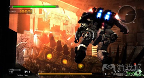
lost planet(from takeinitiative)
红色
而红色通常用于表达与绿色截然相反的意境。对某些人来说,红色暗示危险情况,代表警告或一些消极内容,但如果是红色的心形则可代表爱情和激情。这种颜色也被交通灯所采 纳,在英国有许多路标也使用了红色元素。
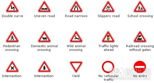
road signs(from takeinitiative)
在游戏设计中,人们也在HUD中使用红色描述角色性命危险的状态,但也可以用红色健康条表达同样的意思。我认为这种用法的原因在于,红色总让人联想到鲜血,所以它很适用于 游戏角色的健康条(如下图《神鬼寓言》的健康条)。

fable_health(from takeinitiative)
白色
白色通常被视为纯洁、宁静、恬静的象征,它会唤起一种淡定的情感。在游戏设计中,白色被广泛用于制作脱离背景色彩的图标、物品或文本,从而吸引玩家注意力,或向其指明 具有重要意义的信息(如下图《神鬼寓言》中的白色标志)。
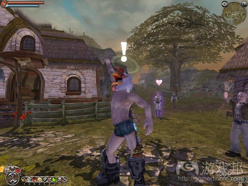
fable(from takeinitiative)
黑色
黑色是多数人公认的消极象征,它经常与黑暗、恐怖、邪恶或死亡形影不离。黑色与白色相反,常被视为与“正义力量”作对的“黑恶势力”。它和许多暗色被广泛用于创造封闭 的环境,让这些环境看起来更加可怕,让玩家产生一种恐惧感。
灰色
与黑色一样,灰色常与沉闷、了无生气和死气沉沉相挂钩。现在人们经常用灰色制造玩家死亡的氛围,所以如果游戏视窗为彩色状态,玩家就仍有生命存在,如果视窗颜色淡出, 也就意味着玩家已经毙命(游戏邦注:例如《质量效应》和《侠盗猎车手4》的用法)。

Heavy-Rain-3(from takeinitiative)
PS 3游戏《暴雨》使用灰色和暗色调制造一种沉闷的场景,让玩家立即产生一种寒冷、潮湿和阴郁的感觉。
黄色
与红色一样,黄色对一些人来说也带有对立的双重含义。有些人会将黄色与明朗、夏天和温暖相联系,由于这也是一种高反光的色调,它也常与黑色背景相结合,用于创造醒目的 文本内容。

Warning Signs(from takeinitiative)
黄色还广泛用于生物危害的警告信息,交通灯则通过黄灯提醒路人绿灯将至,请注意路况。
《魔兽世界》使用黄色警告信息显示危险区域,强调玩家该区域并非久留之地。
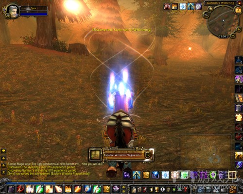
魔兽世界(from takeinitiative)
粉红色
粉红色在最近十多年的游戏设计中运用较为普遍,它常与有趣或小女孩元素相联系,但最近已有更多成人用户也开始接受粉红色的产品。游戏公司常用这种色彩包装掌机设备,使 其迎合更广的用户市场,向那些从未接触掌机设备的年轻女孩兜售产品。可见粉红色对世界的影响力更是不容忽视。
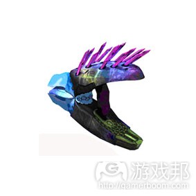
与白色一样,粉红色通常也用于制造游戏中的特殊物品,使其在周围环境中更为醒目,向玩家突出相关信息。《光晕2》和《光晕3》使用粉红色(以及其他异域色彩)代表Needler 等外星武器。
needler(from takeinitiative)
只要使用得当,颜色会成为一种强大的武器,让游戏有效地向玩家提示信息。
当代多数游戏都会巧用色彩来吸引其瞄准的用户群体,并传达关于游戏场景的相关信息。但也有一些游戏选择控制游戏色彩,仅采用黑白双色传达视觉形象,也有些游戏通过这种 方式创造一种类似老电影的怀旧感。
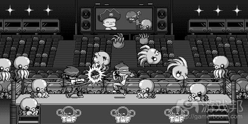
Pirate Baby’s Cabana Battle Street Fight(from bdcomics)
也有人会运用色彩来降低内容的暴力格调,例如2003与2004年由昆廷·特拉蒂诺导演的电影《杀死比尔》。在一些欧美电影中,运用黑白两色来减少画面暴力感的做法并不鲜见。
全屏效果(Full Screen Effects,简称FSE)
开发者还可以通过运用色彩填充环境,从而让玩家产生一种身临其境之感。
现在多数游戏都会在整个游戏场景中运用明亮色彩,只有当特别强调某个时刻之时,才会转换成黑白基调。在《质量效应》中,当游戏故事主角Shephard失去所有健康值时,所有 游戏视窗的颜色都会淡出,强调主角已死的情况。我们之前的文章曾提到灰色、黑色总让人联想到沉闷、无精打采和死气沉沉的氛围,所以这类颜色很适用于表达角色死亡的场景 ,设计师可运用这类色彩向玩家释放消极信号。
有些游戏会使用血迹飞溅作为FSE,这对玩家来说也蕴含了一种消极意义,而画面呈现鲜红的血迹时更是如此,因为这种情况通常意味着游戏角色正在遇害并丧失健康值。这种FSE 在《战争机器》中的运用尤为典型。
随着越来越多游戏问世,设计师愈发难以创造出利用色彩创造出既有新意,又不会让玩家对新系统感到陌生的视觉特效。于是有些游戏就借鉴其竞争对手的做法,重复使用玩家容 易理解的特效。这样玩家会更快适应这种特效,而设计师则可由此分散出更多精力设计游戏的新功能。
吸引玩家注意力
设计师还可通过色彩为玩家指出游戏的特定内容,或者强调游戏视窗、HUD或菜单系统中含有特殊信息的对象。
在菜单系统中,更明亮的颜色通常用于指向刚刚选择的对象,提醒玩家自己正选择的内容。而其他选项在此时通常以更暗的颜色显(游戏邦注:或者与游戏主色调相同的色彩)告 知玩家这些属于他们暂时无需注意的选项。
有些游戏的视窗也会使用更明亮色彩的物体吸引玩家注意力,虽然这种突出彩色物体的方法在一定程度上很管用,但由于玩家看到这种视觉元素,就会意识到自己是在玩游戏,所 以它也会产生削弱玩家沉浸感的副作用。与此同时,这种做法也会对游戏的难度造成影响,因为它会指出游戏的关键环节,让游戏中的谜题更易为玩家所破解。
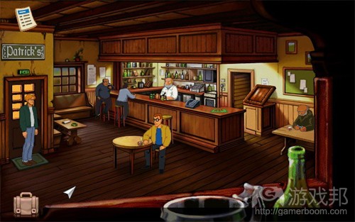
断剑:圣堂武士之谜(from takeinitiative)
现在有许多游戏并不主张为玩家特别指出某项物品,但会在屏幕上显示GUI按钮,告知玩家如何获取道具的信息,并通过这种方式为其指出道具所在。有些游戏只有在玩家走到一定 距离时才会突出其寻找的物品,让他们快速获取道具,避免因其他抢眼的道具而分心。
在2D游戏中,开发者为了区分背景和前景,通常也会在不同区域采用暗色和亮色来达到这一效果。背景一般情况下会采用暗色元素,而前景及其物品通常是更亮的色调。但有时候 也有游戏会将两种做法对调以达到同样的效果(如下图《断剑:圣武士之谜》所示)。

断剑:圣堂武士之谜(from takeinitiative)
总之,我们有多种运用色彩的方法来转移或吸引玩家注意力,创建不同氛围或向玩家传达信息,你只需要找到最合适的色彩运用方法,就有可能为自己的游戏加分增色。
相关拓展阅读:篇目1,篇目2(本文由游戏邦编译,转载请注明来源,或咨询微信zhengjintiao)
Colour within Game Design: Colours with Meaning
Colour is a very powerful thing. From a young age we are taught to associate colours with certain feelings, thoughts and meanings, even subconsciously. In games, designers use these associations to connect with the player and communicate with them subconsciously telling them that i.e. their health is getting low. By choosing to colour health green when the players health is between 75% – 100% in the health meter, and slowly changing to red when the health decreases from 75%, this will tell the player that when their health level is green this is ‘good’ and when it’s red that this is bad.
Colour can be used in the following areas of games: menus, the Heads Up Display (HUD), font and in the game window.
Colours with Meaning
Green
When people see green they immediately think ‘Go’ or of something positive. That is because green is used everyday in traffic systems and checking something off of a list i.e. the tick colour will most likely be green.
So a positive association with the colour green has been built up by us so whenever we see the colour green used we immediately think that whatever is being highlighted by that colour, be it either a word or icon, will be depicting positive information.Game designers quite often use green in games to depict a safe amount of health for the character via the HUD like in Lost Planet: Extreme Condition.
Red
When red is used it can mean two different and opposite things. To some it would immediately signify danger, a warning or something negative but when used in the shape of a heart can symbolise love and passion. Again this is to do with traffic lights, but also various road signs (in the UK) are outlined in red.
But of course, red is also used to colour heart shapes and signifies love.
In game design red can also be used in the HUD to depict a dangerously low amount of health for the character (when used in a health meter that changes from green to red) but can also be used as the entire colour of the health bar. The reason for this I think, is because when you think of health you think of blood and blood is red so it is an appropriate colour for the health meter as shown in Fable.
White
White is seen as a pure, serene and tranquil colour and it provokes a sense of calm from many. In games white is used in many ways. It is usually used to make icons, objects or text stand out against the environment or a dark background to draw the player’s attention to something significant or important. This is depicted in the Fable screenshot below.
Black
The colour black is mostly seen in a negative light as it’s usually associated with darkness, scary, evil and death. Black is considered the opposite to white and is considered the ‘bad force’ in constant struggle with ‘good forces’. In game design this colour and alot of other dark colours are used a lot to create enclosed environments and make them feel more dreary and create a sense of fear within the player.
The colour black is also used quite often with the colour white to display text. As they are the opposites of the scale, one reflects the most light and the other absorbs the most. So by putting black text on the top of a white background or white text on a black background helps the player by making the text visibly clearer (this will be further discussed in a later article).
Grey
Just like black grey is associated with dull, drained and lifeless feelings. Greys are now being used more often in death sequences of games when the player dies. So the colour in the game window represents life and being alive whereas when you die the window is drained of colour like in Mass Effect or Grand Theft Auto IV (this will be discussed further in a later article).
The PS3 title Heavy Rain uses greys and dark colours to create a dreary environment shown in the screenshot below. Immediately you get the sense of a cold, damp and unpleasant environment.
Yellow
Like red, yellow also has a double meaning with some people. To some yellow is associated with brightness, the summer and warmth. Also because it reflects light more than other colours it is generally used as a text colour against black backgrounds.
Yellow is also associated with warnings like biohazard signs. As the amber light on traffic lights suggests to pedestrians to be wary that the lights are soon about to change to green and they need to be clear of the road.
Games like the popular World of Warcraft use the warning association with the colour yellow by using it to tinge plagued and diseased areas to highlight to a player that this area is not completely safe to be in.
Pink
Pink has also been used more in games over the past ten years. Pink has mostly been associated with fun and baby girls but recently more people especially men have been adopting more pink products. Games companies have even used this colour to their advantage by colouring their consoles in a variety of shades of pink to help widen their market and sell their products to young girls who previously would not have touched consoles. So pink is definitely having a bigger impact on the world.
Within actual games pink, like white has been used to make certain objects stand out to players and show that they are not a part of the norm. In Halo 2 and 3 pink (and other exotic colours) are used to signify aliens weapons like the Needler.
Colour can be a very powerful thing when used correctly especially when implemented games. So make sure that when you use colours in your games you think about the meanings associated with them.
The majority of current generation console games use colour to attract their chosen demographic and convey the type of environment that their game is based within. Although using colour can convey a lot of information to the player just by looking at it, some games chose to restrict their colour palletes to black and white only. Some games do this to create a more old-fashioned feel to the game like in old films before colour crept into every type of media we have.
Some may do this to lower the feel of violence as was allegedly done within the 2003 and 2004 film Kill Bill by Quentin Tarantino. It was thought that the goriest fight scenes in American and Europe releases of the film were portrayed in black and white to reduce the level of violence within those scenes.
The Youtube clip below shows a video of Pirate Baby’s Cabana Battle Street Fight that could be considered quite violent for some. Be advised that if you watch the video you may be exposed to scenes of violence.
Full Screen Effects (FSE)
Using colour can immediately fill an environment with feeling that can draw the player into the correct frame of mind for that game.
Most games nowadays rely on bright colours throughout the entire game and only switch to black and white scenes to emphasise moments within the game. In Mass Effect when the main character Shephard loses health all of the colour drains out of the game window to emphasise that the character is dead. As discussed in the previous post, colours like grey and black are associated with dull, drained and lifeless feelings so using these colours at the point of death of a
character are very appropriate as the designers want the player to know that something negative has occured.
Some games use blood splatters as their FSE. Again this carries a negative meaning to the player especially if the blood is coloured bright red as they will see that they are taking damage and that their health is being reduced. This type of FSE is used in Gears of War (shown below).
The Youtube clip below shows a video of Gears of War that could be considered quite violent for some. Be advised that if you watch the video you may be exposed to scenes of violence.
As more and more games emerge it can be difficult for designers to come up with new ways of creating visual effects with colour that are new but that also won’t alienate or confuse players to this new system. Some games have re-used the effects that players find easy to understand from their competition. By making these new games use the same effects with colour, players will get accustomed to these effects so designers can focus more on delivering instructions on new features for their game.
Drawing Attention
Colour is also used to draw attention to specific aspects of the game or important information by highlighting objects in the game window, the HUD or the menus system.
In menu systems, brighter colours are used around the currently selected option to make the player aware of what they will be choosing. The other options are usually coloured in dark colours (or something in keeping with the colour scheme of the game) to draw the players attention away from these options.
Using brighter colours on objects to attract the players attention has also been used in the game window within some games, mainly older titles. Although this is an effective way of drawing the players attention by highlighting the object with a colour that will stand out from the background environment, doing this also makes the player more aware that they are playing a game and are less immersed in the game world. This also affects the difficulty of the game as
pointing out crucial parts of the game will make game puzzles easier for most players. See how many interactable items you can see within the screenshot below from Broken Sword: Shadow of the Templars (SotT).
Many games nowadays do not highlight the object but show GUI buttons on screen to provide the player with information of how to acquire the item and highlighting it to them. Some just highlight the object when the player is within a certain distance so the player can acquire it quickly and are less distracted by an item that is constantly attracting the players attention.
In 2D games to differentiate between the background and the foreground, dark and light colours can be used in these areas. The background is usually coloured in darker shades and the foreground and objects that the player can interact with are coloured in lighter, brighter shades. Although this may be inverted as shown in a scene from Broken Sword: SotT below.
There are a multitude of ways that colours can be used within games to deflect or direct a players attention, to create different atmospheres or reinforce a message to the player. Make sure that which ever way you use colour within your game designs that they are effective and complimentary to your game.




 闽公网安备35020302001549号