


分析手机UI和游戏设计:屏幕vs流
作者:Joseph Kim
引用能够映射出用户在手机游戏中可以轻敲的整个屏幕的概念而使用流设计手机游戏:用户流。尽管像Zynga或GREE等许多大型手机游戏工作室经常会使用流去设计UI/UX,但仍有许多手机应用设计师仍在使用功能设计单独的屏幕。
在本文中我将描述:
屏幕vs流概念:设计屏幕vs流的概念以及为何流在手机游戏设计中如此重要
首选方法:我认为比现在许多工作室所使用的方法更有效的格式和工具(使用Google Docs Drawings)
1.屏幕vs流
在过去几年,因为与许多不同的游戏设计师共事,我注意到许多设计师仍然是通过屏幕设计手机游戏。这意味着什么?
我所看到的典型的过程是从游戏设计文件开始,即列出包含于游戏中的一整套功能。之后,游戏设计师和UI美术师将分解每个功能以及每个功能的游戏屏幕。小型工作室大多会采取这一方法,特别是带有那些来自主机/PC领域的游戏设计师的工作室。主机/PC设计师不习惯面对着手机应用中更常见的屏幕设计。在《使命召唤》的“核心循环”中呈现给用户多少个屏幕。
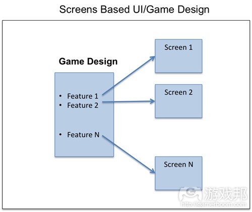
screens-based-UI(from gamasutra)
对于游戏设计来说这是一个非常简单的(vs整体的)方法。这忽视了用户如何与游戏以及构成整体用户体验的所有方法进行互动,即用户流。
还有一种更好的方法便是考虑用户在你的游戏中的路径以及用户如何穿越所有的这些屏幕去设计手机应用。
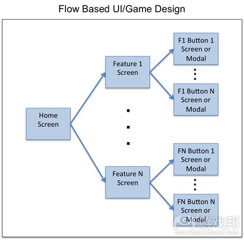
Flow-UI-design(from gamasutra)
游戏设计师和UI设计师能够从这一方法中获得2个主要优势:
理解用户体验:他们能够更轻松地想象并明确用户是如何体验自己的手机应用
避免功能迸发:通过明确所有的流(并且未停留在屏幕上),游戏设计师便不会因为那些自己未预料到的新功能和意外情况而措手不及。
根据我的个人经验,我想说存在许多情况并不会映射出所有能够导致不可预见的意外事件和额外功能的流。这里存在的一个简单的问题是:“当有人轻敲X时会发生什么?”对于每一个按键和可轻敲的图标来说这将揭示那些需要支持的不可预见的功能。
在很多情况下,我们估计功能X的开发需要10天的时间,但是因为一些不可预见的功能,我们可能需要额外增加5天的时间。如果我们还需要图像和额外的UI的话可能还要进一步延长时间。
基于设计方法的流经常能够帮助你制定出更精确的开发时间表。
2.完美的方法:Google Drawing–>紧凑的综述
根据我的经验,设计应用流通常是基于以下两种方法中的一种:
1.Big Ass AI文件:在这种方法中,一名UI美术师(通常是使用Adobe Illustrator)绘制出整套屏幕和流。最终他们将创造出带有最多30几个屏幕的巨大图像,并且有时候还会伴随着一些箭头和注释。这也可以通过功能进行分解,但通常情况下你拥有许多屏幕并且除了一个特定的功能视图外很难再获得更多内容。
2.紧凑的综述:另外一种方法便是基于一种有序的方式罗列所有屏幕,如一个网站上3至4个屏幕或基于JPG格式。这一方法将帮你获得一个较为紧凑的屏幕视图以及整体感的流。
当然了,这两种方法也具有以下弊端:
Big Ass AI文件:
太复杂了,所以导致你很难看清在这大张图像中究竟发生着什么。你很容易迷失于一张大型图像的细节中。
紧凑的综述:
网站格式中缺少了关于流的注释和箭头。
两种方法的共同弊端:
缺少个体和群组保障。
不能分享,合作并允许多名用户同时致力于流文件中。
很难添加并分享评价。
缺少带有修订记录的版本控制。
缺少像轻松编辑/图像插入,复制等主要功能。
所以有什么更好的解决方法吗?
我上述所描述的方法都可以使用Google Docs进行创造!因此我们可以使用Google Docs Drawing格式去采用3列紧凑的综述方法的变量,同时添加注释和箭头,允许合作并使用所有由谷歌所创造的功能。
让我以我去年出于乐趣所进行的一个局部游戏设计为例:
《Fantasy Alliance》流设计例子
在这一解决方法中:
1.工具:前往Google Docs并创造一个Google Docs Drawing
1)点击文件–>页面设置并将宽度改为12″,然后根据你所涉及的屏幕数设置长度
2)点击视图–>100%
3)点击视图–>对齐–>网格
2.组织:交叉组织你的屏幕(游戏邦注:每个屏幕的宽度不应该超过4″)
3.拖放:选择任何网格或最终屏幕,并将其拖放到适当的位置
4.注释和箭头:适当地添加注释和屏幕标题。使用箭头去呈现哪个按键是主要按键或者哪个屏幕需要移动
5.占位符:将每个流与必要的屏幕映射在一起,并将占位符屏幕设置在你还未设计屏幕的位置上。确保所有内容都的更新!
6.安全与合作:设置你的安全许可并与那些能够与你合作的人进行分享。你可以在此留下一些注释。
整体方法:
1.Google Drawing:在最初的游戏设计阶段,使用所有简单的黑白模拟的流创造一个Google Drawing
2.迭代核心设计:与你的设计团队一起在所有主要的流中进行迭代,直至确定了核心设计。如果在此使用合作以及简单的Google Drawing编辑能力的话,那么迭代过程会变得更加简单
3.转向紧凑的综述:一旦完成了核心设计,你将添加增加的功能和设计迭代到适当的位置。牢记始终确保整体游戏带有一个非常简单的综述,并使用所有最新的屏幕或即时更新的模拟创造一个紧凑的综述模拟网站。
1)基于宏观层面你将丢失注释/评论/评价,但这时候你应该基于特定功能或迭代层面进行挽救
2)对于依赖于功能的复杂性与规模的新功能来说,你应该使用Google Drawing执行一个具有特定功能的流文件并在准备好的时候添加紧凑的综述内容
(本文为游戏邦/gamerboom.com编译,拒绝任何不保留版权的转功,如需转载请联系:游戏邦)
Mobile UI and Game Design: Screens vs. Flows
by Joseph Kim
Context:
Mobile game design by flows refers to the concept of mapping out the entire set of screens a user can tap through in a mobile game: the user flows. While many of the larger mobile game studios such as Zynga or GREE routinely design UI/UX by flows, many mobile application designers are still designing individual screens by feature.
In this blog post I describe:
Screens vs. Flows Concept: The concept of designing screens vs. flows and why flows are critical in mobile game design
Preferred Approach: A format and tool (using Google Docs Drawings) that I believe is superior to existing approaches found in many of the studios today
1. Screens vs. Flows
In the past few years, having had the opportunity to work with and collaborate with a number of different game designers I’ve noticed that many designers are still designing mobile games via Screens. What do I mean by this?
A typical process I see is to initially start with a game design document that lists a set of features that comprise the game. After that, the features are broken down and then a game screen for each feature is designed by game designers and UI artists. This approach seems generally true in small studios and especially with game designers coming from the console/PC space. Console/PC designers generally aren’t used to a bunch of screens that is more typical within mobile applications. How many screens is a user presented with in the “core loop” of Call of Duty?
screens based UI
This is a very reductionist (vs. holistic) approach to game design. This ignores how users actually interact with the game and all of the paths, the user flows, that comprise the overall user experience.
A better approach is to design your mobile application considering the user’s path within your game and how the user will actually traverse all of the screens.
Flow UI design
Game and UI designers get 2 primary advantages from this approach:
User Experience Understanding: It becomes much easier to visualize and walk through just how a user will experience your mobile application
Avoiding Feature Explosion: By mapping all of the flows (and not stopping at the screen level) game designers don’t become surprised with new features and contingencies they didn’t expect
I can speak from personal experience in saying that there have been numerous occasions where not mapping out all of the flows has led to unforeseen contingencies and additional required functionality. The simple question: “What happens when someone taps on X?” for every single button and tappable icon will almost always reveal unforeseen functionality that will need to be supported.
In many cases, we may have estimated say a 10 day development schedule for feature X but then due to unforeseen functionality it turns out we now need to expand the schedule by another 5 days (for example). This is even further compounded when we also need art and additional UI which bottlenecks development.
A Flows based design approach will often lead to much more accurate estimates of development schedule.
2. Preferred Approach: Google Drawing -> Compact Overview
In my experience, designing application flows is typically handled in one of 2 ways:
1.Big Ass AI File: In this approach, a UI artist will (often using Adobe Illustrator) draw out the full set of screens and flows. The end result is a really large image with even up to 30+ screens in some cases with arrows and notes all over the place. It’s also possible to breakdown by feature, but you typically still have a lot of screens and it’s difficult to get more than a specific feature view in that case.
2.Compact Overview: Another approach is to just stick all of the screens in an ordered way e.g., 3-4 screens across on a website or JPG. This approach gives a very compact way of viewing the screens and a general sense of flow.
Both of these approaches, however, suffer from some major disadvantages as follows:
Big Ass AI File:
Too difficult to easily see what’s going on with such a big ass picture. It’s easy to get lost in the details of a really big image.
Compact Overview:
In website form, lacks notes and arrows for flows
Both Methods:
Lack of individual and group security
Inability to share and collaborate and give access to multiple users who can work on the flows document simultaneously
Very difficult to add and share comments
No version control with revision history
Lack of other key features such as easy editing/image insertion, copying, etc.
So what is a better solution?
Well much of what I describe above comes built in with Google Docs! Hence, we can just adopt a variation of the 3 column compact overview method using a Google Docs Drawing format but add notes and arrows, enable collaboration, and use all of the nifty features built in by Google.
Let me show you a simple example from a partial game design I worked on for fun last year (Click View->100% for better viewing):
Fantasy Alliance Flows Design Example
In this solution:
1.Tool: Go to Google Docs and create a Google Docs Drawing
1)Click File->Page Setup and change the width to about 12″ and the length according to how many screens you will design
2)Click View->100%
3)Click View->Snap To->Grid (I find it easier to align my wires this way to the grid boundaries)
2.Organization: Organize your screens 3 screens across (hence each screen should take up slightly less than 4″ width)
3.Drag and Drop: Take any wires or final screens and just drag and drop them into place
4.Notes and Arrows: Add notes and screen titles as appropriate. Use arrows to show where buttons should lead or screens should flow
5.Placeholders: Map every flow with the necessary screens and just put placeholder screens where you haven’t designed that screen yet. Keep everything up to date!
6.Security and Collaboration: Set your security permissions and share with the other folks who should be able to collaborate with you. You can leave notes here as well.
Overall Approach:
1.Google Drawing: During the initial game design, create a Google Drawing with all of the flows in rough black & white mocks
2.Iterate Core Design: Iterate with your design team on all of the major flows until the core design is settled upon. Here the iteration process will be much easier with the collaboration and easy editing capabilities of Google Drawing
3.Shift to Compact Overview: Once the core design is complete you will now be adding incremental features and design iteration as appropriate. To keep a very easy overview of the whole game in mind create a Compact Overview mocks website with all of the latest screens or mocks always updated in real time.
1)You’ll lose notes/review/comments at a macro level but at this point you should be doing that at the specific feature or iteration level
2)For new features depending on the complexity and size of the feature, you could do a feature specific flows document using Google Drawing and add to the Compact Overview when ready
That’s it. If you know of a better solution please reach out and comment below…(source:gamasutra)

")
")
")
")


 闽公网安备35020302001549号