阐述针对多人游戏设计开放式UI的挑战性
作者:Danielle Bailey
作为Grantoo的美术和UI设计师,我有幸参与设计了一个独特的产品:将异步玩法引进手机游戏的多人模式SDK。这个SDK的一个独特之处就在于能够剥皮,它的设计能够呈现游戏的风格和感觉,而不是令玩家脱离核心体验。
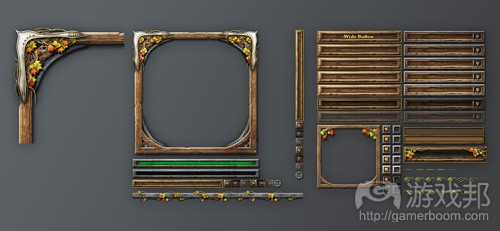
该技术可实现这一操作,因为它提供了许多定制图片和选项。开发者控制了背景图片,按钮颜色(都分别有一个上下状态 )、菜单颜色、图标、加载屏幕以及运用于整个SDK不同的条幅广告,这一切都可以通过控制面板更新和调整。
当我们开始开发时,我们向开发者允诺的定制程度让我们陷入了严重的设计挑战。我们必须想法设计看起来像是可爱儿童所接触的游戏UI。另一个挑战就在于,我们经常收到来自不同信息源并且互有矛盾的反馈,它们都有各自的需求和必须解决的问题。
以下就是我在过去一年中所掌握的经验。
游戏美术很重要
这种资产可能严重影响游戏体验。高质量的背景以及条幅广告确实不容小觑。由于我们产品的UI结构极为普通,它只是与围绕它的美术一样优良。当图像很有趣时可以得到最佳结果,不会显得过于杂乱,并能清晰显示游戏品牌。
以这些资产帮助开发者实现这种水平的质量是这个过程中的一项工作。我发现将所有关于如何让资产对应SDK的详细文件和指南整合到一起,有助于实现理想的效果。
管理反馈
从大量来源中筛选反馈是一项困难的任务。以我个人经验来看,人们并不一定很清楚如何说明在设计中的困扰。最好是深入提问和探究,尝试找到问题的根源,将功能性问题与个人观点区别出来。
例如,有些人可能偏爱圆角按钮,有些偏爱方形按钮。哪一个才是正确的呢?
最好的建议就是问问他们为什么喜欢不同的形状。你可能会发现问题并不在于按钮的形状。我习惯让他们列举自己所喜欢的美术作品案例。看过实际的案例之后,可能就会清楚他们真正需要的实际上是更小的按钮,形状并不重要。
重视分析的作用
反馈和个人意见的另一个问题在于,它可能无法解决问题。所幸我能够运用我们的分析工具引导我们走向正确的方向。在测试一种新视觉风格或功能时,我们经常发现自己认为将会发生的与实际情况存在出入。有时候唯一的方法就是通过观察它的操作情况来审视自己的设计是否合理。
不要过于主观
正如人们所言,你无法一直取悦所有人。你应该确定多数人会支持的功能或视觉风格,即便这种决策可能令一小部分人不快。
无论这种决定是根据反馈、分析、技术局限性还是一种直觉而得的结果,你都只能尽可能将解决方案引向最好的方向。有些人可能会有所不满,但他们通常会理解这是当前你所能制定的最好决策了。
作为Granoo设计师的一个美妙之处就在于,我们可以通过自己的错误快速吸取教训并进行纠错。我们能够快速调整方案,这让我们获得了更多自由,从而多次检验设计直到发现最可行的解决方案为止。设计挑战并不会止步,但当你创造了能够让客户获得更多自由的产品时,你就会知道这些挑战真的值得一试。(本文为游戏邦/gamerboom.com编译,拒绝任何不保留版权的转载,如需转载请联系:游戏邦)
The Challenges of Creating An Open Ended UI Design For Multiplayer Games
by Danielle Bailey
The following blog post, unless otherwise noted, was written by a member of Gamasutra’s community.
The thoughts and opinions expressed are those of the writer and not Gamasutra or its parent company.
As the resident artist and UI designer for Grantoo, I’ve been lucky enough to assist in the design of a unique product: a multiplayer SDK that brings asynchronous play to mobile games. One of the things which makes the SDK unique is its ability to be skinned, it is designed to take on the look and feel of the game instead of taking the player out of the core experience.
The tech can achieve this because it offers up many customizable images and options. Developers have control over background image, button colours (both an up and a down state), menu colours, icons, loading screen as well different banners which are used throughout the SDK, all of which can updated through the admin panel and changed on the fly.
When we began development, the level of customization we were promising developers introduced us to some serious design challenges. We needed to figure out how to design a UI that looks just as great labeled as a cute kid’s game as it does as a sleek racing title. Added were the challenges of receiving conflicting feedback from a variety of different sources, each with their own needs and problems that needed to be addressed.
Here are a few things I have learned during this past year:
Game Art Matters
It is amazing how the assets can drastically change the look of the experience. High quality backgrounds and banners really do make the difference. Since the UI structure of our product is pretty generic, it is only as good as the artwork that surrounds it. The best results are achieved when graphics are fun, aren’t too busy and clearly show the game brand.
Helping developers achieve this level of quality with the assets has been a work in progress. I discovered that putting together detailed documentation and guidelines on how assets fit within the SDK has certainly helped produce some great results.
Managing Feedback
Sorting through feedback from multiple sources is difficult. In my experience, people aren’t always clear when it comes to explaining what bothers them about a design. It always helps to dive deeper and ask more questions, try to get to the root of the problem and separate a functional problem from personal opinion.
For instance, some people might prefer a round button and some may prefer a square. Which is correct?
The best advice I can give is to ask why they prefer a different shape. You may find that it isn’t the shape that bothers them but something different. I like to ask for visual examples of work they do like. After taking a look at actual examples it may become clear that what they really wanted was in-fact a smaller button and the shape didn’t really matter at all.
Analytics Help. A Lot.
Another problem with feedback and personal opinion is that it may not address the problem. I’m lucky enough to have access to our analytics to steer us in the right direction. When testing a new look or feature, we often find that what we think will happen and what happens are different. Sometimes the only way to know for sure that what you designed works is by watching it in action.
Don’t Take Things Personally
As they say, you can’t make everyone happy all of the time. You need to make the tough calls and decide on a feature or look that the majority can live with, even if it may put-off a few.
Whether this decision is made based on feedback, analytics, tech constraints or just a gut feeling, you can only steer the solution in the best possible direction. Some may not be entirely content, but they’ll usually understand it’s creating the best outcome with what you have.
A fantastic thing about being a designer at Granoo is that we can learn from and quickly correct our mistakes. We are able to change things on the fly which gives us more freedom to experiment with our design until we find the solution that makes the most sense. Design challenges will continually roll in, but when you create something that allows a greater amount of freedom for your clients, you know those challenges are worth tackling.(source:gamasutra)
下一篇:市场上的鲸鱼用户是不是太少了?


 闽公网安备35020302001549号