分享用Photoshop为地图上色的技巧
作者:Michael Wenman
本贴图片是用Photoshop所制作,因为它是我了解和使用的工具。如果你可以使用GIMP的图层和滤镜,那么这些技巧对你也适用,只是我并不使用GIMP。
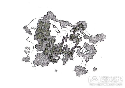
为地图上色需要一个起点,在这种情况下,起点就是一个手绘地图。我为最近由Dyson Logos举办的“Dungeon of Lost Coppers”活动绘制了这个地图。这是我第二次参与该活动,所以我想做一些极为不同的东西。
我决定根据现成的地下城环节尽量将地图做得更开放一些。在我绘图过程中,我在废墟和岛屿这两个选择中举棋不定……后来我选择了后者。
最基本的地图风格就是我通常所做的那一类(碰巧与Dyson通常制作的那种地图类型极为相似)。我并不想添加过多额外房间,而是尽量在当前约束条件中使用开放场景。
我刚开始绘制这个地图时,其中就已经有了一些入口。我想让它更独特一点,与那些已经参杂其中的入口更为不同。因此给它上色,对地图进行了一点调整,以打破垂直和水平这种二元划分法的常规。
(这张图是黑色背景,以扫描的地图倾斜地靠在上面。最初的扫描是白色矩形,灰色矩形是我原来打算在倾斜之前添加的边缘区域,黑色则是深色背景图层。)
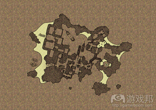
将其载入Photoshop之后,我复制了扫描层图像。这些复本之一就含有一个运用其中的临界值,所以一切比中灰更暗的颜色都会变黑,一切比它更浅的颜色都会变白。这就会制作出一个相当粗糙而荒凉的图像,所以它就会调低50%的不透明度(这也是上图产生灰色边缘的真正原因)。原图和调整后的图都会转变成“多个”图层,这会让位于它们之下的图层更暗。
接下来我们开始添加一些纹理……第一个是石头的通用纹理。这要在手绘地图的下一个图层进行。整个图层填充了一种表面色,具体是什么颜色并不重要,它只是一个由图层风格操纵的占位符。Photoshop中有一些标准纹理可用于图层风格,由为我赶时间,所以只使用了图案叠加模式“紫色雏菊”,之后运用了一种含50%不透明度的棕色叠加色。它呈现了一种模糊的岩石外观。我原本可以花更长时间,尽量获得一种准确的颜色,但略有模糊的效果已经足够呈现我所需要岩石外观了(我是色盲,如果我过去沉溺其中,可能就会做得更糟)。
下一步我使用了魔术棒工具选择了岛屿的海滩。我在绘制地图之下,岩石之上创造了一个新图层。我将其填充为白色,并添加了一个新图层风格。此时的纹理是“黄菊”,应用了50%的不透明度,这让它看起来更浅一些(我认为这看起来更为沙化)。
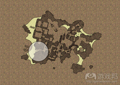
地图中还有一点地方看起来不太对劲(游戏邦注:即上图中圆圈所标注的地方),其中的沙子引向了地图中的一个神秘的门,我不喜欢它的设计,所以使用了一个大型的褪色橡皮擦轻轻抹掉了一些图层,令这扇门逐渐淡入海滩上的沙子,令其成为图层中完整的一部分。
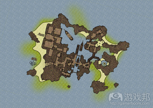
下一步我们将为地图中所有非陆地区域制作水印效果(新图层在绘图之下,但在海滩图层之上……魔法棒选择潮湿的部分,填充区域使用“地毯”图层风格的纹理,并略微调整颜色令其看起来更为潮湿)。
它看起来开始更像一个岛屿了,当然也更接近于我原先的想象……但还不能算是完工了。
我们在第一部分中得到了一个基本的结构,但图片还是有一点平凡。
所以,我决定添加更多图层。每个图层就会提供更多的信息和视觉效果。
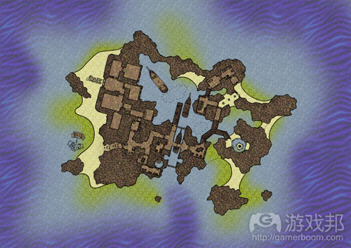
首先,在“沙滩”图层之下,我添加了一个“湿沙”图层。
当某物质是潮湿的时候,它就会开始变得有点暗,在颜色上也更丰富一点。图层风格沿袭了沙地图层的线索,采用了不透明度为100%的“黄菊”纹理模式。为了绘制这一图层,我使用了喷枪工具式的笔刷,黑色的大扩散效果(游戏邦注:在此颜色并不重要,因为一切都会被纹理所覆盖)。
我沿着海岸线进行喷雾,制造了沙地从这些区域延伸到水里的模糊效果。我确保喷雾不会靠近外露的岩石,因为这些是更为参差不齐的岩石,而非岛屿柔和的沙滩边缘。地图西部上的海滩笔刷用得更大,不透明度也降为25%左右。我花了一些功夫才得到了自己理想的效果。
使用相同的模糊技巧(新图层、新纹理、笔刷来标注图层),我创造了岛屿四周的深水区。这里有一个“波浪”模式的叠加效果,很接近于我这张地图的需求,但其颜色与地图上其他元素相比有点不刺眼了。所以我没有调小它的不透明度(这会暴露我用于标注该图层的颜色),而是调小了整个图层的不透明度。这令图片看起来效果更佳,令浅水图层的一些颜色渗透出来。
在岛屿南部,我确保深水引向小岛的神秘码头,这是一个可容纳Isabel船舰进入的安全通道。
下一步我的重心转移到了地图上的新物质——木头。这适用于船只,以及在岛屿内部水道的防洪堤。
在绘制地图之下的一个新图层中,我使用多边形套索工具标出了木制区域。每个木制区域都用油漆桶填充了木质的棕色。我使用了与地图上已经绘制的一些木制物品相同的颜色(我后来很快忘了这些……我原本打算让这些物品在各自区域中更为醒目,但由于其他纹理的覆盖,效果似乎并不理想)。
现在地图看起来更有趣一点了,但仍然有点平凡……这就需要一点独特的技巧令其生色。
目前一切都还只是以某各方式加入的普通颜色图层。我相信多数人可能会在自己的图像程序中调整我所呈现的想法(只要他们能够处理图层即可)。添加特定深度可能会更棘手一点。
在Photoshop中我结合了一些上文已经讨论过的技巧,使用了“斜角”图层风格。
(在深入讨论之前,我忘了提一下船和防洪堤的木质纹理有一个粗糙的单色潦草纹理。使用一点点纹理总能让事物看起来不那么乏味。)
为了关注隧道的技巧,我将除去目前已经运用的一切其他颜色。
首先,我在走廊使用了一种新的石头纹理。在这种情况下,使用什么纹理确实不重要,只要它有一点参差不齐和岩石的效果即可。添加一个新图层(在所有其他纹理图层之上,但在绘制图层之下),之后使用魔术棒工具选择每个房间……(游戏邦注:当你按住Shift键时,可使用魔术棒工具选择多个区域)。像之前一样,我使用了“Select->Modify->Expand”工具为所选区域增加了一两个像素。
当选择相关区域后,就可以使用油漆桶为所有区域填充一种独特的颜色……我只使用了黑色,因为这更简单。图层风格拥有“尖锐笔刷”叠加模式。
这有一点绿色,虽然它可能很符合主题(毕竟小岛地下隐匿处也有一些潮湿和发霉),我认为它看起来还不够像岩石。更深的棕褐色颜色叠加适用于该图层风格。颜色叠加不透明度降至50%,这样就可以透漏出其中的纹理。
下一步我们要添加“内阴影”,它实际上创造了一种纸张上被割了一个洞,你可以从底部物质看出的这种效果。在这种情况下,所谓的“底部物质”就是我们刚刚运用于房间和走廊的纹理模式。在这张地图中,我将阴影设为15像素的深度,并令其调整为10像素以软化这种效果。至于你自己的地图,你可以通过滑块调整这些值,直到获得你满意的结果为止。斜角面积越大,墙面看起来就会越深,而软化值低,地图上的采光就会越困难。我采用了一些不会让图像看起来过于繁琐又能传达墙体深度的方法,并软化了它的值,直到墙体看起来有点磨损和“千疮百孔”的样子。
现在来处理斜角。这在Photoshop中是一个简单的技巧,它只是另一个针对现成元素添加图层风格的方法。我简单地添加了一个“内斜角”,因为我们想让该效果适用于内部选择的房间和走廊区域。我让它看起来“像凿子一样坚硬”,以便这个斜角的轮廓与墙体的轮廓对应,其深度为100%,方向为“向下”。这最后层面并不会让地图有很大变化,只是调整了光照的强度,以及将创造的阴影效果。
针对我的地图大小,我令斜角为10像素,并以5像素进行软化。这突出了有阴影的墙体,并为无阴影的墙体提供了一些微弱的亮度(灯光会在墙面上反射并折回室内/走廊)。
这是一个无需加以考虑何处布置阴影,何处增加光照的简单效果……一切都是自然而然的结果。
如果我再次制作地图,我可能会调整这一技巧以便获得沙难上的阴影……但这个地图的关键在于隐藏的通道和嵌入神秘洞穴的东西,这正是地图的细节所在。额外细节固然很好,但我们并不想让太多细节使这个地下城隧道黯然失色。(本文为游戏邦/gamerboom.com编译,拒绝任何不保留版权的转载,如需转载请联系:游戏邦)
A Colour Mapping Technique (Part 1)
Michael Wenman
The following few posts use Photoshop, it’s what I use, it’s what I know. If you can use layers and filters in GIMP, then these techniques might work there as well. I don’t know, I don’t use it.
Colouring a map requires a starting point, in this case that starting point is a hand illustrated map. I drew up this map for the recent “Dungeon of Lost Coppers” event hosted by Dyson Logos. It was my second attempt at the event, so I wanted to do something dramatically different.
I decided to make the map as open as possible given the existing pre-defined sections of the dungeon. As I continued drawing, I couldn’t decide between ruins or an island…I went with the latter.
The basic mapping style is the kind of thing I’d normally do (which coincidentally is pretty similar to the type of map that Dyson normally produces). I didn’t want to add too many extra rooms to it, instead opening up the environment as much as possible within the constraints given.
Since there had already been a few entries by the time I started on this map. I wanted to make it a bit distinctive, different to the entries already in the mix. Hence colouring it, and twisting the map a bit so that everything wasn’t just horizontal and vertical.
(This image is a plain black background, with the scanned image of the map tilted and applied to it. The original scan is the white rectangle, the grey rectangle is an added border area I had intended to use before tilting it, and the black is the deep background layer.)
Once adding it into Photoshop, I duplicated the scanned layer image. One of these duplicates had a threshold applied to it so that everything darker than a mid-grey was turned black, and everything lighter was turned white. This tends to make a pretty harsh and stark image, so it is turned down to 50% opacity (the true reason for the grey border on the above image). Both the original image and the modified one are turned into “multiply” layers, that darken anything beneath them.
Next we start adding some textures…first the general texture of the rock. This is done on a layer beneath the drawn maps. The whole layer is filled in with a flat colour, it doesn’t matter what the colour is, it’s just a placeholder to be manipulated by layer styles. There are a few standard textures that photoshop can apply as layer styles; since I was in a hurry, I just used the pattern overlay called “purple daisies” and then applied a colour overlay of brown with a 50% opacity. It gives a vaguely rocky appearance. I could spend longer on it, trying to get an accurate colour, but something vague is fine to give the rocky impression I need. (Besides, I’m colour blind; if I obsess too much I might make it worse).
Next I use the magic wand tool to select the island’s beaches. I create a new layer beneath the drawn maps, but above the rock; I fill it in with white and add a new layer style. This time the texture is “yellow mums” applied at a 50% opacity, this makes it a lot lighter (and I think it looks more sandy).
There’s one bit of the map that just doesn’t seem right (circled above), the sand leads up to a secret door on the map, and I don’t like it, so I use a large faded eraser to softly remove some of this layer away from the door gradually fading into the sand of the beach as the intact parts of the layer remain.
Next we do the same to get a water effect for all parts of the map that aren’t land. (New layer beneath the drawn images but above the beach layer…magic wand selects the wet parts…result is filled, filled area is textured with the “carpet” layer style and slightly colour adjusted to look more watery).
Starting to look more like an island, and certainly getting closer to what I had originally envisioned…but it’s not there yet.
We left the map at the end of part 1 at an adequate state; but the image was generally a bit flat.
So, I decided to add a few more layers into it. Each of these providing a bit more information and visual stimulus.
First, immediately below the “sandy beach” layer, I add a “wet sand” layer.
When a material is wet it tends to be a bit darker, and a bit richer in colour (I could get into the properties of physics that determine this…things like diffraction of light and
scattering of reflection from rough or smooth items, but just trust me on this for the moment). The layer style follows cues from the sandy layer, with a pattern texture of “yellow mums” at an opacity of 100%. To draw this layer I use an airbrush style of brush, big diffuse and black (colour doesn’t matter because everything is going to be overlaid with the texture).
I spray along the coastlines where the beaches are, giving a vague impression that the sand continues down from these areas an into the water. I make sure not to spray near the rocky outcrops, because these are more jagged rocky drops rather than soft sandy borders to the island. The beach to the maps west is done with the size of the brush dialled up even more and the opacity turned down to 25% or so…it takes a few sweeps to get a look I’m happy with.
Using the same vague technique (new layer, new texture, airbrush to mark out the layer), I create the deep water around the island. There is a “waves” pattern overlay and that comes pretty close to what I want for this map, but the colours are a bit too harsh compared to everything else on the map. Instead of turning down the opacity of the pattern overlay (which would expose the colour I’ve been using to mark out the layer), I turn down the opacity of the whole layer. This blends it in better, and allows some of the colours from the shallow water layer to seep through.
Toward the south of the island, I make sure to indicate deep water heading into the secret dock of the island, that’s the safe passage for Isabel’s ships to get in or out.
Next I move away from the water and focus on a new material for the map…the wood. This applies to the ships, and the piers running across the islands interior waterways.
In a new layer just under the drawn map I mark out the wooden areas using the polygonal lasso. Each of the wooden areas it bucket-filled with a woody brown colour. I’m in a hurry here and it give a bit of contrast…so it works at a pinch. Using the same colour I spray a few clusters of wooden items that have been drawn into the maps (I promptly forget about these later…I had intended to make these items stand out in their respective rooms, but something didn’t quite work and they just ended up getting covered by other textures).
That’s about it for the flat layers of colour. The map is looking a bit more interesting, but still a bit flat…and that’s where a distinctly different technique comes into its own.
So far everything has just been flat layers of colour, often blended in some way. I’m sure that most people would be able to adapt the ideas I’ve presented in their own graphic programs (as long as they are capable of handling layers). Adding specific depth might be a bit trickier.
In Photoshop I use the “Bevel” layer style in combination with some of the techniques already discussed.
(Oh, before I go much further, I forgot to mention that the wood texture of the boats and piers had a rough monochromatic scratchy texture applied to it. A bit of texture always stops things looking too flat.)
To focus on the technique for the tunnels, I’ll strip away all of the other colours that have been applied so far.
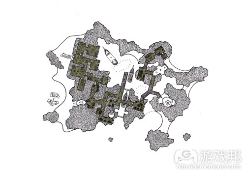
First, I apply a new stone texture to the corridors.In this case, it really doesn’t matter what the texture is, as long as it’s a bit jagged and rocky looking. A new layer is added (on top of all the other textured layers, but beneath the drawn layer), then each room is selected with the magic wand tool…(when you hold the shift key down with the magic wand tool, you can select multiple areas). Like before, I use the “Select-> Modify -> Expand” tool to increase the selected area by a pixel or two.
Once the relevant area is selected, a paint bucket fill can be used to give all of these areas a distinct colour…I just use black because it’s easier. The layer style has a “spiky bush” pattern overlay applied to it.
This is a bit green, and while that might be suitably thematic (after all, there would be a bit of moisture and mildew in a subterranean island hideaway), I’ve decided that it doesn’t look rocky enough. A colour overlay of a dark tan colour is applies to the layer style. The colour overlay is turned down to 50% opacity so that the texture can be seen through it.
Next we add an “inner shadow”, it basically gives the appearance that a hole has been cut out of some paper and you can see the material underneath. In this case the “material underneath” is the pattern texture we just applied to the rooms and corridors. For this map I’ve made the drop shadow 15 pixels deep and have softened it by 10 pixels. For your own maps, you might want to play with the sliders on these values until you get something that you like. The bigger the bevel size, the deeper the walls will look; the lower the softening, the harder the lighting will look for the map. I went for something that conveyed the wall depth without overwhelming the image, and softened it to the point that the walls look a bit more worn and “cave-ish”.
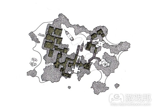
Now for the bevel. This is a simple technique in Photoshop, it’s just another layer style to add to the others already in place. I simply add an “inner bevel” because we want the effect to be applied inside the selected room and corridor areas. I make it “chisel hard” so that the contours of this bevel will specifically follow the contours of the walls, it is marked as a depth of 100% and has a direction of “down”. These last aspects don’t really make much difference except to change the strength of the highlights and shadows about to be created.
For the size of my map, I make the bevel 10 pixels wide and soften it by five pixels. This accents the walls where the shadow lies, and provides a subtle highlight to the un-shadowed walls (giving the illusion that a light is reflecting off these walls and back into the chamber/passage).
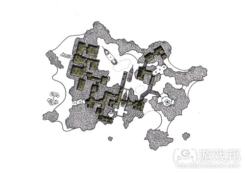
It’s a pretty simple effect that doesn’t require too much thought about where to put shadows and where to put highlights…everything is basically automated.
If I was to do the map again, I might modify this technique to get shadows on the beaches…but the important thing for this map is the hidden passages and cool stuff embedded within the secret cove, so that’s where the detail stays. Extra detail is nice, but we don’t really want too much detracting from these dungeon tunnels. (source:vulpinoid)
上一篇:开发者应重视“小型”游戏设计体验
下一篇:独立游戏相互合作才能拥抱未来








 闽公网安备35020302001549号