总结设计师需要掌握的色彩理论(3)
作者:Cameron Chapman
在此我们将分析从头创造自己的配色方案的方法。我们将涉及传统的配色方案模式(如单色调,类似颜色,补充色等等)以及如何创造不是严格依赖于任何一种模式的定制方案。在本文的最后,你将拥有工具和技能能够开始为自己的设计项目创造好看的调色板。提高技能的最佳方法便是实践,所以你最好能够为自己设定一个目标,每天都努力创造一个新的配色方案。
快速回顾
让我们快速回顾下第一篇和第二篇的内容。在第一篇中,我们谈论了所有颜色所具有的内在含义,这可能会根据不同的国家或文化发生变化。这些含义将对访客如何看待你的网站产生直接影响,即使这只是潜意识的作用。你所选择的颜色既可能作用于你尝试着去创造的品牌认知也有可能将其摧毁。
在第二篇中,我们谈及了颜色术语:色彩(某些东西是什么颜色,如蓝色或红色);色度(颜色的纯粹度,缺少白色,黑色或灰色);饱和度(颜色的强度和弱度);值(颜色多亮或多暗);色调(通过添加灰色到纯色中而创造出来)’阴影(通过添加黑色到纯色中而创造出来);浅色(通过添加白色到色彩中而创造出来)。这些都是我们继续向前并创造自己的配色方案前需要掌握的重要术语。
传统的配色方案类型
存在许多预先定义好的配色方案标准能够帮助我们更轻松地创造出新方案,特别是对于初学者而言。以下是一些传统的方案,并且都伴随着一些例子。
单色调
单色调配色方案是由一种特定颜色中的不同色调,阴影以及浅色所构成的。这是我们能够创造的最简单的配色方案,因为它们都是源于同一个颜色,如此便不大可能创造出不和谐或丑陋的方案。
例子:
以下是三个单色调配色方案的例子。关于这些方案,在大多数情况下第一个颜色(如果我们是从左往右去看的话)将可能用于标题。第二个颜色将用于正文或者可能作为背景。而第三个颜色将可能用于背景(如果第二个颜色作为背景的话这个颜色就要用于正文)。最后两个颜色可以作为一种强调或用于图像中。
类似
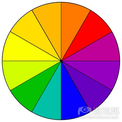
类似配色方案是下一种容易创造的方案。我们可以通过使用三种颜色(在12个颜色色环中相邻的颜色)进行创造。通常情况下,类似配色方案都拥有相同色度标准,但通过使用色调,阴影和浅色,我们便可以为这些方案添加一些乐趣,并调整它们去适应我们设计网站的需求。
例子:
这是一种传统的类似配色方案,尽管从视觉效果上看很有吸引力,但如果想要用于网站设计的话,其颜色与颜色间却缺少足够的反差。
这是基于相同色彩的配色方案,但基于色度的调整而具有更多多样性。这更适合用于网站中。
这是另一个传统类似配色方案的例子。
为了用于网站设计而对上述方案做出了修改。
补充
补充方案是通过结合色环对边的颜色所创造出来。在最基本的形式中,这些方案只包含两种颜色,但能够使用色调,浅色和阴影轻松地扩展。警示:使用完全相反并伴随着彼此相近的色度或值将创造出视觉上的不和谐。最好能够避免这种情况(可以通过在它们之间留下空白或添加另一个过渡性颜色)。
例子:
大范围的浅色,阴影和色调促成了这一多彩的配色方案。
带有大范围色度的另一个补充配色方案。
不要忘记米黄色和褐色也属于橙色的浅色和阴影。
拆分互补
拆分互补方案是非常简单的补充方案。在这一方案中,比起使用相反的颜色,你可以使用与基本颜色相反的颜色两旁的颜色。
例子:
在这一方案中黄绿色便是基本色彩。在你为这种方案所选择的颜色两旁的色度和值之间必须具有足够的差异性。
另一个带有大范围色度的调色板。
三色系
三色系方案是由12色环中等间隔的色彩所组成的。这是更多样的配色方案之一。
例子:
在三色中的一种颜色的最浅或最暗的版本,并伴随着其它两个颜色的阴影/色调/浅色而创造出方案中较为中性的一种颜色。
使用一个搭配着柔和色彩的明亮颜色让整体的色彩更加突出。
双倍补充(四色)
四色方案可能是最难做到的一种方案。
例子:
一个并不引人注意的四色方案。使用这种方案的最佳方法便是使用一种颜色作为设计的主要颜色,其它颜色用于强调内容。
四色方案能够有效地创造出带有类似色度和值的配色方案。只要添加一个中性颜色(游戏邦注:如黑灰或黑色)到文本和强调内容中便可。
这也适用于更暗的配色方案。
定制
定制配色方案更难进行创造。比起遵循预先定义好的配色方案,定制方案并不是基于任何正式规则。在创造这类型配色方案时要记住像色度,值以及饱和度等内容。
例子:
这里的颜色都具有类似的色度和饱和度。
再一次,使用带有类似色度和饱和度的颜色是有效的,且能够贯穿整个颜色方案创造出一种凝聚力。
在其它带有较低色度的颜色间使用带有高色度的颜色是另外一种有效的放啊(更高的色度可以作为一种强调)。
创造一种配色方案
创造你自己的配色方案可能有点吓人。但是事实上这并不象我们想象的那么困难。关于从头开始创造一个出色的调色板并不存在多少技巧。
在上面的内容中我们已经介绍了一些不同的配色方案类型。现在,让我们尝试着创造属于自己的一些方案。网上有许多工具能够帮助你创造配色方案,不过让我们暂时忽视这点只是用Photoshop进行创造。
让我们尝试着摆脱已经提到的配色方案类型,而创造一些定制的方案。尽管我们必须清楚不同颜色互动的方法以及传统方案是如何创造出来的,但对于大多数设计项目来说,你将可能创造不需要颜色遵守任何预先定义好的模式的定制方案。
所以为了我们的项目,我们将分别为两个不同的网站各创造三种配色方案。假设我们的客户是现代建筑设计博客以及高端女性服装零售商(专门研究维多利亚时期的服装)。
我们将从基本的单色方案开始。尽管我之前提到传统配色方案模式并未经常用于设计中,但单色调配色方案却是例外。你将发现自己会定期使用单色调方案。
关于我们的服装商店,以下是一个传统的单色调方案,带有白色作为中和。
关于我们的设计博客,我们使用的是由阴影和灰色(浅色)所组成的颜色方案。
这几乎就是一种类似配色方案,但是我们忽视了一个颜色。这是由紫色和红紫色阴影组合而成的。这两个颜色在色环中相邻,并相互作用,特别是用于不同的值与饱和度时。
添加一些红色阴影到灰色方案中将呈现出更多视觉乐趣,并能突出设计中某些特定部分。
在此,我们已经摆脱了紫色并切换到较深的紫红色。再一次地,这一颜色在色环中也是与红紫色相邻。我们已经添加了浅黄色色调,这在色环中位于紫色的对立面。如此便能起到中和作用,并在与其它颜色相比较时更像是奶白色。
尽管乍看之下这一配色方案就像是另一个标准的灰色和红色调色板,但如果你仔细去看它的话会发现灰色其实是蓝色的色调。蓝色和红色构成了一个四色方案中2/3的颜色,但即使没有黄色也能够相互搭配,特别是当红色保持纯粹的颜色,而蓝色降低色调变成接近灰色时。
为什么阴影,色调和浅色如此重要
就像我们在上述配色方案中所看到的,在配色方案中使用浅色,色调和阴影都很重要。纯色都具有类似的值和饱和度。这将导致配色方案太过单一且无聊。
当你混合了色调,阴影和浅色时,你将把基本的12色色环扩展成无数种颜色并用于你的设计中。创造专业的配色方案的一种简单方法便是利用一些色调,浅色和特定颜色(避免纯色)的阴影,然后将其添加到在色环中至少隔了三个颜色的另一个纯色(或接近纯色)中作为强调颜色。这不仅能够为你的配色方案添加一种视觉乐趣,同时还能保留一种平衡感。
添加一些中性色
中性色是创造配色方案的另外一个重要部分。灰色,黑色,白色,褐色,茶色以及灰白色都被当成是中性色。褐色,茶色和灰白色更倾向于把配色方案变暖(它们真的只是关于色调,阴影,橙色和黄色的浅色)。根据周边的颜色,灰色将把整体的效果调暖或变冷。黑色和白色也是如此。
黑色和白色是任何配色方案中最简单的中性色。为了给配色方案添加更具视觉化的乐趣,我们可以考虑使用更亮或更暗的灰色阴影去取代白色或黑色。
添加褐色,茶色和灰白色更难,但如果基于一定的联系,你将能够轻松地添加它们。对于褐色,你可以考虑使用一个更暗的巧克力褐色去取代黑色。较浅的灰白色也能够用于取代白色或较亮的灰色。茶色也能够取代灰色。
为配色方案使用照片
关于创造配色方案我个人最喜欢的一种方法便是使用照片。网上有许多工具能够自动为你做到这点(游戏邦注:Adobe Kuler便是其中一种,也是我个人最喜欢的一种),或者你可以自己用Photoshop完成它。
使用Adobe Kuler,你便可以在Flickr上浏览或搜索照片,或者你也可以上传自己的图像。如果你不知道在网站设计中该使用怎样的颜色,你可以尝试着在Flickr搜索关键字。有时候你将找到一些自己都没想过的配色方案。
让我们基于两个方式去尝试这种方法(即使用Kuler和Photoshop)。在Flickr找到你所喜欢的照片即你认为将唤醒你想要创造的设计感。我选择这一个:
这是在使用这一图像时Kuler提供给我们的最初的配色方案:
Kuler通过图像创造配色方案的一个最酷的功能便是“选择心境”。这里包括五彩缤纷,明亮,柔和,深色和暗色。这些都是我们在利用同样的照片使用每种心境时所获得的方案:
五彩缤纷
明亮
柔和
深色
暗色
现在让我们使用相同的图像在Photoshop中创造一个配色方案。这比Kuler所做的显得较不科学。我经常使用滴管工具选择一种颜色,然后在图像上不断点击不同地方直至找到其它可搭配的颜色。以下是结果(在Photoshop中执行只要不到5分钟的时间便可以做到,所以并不像听起来那么紧迫):
在Photoshop中通过图像创造配色方案是最简单的方法,特别是伴随着相对单色调的颜色开始时。如果面对的是更多颜色的图像,情况将变得更加棘手。
让我们尝试另一种方法,即这次是关于更多彩的图像。以下是我们所面对的初始图像:
从这一图像中Kuler提供给我们5种配色方案:
五彩缤纷
明亮
柔和
深色
暗色
以下是我使用同样的图像在Photoshop中创造出来的内容:
就像你所看到的,我所创造出来的Photoshop版本与Kuler所创造出来的是完全不同的内容,但上述所有的方案在视觉上都具有吸引力。这里的Photoshop版本比之前的花了更长的时间,一部分原因是这一图像呈现出了更多颜色。
最简单的配色方案
之前我们已经稍微提到这一点,但添加一个明亮的强调色到较为中心的调色板中是最容易创造的配色方案之一。这也是最突出且最具视觉性的一种方法。如果你不确定自己关于创造定制方案的技能,你便可以尝试这些类型的调色板。
以下是关于我所谈及的内容的一些例子:
在此你可以看到如何使用褐色取代灰色而让整体的方案变暖,甚至是伴随着蓝色强调色的方案。
在这一类型的方案中,你可以使用任何颜色的色调取代灰色或褐色,为了获得最可靠的结果而保持它接近于灰色。一般说来,较冷的灰色和纯粹的灰色都最适合现代设计。但对于传统设计来说,更暖的灰色和褐色更适合。
多少颜色?
你将注意到在文章中我们已经使用了5种不同的颜色的配色方案。5是一个很棒的数字,能够为列举理念提供许多选择,这也是设计中最可靠的数字。但我们也可以在自己的方案中随意使用更多或更少的颜色。
许多网站可能只在设计中使用了3种颜色。有些只使用了2种。也有些使用了8种或10种(这比使用少量颜色更难)。你应该尝试着为自己的设计使用许多或少数颜色。但你可能想从5种颜色的调色板开始,然后在设计过程中添加或提取你任何适合的元素。
添加颜色的最简单的方法便是从预先定义好的传统配色方案开始,然后基于此进行创造。这至少能够带给你一定的方向去考虑还需要其它哪些颜色。
带有出色配色方案的10个网站
为了带给你更多灵感,以下是10个具有出色配色方案的网站。有些配色方案可能乍看之下有点奇怪,但看着它们如何使用将呈现出更大范围的配色方案可能性。
Wentings Cycle & Mountain Shop
方案:
Trivuong.com
方案:
Oscar Barber
方案:
North East Peace III Partnership
方案:
mbA Architects
方案:
Studio 13
方案:
Joy Project
方案:
Morphix Blog
方案:
El Designo
方案:
LemonStand
方案:
结论
在本系列文章中我们只谈及颜色理论。有一些专家已经花了好几年时间去提升他们选择适合任何情境的颜色的能力了。
学习创造优秀的配色方案的最佳方法便是不断实践。每天都能创造方案。一开始你可以使用自动化工具做到这点(游戏邦注:就像Kuler通过图像创造方案的工具),或者只是打开Photoshop然后开始创造。如果你在每日生活中看到一个特别好看或醒目的颜色,你便可以尝试着围绕它去创造一个方案。利用所有能够让你上传配色方案的网站然后为之后的参考将其组织起来。这让所有的配色方案可以变得更使用且能够更轻松地用于之后的设计。
更多资源
以下是能帮你创造自己的配色方案的一些额外资源。
选择合适颜色调色板的10个超级有用的工具
Web Design Ledger涵括了寻找并创造颜色调色板的10种出色工具。
100 Random Colors 2.0
该网页将加载100种随机颜色,并伴随着十六进制代码。在这里你将能够获得颜色灵感。
经典配色方案
来自Color Wheel Pro的这篇文章详细描述了所有传统的配色方案,并列举了相关例子。
ColorMunki
这是另一种配色方案工具。它们配色标签库特别适合用于寻找并创造单色调颜色方案。
ColorSchemer
这是一个带有免费在线版本的配色方案工具。
ColourLovers
关于颜色和设计的社区,包含一个巨大的调色板渠道,研究功能以及创造调色板的工具。
(本文为游戏邦/gamerboom.com编译,拒绝任何不保留版权的转载,如需转载请联系:游戏邦)
Color Theory for Designer, Part 3: Creating Your Own Color Palettes
By Cameron Chapman
In the previous two parts of this series on color theory, we talked mostly about the meanings behind colors and color terminology. While this information is important, I’m sure a lot of people were wondering when we were going to get into the nitty-gritty of actually creating some color schemes.
Well, that’s where Part 3 comes in. Here we’ll be talking about methods for creating your own color schemes, from scratch. We’ll cover the traditional color scheme patterns (monochrome, analogous, complementary, etc.) as well as how to create custom schemes that aren’t based strictly on any one pattern. By the end of this article, you’ll have the tools and skills to start creating beautiful color palettes for your own design projects. The best way to improve your skills is to practice, so why not set yourself a goal of creating a new color scheme every day.
A Quick Review
Let’s start with a quick review of what was covered in parts 1 and 2. In part 1, we talked about how all colors have inherent meanings, which can vary depending on the country or culture. These meanings have a direct impact on the way your visitors perceive your site, even if it’s just subconsciously. The colors you choose can either work for or against the brand identity you’re trying to create.
In part 2, we covered color terminology: hue (what color something is, like blue or red); chroma (how pure a color is, the lack of white, black or gray added to it); saturation (the strength or weakness of a color); value (how light or dark a color is); tone (created by adding gray to a pure hue); shade (created by adding black to a pure hue); and tint (created by adding white to a hue). These are important terms to know as we move forward and create our own color schemes.
Traditional Color Scheme Types
There are a number of predefined color scheme standards that make creating new schemes easier, especially for beginners. Below are the traditional schemes, with a few examples for each.
The basic, twelve-spoke color wheel is an important tool in creating color schemes.
Monochromatic
Monochromatic color schemes are made up of different tones, shades and tints within a specific hue. These are the simplest color schemes to create, as they’re all taken from the same hue, making it harder to create a jarring or ugly scheme (though both are still possible).
Examples:
Here are three examples of monochrome color schemes. For the most part with these schemes, the first color (if we look at this from left to right) would likely be used for headlines. The second color would be used for body text or possibly the background. The third color would likely be used for the background (or body text if color #2 was used as the background). And the last two colors would be used as accents or within graphics.
Analogous
Analogous color schemes are the next easiest to create. Analogous schemes are created by using three colors that are next to each other on the 12-spoke color wheel. Generally, analogous color schemes all have the same chroma level, but by using tones, shades and tints we can add interest to these schemes and adapt them to our needs for designing websites.
Examples:
analogous-traditional
This is a traditional analogous color scheme, and while it’s visually appealing, there isn’t enough contrast between the colors for an effective website design.
analogous-modified
Here’s a color scheme with the same hues as the one above, but with the chroma adjusted to give more variety. It’s now much more suitable for use in a website.
analogous-tradpink
Another example of a traditional analogous scheme.
analogous-modpink
And the above theme modified for use in a website design.
Complementary
Complementary schemes are created by combining colors from opposite sides of the color wheel. In their most basic form, these schemes consist of only two colors, but can easily be expanded using tones, tints, and shades. A word of warning, though: using colors that are exact opposites with the same chroma and/or value right next to each other can be very jarring visually (they’ll appear to actually vibrate along their border in the most severe uses). This is best avoided (either by leaving white space between them or by adding another, transitional color between them).
Examples:
comp-purplegreen
A wide range of tints, shades, and tones makes this a very versatile color scheme.
comp-redgreen
Another complementary color scheme with a wide range of chromas.
comp-orangeblue
Don’t forget that beige and brown are really tints and shades of orange.
Split Complementary
Split complementary schemes are almost as easy as the complementary scheme. In this scheme, instead of using colors that are opposites, you use colors on either side of the hue opposite your base hue.
Examples:
split-yellowgreen
A scheme where yellow-green is the base hue. It’s important to have enough difference in chroma and value between the colors you select for this type of scheme.
split-red
Another palette with a wide range of chromas.
Triadic
Triadic schemes are made up of hues equally spaced around the 12-spoke color wheel. This is one of the more diverse color schemes.
Examples:
triad-berry
Using a very pale or dark version of one color in the triad, along with two shades/tones/tints of the other two colors makes the single color almost work as a neutral within the scheme.
triad-red
Alternately, using one very bright hue with paired muted hues makes the single bright hue stand out more.
Double-Complementary (Tetradic)
Tetradic color schemes are probably the most difficult schemes to pull off effectively.
Examples:
tetradic-red
A rather unimpressive tetradic color scheme. The best way to use a scheme like this is to use one color as the primary color in a design and the others just as accents.
tetradic-pastel
Tetradic color schemes can work well for creating color schemes with similar chromas and values. Just add a neutral (such as dark gray or black) for text and accents.
tetradic-dark
It works just as well for darker color schemes.
Custom
Custom color schemes are the hardest to create. Instead of following the predefined color schemes discussed above, a custom scheme isn’t based on any formal rules. Keep in mind things like chroma, value, and saturation when creating these kinds of color schemes.
Examples:
industrygiant
The colors here all have similar chroma and saturation levels.
palisadespark
Again, using colors with similar chroma and saturation is effective and creates a sense of cohesion across a color scheme.
50schristmas
Using one color with a high chroma among other colors with lower chromas is another effective method (the higher chroma color can act as an accent).
Creating a Color Scheme
Creating your own color schemes can be a bit intimidating. But it’s not as complicated as many people think. And there are quite a few tricks you can employ to create great color palettes right from the start.
danceofcolors
We’ve been over the different types of color schemes above. Now, let’s try creating a few of our own. There are plenty of tools online that will help you create a color scheme, but let’s forget about those for now and just use Photoshop.
Lets try breaking away from the color scheme types already mentioned, and create some custom schemes. While it’s important to know the ways that different colors interact and how traditional schemes are created, for most design projects you’ll likely create custom schemes that don’t strictly adhere to any predefined patterns.
So, for the purposes of our project here, we’ll create three color schemes each for two different websites. Our hypothetical clients are a modern architecture design blog and a high-end women’s clothing retailer who specializes in Victorian-influenced apparel.
We’ll start with a basic monochromatic scheme, just to get a feel for each. While I mentioned that traditional color scheme patterns aren’t used as often in design, monochomatic color schemes are the exception to that rule. You’ll likely find yourself using monochromatic schemes on a fairly regular basis.
apparel-mono
For our apparel store, here’s a traditional monochromatic scheme, with white added in as a neutral.
design-mono
For our design blog, we’ve gone with a color scheme made up of shades and tints of gray.
apparel-one
This is almost an analogous color scheme, but we’ve left out one color. It’s made up of shades of purple and reddish-purple. These two colors fall next to each other on the color wheel, and work well together, especially when they’re used in different values and saturation levels.
design-one
Adding a couple shades of red to the gray color scheme adds a lot of visual interest and the potential for creating extra emphasis on certain parts within your designs.
apparel-two
Here, we’ve gotten rid of the purple hues and switched over to a burgundy. Again this is next to the reddish-purple on the color wheel. We’ve also added in a very pale yellow tone, which sits opposite purple on the color wheel. This serves as our neutral, and looks more like an off-white color when compared to our other hues.
design-two
While this color scheme at first glance looks like another standard gray and red palette, if you look more closely you’ll see that the grays are actually tones of blue. Blue and red make up two thirds of a tetradic color scheme, but work just fine together without yellow, especially when the red is kept pure but the blue is toned down to the point of almost being gray.
Why Shades, Tones, and Tints Are Important
As you can see from the color schemes above, using tints, tones, and shades in your color schemes is vital. Pure hues all have similar values and saturation levels. This leads to a color scheme that is both overwhelming and boring at the same time.
colorblotchedpaper
When you mix in tones, shades, and tints, you expand the basic 12-spoke color wheel into an infinite number of colors for use in your designs. One of the simplest ways to create a professional looking color scheme is to take a few tones, tints, and shades of a given color (avoiding the pure hue), and then add in another pure hue (or close to pure) that’s at least three spaces away on the color wheel (part of a tetradic, triatic, or split-complementary color scheme) as an accent color. This adds visual interest to your color scheme while still retaining a sense of balance.
Adding in Some Neutrals
Neutrals are another important part of creating a color scheme. Gray, black, white, brown, tan, and off-white are generally considered neutral colors. Browns, tans, and off-whites tend to make color schemes feel warmer (as they’re really all just tones, shades, and tints of orange and yellow). Gray will take on a warm or cool impression depending on surrounding colors. Black and white can also look either warm or cool depending on the surrounding colors.
neutralcolors
Black and white are the easiest neutrals to add into just about any color scheme. To add a bit more visual interest, though, considering using a very light or very dark shade of gray in place of white or black.
Adding browns, tans, and off-white hues are a bit trickier, but with some practice you’ll find adding them gets easier. For browns, consider using a very dark, chocolate brown in place of black. A pale off-white can be used in place of white or light gray in many cases. And tan can be used in place of gray, as well (create a tone by adding some gray to make it even easier).
Using Photos for Color Schemes
One of my personal favorite ways to create a color scheme is to use a photograph. There are automated tools online that can do this automatically for you (Adobe Kuler is one of them, and my personal favorite), or you can do it in Photoshop yourself.
Using Adobe Kuler, you can either browse or search for photos on Flickr, or you can upload your own image. If you’re stumped for what colors you want to use in a website design, try searching for related words on Flickr. Sometimes this can result in finding color schemes that you might not have thought of on your own.
Let’s try this method out, both ways (using Kuler and Photoshop). Find a photo you like on Flickr, one that you think evokes the feeling of the design you want to create. I chose this one:
poppy
Here’s the original color scheme that Kuler gives us when using this image:
poppy-kuler-original
One of the coolest features Kuler has for creating color schemes from images is their “Select a Mood” option. Included here are Colorful, Bright, Muted, Deep, and Dark. These are the schemes we get when using each of those moods with the same photo:
poppy-kuler-colorful
Colorful
poppy-kuler-bright
Bright
poppy-kuler-muted
Muted
poppy-kuler-deep
Deep
poppy-kuler-dark
Dark
Now, let’s create a color scheme in Photoshop using the same image. This is a bit less scientific than the way Kuler does it. I usually just pick a color with the eyedropper tool, and then keep clicking on different spots in the image until I find other colors that go with it. Here are the results (this took less than five minutes to do in Photoshop, so it’s not as time-intensive as it sounds):
poppy-photoshop
Creating color schemes from images in Photoshop is easiest with images that are relatively monochromatic to begin with. With more colorful images, it gets trickier.
Let’s try another one, something more colorful this time. Here’s the original image we’ll work with:
sari
And here are the five color schemes that Kuler gives us from this image:
sari-kuler-colorful
Colorful
sari-kuler-bright
Bright
sari-kuler-muted
Muted
sari-kuler-deep
Deep
sari-kuler-dark
Dark
And here’s what I came up with in Photoshop using the same image:
sari-photoshop
As you can see, the Photoshop version I came up with is completely different than what Kuler came up with, but all of the schemes above are visually appealing. The Photoshop version here took a bit longer than the one above, partly because of the diversity of colors present in the image.
The Easiest Color Schemes
We’ve touched on this a bit before, but adding a bright accent color into an otherwise-neutral palette is one of the easiest color schemes to create. It’s also one of the most striking, visually. If you’re unsure of your skills in regard to creating custom schemes, try starting out with these types of palettes.
Here are a few examples to give you an idea of what I’m talking about:
easiest-red
easiest-chartreuse
easiest-pink
easiest-lightblue
easiest-blue
You can see here how using browns instead of grays makes the entire scheme look warmer, even with the blue accent color.
You can use tones of any color instead of gray or brown in this type of scheme, just keep it very close to the gray end of the spectrum for the most fool-proof results. As a general rule, cool grays and pure grays are best for more modern designs. For traditional designs, warmer grays and browns often work better.
How Many Colors?
You’ll notice that throughout this post we’ve used color schemes with five separate colors. Five is a good number that gives plenty of options for illustrating the concepts here, and it’s a workable number in a design. But feel free to have more or fewer colors in your own schemes.
coloredpencils
A lot of websites might only use three colors in their designs. Others use only two. And some might use eight or ten (which is a lot trickier than using fewer colors). Experiment and use as many or as few colors as you need to for your design. But you may want to start with a palette of five colors, and then add or subtract as you see fit and as you progress through the design process.
The easiest way to add a color is to start with one of the predefined, traditional color schemes and then work out from there. That at least gives you a bit of direction as far as which other colors to consider.
10 Sites With Great Color Schemes
To give you more inspiration, here are ten websites that have excellent color schemes. Some of the schemes below might look a bit odd at first glance but seeing how they’re actually used shows the wide range of possibilities color schemes can present.
Wentings Cycle & Mountain Shop
wentings
Scheme:
wentings-scheme
Trivuong.com
trivuong
Scheme:
trivuong-scheme
Oscar Barber
oscarbarber
Scheme:
oscarbarber-scheme
North East Peace III Partnership
northeastpeace
Scheme:
northeastpeace-scheme
mbA Architects
mbaarchitects
Scheme:
mbaarchitects-scheme
Studio 13
studio13
Scheme:
studio13-scheme
Joy Project
joyproject
Scheme:
joyproject-scheme
Morphix Blog
morphixblog
Scheme:
morphixblog-scheme
El Designo
eldesigno
Scheme:
eldesigno-scheme
LemonStand
lemonstand
Scheme:
lemonstand-scheme
Conclusion
We’ve really only just touched on color theory in this series. There are specialists out there who have literally spent years refining their ability to choose colors that are appropriate to any situation.
The best way to learn to create beautiful color schemes is to practice. Create a scheme on a daily basis. You can use automated tools to do this at first (like Kuler’s tool for creating schemes from images), or just open up Photoshop and start. If you see a particularly beautiful or striking color in your daily life, try creating a scheme around it. And take advantage of all the sites out there that let you upload your color schemes and organize them for later reference. This makes all those color schemes more practical and easier to use in the future.
Further Resources
Here are some additional resources that should help you in creating your own color schemes, as well as some links with more information about traditional color schemes.
10 Super Useful Tools for Choosing the Right Color Palette
A round-up from Web Design Ledger that covers ten great tools for finding and creating color palettes.
100 Random Colors 2.0
This page will load 100 random colors, with hex codes. It’s a great place to check if you’re looking for color inspiration.
Classic Color Schemes
This article from Color Wheel Pro covers all the traditional color schemes in detail, with examples.
ColorMunki
Another color scheming tool. Their library colors tab is particularly useful for finding and creating monochromatic color schemes.
ColorSchemer
A color scheme gallery and tool with a free online version.
ColourLovers
A community for color and design that includes a huge gallery of color palettes, search functionality as well as tools to create your own color palettes.(source:smashingmagazine)
下一篇:阐述有效的用户体验设计的注意要点


.jpg)
3.jpg)
4.jpg)
5.jpg)
6.jpg)
7.jpg)
8.jpg)
9.jpg)
10.jpg)
11.jpg)
12.jpg)
13.jpg)
14.jpg)
15.jpg)
17.jpg)
17.jpg)
18.jpg)
19.jpg)
20.jpg)
21.jpg)
22.jpg)
23.jpg)
24.jpg)
25.jpg)
26.jpg)
27.jpg)
28.jpg)
.jpg)
281.jpg)
291.jpg)
30.jpg)
31.jpg)
32.jpg)
32.jpg)
331.jpg)
34.jpg)
35.jpg)
36.jpg)
37.jpg)
38.jpg)
39.jpg)
40.jpg)
41.jpg)
42.jpg)
43.jpg)
44.jpg)
45.jpg)
46.jpg)
46.jpg)
47.jpg)
48.jpg)
49.jpg)
50.jpg)
51.jpg)
52.jpg)
.jpg)
54.jpg)
55.jpg)
561.jpg)
57.jpg)
58.jpg)
59.jpg)
60.jpg)


 闽公网安备35020302001549号