分享8位电子游戏对设计和用户体验的启发
作者:Jason Phillips
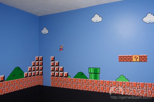
无论相信与否,过去总在启发未来。无论你家里现在使用的是哪种电脑,它一事实上比80年代多数公司所使用的电脑更好。20年前,创意和抽象还未被视为一种设计选择,但它们却是技术局限性所衍生出的良好结果。我们都记得赫赫有名的《马里奥》游戏,并不只是因为其中身着工作装,蓄着小胡子的角色,还因为其中富有创造力而让我们爱上这款游戏的场景设计。
任天堂游戏变革了电子游戏。该系统创造了持续膨胀数十年的文化痕迹,它从未走远。对于80后而言,在《超级马里奥》中收集金币的声音依稀在耳畔。如今,人们讨论的是抢眼的特效,而多数设计工具也变得愈加复杂。每款出击市场的游戏都必须有所突破,才有可能收获眼球,在今天这个玩家更关心技术特点而游戏设计和艺术则因像素而错位的时代尤其如此。
简单是福
马里奥的著名设计师宫本茂并没有让角色看起来很棒,或者吸引玩家。他给家色一顶帽了,因为这比头发更易于处理动画。此外,他还得采取一些行动让马里奥突显于引人注目的背景。与能够呈现成百上千万种色彩组合的现代电脑不同的是,NES(任天堂娱乐系统)呈现的是48种色彩的硬连接调色板。再加上256 * 240的分辨率,以及2KB的内存,多数任天堂游戏具有苛刻的图像局限性。
为了创造一个虚拟世界,设计师只能用一种背景色,25种色彩/渲染器,4个贴图设置/每个3种颜色来创建背景,以及4个贴图/3种颜色来制作敌人。在这种显然不可能的限制条件下,公众很快就喜欢上了《俄罗斯方块》、《Army Games 365》和《最终幻想》等游戏。
缺色创造了氛围
以《银河战士》这款任天堂制作于1986年的科幻冒险游戏为例。该系列因其令人毛骨悚然的外星人风格而得名,正如多数优秀的恐怖电影一样,我们看不到的东西远比肉眼能看到的更惊悚。敌人少量分布,房间与汽泡门相连,玩家不知道下次会出现什么东西,这令《银河战士》相当刺激。没有色彩倒是有利于创造一种氛围,令游戏神秘而激发人的兴趣。其黑色的背景倒是突出了游戏的主题——黑暗世界。
值得称道的是其富有创意的贴图布局和洞穴式的场景(这根本不能算是完美和平整的艺术)创造了一种类似真实世界的峡谷和山峰的自然风光。但1986年时,这个是极具革命性的方法,更不用说其富有组织和网格状的结构对现代世界的启发了。
创造不可思议的世界
虽然多数人是现实主义的,但有时候成为梦想家也同样不乏好处。在电子游戏《超级马里奥兄弟2》中,主角和小伙伴们在一个所谓的Subcon幻想世界中旅行。其中还有一个有形的门户魔药,以及拥有微笑脸的可爱蔬菜,这令游戏显得格外超现实主义。但是,乌龟和蘑菇在一条邪恶龙的监视下统治整个世界则颇有意义。
能量提升道具可行吗?
《洛克人3》以及无数其他NES游戏则会改变角色的色彩或外观,以便呈现其强大的威力。在使用Robot Master这项武器时,洛克人改变了颜色。在《马里奥》游戏中,角色大小在食用蘑菇后会发生变化。
我们经常可以在网络上看到这种行为,当我们点击超链接时,就会看到它们变色。对于NES设计师来说,开发能够脱颖而出的东西十分重要。最近的一个例子是Burn studios音频工具,它能够在Flash中模拟一个隐性的工作室环境。音频工具利用了虚拟电缆来指出哪项道具已被连接,并形象化地按路线发送,而不是使用令人困惑的图表和菜单。设计师可以根据自己的要求选择能够呈现玩家使用了能量提升道具的方法。
永远不要透露友好与非友好型内容
你还记得自己首次玩《马里奥》的情况吗?当蘑菇跑出来时,你是不是也困惑它到底是友好还是邪恶的?假如它是坏蛋呢?假如它杀死我呢?一款游戏的整体设计必须是固定的。《马里奥》中几乎不可能没有蘑菇,所以你立即就会发现它是友好的。但是,这种肉食性植物看起来相当可怕,并不像是很好吃的样子,所以我们的直觉就会让我们避开它。这正是你玩《马里奥》这类游戏的方式,即听从自己的直觉。
尝试着不要落入俗套,让自己与众不同。最终,就会让事情更糟糕,你的设计能力也无法发挥出最大潜能。拥有知识、技能和工具固然很棒,但它们却并非取得胜利的保证。(本文为游戏邦/gamerboom.com编译,拒绝任何不保留版权的转载,如需转载请联系:游戏邦)
8-Bit Video Games That Can Teach About Design And UX
by Jason Phillips
Mario
Believe it or not, the past will always inspire the future. Whatever type of computer you have at home now is better than what most businesses had back in the 80s. Twenty years ago, creativity and abstraction were not considered design choices, but they were the result of technological limitations put to good use. We all remember the famous Mario game, and not just because of the character who had bib overalls and a moustache, but also because of the creative landscape that was practical enough to make us love the game.
NES games revolutionized video gaming. The system created cultural imprints that continued to swell for decades, and it’s not going anywhere. The mere sound of grabbing as many coins as possible in Super Mario still sounds familiar to the 80s generation. Nowadays, people are talking about eye-popping and eye-candy effects and most design tools are becoming increasingly more complex. Each game that hits the market must push the limit in order to draw attention, especially since gamers are currently strained by tech features while the design and art of the game is misplaced through the pixels.
Simplicity is bliss
Mario’s famous designer Shigeru Miyamoto didn’t make the character to look good or entice the player in any way. He gave him a hat because it was simpler to animate than hair. Also, he had to do something to make Mario stand out from that striking background. Nowadays, the simplest, most inexpensive PC on the market is a graphical source of power. As opposite to the millions of color combos a modern computer can display, a NES (Nintendo Entertainment System) featured a hard-wired color palette of 48 colors. Together with a 256 by 240 resolution, as well as 2 kb of memory, most NES games had strict graphic limitations.
In order to create a virtual world, designers had at their disposal 1 background colour, 25 colours/scanline, 4 tiles set/ 3 colors each to build the background, and 4 tiles/3 colors to make the enemy. Within these apparently impossible limitations, the public grew quite fond of the games like Tetris, Army Games 365 and Final Fantasy.
Lack of color creates an ambiance
Metroid for example, was a science-fiction adventure game made by Nintendo back in 1986. The series was famous for its intimidating, creepy alien flick feel. Just like with most good horror movies, what we can’t see is a lot scarier than what we can actually see. Sparingly placed enemies, rooms linked to bubble doors, and players who had no idea what was coming next, made Metroid extremely enticing. The absence of color was managing to create an atmosphere, thus making the game intriguing and mysterious. That black background was meant to highlight the theme of the game: a world of darkness.
Complimenting the creative usage of tile placement and cave-like environments creates a natural landscape with valleys and peaks resembling the real world, which is far from being perfect and flat. Back in 1986, the approach was revolutionary, not to mention that the organic and grid-like structures were an inspiration to the modern world.
Creating an unbelievable world
Although most individuals are realistic, being a dreamer sometimes pays off too. In the video game Super Mario Brothers 2, the main characters and his pals are travelling through a world of dreams known as Subcon. Together with materializing door potions as well as veggies with cute smiley faces on them made the game quite surreal. Somehow, turtles and mushrooms conquering the world under the close supervision of an evil dragon make a lot of sense.
Is the power-up working?
Similar to a foaming cleanser forfeited on a late-night commercial by the most detestable pitchman, Megaman 3 and numerous others NES games are changing the characters’ color or alter their appearance to point out that a super-power is in place. When making use of a Robot Master weapon, Megaman changes colour; in the Mario game, the character’s size grows after eating a mushroom.
We can often witness such behaviour on the web, when we click on hyperlinks and they change color. Similar to a NES designer, it is important to develop something that can stand out from the crowd. A more current example is the Burn studios audio tool that imitates an implicit studio environment in Flash. Audiotool makes use of virtual cables to point out how items are linked and visually routed, rather than use confusing diagrams and menus. It’s up to the designer to find a way to show that a power-up is being put to use.
Never reveal what’s friendly and what’s not
Do you remember the first time you played Mario? When that mushroom came out didn’t you wonder if it’s friendly or not? What if it’s bad? What if it kills me? The overall design of a game must be innate. Mushrooms are almost impossible to miss in Mario, at least that first one from the beginning, so you immediately see it’s good. Yet, that carnivore plant that looks rather creepy doesn’t seem that tasty, so our perception tells us to avoid it. That’s how you play a game like Mario; you listen to your instincts.
Try not to fall into a trap and make an attempt to be different. In the end, you’ll make things worse and your design abilities won’t be explored to their highest potential. Wonderful things to have are knowledge, skill, and tools, yet they’re not sure-fire means to victory either.(source:i2mag)


 闽公网安备35020302001549号