设计师应巧用菜单传达游戏故事情境
作者:Declan Kolakowski
在此我们说的是游戏中的菜单,而非餐厅菜单。多数游戏设计师在设计过程中并没有对其给予足够的考虑(如果他们就职于大型工作室,很可能就会将菜单设计的失败照片于糟糕的UI美术人员)。游戏菜单已经成为设计过程中的一个败笔,因为游戏开发者将它们的主要目的和主要设计标准完全弄错了。
多数菜单设计的一个主要原则是:实用性。通常这可以理解为非干扰性,极易主义风格,与你所玩的游戏没有任何关系,或者无法突显游戏的个性。
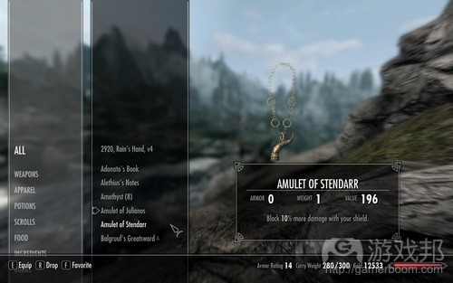
(无趣,无趣。《天际》的菜单设计是最大的反例之一。这种美观而流畅的界面并不能准确传达蔓延游戏其他部分的中世纪哥特风格。)
回想一下你这一生中与多数游戏的首次互动情景。多数时候这一体验始于平铺在中间的菜单(如果设计师觉得这种设计不妥,就会将其设为右对齐方式),其中包括的文字有:新游戏、载入游戏/继续游戏、选项。其中也有一些背景图片或动画。如果你拣出一款UI设计非常刺激的游戏,之后再选择不同的子菜单就可能更改背景图片,甚至是动画。
在相信被多数游戏设计师所遗弃的游戏菜单是最糟糕的设计之一。原因是?因为多数游戏设计师与游戏的互动并不全面。我的许多同行就曾表示,他们并不认为“玩法”开始前的菜单互动是关键的游戏体验环节之一。多数人认为菜单功能只是一种中立的导管,将玩家引向更为传统的体验,这真是一个悲剧,因为我们实际上可以在菜单上多下点功夫,强化游戏设计、主题和故事。
让我们看看Suda51的古怪游戏《Killer7》,它在菜单设计上比之前提到的《天际》好一点。这是富有意义的菜单设计的绝佳例子之一。虽然它并不完美,并且仍然具有多数游戏所犯的一些“标准”通病,但至少能够以一种原创方式传送这些标准设计。玩家初次载入游戏时,会看到普通的CAPCOM/GRASSHOPPER的公司logo,但这些名称却伴随着游戏中主要敌人——Heaven Smiles发出的哈哈大笑,之后就是一声枪击以及暴力的血迹溅在每个logo之上。之后就是一个相当平凡的“按下开始”的按钮出现在新游戏/继续游戏/载入游戏之后。但是,这些字幕被压缩得几乎难以辩认——需要指出的是,《Killer7》中的多数内容是荒诞的游戏玩法体验及其执行方式,所以使用这种压缩字幕会仅能迫使玩家去看一次,这意味着玩家应该早已熟悉这些内容,这至少是个有趣的命题,因为它令玩家按压新游戏时产生对自己所做事情的新看法。随着玩家在这个列表中选择不同的选项,出现在屏幕上的字幕也开始拉伸——这是另一个几乎令人无法阅读的极端。简单的文本转换可以产生一些有趣的暗示,并提升通用准则的新意,令其更具趣味性。
之后玩家会进入一个任务选择画面,其中展现的是80年代的纪录存档卡片飘浮在空中,其背景是一些无名之人的剪影——这就是你的任务目标。在任务卡上是一个单选框,其中有一个块状的激光瞄准器从玩家所在区域射出,就像在第一人称射击模式一样。
玩家最初的唯一选择就是接受任务并继续前进。但是,之后该画面会动态更新,将你已经消灭的目标以暗色置于前景中,仔细看会发现他们已经受伤和被打败了。所有这些元素都能立即传达《Killer7》的游戏基调——即90年代初的职业杀手。
玩家从这个菜单中接受任务卡。摁压接受按钮时,就会听到另一声枪响——没错,《Killer7》就是让人们通过开枪来接受任务,此时画面会快速切换,出现一个红外线指向同个目标的剪影,其间伴随着粗糙的响铃声。玩家就必须将红外线定位到该人影的身体,并再次开枪。最后就会再次听到猛烈的重击声,该人影被炸裂成血肉模糊的颗粒,而后就响起汽车或货运号角的声音,并转向震聋发聩的巨响,该画面就会被解释这一游戏主题的日语解说文字所代替。
《Killer7》说明即使是在选择任务的基本程序中,交互性也仍然十分重要。玩家被迫查看、瞄准和开枪。他们每时每刻都要面对自己最终要进入的虚构游戏世界。这是一个充斥安静和嘈杂,压缩和扩展,象征和位置这些极端的偏执狂世界。
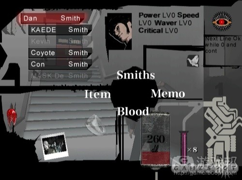
《Killer7》中的“暂停菜单”有一个非常有趣和新颖,并且能够加强游戏世界的虚构和故事性的美术设计。这个图片中有许多能够说明该菜单是针对虚构故事量身订做的元素——红色血袋、呈现出尖锐轮廓的道具等等,但在此文我将只挑选一者来讨论。
该图右角落中的眼睛显示玩家的身体状况,如果这个眼睛越来越紧闭着,玩家所剩命值就越少——这与《Killer7》关于第三只眼、启蒙和眼线的虚构故事在概念上十分一致,并再次呼应了上文所讨论的最初开幕画面中的激光瞄准器元素。多数游戏是以绿色或红色命值条来显示玩家身体状态,从右到右减少则说明玩家命值下降,这种设计毫无新意可言。你可以由此看出为何这种自定义设计如此强大。
最后需要指出的是《Killer7》中的保存和载入系统拥有合理的故事情境。所有的保存和载入文件都通过与记录监督磁带的互动,呈现在特定房间的电视屏幕上。这种做法类似于《Fahrenheit 451》中那种全民受到电视监督,大家的一举一动皆会被记录下来,令玩家产生一种自己的行动也在记录之列这种感觉。玩家可以通过一个电报文本风格的菜单系统访问保存和载入文件,这种设计再次传达了游戏背后的主要理念。
从更广泛的层面来看,菜单的一体化设计还代表一种抹煞以整体眼光看待游戏,以及游戏交互机制决定游戏世界的理念。“标准”的菜单在游戏行业中甚为普遍,以至于我们不再去设想新游戏和载入游戏方式。从游戏故事来看,这两个操作不过是一个易用性的问题。当许多设计师想到自己最容易马上接受的游戏时,首先就是这类游戏要有一个明确的开始按钮,如果这是一款玩家令角色取得进展的游戏,那就要有一个容易使用的保存/载入选项。这一切都可以通过标准菜单列表的平庸的中立性来实现。
考虑到多数游戏的虚构情境及其暗示体验时,载入游戏的操作就呈现出内在的奇异性。仔细追究,就会发现即使是“开始游戏”的操作也很荒唐。游戏似乎喜欢采用叙事形式,但为什么我们要从这里“开始”,为何这是一个“新”游戏。在这之前发生了什么情况?所谓的“新”游戏是什么概念?我们结束了一款游戏,又通过列表选择制作了一个“新”版本的游戏,这难道不是很荒唐吗?
在此我并不打算肤浅地批评交互性的荒唐性。我认识到设计师无法检验每款游戏或每个回合中的经验性的互动和第四堵墙(游戏邦注:这是戏剧术语,在镜框舞台上,一般写实的室内景只有三面墙,沿台口的一面不存在的墙,被视为“第四堵墙”)。但行业对当前菜单设计的接纳导致人们对这些设计层面欠缺思考。这对我们的游戏媒体来说真是有趣的问题,因为它可以增强游戏媒体的故事和执行,但却没人想这么做,或者无法这么做,只是因为大家都甘愿受制于游戏媒体应该呈现的假设形式。
以《刺客信条》为例,这一系列游戏中的虚构故事极其需要情境化的菜单系统。这是一款需要通过电脑探索记忆的游戏。为何不将该电脑终端设置为一个可操作的组件,而不只是一个菜单。想象一下载入游戏时,你首先要做的一件事就是通过电脑终端导航。开启存储模块,将角色插入它们所记得的DNA矩阵中。玩家很快就会融入这个以极有趣方式构成的故事中。但由于设计师接受游戏菜单既定的设计模式,所以他们避开了这些可行的做法。
再次声明,我并非易用性的反对者,每个菜单都不应该一开始就将玩家置于复杂的迷宫中。但UI本身应该成为玩家的一个挑战吗?如果它与你所想传达游戏世界故事相得益彰,那么使用这一设计当然可以带来极大的好处,并且可以令其成为故事的一部分。所以我批评菜单设计以实用性(或易用性)为主要原则时,我实际上是在批评游戏行业对该理念的理解导致许多游戏采用了无趣、毫无灵气和美感的菜单设计。
我在一年前制作了一款名为《Rosemary’s Artery》的游戏,在一堆心脏碎片中隐藏了所有菜单元素。用户在开始游戏或者做出选择之前,必须在这些心脏碎片中找到菜单,这可以让玩家立即感知游戏的基调,即被禁锢于他人的体内,试图从这个血肉牢笼中逃脱的氛围。
总体上说,开发者应该像创造游戏体验一样,尽量将菜单制作得更有艺术性、美观和深度。设计师应该像对待游戏体验的关键内容一样重视菜单。(本文为游戏邦/gamerboom.com编译,拒绝任何不保留版权的转载,如需转载请联系:游戏邦)
Thematic Storytelling Through Menu Design
by Declan Kolakowski
The following blog post, unless otherwise noted, was written by a member of Gamasutra’s community.
The thoughts and opinions expressed are those of the writer and not Gamasutra or its parent company.
Menus. No! Not restaurant menus, menus in games, you know? Those things that most designers give about as much thought to as their dirty laundry during the design process (and if they work in a bigger studio, palm the design of off onto a poor UI artist)? Those things. Game menus have become the black sheep of the design process because we, as makers of games, have got their primary purpose and our primary criterion for their design completely wrong!
Most menus are designed with one major principle; practicality. Usually this translates into noninvasive, minimalist style affairs, a positive yawn-o-rama devoid of any personality or relationship with the actually game you are playing.
Dull, dull dull. Skyrim: one of the worst offenders. This beautifully streamlined interface doesn’t exactly communicate the medieval gothic that pervades the rest of the game.
Think back to the first interactable moment you have had with most games over the course of your life. Almost always this experience will start with a menu laid out as a centred (or if the designers were feeling really edgy, right-aligned) list comprising the words: NEW GAME, LOAD GAME/CONTINUE, OPTIONS. And some sort of background image or animation. If you’ve picked up a game in which the UI designer was a real thrill seeker then selecting different sub-menus might change the background image, or even animate it!
In the department of missed opportunities I believe the abandonment of games menus by most games designers is one of the worst. And the reason for this? Because most games designers don’t really approach the experience of interacting with a game holistically. Speaking to many of my peers they don’t consider the interaction with a menu before “gameplay” begins to be part of he essential game experience. Most believe that menus functions as a kind of neutral conduit through which users travel into their more traditional experiences and this is tragic because there is SO much you can do with a menu that re-inforces the design, theme and storytelling of your game.
Let’s look at a game that does this a bit better than our aforementioned Skyrim; Suda51′s bizarre epic, Killer7. This game is one of best examples of meaningful menu design. Although it’s not perfect and still has some standard “menuing” that many games suffer from, these standards are delivered in at least in an original style. When first loading it up the player will be treated to the run of the mill CAPCOM / GRASSHOPPER title cards, however each of these is underscored by the giggling laughs of KIller7′s main enemy – the Heaven Smiles – followed by a gun shot synced with a violent red color palette swap on each logo throwing them into dramatic noir-style lighting. Then a rather (formally) uninspired Press Start to begin screen followed is followed by the NEW GAME / CONTINUE / LOAD GAME shtick. However, these titles are compressed as to be almost unreadable – it’s arguable that much of KIller7′s fiction is about the absurdity of the game play experience and its execution, so the use of these compressed titles forcing the player to interrogate ( and actually read) them for once, signs which they should be so familiar with, is at least a somewhat interesting statement as it forces a new perception of what one is actually doing when they press new game. As different options are selected from this list the titles spring out across the screen become grossly stretched – the opposite extreme – and equally hard to read. A simple transformation of text can have some interesting implications then and reinvigorate a tired formula but things are about to get a lot more interesting.
Next the player is taken to a mission select screen presented in the style of 80′s documentary store archive cards, floating passively in space with an anonymous silhouette behind it – the target for your mission. In the mission card is a single check box into which a glowing blocky laser sight points from where the player is seated – as if in first-person shooter mode (another reference possibly to the point, shoot, select arcade games of the early 90′s).
When first starting the player’s only option is to accept and mission and proceed. However, later on this screen updates dynamically, placing the targets you have eliminated in cell-shaded color in the foreground, staring off, maimed and defeated. All of these elements immediately communicate the sense of the Killer7; contract assassins of the early 90′s – in deep with the end of the political machinations of the Reagan administration.
The player literally plays accepting the mission card from this menu. On pressing accept another visceral gun shot is heard – yes, the Killer7 are the type of people who accept a mission by firing at it – shifting the screen again violently to the same target silhouette this time with a glowing red laser that the player can control tracing the line of the target’s body, underscored by an abrasive ringing sound. You must then position the laser over a body part of the shadow and fire again. A final violent bang issues forth and the body disintegrates into a collection of red particles, the sound of a car or freight horn sampled and shifted to a deafening degree blares out, and the figure is replaced by a japanese kanji stating the theme for this level made from the same blood red spots that disintegrated them on your shot.
Here Killer7 offers a thoughtful look at how interactivity is important even in the basic procedure of selecting a mission. The player is forced to look, aim and fire. They are confronted at every moment by the fiction of the game world which they will, and arguably already have, stepped into. A world of paranoia, extremes of quiet and loud, compression and expansion, symbol and lie.
Killer7′s innovative pause screen menu.
Similarly Killer7′s “pause menu” has a very interesting and original aesthetic that reinforces the fiction and story of the game world. There are numerous examples in this image of the tailoring of menu for fiction – the blood bag styled blood counter, items displayed on silhouetted spikes, polaroids of targets yet to be found – but I will focus on one for the purposes of this post.
The eye in top right hand corner indicates the player’s health. The closer it is to being closed the less health the player has – conceptually consistent with Killer7′s fiction about the third eye, enlightenment and lines of sight, echoed again in the laser sights of the original opening screens discussed above. Compare that to how most games indicate health; a green or red bar that moves from right to left as health decreases and has absolutely nothing original to say. You can see why these sorts of customisations can be so powerful.
A final note about Killer7 is its save and load system which has a proper fictional context for it. All save and load files work through interaction with recorded surveillance tapes that appear on TV’s in specific rooms. A nod to the nightmarish surveillance state in the style of Fahrenheit 451, in which citizens are spied on through their televisions, a state that records every move one makes, so closely that the player’s very being can be reconstituted at the point they were last recorded. Save and load files are accessed through a tele-text style menu system that again fundamentally communicates the thematic ideas behind the game.
On a wider level the homogenisation of the menu also represents a kind of effacement of thought about games as whole and how all their interactable mechanics dictate the game world. The “standard” menu has become so accepted in the medium that we no longer think about the assumptions that spring from new game and load game. In terms of storytelling these two actions have become nothing more than a usability convenience. When many designers think about games they accept almost immediately that their game will have an unambiguous start button, and if its a game where the player makes character progress, there will be an easily accessed save/load option. All mediated through the meretricious neutrality of a standard menu list.
The act of loading a game is inherently bizarre when you consider the fictional context of most games and their implied experience. Even the act of starting is completely ridiculous when examined closely. Games seem to be fond of in medias res story telling but why do we “start” here, why is this a “new” game. What happened before now? What about the notion of “new”? Isn’t it fundamentally absurd that we can finish a game and somehow make a “new” version of it just by selecting from a list.
My point is not meant to be a surface level, clever-clogs critique of the absurdities of interaction, I realise that designers can’t somehow examine the nature of experiential interaction and the fourth wall in every game or play session. But the tacit acceptance of menu design as it is today is leading to a lack of thought about these aspects of design. These are really interesting questions about our medium, that could add so much to the story and execution of the video-game medium but no one wants to, or perhaps simply can’t, engage with because of assumptions about the form the medium should take.
Think of Assassin’s Creed. A series of games, the fiction of which is crying out for a fictionalised menu system. A game in which you explore memories through a computer. Why not make that computer terminal an operable component instead of a menu. Imagine loading up the game and the first thing you have to do is navigate through a computer terminal. Start up the memory module to plug your character into their matrix of remembered DNA. Immediately the player is engaged in a way that builds the fiction of a universe in a very interesting way. But because of designer’s acceptance of how game menus “should” be, they shy away from these possibilities.
A quick disclaimer; I am not an enemy of usability, every menu should not be labyrinthine affair intended to put the player off from the start. But the idea that a UI should itself be a challenge to a player? If that’s consistent with the fiction of the game world you are trying to communicate then surely it would be hugely beneficial to use that play time to your advantage as piece of story telling. So when I critique the primary tenent of menu design as being practicality (or usability) I am critiquing a particularly interpretation of this that has become widespread in the game’s industry; that translates these worlds in the boredom inducing, uninspired minimal aesthetic that many games’ menus use.
In games I’ve developed in the past I’ve tried to practice what I preach. I made a game about a year ago called Rosemary’s Artery in which I cloaked all the menu elements in claustrophobic cuttings of a heart. The user, before they could select any options or begin the game then had to rake away these crowding fragments of heart to find the menu. This made the player immediately get a sense of the game’s tone, the crushing atmosphere of being interned in another’s body, trying to escape a prison of flesh.
More recently when developing a game called Really Good Paths, I’m hoping to create a fully fledged mini-game out of the start menu, through a paired down side-scrolling version of the central experience in which you have to play and catch the UI element you want to choose.
In essence. Go wild. Question your medium. And make your menus as artistic, beautiful and thought provoking as the experiences that you want to craft. More designers need to treat the menu as an essential part of the game experience.(source:gamasutra)
上一篇:如何制作有趣而令人上瘾的游戏谜题
下一篇:手机广告对于独立开发者的消极面






 闽公网安备35020302001549号