分析5大电子游戏公司的网站设计特点
作者:Paula Mooney
我们知道他们创造了一些非常出色的游戏——即长期停留在畅销游戏榜单上,但是这些大受欢迎的电子游戏创造者到底是如何设计自己的网站呢?
根据Doublespark(总部位于英国剑桥的网站设计公司),以下设计元素可能造就一家游戏公司的网站,也有可能将其彻底摧毁。
让我们着眼于一些知名游戏公司的网站,其中不乏现代风格,对于游戏自身的说明以及单纯具有疯狂创造性的范式。
1.Mojang.com:简单但却具有大量信息
Mojang创造了大受欢迎的《我的世界》,这也是我们想要探究其网站设计的主要原因。该公司的网站非常简洁,带有白色的背景并伴随着红色的标题文本去突出其游戏的Xbox 360版本惊人的销量:
此外,Mojang.com还使用了一个简单的导航菜单去告诉读者他们的其它游戏和商品,并且在右边的导航上还有一个Twitter种子。该网站让人想起整洁的博客,即把传达信息作为主要目标——这也是这一独立游戏开发者的网站的目标:告诉我们他们正在开发一款即将问世的游戏,并且无需投入上百万去建造工作室的网站。
2.Rovio.com:非常可爱,色彩显眼且吸引人
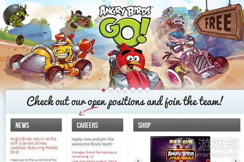
Rovio Entertainment Ltd. 创造了大受欢迎的《愤怒的小鸟》,所以显然在Rovio.com主页的头版上会出现这棵摇钱树。
主页上将近80%的空间都不满了颜色显眼的图像,而剩下的空间则是关于重要的导航功能和社交媒体链接。
Rovio声称:“盯紧了我们的空缺职位,加入我们的团队吧!”显然他们想要强化一个不可空缺的职位中的人员,让那些对此感兴趣的游戏创造者能够看到这一号召。
3.TocaBoca.com:首先也是最重要的便是获取用户的电子邮件
除非你是那些帮助Toca Boca庆祝其5千万游戏应用下载记录的人(凭借着《小小发型师2》和《托卡米尼》等面向孩子们的应用的大获成功),否则你可能从未听说过这家游戏工作室。
不管怎样,我们从这家公司明亮且深受孩子们喜欢的网站中学到的一大重要元素便是,他们意识到了一句著名的网络格言的重要性:“有钱的在册,”也就是说如果你能够一次就获得感兴趣的用户的联络方法,你便能够反复向他们销售产品。
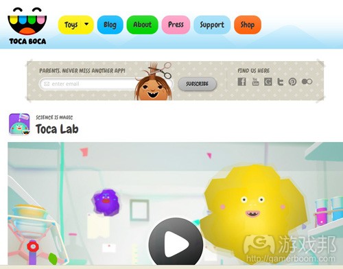
Toca Boca(游戏邦注:是西班牙语中的“碰触到嘴巴”)通过在主要的网站空间上直接添加订阅框(在用户一眼就能看到的地方),并写道“爸爸绝对不会错过的另一款应用!”而获取可能回答“妈妈,我能下载这一应用吗?《Toca Train》只需要99美分,求求你了”这类问题的人的电子邮件地址。
这种机制的市场营销计划能够让家长们知道该公司即将出现的新游戏,并为此提供源源不断的收益流。通过这家聪明的公司,我们可以学到游戏网站该如何做到有趣且能盈利。
4.RelianceGames.com:利用滑块进行展示,让用户能够更轻松地消费
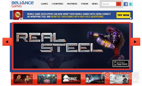
Reliance Games利用滑块让所有访问者能够轻松地看到他们所创造的各种游戏,如《钢甲铁拳》和《饥饿游戏:星火燎原》。
这一巨大滑块的另外一大优点便是,公司在这里设置了直接的链接能够引导购买者前往他们想要购买的游戏在App Store或Google Play上的具体位置。这是一种巧妙的设置,因为如果消费者必须在一个网站上寻找重要的“购买”按键好半天,他们便会受挫。
5.Activision.com:从大人物身上学习网站设计诀窍
自从1979年成立以来,动视这一电子游戏产业领导者就一直扮演着巨头与贡献者的身份,特别是在《使命召唤》获取巨大成功以后。
在游戏领域中向那些全新或即将出现的“小人物”学习自然是件好事,但专注于那些始终都能开发出成功游戏的开发者才真正重要。
为此,动视网站的粗略审查呈现出了他们知道那些内容能够真正突显自己,所以他们便利用网站的大部分空间去突显这些内容,包括张贴像《使命召唤:幽灵》的升级功能的巨大图像等等。
这是“保持简单”哲学的缩影。有什么比动视的黑色背景上一个“我想要”的明黄色链接能够更轻松地将玩家带到充满其想要购买的产品的信息的页面上呢?
(本文为游戏邦/gamerboom.com编译,拒绝任何不保留版权的转载,如需转载请联系:游戏邦)
Gaming companies’ websites: What we can learn from their designs
Paula Mooney
We already know they have created some pretty awesome games — as witnessed by their consistent status atop gaming best-seller lists — but how have some of the most popular video game creators designed their own websites?
According to the Cambridge, England-based web design house Doublespark, the following types of design elements can make or break a gaming company’s website – and spell the difference between an effective site that increases customer awareness and sale or one that sends them clicking away in droves.
Let’s take a look at some of the top game companies’ own websites, which include examples that are sleek and stylish, indicative of the games themselves, or just crazily creative.
#1 – Mojang.com: Surprisingly simple yet informative
Mojang makes the popular Minecraft game, which is why an inquisitive look into their own website’s design brings a refreshing and curious observation. The website is clean and uncomplicated, with a plain white background that sets off the bold red text of headlines that scream about record-breaking sales of the Xbox 360 edition of the game:
Other than that, Mojang.com employs a simple navigation menu that tells readers more about their other games and merchandise and a Twitter feed in the right-hand sidebar. The site is reminiscent of a clean blog whose main goal is to pass on information — and that’s exactly what this independent game developer’s website does: teaching us about upcoming games being developed and that you don’t necessarily need to throw millions into your studio’s site to be successful.
#2 – Rovio.com: Positively cute, colorful and engaging
Rovio Entertainment Ltd. created the popular Angry Birds franchise, so it stands to reason that their Rovio.com home base would feature a version of their cash cow pretty prominently on their front page:
Nearly 80% of the homepage is filled with colorful images that speak of action, while the rest of the prime real estate space is saved for important navigational features and social media links.
“Check out our open positions and join the team!” exclaims Rovio, obviously putting their desire to beef up their staff in a can’t-miss position where avid game creators can see (and perhaps heed) the clarion call.
#3 – TocaBoca.com: Grabbing customers’ email addresses first and foremost
Unless you’re one of those who helped Toca Boca celebrate passing their 50 million game apps downloaded mark recently, due to the success of kid-friendly apps like Toca Hair Salon 2 and Toca Mini, you may have never heard of the game development studio.
Either way, one important lesson we can learn from the company’s bright and kid-friendly website is that they realize the importance of that popular web adage that states, “The money’s in the list,” which means that if you can grab the contact information of an interested customer just once, you might be able to sell to them over and over again.
Toca Boca — which curiously translates as “touch the mouth” from Spanish — uses their prime real estate website space to procure the email address of the person who likely holds the answer to the question, “Mommy, can I download this app? Toca Train is only 99 cents…please…” by adding a subscription box directly in most users’ line of sight that reads, “Parents, never miss another app!”
That kind of brilliant marketing plan keeps parents “in the know” about the company’s latest games coming down the pipe and a steady stream of revenue filling the coffers. From this brilliant firm, we can learn how gaming websites can be both fun to visit and utilitarian in purpose.
#4 – RelianceGames.com: Show off with sliders and make it easy for customers to buy
Reliance Games makes it easy for their website visitors to see the variety of games they create by making great use of a slider that rotates titles like Real Steel and The Hunger Games: Catching Fire Panem Run:
Another excellent feature within the large slider is the fact that the company includes direct links that lead buyers to the correct and precise locations in the App Store or on Google Play to easily purchase the game they want. This is a smart move because it’s a frustrating experience to have to hunt around on a site attempting to find the proper place that contains that all-important “buy” button that helps consumers throw money at game development companies.
#5: Activision.com: Learning web design tips from the big guns
Activision has been around since 1979, and this video game industry leader is still a major player and contributor — especially in light of the roaring success of the Call of Duty series.
It’s great to study the new and upcoming “little guys” in the field of gaming, but it’s also just as important to keep our eyes on the ones who’ve been developing games seemingly forever in an attempt to duplicate their successes.
To that end, a cursory review of the Activision website shows that they know where their bread is buttered, and they use most of their website space to show it off, which includes huge call-to-action images like this Call of Duty: Ghosts upgrade feature:
They are the epitome of the “keep it simple, sweetheart” philosophy. What can be easier than Activision’s “I want one” link surrounded in bright yellow against a dark background to help send gamers directly to a page with information about where to buy the product in question?(source:venturebeat)
下一篇:硬核社交游戏获得成功的4个要素


.jpg)




 闽公网安备35020302001549号