90%手机应用的帮助功能有待完善
作者:Michael Mace
尽管手机设备已经出现十多年了,软件开发者仍然在琢磨制作优秀的手机应用的法则是什么。讽刺的是,他们面临的最大的障碍之一是,网页软件开发的成功经验。现在大多数开发者都是网页应用出身,已经非常熟悉那个领域的惯例和最佳实践,以致于他们甚至没有意识到这些东西的存在。正是那些经验,经常使开发者在制作手机应用时惹上麻烦。
其中一个大问题就是应用的帮助功能。
在网页世界,最好的事就是做一个不需要内置帮助的网页应用——体验太直观了,用户不需要任何帮助就知道该怎么做。添加帮助功能被认为是设计失败的证明。
网页应用环境的多个方面鼓励这种免帮助的方法。首先是工具提示条的使用:当鼠标悬停在按钮或图标上时,这个小小的解释框就会弹出来。工具提示条几乎无处不在,因为它们太实用了;它们使用户得以发现屏幕上的一切信息,不需要真的点击和犯错。工具提示条是内置在网页应用中的隐藏帮助,鼓励用户探索网页,而不必害怕犯错。
网页应用的另一个重要的特征就是,开发者能够准确地监测用户行为,和每天更新网页。尽管在技术行业经常讨论这么做是否侵犯用户隐私,现在追踪技术最经常被用于收集用户在网站上做什么的数据,以确定网站设计是否合理。比如,用户是否在某个时刻放弃购买?他们点击不到他们想点击的位置?根据这些信息,网页设计师可以即时发现问题并迅速地做调整。
准确的追踪和迅速的改变相结合,使开发者能够很快把网页应用变成使用不费力的工具。这是网页新公司的标准过程,他们应该首先发布差到令人耻辱的产品版本,这样他们才能尽快进入学习过程。
在手机领域使用相同的方法会变成灾难
手机没有鼠标,所以工具提示条再也不管用了。并且,手机应用开发者很难快速迭代应用,因为他们必须让用户安装新版本。苹果甚至限制开发者更新应用的次数。另外,即使开发者想出如何快速迭代,第一版应用的糟糕体验也可能是致命的,因为会导致应用商店的评价很差,即使应用已经更新了,那些差评也不会消失。
所以,不是赶时间拼凑应用,手机应用开发者必须在第一版就把用户体验做好。
那意味着发布前的测试是非常重要的,但还意味着开发者必须有不同的设计考虑。手机应用开发者不能假设用户完全能够凭直觉知道怎么使用应用,而是假设用户会犯错会遇到困难,这时候要给他们一个比较体面的改正方式。这一点尤其重要,因为手机设备的屏幕小,解释各种特征是很困难的;再加上没有工具提示条,特征不能自己解释自己。制作一个完全直观的手机应用几乎是不可能的,特别是如果它以任何复杂度执行功能。
当我们用真正的用户测试手机应用时,我们会发现用户很难想出如何如何执行哪怕是最简单的功能。当他们遇到困难时,他们做的第一件事通常是寻找帮助功能。如果能够使用帮助,且帮助是比较有条理的,那么用户通常可以自己找到答案并继续使用应用。但是,如果他们找不到帮助,或如果帮助没有提供他们所需的信息,那么他们可能会觉得受挫,甚至彻底抛弃这款应用。而开发者得到的结果就是,用户流失和应用商店的差评。
改进建议
显然,把应用做得尽可能地直观是关键。但设计师不是努力做出完美的设计,而是带着用户会遇到困难的假设做设计。那意味着帮助功能应该:
1、在任何页面都可以使用它。理想的情况下,帮助应该有一个显眼的的按钮(比如问号图标)。
2、环境敏感。应该与用户现在所做的事相关。
3、可搜索。认识到用户的问题不总是与应用的当前页面相关。使用户容易就不同的主题提出问题。通过可搜索的FAQ列表可以达到这个目标。
在我们测试的应用中,超过90%没有遵守以上原则,根据应用商店的非正式调查,这个比例甚至更高。玩家通常更容易使用和学习能把帮助功能做好的应用。
榜样:
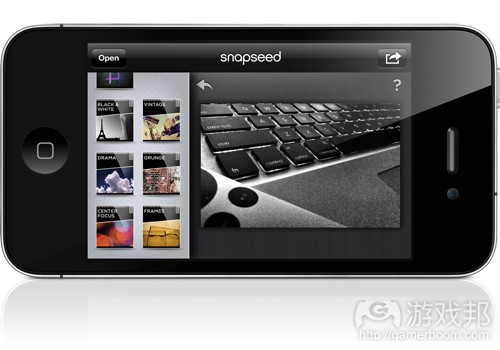
Snapseed(一款照片编辑应用)的每一个页面都有帮助图标。用户轻击问号图标就能显示如何使用。
WebMD中有一个教程,告诉用户如何使用应用和按键的功能。注意它使用了提示工具条风格的图解。(本文为游戏邦/gamerboom.com编译,拒绝任何不保留版权的转载,如需转载请联系:游戏邦)
90% of mobile apps have inadequate help
by Michael Mace
Although mobile devices have been around for more than a decade, software developers are still figuring out the rules of what makes a great mobile app. Ironically, one of the biggest barriers they face is the legacy of successful software development on the web. Most developers today grew up in the web app world, and have absorbed the assumptions and best practices of that world so thoroughly that they’re not even aware of them. Those assumptions often steer a developer onto the rocks when creating mobile apps.
One glaring example is the issue of help
In the web world, the ideal is to create a web app that requires no built-in help. The experience is supposed to be so compelling, and so intuitive, that the user will naturally flow through it without any need for assistance. Adding help is seen as an admission of design failure.
This help-free approach is encouraged by several aspects of the web app environment. The first is the use of tooltips: the little explanatory text boxes that pop up whenever you hover your mouse over a button or icon in a major website. Tooltips are almost ubiquitous because they’re incredibly useful; they enable a user to discover what anything on the screen does, without having to actually click it and possibly make a mistake. Tooltips are a hidden layer of built-in help in web apps, and encourage users to explore a website without fear of doing something wrong.
Another important characteristic of web apps is the developer’s ability to monitor user behavior in exquisite detail, and make changes to the website on a daily basis. Although there’s intense discussion in the tech industry about the privacy aspects of user tracking, the most common use of tracking today is to aggregate statistics on what users do in a site, to determine whether it is well designed. Do users abandon the purchase process at a certain point? Do they fail to click where they’re expected to? A web developer can determine this in real-time, and make changes almost as fast.
Editor’s note: Developers! If you’re good and want to be great, our upcoming DevBeat conference, Nov. 12-13 in San Francisco, is a hands-on event packed with master classes, presentations, Q&As, and hackathons, all aimed at boosting your code skills, security knowledge, hardware hacking, and career development. Register now.
This combination of detailed tracking and fast changes makes it possible for a developer to quickly evolve a web app into a finely tuned instrument that is more or less effortless to use. This is such a standard practice that a mantra of web startups is that they should try to ship an embarrassingly bad first version of their product, so they can start the learning process as soon as possible.
Example: Snapseed, an app done right
Using those same approaches in mobile can be a disaster
There is no mouse in mobile, so tooltips don’t work at all. And it’s hard for mobile app developers to iterate their apps quickly because they have to get users to install the new versions. Apple even restricts how often a developer can update an iPhone app. What’s worse, even if a developer figures out how to iterate quickly, a bad experience in the first version of an app can be fatal because it’ll attract bad reviews on the app store, reviews that do not go away after the app has been updated.
So instead of shipping a sketchy app as early as possible, mobile developers need to take the time to give a great user experience from the very first release of their apps.
That means pre-release testing is important, but it also means developers need to think about design differently. Instead of assuming that users will be able to navigate an app on complete intuition, mobile app developers need to assume that users will get stuck, and give them a path to graceful recovery. This is especially important because the limited screen space of a mobile device makes it very hard to explain multiple features, and because the absence of tooltips means the features can’t explain themselves. It is almost impossible to create a completely intuitive mobile app, especially if it performs a function with any level of complexity to it.
When we test mobile apps on real users, time and again we see users struggle to figure out how to perform even straightforward functions with mobile apps. And when they get stuck, the first thing they usually do is search for a Help function. If help is available, and if it’s properly structured, users can usually answer their own questions and go back to using the app. But if they can’t find help, or if it doesn’t give the information they need, they’re likely to get frustrated, and may abandon the task altogether. The result is lost users and bad reviews in the app store.
Example: WebMD
What to do
Obviously, it’s important to make a mobile app as intuitive as possible. But rather than making perfection a design goal, developers should design with the assumption that users will sometimes get confused. That means the Help function should be:
Accessible on every screen. Ideally through a prominent button (question mark icon works well)
Context-sensitive. Should be relevant to whatever the user is doing at the time.
Searchable. Recognize that the user’s question will not always be related to the current screen in the app. Make it easy for the user to ask about a different topic. This can be achieved through something as simple as a searchable FAQ list.
More than 90% of the apps we test do not follow these guidelines, and based on informal surveys of the app stores, the percentage is even higher in the app base as a whole. But apps that do help right generally test better and are easier for people to use and learn.
Examples of help done right
Snapseed (a photo editing app) offers a help overlay for every screen. Tap the question mark icon and it shows how to control the app.
WebMD includes an on-screen tutorial that tells you how to use the app and what the buttons do. Note the tooltip-style illustrations.(source:venturebeat)
上一篇:手机游戏应准确呈现IAP付费机制
下一篇:分享AI寻径设计的射线追踪法


 闽公网安备35020302001549号