分析高收益手机游戏的美术设计特点
作者:Olga Cherkashina
重复迭代原有的东西并无多大意义,重要的是创造出未来的需求。
我分析了俄罗斯、欧洲和亚洲iTunes App Store、Google Play和亚马逊应用商店的“顶级”美术设计特点,希望在此分享我所总结出的规则。需要说明的是,本文撰稿时间是今年5月份,现在各应用商店榜单前列排名已经发生变化,但我所引用的例子应该还不算过时,至少在我看来还是能够体现总体趋势。
界面设计
如果我们看看整体效果,就能发现界面设计上的独特倾向。两三年前,我们可以看到屏幕上的箭头和虚拟摇杆。为了开始游戏,我们得点击并更换许多屏幕。现在这种情况已经不同以往——界面也变成了一种游戏元素。所有多余的操作全被移除了,玩家可以直接进入游戏。所有他此前可能需要进行变换的都已经呈现在屏幕上。所有重要按钮都会闪光和发出信号,总之不会让你遗漏这些按钮。
我们可以把今天的界面比喻为游戏的神经系统。神经系统是有机体的一部分,贯穿其结构,负责执行有机会的部分和整体功能。现代界面也同此理。它不再是一种用来管理玩法的额外附加件。它已经融入并成为游戏的一部分。高收益游戏的界面也很出众。即使是中度硬核的游戏也令人感觉极易上手。让我们看看支持这种神经系统理论的界面设计案例。
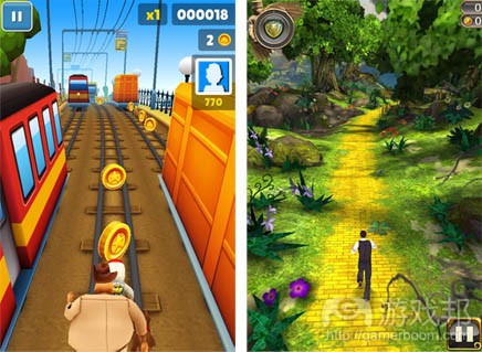
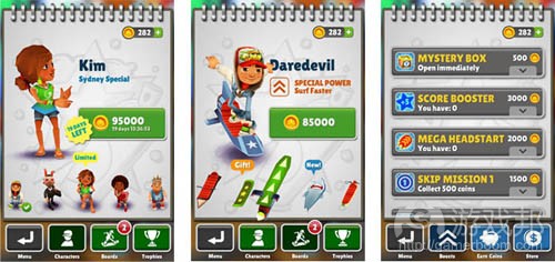
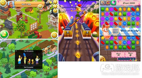
《Subway Surfers》&《Temple Run:Oz》:
它们没有任何多余画面,主菜单不见了,商店和设置会以窗口形式出现:
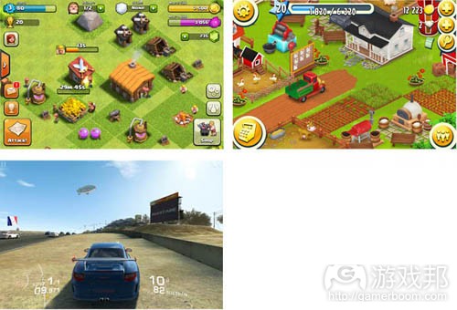
《Clash of Сlans》、《Real Racing》&《HayDay》:
我们该如何解释将界面整合到游戏中的过程呢?很显然,答案在于开发者要掌握如何利用设备不断发展的性能。例如,轻触屏莫可以让你在无需任何额外操作的情况下管理游戏元素。所以,你需要做的就只是提高易用性,而要让用户投入到玩游戏过程中,就要移除虚拟摇杆,注意屏幕上的任何细节,最小化用户的点击次数。
3D的优势——是传说还是现实?
很久之前,首款智能手机的问世让人们对移动平台上的3D游戏心生向往。这些游戏极受青睐,甚至褒奖,但却并未普遍推广。随着苹果iPhone在2007年横空出世,平板电脑、更强大的智能手机、混合设备等大量涌现,我们终于能在应用商店的高收益榜单中看到3D游戏的身影。但这会成为一种趋势呢?
为此我观察了今年3月和4月的高收益榜单,需要说明的是,我在此仅指纯3D游戏,而非3D渲染游戏。
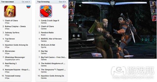
快速浏览苹果App Store,我们会发现《Subway Surfers》、《Real Racing》、《Injustice》是俄罗斯市场收益榜单前十名的常客,它们在前10强的收益中占比30%。在美国市场,《Injustice》则是该榜单前10名中唯一的3D项目。而在欧洲同个榜单前十名却没有任何一款3D游戏。亚洲市场看似相对平衡,《Injustice》也在该市场榜单现身。
美国和欧洲Google Play收益前十名榜单没有任何一个3D项目。在Android平台最扎眼的3D游戏是《Temple Run Oz》,它在亚马逊应用商店榜单位居第一。但我相信,这是该应用商店政策操作的结果。
如果我们将范围扩大至美国和欧洲收益榜单前20名,就会发现我们在前面提到的项目都出现在这一榜单,《Minecraft》和《无尽之剑》也在此列。很有趣,对吗?我们应该如何理解这一现象?
首先,这表明3D时代其实尚未到来。因为现在开发者更容易制作高质量的2D游戏,3D游戏虽然有潜力,但它目前还仅适用于特定的题材和用户。这里的关键在于游戏题材。3D游戏的发展潜力将体现于竞速游戏和第一人称街机游戏。
数量vs质量——孰优孰胜?
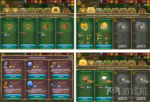
当然,将注意力集中于任何一方都是错误的。但如果一定要我们做出决定——当然还是数量取胜。只要游戏中还有目标,玩家在游戏中还有事做,这些玩家就还是你的。给他们更多角色,更多建筑,更多奖励就行。
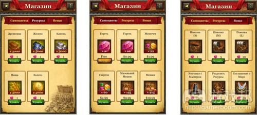
为证明这个观点,让我们看看以下游戏就知道了:
出卖色相?这一古老的法则还管用吗?
为什么这么问?我们经常在商品广告中看到一些漂亮性感的妹纸。但我们也要确保应用商店不会禁止这种做法。
在广告、电子游戏、电影行业中利用性感美女来吸引眼球,已经不是什么秘密。苹果App Store、Google Play和亚马逊等应用市场巨头号在其政策中都禁止宣传明显的色情元素,只是其执行力度有所不同。《花花公子》应用(Playboy App)在应用商店发布了,但其中的美女穿着严实,并不露点。这是不是说明,原来出卖色相的做法不复存在了?我并不这样认为。我们也许会出于某些原因,忘了今天的“色情”与“性”等字眼并不一定意味着“赤身裸体”。甚至还可以说赤祼程度与性事并无关联。那么就让我们来看看高收益榜单中的游戏在此方面的做法:
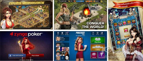
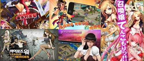
1.美女
毫无疑问,这些图片的上美女所摆的pose,敞胸露肩的穿着,蓬松的头发等特点,仍然是打美女牌的表现。但这些设计现在都是以更得体的姿态出现,主要用于修饰画面,而非诱惑用户。
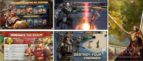
2.帅哥
这里我们可以看到所有的男性特点:肌肉、力量、冷酷、攻击性。仿佛给他们行使权力的自由,就可以看到血流成河的暴乱。
3.这里我要插入一个题外话:
大约一年前,我们的韩国合作伙伴要求重要设计我们一款关于小猪冒险游戏的图标。原因是我们所提供的图标并不适用于当地市场。我们答应了,可最后却发现这些韩国人所设计的图标,将一个宽脸微笑猪置于棕色背景,又添加了一些鲜花,将所有这些元素置于金色边框内。我们惊讶得无语了,而韩国人却对此颇为陶醉。由此可见各个市场的用户喜好和审美大不相同。
亚洲是一个拥有不同世界观的市场——重视形式甚至于内容。所以你会发现他们的宣传美术设计所包括的海量信息,真是让你大开眼界,它们一般是内容导向型的风格。
难怪含有性特征的内容在东方颇为盛行。原因就在于他们比欧洲人更感性。
所以,我们的结论是?出卖色相很可行,但已经不像在java时代那么赤裸无遮拦了。
客观看待高收益游戏的美术设计
首先,我们可以看到明亮而休闲的风格极受喜爱,例如《HayDay》, 《Candy Crush Saga》, 《the Simpsons》, 《Subway Surfers》, 《the Tribez》, 《Puzzle and Dragons》就是这方面的典型,它们都采用了明亮、丰富而友善的风格。
让我们再看看与休闲并不相关,接近于硬核风格的中核游戏——它们的色彩更为低沉,界面更接近于PC游戏,图像更富真实感。这方面的典型包括《Clash of Clans》、《Kingdoms of Camelot》、《King’s Empire》、《Rage of Bahamut》、《Blood Brothers》。
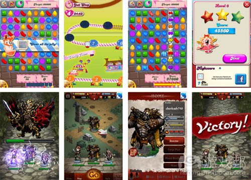
也有许多高收益游戏的图像设计质量只是一般水准。例如《Candy Crush Saga》和《Blood Brothers》:
客观来讲,它们没有任何特效,没有宏大的美术设计,一切元级都很过硬,但并没有达到顶级水平。但这有什么关系?还是有人玩这些游戏,并从中获得乐趣。但这又是为什么?只是因为玩法才是游戏的关键。设计虽然也很重要,但并非体现在图像外观上,而是游戏玩法上——高收益游戏通常都有设计精良、顺手的界面和细节。
总而言之,时尚的游戏美术和人人都想模仿的美术设计,只能辅助团队推出优秀的游戏设计。而拥有平衡良好的玩法、通俗性、支持良好的社交功能的游戏才是王道。这样的游戏才会虏获大量粉丝并跻身榜单前列。但我们仍需时刻牢记第一印象和情感作用的重要性,而这两者又在很大程度上取决于美术设计。(本文为游戏邦/gamerboom.com编译,拒绝任何不保留版权的转载,如需转载请联系:游戏邦)
The tendencies of the mobile art on the example of top-grossing games
by Olga Cherkashina
The following blog was, unless otherwise noted, independently written by a member of Gamasutra’s game development community. The thoughts and opinions expressed here are not necessarily those of Gamasutra or its parent company.
Want to write your own blog post on Gamasutra? It’s easy! Click here to get started. Your post could be featured on Gamasutra’s home page, right alongside our award-winning articles and news stories.
There’s no use in iterating what’s already been done. It’s very important to create what will be in demand tomorrow.
I’ve analyzed the art of the “champions” of the Russian, American, European and Asian iTunes Store, Google Play and Amazon, and want to share the regularities I’ve determined. The article was prepared in the frames of a conference that took place in May. Surely, the top has changed; nevertheless, all the examples are still timely and, in my opinion, portray the general tendency.
Interface is dead? Up with interface!
If we take a look at the general picture, we can see the distinct tendencies in the interface design. Two-three years ago we could see arrows and joysticks on the touch screen. In order to start a game we needed to click a lot and to change lots of screens. Now the situation is contrary to that: the interface became the element of the game. All needless operations are removed; a player is rushed into the game at once. All that he might need to change is already presented on the screen. All important buttons are flashing and semaphoring. No way you can miss them.
One can compare the nowadays interface with the nervous system of a game. Nervous system is a part of an organism, threading through its structure, responsible for the functioning of its parts and of an organism as a whole. The same is with the modern interface. It’s no longer an add-in used to manage gameplay. It’s integrated into the game and is a part of it! The interfaces of top-grossing games are of top class. Even midcore projects feel very easy to play. Let’s look at the examples that can support this nervous system theory.
Subway Surfers & Temple Run:Oz:
There are no additional screens here, the main menu is gone, the store and the settings come out as windows:
Clash of Сlans, Real Racing & HayDay:
So how can we explain the process of the interface integration into games? Most certain, the answer lies in the ever-growing capability of devices which developers have learnt to use. For example, simple tapping allows you to manage game elements without any additional operations. So, all you have to do in order to raise usability and involve a user in the gameplay is to take away joysticks, put every detail on the screen and minimize the number of taps.
The advent of 3d — a myth or reality?
Long ago, the appearance of the first smartphones gave an impulse for 3d-games to appear. The games were highly admired, even awarded, but were never widely spread. And then Apple emerged the market in 2007 with its iPhones. Tablets, powerful smartphones, hybrids… And now we can see 3d in the top-grossing of the stores. Can this be a tendency?
I’ve reviewed the top-grossing in March and April while preparing for a conference. It needs to be cleared that I’m talking of a true 3d, rendering doesn’t count.
A quick look at the Apple Appstore and we see that Subway Surfers, Real Racing, Injustice are the constant members of the top-10 of the grossing in Russia, making 30% of all top-10 revenue. As for the US Injustice is the only 3d-project in the top. And there were no 3d-games in the European top-grossing. Asian chart seems to be a sort of a parallel world, though Injustice can be found there too.
The US and European Google Play didn’t see any 3d projects in their top-10 of the grossing. The only Android exclusion is Temple Run Oz occupying the first place in the Amazon Store. But I believe, it’s more about the policy of the store.
If we widen the range under the examination and look at top-30 of the top-grossing of the US and Europe we will see that in all stores outside the first ten positions some of the above mentioned projects start to appear, plus Minecraft and Infinity Blade. Interesting, isn’t it? What can we make of it?
First, it doesn’t seem like the age of 3d has come yet. Simply because it’s easier for the most of the developers to make a high-quality 2D-project. 3D-games have potential, though: these are advantages in certain genres and its audience. The key word here is genre. And the potential will be growing within racing games and first-person arcades.
Quantity vs quality — what will bring you a million?
Surely, it would be wrong to concentrate on the opposition that, actually, doesn’t exist at all. But if we decide hard and disconcertingly – the quantity will, definitely, win. As long as there’s something to achieve, something to do in the game – the player is yours. Give him more heroes, more buildings, more bonuses.
In order to prove the point let’s look at the supermarkets of the following games:
Hay Day
King of Empire
The tribez
Subway Surfers
Sex sells? How an ancient principle works in the frames of Stores.
Why ask? We often face a situation when it would be great to have beautiful sexy girls on our promo art. But we also have to be sure that they won’t be censured. But still they have to be hot.
It’s no secret that the principle sex sells is widely used in ads, video games, in movie industry – with the different degree of allowability. Apple Appstore, GooglePlay and Amazon, the biggest representatives of the market, in their guidelines forbid everything that deals with explicit erotic. Well, Playboy App was released, but with girls fully dressed. So has the principle gone forever and for good? I don’t think so. For some reason we tend to forget that nowadays the terms “erotic” and “sexual” do not necessarily mean “lack of clothes”. One can even say that there’s no connection between the degree of nakedness and sexuality. And now let’s examine the top-grossing games and define the limits of the research. So:
1. Beauties
No doubt that expressive poses, decolletes, and loose hair, are still an integral attribute of beauty, but now these all are presented in a rather moderate manner and are used to decorate the screen rather than to seduce a user.
2. Good-lookers
Here we will find all the attributes of masculinity: muscles, power, brutality, aggression. Give them the liberty and you’ll see violence and blood.
3. Here I should take a short break:
About a year ago our Korean partners asked for permission to redesign an icon of our game about the adventures of a piglet. The reason was that the one that we offered didn’t fit the market. We said ok, but when we saw the result I believe, our faces were like this: о_0. The Koreans chose the sprite of a piglet with a face-wide smile, put it on a brown background, added a few flowers, and all this in a golden frame. We were astonished to say the least, the Koreans – were in the state of ecstasy. Thus there IS a difference between us and them.
So let’s now go back to our topic.
Asia is a different world with different view of the world: the cover is more important than the content. So the abundance of the information you can find on their promo art will blow your brain, used to composed and content-oriented style.
No wonder that the sexuality of the content in the East is expressed more explicitly. The reason is that they are more emotional than Europeans.
So, what do we see? Sex really sells, but may be less aggressive than it was before in java.
The art of top-grossing: let’s put away envy and look at it objectively.
First, we can see that bright and casual is in favor: HayDay, Candy Crush Saga, the Simpsons, Subway Surfers, the Tribez, Puzzle and Dragons. They all are bright, rich and amiable.
On the other hand we can observe the walkoff from casuality. There are projects that can be described as midcore with their style close to hardcore games: the colors are subdued, the interfaces are close to those of PC-games, the graphics can be realistic. These are Clash of Clans, Kingdoms of Camelot, King’s Empire, Rage of Bahamut, Blood Brothers.
The graphics of many top-grossing games is of average quality. For example, Candy Crush Saga and Blood Brothers:
– objectively, there are no any super effects, no mega art, everything is solid, but not of star-quality. But what difference does it make? People play them and this makes them happy. But why? Simply because gameplay is what really matters and makes the game. Design is also very important, but not in the sense of graphical appearance, but in the sense of how this all works. And it works magnificently: the top-grossing games are usually marked by well-thought, handy interfaces and details.
To sum it up: the cult game art and the art everyone is trying to copycat are just a support team of a good game design. It is born the next way: a game with a well-balanced gameplay, usability, social functions is well-promoted and supported and voila! It has tons of fans and a top position in charts. Though its graphics can be average or higher. There are only a few high-quality graphics projects in the top-grossing of the Stores. Though we might have hastened when called art the support team. It’s not at all that simple. We should always keep in mind the importance of the first impression and emotional impact. And they depend very much on the graphics and artists creating it. (source:gamasutra)
下一篇:分析一些可行的免费游戏盈利技巧








 闽公网安备35020302001549号