简述《Hundreds》极简抽象设计的得与失
极简抽象风格的益智游戏《Hundreds》于2013年2月登录iTunes应用商店。这款游戏获得了舆论上和商业上的双赢,被赞誉为引领了游戏设计的“新时尚”。
在《游戏开发者》杂志2013年5月版的分析文中,《Hundreds》的联合开发者Adam Saltsman探讨了该游戏的极简抽象美学,正是这一风格吸引了各个年龄层次和不同背景的玩家。
以下是从原文中摘录的几个要点:
极简抽象设计的优势
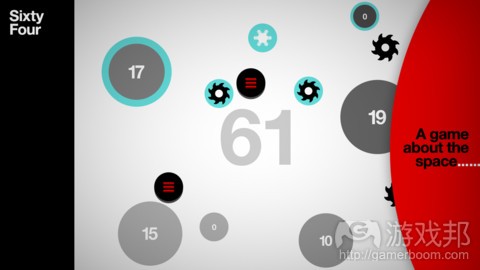
《Hundreds》最显著的特点就是它的画面。Greg Wohlwend的富有特色的极简抽象图像贯穿于整个游戏,几乎所有重要的东西都是用不同的灰色块来表示,用奔放的、红色UI元素来强调的。
《Hundreds》的极简抽象设计有两个优势。第一个(可能也是最重要的)优势我称之为“Sworcery Doctrine”(一定程度上夸张了)。在独立游戏工作室和独立游戏四处扩张的时代,做出一款漂亮的游戏然后在应用商店上发布,是远远不够的。你可能会争论道,永远都不够!现在,要让一款独立游戏获得商业上的成功,似乎必须创造出一些独特的东西。看起来像《Hundreds》这样的游戏并不多,所以它的诞生对游戏业意义重大。
当然,做一些独创性的东西有很多种方式。从这个项目的一开始,我们就知道我们想做的东西是一款你非常乐意在大庭广众之下用iPad玩的游戏(听起来有些势利了,我只是喜欢卡通游戏、暴力游戏,这不是低俗文化和高雅文化的问题)。
对游戏来说,“儿童向”是一个耻辱的标签,我确实认为会被当作“儿童游戏”很大程度上是因为游戏的视觉外观,无论这款游戏是模似梦工厂动画片、漫画书还是R级动作电影(我们知道确实有向儿童推销的)。难怪说服人们相信《驯龙记》很棒是一件很困难的事。我们确实希望做一款不挑受众的游戏,包括那些一看到明显的“儿童向”元素就扭头离开的玩家。游戏研究学者Ian Bogost甚至在《大西洋月刊》的某篇文章中将《Hundreds》的美学描述为“新时尚”。好消息是,孩子们仍然喜爱《Hundreds》;受孩子欢迎的东西似乎不一定要与卡通小鸟扯上关系。
我们追求极简抽象设计的另一个更实际一些的好处就是,我们不必花上数个月或甚至数年的时间绘制成千上百帧动画、制作背景或其他东西。
《Hundreds》中的几乎所有东西,比如圆圈、图标和字体的纹理都是程序生成的。我们甚至省掉了美术制作这一环节;也不需要考虑分辨率的问题。
极简抽象设计的劣势
我对极简抽象游戏设计充满激情,但是,当试图制作能与其他风格的游戏竞争的作品时,极简抽象设计也可能产生怪异或意料之外的结果,使我们面临无尽的压力。许多消费者对游戏的视觉效果很敏感。无论如何,这并不是玩家的要求,而是我们作为游戏设计师对我们的受众许下的承诺。对我而言,画面上的精良意味着“看这游戏,我们为它付出了多少努力。我们对它有信心!它值得你一试。”当然,这并不能为游戏的品质打包票,但却是显示开发者对作品的信心的一种方式。作为一个没有多少营销预算的独立工作室,我们没有太多渠道向消费者传达我们的信念。所以,我们要在画面上精益求精。
我们的游戏很简单,就是玩圈圈,要让游戏大放异彩,意味着画出漂亮的圈圈。在这里我就不详述我们怎么做的,但我可以告诉你,在iPad 1 或iPhone 4上完美地画出规整的、不同大小的圆圈,并且加上全屏特效和每秒60帧的动画,确实很艰难。在开发过程中,支撑《Hundreds》的技术从无到有重制了至少三次。(本文为游戏邦/gamerboom.com编译,拒绝任何不保留版权的转载,如需转载请联系:游戏邦)
How Hundreds’ minimalist design paid off
By Gamasutra
The minimalist puzzle game Hundreds, which shipped on the iTunes App Store in January 2013, was a critical and commercial success and went on to be praised as the new “haute couture” of games.
In this postmortem for the May 2013 issue of Game Developer magazine, Adam Saltsman, co-developer for Hundreds, discusses the game’s aesthetic minimalism, appealing to players across age groups and backgrounds.
Here are some choice extracts from the postmortem:
What went right: Minimalist design
The thing that stands out the most about Hundreds is the way it looks. Greg Wohlwend’s striking minimalist graphic design permeates the entire game, with nearly everything important communicated by subtly different shades of gray, punctuated by bold, red user-interface elements.
The minimalist design of Hundreds had two big benefits. The first (and maybe most important) benefit is what I (somewhat hyperbolically) refer to as the “#Sworcery Doctrine.” In this age of app stores and the proliferation of indie studios and indie games, it’s not enough to just make a pretty good game and release it. You could probably argue that was never enough! Right now it feels like creating something that stands out is an integral part of making indie games commercially. There aren’t very many games out there that look like Hundreds, and that made a very big difference for us.
There are many different ways to make something that stands out, of course. We knew from the start of this project that one of the things we wanted to build was a game that wasn’t embarrassing to play on your iPad in public. (That sounds snobby, and please keep in mind that I love cartoony games, and I enjoy violent games, and this is not a low-culture/high-culture thing.)
There is a stigma about games being “for kids,” and I do think a lot of that has to do with their presentation, whether these games are aping Dreamworks cartoons, comic books, or R-rated action movies (which we all know are really marketed to kids). How hard is it to convince people that How to Train Your Dragon is totally amazing? We really wanted to make a game that didn’t unnecessarily exclude anyone, and that definitely includes people who are turned off by stuff that is obviously “for kids.” Games researcher Ian Bogost went so far as describing the Hundreds aesthetic as “haute couture” in an article for The Atlantic. The great thing is that kids still love Hundreds; it turns out they don’t really need cartoon birds in order to enjoy something.
The more pragmatic benefit we got from pursuing a minimalist design is that we didn’t have to spend months or even years drawing thousands of frames of animation, modeling backgrounds, or whatever. Nearly everything in Hundreds is procedurally generated, from the circles to the icons, and even the texture atlases for the fonts. We didn’t even have an art pipeline; no retina-resolution assets required.
What went wrong: minimalist design
Minimalist game design is a passion of mine, but it can put enormous pressure on weird or unexpected parts of the design when you are trying to produce work that is competitive with less minimalist offerings. A lot of the game-buying audience has a sensitivity to polish. It’s not a requirement, by any means, but it is part of a promise that we make as game designers, to our audience. To me, polish says, “Look at this game; look how much effort we put into it. Look how much we believed in it! It’s worth taking a second look at this game.” It doesn’t mean the game is good, of course, but it is one way of conveying a creator’s confidence in the work. As an indie game studio with no marketing budget, there aren’t a lot of ways for us to tell people this. So, we’re pro-polish, as it were.
When your game is just circles, though, part of making the work really shine means drawing really, really good circles. I don’t have room to go into detail here about how we did it, but I can tell you that drawing perfectly anti-aliased circles of any imaginable size, under a full-screen vignette effect, at 60 frames per second, on an iPad 1 or iPhone 4, is… difficult. The tech behind Hundreds was rebuilt from scratch at least three times during development.(source:gamasutra)
上一篇:阐述日本手机游戏的协同营销策略
下一篇:阐述游戏中的作弊技巧类型及特点


 闽公网安备35020302001549号