分享《Twenty Twelve》的9个触屏界面设计方案
作者:Gary Dahl
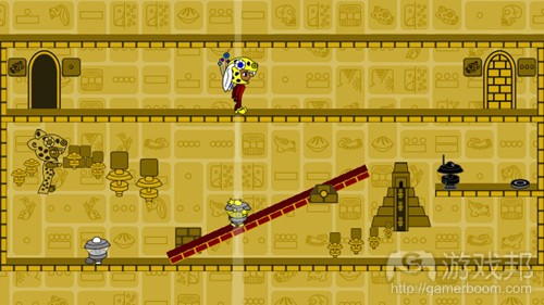
《Twenty Twelve》是我从事独立游戏开发后制作的第一款游戏。现在,这款游戏已登录多个平台:主机(XBox360)、浏览器(Silverlight 5)、电脑(Windows系统)和手机(Windows Phone 7系统)。各个平台利用不同的输入设备:外接游戏手柄、鼠标、键盘和触摸屏。给《Twenty Twelve》设计触屏界面比我原先设想的要困难得多。本文记录了该游戏的触屏界面的9个设计方案。
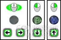
我为《Twenty Twelve》设计了相对简单的控制,为了便于在各个目标平台和输入设备之间移植。这款游戏的主角(Serena)可以左右移动,她会拉控制杆、会激活与她平齐的机器人,会穿过门廊,偶尔加速时间(想象一下《俄罗斯方块》中的向下箭头)。做了一些实验后,我发现Serena的活动能很好地映射到四个键盘按钮:左、右、激活(控制杆和机器人)和前进(穿过门廊和时间)。在游戏手柄上,模拟杆或控制杆操纵左右移动,而A和X键则对应激活和前进。使用鼠标时,由光标指引Serena向左或向右移动,而两个鼠标键则用于触发激活和前进。
刚开始这个项目时,我天真地认为触屏界面基本上可以一一对应到鼠标的按钮上,因为我以为XNA组件(游戏邦注:XNA是微软针对业余创作者所设计的游戏开发套件)会自动将触屏输入转换为单个鼠标事件。后来,我才意识到手会挡住玩家的视线,且虚拟按钮缺少触觉反馈。但我仍然没有料到移植的《Twenty Twelve》只需多使用一种输入装置。如果不你还没玩过《Twenty Twelve》,你可以尝试一下,考虑一下你会怎么设计它的触屏界面。
设计1
我为《Twenty Twelve》设计的第一个接触界面与鼠标控制紧密相关。当玩家的手指接触到屏幕的下半部分时,主角总是朝着玩家手指的方向移动。这个激活按钮会在玩家手指第一次接触到屏幕的任意位置时响应。屏幕的上半部分作为虚拟前进按钮。
当测试这个界面时,我一般一只手拿设备,同时在屏幕底部滑动我的食指。这种控制方案对游戏来说精确又敏感,且不会挡住玩家的视线。另外,玩家也可以两手持设备,两个拇指则舒服地放在屏幕底部的左右两角。当其中一个拇指激活它的虚拟按钮时,触屏会使Serena朝那个拇指的方向移动。
对于这个界面,我最大的问题是,每一次玩家将手指移回屏幕时,就会引发一个动作。这导致了许多误报,因为游戏指示的动作并不是玩家的意图。
设计2
为了减少设计1中的误报,我将第一次接触的激活替换成轻击动作。这个轻击动作只有经过短暂的接触后才能引发激活。虽然误报减少了,但这个动作又导致了更严重的延迟问题。限时动作是《Twenty Twelve》的重要部分,轻击动作的临时精确度不足。
设计3
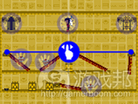
为了减少误报和延迟,我尝试了将多接触动作指定到激活按钮上。用食指牵引移动,同时第二个手指接触屏幕的任意位置都会引发激活按钮。这非常像用鼠标操作,一个手指控制移动,而第二个手指点击。不幸的是,保持一个手指接触而另一根手指停在屏幕上方对玩家来说非常疲劳。坚持这样的动作不动摇,很难支撑到2到3个关卡。
设计4
这是设计1的又一个翻版,即改变激活触发,即当玩家手指离开屏幕而不是第一次接触时,就会引发激活指令。虽然不太直观,但相比于之前描述的那些,我偏好这个控制方案。从某种意义上说,触屏意味着玩家准备激活,而移动手指会在玩家认准的位置和时间引发激活。虽然当玩家复位手指或收回手指思考时,仍然会产生一些误报,但这个界面引发的误报比设计1少。除了不太直观,这个界面还很难执行一系列快速的激活。这就让我没有办法完成《Twenty Twelve》的某些关卡。
设计5
对于《Twenty Twelve》的触屏界面,我的早期想法之一更具环境敏感性。在这个界面中,接触石头机器人会引发激活反应,接触玩家角色或任意一道门会引发前进反应。至于移动,玩家角色仍然朝着接触点的方向移动。
这个界面的主要问题是游戏时,很大一块屏幕会被玩家的手挡住。因为门通常靠近屏幕顶部,所以这个问题很严重。
设计6
当我意识到屏幕上发生的活动太多后,我得到了一些好建议,利用其他Windows Phone 7手机的另一个感应器。我将玩家的移动映射到设备的旋转上(绕着从屏幕顶穿到底的轴)。当设备旋转时,角色移向远离玩家的一边,否则留在原地不动。覆盖在屏幕左右两边上的虚拟按钮各表示激活和前进控制。
旋转控制的问题在于平衡敏感度。然而,我认为更大的问题在于玩家不能感觉到自己把设备旋转了多少。我们可以清楚地感觉到鼠标的位置,而对于旋转设备,就是另一回事了。旋转控制的优点在于,激活和前进按钮非常准确,让人感觉舒服。
设计7
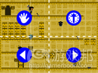
这个方案将4个虚拟按钮各置于屏幕的四个角落。从屏幕的左上方开始,顺时针方向,这些按钮分别是:激活、前进、右移和左移。
这个界面非常舒适直观。但问题是,左移和激活会互相排斥。玩家左拇指可以向左移,也可以执行激活在,但不能同时完成这两个操作,那样会很不舒服。这个界面还导致右移和前进互相排斥,但玩家极少会同时用到这两个操作。
设计8
你大概还记得设计1中的朝接触点移动实际上可以作为虚拟按钮。这个界面将设计7中的左右移动恢复到设计1中的样子,即总是朝着接触点移动。在这个设计中,手持姿势显然有很大影响,所以我决定将一手持设备,另一手控制作为正确的姿势。
这个界面与上面提到的几个设计有相同的缺陷。用一只手在移动控制和激活之间转换,会引发与设计2中相同的延迟问题。这个操作方案的另一个问题是,玩家的控制手在准备激活和前进时会严重地阻挡视线。这与设计5的问题一样。奇怪的是,在使用一只手时,设计7的互相排斥的问题看起来并不那么严重。
设计9
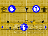
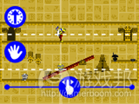
为了解决设计8的延迟和阻挡视线的问题,这个方案将激活和前进按钮垂直排列,且置于持设备的手的拇指能接触到的范围内。事实上,这些虚拟按钮横跨屏幕的宽度,无论玩家用左手还是右手持设备,都很方便。
Windows Phone 7手机版的《Twenty Twelve》使用的正是这个界面。它比前面提到的设计实用多了,但并非十全十美。我最关心的是,玩家持设备的姿势并不像我所说的那么准确。我第二关心的是,手指偶尔会挡住屏幕边缘的游戏物品,虽然这种情况很少发生。
结论
除了功能上的相似,鼠标和触屏界面的设计之间存在着重大差别。触屏界面的游戏需要考虑更多独有的问题(如持设备的姿势)。在重复设计《Twenty Twelve》的触屏界面的过程中,我觉得自己遇到了许多触屏界面的问题。在留心这些问题的同时,记得在设计用户界面时,玩家测试和反馈是必不可少的。(本文为游戏邦/gamerboom.com编译,拒绝任何不保留版权的转载,如需转载请联系:游戏邦)
Nine Touch Designs for Twenty Twelve
by Gary Dahl
Twenty Twelve is my first game as a full-time indie developer, and it is now available on several platforms: console (XBox360), browser (Silverlight5), desktop (Windows), and mobile (Windows7Phone). Each of these platforms makes use of different primary input devices: gamepads, mice, keyboards, and touch screens. Designing a touch interface for Twenty Twelve proved much more difficult than I originally anticipated. This post documents nine design iterations on the touch interface that ultimately shipped with game Twenty Twelve.
I designed relatively minimalist controls for Twenty Twelve, in an attempt to ease porting between each of the target platforms and input devices. The game’s protagonist (Serena) moves left and right, she pulls levers, activates robots she’s lined up with, moves through doorways, and occasionally speeds up time (think down-arrow in Tetris). With a bit of experimentation, I found that Serena’s actions mapped nicely to four keyboard buttons: left, right, activation (both levers and robots), and advancement (both through doorways and time). On a gamepad, the analog-stick or directional-pad controls movements left and right, while the A and X buttons are mapped to activation and advancement. Using a Mouse, Serena walks left or right toward the cursor position, leaving the two mouse buttons to trigger activation and advancement.
When starting this project, my na?ve understanding of touch interfaces essentially equated them to single button mouse interfaces. Supporting this view, the XNA framework automatically converts touch inputs into simple mouse events. I was peripherally aware of problems related to hands blocking players’ view, and of virtual buttons lacking tactile feedback. Still I didn’t anticipate problems porting Twenty Twelve to use just one more input device. If you haven’t yet played Twenty Twelve, now would be a great time to download the trial (on Windows or XBox360), and consider what kind of touch interface you would design for it: http://sugarpillstudios.com/games/twentytwelve/.
Design #1
My first touch interface for Twenty Twelve closely followed the mouse controls. The protagonist always moved toward your finger while it was in contact with the bottom half of the screen. The activation-button was invoked as your finger first made contact with any part of the screen. And the top half of the screen served as a virtual advancement-button.
While testing this interface, I typically held the device in one hand while sliding my index finger across the bottom of the screen for movement. This felt accurate and responsive, and kept players’ hands from blocking too much of their view. This setup also enabled a two handed holding-posture where the players’ thumbs comfortably hovered over the lower left and right corners of the screen. Touching the screen with either thumb moved Serena toward that thumb as each thumb were triggering its own virtual button.
My biggest problem with this interface was that every time you return your finger to the screen, an action is triggered. This results in many false positives, where the game registers actions that the player never intended. The next couple of interface revisions focus primarily on this problem.
Design #2
To reduce the false positives from Design #1, I replaced the first-contact activation control with a tap gesture. This tap gesture only triggers activations after short duration touch contacts. While eliminating false positives, this gestural control introduced an even worse problem of lag. Timing actions is an important part of Twenty Twelve, and tap gestures just didn’t provide enough temporal precision.
Design #3
In an attempt to reduce both false positives and lag, I tried assigning a multi-touch gesture to the activation-button. While dragging your index finger to control movement, a second finger anywhere on the screen invoked the activation-button. This felt much more like a mouse by allowing movement with one finger, and clicking with a second finger or thumb. Unfortunately, keeping one finger touching and one finger hovering above the screen was very fatiguing for players. It was hard to play more than two or three levels in this posture before feeling compelled to shake cramps out of your hand.
Design #4
One more variation on Design #1 involved inverting the activation trigger, so the activation command was triggered when your finger left the screen instead of upon first contact. While initially less intuitive, I preferred this control scheme over those previously described. In a sense, touching the screen signified that you were preparing to align an activation, and removing your finger then triggered that activation at the precise place and time you had planned. There were still some false positives when players reposition their hands or withdrew to contemplate solutions, but this interface provoked far fewer false positives than Design #1. In addition to its counter-intuitiveness, this interface also made it difficult to perform rapid series of activations. This prevented me from being able to beat some of the later levels in Twenty Twelve.
Design #5
One of my early visions for Twenty Twelve’s touch interface was much more context sensitive. In this interface, touching a stone robot triggered an activation response, and touching your avatar or any door triggered an advancement response. In terms of movement, your avatar still walked toward all touch contacts for as long as they were held down.
The main problem with this interface was that players’ hands blocked too much of the screen while playing. Since the doors were usually near the top of the screen, they were particularly problematic.
Design #6
With a sense that there was just too much happening on the screen, I received some good advice to try making use of the other Windows7Phone sensors. In particular, I mapped the player’s movement to the device’s rotation (around an axis running from the top to bottom of the screen). When the device was rotated, the player moved toward the side turned away from the player, otherwise they stayed put. The activation and advancement controls were presented as virtual buttons covering the left and right halves of the screen respectively.
Part of the problem with these rotation controls may have involved balancing their sensitivity. However, I think the bigger difficulty stemmed from the players’ inability to sense how much rotation they were applying. This was in stark contrast to how well we can sense the position of a mouse beneath our hand. On the positive side, the activation and advance buttons were very precise and comfortable.
Design #7
The next design implements four virtual buttons arranged in the four corners of the screen. Starting in the upper-left corner and working clockwise around the screen, the buttons include: activation, advancement, move right, and move left.
This interface was very comfortable and intuitive. The problem with this interface was that it made moving left and performing activations mutually exclusive. Your left thumb could either move left, or perform an activation, but it could not comfortably do both at once. This interface also made moving right and advancement mutually exclusive but that’s a rare combination for players to attempt in Twenty Twelve.
Design #8
You may recall how moving toward touch contacts (ala Design#1) could be effectively used like virtual buttons. This interface reverted the left and right movement in Design #7 back to the Design #1 scheme of always moving toward touch contacts. It became clear in this design iteration that holding posture was making a big difference, so I decided the correct usage was holding with one hand and controlling with the other.
This interface shared the drawbacks of several earlier designs. Using one hand to move between movement controls and activation introduced lag similar to Design #2. The other problem with this control scheme was that players’ controlling hands significantly blocked their view while preparing activations and advancements. This was similar to the difficulty encountered with Design#5. Oddly enough the mutual-exclusion problems of Design #7 did not seem as severe while using one hand.
Design #9
To address both the lag and view blocking of Design#8, this design stacks the activation and advancement buttons vertically and within reach of the holding-hand’s thumb. Actually, these virtual buttons span the width of the screen to enable both left and right handed holders.
This is the interface design that Twenty Twelve is shipping with on Windows7Phone. It’s far more usable than the previously described designs, but not without problems. My biggest concern is that the correct holding posture may not be communicated clearly enough players. A secondary concern is that fingers do occasionally occlude game objects around the edges of the screen, although this rarely happens.
Conclusion
Despite functional similarities, there are important differences between mouse and touch interface designs. Porting games to run on touch interfaces requires special attention to unique issues (like how a mobile device is even being held). In iterating on Twenty Twelve’s touch interface, I feel like I’ve been exposed to some common classes of touch interface problems. While staying mindful of these issues, remember that when designing user interfaces, there is no substitute for player testing and feedback.(source:gamasutra)







 闽公网安备35020302001549号