阐述游戏界面设计原则之映射玩家的想法
作者:Martin Kremecek
没有UI的游戏就像一辆被卸掉方向盘的汽车,根本不可能吸引任何人的注意。UI设计是游戏开发的一大基础,而幸运的是最近开发者们都开始尝试着对UI进行创新,《黑与白》便是一个典型的例子。而我将在本篇文章中对UI进行详细描述,并阐述如何才能将玩家真正带进我们所创造的游戏世界中。
在此我将谈谈玩家与游戏界面间的关系(PGI),即关于玩家如何与游戏进行互动,而不是游戏与玩家界面的关系(GPI)所提供的信息反馈。PGI将通过游戏语言而映射出玩家的思想,并且也包含了游戏操纵规则,让玩家既拥有一种熟悉感同时也能够实现较小的转换,即玩家如何基于游戏界面从一个简单的行动转换到一个单独的游戏行动中去。而如果玩家只是在3个菜单中按照自己的想法进行点击或者直接点击,那么情况便完全不同。但是这却不只是因为数量的作用。使用鼠标指针进行点击是一种抽象的行动,而我们还需要创造其它操纵形式——我不希望再面对操纵杆等设备,但却希望保留下标准的PC键盘和鼠标设置。《黑与白》便是操纵多样性的最佳例子,其制作人Peter Molyneux便有效地遵照了上述的规则。他的光标是通过一只“手”的图形表现出来,从而玩家能够按照人类所熟悉的方式用“手”触摸任何景观,拍打并轻抚自己的生物,并通过绘制符号而投射出咒语。这些都是我们人类所习惯的行动。如果玩家不能自己绘制咒语符号而是像标准的角色扮演游戏那样点击GUI按钮去选择一个咒语,并且后面跟随着目标位置的话情况又会怎样?这样的游戏还会有趣吗?从根本上说后面这种方法并不算太糟糕,只要其它界面处理方法仍然保持不变,那么《黑与白》顶多也就是缺乏创造性而已,并且仍然是一款具有可玩性的游戏。但是如果整个游戏界面都相应改变,那么麻烦就大了,因为玩家将不得不选择自己的生物,然后按压“好”或“坏”按钮。如果在UI中所有事物都过于相似,那么它们将被混在一起而变得难以区分,尽管它们所创造的效果有所不同但是它们本身的特殊关联性却早已消失了。
动作
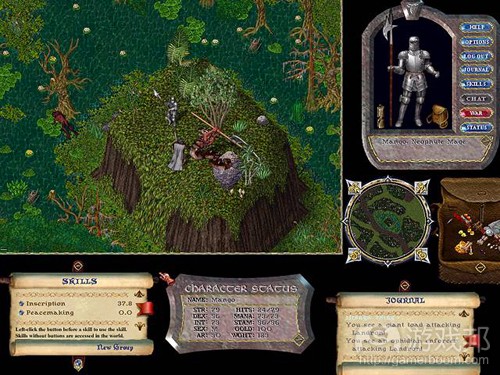
对我来说《网络创世纪》便是最佳例子。游戏中设有各种技能,但是玩家好像都在做些相同的事并看到不同的结果,尽管唯一的不同只在于技能按钮位置或者它所适 用的对象类型有所不同。我们可以将点击按钮砍伐树木与点击按钮驯养动物的动作分别命名为allarch和allurch。两种技能尚可接受,但是如果共有 20种行动需要以“rch”形式(如allorch,allirch,allmrch等)表现出来的话应该够呛了。因为我们将很难记住哪种技能对应哪个单 词。如果技能按钮旁边并未对应任何文本内容,玩家应该很快就会停止游戏吧。按钮位置各有不同,但是这种不同又是否等同于砍伐树木和驯养动物的不同呢?我希 望不是这样的,同时我也希望你们能够清楚这并不是最有效的方式。
而之后我们又该如何完善?让我们再次基于现实世界去设置UI。当提到砍伐树木时我第一个想到的动作便是挥舞斧头,所以为何不让玩家这么做呢?或者你认为这种行动很愚蠢?我认为从长远角度来看这比双击树木明智多了,并且它也区别于其它行动,而我的行动看起来就像真的在干活似的。但是我的意思并不是说我们应该尽可能确保任何事物的现实性,即将一个额外的斧头设备捆绑在游戏上让玩家能够打击一块塑料木板(游戏邦注:这是街机游戏中的趋势——如果我们说的是钓鱼船或哈雷摩托车。或许砍伐树木的动作也能够表现得与健身器材一样,就像《劲爆热舞》中那样)。我希望通过不同方式而抽象地传达任何事物。这不仅需要一定的现实性,同时还需要考虑到游戏的复杂度。这里可以想象《网络创世纪》的玩家在自己的房间中控制着多种不同设备的场景。
语言
让我们重新回到语言的话题中,我们都知道程序语言比起其它语言更加适合用于某些特定的应用中,因为它们更加简洁且容易理解。同样的原理也适用于此。我们也可以用“简短”来衡量玩家完成一个行动所需要的时间以及/或者屏幕上的空间距离,但是不管怎么样最频繁使用这些行动的还是玩家。而简单总是与速度对应在一起,因为越多UI动作也就意味着玩家需要投入越多时间!所以我们便需要在此添加快捷键让玩家能够重新定义UI,即根据自己的目标去优化它。虽然创造一个能够自动适应玩家游戏风格的UI仍是一个未来创想,但即便到那时候我们也仍需要设置一种可让电脑执行的基本语言。尽管要达到这个目标并不容易,但是设计师还是需要投入更多时间去实现这一目标。
关于设计的第一步便是真正了解你的游戏。这是你唯一拥有的绝对语言,你必须熟悉它。猜想着别人会想些什么是一个典型问题。但是就像我们之前利用现实世界去呈现玩家所熟悉的内容一样,我们也可以将同样的原理用于两个人见面时的场景,即虽然两者使用的是不同语言,但是他们也可以用肢体语言进行表达,并且他们也同处于一个环境中。通过这种方法便能够逐渐将两个系统联系在一起了——尽管有时候我们并不能直接转化某些内容,只能基于一种漫长且笨拙的方式进行转化。例如一种语言可能没有能够直接表达“巨大”的单词,所以我们便需要将其转化为“非常非常大”。虽然“巨大”这个单词较为简短,但是在这种语言中却并不存在。所以我们该怎么办?让我们假设你的界面所使用的是外语,而玩家使用的却是英语。所以为了说出“巨大”这个词他们便不得不以更加复杂的说法进行表达。而如果人们习惯使用“非常非常大”的说法,他们便会觉得“巨大”或者其它新的表达方式很奇怪。而这将会导致玩家在游戏初期疑惑不已。
为了避免让玩家产生笨拙感,我们可以使用简单且容易理解的图像代替书面语言。因为当玩家看到“树”这个单词时他还需要将其转变成某种形式的图像并在游戏中对上号。而有可能你的游戏中的树与玩家想象中的完全不同,这将导致他们需要将脑海中的树重新转换为游戏中的树,从而产生一些不必要的阻力,混淆他们在一开始的判断。但是我们也不能认为使用图像就万事大吉了。我们同时还需要留意各种动作(因为它们并不是静止的!),因为使用符号总是容易产生歧义,所以这些动作也会存在较大风险。《战锤40K》便广泛使用了图像按钮,虽然很多图像是与动作有关,但是我却很容易猜错!所以是否设置动画会更加合适?但是如果动画只是通过按钮上的光标呈现出来呢?不可否认这是一种更好的方法,因为动作总会操纵各种不同的对象,而只使用一种范例将会让玩家感到厌烦。《命令与征服》便在它那虽小但却快速的界面上有效地使用了动作符号。销售和维修虽然是两种行动,但是我们却可以使用钱和螺丝刀的符号去描写它们,因为实际上来看销售总是离不开钱,所以钱=贸易=销售(买进)(一开始先只有一些小冲突,并且因为相关描述将出现在鼠标光标上,所以这种问题很快就得到了解决),而维修则是:螺丝刀=技工=维修。但是使用符号并不总是可行,有时候文字更具有说服力。而如果我们能够结合图像和文字便有可能创造出非常棒的效果。
阻力
我在上文提到了“阻力”,而这也是表达UI如何与玩家进行互动的好方法。它将传达出玩家将想法转变成游戏行动时所遇到的各种问题和冲突。如果玩家心中想的是“左边”,但是实际上他却必须点击/按压右边,这便是他需要适应的第一个冲突。一些游戏便有意识地使用这种方法而在游戏中添加了其它变化(例如当收集到一个特别“糟糕”的道具),但是通常情况下设计师都会想法让UI与玩家间的关系更加和谐。但是在具有一定难度且需要与复杂的人类进行互动的游戏中我们总是难以避免冲突。我们最好在一开始将自己当成一个模型,因为在我们的脑海中我们更加贴近人类而不是任何创造意象。
优化特定UI的一种方法便是观察玩家如何执行游戏中的不同操作,例如使用一种程序语言。通过这种方法你便能够明确游戏是属于机制密集型还是思维密集型,以及游戏中所存在的最大问题是什么。如果你拥有游戏的可操作版本,你当然可以玩看看,但是如果你并不想搞清楚玩家的具体游戏进展你便可以跳过它。
结论
我唯一能够做的便是提供一个简短的总结以及一些对于你的追求有帮助的建议:
*就像爱因斯坦曾经说过的:万事万物应该尽量简单,而不是更简单。
*努力创造出接近游戏并能够让玩家感到舒适的语言,且不会让事物过于普遍化(如将建筑和单位放置在相同的创建列表中)。
*将现实生活作为基本模型从而为玩家创造熟悉感。
*让玩家能够通过捷径(如《博德之门》中的咒语)或可自由使用的基本UI元素(如《网络创世纪》)来表达自己的个性。
*区分控制方式。这能让玩家真正融入游戏世界中。
*将一些相互依存的内容放置在一起。
*缩短玩家与需频繁使用的对象之间的时间/距离,并这些对象设置更为合适的尺寸(这将能够减少时间的浪费并且不会让玩家因为调整鼠标移动而消耗更多时间)
*不要因全屏界面而导致玩家完全脱离游戏(特别是在即时游戏中),因为此时玩家无法完全控制行动,这可能会导致他们郁闷地离开菜单。
游戏邦注:原文发表于2000年5月26日,所涉事件和数据均以当时为准。(本文为游戏邦/gamerboom.com编译,拒绝任何不保留版权的转载,如需转载请联系:游戏邦)
The Interface Part I : Mapping the Player
By Martin Kremecek
Introduction
A game without a UI is like a car without a steering wheel, very unlikely to get much attention. UI design is one of the fundamentals, and luckily developers especially in recent times really try to innovate in this direction, with Black & White as one of the best examples. In this article I’ll try to give some new views about what a UI is basically about, and give a few hints on how to achieve one that really incorporates the player into the worlds we create.
For the first Part of this series, I’ll only talk about the Player to Game Interface, which defines how the player interacts with the game, not the information feedback provided by the game using the Game to Player Interface. The PGI has to map the thought input of the player to the game language, which is comprised of the game’s manipulation rules, in a way that gives the player a feeling of familiarity and has a small conversion overhead. With this overhead I mean how a single action by the player gets converted to a single game action using the interface.
It makes a difference if the player has to click his way through 3 menus or by using a single direct Click!But not only quantity plays a role. Basically clicking using the mouse pointer is a rather abstract action, and other forms of manipulation should be explored, with which I don’t want to stress on joysticks or other devices, but rather remain with the standard PC setting of keyboard and mouse. The best example for manipulation diversity is now Black&White, where Peter Molyneux actually meets the above rules very elegantly. He uses a hand as a cursor ( aren’t we used to manipulate things with that?). So the player moves by grabbing the landscape, slaps or caresses his creature and casts spells by drawing symbols. This really merges with what we as humans are used to. Image that instead of drawing the spell, you just would have to click on a GUI button co choose a spell, with the target location following right after, like in standard RPGs. But where would the fun remain? Basically the latter approach isn’t too bad, an as long as the other ways of the interface would stay the same, B&W would be less creative, but still very playable. A problem would arise, if everything worked that way, so you would have to select your creature, then press on a “good” or “bad” button. If things get too similar in using the UI, they’ll all be blurred together, and the special associations get lost, although the effects they create may be different ones.
Actions
Ultima Online appears to me as the best example for this. There are dozens of skills, but players don’t really do different things, they just see different outcomes although the only difference is the location of the skill buttons, and maybe the type of object it gets applied to. Clicking on a button to chop wood, compared to clicking on a button to domesticate an animal would be comparable to name the first one allarch, and the second one allurch (whatever..). Now this is acceptable with two skills, but imagine all 20 actions were modifications of all rch (allorch, allirch, allmrch etc ). Pretty weird and difficult to remember which skill belongs to which word, isn’t it? Imagine there was no text next to the skill buttons, and probably you’ll soon stop playing the game. The button locations are different, but is location on the screen really comparable to the difference between chopping wood and petting an animal? I hope not, and I also hope that you agree that his way surely cannot be the most efficient.
But how could it be improved then? Let’s try again to base the UI on the real world. Swinging an axe is the basic action that comes to my mind most immediately if I think about chopping wood, so why not let the player do some of the work? This is stupid you think? In my opinion this is less stupid in the long term than double clicking on trees, and it would also feel different from the other actions and my action actually really is more like doing the real work! But hold! I don’t want to say that you should make things as real as possible, bundle an extra axe device with your game and let the player hit a piece of plastic wood (though this really is the trend in arcades, if we look at Bass-Fishing, Harley Davidson. Who knows, maybe TreeChopper would do well as a fitness machine, maybe a bit like Dance Dance Revolution..). I want to show that things can be abstracted in many different ways. A certain degree of realism is enough, depending also on the complexity of the game. Imagine UO players sitting in their rooms scrammed with dozens of different devices!
Language
But let’s return to the language term. As many of us will probably know, some programming languages simply are better suited for certain applications than others, because they are shorter, faster, easier or whatever. The same things applies here. “Shortness” can be measured as the time needed for a player in average to do an action, and/or the spatial distance on the screen, but in any way it should be tried to minimize these functions, especially for those actions that are most frequently used by the player. Simplicity is often correlated with speed, because more UI actions simply need more time! So placing shortcuts, for letting the player redefine the UI at least a bit, to optimize it for his own purpose is recommendable (a positive point in UO!). Creating one that automatically adapts to the player’s style still is a vision for the future, but still there would be a basic language needed for the computer to act on. So as tough as it seems, it will stay the designer’s job for probably quite some more time!
The first step for your design is to really understand your game. This is the only absolute language you’ll have, so you’d better be familiar with it. Anticipating what players are going to think is a classical problem. But as we tried before, using the real world is a good guarantee that many people might actually understand what you mean, since this is also usually used when two people meet, having foreign languages but a quite similar body and their shared environment. This way they then are able to gradually draw parallels between the two systems, although there may be things that cannot be directly translated, but only in a rather long and clumsy way. For example one language might not have a word for “huge”, and it would need to be translated as “very very large”. The first one surely is shorter, but it does not exist.. So what? Lets say your interface is the foreign language and the player speaks English. So in order to say huge he has to express this in longer ways. And since real world language is usually more elaborate than than the UI one, we should try to minimize the effect by guessing what word or sentence the player is most likely to use. If all people were used to say “very very huge”, it would be strange if you used “huge” for this and actually invented a new word. This would create confusion at the beginning at least.
In order to reduce clumsy for the player, using images instead of written language can be extremely helpful as long as images are easy and clear to understand. This is because if a player reads “tree”, he first has to convert it to some sort of image to use it in comparison to your game. The probability that your game tree looks different to what the player expects is quite large, forcing him to remap his mind-tree to the actual game-tree, introducing unnecessary resistance, especially for beginner players. But again, don’t just think that by using images always this job is done. Great care has to be taken of actions ( since they actually are not static! ), and they offer a high risk, since the used symbols are often ambiguous.Warhammer 40K ( an XCOM like strategy game) uses graphical buttons for quite everything and guess, many of them indeed are actions and I often really didn’t guess the right way! So would animations be better? Well maybe if they wouldn’t draw as much attention to themselves. But! What if the animation was only shown with the cursor over the button? This definitely would better things, but still I prefer a word like approach, because actions often manipulate many kinds of different objects, and using just one as example would be rather irritating. But a good example for use of symbols for actions is C&C with its small and fast interface. Sell and Repair both are actions, but both can be very well described using the symbols for money and a screwdriver, since selling is practically always associated with money, so: money <-> trade <-> sell(buy), (offering just a small conflict at the beginning, which is very quickly resolved because of the description appearing above the mouse cursor!), while repair is something like this: screwdriver<->mechanic<->repair. But using symbols is always a vulnerable way, with words being more absolute in its meaning. A combination of both might serve the purpose well.
Resistance
Above I wrote about “resistance”, and this basically is too a good way to express how a UI interacts with a player. It expresses the problems or conflicts the player meets when converting his thoughts to the game actions. If the thinks “left” for example and the player actually has to click right/press right, this is a conflict for the player to which he first needs to adapt. Some games use this consciously to add another twist to the game (eg. When collecting a special “bad” item), but generally a UI will be designed to have a harmonious relationship with the player. But conflicts can basically cannot be avoided in a game that is complex to a certain degree and interacts with a complexity of a human being! IT is always best to take yourself as model at the start, since you are much more human than any created image could possibly be in your head.
A way to optimize a given UI is to actually take a look at how the player has to perform the different actions of the game, by using a programming language for example. This way you are also able to see how mechanically/thinking intensive the game is, and where the biggest problems arise. If you have a working version of the game though, it is always best to just play it of course, and this phase might be skipped, except you want to take a very detailed look at what is really going on ( or should be going on ) inside the player.
Summary
All I can do now is offer a short summary and some hints to aid you on your quest:
As Einstein said: make it as simple as possible, but not simpler.
Meaning to create the language as close to the game but also as comfortable to the player as you can, while not generalizing things too much ( eg by putting buildings and units into the same build-list ).
Use real life as a basic model to give players familiarity.
Allow players to express their individuality by allowing UI refinements using shortcuts ( to spells in Baldur’s Gate) and/or basic UI elements that can be freely used ( UO).
Differentiate the controls. This gives the players a “feeling” of your world.
Place things belonging together closer to each other.
Reduce the time/distance to frequently used objects and give them proper sizes ( this also decreases time and does not distract the player too much with fine tuning his mouse movements)
Do not tear the player completely away from the game with fullscreen interfaces ( especially in real time games!), since he loses complete control over the actions and will always be hectic to leave the menu again.
Conclusion
Well, these are at least some rules, but this merely scratches the surface into which it is best to dive on your own!
I hope you enjoyed this article a bit and are interested in reading Part II, in which I’ll cover the Game to Player mapping of game outputs. Defining what data is needed and how it should best be converted. Hope you’ll be with me then! (source:gamedev.net)






 闽公网安备35020302001549号