分享《Lunch Bug》关卡选择屏幕的优化过程
作者:Matt Hackett
此时的我们正在准备《Lunch Bug》(游戏邦注:这是Lost Decade Games即将在Facebook、Pokki、Chrome Web Store、Mac App Store、iOS、Android和开放网页平台上推出的一款HTML5游戏)的发布工作,也就意味着我们正在不断修饰这款游戏的边边角角以让它闪耀出更璀璨的光芒。而最近我们所遇到的最粗糙“边角”要数“关卡选择”屏幕(玩家需要通过这一关口进入游戏)。
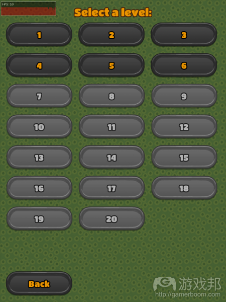
关卡选择屏幕既简单又有用,但是却甚少玩家愿意去仔细观看这一屏幕。同时在竖屏显示状态下,每一列的行数也并不均衡。我们相信自己能够更好地完善这一屏幕。
计划
在经过了几次头脑风暴后我想出了以下计划:
1.将这单一的屏幕分为多个页面而让玩家明显感受到自己在游戏中的进展。
2.根据当前目标和打开关卡完善用户界面。
3.使用特的图像和动画优化屏幕。
1.分解
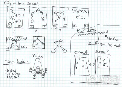
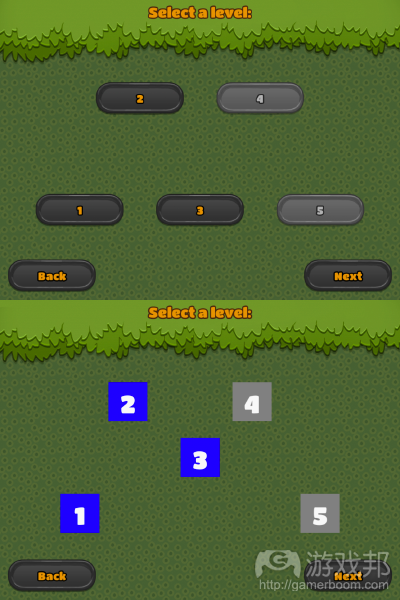
首先我们需要将关卡选择屏幕分解成多个页面。因为《Lunch Bug》共有20个关卡,所以我们可以将其分解成4个屏幕,并且每个屏幕显示5个关卡。当我们准确设置好按钮的位置后,我把这些按钮转变成一些简单的图像。
在首次迭代中我添加了“返回”和“下一步”按钮让玩家能够浏览不同页面。我之所以未做出太大的变化是想尽早隔离潜在问题,避免自己在深入执行阶段时绊倒在漏洞上。
当我在设计中删除了大量按钮后,我发现整个屏幕变得异常空荡。所以为了让整个画面看起来更加紧凑,我便在标题画面中添加了悬挂的树叶。
2.更好的用户界面
早前的关卡选择屏幕未经过完善,所以我们只能看到一些糟糕的用户界面。当玩家打开一个新的关卡时,代表下一个关卡的按钮将会启用(即从灰色便为黑色)。但这种设置不仅完全没有吸引力,更糟糕的是根本不能清楚地向玩家传达相关信息。
为了解决这一问题,我使用了“引导小虫”去突出当前的关卡按钮,让这些小家伙们在所强调的按钮周边围成一圈。这便能够清楚地告诉玩家接下来是哪个关卡,因为这些小家伙会绕着相应按钮舞动,使整个屏幕显得更加有趣。
同时在玩家打开关卡时我还添加了渐变动画。即当玩家敲击按钮时这些引导小虫将涌向相应关卡按钮,并簇拥着走向下一个关卡按钮边,这可以推动玩家走向下一个关卡。
3.图像和动画
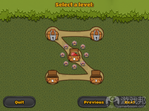
最后便需要导入图像了。为了取代那些启用或关闭按钮,我希望图像能够吻合游戏主题而明确表现出关闭,打开和使用中三种状态。最终我选择了野餐篮图标。因为野餐篮本来就能够“关闭”和“打开”,所以我们便能够轻松地呈现出这两种状态。而为了突出“使用中”状态,我添加了一些草莓去突出这个特点。
同时我还渲染了关卡与关卡间的路径,就好像是游戏的背景图层一样。在关卡间呈现出这种路径效果能够更好地完善我们的设计。
视差滚动更能体现优化效果。运用了一点Photoshop技巧,我将树叶图像调整为重复模式,然后我在右边添加了第二个叶子堆图像,并且使用了一些简单的渐变公式而让它们能够随着背景缓慢滚动。可以说视差滚动是我们在优化游戏时最简单也是最具视觉影响力的方法。
进一步润色
可以说优化是一个无底洞,需要你投入更多时间,但是你却不可避免地想要进行更深入的润色。我已创造出的合理关卡选择屏幕,是时候引入新图像和音乐了。
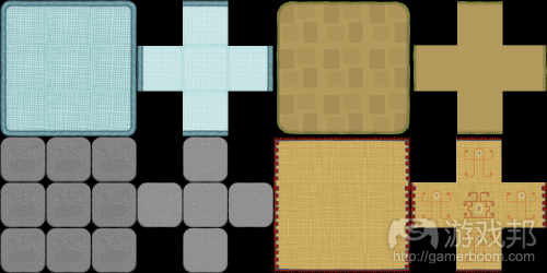
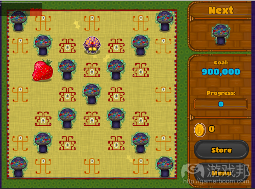
第一步便是添加新的重复区块图像。如此玩家便能够伴随着有趣的新图像而面对游戏中的挑战。因为《Lunch Bug》的作曲人已经为游戏玩法创作了4首曲子,所以我们只要将其加载到游戏中便可。
作为一款策略型益智游戏,玩家需要投入一定时间才有可能精通《Lunch Bug》。我希望这些新关卡页面能够帮助玩家更深刻地感受到自己在游戏中的前进,而外观和风格的改变也能够推动着玩家更乐意体验游戏。
总结
虽然优化是件苦差事,但是如果你希望自己的游戏能够更加出众那就不得不接受这项工作。就我自己来说,单单优化过程便花费了我整整一周的时间,但是我却认为这一切都是值得的。因为如果游戏的某一部分未得
到优化,它就会影响着整体的游戏体验。(本文为游戏邦/gamerboom.com编译,拒绝任何不保留版权的转载,如需转载请联系:游戏邦)
Polishing a Level Select screen: process and implementation
by Matt Hackett
We’re just about ready to launch Lunch Bug, which means I’ve been polishing every rough edge until it shines. One of the roughest edges until just recently was the “level select” screen, where players progress through the game.
The level select screen was simple and worked fine, but it wasn’t much to look at and certainly wasn’t fun to interact with. Also the number of rows in each column were uneven in portrait mode. We can do better!
The plan
After some brainstorming, I came up with this plan of attack:
1.Break up this single screen into multiple pages to enhance the feeling of progression.
2.Improve the user interface regarding current goal and level unlocking.
3.Polish up the screens with unique graphics and animations.
1.Break it up
The first step was to split the level select screen into separate pages. Since Lunch Bug has 20 levels, 4 screens displaying 5 levels each felt like a good separation. Once the buttons were positioned correctly, I converted them into simple images instead of buttons.
In this first iteration, I also threw in “back” and “next” buttons to allow users to navigate through the pages. The steps I take are deliberately small, in an attempt to isolate potential issues early on and avoid tripping on bugs as I get deeper into the implementation.
Once I removed the large majority of buttons from the design, I noticed that the screen looked especially bare. Always on the lookout for ways to give our graphics longer legs, it occurred to me that the overhanging leaves from the title screen would work here too.
2.Better user interface
The previous level select screen wasn’t just unpolished, it also had a clunky user interface. When players unlocked a new level, the button representing the next level would simply become enabled (changing its color from grey to black). Pretty lame, not very rewarding, and worst of all, not a very clear message to the player.
To fix this, I highlighted the current level button with what I ended up calling “guide bugs.” I positioned these little guys in a circle around the highlighted button. This clearly messages to the player which level is next, and since they dance around, it makes the screen more entertaining to look at too.
I also added tweening animations when players unlock levels. The guide bugs swarm in on the button of the level the player just beat, then tween to the next level’s button. It’s a little reward to the player for finishing a level and reinforces what the player’s next goal is.
3.Graphics and animation
The final step was graphical work. In place of the buttons which were only ever enabled or disabled, I wanted images with three states (locked, unlocked and current) that fit the game’s theme. To solve this I opted for picnic baskets. Since they already have “closed” and “opened” states, they’re easily visually mapped to “locked” and “unlocked.” To represent the “current” state, I filled it with a berry and made it glow.
I also rendered the paths between levels in the same style as the background tiles in the game. This draws a visual path between the levels and helps fill the design out.
Lastly, nothing says polish like parallax scrolling! With a little Photoshop work, I made the leaves image into a repeating pattern. I then added a second leaves image stacked to the right, and after some easy tweening math, had them slowly scrolling along with the background. Parallax scrolling can be one of the simplest and most impactful visual effects to add when polishing your game.
Take it further
Polish is one of those deep holes that you can spend tons of time on, but you’ll always want to add more! Once I had the paginated level select screen in place, it created the perfect situation to introduce new graphics and music to the game.
The first step was to add new repeating tile graphics to the mix. This rewards the player for progressing through the game with interesting new graphics to enjoy. Since Lunch Bug’s composer Joshua Morsehad already made four songs for the gameplay, it was easy to load those on the fly too.
As a strategic puzzle game, Lunch Bug can take a long time to master. The hope is that these new pages of levels will enhance the feeling of progression. Changing up the look and feel should also reinvigorate players to keep enjoying the game.
Summary
Polish can be hard work but it is absolutely mandatory if you want your game to shine. This process took about one entire week of development, but I think it was well worth it. When a part of your game isn’t polished shiny, the overall experience of playing it can suffer.
Lunch Bug is the next HTML5 game from Lost Decade Games, soon to be released on Facebook, Pokki, the Chrome Web Store, Mac App Store, iOS, Android and the open web. Follow us on Twitter and we’ll let you know when it’s ready to play!(source:GAMASUTRA)








 闽公网安备35020302001549号