阐述手机游戏用户界面设计的8大步骤
作者:Derk
我发现界面设计是创造游戏最困难的阶段之一。如今市面上充斥着各种不同的屏幕,而在这些较小的屏幕空间里,设计师更是需要谨慎思考每个屏幕的像素问题。
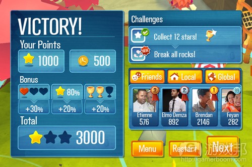
最近,我们重新设计了一款即将发行的游戏的整个界面——因为我们发现用户体验未像我们预想的那般合理。起初的界面是同时在整个屏幕上提供各种信息,并且没有任何一个明确的关注点,所以玩家很难搞清楚自己到底在看些什么。如此玩家便只会看着屏幕1秒就点击“下一步”按钮而开始接下来的关卡。换句话说,我们之前的界面未能执行自己的功能。
以下我将列出引导开发者设计游戏界面(特别是针对于iPhone,iPad以及Android游戏)的8大步骤:
1.选择平台
界面设计师必须先明确自己的界面能够支持的平台。就像对于《Momonga》,我们在发布时只支持iOS和Android。这点看起来好像很简单,但是实际上我们需要考虑到以下屏幕:
iOS设备分辨率:
iPhone 3GS(480 x 320像素)
iPhone 4(S)(基于326 ppi的960 x 640像素)
iPad 1和2(1024 x 768像素)
iPad 3 Retina(基于264 ppi的2048 x 1536像素)
Android设备分辨率:
包括三星,HTC,宏碁,华硕——其分辨率更是多种多样!
处理iOS的显示器较为简单。因为这些设备只存在两种屏幕尺寸,并且Retina像素也只是双倍增长。所以如果你只是面向iOS开发游戏,你便可以只创造两种不同的界面:一种面向iPhone/iPod Touch,另外一种面向iPad。基于Retina分辨率进行设计,然后根据比例调整以适应较早的版本。
而对于Android来说就复杂得多了,因为这里有各种各样的设备,并且我们也不可能针对每一台设备定制专属的界面布局。所以我们必须选择两种基本的分辨率(游戏邦注:一种是面向手机,另一种是面向平板电脑)。最终我们选择了三星Galaxy S2以及Droid,而其它受欢迎的设备中也是同样可行的。
随后我们明确了自己的设计能否与这些分辨率有效匹配。同时我们需要调整界面以适应其它分辨率。也许我们的界面不能完美地呈现于这些设备中,但是我们却可以不用投入额外精力轻松地完成这种设置。
注:明确你的界面能够支持哪些平台,并列出所有合适界面的分辨率。
2.明确定向
这是一个很明显但是却容易被忽视的步骤。你的界面是支持竖屏还是横屏模式?或者两者均可?这是你在进行各种设计之前必须仔细思考的问题。
选择一种合适的定向能够帮助你节省许多时间。就像在《Momonga》中我们只使用了横屏模式,因为在横屏模式中玩家能够更好地操纵游戏。但是设计师们并不能因此而懈怠,因为市场上还存在着各种不同的手机玩家,他们也拥有各自的喜好。设计师应该亲自实践哪种定向更适合自己的游戏,并坚持自己的判断。
注:明确你的界面定向。
3.参照其他游戏
市场上已经出现了许多优秀的游戏,而如果设计师对于这么多活生生的参考样本置之不理那就不可原谅了。设计师应该花钱购买一些游戏,获得游戏界面截图,然后花点时间仔细琢磨对方设计师的想法,并思考这种设计是否也适用于自己的游戏。?
以下是我在进行《Momonga》的互动设计时所参考的一些iPhone游戏:
(上图分别是《愤怒的小鸟》,《卡勒瓦拉英雄》,《鱿鱼小英雄》以及《翼飞冲天》的界面。)
寻找参考游戏主要是为了让设计师能够发现其华丽图像之外的界面布局原理。但是盲目地复制其它游戏设计却不是一种好方法,因为别人的设计不一定符合你的需求。这时候设计师需要自问:
*我需要向玩家传达哪些信息?
*玩家需要哪些功能?
*需要突出哪些内容?
*窗口处于何种环境中?
注:使用参考范本作为自身设计的灵感和基准,但切记盲目复制,你只要从中学习便可。
4.制作流程图
在你开始面向个别屏幕进行设计前,请先列出可能会出现于你游戏中的所有窗口。
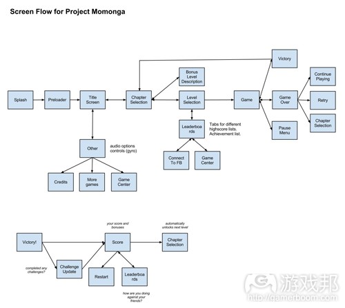
随后,你需要创造这些屏幕的流程图,也就是我所说的“屏幕流程图”。这是一种手动操作的流程图,能够呈现出所有屏幕彼此间的关系。当你完成了一个关卡后,哪个屏幕会最先出现?你是否能够从主菜单直接进入最高分数榜单页面?这都是一些复杂的问题,你可以在整个设计过程中不断对屏幕流程图做出调整。
以下便是《Momonga》的屏幕流程图:
我们可以从图中看到,这款游戏拥有一个主菜单,一个胜利序列,一个游戏结束屏幕,一个关卡选择屏幕,并且游戏所需要的一切内容都能够有效地运行着。从屏幕流程图中我们能够知晓在每个屏幕上需要按压哪些按钮。我们必须让玩家能够前进到下一个窗口中,并在大多数情况下也能够回到之前的窗口。
注:列出你需要设计的所有屏幕列表,然后围绕着这些屏幕创造流程图。从中你便能够明确它们彼此之间是如何相互协作的。
5.选择功能
接下来便需要选择屏幕的功能。从此你便算真正开始进行游戏的互动设计。界面主要有两种功能:一是提供信息,二是允许用户做某事。
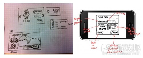
而设计师的工作便是明确需要在屏幕上呈现何种信息以及用户能够采取何种行动。我通过一张简单的草图勾勒出了游戏界面应该拥有哪些按钮并呈现出哪些信息。而这些草图都较为粗糙,甚至未考虑到尺寸和定位等问题。这时候你便需要问自己:是否该在这里设置按钮?具体该将按钮设置在哪里?按钮的尺寸要多大?等等。
以下便是我所勾勒出的一些草图:
我会根据不同心情或者所处的设计阶段,利用书签,便条纸或者Photoshop等工具绘制草图。
我们需要牢记:
*尽可能将信息量和按钮压到最低数量。
*明确每个屏幕都有一个主要目的。
*铭记屏幕流程处所有情境。
*删除任何重复的内容,除非它们真的有存在必要。
*考虑到需要在多个屏幕上分割内容,所以你需要尽可能地压缩信息量。
注:创造屏幕的功能草图。即通过界面的基本草图列出我们真正需要的内容。
6.创造线框图
在这个阶段我们便需要使用Photoshop!这是关于创造屏幕的布局(没有额外的装饰)。虽然这仍是关于互动设计,但是我们现在却需要开始正视定位和尺寸。在步骤5中你可能会在一张餐巾纸上绘制出草图,但是线框图却不再是那般随意。线框图可以说是设计师的指导方针,你不能草率对待。
以下我将列出创造游戏界面线框图的诀窍:
*使用一种能够支持你所有设备分辨率的模板。
*开始设计之前,与程序员好好讨论如何真正落实行动。
*在整个设计过程中定期与程序员一起核实设计的可行性。
*在Photoshop中为游戏的每一个屏幕分组,并使用你所创造的线框图去填充这些屏幕。
*当你做出了一个巨大的改变后记得复制整个屏幕组,然后重新开始新的设计。这样你便能够随时回到之前的设计中。
*明确一个主导框架:创造指南,并始终坚持这一指南——不论你选择了何种平台或屏幕。
*设置灰度等级,并且在必要的情况下为按钮设置颜色。
*还没有圆角:你需要重新调整尺寸并创造出更容易使用的普通矩形。
*使用Dropbox你便能够基于目标设备轻松地测试你的设计。在Dropbox中以jepg的格式保存设计,并在你自己的iPhone上打开它们。
我总是喜欢以jpeg格式保存设计。并且我会根据时间顺序去排列所有的文件。
注:创造线框图。不加任何修饰,并且也不留任何缺口。在你的目标设备上进行测试。
7.创造设计
这时候就需要Photoshop高手的帮忙了。在我们的游戏设计中,Jimmy便是我们的专家。我们总是会认为,如果创造出了一个很棒的设计,那么制作出合适的用户界面便是轻而易举的事。
但是实际上却不是这般简单。不管你是否做出了慎重的思考,当你真正落实行动时总会出现一些漏洞。这时候你就必须与Photoshop高手保持密切的联系,并时刻准备着回答他所提出的复杂问题。同时你还需要顾及到创造性自由,并在必要时刻坚持自己的想法。
设计手机游戏还需要注意的一个小细节是:要使用矢量图。在之前游戏的界面中我们便因为着眼于像素而让自己陷入一个大麻烦,即当iPad 3带着更加精确的Retina屏幕问世时,我们便不得不重新捣鼓游戏的界面设计。
以下是《Momonga》的新界面。你们需要以此为教训,时刻谨记:
注:该开始设计界面了。
8.测试并迭代
你不要以为来到了这个阶段就相当于大功告成了。你真正需要面对的是再次重复之前的工作。设计是一个很奇特的问题:因为只有创造出补救内容并看到它真正运行时你才知道自己的创作是否合理。所以设计师就必须测试自己的游戏界面,并且在必要时刻重新开始。
我们现在便处于需要完全重新设计界面的过程。这听起来确实很伤感:我们投入了大把的时间设计出了之前的那个布局,并且也精心雕琢了其外观。但是在花费了好几周的时间后我们却发现这一布局并不能有效运行。所以我们不得不重新来过。这一次我们将从Retina的矢量着手,并且有信心创造出更棒的互动设计。
我很早就知道之前设计很糟糕?也许吧,因为再次回首我便很明显地看到了问题所在。但在那时候我们却只能依靠测试者去判断它的好坏。因为这是最简单的方法。
注:执行界面并测试它。如果必要的话就重新回到绘图板再次进行设计。反复迭代。要知道任何细微的改变也有可能创造出巨大的不同。(本文为游戏邦/gamerboom.com编译,拒绝任何不保留版权的转载,如需转载请联系:游戏邦)
The 8-Step Guide To Interface Design for iPhone Games
by Derk
I have found that interface design is one of the toughest parts of creating a game. With so many different screens, and so little screen space, every pixel needs to be thought through.
We have recently redesigned the entire interface for our upcoming game, because we realized the user experience simply did not work as we intended. There was too much information on screen at one time, and without a clear focus, people did not understand what they were looking at. People looked at the screen for about 1 second, then clicked on the “Next” button and started the next level. In other words: The interface simply did not do its job.
Above: The crowded victory screen that is currently getting a full make-over.
For all you game interface designers out there, here is an 8-step guide to interface design – specifically tailored to iPhone, iPad, and Android games.
Ready? Let’s go! ![]()
1. Determine the platforms
The first step is to find out which platforms your interface will support. With Momonga, we are supporting iOS and Android at launch. This seems simple enough, but in fact we need to support for the following screens:
iOS device resolutions:
iPhone 3GS and equivalent (480 x 320 pixels)
iPhone 4(S) and equivalent (960 x 640 pixels at 326 ppi)
iPad 1 & 2 (1024 x 768 pixels)
iPad 3 retina (2048 x 1536 pixels at 264 ppi)
Android device resolutions:
Samsung, HTC, Acer, Asus – resolutions are all over the place!
The displays for iOS are fairly straightforward. There are two aspect ratios, and retina simply doubles the pixels. If you are only developing for iOS only, you could consider making 2 different interfaces: One for iPhone / iPod Touch, and one for iPad. Design it at retina resolution and scale it down to fit the older models.
For Android, however, there are so many different devices out there that it is impractical to create a custom interface layout for each one. We therefore chose two basic resolutions (one for phones, one for tablets). We worked with the Samsung Galaxy S2 and the Droid, but any popular device will do.
We then make sure that the design matches those resolutions perfectly. The interface should scale and adapt to other resolutions. It will not be perfect on those devices, but it will work without too much extra effort.
Step 1: Determine which platforms you will support and make a list of all the resolutions the interface should cater to.
2. Determine the orientations
This is an obvious but easily overlooked step. Will you support portrait or landscape orientation? Or both? This is a critical question before you do any design work at all.
Choosing one orientation cuts your work in half. For Momonga we use landscape only, because the game simply plays better in landscape mode. Don’t be lazy though – there are many different mobile gamers out there, and they each have their own preferences. Play around a bit to see what works and what does not. Then stick to that decision.
Step 2: Decide the orientations you will support.
3. Search for references
There are so many great games out there, that it would be silly not to look for references. Buy some games, make screenshots of the interface and take a bit of time to think about the decisions these designers made. Will they apply to your game?
These are some of the iPhone games I have looked at for the Momonga interaction design:
Above: Interfaces for Angry Birds, Heroes of Kalevala, Squids, and Tiny Wings.
The trick here is to look beyond the visual splendor and identify the purpose of the screen. Bluntly copying a design won’t make you smarter, and it might not fit your specific goal. Ask yourself these questions:
What information do I need to convey to the user?
What kind of functionality does the user need?
What needs to stand out from the rest?
What is the context for this window?
Step 3: Use references for inspiration and benchmarks. Don’t copy, but learn from them. No need to invent the wheel.
4. Make the Screen Flow
Before you start on the individual screens, make a list of all the windows your game will have. This is your to-do list for the upcoming weeks.
When you have that ready, it is time to make a flowchart of all those screens. I call it the “screen flow”. It is a handy flowchart that states how do all those screens relate to each other. When you complete a level, which screen comes first? Should you be able to go to the high score list from the main menu? These are tough questions, and you will probably have to make changes to the screen flow as you progress through the design process.
Here is the screen flow for Momonga:
Above: Example interface flowchart. (Click for larger version)
It has a main menu, a victory sequence, a game over screen, level selection screen, all the things the game needs to work well. The screen flow tells you which buttons need to be on every screen. Players need to be able to progress to the next window and in most cases, move back to the previous one.
Step 4: Make a list of all screens you need to design. Then create a flowchart with those screens. This will allow you to see how they all connect together.
5. Choose the functionality
The next step is to choose the functionality of the screens. This is where you actually start the interaction design for your game. An interface does two things: It provides information and it allows the user to do something.
It is your job to decide what information should be on the screen and what actions the user can take. I make small and simple sketches of what buttons the interface should have, and what info should be displayed. These sketches are small and rough – they don’t take into account size and positioning. The question here is: To Be Or Not To Be. Should the button be here or not? Where you place it, and how big it is, that is for the next step.
Here are some examples of this:
Depending on my mood and the stage I’m in, I sometimes sketch with a marker, sometimes on super small stickies, sometimes in Photoshop.
Some things to keep in mind:
Less is more. Keep information and buttons to a minimum.
Stick to the one primary purpose for the screen.
Keep the context of the screen flow in mind.
Try to remove any doubles you may find, unless it is a necessary one.
Consider splitting things up on multiple screens, to keep the info bite-sized.
Step 5: Make the functional drafts of the screens. The result is a basic sketch of the interface, outlining what needs to be in there.
6. Make the Wireframes
This is where things get Photoshoppy! The next step is about making the basic layout of the screens, without colour or fluff. This is still about interaction design, but this time we start to think seriously about positioning and size. In step 5 you were probably making a doodle on a napkin, but a wireframe is more than that. It is a guideline for the designer, and you want to do the thinking for him.
Here are my tips for wireframing your game interface:
Use a template that supports all your device resolutions.
Before you start, sit down with your programmers to discuss the implementation.
Along the way, sit down with your programmers regularly to verify that your design is feasible.
In Photoshop, make a group for every screen of your game. Fill them with your wireframes as you go along.
When making a destructive change, copy the entire group and start with a new one. You can always go back that way.
One grid to rule them all: Create your guides and stick to them, no matter the platform or screen you are working on.
Work in greyscale. Emphasize buttons with colors if you need to.
No rounded corners yet: you will do a lot of re-sizing and plain rectangles are much easier to work with.
With Dropbox you can easily test the designs on your target devices. Save it as jpeg in Dropbox, and open the design right on your iPhone.
I like to save the designs as jpeg often. In the end I have all chronological steps in numbered files.
Step 6: Make the wireframes. No fluff, but don’t leave any gaps either. Test on your target devices. Make sure the programmers and designers can take it from here.
7. Create the design
This is where the Photoshop Guru takes over. That could be you, in my case it’s Jimmy. If you did your design work well, the making of the actual shiny interface should be a breeze in the park.
Of course, that is not how it works in real life. No matter how well you thought everything through, when it is time to really make the thing there will always be gaps to fill. Stay in close touch with your Photoshop Guru and be prepared to answer some tough questions. Make sure that you allow for creative freedom, and stick to your guns when necessary.
I won’t go into the little details of photoshopping an interface, but I have one tip for designing for mobile games: Work with vectors. We have made the mistake to work in pixels on our previous interface, and when the iPad 3 came out with its fancy retina display, we had to do the whole thing over again.
Here is the new interface for Momonga. Work in progress, mind you! ![]()
Step 7: Design the interface. About time.
8. Test and iterate
This is the part where you get to do the whole thing over again.
All jokes aside, in this step the programmers take over the show and implement the designs in the game. Of course this will be a breeze and there will be champagne and happy faces. In your dreams. Be prepared to do things over again. Design is a wicked problem: You only know if it works when you have built the darn thing and see it in action. So test your interface, and get back to the drawing board when necessary.
We are currently in the process of a complete redesign of the interface. This hurts: We spent a lot of time designing the old layouts and the visuals were carefully crafted. We spent weeks on it. But it didn’t work. So we have to do it again. This time in vectors for retina, and this time with a better interaction design.
Could I have known that the old design would suck? Maybe. Looking back, it is quite obvious. But then again, we had to see it in the hands of testers to actually know it for sure. And that is simply the way it is.
Step 8: Implement the interface and test it. Go back to the drawing board if necessary. Iterate, iterate, iterate. Small changes can make a big difference.
So here you are: The 8-step guide to interaction design for iOS and Android games. I hope this makes your life a bit easier and your designs a bit better.(source:paladinstudios)
下一篇:论述确立独特游戏美术风格的重要性







 闽公网安备35020302001549号