开发者应选择可体现游戏玩法的美术风格
作者:Brice Morrison
“人不可貌相”(Don’t judge a book by its cover)不要从书皮判断书的内容,是许多人都熟悉的一句谚语。这就相当于书本的封面并不能反映其内容,书籍的价值在于人们在字里行间的阅读体验。假如你因为一空白或者无趣封面而跳过一本书,那就未免过于肤浅了,从而错过了书中真正的精髓。
但不可否认的事情是,人们就是要从封面判断书的价值。这是你知我知,作者和发行商皆知的情况。这也正是为何我们看不到一本空白封面畅销书的原因——因为封面正是人们对书本的第一印象。虽然封面并非人们看书的最终目的,但却会影响他们的阅读体验。
游戏也同此理。一款游戏是由许多元素组合而成,玩家投入最多时间用于思考、处理和体验的部分是基础机制,即玩家在游戏中的行为和活动。而美学布局等其他元素虽然也是游戏的一部分,但却未必是游戏玩法的组成要素。从某种程度上讲,许多在基础机制上表现出色的游戏,却总因粗糙随意的美术设计而被人忽视。这些游戏的美术设计不上台面,游戏背景乏善可陈,或者音乐声效很平庸。但人们就是摆脱不了以貌取人的天性,拥有新鲜、有趣玩法的好游戏就这样因为卖相不济而陷入沉寂。在独立游戏领域和学生游戏作品中,这种情况尤为常见。
本文主旨并非讨论游戏玩法与画面质量孰轻孰重,而是要让开发者认识到美术设计是游戏的重要组成部分,无论他们是否擅长此道,就要明白如何让美术设计体现游戏风格。
美术设计案例
很不幸,许多独立游戏在美术设计上都不够用心。从最近的发展趋势来看,多数人都比较重视游戏机制,而美术设计则是事后才考虑的元素,经常是随意选择或者取捷径而行的结果。
我并不是说开发者应在美术设计上投入比玩法设计更多的时间,只是认为开发者不可忽视美术设计的作用。作为美学布局的一部分,美术设计是赋予游戏生命力的重要部分。它可以增强或削弱游戏主题和效果。在你的博客或评论网站的游戏玩法截屏中,视觉效果极为重要,精挑细选的美术效果图可以亮出游戏的独特之处。动作类游戏一般要有动作风格,而极具思想深度的游戏当然要搭配更忧郁的基调、色彩和UI元素。
你的游戏设计可以选择多种美术效果,但唯一不变的原则是要让美术风格与游戏玩法相得益彰。这是一个很好的挑战,因为它让开发者深思:“我的游戏主题到底是什么?”明确了游戏核心体验,就不难执行美术设计。我们可以先看看一些独立游戏的案例,看看它们的美术设计如何支撑游戏玩法。
最低限度美术设计——《Achievement Unlocked》
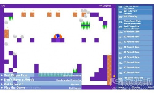
《Achievement Unlocked》是一款颇具名气的Flash游戏,玩家在游戏中只需闯过一个单独的关卡。对于一款仅有一个关卡的游戏来说,它在玩法设计上的确表现出众,添加了许多让玩家寻找和发现的不同成就。所以这款游戏的重点不在于大量的关卡、台阶或者角色,而是探索构成整款游戏的一个台阶。
它的美术设计也同样很简单,其简易设计的Flash美术风格很可能就是出自开发该游戏的程序员之手。游戏也没有动画效果,玩家就只需控制一只会上蹿下跳的大象,如果它死了,图像就变成灰色。游戏中所有视觉元素就只是一些形状和文本,没有任何复杂或者抢眼的元素。
这是一款典型的无需制作大量出色美术效果的成功游戏,但我们在本文只是将其作为美术设计的最低标准。我个人建议,只有当开发者别无选择时才能采用这种做法,例如团队没时间,或者缺乏美工预算,或者资源有限的情况。当然,这款游戏本身就很棒,但如果能再添加一些更抢眼的视觉元素,效果可能还会更好。
经典任天堂风格——《Banana Nababa》
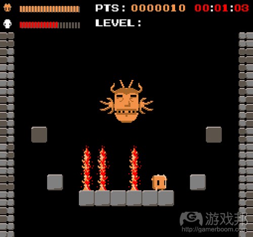
《Banana Nababa》是一款《旺达与巨像》风格的独立游戏,玩家在其中要Harry Flowerpower,在向高塔攀升的过程中一路打败不同的boss。
游戏的图像和音乐效果都很棒,与《Achievement Unlocked》不同的是,它们是精心设计的结果,而且与游戏玩法相呼应。它从视觉和风格上看就是一款针对原版任天堂娱乐系统(游戏邦注:以下简称NES)而设计的游戏,其中文本所用字体与旧式NES游戏字体相同。游戏像素大小也与旧款NES游戏相同,它所用的调色盘也与旧式的NES调色盘如出一辙。
游戏精心挑战的视觉元素(以及音乐)延续了旧式任天堂游戏风格,它们与游戏玩法十分协调——玩法非常困难,具有惩罚性,只有一个方向的控制盘以及两个按钮。《Banana Nababa》可以说是款乍一看像是仅满足最低限度美术设计,但实际上却是有意为之的游戏。
幻觉派美术设计——Cactus Games
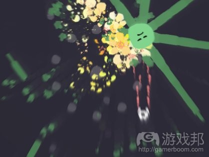
Cactus是一个极为高产的独立开发商,其作品涉足多种风格,而且都很不走寻常路。Cactus的多数游戏看上去像是由程序员制作的美术设计,值得一提的是,他是特意利用自己的编程技术制作了这些美术设计。当然,他的多数游戏也不过是一些形状和色彩,但这些都是特效,爆炸、颗粒、渐变和阴影等效果。他巧用自己的编程技术弥补了美术设计的劣势,让程序自动生成美术效果。
这种四处蔓延的爆炸和颗粒效果与游戏核心体验也同样配合得天衣无缝。在《Ad Nauseum》等作品中,游戏玩法极为疯狂,动作速度极快,甚为吻合玩家所看到的美术效果。
超级任天堂风格——《Owlboy》
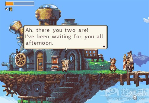
《Owlboy》的视觉风格像是经典的超级任天堂游戏,《Chrono Trigger》和《Kirby Superstar》等作品也从超级任天堂游戏获取了美术设计灵感。
这款游戏的美术风格与其玩法极为搭调,它试图重温超级任天堂时代的游戏玩法,其巨大华丽的像素世界很适合这种玩法。
动作漫画书——《Shank》
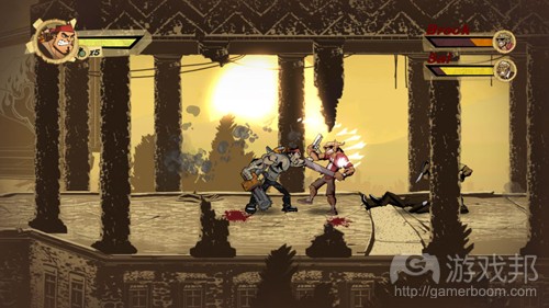
这是一款由EA发行的经典游戏,玩法极为暴力,到处充斥血腥画面,玩家的每一击都极为经典。它的游戏玩法与美国漫画书的故事和动作序列甚为相似,其美术风格也体现了这一点。黑暗的阴影,风格化的讽刺面孔,肢解中喷溅而出的鲜血,所有元素都不禁让人想起90年代的超人或蜘蛛侠漫画书。
这款游戏的美术风格让人感觉游戏玩法更为困难,玩家受伤时也更易产生切肤之痛,其中关卡也更让人觉得障碍重重和危机四伏。可见开发者在美术设计上多用点心思,使其更贴近游戏玩法及其锁定的用户群体,这一点可以强化游戏的现场感。
古典绘画派——《Braid》
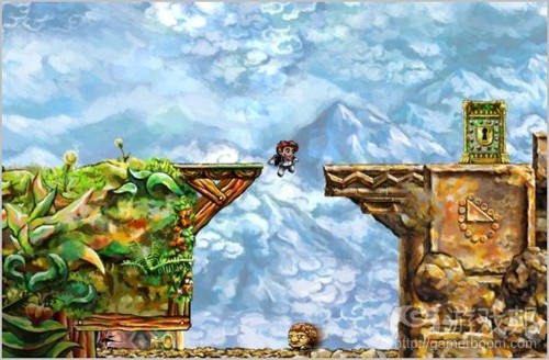
它是独立游戏的代表作品之一,其美术风格极为复杂——但并不是复杂在外观,而是构思。极少有游戏会尝试让美术风格看起来像是古典绘画作品,它的背景等元素堪比印象派画家莫纳的作品。
《Braid》采用这种美术风格很可能是为了让自己与众不同,它困难的谜题和冗长的叙事列表,提升了玩法的复杂性。可以说这是一款为在美术风格上投入大量心血的游戏,由此可看出开发者煞费苦心地琢磨了让美术设计表达游戏主题的方式。
选择自己的美术风格
你可以为自己的游戏选择无数多种美术风格,但为了不走上岔道,你首先得自答以下问题:
我有什么资源?你自己是一个很有抱负的美术设计师吗?或者你有什么朋友、学生是可以合作的美术设计人员吗?如果不是,那么你可能就很难制作出高极或复杂的美术效果。但也可以选择聘请一名美工,只要你有足够的预算,就可以通过oDesk或Elance等网站寻找外包合作伙伴。
我的游戏核心体验是什么,如何让美术风格体现这一点?这个问题迫使开发者仔细思考游戏的意义所在。你的游戏是采用暴力还是和平主题?是关于益智挑战还是神秘犯罪案件?总之,得让美术设计如实反映游戏主题,表达你想让玩家知道的信息。
我有多少美术设计时间?有些开发者对美术并不感兴趣,他们只关心基础机制,而有些开发者却深深为美术设计而着迷。最好是找到符合自己时间安排的美术设计选择。(本文为游戏邦/gamerboom.com编译,拒绝任何不保留版权的转载,如需转载请联系:游戏邦)
Game Artwork: Choosing the Perfect Style for You
by Brice Morrison
“Don’t judge a book by its cover” is a phrase that many people are familiar with. The point is that the essence of a book has nothing to do with the cover. The experience of a book is spend between the pages, reading and enjoying the story, not by staring at the cover. If you skip on a book because it has a blank or boring cover, then you are selling youself short. Don’t judge by the cover, the phrase goes, because you will miss out on what’s really important inside.
But of course, people do judge books by their cover. You know this, I know this, and authors and book publishers certainly know this. That’s why you’ll never find blank book covers on the shelf of the best sellers – because a catch cover draws attention and will get people to read it. Even though it’s not what people are ultimately looking at when they read the book, it affects their experience.
Games are similar to books in this fashion. A game is made of many components within the Game Design Canvas. The ones that the player often spends the most time thinking about, processing, and experiencing are the Base Mechanics – what the player actually does. Other components, such as the Aesthetic Layout, are integral to the game, but may not be integral to the gameplay. So in the same way, many good games, from a Base Mechanics standpoint, get passed over because of their poorly designed Aesthetic Layout. The game artwork is shoddy, there are uninspiring backgrounds, or the music and sounds are generic and dull. And sadly, people do judge books by their cover. Good games with fresh, fun gameplay get ignored because they don’t have the look and feel of their peers. Especially in independent and student games that many of the readers on this site work on, a large amount of games don’t get the chance they deserve because of their artwork.
This article isn’t about the importance of gameplay versus graphics — that debate rages on and is, I believe, largely pointless. Instead, smart developers should recognize that artwork is a component of their games, whether they like it or not, and make clear decisions about what they want their art to say about their title. So what does your game’s artwork say?
Seeing is Believing
Most indie developers sadly don’t put much thought into their game artwork. The current trend, running along with the Experimental Gameplay Sessions and other conferences, is to focus squarely on mechanics. Artwork is an afterthought, often just chosen randomly or by deciding what is the easiest to pull off.
I’m not saying that more time should be invested in artwork planning than gameplay planning. But I am saying that it should be something developers think about. As part of the Aesthetic Layout, artwork is what makes your game come alive. It can augment or reduce the theme and effectiveness of your game, and as such it should not be taken lightly. During gameplay as well as in screenshots on your blog or review sites, artwork speaks volumes, and purposefully chosen artwork screams your game’s uniqueness. Action packed games will have an action packed style. Thoughtful or somber titles will have sadder tones, colors, and UI elements.
The choices are as endless as the choices for your game design. But the central idea is that your artwork should match your gameplay. This is a good challenge, because it forces a developer to practically ask themselves: “What is my game really about?” Understand the Core Experience and the artwork will flow from it. Let’s take a look at how some other indie game artists have supported their gameplay with their artwork.
The Minimalist Approach – “Achievement Unlocked”
Achievement Unlocked is a popular flash game where the player runs around through a single level. For a game with only one level, it does a great job extending gameplay a good deal by adding many different, you guessed it, achievements for the player to find. The focus of the game therefore is not on multiple levels or stages or even characters, but just on exploring the one stage that makes up the whole game.
The artwork for Achievement Unlocked is about as simple as it gets. Simple flash art, easy to make, likely drawn by the programmer who made the game. There are no animations – the elephant that you play as only bounces up and down and turns grey when he dies. All of the game is made up of shapes and text, nothing complicated or eye catching at all.
This is a successful game and a great example that you don’t need great art to make something fun. However, in this discussion of art styles for games, we’re going to use Achievement Unlocked as the lower bound, the bare minimum. I personally would only recommend this approach if no other options are available, if the team is out of time, or has no money to spend on art, or doesn’t have the resources. Sure, it makes a fine game on its own, but any added artwork on top of it could have made it better, more eye catching, and possibly more successful.
Classic Nintendo – “Banana Nababa”
Banana Nababa is Shadow-of-the-Colossus style indie game where you play as Harry Flowerpower, fighting through various bosses to reach the top of a ominous tower.
Despite first appearances, the game’s graphics and music are superb and well thought out, because unlike Achievement Unlocked, they were created with a plan in mind and a purpose that reflects the gameplay. Banana Nababa is meant to look and feel like a game for the original Nintendo Entertainment System. The letters used in the text are the same letters used in old NES games. The pixel size is the same size as pixels in old NES games. And finally, the color palette used to draw the game never goes outside the old NES’s color palette.
Each of these deliberate choices (along with the music) make the game play and feel like an old Nintendo game. This matches the gameplay very well – very difficult, punishing, with only a directional pad and two other buttons to play with. Banana Nababa is a game that, although at first glance looks like it is bare minimalist programmer art, was actually carefully crafted and well chosen.
Psychedelic – Cactus Games
Cactus is a widely known indie developer who is extremely prolific. His titles cross a wide range of genres and are often quite unusual or absurd in their premise. Most of Cactus’ games seem to be made up of programmer art, but what makes him worth mentioning here is that he goes out of his way to put his programming skills to use in the artwork. Sure, much of his games are nothing more than simple shapes and colors, but there are effects, explosions, particles, gradients, and shading flying everywhere. He compensates for his lack of strong artwork by using his programming to auto-generate the artwork for him.
These explosions and particles bursting forth certainly support his core experience as well. With titles called things like “Ad Nauseum”, Cactus games come off as a kind of enjoyable seizure. The gameplay is frenetic and the action is fast, just like the art that the player sees.
Super Nintendo – “Owlboy”
Owlboy was a contender at this year’s Independent Game’s Festival in San Francisco, and is modeled to look like a classic game at the height of the Super Nintendo era. Games like Chrono Trigger or Kirby Superstar had similar whimsical art styles constrained to the Super Nintendo palette.
This art style supports Owlboy’s gameplay because, as least as much as has been revealed so far, it seems that Owlboy is attempting to harken back to the gameplay of Super Nintendo. Exploration, giant beautiful, pixelated world. Thus again the artwork supports this style of game.
Action Comic Book – “Shank”
Shank, the indie brawler published by EA that was released recently, is a classic beat-’em-up game. The game is very violent, with blood and sweat spewing everywhere with each hit in a very stylized manner. In that way, the gameplay is similar to the stories and action sequences of an american comic book, and the artwork conveys that. The dark shadows, the stylized caricature faces, the gushing fountains of blood from chainsaw attacks, all are drawn in styles reminiscent of 90′s Superman or Spiderman comic books.
Because of the game artwork, the punches feel harder, the damage feels more visceral, and the levels feel grittier and more dangerous. A good deal of thought was put into an art style that would match both the gameplay and the audience the game was being developed for, and it pays off in the feel.
Classical Paintings – “Braid”
Braid, one of the poster child indie games, has a very complex art style — not complex in presentation, but complex in how the art style was conceived. You don’t see many games that attempt to look like a painting or piece of classical artwork. Indeed, the backgrounds and tiles look like they come out of an impressionist Monet painting.
The art style of Braid was likely meant to look very unique and support the designer’s attempt at a highly intellectual title. With the difficult puzzles and long narrative quotations, the gameplay holds itself to a high standard of sophistication. Thus once again, this is a great example of an art style that had much thought put into it, that the developers choose purposefully to convey what the game was about.
Choosing Your Art Style
There are an infinite number of art styles to choose to go with your game. To get started on the right track, as yourself these questions:
What are my resources? Are you an an aspiring artist yourself? Do you have a friend or fellow student who is an artist who would like to work on a project with you? If not, then you may have a difficult time going to the level of some of the more sophisticated art styles we have covered in this article. Another option is to hire an artist. If you have the money, sites such as oDesk or Elance are great resources for contract work.
What is the Core Experience of my game, and how can my artwork reflect that? This is a great question for practical developers to ask themselves because it forces you to hone in on what the purpose of your game is. Is your game about violence? About peace? About intellectual puzzles or a mystery crime? The artwork should reflect what the game is truly about and what you want to convey to your players.
How much time am I willing to put into artwork? Some developers aren’t interested in artwork at all. It’s Base Mechanics or nothing. Others, however, deeply enjoy developing the artwork of their game. Finding out what works for you will allow you to budget your time accordingly.(source:thegameprodigy)
上一篇:分析文字编写对游戏设计的重要性





 闽公网安备35020302001549号